How to Build an Add Card Screen with a Live Card Preview in Flutter (Full Code + Preview)
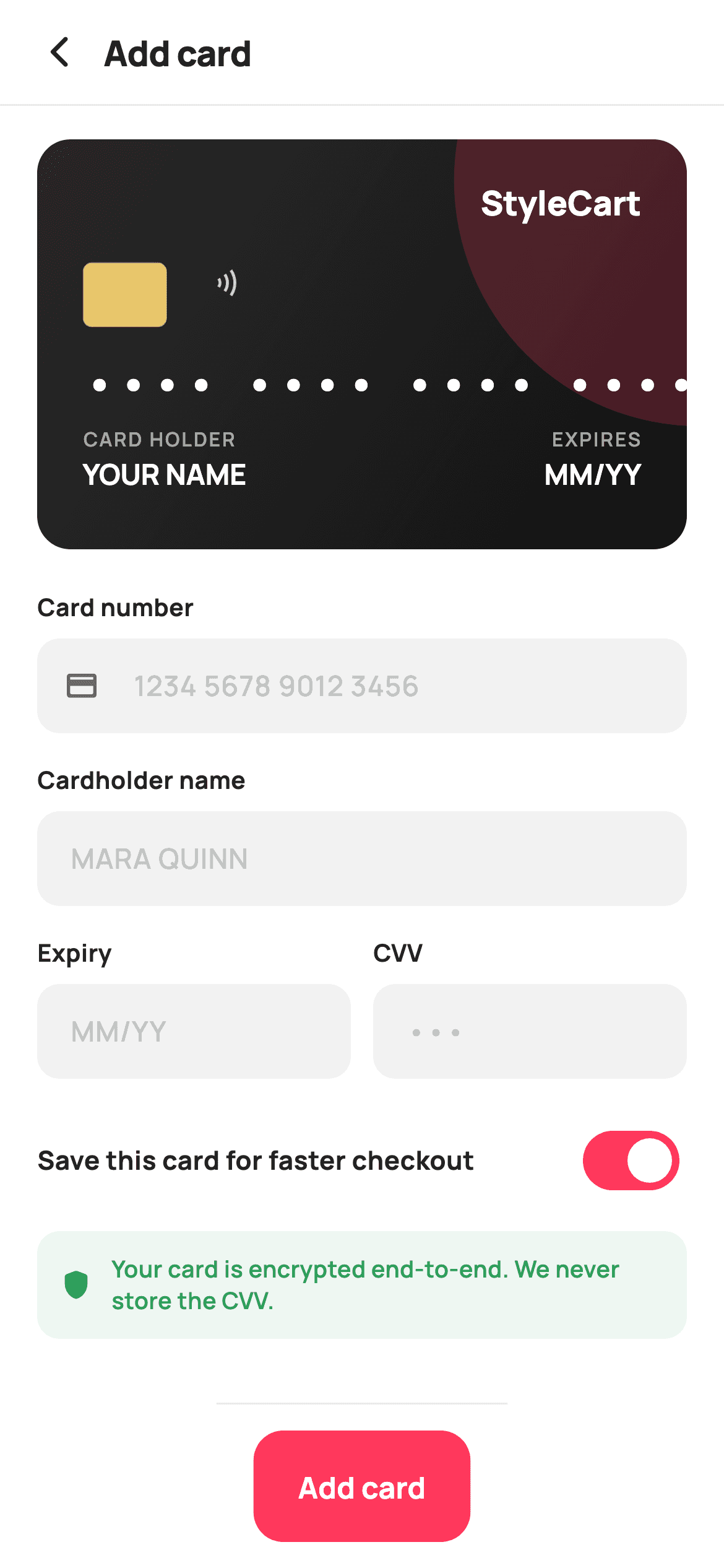
This is the screen where a shopper hands over a card number, so it has to feel like a real payment surface. This tutorial builds StyleCart's add-card form in Flutter with a card face painted live on a Canvas that fills in as you type, two custom TextInputFormatters that group digits into fours and insert the MM/YY slash, an Expiry and CVV row, and a green encryption note. Everything renders with TextPainter — no card image asset anywhere.
Watch the Flutter UI walkthrough
A short screen recording of Add Card running, if you'd rather see it before you read the code. The written tutorial below covers everything in it.
Can't see the video? Watch it on YouTube.
What you'll build
- ✓A card face painted with CustomPainter that updates on every keystroke
- ✓A digit-grouping formatter that spaces a card number into blocks of four
- ✓An expiry formatter that inserts the slash automatically after two digits
- ✓Text drawn onto a Canvas with TextPainter, including right-aligned labels
Step-by-step build
Create the file
Add a new file at lib/ecom_checkout_add_card/ecom_checkout_add_card_screen.dart in your Flutter project.
Register the bundled fonts
No external packages — this is pure Flutter. It does bundle its design font (Manrope), so drop the font file into fonts/ and declare it in pubspec.yaml:
flutter:
  fonts:
    - family: Manrope
      fonts:
- asset: fonts/Manrope-Regular.ttfBuild it, piece by piece
Here's how the screen goes together. Each block below is a real slice of the code with a plain-English explanation — paste them in order, or grab the whole file from the next section.
Four controllers wired to rebuild the preview
import 'package:flutter/material.dart';
import 'package:flutter/services.dart';

/// StyleCart — Add Card.
///
/// A live painted card preview that fills in as the shopper types — number
/// (grouped & masked), cardholder name and expiry — above the entry fields, a
/// save-card toggle and a PCI-style secure note, with a pinned add bar.
///
/// Self-contained per CONVENTIONS.md: pure Flutter, bundled Manrope, inline
/// Airbnb-style tokens, own light theme + SafeArea. The card face is a
/// CustomPainter (no emoji glyph, no network). Exposes callbacks only.
class EcomCheckoutAddCardScreen extends StatefulWidget {
  const EcomCheckoutAddCardScreen({
    super.key,
    this.onBack,
    this.onSave,
  });

  final VoidCallback? onBack;
  final VoidCallback? onSave;

  @override
  State<EcomCheckoutAddCardScreen> createState() =>
      _EcomCheckoutAddCardScreenState();
}

class _EcomCheckoutAddCardScreenState extends State<EcomCheckoutAddCardScreen> {
  static const String _font = 'Manrope';
  static const Color _canvas = Color(0xFFFFFFFF);
  static const Color _ink = Color(0xFF222222);
  static const Color _muted = Color(0xFF6A6A6A);
  static const Color _faint = Color(0xFFC1C1C1);
  static const Color _brand = Color(0xFFFF385C);
  static const Color _surface = Color(0xFFF2F2F2);
  static const Color _success = Color(0xFF2E9E5B);
  static const Color _hairline = Color(0xFFEBEBEB);

  late final TextEditingController _number;
  late final TextEditingController _name;
  late final TextEditingController _expiry;
  late final TextEditingController _cvv;

  bool _saveCard = true;

  @override
  void initState() {
    super.initState();
    _number = TextEditingController();
    _name = TextEditingController();
    _expiry = TextEditingController();
    _cvv = TextEditingController();
    for (final TextEditingController c in <TextEditingController>[
      _number, _name, _expiry, _cvv
    ]) {
      c.addListener(() => setState(() {}));
    }
  }

  @override
  void dispose() {
    for (final TextEditingController c in <TextEditingController>[
      _number, _name, _expiry, _cvv
    ]) {
      c.dispose();
    }
    super.dispose();
  }
The screen imports `package:flutter/services.dart` as well as material, because the input formatters live there. In `initState` all four controllers are created and then given the same listener: `c.addListener(() => setState(() {}))`. That empty `setState` is the mechanism behind the live preview — any keystroke in any field marks the widget dirty, `build` runs, and the painter receives the current text. `dispose` loops over the same list to release them. Iterating a list literal rather than repeating four lines each time keeps the two methods symmetrical, which is how you avoid the classic bug of adding a fifth controller and forgetting to dispose it.
The card preview and the field stack
  @override
  Widget build(BuildContext context) {
    return Theme(
      data: ThemeData.light(useMaterial3: true),
      child: Scaffold(
        backgroundColor: _canvas,
        body: SafeArea(
          child: Column(
            children: <Widget>[
              _header(),
              const Divider(height: 1, color: _hairline),
              Expanded(
                child: ListView(
                  padding: const EdgeInsets.fromLTRB(20, 18, 20, 20),
                  children: <Widget>[
                    AspectRatio(
                      aspectRatio: 1.586,
                      child: CustomPaint(
                        painter: _CardFacePainter(
                          number: _number.text,
                          name: _name.text,
                          expiry: _expiry.text,
                        ),
                      ),
                    ),
                    const SizedBox(height: 22),
                    _field(
                      'Card number',
                      _number,
                      hint: '1234 5678 9012 3456',
                      keyboard: TextInputType.number,
                      formatters: <TextInputFormatter>[
                        FilteringTextInputFormatter.digitsOnly,
                        LengthLimitingTextInputFormatter(16),
                        _CardNumberFormatter(),
                      ],
                      icon: Icons.credit_card_rounded,
                    ),
                    _field(
                      'Cardholder name',
                      _name,
                      hint: 'MARA QUINN',
                      capitalization: TextCapitalization.characters,
                    ),
                    Row(
                      crossAxisAlignment: CrossAxisAlignment.start,
                      children: <Widget>[
                        Expanded(
                          child: _field(
                            'Expiry',
                            _expiry,
                            hint: 'MM/YY',
                            keyboard: TextInputType.number,
                            formatters: <TextInputFormatter>[
                              FilteringTextInputFormatter.digitsOnly,
                              LengthLimitingTextInputFormatter(4),
                              _ExpiryFormatter(),
                            ],
                          ),
                        ),
                        const SizedBox(width: 12),
                        Expanded(
                          child: _field(
                            'CVV',
                            _cvv,
                            hint: '•••',
                            keyboard: TextInputType.number,
                            obscure: true,
                            formatters: <TextInputFormatter>[
                              FilteringTextInputFormatter.digitsOnly,
                              LengthLimitingTextInputFormatter(4),
                            ],
                          ),
                        ),
                      ],
                    ),
                    const SizedBox(height: 4),
                    _saveRow(),
                    const SizedBox(height: 14),
                    _secureNote(),
                  ],
                ),
              ),
              _addBar(),
            ],
          ),
        ),
      ),
    );
  }
The preview sits in an `AspectRatio(aspectRatio: 1.586)` — that number is the real ISO/IEC 7810 ID-1 ratio used by physical bank cards, so the painted face has the proportions of the thing in the shopper's hand at any screen width. Beneath it the fields are built by one `_field` helper called four times. Card number gets three formatters, digits-only then a 16-character limit then the grouping formatter, and the order matters: filtering first means the length limit counts digits rather than spaces. Expiry and CVV share a Row with `Expanded` on each and `crossAxisAlignment: CrossAxisAlignment.start`, so the two stay top-aligned even if one shows an error line later. CVV sets `obscure: true`, and the name field uses `TextCapitalization.characters` to match how names are embossed on cards.
One field builder with six optional knobs
  Widget _field(
    String label,
    TextEditingController controller, {
    required String hint,
    TextInputType? keyboard,
    bool obscure = false,
    IconData? icon,
    TextCapitalization capitalization = TextCapitalization.none,
    List<TextInputFormatter>? formatters,
  }) {
    return Padding(
      padding: const EdgeInsets.only(bottom: 16),
      child: Column(
        crossAxisAlignment: CrossAxisAlignment.start,
        children: <Widget>[
          Text(
            label,
            style: const TextStyle(
              fontFamily: _font,
              fontSize: 13,
              fontWeight: FontWeight.w700,
              color: _ink,
            ),
          ),
          const SizedBox(height: 7),
          TextField(
            controller: controller,
            keyboardType: keyboard,
            obscureText: obscure,
            textCapitalization: capitalization,
            inputFormatters: formatters,
            style: const TextStyle(
              fontFamily: _font,
              fontSize: 15,
              fontWeight: FontWeight.w600,
              color: _ink,
            ),
            decoration: InputDecoration(
              isDense: true,
              hintText: hint,
              prefixIcon: icon == null
                  ? null
                  : Icon(icon, size: 19, color: _muted),
              hintStyle: const TextStyle(
                fontFamily: _font,
                fontSize: 15,
                fontWeight: FontWeight.w500,
                color: _faint,
              ),
              filled: true,
              fillColor: _surface,
              contentPadding:
                  const EdgeInsets.symmetric(horizontal: 14, vertical: 14),
              border: OutlineInputBorder(
                borderRadius: BorderRadius.circular(12),
                borderSide: BorderSide.none,
              ),
              enabledBorder: OutlineInputBorder(
                borderRadius: BorderRadius.circular(12),
                borderSide: BorderSide.none,
              ),
              focusedBorder: OutlineInputBorder(
                borderRadius: BorderRadius.circular(12),
                borderSide: const BorderSide(color: _brand, width: 1.4),
              ),
            ),
          ),
        ],
      ),
    );
  }
`_field` takes a label and controller plus six named options — hint, keyboard, obscure, icon, capitalisation and formatters — which is enough to produce every input on the screen from one function. The visual style comes from three border definitions on the `InputDecoration`: `border` and `enabledBorder` both use `BorderSide.none` over a `filled: true` `_surface` background, so a resting field is a soft grey box with no outline, and only `focusedBorder` draws a 1.4px coral rule. Defining all three explicitly is the reliable way to get this look; overriding just one leaves Material's defaults showing in the other states. The `prefixIcon` is built conditionally so only the card-number field carries one.
The save toggle and the encryption note
  Widget _saveRow() {
    return Row(
      children: <Widget>[
        const Expanded(
          child: Text(
            'Save this card for faster checkout',
            style: TextStyle(
              fontFamily: _font,
              fontSize: 14,
              fontWeight: FontWeight.w700,
              color: _ink,
            ),
          ),
        ),
        Switch(
          value: _saveCard,
          onChanged: (bool v) => setState(() => _saveCard = v),
          activeThumbColor: _canvas,
          activeTrackColor: _brand,
          inactiveThumbColor: _canvas,
          inactiveTrackColor: _faint,
          trackOutlineColor: WidgetStateProperty.all(Colors.transparent),
        ),
      ],
    );
  }

  Widget _secureNote() {
    return Container(
      padding: const EdgeInsets.all(12),
      decoration: BoxDecoration(
        color: _success.withValues(alpha: 0.08),
        borderRadius: BorderRadius.circular(12),
      ),
      child: Row(
        children: <Widget>[
          const Icon(Icons.shield_rounded, size: 18, color: _success),
          const SizedBox(width: 10),
          Expanded(
            child: Text(
              'Your card is encrypted end-to-end. We never store the CVV.',
              style: const TextStyle(
                fontFamily: _font,
                fontSize: 12.5,
                fontWeight: FontWeight.w600,
                height: 1.35,
                color: _success,
              ),
            ),
          ),
        ],
      ),
    );
  }
`_saveRow` restyles Material's `Switch` inline to brand colours, including `trackOutlineColor: WidgetStateProperty.all(Colors.transparent)` — Material 3 draws an outline around the inactive track by default, and clearing it is what makes the control match the flat StyleCart look. `_secureNote` then does the reassurance work: a panel at `_success.withValues(alpha: 0.08)` with a shield icon and text both in full `_success` green. Two things make it worth including — it is placed immediately above the commit button where hesitation actually happens, and it states a specific, checkable fact ('we never store the CVV') rather than the vague 'your data is safe' that reassures nobody.
Grouping card digits as they are typed
/// Groups card digits into 4s as typed.
class _CardNumberFormatter extends TextInputFormatter {
  @override
  TextEditingValue formatEditUpdate(
      TextEditingValue oldValue, TextEditingValue newValue) {
    final String digits = newValue.text.replaceAll(' ', '');
    final StringBuffer out = StringBuffer();
    for (int i = 0; i < digits.length; i++) {
      if (i != 0 && i % 4 == 0) out.write(' ');
      out.write(digits[i]);
    }
    final String text = out.toString();
    return TextEditingValue(
      text: text,
      selection: TextSelection.collapsed(offset: text.length),
    );
  }
}
`_CardNumberFormatter` extends `TextInputFormatter` and overrides `formatEditUpdate`. It strips existing spaces, then rebuilds the string through a `StringBuffer`, writing a space before every fourth character via `if (i != 0 && i % 4 == 0)`. The critical detail is the returned `TextEditingValue`: it must carry a `selection` as well as text, and `TextSelection.collapsed(offset: text.length)` parks the caret at the end. Omit it and the cursor jumps to position zero on every keystroke — the single most common bug when writing a custom formatter.
Auto-inserting the expiry slash
/// Inserts the MM/YY slash as the shopper types.
class _ExpiryFormatter extends TextInputFormatter {
  @override
  TextEditingValue formatEditUpdate(
      TextEditingValue oldValue, TextEditingValue newValue) {
    final String digits = newValue.text.replaceAll('/', '');
    String text = digits;
    if (digits.length >= 3) {
      text = '${digits.substring(0, 2)}/${digits.substring(2)}';
    }
    return TextEditingValue(
      text: text,
      selection: TextSelection.collapsed(offset: text.length),
    );
  }
}
`_ExpiryFormatter` follows the same shape but simpler: strip any existing slash, and once three or more digits are present, rebuild as `MM/YY` by slicing at index 2. Waiting for the third digit rather than inserting at two is a deliberate choice — adding the slash the instant the month is complete makes backspacing feel like it is fighting you, because deleting a character immediately re-adds the separator. Like the card formatter it returns a collapsed selection at the end of the text to keep the caret in place.
Painting the card face
/// Paints the live card face: brand gradient, chip, contactless glyph, the
/// grouped number (placeholder dots until typed), name and expiry.
class _CardFacePainter extends CustomPainter {
  _CardFacePainter({
    required this.number,
    required this.name,
    required this.expiry,
  });

  final String number;
  final String name;
  final String expiry;

  static const String _font = 'Manrope';

  @override
  void paint(Canvas canvas, Size size) {
    final RRect card = RRect.fromRectAndRadius(
      Offset.zero & size,
      const Radius.circular(18),
    );
    // Brand gradient.
    final Rect r = Offset.zero & size;
    canvas.drawRRect(
      card,
      Paint()
        ..shader = const LinearGradient(
          begin: Alignment.topLeft,
          end: Alignment.bottomRight,
          colors: <Color>[Color(0xFF2B2B2B), Color(0xFF111111)],
        ).createShader(r),
    );
    // Brand accent swoosh.
    canvas.save();
    canvas.clipRRect(card);
    canvas.drawCircle(
      Offset(size.width * 1.02, size.height * 0.1),
      size.height * 0.6,
      Paint()..color = const Color(0xFFFF385C).withValues(alpha: 0.22),
    );
    canvas.restore();

    final double pad = size.width * 0.07;

    // Chip.
    final RRect chip = RRect.fromRectAndRadius(
      Rect.fromLTWH(pad, size.height * 0.30, size.width * 0.13,
          size.width * 0.10),
      const Radius.circular(5),
    );
    canvas.drawRRect(chip, Paint()..color = const Color(0xFFE8C66B));
    canvas.drawRRect(
      chip,
      Paint()
        ..style = PaintingStyle.stroke
        ..strokeWidth = 0.8
        ..color = const Color(0x55000000),
    );

    // Contactless arcs.
    final Paint wave = Paint()
      ..style = PaintingStyle.stroke
      ..strokeWidth = 1.6
      ..color = const Color(0xCCFFFFFF);
    final Offset wc = Offset(pad + size.width * 0.20, size.height * 0.35);
    for (int i = 1; i <= 3; i++) {
      canvas.drawArc(
        Rect.fromCircle(center: wc, radius: 4.0 * i),
        -0.6, 1.2, false, wave,
      );
    }

    // StyleCart wordmark (top-right).
    _text(canvas, 'StyleCart', Offset(size.width - pad, pad * 0.9),
        size: size.width * 0.052, weight: FontWeight.w800,
        color: const Color(0xFFFFFFFF), alignRight: true);

    // Number.
    final String shown = _numberDisplay();
    _text(canvas, shown, Offset(pad, size.height * 0.52),
        size: size.width * 0.066, weight: FontWeight.w700,
        color: const Color(0xFFFFFFFF), letter: 2.0);

    // Labels.
    _text(canvas, 'CARD HOLDER', Offset(pad, size.height * 0.70),
        size: size.width * 0.030, weight: FontWeight.w600,
        color: const Color(0x99FFFFFF), letter: 1.0);
    _text(
        canvas,
        name.isEmpty ? 'YOUR NAME' : name.toUpperCase(),
        Offset(pad, size.height * 0.77),
        size: size.width * 0.044,
        weight: FontWeight.w700,
        color: const Color(0xFFFFFFFF));

    _text(canvas, 'EXPIRES', Offset(size.width - pad, size.height * 0.70),
        size: size.width * 0.030, weight: FontWeight.w600,
        color: const Color(0x99FFFFFF), letter: 1.0, alignRight: true);
    _text(
        canvas,
        expiry.isEmpty ? 'MM/YY' : expiry,
        Offset(size.width - pad, size.height * 0.77),
        size: size.width * 0.044,
        weight: FontWeight.w700,
        color: const Color(0xFFFFFFFF),
        alignRight: true);
  }
`_CardFacePainter` builds the face in layers. First an `RRect` with an 18px radius filled by a `LinearGradient` shader running dark grey to near-black. Then the coral accent: `canvas.save()`, `clipRRect(card)`, a large circle drawn mostly off the right edge at `alpha: 0.22`, then `canvas.restore()`. That save/clip/restore sandwich is essential — without the clip the circle would spill past the rounded corners, and without the restore every later draw would inherit the clip. All geometry is expressed in fractions of `size`, so `pad = size.width * 0.07` and the chip and text positions scale with the card. The chip is drawn twice, filled gold then stroked at 0.8px in translucent black for an edge, and the contactless symbol is three `drawArc` calls at radii `4.0 * i` sharing a centre.
Placeholder digits and drawing text on a Canvas
  String _numberDisplay() {
    final String digits = number.replaceAll(' ', '');
    final StringBuffer b = StringBuffer();
    for (int i = 0; i < 16; i++) {
      if (i != 0 && i % 4 == 0) b.write('  ');
      b.write(i < digits.length ? digits[i] : '•');
    }
    return b.toString();
  }

  void _text(Canvas canvas, String s, Offset at,
      {required double size,
      required FontWeight weight,
      required Color color,
      double letter = 0,
      bool alignRight = false}) {
    final TextPainter tp = TextPainter(
      text: TextSpan(
        text: s,
        style: TextStyle(
          fontFamily: _font,
          fontSize: size,
          fontWeight: weight,
          color: color,
          letterSpacing: letter,
        ),
      ),
      textDirection: TextDirection.ltr,
    )..layout();
    final double dx = alignRight ? at.dx - tp.width : at.dx;
    tp.paint(canvas, Offset(dx, at.dy));
  }

  @override
  bool shouldRepaint(_CardFacePainter old) =>
      old.number != number || old.name != name || old.expiry != expiry;
`_numberDisplay` always emits sixteen characters, taking a real digit when one has been typed and a `•` otherwise, with a double space every fourth. That fixed width is why the number does not jump around as you type — the layout is stable from the first keystroke. `_text` is the Canvas text helper: a `Canvas` has no drawText, so you build a `TextPainter` with a `TextSpan`, call `layout()`, then `paint()`. `textDirection` is required or layout throws. Right alignment is handled by measuring after layout and subtracting `tp.width` from the x offset, which is how the EXPIRES column and the wordmark stay flush to the right edge at any card width. `shouldRepaint` compares all three strings, so the face repaints when a field changes and is skipped otherwise.
Full code
The complete, ready-to-paste source. Free to use in your projects — one click copies it all.
import 'package:flutter/material.dart';
import 'package:flutter/services.dart';

/// StyleCart — Add Card.
///
/// A live painted card preview that fills in as the shopper types — number
/// (grouped & masked), cardholder name and expiry — above the entry fields, a
/// save-card toggle and a PCI-style secure note, with a pinned add bar.
///
/// Self-contained per CONVENTIONS.md: pure Flutter, bundled Manrope, inline
/// Airbnb-style tokens, own light theme + SafeArea. The card face is a
/// CustomPainter (no emoji glyph, no network). Exposes callbacks only.
class EcomCheckoutAddCardScreen extends StatefulWidget {
  const EcomCheckoutAddCardScreen({
    super.key,
    this.onBack,
    this.onSave,
  });

  final VoidCallback? onBack;
  final VoidCallback? onSave;

  @override
  State<EcomCheckoutAddCardScreen> createState() =>
      _EcomCheckoutAddCardScreenState();
}

class _EcomCheckoutAddCardScreenState extends State<EcomCheckoutAddCardScreen> {
  static const String _font = 'Manrope';
  static const Color _canvas = Color(0xFFFFFFFF);
  static const Color _ink = Color(0xFF222222);
  static const Color _muted = Color(0xFF6A6A6A);
  static const Color _faint = Color(0xFFC1C1C1);
  static const Color _brand = Color(0xFFFF385C);
  static const Color _surface = Color(0xFFF2F2F2);
  static const Color _success = Color(0xFF2E9E5B);
  static const Color _hairline = Color(0xFFEBEBEB);

  late final TextEditingController _number;
  late final TextEditingController _name;
  late final TextEditingController _expiry;
  late final TextEditingController _cvv;

  bool _saveCard = true;

  @override
  void initState() {
    super.initState();
    _number = TextEditingController();
    _name = TextEditingController();
    _expiry = TextEditingController();
    _cvv = TextEditingController();
    for (final TextEditingController c in <TextEditingController>[
      _number, _name, _expiry, _cvv
    ]) {
      c.addListener(() => setState(() {}));
    }
  }

  @override
  void dispose() {
    for (final TextEditingController c in <TextEditingController>[
      _number, _name, _expiry, _cvv
    ]) {
      c.dispose();
    }
    super.dispose();
  }

  @override
  Widget build(BuildContext context) {
    return Theme(
      data: ThemeData.light(useMaterial3: true),
      child: Scaffold(
        backgroundColor: _canvas,
        body: SafeArea(
          child: Column(
            children: <Widget>[
              _header(),
              const Divider(height: 1, color: _hairline),
              Expanded(
                child: ListView(
                  padding: const EdgeInsets.fromLTRB(20, 18, 20, 20),
                  children: <Widget>[
                    AspectRatio(
                      aspectRatio: 1.586,
                      child: CustomPaint(
                        painter: _CardFacePainter(
                          number: _number.text,
                          name: _name.text,
                          expiry: _expiry.text,
                        ),
                      ),
                    ),
                    const SizedBox(height: 22),
                    _field(
                      'Card number',
                      _number,
                      hint: '1234 5678 9012 3456',
                      keyboard: TextInputType.number,
                      formatters: <TextInputFormatter>[
                        FilteringTextInputFormatter.digitsOnly,
                        LengthLimitingTextInputFormatter(16),
                        _CardNumberFormatter(),
                      ],
                      icon: Icons.credit_card_rounded,
                    ),
                    _field(
                      'Cardholder name',
                      _name,
                      hint: 'MARA QUINN',
                      capitalization: TextCapitalization.characters,
                    ),
                    Row(
                      crossAxisAlignment: CrossAxisAlignment.start,
                      children: <Widget>[
                        Expanded(
                          child: _field(
                            'Expiry',
                            _expiry,
                            hint: 'MM/YY',
                            keyboard: TextInputType.number,
                            formatters: <TextInputFormatter>[
                              FilteringTextInputFormatter.digitsOnly,
                              LengthLimitingTextInputFormatter(4),
                              _ExpiryFormatter(),
                            ],
                          ),
                        ),
                        const SizedBox(width: 12),
                        Expanded(
                          child: _field(
                            'CVV',
                            _cvv,
                            hint: '•••',
                            keyboard: TextInputType.number,
                            obscure: true,
                            formatters: <TextInputFormatter>[
                              FilteringTextInputFormatter.digitsOnly,
                              LengthLimitingTextInputFormatter(4),
                            ],
                          ),
                        ),
                      ],
                    ),
                    const SizedBox(height: 4),
                    _saveRow(),
                    const SizedBox(height: 14),
                    _secureNote(),
                  ],
                ),
              ),
              _addBar(),
            ],
          ),
        ),
      ),
    );
  }

  Widget _header() {
    return Padding(
      padding: const EdgeInsets.fromLTRB(8, 4, 20, 4),
      child: Row(
        children: <Widget>[
          IconButton(
            onPressed: widget.onBack,
            icon: const Icon(Icons.arrow_back_ios_new_rounded,
                size: 20, color: _ink),
          ),
          const Expanded(
            child: Text(
              'Add card',
              style: TextStyle(
                fontFamily: _font,
                fontSize: 19,
                fontWeight: FontWeight.w800,
                letterSpacing: -0.3,
                color: _ink,
              ),
            ),
          ),
        ],
      ),
    );
  }

  Widget _field(
    String label,
    TextEditingController controller, {
    required String hint,
    TextInputType? keyboard,
    bool obscure = false,
    IconData? icon,
    TextCapitalization capitalization = TextCapitalization.none,
    List<TextInputFormatter>? formatters,
  }) {
    return Padding(
      padding: const EdgeInsets.only(bottom: 16),
      child: Column(
        crossAxisAlignment: CrossAxisAlignment.start,
        children: <Widget>[
          Text(
            label,
            style: const TextStyle(
              fontFamily: _font,
              fontSize: 13,
              fontWeight: FontWeight.w700,
              color: _ink,
            ),
          ),
          const SizedBox(height: 7),
          TextField(
            controller: controller,
            keyboardType: keyboard,
            obscureText: obscure,
            textCapitalization: capitalization,
            inputFormatters: formatters,
            style: const TextStyle(
              fontFamily: _font,
              fontSize: 15,
              fontWeight: FontWeight.w600,
              color: _ink,
            ),
            decoration: InputDecoration(
              isDense: true,
              hintText: hint,
              prefixIcon: icon == null
                  ? null
                  : Icon(icon, size: 19, color: _muted),
              hintStyle: const TextStyle(
                fontFamily: _font,
                fontSize: 15,
                fontWeight: FontWeight.w500,
                color: _faint,
              ),
              filled: true,
              fillColor: _surface,
              contentPadding:
                  const EdgeInsets.symmetric(horizontal: 14, vertical: 14),
              border: OutlineInputBorder(
                borderRadius: BorderRadius.circular(12),
                borderSide: BorderSide.none,
              ),
              enabledBorder: OutlineInputBorder(
                borderRadius: BorderRadius.circular(12),
                borderSide: BorderSide.none,
              ),
              focusedBorder: OutlineInputBorder(
                borderRadius: BorderRadius.circular(12),
                borderSide: const BorderSide(color: _brand, width: 1.4),
              ),
            ),
          ),
        ],
      ),
    );
  }

  Widget _saveRow() {
    return Row(
      children: <Widget>[
        const Expanded(
          child: Text(
            'Save this card for faster checkout',
            style: TextStyle(
              fontFamily: _font,
              fontSize: 14,
              fontWeight: FontWeight.w700,
              color: _ink,
            ),
          ),
        ),
        Switch(
          value: _saveCard,
          onChanged: (bool v) => setState(() => _saveCard = v),
          activeThumbColor: _canvas,
          activeTrackColor: _brand,
          inactiveThumbColor: _canvas,
          inactiveTrackColor: _faint,
          trackOutlineColor: WidgetStateProperty.all(Colors.transparent),
        ),
      ],
    );
  }

  Widget _secureNote() {
    return Container(
      padding: const EdgeInsets.all(12),
      decoration: BoxDecoration(
        color: _success.withValues(alpha: 0.08),
        borderRadius: BorderRadius.circular(12),
      ),
      child: Row(
        children: <Widget>[
          const Icon(Icons.shield_rounded, size: 18, color: _success),
          const SizedBox(width: 10),
          Expanded(
            child: Text(
              'Your card is encrypted end-to-end. We never store the CVV.',
              style: const TextStyle(
                fontFamily: _font,
                fontSize: 12.5,
                fontWeight: FontWeight.w600,
                height: 1.35,
                color: _success,
              ),
            ),
          ),
        ],
      ),
    );
  }

  Widget _addBar() {
    return Container(
      decoration: const BoxDecoration(
        color: _canvas,
        border: Border(top: BorderSide(color: _hairline)),
      ),
      child: SafeArea(
        top: false,
        child: SizedBox(
          height: 88,
          child: Padding(
            padding: const EdgeInsets.fromLTRB(20, 14, 20, 14),
            child: SizedBox(
              height: 56,
              child: FilledButton(
                onPressed: widget.onSave,
                style: FilledButton.styleFrom(
                  backgroundColor: _brand,
                  foregroundColor: _canvas,
                  shape: RoundedRectangleBorder(
                    borderRadius: BorderRadius.circular(16),
                  ),
                ),
                child: const Text(
                  'Add card',
                  style: TextStyle(
                    fontFamily: _font,
                    fontSize: 16,
                    fontWeight: FontWeight.w700,
                  ),
                ),
              ),
            ),
          ),
        ),
      ),
    );
  }
}

/// Groups card digits into 4s as typed.
class _CardNumberFormatter extends TextInputFormatter {
  @override
  TextEditingValue formatEditUpdate(
      TextEditingValue oldValue, TextEditingValue newValue) {
    final String digits = newValue.text.replaceAll(' ', '');
    final StringBuffer out = StringBuffer();
    for (int i = 0; i < digits.length; i++) {
      if (i != 0 && i % 4 == 0) out.write(' ');
      out.write(digits[i]);
    }
    final String text = out.toString();
    return TextEditingValue(
      text: text,
      selection: TextSelection.collapsed(offset: text.length),
    );
  }
}

/// Inserts the MM/YY slash as the shopper types.
class _ExpiryFormatter extends TextInputFormatter {
  @override
  TextEditingValue formatEditUpdate(
      TextEditingValue oldValue, TextEditingValue newValue) {
    final String digits = newValue.text.replaceAll('/', '');
    String text = digits;
    if (digits.length >= 3) {
      text = '${digits.substring(0, 2)}/${digits.substring(2)}';
    }
    return TextEditingValue(
      text: text,
      selection: TextSelection.collapsed(offset: text.length),
    );
  }
}

/// Paints the live card face: brand gradient, chip, contactless glyph, the
/// grouped number (placeholder dots until typed), name and expiry.
class _CardFacePainter extends CustomPainter {
  _CardFacePainter({
    required this.number,
    required this.name,
    required this.expiry,
  });

  final String number;
  final String name;
  final String expiry;

  static const String _font = 'Manrope';

  @override
  void paint(Canvas canvas, Size size) {
    final RRect card = RRect.fromRectAndRadius(
      Offset.zero & size,
      const Radius.circular(18),
    );
    // Brand gradient.
    final Rect r = Offset.zero & size;
    canvas.drawRRect(
      card,
      Paint()
        ..shader = const LinearGradient(
          begin: Alignment.topLeft,
          end: Alignment.bottomRight,
          colors: <Color>[Color(0xFF2B2B2B), Color(0xFF111111)],
        ).createShader(r),
    );
    // Brand accent swoosh.
    canvas.save();
    canvas.clipRRect(card);
    canvas.drawCircle(
      Offset(size.width * 1.02, size.height * 0.1),
      size.height * 0.6,
      Paint()..color = const Color(0xFFFF385C).withValues(alpha: 0.22),
    );
    canvas.restore();

    final double pad = size.width * 0.07;

    // Chip.
    final RRect chip = RRect.fromRectAndRadius(
      Rect.fromLTWH(pad, size.height * 0.30, size.width * 0.13,
          size.width * 0.10),
      const Radius.circular(5),
    );
    canvas.drawRRect(chip, Paint()..color = const Color(0xFFE8C66B));
    canvas.drawRRect(
      chip,
      Paint()
        ..style = PaintingStyle.stroke
        ..strokeWidth = 0.8
        ..color = const Color(0x55000000),
    );

    // Contactless arcs.
    final Paint wave = Paint()
      ..style = PaintingStyle.stroke
      ..strokeWidth = 1.6
      ..color = const Color(0xCCFFFFFF);
    final Offset wc = Offset(pad + size.width * 0.20, size.height * 0.35);
    for (int i = 1; i <= 3; i++) {
      canvas.drawArc(
        Rect.fromCircle(center: wc, radius: 4.0 * i),
        -0.6, 1.2, false, wave,
      );
    }

    // StyleCart wordmark (top-right).
    _text(canvas, 'StyleCart', Offset(size.width - pad, pad * 0.9),
        size: size.width * 0.052, weight: FontWeight.w800,
        color: const Color(0xFFFFFFFF), alignRight: true);

    // Number.
    final String shown = _numberDisplay();
    _text(canvas, shown, Offset(pad, size.height * 0.52),
        size: size.width * 0.066, weight: FontWeight.w700,
        color: const Color(0xFFFFFFFF), letter: 2.0);

    // Labels.
    _text(canvas, 'CARD HOLDER', Offset(pad, size.height * 0.70),
        size: size.width * 0.030, weight: FontWeight.w600,
        color: const Color(0x99FFFFFF), letter: 1.0);
    _text(
        canvas,
        name.isEmpty ? 'YOUR NAME' : name.toUpperCase(),
        Offset(pad, size.height * 0.77),
        size: size.width * 0.044,
        weight: FontWeight.w700,
        color: const Color(0xFFFFFFFF));

    _text(canvas, 'EXPIRES', Offset(size.width - pad, size.height * 0.70),
        size: size.width * 0.030, weight: FontWeight.w600,
        color: const Color(0x99FFFFFF), letter: 1.0, alignRight: true);
    _text(
        canvas,
        expiry.isEmpty ? 'MM/YY' : expiry,
        Offset(size.width - pad, size.height * 0.77),
        size: size.width * 0.044,
        weight: FontWeight.w700,
        color: const Color(0xFFFFFFFF),
        alignRight: true);
  }

  String _numberDisplay() {
    final String digits = number.replaceAll(' ', '');
    final StringBuffer b = StringBuffer();
    for (int i = 0; i < 16; i++) {
      if (i != 0 && i % 4 == 0) b.write('  ');
      b.write(i < digits.length ? digits[i] : '•');
    }
    return b.toString();
  }

  void _text(Canvas canvas, String s, Offset at,
      {required double size,
      required FontWeight weight,
      required Color color,
      double letter = 0,
      bool alignRight = false}) {
    final TextPainter tp = TextPainter(
      text: TextSpan(
        text: s,
        style: TextStyle(
          fontFamily: _font,
          fontSize: size,
          fontWeight: weight,
          color: color,
          letterSpacing: letter,
        ),
      ),
      textDirection: TextDirection.ltr,
    )..layout();
    final double dx = alignRight ? at.dx - tp.width : at.dx;
    tp.paint(canvas, Offset(dx, at.dy));
  }

  @override
  bool shouldRepaint(_CardFacePainter old) =>
      old.number != number || old.name != name || old.expiry != expiry;
}
Plus bundled 5 binary assets (fonts/images). The CLI and MCP install those for you automatically.
Two faster ways to add it
Copy-paste works, but you can skip it entirely.
1. FlutterKit CLI
One command drops this screen — and its fonts — straight into your project.
$ flutterkit add ecom-checkout-add-card2. AI agent (MCP)
Connect FlutterKit's MCP server in Claude or Cursor and just ask your agent to install ecom-checkout-add-card — it fetches and writes the files for you.
FAQ
Is this add-card screen free to use in a commercial app?
Yes — FlutterKit is free permanently. Copy the Dart from this page, install it with the CLI, or pull it through MCP in your AI editor, then ship it in client work or a paid product. No account, no licence key, no attribution.
Does it process or validate card payments?
No. It collects and formats input and calls `onSave`; there is no Luhn check, no network call and no payment SDK. In production you would pass the fields to a PCI-compliant SDK such as Stripe's, and never send raw card data to your own backend.
Why does my cursor jump to the start when I use a custom formatter?
Because the returned `TextEditingValue` has no selection. Both formatters here return `TextSelection.collapsed(offset: text.length)` alongside the new text, which parks the caret at the end. Returning only the text resets the selection to offset zero on every keystroke.
Why is the card preview 1.586 wide?
That is the ISO/IEC 7810 ID-1 aspect ratio — the actual proportion of a physical bank card. Wrapping the painter in an `AspectRatio` with that value means the preview matches the card in the shopper's hand at any screen width, without hard-coding pixel dimensions.
Which Flutter version does this need?
Flutter 3.27 or newer, because the Switch uses `activeThumbColor` and `trackOutlineColor` with `WidgetStateProperty`. The painter also uses `Color.withValues(alpha: ...)`, which needs 3.22+. On older SDKs use `MaterialStateProperty`, `activeColor` and `withOpacity(...)`.


