How to Build a Sort By Bottom Sheet in Flutter (Full Code + Preview)
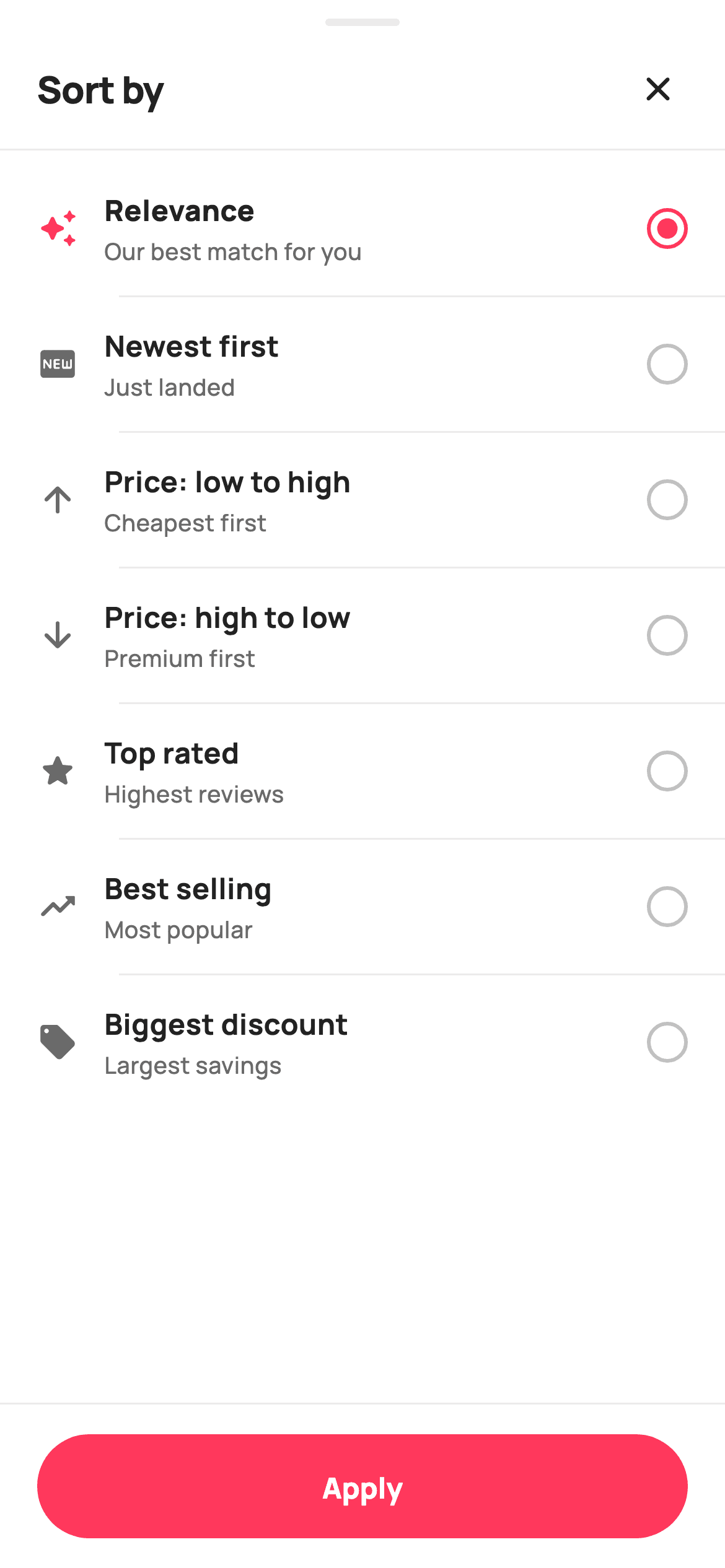
A sort sheet is a single-choice list, and the thing that makes a good one is restraint: seven options, one selected, nothing applied until you say so. This tutorial builds it in Flutter with a hand-built radio (two nested circles, no `Radio` widget), a one-line explanation under each option, and a pinned Apply bar. The selection stays internal until Apply fires, so backing out of the sheet leaves the product list exactly as it was.
Watch the Flutter UI walkthrough
A short screen recording of Sort by running, if you'd rather see it before you read the code. The written tutorial below covers everything in it.
Can't see the video? Watch it on YouTube.
What you'll build
- ✓A single-choice option list where selection is staged locally until Apply
- ✓A hand-built radio: an outlined circle with a filled inner dot, no `Radio` widget
- ✓A grab handle and close button that make the screen read as a bottom sheet
- ✓Selection shown three ways at once — icon colour, font weight, and the radio
- ✓A defensive `initial` value clamped to the valid option range
- ✓A pinned Apply bar that emits the chosen label to the caller
Step-by-step build
Create the file
Add a new file at lib/ecom_cat_sort/ecom_cat_sort_screen.dart in your Flutter project.
Register the bundled fonts
No external packages — this is pure Flutter. It does bundle its design font (Manrope), so drop the font file into fonts/ and declare it in pubspec.yaml:
flutter:
  fonts:
    - family: Manrope
      fonts:
- asset: fonts/Manrope-Regular.ttfBuild it, piece by piece
Here's how the screen goes together. Each block below is a real slice of the code with a plain-English explanation — paste them in order, or grab the whole file from the next section.
Seven options and a clamped initial selection
class EcomCatSortScreen extends StatefulWidget {
  const EcomCatSortScreen({
    super.key,
    this.initial = 0,
    this.onClose,
    this.onApply,
  });

  final int initial;
  final VoidCallback? onClose;

  /// Apply pressed — emits the chosen sort label.
  final ValueChanged<String>? onApply;

  @override
  State<EcomCatSortScreen> createState() => _EcomCatSortScreenState();
}

class _EcomCatSortScreenState extends State<EcomCatSortScreen> {
  static const String _font = 'Manrope';
  static const Color _canvas = Color(0xFFFFFFFF);
  static const Color _ink = Color(0xFF222222);
  static const Color _muted = Color(0xFF6A6A6A);
  static const Color _faint = Color(0xFFC1C1C1);
  static const Color _brand = Color(0xFFFF385C);
  static const Color _hairline = Color(0xFFEBEBEB);

  static const List<_Opt> _opts = <_Opt>[
    _Opt('Relevance', 'Our best match for you', Icons.auto_awesome_rounded),
    _Opt('Newest first', 'Just landed', Icons.fiber_new_rounded),
    _Opt('Price: low to high', 'Cheapest first', Icons.arrow_upward_rounded),
    _Opt('Price: high to low', 'Premium first', Icons.arrow_downward_rounded),
    _Opt('Top rated', 'Highest reviews', Icons.star_rounded),
    _Opt('Best selling', 'Most popular', Icons.trending_up_rounded),
    _Opt('Biggest discount', 'Largest savings', Icons.local_offer_rounded),
  ];

  late int _sel = widget.initial.clamp(0, _opts.length - 1);
Each `_Opt` carries a label, a `blurb`, and an icon — the blurb is what raises this above a plain radio list, translating 'Price: low to high' into 'Cheapest first'. The widget takes an `initial` index so the sheet reopens on whatever the shopper last chose. Line 49 is the defensive bit: `late int _sel = widget.initial.clamp(0, _opts.length - 1)`. If a caller passes a stale index from a longer option list, the clamp keeps it in range rather than throwing on `_opts[_sel]` later. `late` lets the initialiser read `widget`, which a plain field initialiser cannot.
Sheet chrome: grab handle, header, list, Apply
  @override
  Widget build(BuildContext context) {
    return Theme(
      data: ThemeData.light(useMaterial3: true),
      child: Scaffold(
        backgroundColor: _canvas,
        body: SafeArea(
          bottom: false,
          child: Column(
            children: <Widget>[
              Container(
                width: 40,
                height: 4,
                margin: const EdgeInsets.only(top: 10, bottom: 6),
                decoration: BoxDecoration(
                  color: _hairline,
                  borderRadius: BorderRadius.circular(99),
                ),
              ),
              _header(),
              const Divider(height: 1, color: _hairline),
              Expanded(
                child: ListView.separated(
                  padding: const EdgeInsets.symmetric(vertical: 6),
                  itemCount: _opts.length,
                  separatorBuilder: (_, _) => const Divider(
                      height: 1, color: _hairline, indent: 64),
                  itemBuilder: (BuildContext context, int i) => _row(i),
                ),
              ),
              _applyBar(),
            ],
          ),
        ),
      ),
    );
  }
The 40×4 rounded `Container` at the top is the grab handle — pure signalling, but it's what makes a full screen read as a draggable sheet. Below it, a full-width `Divider` separates the header from the list, while the *row* separators use `indent: 64` so they start under the option text rather than slicing through the icon column (20px padding + 22px icon + 14px gap ≈ 64). `SafeArea(bottom: false)` lets the Apply bar handle the home-indicator inset itself with its own `SafeArea(top: false)`, so its white background paints all the way down.
The option row and its three selection signals
  Widget _row(int i) {
    final _Opt o = _opts[i];
    final bool on = _sel == i;
    return InkWell(
      onTap: () => setState(() => _sel = i),
      child: Padding(
        padding: const EdgeInsets.symmetric(horizontal: 20, vertical: 15),
        child: Row(
          children: <Widget>[
            Icon(o.icon, size: 22, color: on ? _brand : _muted),
            const SizedBox(width: 14),
            Expanded(
              child: Column(
                crossAxisAlignment: CrossAxisAlignment.start,
                children: <Widget>[
                  Text(
                    o.label,
                    style: TextStyle(
                      fontFamily: _font,
                      fontSize: 15.5,
                      fontWeight: on ? FontWeight.w800 : FontWeight.w700,
                      color: _ink,
                    ),
                  ),
                  const SizedBox(height: 2),
                  Text(
                    o.blurb,
                    style: const TextStyle(
                      fontFamily: _font,
                      fontSize: 12.5,
                      fontWeight: FontWeight.w500,
                      color: _muted,
                    ),
                  ),
                ],
              ),
            ),
            _radio(on),
          ],
        ),
      ),
    );
  }
`_row` computes `final bool on = _sel == i` and spends it three ways: the leading icon switches from `_muted` to `_brand`, the label's weight steps from `w700` to `w800`, and the trailing radio fills. Using weight as well as colour means the selection is still visible to someone who can't distinguish the pink. Tapping calls `setState(() => _sel = i)`, and because every row derives `on` from the shared `_sel` rather than storing its own flag, the previous selection clears itself with no extra code. The text column is `Expanded`, so long labels wrap without pushing the radio off the row.
A radio built from two containers
  Widget _radio(bool on) {
    return Container(
      width: 22,
      height: 22,
      decoration: BoxDecoration(
        shape: BoxShape.circle,
        border: Border.all(color: on ? _brand : _faint, width: 2),
      ),
      child: on
          ? Center(
              child: Container(
                width: 11,
                height: 11,
                decoration: const BoxDecoration(
                  color: _brand,
                  shape: BoxShape.circle,
                ),
              ),
            )
          : null,
    );
  }
No `Radio` widget here — it comes with Material's own tap target, padding and theming, all of which would fight this layout. Instead: a 22px circular `Container` with a 2px border that switches between `_brand` and `_faint`, and when selected a centred 11px filled circle as its child, otherwise `null`. Returning `null` for the child is the cleanest way to express 'nothing inside' — no `SizedBox.shrink()`, no `Opacity`. The 11px dot at exactly half the 22px outer diameter is what gives the classic proportion.
The pinned Apply bar
  Widget _applyBar() {
    return Container(
      decoration: const BoxDecoration(
        color: _canvas,
        border: Border(top: BorderSide(color: _hairline)),
      ),
      child: SafeArea(
        top: false,
        child: SizedBox(
          height: 88,
          child: Padding(
            padding: const EdgeInsets.symmetric(horizontal: 20),
            child: Center(
              child: SizedBox(
                height: 56,
                width: double.infinity,
                child: FilledButton(
                  onPressed: () => widget.onApply?.call(_opts[_sel].label),
                  style: FilledButton.styleFrom(
                    backgroundColor: _brand,
                    foregroundColor: _canvas,
                    shape: const StadiumBorder(),
                    textStyle: const TextStyle(
                      fontFamily: _font,
                      fontSize: 15.5,
                      fontWeight: FontWeight.w800,
                    ),
                  ),
                  child: const Text('Apply'),
                ),
              ),
            ),
          ),
        ),
      ),
    );
  }
The bar is a `Container` with a top `BorderSide` hairline — that single line is what separates it from the scrolling list above and stops the button floating in space. Its `SafeArea(top: false)` claims only the bottom inset, and an 88px `SizedBox` gives the 56px `FilledButton` room to sit centred with breathing space. `shape: const StadiumBorder()` is the built-in way to get a pill with no radius arithmetic. On press it calls `widget.onApply?.call(_opts[_sel].label)` — emitting the human-readable label rather than the index, so the caller isn't coupled to this list's ordering.
Full code
The complete, ready-to-paste source. Free to use in your projects — one click copies it all.
import 'package:flutter/material.dart';

/// StyleCart — Sort (bottom sheet).
///
/// A single-choice sort sheet — Relevance, Newest, Price low→high, Price
/// high→low, Top rated, Best selling, Biggest discount — with a painted radio
/// per row and a pinned Apply bar.
///
/// Self-contained per CONVENTIONS.md: pure Flutter, bundled Manrope, inline
/// Airbnb-style tokens, own light theme + SafeArea. No emoji glyphs. Exposes
/// callbacks only; the chosen option is internal until Apply.
class EcomCatSortScreen extends StatefulWidget {
  const EcomCatSortScreen({
    super.key,
    this.initial = 0,
    this.onClose,
    this.onApply,
  });

  final int initial;
  final VoidCallback? onClose;

  /// Apply pressed — emits the chosen sort label.
  final ValueChanged<String>? onApply;

  @override
  State<EcomCatSortScreen> createState() => _EcomCatSortScreenState();
}

class _EcomCatSortScreenState extends State<EcomCatSortScreen> {
  static const String _font = 'Manrope';
  static const Color _canvas = Color(0xFFFFFFFF);
  static const Color _ink = Color(0xFF222222);
  static const Color _muted = Color(0xFF6A6A6A);
  static const Color _faint = Color(0xFFC1C1C1);
  static const Color _brand = Color(0xFFFF385C);
  static const Color _hairline = Color(0xFFEBEBEB);

  static const List<_Opt> _opts = <_Opt>[
    _Opt('Relevance', 'Our best match for you', Icons.auto_awesome_rounded),
    _Opt('Newest first', 'Just landed', Icons.fiber_new_rounded),
    _Opt('Price: low to high', 'Cheapest first', Icons.arrow_upward_rounded),
    _Opt('Price: high to low', 'Premium first', Icons.arrow_downward_rounded),
    _Opt('Top rated', 'Highest reviews', Icons.star_rounded),
    _Opt('Best selling', 'Most popular', Icons.trending_up_rounded),
    _Opt('Biggest discount', 'Largest savings', Icons.local_offer_rounded),
  ];

  late int _sel = widget.initial.clamp(0, _opts.length - 1);

  @override
  Widget build(BuildContext context) {
    return Theme(
      data: ThemeData.light(useMaterial3: true),
      child: Scaffold(
        backgroundColor: _canvas,
        body: SafeArea(
          bottom: false,
          child: Column(
            children: <Widget>[
              Container(
                width: 40,
                height: 4,
                margin: const EdgeInsets.only(top: 10, bottom: 6),
                decoration: BoxDecoration(
                  color: _hairline,
                  borderRadius: BorderRadius.circular(99),
                ),
              ),
              _header(),
              const Divider(height: 1, color: _hairline),
              Expanded(
                child: ListView.separated(
                  padding: const EdgeInsets.symmetric(vertical: 6),
                  itemCount: _opts.length,
                  separatorBuilder: (_, _) => const Divider(
                      height: 1, color: _hairline, indent: 64),
                  itemBuilder: (BuildContext context, int i) => _row(i),
                ),
              ),
              _applyBar(),
            ],
          ),
        ),
      ),
    );
  }

  Widget _header() {
    return Padding(
      padding: const EdgeInsets.fromLTRB(20, 4, 12, 8),
      child: Row(
        children: <Widget>[
          const Expanded(
            child: Text(
              'Sort by',
              style: TextStyle(
                fontFamily: _font,
                fontSize: 20,
                fontWeight: FontWeight.w800,
                letterSpacing: -0.3,
                color: _ink,
              ),
            ),
          ),
          IconButton(
            onPressed: widget.onClose,
            icon: const Icon(Icons.close_rounded, size: 22, color: _ink),
          ),
        ],
      ),
    );
  }

  Widget _row(int i) {
    final _Opt o = _opts[i];
    final bool on = _sel == i;
    return InkWell(
      onTap: () => setState(() => _sel = i),
      child: Padding(
        padding: const EdgeInsets.symmetric(horizontal: 20, vertical: 15),
        child: Row(
          children: <Widget>[
            Icon(o.icon, size: 22, color: on ? _brand : _muted),
            const SizedBox(width: 14),
            Expanded(
              child: Column(
                crossAxisAlignment: CrossAxisAlignment.start,
                children: <Widget>[
                  Text(
                    o.label,
                    style: TextStyle(
                      fontFamily: _font,
                      fontSize: 15.5,
                      fontWeight: on ? FontWeight.w800 : FontWeight.w700,
                      color: _ink,
                    ),
                  ),
                  const SizedBox(height: 2),
                  Text(
                    o.blurb,
                    style: const TextStyle(
                      fontFamily: _font,
                      fontSize: 12.5,
                      fontWeight: FontWeight.w500,
                      color: _muted,
                    ),
                  ),
                ],
              ),
            ),
            _radio(on),
          ],
        ),
      ),
    );
  }

  Widget _radio(bool on) {
    return Container(
      width: 22,
      height: 22,
      decoration: BoxDecoration(
        shape: BoxShape.circle,
        border: Border.all(color: on ? _brand : _faint, width: 2),
      ),
      child: on
          ? Center(
              child: Container(
                width: 11,
                height: 11,
                decoration: const BoxDecoration(
                  color: _brand,
                  shape: BoxShape.circle,
                ),
              ),
            )
          : null,
    );
  }

  Widget _applyBar() {
    return Container(
      decoration: const BoxDecoration(
        color: _canvas,
        border: Border(top: BorderSide(color: _hairline)),
      ),
      child: SafeArea(
        top: false,
        child: SizedBox(
          height: 88,
          child: Padding(
            padding: const EdgeInsets.symmetric(horizontal: 20),
            child: Center(
              child: SizedBox(
                height: 56,
                width: double.infinity,
                child: FilledButton(
                  onPressed: () => widget.onApply?.call(_opts[_sel].label),
                  style: FilledButton.styleFrom(
                    backgroundColor: _brand,
                    foregroundColor: _canvas,
                    shape: const StadiumBorder(),
                    textStyle: const TextStyle(
                      fontFamily: _font,
                      fontSize: 15.5,
                      fontWeight: FontWeight.w800,
                    ),
                  ),
                  child: const Text('Apply'),
                ),
              ),
            ),
          ),
        ),
      ),
    );
  }
}

class _Opt {
  const _Opt(this.label, this.blurb, this.icon);
  final String label;
  final String blurb;
  final IconData icon;
}
Plus bundled 5 binary assets (fonts/images). The CLI and MCP install those for you automatically.
Two faster ways to add it
Copy-paste works, but you can skip it entirely.
1. FlutterKit CLI
One command drops this screen — and its fonts — straight into your project.
$ flutterkit add ecom-cat-sort2. AI agent (MCP)
Connect FlutterKit's MCP server in Claude or Cursor and just ask your agent to install ecom-cat-sort — it fetches and writes the files for you.
FAQ
Is this sort sheet free to use?
Yes. The complete Dart source on this page is free for personal and commercial apps. Copy it from the code block, install it with the FlutterKit CLI (flutterkit add ecom-cat-sort), or add it through an AI agent over MCP.
Why doesn't tapping an option apply the sort immediately?
Because _sel is local state and only Apply calls onApply. Staging the choice means closing the sheet without applying leaves the product list untouched — which is what users expect from a sheet with an explicit Apply button. If you'd rather apply instantly, call onApply from the row's onTap and drop the bar.
How do I show it as a real bottom sheet?
Pass it to showModalBottomSheet with isScrollControlled: true and a rounded shape, and wire onClose to Navigator.pop. The screen already carries the grab handle and close button, so it needs no changes to work as a sheet.
Why not use Flutter's Radio widget?
Radio brings its own 48px tap target, padding and Material theming, which would conflict with this row's spacing and colours. Two nested Containers give exactly the look required in a dozen lines, and the whole InkWell row is already the tap target.
Which Flutter version does it target?
It uses wildcard parameters in separatorBuilder ((_, _) => …), which need Dart 3.7+, so target Flutter 3.29+. On an older SDK, name those parameters and everything else compiles unchanged — there are no withValues calls in this screen.


