How to Build a Product Grid Listing Screen in Flutter (Full Code + Preview)
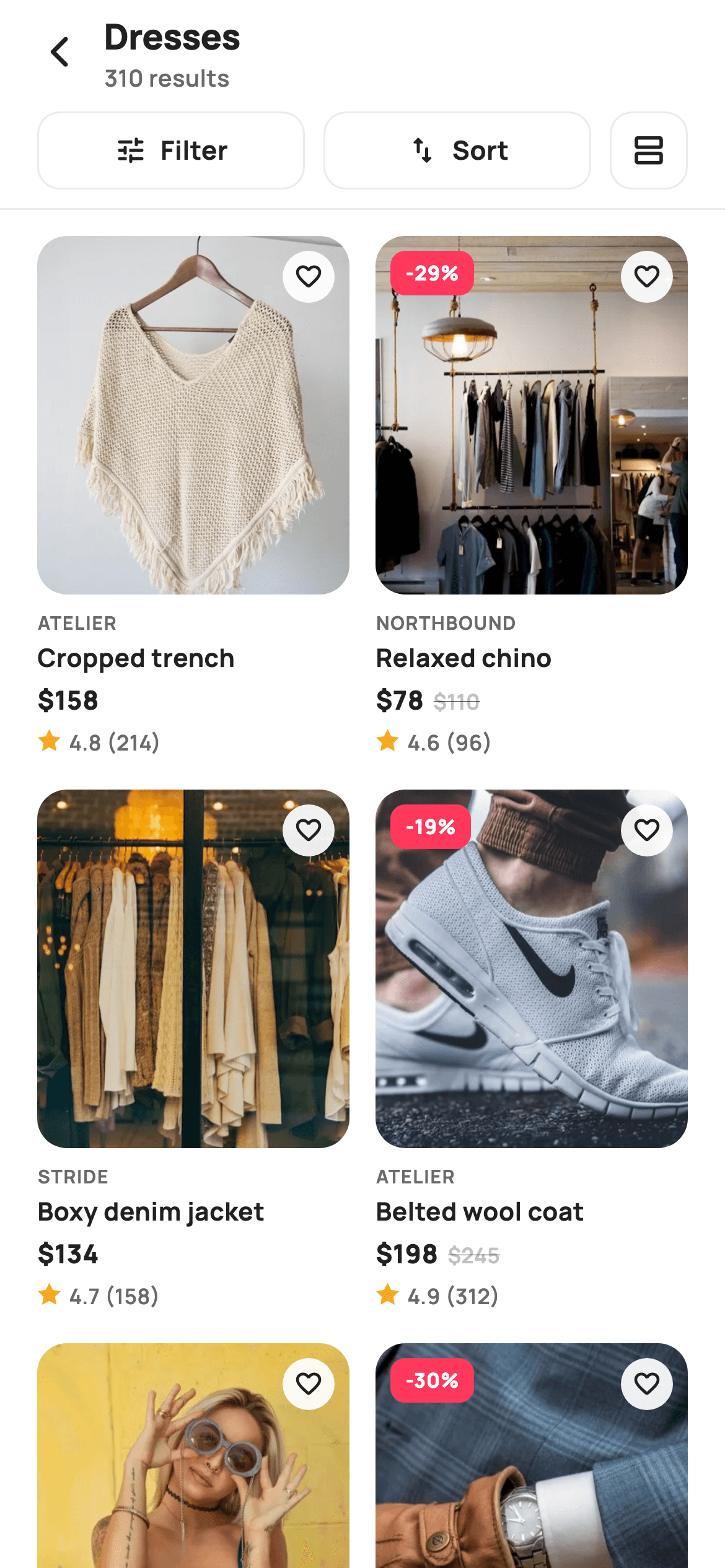
This is the two-column product grid every shopping app needs, and it's built as a `StatelessWidget` — no state at all, because the wishlist and view toggle report upward instead of storing anything. You'll learn the two numbers that make or break a product grid: the `childAspectRatio` that stops cards from overflowing, and the `Expanded` around the image that lets photos absorb the leftover height. It also includes a five-point star drawn with trigonometry, which is worth reading even if you never need a star again.
Watch the Flutter UI walkthrough
A short screen recording of Category Listing running, if you'd rather see it before you read the code. The written tutorial below covers everything in it.
Can't see the video? Watch it on YouTube.
What you'll build
- ✓A `GridView.builder` with `SliverGridDelegateWithFixedCrossAxisCount` tuned to a 0.60 aspect ratio for tall fashion cards
- ✓A Filter / Sort / view-toggle toolbar where the two text buttons flex and the icon button stays square
- ✓Cards that compute their own `-29%` badge from price versus was, and hide it entirely when `was` is 0
- ✓A price row with a struck-through original price that only appears on sale items
- ✓A five-point star painted from a polar-coordinate loop, alternating outer and inner radius
Step-by-step build
Create the file
Add a new file at lib/ecom_cat_listing/ecom_cat_listing_screen.dart in your Flutter project.
Register the bundled fonts
No external packages — this is pure Flutter. It does bundle its design font (Manrope), so drop the font file into fonts/ and declare it in pubspec.yaml:
flutter:
  fonts:
    - family: Manrope
      fonts:
- asset: fonts/Manrope-Regular.ttfBuild it, piece by piece
Here's how the screen goes together. Each block below is a real slice of the code with a plain-English explanation — paste them in order, or grab the whole file from the next section.
A stateless screen and its product model
class EcomCatListingScreen extends StatelessWidget {
  const EcomCatListingScreen({
    super.key,
    this.title = 'Dresses',
    this.onBack,
    this.onFilter,
    this.onSort,
    this.onListView,
    this.onProduct,
  });

  final String title;
  final VoidCallback? onBack;
  final VoidCallback? onFilter;
  final VoidCallback? onSort;

  /// Switch to the horizontal-card list layout.
  final VoidCallback? onListView;
  final ValueChanged<String>? onProduct;

  static const String _font = 'Manrope';
  static const Color _canvas = Color(0xFFFFFFFF);
  static const Color _ink = Color(0xFF222222);
  static const Color _muted = Color(0xFF6A6A6A);
  static const Color _faint = Color(0xFFC1C1C1);
  static const Color _brand = Color(0xFFFF385C);
  static const Color _imageBg = Color(0xFFF5F5F5);
  static const Color _hairline = Color(0xFFEBEBEB);

  static const String _dir = 'lib/screens/ecommerce/ecom_cat_listing/images';

  static const List<_P> _items = <_P>[
    _P('Cropped trench', 'Atelier', 158, 0, 4.8, 214, 'p01.webp'),
    _P('Relaxed chino', 'Northbound', 78, 110, 4.6, 96, 'p02.webp'),
    _P('Boxy denim jacket', 'Stride', 134, 0, 4.7, 158, 'p03.webp'),
    _P('Belted wool coat', 'Atelier', 198, 245, 4.9, 312, 'p04.webp'),
    _P('Silk slip dress', 'Aria', 138, 0, 4.5, 88, 'p05.webp'),
    _P('Knit cardigan', 'Maison', 64, 92, 4.4, 142, 'p06.webp'),
    _P('Court sneakers', 'Stride', 95, 0, 4.8, 268, 'p07.webp'),
    _P('Ribbed knit top', 'Maison', 54, 0, 4.3, 74, 'p08.webp'),
    _P('Pleated midi skirt', 'Aria', 76, 105, 4.6, 120, 'p09.webp'),
    _P('Leather tote', 'Maison', 165, 0, 4.9, 204, 'p10.webp'),
  ];
Note `extends StatelessWidget` — unusual for a product grid, and correct here because nothing on the screen mutates: the wishlist heart is presentational, and the list-view toggle fires `onListView` for the parent to swap routes. The `title` defaults to 'Dresses' so the widget previews standalone. All tokens and the ten-item `_items` list are `static const` on the widget class itself rather than a state class, which is what lets `_card` be a plain method. Each `_P` carries title, brand, price, `was`, rating, review count, and asset — with `was` again using 0 as the 'not on sale' sentinel. Also note `import 'dart:math' as math` at the top: that's only needed by the star painter at the very bottom.
The grid delegate — the two numbers that matter
  @override
  Widget build(BuildContext context) {
    return Theme(
      data: ThemeData.light(useMaterial3: true),
      child: Scaffold(
        backgroundColor: _canvas,
        body: SafeArea(
          child: Column(
            children: <Widget>[
              _header(),
              _toolbar(),
              const Divider(height: 1, color: _hairline),
              Expanded(
                child: GridView.builder(
                  padding: const EdgeInsets.fromLTRB(20, 14, 20, 24),
                  gridDelegate:
                      const SliverGridDelegateWithFixedCrossAxisCount(
                    crossAxisCount: 2,
                    mainAxisSpacing: 18,
                    crossAxisSpacing: 14,
                    childAspectRatio: 0.60,
                  ),
                  itemCount: _items.length,
                  itemBuilder: (BuildContext context, int i) =>
                      _card(_items[i]),
                ),
              ),
            ],
          ),
        ),
      ),
    );
  }
`SliverGridDelegateWithFixedCrossAxisCount` locks the grid to `crossAxisCount: 2` and spaces cells 18px vertically and 14px horizontally. The critical value is `childAspectRatio: 0.60` — that's width÷height, so each cell is noticeably taller than it is wide, which is what a fashion card needs to fit a portrait photo plus four lines of text. Get this wrong and you'll see the yellow-and-black overflow stripes, because grid cells have a fixed height and won't grow for their content. The header sits above the grid outside the scroll area, with `Expanded(child: GridView.builder(...))` taking the remaining space.
Header count and the flexible toolbar
  Widget _header() {
    return Padding(
      padding: const EdgeInsets.fromLTRB(8, 4, 16, 4),
      child: Row(
        children: <Widget>[
          IconButton(
            onPressed: onBack,
            icon: const Icon(Icons.arrow_back_ios_new_rounded,
                size: 20, color: _ink),
          ),
          Expanded(
            child: Column(
              crossAxisAlignment: CrossAxisAlignment.start,
              children: <Widget>[
                Text(
                  title,
                  style: const TextStyle(
                    fontFamily: _font,
                    fontSize: 19,
                    fontWeight: FontWeight.w800,
                    letterSpacing: -0.3,
                    color: _ink,
                  ),
                ),
                Text(
                  '${_items.length * 31} results',
                  style: const TextStyle(
                    fontFamily: _font,
                    fontSize: 12.5,
                    fontWeight: FontWeight.w600,
                    color: _muted,
                  ),
                ),
              ],
            ),
          ),
        ],
      ),
    );
  }

  Widget _toolbar() {
    return Padding(
      padding: const EdgeInsets.fromLTRB(20, 4, 20, 10),
      child: Row(
        children: <Widget>[
          Expanded(child: _toolBtn(Icons.tune_rounded, 'Filter', onFilter)),
          const SizedBox(width: 10),
          Expanded(
              child:
                  _toolBtn(Icons.swap_vert_rounded, 'Sort', onSort)),
          const SizedBox(width: 10),
          _iconToggle(),
        ],
      ),
    );
  }

  Widget _toolBtn(IconData icon, String label, VoidCallback? onTap) {
    return GestureDetector(
      onTap: onTap,
      child: Container(
        height: 42,
        alignment: Alignment.center,
        decoration: BoxDecoration(
          borderRadius: BorderRadius.circular(12),
          border: Border.all(color: _hairline),
        ),
        child: Row(
          mainAxisAlignment: MainAxisAlignment.center,
          children: <Widget>[
            Icon(icon, size: 18, color: _ink),
            const SizedBox(width: 7),
            Text(
              label,
              style: const TextStyle(
                fontFamily: _font,
                fontSize: 14,
                fontWeight: FontWeight.w700,
                color: _ink,
              ),
            ),
          ],
        ),
      ),
    );
  }

  Widget _iconToggle() {
    return GestureDetector(
      onTap: onListView,
      child: Container(
        width: 42,
        height: 42,
        alignment: Alignment.center,
        decoration: BoxDecoration(
          borderRadius: BorderRadius.circular(12),
          border: Border.all(color: _hairline),
        ),
        child: const Icon(Icons.view_agenda_outlined, size: 20, color: _ink),
      ),
    );
  }
The header stacks the category title over a muted result count computed as `'${_items.length * 31} results'` — a stand-in for a server total you'd swap for a real number. The toolbar shows a useful `Row` trick: the Filter and Sort buttons are each wrapped in `Expanded` so they split the free width evenly, while `_iconToggle()` is left unwrapped and keeps its intrinsic 42×42. All three share the same 42px height, 12px radius, and hairline border, so they read as one control group despite being built by two different helpers.
The product card and its derived discount
  Widget _card(_P p) {
    final bool sale = p.was > p.price && p.was > 0;
    final int off = sale ? (100 - (p.price * 100 / p.was)).round() : 0;
    return GestureDetector(
      onTap: () => onProduct?.call(p.title),
      child: Column(
        crossAxisAlignment: CrossAxisAlignment.start,
        children: <Widget>[
          Expanded(
            child: ClipRRect(
              borderRadius: BorderRadius.circular(16),
              child: Stack(
                fit: StackFit.expand,
                children: <Widget>[
                  Container(color: _imageBg),
                  Image.asset('$_dir/${p.asset}', fit: BoxFit.cover),
                  if (sale)
                    Positioned(
                      left: 8,
                      top: 8,
                      child: Container(
                        padding: const EdgeInsets.symmetric(
                            horizontal: 8, vertical: 4),
                        decoration: BoxDecoration(
                          color: _brand,
                          borderRadius: BorderRadius.circular(8),
                        ),
                        child: Text(
                          '-$off%',
                          style: const TextStyle(
                            fontFamily: _font,
                            fontSize: 11,
                            fontWeight: FontWeight.w800,
                            color: _canvas,
                          ),
                        ),
                      ),
                    ),
                  Positioned(
                    right: 8,
                    top: 8,
                    child: Container(
                      width: 28,
                      height: 28,
                      decoration: BoxDecoration(
                        color: _canvas.withValues(alpha: 0.92),
                        shape: BoxShape.circle,
                      ),
                      child: const Icon(Icons.favorite_border_rounded,
                          size: 16, color: _ink),
                    ),
                  ),
                ],
              ),
            ),
          ),
`sale` and `off` are both computed at the top of `_card`, never stored: `off` is `(100 - (p.price * 100 / p.was)).round()`, so the badge text always matches the two prices shown below it. The image block is `Expanded`, which is what makes the layout robust — the text below takes whatever height it needs and the photo absorbs the rest, so a longer title can't push the card past its grid cell. Inside, `ClipRRect` at 16px wraps a `Stack(fit: StackFit.expand)` layering the `_imageBg` placeholder, the photo, the conditional sale badge, and a wishlist heart on a `_canvas.withValues(alpha: 0.92)` circle — a near-opaque white puck so the dark icon stays readable over any photo.
Card typography and the rating line
          const SizedBox(height: 8),
          Text(
            p.brand.toUpperCase(),
            style: const TextStyle(
              fontFamily: _font,
              fontSize: 10,
              fontWeight: FontWeight.w700,
              letterSpacing: 0.6,
              color: _muted,
            ),
          ),
          const SizedBox(height: 2),
          Text(
            p.title,
            maxLines: 1,
            overflow: TextOverflow.ellipsis,
            style: const TextStyle(
              fontFamily: _font,
              fontSize: 13.5,
              fontWeight: FontWeight.w700,
              color: _ink,
            ),
          ),
          const SizedBox(height: 4),
          Row(
            children: <Widget>[
              Text(
                '\$${p.price}',
                style: const TextStyle(
                  fontFamily: _font,
                  fontSize: 14,
                  fontWeight: FontWeight.w800,
                  color: _ink,
                ),
              ),
              if (sale) ...<Widget>[
                const SizedBox(width: 5),
                Text(
                  '\$${p.was}',
                  style: const TextStyle(
                    fontFamily: _font,
                    fontSize: 11.5,
                    fontWeight: FontWeight.w600,
                    color: _faint,
                    decoration: TextDecoration.lineThrough,
                  ),
                ),
              ],
            ],
          ),
          const SizedBox(height: 4),
          Row(
            children: <Widget>[
              SizedBox(
                width: 13,
                height: 13,
                child: CustomPaint(painter: _StarPainter()),
              ),
              const SizedBox(width: 4),
              Text(
                '${p.rating} (${p.reviews})',
                style: const TextStyle(
                  fontFamily: _font,
                  fontSize: 11.5,
                  fontWeight: FontWeight.w600,
                  color: _muted,
                ),
              ),
            ],
          ),
        ],
      ),
    );
  }
The text block follows a strict hierarchy in shrinking sizes: brand in `toUpperCase()` at 10px with `letterSpacing: 0.6`, the product title at 13.5px `w700` with `maxLines: 1` plus `TextOverflow.ellipsis` (mandatory in a fixed-width grid cell), then the price row. The struck-through original is spread in with collection-if and styled with `decoration: TextDecoration.lineThrough` in the pale `_faint` grey, so it recedes behind the live price. The rating line pairs a 13×13 `CustomPaint` star with `'${p.rating} (${p.reviews})'` — combining score and review count in one string keeps the fourth line compact.
Drawing a five-point star with trigonometry
class _StarPainter extends CustomPainter {
  @override
  void paint(Canvas canvas, Size size) {
    const Color amber = Color(0xFFF5A623);
    final Path star = _starPath(size.width / 2, size.height / 2,
        size.width / 2, size.width / 4);
    canvas.drawPath(star, Paint()..color = amber);
  }

  Path _starPath(double cx, double cy, double outer, double inner) {
    final Path p = Path();
    const double step = math.pi / 5;
    double a = -math.pi / 2;
    for (int i = 0; i < 10; i++) {
      final double r = i.isEven ? outer : inner;
      final double x = cx + r * math.cos(a);
      final double y = cy + r * math.sin(a);
      if (i == 0) {
        p.moveTo(x, y);
      } else {
        p.lineTo(x, y);
      }
      a += step;
    }
    p.close();
    return p;
  }

  @override
  bool shouldRepaint(_StarPainter oldDelegate) => false;
}
`_starPath` walks ten points around a circle. `step = math.pi / 5` is 36 degrees, and the loop alternates radius with `i.isEven ? outer : inner` — outer points make the tips, inner points make the valleys between them. Starting the angle at `-math.pi / 2` rotates the whole star so a tip faces straight up instead of right, since 0 radians points along the positive X axis. Each point is converted from polar to cartesian with `cx + r * cos(a)` and `cy + r * sin(a)`, joined with `lineTo`, and closed. The painter passes `size.width / 2` as the outer radius and `size.width / 4` as the inner, a 2:1 ratio that gives the classic star proportion. `shouldRepaint` returns `false` since the painter takes no parameters.
Full code
The complete, ready-to-paste source. Free to use in your projects — one click copies it all.
import 'dart:math' as math;

import 'package:flutter/material.dart';

/// StyleCart — Category Listing (grid view).
///
/// The product grid for a subcategory: a result count, a sticky Filter / Sort /
/// view-toggle bar, and a two-column grid of photo cards with wishlist heart,
/// painted sale badge, brand, title, price and a painted rating capsule.
///
/// Self-contained per CONVENTIONS.md: pure Flutter, bundled Manrope, inline
/// Airbnb-style tokens, own light theme + SafeArea, bundled webp photos. Sale
/// badge and stars are CustomPainters (no emoji glyph). Exposes callbacks only.
class EcomCatListingScreen extends StatelessWidget {
  const EcomCatListingScreen({
    super.key,
    this.title = 'Dresses',
    this.onBack,
    this.onFilter,
    this.onSort,
    this.onListView,
    this.onProduct,
  });

  final String title;
  final VoidCallback? onBack;
  final VoidCallback? onFilter;
  final VoidCallback? onSort;

  /// Switch to the horizontal-card list layout.
  final VoidCallback? onListView;
  final ValueChanged<String>? onProduct;

  static const String _font = 'Manrope';
  static const Color _canvas = Color(0xFFFFFFFF);
  static const Color _ink = Color(0xFF222222);
  static const Color _muted = Color(0xFF6A6A6A);
  static const Color _faint = Color(0xFFC1C1C1);
  static const Color _brand = Color(0xFFFF385C);
  static const Color _imageBg = Color(0xFFF5F5F5);
  static const Color _hairline = Color(0xFFEBEBEB);

  static const String _dir = 'lib/screens/ecommerce/ecom_cat_listing/images';

  static const List<_P> _items = <_P>[
    _P('Cropped trench', 'Atelier', 158, 0, 4.8, 214, 'p01.webp'),
    _P('Relaxed chino', 'Northbound', 78, 110, 4.6, 96, 'p02.webp'),
    _P('Boxy denim jacket', 'Stride', 134, 0, 4.7, 158, 'p03.webp'),
    _P('Belted wool coat', 'Atelier', 198, 245, 4.9, 312, 'p04.webp'),
    _P('Silk slip dress', 'Aria', 138, 0, 4.5, 88, 'p05.webp'),
    _P('Knit cardigan', 'Maison', 64, 92, 4.4, 142, 'p06.webp'),
    _P('Court sneakers', 'Stride', 95, 0, 4.8, 268, 'p07.webp'),
    _P('Ribbed knit top', 'Maison', 54, 0, 4.3, 74, 'p08.webp'),
    _P('Pleated midi skirt', 'Aria', 76, 105, 4.6, 120, 'p09.webp'),
    _P('Leather tote', 'Maison', 165, 0, 4.9, 204, 'p10.webp'),
  ];

  @override
  Widget build(BuildContext context) {
    return Theme(
      data: ThemeData.light(useMaterial3: true),
      child: Scaffold(
        backgroundColor: _canvas,
        body: SafeArea(
          child: Column(
            children: <Widget>[
              _header(),
              _toolbar(),
              const Divider(height: 1, color: _hairline),
              Expanded(
                child: GridView.builder(
                  padding: const EdgeInsets.fromLTRB(20, 14, 20, 24),
                  gridDelegate:
                      const SliverGridDelegateWithFixedCrossAxisCount(
                    crossAxisCount: 2,
                    mainAxisSpacing: 18,
                    crossAxisSpacing: 14,
                    childAspectRatio: 0.60,
                  ),
                  itemCount: _items.length,
                  itemBuilder: (BuildContext context, int i) =>
                      _card(_items[i]),
                ),
              ),
            ],
          ),
        ),
      ),
    );
  }

  Widget _header() {
    return Padding(
      padding: const EdgeInsets.fromLTRB(8, 4, 16, 4),
      child: Row(
        children: <Widget>[
          IconButton(
            onPressed: onBack,
            icon: const Icon(Icons.arrow_back_ios_new_rounded,
                size: 20, color: _ink),
          ),
          Expanded(
            child: Column(
              crossAxisAlignment: CrossAxisAlignment.start,
              children: <Widget>[
                Text(
                  title,
                  style: const TextStyle(
                    fontFamily: _font,
                    fontSize: 19,
                    fontWeight: FontWeight.w800,
                    letterSpacing: -0.3,
                    color: _ink,
                  ),
                ),
                Text(
                  '${_items.length * 31} results',
                  style: const TextStyle(
                    fontFamily: _font,
                    fontSize: 12.5,
                    fontWeight: FontWeight.w600,
                    color: _muted,
                  ),
                ),
              ],
            ),
          ),
        ],
      ),
    );
  }

  Widget _toolbar() {
    return Padding(
      padding: const EdgeInsets.fromLTRB(20, 4, 20, 10),
      child: Row(
        children: <Widget>[
          Expanded(child: _toolBtn(Icons.tune_rounded, 'Filter', onFilter)),
          const SizedBox(width: 10),
          Expanded(
              child:
                  _toolBtn(Icons.swap_vert_rounded, 'Sort', onSort)),
          const SizedBox(width: 10),
          _iconToggle(),
        ],
      ),
    );
  }

  Widget _toolBtn(IconData icon, String label, VoidCallback? onTap) {
    return GestureDetector(
      onTap: onTap,
      child: Container(
        height: 42,
        alignment: Alignment.center,
        decoration: BoxDecoration(
          borderRadius: BorderRadius.circular(12),
          border: Border.all(color: _hairline),
        ),
        child: Row(
          mainAxisAlignment: MainAxisAlignment.center,
          children: <Widget>[
            Icon(icon, size: 18, color: _ink),
            const SizedBox(width: 7),
            Text(
              label,
              style: const TextStyle(
                fontFamily: _font,
                fontSize: 14,
                fontWeight: FontWeight.w700,
                color: _ink,
              ),
            ),
          ],
        ),
      ),
    );
  }

  Widget _iconToggle() {
    return GestureDetector(
      onTap: onListView,
      child: Container(
        width: 42,
        height: 42,
        alignment: Alignment.center,
        decoration: BoxDecoration(
          borderRadius: BorderRadius.circular(12),
          border: Border.all(color: _hairline),
        ),
        child: const Icon(Icons.view_agenda_outlined, size: 20, color: _ink),
      ),
    );
  }

  Widget _card(_P p) {
    final bool sale = p.was > p.price && p.was > 0;
    final int off = sale ? (100 - (p.price * 100 / p.was)).round() : 0;
    return GestureDetector(
      onTap: () => onProduct?.call(p.title),
      child: Column(
        crossAxisAlignment: CrossAxisAlignment.start,
        children: <Widget>[
          Expanded(
            child: ClipRRect(
              borderRadius: BorderRadius.circular(16),
              child: Stack(
                fit: StackFit.expand,
                children: <Widget>[
                  Container(color: _imageBg),
                  Image.asset('$_dir/${p.asset}', fit: BoxFit.cover),
                  if (sale)
                    Positioned(
                      left: 8,
                      top: 8,
                      child: Container(
                        padding: const EdgeInsets.symmetric(
                            horizontal: 8, vertical: 4),
                        decoration: BoxDecoration(
                          color: _brand,
                          borderRadius: BorderRadius.circular(8),
                        ),
                        child: Text(
                          '-$off%',
                          style: const TextStyle(
                            fontFamily: _font,
                            fontSize: 11,
                            fontWeight: FontWeight.w800,
                            color: _canvas,
                          ),
                        ),
                      ),
                    ),
                  Positioned(
                    right: 8,
                    top: 8,
                    child: Container(
                      width: 28,
                      height: 28,
                      decoration: BoxDecoration(
                        color: _canvas.withValues(alpha: 0.92),
                        shape: BoxShape.circle,
                      ),
                      child: const Icon(Icons.favorite_border_rounded,
                          size: 16, color: _ink),
                    ),
                  ),
                ],
              ),
            ),
          ),
          const SizedBox(height: 8),
          Text(
            p.brand.toUpperCase(),
            style: const TextStyle(
              fontFamily: _font,
              fontSize: 10,
              fontWeight: FontWeight.w700,
              letterSpacing: 0.6,
              color: _muted,
            ),
          ),
          const SizedBox(height: 2),
          Text(
            p.title,
            maxLines: 1,
            overflow: TextOverflow.ellipsis,
            style: const TextStyle(
              fontFamily: _font,
              fontSize: 13.5,
              fontWeight: FontWeight.w700,
              color: _ink,
            ),
          ),
          const SizedBox(height: 4),
          Row(
            children: <Widget>[
              Text(
                '\$${p.price}',
                style: const TextStyle(
                  fontFamily: _font,
                  fontSize: 14,
                  fontWeight: FontWeight.w800,
                  color: _ink,
                ),
              ),
              if (sale) ...<Widget>[
                const SizedBox(width: 5),
                Text(
                  '\$${p.was}',
                  style: const TextStyle(
                    fontFamily: _font,
                    fontSize: 11.5,
                    fontWeight: FontWeight.w600,
                    color: _faint,
                    decoration: TextDecoration.lineThrough,
                  ),
                ),
              ],
            ],
          ),
          const SizedBox(height: 4),
          Row(
            children: <Widget>[
              SizedBox(
                width: 13,
                height: 13,
                child: CustomPaint(painter: _StarPainter()),
              ),
              const SizedBox(width: 4),
              Text(
                '${p.rating} (${p.reviews})',
                style: const TextStyle(
                  fontFamily: _font,
                  fontSize: 11.5,
                  fontWeight: FontWeight.w600,
                  color: _muted,
                ),
              ),
            ],
          ),
        ],
      ),
    );
  }
}

class _P {
  const _P(this.title, this.brand, this.price, this.was, this.rating,
      this.reviews, this.asset);
  final String title;
  final String brand;
  final int price;
  final int was;
  final double rating;
  final int reviews;
  final String asset;
}

/// A single filled five-point star (rating capsule mark).
class _StarPainter extends CustomPainter {
  @override
  void paint(Canvas canvas, Size size) {
    const Color amber = Color(0xFFF5A623);
    final Path star = _starPath(size.width / 2, size.height / 2,
        size.width / 2, size.width / 4);
    canvas.drawPath(star, Paint()..color = amber);
  }

  Path _starPath(double cx, double cy, double outer, double inner) {
    final Path p = Path();
    const double step = math.pi / 5;
    double a = -math.pi / 2;
    for (int i = 0; i < 10; i++) {
      final double r = i.isEven ? outer : inner;
      final double x = cx + r * math.cos(a);
      final double y = cy + r * math.sin(a);
      if (i == 0) {
        p.moveTo(x, y);
      } else {
        p.lineTo(x, y);
      }
      a += step;
    }
    p.close();
    return p;
  }

  @override
  bool shouldRepaint(_StarPainter oldDelegate) => false;
}
Plus bundled 15 binary assets (fonts/images). The CLI and MCP install those for you automatically.
Two faster ways to add it
Copy-paste works, but you can skip it entirely.
1. FlutterKit CLI
One command drops this screen — and its fonts — straight into your project.
$ flutterkit add ecom-cat-listing2. AI agent (MCP)
Connect FlutterKit's MCP server in Claude or Cursor and just ask your agent to install ecom-cat-listing — it fetches and writes the files for you.
FAQ
Is this product grid screen free to use?
Yes. The full Dart source here is free for personal and commercial apps. Copy it from the page, run flutterkit add ecom-cat-listing with the CLI, or install it through an AI agent over MCP.
Does it need any packages?
No packages — it's pure Flutter using material.dart plus dart:math for the star geometry. It does ship bundled WebP product photos and the Manrope font family, both registered in pubspec.yaml as shown in the dependencies step.
My cards overflow when I change the text. How do I fix it?
Adjust childAspectRatio in the grid delegate — lower it (say 0.55) to make cells taller. Because the image sits inside Expanded, the photo shrinks or grows to absorb the difference, so you only ever need to tune that one number rather than resizing anything inside the card.
Which Flutter version does it target?
It uses Color.withValues(alpha:) and super parameters, so it targets Flutter 3.27+ for withValues. On an older SDK, swap _canvas.withValues(alpha: 0.92) for _canvas.withOpacity(0.92) and it compiles back to Flutter 3.10.


