How to Build a Product List View Layout in Flutter (Full Code + Preview)
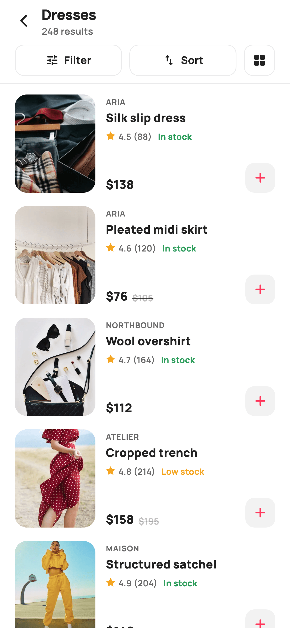
Grids show more products; list rows show more information. This tutorial builds StyleCart's list-view catalogue in Flutter — full-width horizontal cards each carrying a tall photo, brand, title, a canvas-drawn star rating, a colour-coded stock label, price with an optional strike-through, and a quick-add button. Above them sits a Filter / Sort / grid-toggle bar. You'll learn how a fixed row height plus Spacer pins the price to the bottom, and how a five-point star is generated from trigonometry rather than an icon font.
Watch the Flutter UI walkthrough
A short screen recording of Listing (List View) running, if you'd rather see it before you read the code. The written tutorial below covers everything in it.
Can't see the video? Watch it on YouTube.
What you'll build
- ✓Full-width catalogue rows with a fixed 132px height so every card aligns no matter how long the title is
- ✓A three-part toolbar where Filter and Sort share the width evenly and a square button toggles back to grid
- ✓A five-point star rating mark generated with sin/cos instead of an emoji or icon font
- ✓Green 'In stock' / amber 'Low stock' labels and a quick-add button that reports the product it was tapped for
Step-by-step build
Create the file
Add a new file at lib/ecom_cat_list_view/ecom_cat_list_view_screen.dart in your Flutter project.
Register the bundled fonts
No external packages — this is pure Flutter. It does bundle its design font (Manrope), so drop the font file into fonts/ and declare it in pubspec.yaml:
flutter:
  fonts:
    - family: Manrope
      fonts:
- asset: fonts/Manrope-Regular.ttfBuild it, piece by piece
Here's how the screen goes together. Each block below is a real slice of the code with a plain-English explanation — paste them in order, or grab the whole file from the next section.
Imports, six callbacks, and the catalogue data
import 'dart:math' as math;

import 'package:flutter/material.dart';

/// StyleCart — Listing (list view).
///
/// The same catalogue as the grid listing, laid out as full-width horizontal
/// cards: a large thumbnail, brand / title / painted rating / price row and a
/// quick-add affordance. A Filter / Sort / view-toggle bar sits up top.
///
/// Self-contained per CONVENTIONS.md: pure Flutter, bundled Manrope, inline
/// Airbnb-style tokens, own light theme + SafeArea, bundled webp photos. Star
/// rating is a CustomPainter (no emoji glyph). Exposes callbacks only.
class EcomCatListViewScreen extends StatelessWidget {
  const EcomCatListViewScreen({
    super.key,
    this.title = 'Dresses',
    this.onBack,
    this.onFilter,
    this.onSort,
    this.onGridView,
    this.onProduct,
    this.onAdd,
  });

  final String title;
  final VoidCallback? onBack;
  final VoidCallback? onFilter;
  final VoidCallback? onSort;

  /// Switch back to the two-column grid layout.
  final VoidCallback? onGridView;
  final ValueChanged<String>? onProduct;

  /// Quick-add a product to the bag (passes its title).
  final ValueChanged<String>? onAdd;

  static const String _font = 'Manrope';
  static const Color _canvas = Color(0xFFFFFFFF);
  static const Color _ink = Color(0xFF222222);
  static const Color _muted = Color(0xFF6A6A6A);
  static const Color _faint = Color(0xFFC1C1C1);
  static const Color _brand = Color(0xFFFF385C);
  static const Color _surface = Color(0xFFF2F2F2);
  static const Color _imageBg = Color(0xFFF5F5F5);
  static const Color _hairline = Color(0xFFEBEBEB);

  static const String _dir = 'lib/screens/ecommerce/ecom_cat_list_view/images';

  static const List<_P> _items = <_P>[
    _P('Silk slip dress', 'Aria', 138, 0, 4.5, 88, 'p11.webp', true),
    _P('Pleated midi skirt', 'Aria', 76, 105, 4.6, 120, 'p12.webp', true),
    _P('Wool overshirt', 'Northbound', 112, 0, 4.7, 164, 'p13.webp', true),
    _P('Cropped trench', 'Atelier', 158, 195, 4.8, 214, 'p14.webp', false),
    _P('Structured satchel', 'Maison', 142, 0, 4.9, 204, 'p15.webp', true),
    _P('Ribbed knit top', 'Maison', 54, 0, 4.3, 74, 'p16.webp', true),
    _P('Belted wool coat', 'Atelier', 198, 245, 4.9, 312, 'p17.webp', true),
    _P('Court sneakers', 'Stride', 95, 0, 4.8, 268, 'p18.webp', false),
  ];
The file starts with `import 'dart:math' as math` — an unusual import for a screen, needed here because the star rating is computed from cosines rather than drawn from an asset. The widget is a StatelessWidget with a `title` that defaults to 'Dresses' and six callbacks, including `onGridView` for switching layout and `onAdd` for quick-add. The catalogue is a `static const List<_P>` of eight products; because it's static const it's built once at compile time and shared by every instance. Each `_P` packs a `was` price (0 when there's no discount), a rating, a review count and an `inStock` boolean — all four drive conditional styling further down.
Stacking header, toolbar, and the scrolling list
  @override
  Widget build(BuildContext context) {
    return Theme(
      data: ThemeData.light(useMaterial3: true),
      child: Scaffold(
        backgroundColor: _canvas,
        body: SafeArea(
          child: Column(
            children: <Widget>[
              _header(),
              _toolbar(),
              const Divider(height: 1, color: _hairline),
              Expanded(
                child: ListView.separated(
                  padding: const EdgeInsets.fromLTRB(20, 14, 20, 24),
                  itemCount: _items.length,
                  separatorBuilder: (_, _) => const SizedBox(height: 18),
                  itemBuilder: (BuildContext context, int i) =>
                      _row(_items[i]),
                ),
              ),
            ],
          ),
        ),
      ),
    );
  }
build() wraps everything in a local `ThemeData.light(useMaterial3: true)` so the screen looks the same in any host app, then arranges four things in a Column: the header, the toolbar, a 1px full-bleed Divider, and an `Expanded` ListView.separated. Only the ListView is Expanded, so the header and toolbar stay pinned while the products scroll underneath. The separator here is a plain `SizedBox(height: 18)` rather than a divider — list-view product cards read better with air between them than with rules, unlike the saved-items screen where hairlines help.
A header with a derived result count
  Widget _header() {
    return Padding(
      padding: const EdgeInsets.fromLTRB(8, 4, 16, 4),
      child: Row(
        children: <Widget>[
          IconButton(
            onPressed: onBack,
            icon: const Icon(Icons.arrow_back_ios_new_rounded,
                size: 20, color: _ink),
          ),
          Expanded(
            child: Column(
              crossAxisAlignment: CrossAxisAlignment.start,
              children: <Widget>[
                Text(
                  title,
                  style: const TextStyle(
                    fontFamily: _font,
                    fontSize: 19,
                    fontWeight: FontWeight.w800,
                    letterSpacing: -0.3,
                    color: _ink,
                  ),
                ),
                Text(
                  '${_items.length * 31} results',
                  style: const TextStyle(
                    fontFamily: _font,
                    fontSize: 12.5,
                    fontWeight: FontWeight.w600,
                    color: _muted,
                  ),
                ),
              ],
            ),
          ),
        ],
      ),
    );
  }
The header stacks the category title over a smaller result count in a left-aligned Column. The count is `'${_items.length * 31} results'` — a deliberate demo stand-in that produces a realistic 248 rather than the 8 rows actually rendered, mirroring how a real catalogue shows total matches while only paging in a few. When you wire this to an API, replace that expression with your response's total field. The title is 19px w800 with tightened `-0.3` letterSpacing; the count below is 12.5px w600 in `_muted`.
The Filter / Sort / view-toggle bar
  Widget _toolbar() {
    return Padding(
      padding: const EdgeInsets.fromLTRB(20, 4, 20, 10),
      child: Row(
        children: <Widget>[
          Expanded(child: _toolBtn(Icons.tune_rounded, 'Filter', onFilter)),
          const SizedBox(width: 10),
          Expanded(child: _toolBtn(Icons.swap_vert_rounded, 'Sort', onSort)),
          const SizedBox(width: 10),
          GestureDetector(
            onTap: onGridView,
            child: Container(
              width: 42,
              height: 42,
              alignment: Alignment.center,
              decoration: BoxDecoration(
                borderRadius: BorderRadius.circular(12),
                border: Border.all(color: _hairline),
              ),
              child:
                  const Icon(Icons.grid_view_rounded, size: 19, color: _ink),
            ),
          ),
        ],
      ),
    );
  }

  Widget _toolBtn(IconData icon, String label, VoidCallback? onTap) {
    return GestureDetector(
      onTap: onTap,
      child: Container(
        height: 42,
        alignment: Alignment.center,
        decoration: BoxDecoration(
          borderRadius: BorderRadius.circular(12),
          border: Border.all(color: _hairline),
        ),
        child: Row(
          mainAxisAlignment: MainAxisAlignment.center,
          children: <Widget>[
            Icon(icon, size: 18, color: _ink),
            const SizedBox(width: 7),
            Text(
              label,
              style: const TextStyle(
                fontFamily: _font,
                fontSize: 14,
                fontWeight: FontWeight.w700,
                color: _ink,
              ),
            ),
          ],
        ),
      ),
    );
  }
The toolbar shows a clean way to mix flexible and fixed controls in one Row. Filter and Sort are each wrapped in `Expanded`, so they split the leftover width equally and stay equal no matter how long their labels get; the grid-toggle is a fixed 42×42 Container, so it never stretches. All three share the same 42px height, 12px radius and `_hairline` border, which is what makes them read as one segmented bar. `_toolBtn()` is a small builder that takes an icon, a label and a callback, so the two text buttons are defined once rather than copy-pasted.
The product row and its bottom-pinned price
  Widget _row(_P p) {
    final bool sale = p.was > p.price && p.was > 0;
    return GestureDetector(
      onTap: () => onProduct?.call(p.title),
      child: SizedBox(
        height: 132,
        child: Row(
          crossAxisAlignment: CrossAxisAlignment.start,
          children: <Widget>[
            ClipRRect(
              borderRadius: BorderRadius.circular(16),
              child: AspectRatio(
                aspectRatio: 0.82,
                child: Stack(
                  fit: StackFit.expand,
                  children: <Widget>[
                    Container(color: _imageBg),
                    Image.asset('$_dir/${p.asset}', fit: BoxFit.cover),
                  ],
                ),
              ),
            ),
            const SizedBox(width: 14),
            Expanded(
              child: Column(
                crossAxisAlignment: CrossAxisAlignment.start,
                children: <Widget>[
                  const SizedBox(height: 2),
                  Text(
                    p.brand.toUpperCase(),
                    style: const TextStyle(
                      fontFamily: _font,
                      fontSize: 10.5,
                      fontWeight: FontWeight.w700,
                      letterSpacing: 0.6,
                      color: _muted,
                    ),
                  ),
                  const SizedBox(height: 3),
                  Text(
                    p.title,
                    maxLines: 1,
                    overflow: TextOverflow.ellipsis,
                    style: const TextStyle(
                      fontFamily: _font,
                      fontSize: 15.5,
                      fontWeight: FontWeight.w800,
                      color: _ink,
                    ),
                  ),
                  const SizedBox(height: 6),
                  Row(
                    children: <Widget>[
                      SizedBox(
                        width: 13,
                        height: 13,
                        child: CustomPaint(painter: _StarPainter()),
                      ),
                      const SizedBox(width: 4),
                      Text(
                        '${p.rating} (${p.reviews})',
                        style: const TextStyle(
                          fontFamily: _font,
                          fontSize: 11.5,
                          fontWeight: FontWeight.w600,
                          color: _muted,
                        ),
                      ),
                      const SizedBox(width: 8),
                      Text(
                        p.inStock ? 'In stock' : 'Low stock',
                        style: TextStyle(
                          fontFamily: _font,
                          fontSize: 11.5,
                          fontWeight: FontWeight.w700,
                          color: p.inStock
                              ? const Color(0xFF2E9E5B)
                              : const Color(0xFFF5A623),
                        ),
                      ),
                    ],
                  ),
Each row is wrapped in a `SizedBox(height: 132)` — that fixed height is what makes the list feel orderly, since a one-line and a two-line title still produce identically sized cards. The thumbnail is a ClipRRect with a 16px radius wrapping an `AspectRatio(aspectRatio: 0.82)`, so its width is derived from the row height rather than hard-coded; change the 132 and the photo rescales with it. Beside it, the meta Row combines a 13×13 CustomPaint star, the rating and review count, and a stock label whose colour is chosen inline — green #2E9E5B when `inStock`, amber #F5A623 when not — so the state is legible at a glance without a badge.
Price, quick-add, and the two Spacers
                  const Spacer(),
                  Row(
                    crossAxisAlignment: CrossAxisAlignment.end,
                    children: <Widget>[
                      Text(
                        '\$${p.price}',
                        style: const TextStyle(
                          fontFamily: _font,
                          fontSize: 16,
                          fontWeight: FontWeight.w800,
                          color: _ink,
                        ),
                      ),
                      if (sale) ...<Widget>[
                        const SizedBox(width: 6),
                        Text(
                          '\$${p.was}',
                          style: const TextStyle(
                            fontFamily: _font,
                            fontSize: 12,
                            fontWeight: FontWeight.w600,
                            color: _faint,
                            decoration: TextDecoration.lineThrough,
                          ),
                        ),
                      ],
                      const Spacer(),
                      GestureDetector(
                        onTap: () => onAdd?.call(p.title),
                        child: Container(
                          width: 40,
                          height: 40,
                          decoration: BoxDecoration(
                            color: _surface,
                            borderRadius: BorderRadius.circular(12),
                          ),
                          child: const Icon(Icons.add_rounded,
                              size: 22, color: _brand),
                        ),
                      ),
                    ],
                  ),
                ],
              ),
            ),
          ],
        ),
      ),
    );
  }
Two Spacers do the heavy lifting here. The first, in the vertical Column, eats all remaining height so the price row is pushed to the bottom of the 132px card regardless of how much text sits above it. The second, inside the horizontal price Row, pushes the quick-add button to the far right while leaving the price and its optional struck-through original on the left. The strike-through is again a collection-if spread guarded by the `sale` boolean computed at the top of the method. The add button is a 40×40 `_surface` tile with a coral plus icon that calls `onAdd?.call(p.title)`, reporting the product without this screen owning any cart state.
The product record and the generated star path
class _P {
  const _P(this.title, this.brand, this.price, this.was, this.rating,
      this.reviews, this.asset, this.inStock);
  final String title;
  final String brand;
  final int price;
  final int was;
  final double rating;
  final int reviews;
  final String asset;
  final bool inStock;
}

/// A single filled five-point star (rating mark).
class _StarPainter extends CustomPainter {
  @override
  void paint(Canvas canvas, Size size) {
    const Color amber = Color(0xFFF5A623);
    final Path star = _starPath(
        size.width / 2, size.height / 2, size.width / 2, size.width / 4);
    canvas.drawPath(star, Paint()..color = amber);
  }

  Path _starPath(double cx, double cy, double outer, double inner) {
    final Path p = Path();
    const double step = math.pi / 5;
    double a = -math.pi / 2;
    for (int i = 0; i < 10; i++) {
      final double r = i.isEven ? outer : inner;
      final double x = cx + r * math.cos(a);
      final double y = cy + r * math.sin(a);
      if (i == 0) {
        p.moveTo(x, y);
      } else {
        p.lineTo(x, y);
      }
      a += step;
    }
    p.close();
    return p;
  }

  @override
  bool shouldRepaint(_StarPainter oldDelegate) => false;
}
_P is the immutable eight-field product record. _StarPainter is the interesting part: `_starPath` walks ten points around a circle, stepping `math.pi / 5` radians each time and starting at `-math.pi / 2` so the first point sits at the top. It alternates between the outer and inner radius using `i.isEven`, which is what turns a ten-point polygon into a five-point star — the even points are the tips, the odd ones the valleys between them. Each point is converted to x/y with cos and sin, joined with lineTo, and closed into a Path filled amber. Because the shape is pure geometry it stays razor-sharp at any size, and `shouldRepaint` returns false since nothing about it varies.
Full code
The complete, ready-to-paste source. Free to use in your projects — one click copies it all.
import 'dart:math' as math;

import 'package:flutter/material.dart';

/// StyleCart — Listing (list view).
///
/// The same catalogue as the grid listing, laid out as full-width horizontal
/// cards: a large thumbnail, brand / title / painted rating / price row and a
/// quick-add affordance. A Filter / Sort / view-toggle bar sits up top.
///
/// Self-contained per CONVENTIONS.md: pure Flutter, bundled Manrope, inline
/// Airbnb-style tokens, own light theme + SafeArea, bundled webp photos. Star
/// rating is a CustomPainter (no emoji glyph). Exposes callbacks only.
class EcomCatListViewScreen extends StatelessWidget {
  const EcomCatListViewScreen({
    super.key,
    this.title = 'Dresses',
    this.onBack,
    this.onFilter,
    this.onSort,
    this.onGridView,
    this.onProduct,
    this.onAdd,
  });

  final String title;
  final VoidCallback? onBack;
  final VoidCallback? onFilter;
  final VoidCallback? onSort;

  /// Switch back to the two-column grid layout.
  final VoidCallback? onGridView;
  final ValueChanged<String>? onProduct;

  /// Quick-add a product to the bag (passes its title).
  final ValueChanged<String>? onAdd;

  static const String _font = 'Manrope';
  static const Color _canvas = Color(0xFFFFFFFF);
  static const Color _ink = Color(0xFF222222);
  static const Color _muted = Color(0xFF6A6A6A);
  static const Color _faint = Color(0xFFC1C1C1);
  static const Color _brand = Color(0xFFFF385C);
  static const Color _surface = Color(0xFFF2F2F2);
  static const Color _imageBg = Color(0xFFF5F5F5);
  static const Color _hairline = Color(0xFFEBEBEB);

  static const String _dir = 'lib/screens/ecommerce/ecom_cat_list_view/images';

  static const List<_P> _items = <_P>[
    _P('Silk slip dress', 'Aria', 138, 0, 4.5, 88, 'p11.webp', true),
    _P('Pleated midi skirt', 'Aria', 76, 105, 4.6, 120, 'p12.webp', true),
    _P('Wool overshirt', 'Northbound', 112, 0, 4.7, 164, 'p13.webp', true),
    _P('Cropped trench', 'Atelier', 158, 195, 4.8, 214, 'p14.webp', false),
    _P('Structured satchel', 'Maison', 142, 0, 4.9, 204, 'p15.webp', true),
    _P('Ribbed knit top', 'Maison', 54, 0, 4.3, 74, 'p16.webp', true),
    _P('Belted wool coat', 'Atelier', 198, 245, 4.9, 312, 'p17.webp', true),
    _P('Court sneakers', 'Stride', 95, 0, 4.8, 268, 'p18.webp', false),
  ];

  @override
  Widget build(BuildContext context) {
    return Theme(
      data: ThemeData.light(useMaterial3: true),
      child: Scaffold(
        backgroundColor: _canvas,
        body: SafeArea(
          child: Column(
            children: <Widget>[
              _header(),
              _toolbar(),
              const Divider(height: 1, color: _hairline),
              Expanded(
                child: ListView.separated(
                  padding: const EdgeInsets.fromLTRB(20, 14, 20, 24),
                  itemCount: _items.length,
                  separatorBuilder: (_, _) => const SizedBox(height: 18),
                  itemBuilder: (BuildContext context, int i) =>
                      _row(_items[i]),
                ),
              ),
            ],
          ),
        ),
      ),
    );
  }

  Widget _header() {
    return Padding(
      padding: const EdgeInsets.fromLTRB(8, 4, 16, 4),
      child: Row(
        children: <Widget>[
          IconButton(
            onPressed: onBack,
            icon: const Icon(Icons.arrow_back_ios_new_rounded,
                size: 20, color: _ink),
          ),
          Expanded(
            child: Column(
              crossAxisAlignment: CrossAxisAlignment.start,
              children: <Widget>[
                Text(
                  title,
                  style: const TextStyle(
                    fontFamily: _font,
                    fontSize: 19,
                    fontWeight: FontWeight.w800,
                    letterSpacing: -0.3,
                    color: _ink,
                  ),
                ),
                Text(
                  '${_items.length * 31} results',
                  style: const TextStyle(
                    fontFamily: _font,
                    fontSize: 12.5,
                    fontWeight: FontWeight.w600,
                    color: _muted,
                  ),
                ),
              ],
            ),
          ),
        ],
      ),
    );
  }

  Widget _toolbar() {
    return Padding(
      padding: const EdgeInsets.fromLTRB(20, 4, 20, 10),
      child: Row(
        children: <Widget>[
          Expanded(child: _toolBtn(Icons.tune_rounded, 'Filter', onFilter)),
          const SizedBox(width: 10),
          Expanded(child: _toolBtn(Icons.swap_vert_rounded, 'Sort', onSort)),
          const SizedBox(width: 10),
          GestureDetector(
            onTap: onGridView,
            child: Container(
              width: 42,
              height: 42,
              alignment: Alignment.center,
              decoration: BoxDecoration(
                borderRadius: BorderRadius.circular(12),
                border: Border.all(color: _hairline),
              ),
              child:
                  const Icon(Icons.grid_view_rounded, size: 19, color: _ink),
            ),
          ),
        ],
      ),
    );
  }

  Widget _toolBtn(IconData icon, String label, VoidCallback? onTap) {
    return GestureDetector(
      onTap: onTap,
      child: Container(
        height: 42,
        alignment: Alignment.center,
        decoration: BoxDecoration(
          borderRadius: BorderRadius.circular(12),
          border: Border.all(color: _hairline),
        ),
        child: Row(
          mainAxisAlignment: MainAxisAlignment.center,
          children: <Widget>[
            Icon(icon, size: 18, color: _ink),
            const SizedBox(width: 7),
            Text(
              label,
              style: const TextStyle(
                fontFamily: _font,
                fontSize: 14,
                fontWeight: FontWeight.w700,
                color: _ink,
              ),
            ),
          ],
        ),
      ),
    );
  }

  Widget _row(_P p) {
    final bool sale = p.was > p.price && p.was > 0;
    return GestureDetector(
      onTap: () => onProduct?.call(p.title),
      child: SizedBox(
        height: 132,
        child: Row(
          crossAxisAlignment: CrossAxisAlignment.start,
          children: <Widget>[
            ClipRRect(
              borderRadius: BorderRadius.circular(16),
              child: AspectRatio(
                aspectRatio: 0.82,
                child: Stack(
                  fit: StackFit.expand,
                  children: <Widget>[
                    Container(color: _imageBg),
                    Image.asset('$_dir/${p.asset}', fit: BoxFit.cover),
                  ],
                ),
              ),
            ),
            const SizedBox(width: 14),
            Expanded(
              child: Column(
                crossAxisAlignment: CrossAxisAlignment.start,
                children: <Widget>[
                  const SizedBox(height: 2),
                  Text(
                    p.brand.toUpperCase(),
                    style: const TextStyle(
                      fontFamily: _font,
                      fontSize: 10.5,
                      fontWeight: FontWeight.w700,
                      letterSpacing: 0.6,
                      color: _muted,
                    ),
                  ),
                  const SizedBox(height: 3),
                  Text(
                    p.title,
                    maxLines: 1,
                    overflow: TextOverflow.ellipsis,
                    style: const TextStyle(
                      fontFamily: _font,
                      fontSize: 15.5,
                      fontWeight: FontWeight.w800,
                      color: _ink,
                    ),
                  ),
                  const SizedBox(height: 6),
                  Row(
                    children: <Widget>[
                      SizedBox(
                        width: 13,
                        height: 13,
                        child: CustomPaint(painter: _StarPainter()),
                      ),
                      const SizedBox(width: 4),
                      Text(
                        '${p.rating} (${p.reviews})',
                        style: const TextStyle(
                          fontFamily: _font,
                          fontSize: 11.5,
                          fontWeight: FontWeight.w600,
                          color: _muted,
                        ),
                      ),
                      const SizedBox(width: 8),
                      Text(
                        p.inStock ? 'In stock' : 'Low stock',
                        style: TextStyle(
                          fontFamily: _font,
                          fontSize: 11.5,
                          fontWeight: FontWeight.w700,
                          color: p.inStock
                              ? const Color(0xFF2E9E5B)
                              : const Color(0xFFF5A623),
                        ),
                      ),
                    ],
                  ),
                  const Spacer(),
                  Row(
                    crossAxisAlignment: CrossAxisAlignment.end,
                    children: <Widget>[
                      Text(
                        '\$${p.price}',
                        style: const TextStyle(
                          fontFamily: _font,
                          fontSize: 16,
                          fontWeight: FontWeight.w800,
                          color: _ink,
                        ),
                      ),
                      if (sale) ...<Widget>[
                        const SizedBox(width: 6),
                        Text(
                          '\$${p.was}',
                          style: const TextStyle(
                            fontFamily: _font,
                            fontSize: 12,
                            fontWeight: FontWeight.w600,
                            color: _faint,
                            decoration: TextDecoration.lineThrough,
                          ),
                        ),
                      ],
                      const Spacer(),
                      GestureDetector(
                        onTap: () => onAdd?.call(p.title),
                        child: Container(
                          width: 40,
                          height: 40,
                          decoration: BoxDecoration(
                            color: _surface,
                            borderRadius: BorderRadius.circular(12),
                          ),
                          child: const Icon(Icons.add_rounded,
                              size: 22, color: _brand),
                        ),
                      ),
                    ],
                  ),
                ],
              ),
            ),
          ],
        ),
      ),
    );
  }
}

class _P {
  const _P(this.title, this.brand, this.price, this.was, this.rating,
      this.reviews, this.asset, this.inStock);
  final String title;
  final String brand;
  final int price;
  final int was;
  final double rating;
  final int reviews;
  final String asset;
  final bool inStock;
}

/// A single filled five-point star (rating mark).
class _StarPainter extends CustomPainter {
  @override
  void paint(Canvas canvas, Size size) {
    const Color amber = Color(0xFFF5A623);
    final Path star = _starPath(
        size.width / 2, size.height / 2, size.width / 2, size.width / 4);
    canvas.drawPath(star, Paint()..color = amber);
  }

  Path _starPath(double cx, double cy, double outer, double inner) {
    final Path p = Path();
    const double step = math.pi / 5;
    double a = -math.pi / 2;
    for (int i = 0; i < 10; i++) {
      final double r = i.isEven ? outer : inner;
      final double x = cx + r * math.cos(a);
      final double y = cy + r * math.sin(a);
      if (i == 0) {
        p.moveTo(x, y);
      } else {
        p.lineTo(x, y);
      }
      a += step;
    }
    p.close();
    return p;
  }

  @override
  bool shouldRepaint(_StarPainter oldDelegate) => false;
}
Plus bundled 13 binary assets (fonts/images). The CLI and MCP install those for you automatically.
Two faster ways to add it
Copy-paste works, but you can skip it entirely.
1. FlutterKit CLI
One command drops this screen — and its fonts — straight into your project.
$ flutterkit add ecom-cat-list-view2. AI agent (MCP)
Connect FlutterKit's MCP server in Claude or Cursor and just ask your agent to install ecom-cat-list-view — it fetches and writes the files for you.
FAQ
Is this Flutter product list view free to use?
Yes. The full Dart source on this page is free to use in personal and commercial apps. Copy it directly, install it with the FlutterKit CLI (flutterkit add ecom-cat-list-view), or have an AI agent add it for you over MCP.
How do I show a half-filled or partial star rating?
_StarPainter draws one solid star as a mark next to the numeric rating, which is the pattern this screen uses. If you want five stars with partial fill, keep `_starPath` as-is and draw it five times at increasing x offsets, then wrap the row in a ShaderMask or clip the last star's Rect to `rating.remainder(1)` of its width — the path itself needs no changes.
Does it need any external packages?
No external packages — the only import beyond material is Dart's built-in `dart:math`, used for the star geometry. It bundles the Manrope font plus eight WebP product photos referenced through `_dir`, registered in pubspec.yaml as shown in step 2. The CLI and MCP install those files for you.
Which Flutter version does it target?
It uses super parameters and wildcard `_` parameters in the separatorBuilder, so it targets Flutter 3.27+ / Dart 3.7+. On an older SDK, give those wildcards real names such as `(BuildContext c, int i)` and everything else compiles unchanged.


