How to Build a Shop Categories Directory in Flutter (Full Code + Preview)
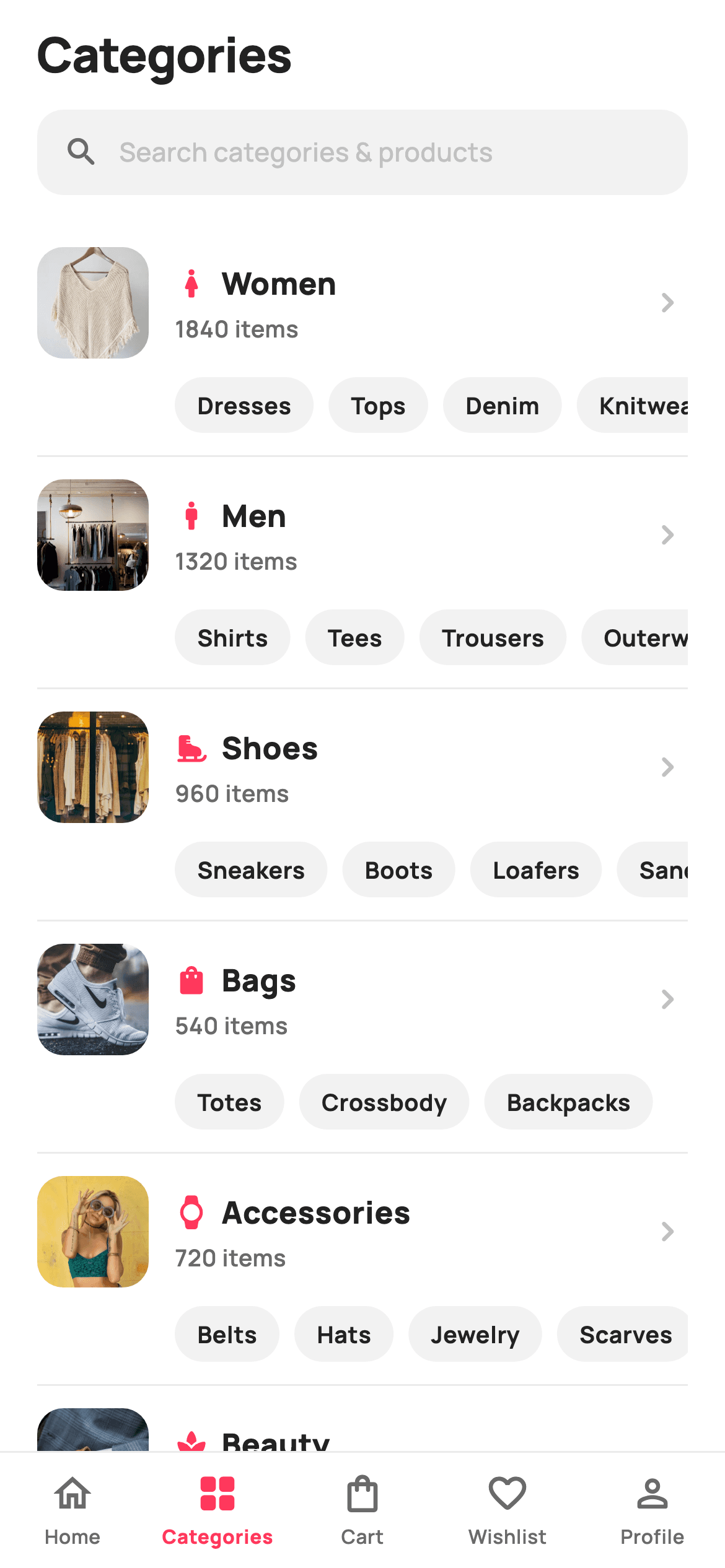
A category directory has to serve two shoppers at once: the one who knows they want 'Women' and the one who really wants 'Denim'. This tutorial builds a Flutter screen that serves both — each of the nine departments is a row with a photo thumbnail, icon, item count and chevron, and directly beneath it sits a horizontally scrolling strip of subcategory chips. That's a horizontal `ListView` nested inside a vertical one, which works fine here because the scroll axes differ.
Watch the Flutter UI walkthrough
A short screen recording of Categories running, if you'd rather see it before you read the code. The written tutorial below covers everything in it.
Can't see the video? Watch it on YouTube.
What you'll build
- ✓Department rows with a photo thumbnail, tinted icon, live item count and chevron
- ✓A horizontal subcategory chip strip nested inside each vertical list row
- ✓Chips indented by 74px so they align under the label rather than the thumbnail
- ✓A five-tab bottom bar with filled/outlined icon pairs per tab
- ✓`SafeArea(bottom: false)` so the nav bar owns the home-indicator inset
- ✓A tappable search entry point that routes to a dedicated search screen
Step-by-step build
Create the file
Add a new file at lib/ecom_cat_browse/ecom_cat_browse_screen.dart in your Flutter project.
Register the bundled fonts
No external packages — this is pure Flutter. It does bundle its design font (Manrope), so drop the font file into fonts/ and declare it in pubspec.yaml:
flutter:
  fonts:
    - family: Manrope
      fonts:
- asset: fonts/Manrope-Regular.ttfBuild it, piece by piece
Here's how the screen goes together. Each block below is a real slice of the code with a plain-English explanation — paste them in order, or grab the whole file from the next section.
Nine departments, each owning its subcategories
class EcomCatBrowseScreen extends StatelessWidget {
  const EcomCatBrowseScreen({
    super.key,
    this.onTab,
    this.onSearch,
    this.onCategory,
    this.onSubcategory,
  });

  /// Bottom-bar tab tap (0 Home · 1 Categories · 2 Cart · 3 Wishlist · 4 Profile).
  final ValueChanged<int>? onTab;
  final VoidCallback? onSearch;

  /// A top-level department was opened (passes its label).
  final ValueChanged<String>? onCategory;

  /// A quick subcategory chip was tapped (passes its label).
  final ValueChanged<String>? onSubcategory;

  static const String _font = 'Manrope';
  static const Color _canvas = Color(0xFFFFFFFF);
  static const Color _ink = Color(0xFF222222);
  static const Color _muted = Color(0xFF6A6A6A);
  static const Color _faint = Color(0xFFC1C1C1);
  static const Color _brand = Color(0xFFFF385C);
  static const Color _surface = Color(0xFFF2F2F2);
  static const Color _imageBg = Color(0xFFF5F5F5);
  static const Color _hairline = Color(0xFFEBEBEB);

  static const String _dir = 'lib/screens/ecommerce/ecom_cat_browse/images';

  static const List<_Cat> _cats = <_Cat>[
    _Cat('Women', Icons.woman_rounded, 1840, 'p01.webp',
        <String>['Dresses', 'Tops', 'Denim', 'Knitwear']),
    _Cat('Men', Icons.man_rounded, 1320, 'p02.webp',
        <String>['Shirts', 'Tees', 'Trousers', 'Outerwear']),
    _Cat('Shoes', Icons.ice_skating_rounded, 960, 'p03.webp',
        <String>['Sneakers', 'Boots', 'Loafers', 'Sandals']),
    _Cat('Bags', Icons.shopping_bag_rounded, 540, 'p04.webp',
        <String>['Totes', 'Crossbody', 'Backpacks']),
    _Cat('Accessories', Icons.watch_rounded, 720, 'p05.webp',
        <String>['Belts', 'Hats', 'Jewelry', 'Scarves']),
    _Cat('Beauty', Icons.spa_rounded, 410, 'p06.webp',
        <String>['Skincare', 'Fragrance', 'Makeup']),
    _Cat('Kids', Icons.child_care_rounded, 380, 'p07.webp',
        <String>['Girls', 'Boys', 'Baby']),
    _Cat('Home', Icons.chair_rounded, 290, 'p08.webp',
        <String>['Decor', 'Bedding', 'Kitchen']),
    _Cat('Sale', Icons.local_offer_rounded, 1150, 'p09.webp',
        <String>['Under \$50', 'Last chance', 'Clearance']),
  ];
`_Cat` holds a label, an icon, an item `count`, a thumbnail asset and — importantly — its own `List<String> subs`. Nesting the subcategories on the parent rather than keeping a separate lookup map is what lets the row render both levels from a single object. The screen exposes four callbacks including two `ValueChanged<String>`s, one for departments and one for subcategories, so the host can route the two levels differently. Note the raw-string escape in `'Under \$50'` — the `$` would otherwise start a Dart interpolation.
The list, and who owns the bottom inset
  @override
  Widget build(BuildContext context) {
    return Theme(
      data: ThemeData.light(useMaterial3: true),
      child: Scaffold(
        backgroundColor: _canvas,
        body: SafeArea(
          bottom: false,
          child: Column(
            children: <Widget>[
              _header(),
              _searchBar(),
              Expanded(
                child: ListView.separated(
                  padding: const EdgeInsets.fromLTRB(20, 12, 20, 24),
                  itemCount: _cats.length,
                  separatorBuilder: (_, _) =>
                      const Divider(height: 1, color: _hairline),
                  itemBuilder: (BuildContext context, int i) => _row(_cats[i]),
                ),
              ),
            ],
          ),
        ),
        bottomNavigationBar: _NavBar(active: 1, onTab: onTab),
      ),
    );
  }
`SafeArea(bottom: false)` is the detail worth copying. The body opts *out* of the bottom inset because `_NavBar` applies its own `SafeArea(top: false)` internally — that way the nav bar's white background extends behind the home indicator instead of leaving a strip of page colour under it. The departments use `ListView.separated` with a hairline `Divider`, which produces exactly *n−1* separators, so there's no stray line above the first row or below the last.
Header and search entry point
  Widget _header() {
    return const Padding(
      padding: EdgeInsets.fromLTRB(20, 10, 20, 4),
      child: Align(
        alignment: Alignment.centerLeft,
        child: Text(
          'Categories',
          style: TextStyle(
            fontFamily: _font,
            fontSize: 26,
            fontWeight: FontWeight.w800,
            letterSpacing: -0.5,
            color: _ink,
          ),
        ),
      ),
    );
  }

  Widget _searchBar() {
    return Padding(
      padding: const EdgeInsets.fromLTRB(20, 8, 20, 4),
      child: GestureDetector(
        onTap: onSearch,
        child: Container(
          height: 46,
          padding: const EdgeInsets.symmetric(horizontal: 14),
          decoration: BoxDecoration(
            color: _surface,
            borderRadius: BorderRadius.circular(14),
          ),
          child: Row(
            children: const <Widget>[
              Icon(Icons.search_rounded, size: 20, color: _muted),
              SizedBox(width: 10),
              Text(
                'Search categories & products',
                style: TextStyle(
                  fontFamily: _font,
                  fontSize: 14,
                  fontWeight: FontWeight.w500,
                  color: _faint,
                ),
              ),
            ],
          ),
        ),
      ),
    );
  }
The 26px `w800` title with `letterSpacing: -0.5` is left-aligned via `Align(alignment: Alignment.centerLeft)`, marking this as a top-level tab rather than a pushed detail screen. The search bar contains no `TextField` at all — it's a `GestureDetector` around a styled `Container` with an icon and placeholder text, all `const`. That's deliberate for a directory: tapping should push a dedicated search route with its own results and keyboard, rather than raising a keyboard that covers the categories you just displayed. The placeholder sits in `_faint` rather than `_muted`, one step lighter than real content so it reads as a prompt.
The department row
  Widget _row(_Cat c) {
    return InkWell(
      onTap: () => onCategory?.call(c.label),
      child: Padding(
        padding: const EdgeInsets.symmetric(vertical: 12),
        child: Column(
          crossAxisAlignment: CrossAxisAlignment.start,
          children: <Widget>[
            Row(
              children: <Widget>[
                ClipRRect(
                  borderRadius: BorderRadius.circular(14),
                  child: SizedBox(
                    width: 60,
                    height: 60,
                    child: Stack(
                      fit: StackFit.expand,
                      children: <Widget>[
                        Container(color: _imageBg),
                        Image.asset('$_dir/${c.asset}', fit: BoxFit.cover),
                      ],
                    ),
                  ),
                ),
                const SizedBox(width: 14),
                Expanded(
                  child: Column(
                    crossAxisAlignment: CrossAxisAlignment.start,
                    children: <Widget>[
                      Row(
                        children: <Widget>[
                          Icon(c.icon, size: 18, color: _brand),
                          const SizedBox(width: 7),
                          Flexible(
                            child: Text(
                              c.label,
                              maxLines: 1,
                              overflow: TextOverflow.ellipsis,
                              style: const TextStyle(
                                fontFamily: _font,
                                fontSize: 16.5,
                                fontWeight: FontWeight.w800,
                                color: _ink,
                              ),
                            ),
                          ),
                        ],
                      ),
                      const SizedBox(height: 3),
                      Text(
                        '${c.count} items',
                        style: const TextStyle(
                          fontFamily: _font,
                          fontSize: 12.5,
                          fontWeight: FontWeight.w600,
                          color: _muted,
                        ),
                      ),
                    ],
                  ),
                ),
                const Icon(Icons.chevron_right_rounded,
                    size: 22, color: _faint),
              ],
            ),
The thumbnail is a 60px `ClipRRect` holding a `Stack` of two layers: a `_imageBg` placeholder colour and the photo at `BoxFit.cover`, so the cell is never blank while the asset decodes. In the text column, the label sits in a `Row` with the brand-tinted icon and is wrapped in `Flexible` rather than `Expanded` — `Flexible` lets the text take only what it needs while still allowing ellipsis if it runs long, whereas `Expanded` would force it to claim all remaining width and push the icon spacing around. The count line is generated from `c.count`, so it can't drift from the data.
Nesting a horizontal list inside a vertical one
            const SizedBox(height: 10),
            SizedBox(
              height: 30,
              child: ListView.separated(
                scrollDirection: Axis.horizontal,
                padding: const EdgeInsets.only(left: 74),
                itemCount: c.subs.length,
                separatorBuilder: (_, _) => const SizedBox(width: 8),
                itemBuilder: (BuildContext context, int i) {
                  return GestureDetector(
                    onTap: () => onSubcategory?.call(c.subs[i]),
                    child: Container(
                      alignment: Alignment.center,
                      padding: const EdgeInsets.symmetric(horizontal: 12),
                      decoration: BoxDecoration(
                        color: _surface,
                        borderRadius: BorderRadius.circular(99),
                      ),
                      child: Text(
                        c.subs[i],
                        style: const TextStyle(
                          fontFamily: _font,
                          fontSize: 12.5,
                          fontWeight: FontWeight.w700,
                          color: _ink,
                        ),
                      ),
                    ),
                  );
                },
              ),
            ),
          ],
        ),
      ),
    );
  }
The chip strip is a horizontal `ListView.separated` inside a 30px `SizedBox` — a horizontal scroller needs that bounded height, since it has none of its own. This nesting is safe precisely because the axes differ: the child scrolls on `Axis.horizontal` and the parent on the vertical, so neither steals the other's gestures and neither needs `shrinkWrap`. `padding: EdgeInsets.only(left: 74)` matches the 60px thumbnail plus the 14px gap, so the chips start exactly under the department label — and because it's *padding* rather than a `SizedBox`, the chips scroll out under that gap rather than being cut off at it.
The five-tab bottom bar
class _NavBar extends StatelessWidget {
  const _NavBar({required this.active, this.onTab});
  final int active;
  final ValueChanged<int>? onTab;

  static const List<_NavItem> _items = <_NavItem>[
    _NavItem('Home', Icons.home_rounded, Icons.home_outlined),
    _NavItem('Categories', Icons.grid_view_rounded, Icons.grid_view_outlined),
    _NavItem('Cart', Icons.shopping_bag_rounded, Icons.shopping_bag_outlined),
    _NavItem('Wishlist', Icons.favorite_rounded, Icons.favorite_border_rounded),
    _NavItem('Profile', Icons.person_rounded, Icons.person_outline_rounded),
  ];

  @override
  Widget build(BuildContext context) {
    return Container(
      decoration: const BoxDecoration(
        color: Color(0xFFFFFFFF),
        border: Border(top: BorderSide(color: Color(0xFFEBEBEB))),
      ),
      child: SafeArea(
        top: false,
        child: SizedBox(
          height: 62,
          child: Row(
            children: List<Widget>.generate(_items.length, (int i) {
              final _NavItem it = _items[i];
              final bool on = i == active;
              return Expanded(
                child: GestureDetector(
                  behavior: HitTestBehavior.opaque,
                  onTap: () => onTab?.call(i),
                  child: Column(
                    mainAxisAlignment: MainAxisAlignment.center,
                    children: <Widget>[
                      Icon(
                        on ? it.active : it.inactive,
                        size: 24,
                        color: on
                            ? const Color(0xFFFF385C)
                            : const Color(0xFF6A6A6A),
                      ),
                      const SizedBox(height: 3),
                      Text(
                        it.label,
                        style: TextStyle(
                          fontFamily: 'Manrope',
                          fontSize: 10.5,
                          fontWeight: on ? FontWeight.w800 : FontWeight.w600,
                          color: on
                              ? const Color(0xFFFF385C)
                              : const Color(0xFF6A6A6A),
                        ),
                      ),
                    ],
                  ),
                ),
              );
            }),
          ),
        ),
      ),
    );
  }
}

class _NavItem {
  const _NavItem(this.label, this.active, this.inactive);
  final String label;
  final IconData active;
  final IconData inactive;
}
Each `_NavItem` stores *two* icons — a filled `active` and an outlined `inactive` — which is the standard iOS/Material convention for tab bars and reads far better than tinting one icon. The row is built with `List<Widget>.generate` wrapping each tab in `Expanded`, so five tabs divide the width evenly at any screen size. `HitTestBehavior.opaque` makes the whole 62px column tappable rather than just the icon and label. The selected tab changes both colour and font weight (`w800` vs `w600`), so it stays distinguishable for colour-blind users too.
Full code
The complete, ready-to-paste source. Free to use in your projects — one click copies it all.
import 'package:flutter/material.dart';

/// StyleCart — Categories (Categories tab).
///
/// The top-level shop directory: a search entry, a "Shop by department" photo
/// grid, and a tall list of every category with a tinted icon badge, item count
/// and thumbnail. Carries the shared 5-tab bottom bar (Categories active).
///
/// Self-contained per CONVENTIONS.md: pure Flutter, bundled Manrope, inline
/// Airbnb-style tokens, own light theme + SafeArea, bundled webp thumbnails.
/// Department icons are Material glyphs (render in goldens); no emoji. Exposes
/// callbacks only.
class EcomCatBrowseScreen extends StatelessWidget {
  const EcomCatBrowseScreen({
    super.key,
    this.onTab,
    this.onSearch,
    this.onCategory,
    this.onSubcategory,
  });

  /// Bottom-bar tab tap (0 Home · 1 Categories · 2 Cart · 3 Wishlist · 4 Profile).
  final ValueChanged<int>? onTab;
  final VoidCallback? onSearch;

  /// A top-level department was opened (passes its label).
  final ValueChanged<String>? onCategory;

  /// A quick subcategory chip was tapped (passes its label).
  final ValueChanged<String>? onSubcategory;

  static const String _font = 'Manrope';
  static const Color _canvas = Color(0xFFFFFFFF);
  static const Color _ink = Color(0xFF222222);
  static const Color _muted = Color(0xFF6A6A6A);
  static const Color _faint = Color(0xFFC1C1C1);
  static const Color _brand = Color(0xFFFF385C);
  static const Color _surface = Color(0xFFF2F2F2);
  static const Color _imageBg = Color(0xFFF5F5F5);
  static const Color _hairline = Color(0xFFEBEBEB);

  static const String _dir = 'lib/screens/ecommerce/ecom_cat_browse/images';

  static const List<_Cat> _cats = <_Cat>[
    _Cat('Women', Icons.woman_rounded, 1840, 'p01.webp',
        <String>['Dresses', 'Tops', 'Denim', 'Knitwear']),
    _Cat('Men', Icons.man_rounded, 1320, 'p02.webp',
        <String>['Shirts', 'Tees', 'Trousers', 'Outerwear']),
    _Cat('Shoes', Icons.ice_skating_rounded, 960, 'p03.webp',
        <String>['Sneakers', 'Boots', 'Loafers', 'Sandals']),
    _Cat('Bags', Icons.shopping_bag_rounded, 540, 'p04.webp',
        <String>['Totes', 'Crossbody', 'Backpacks']),
    _Cat('Accessories', Icons.watch_rounded, 720, 'p05.webp',
        <String>['Belts', 'Hats', 'Jewelry', 'Scarves']),
    _Cat('Beauty', Icons.spa_rounded, 410, 'p06.webp',
        <String>['Skincare', 'Fragrance', 'Makeup']),
    _Cat('Kids', Icons.child_care_rounded, 380, 'p07.webp',
        <String>['Girls', 'Boys', 'Baby']),
    _Cat('Home', Icons.chair_rounded, 290, 'p08.webp',
        <String>['Decor', 'Bedding', 'Kitchen']),
    _Cat('Sale', Icons.local_offer_rounded, 1150, 'p09.webp',
        <String>['Under \$50', 'Last chance', 'Clearance']),
  ];

  @override
  Widget build(BuildContext context) {
    return Theme(
      data: ThemeData.light(useMaterial3: true),
      child: Scaffold(
        backgroundColor: _canvas,
        body: SafeArea(
          bottom: false,
          child: Column(
            children: <Widget>[
              _header(),
              _searchBar(),
              Expanded(
                child: ListView.separated(
                  padding: const EdgeInsets.fromLTRB(20, 12, 20, 24),
                  itemCount: _cats.length,
                  separatorBuilder: (_, _) =>
                      const Divider(height: 1, color: _hairline),
                  itemBuilder: (BuildContext context, int i) => _row(_cats[i]),
                ),
              ),
            ],
          ),
        ),
        bottomNavigationBar: _NavBar(active: 1, onTab: onTab),
      ),
    );
  }

  Widget _header() {
    return const Padding(
      padding: EdgeInsets.fromLTRB(20, 10, 20, 4),
      child: Align(
        alignment: Alignment.centerLeft,
        child: Text(
          'Categories',
          style: TextStyle(
            fontFamily: _font,
            fontSize: 26,
            fontWeight: FontWeight.w800,
            letterSpacing: -0.5,
            color: _ink,
          ),
        ),
      ),
    );
  }

  Widget _searchBar() {
    return Padding(
      padding: const EdgeInsets.fromLTRB(20, 8, 20, 4),
      child: GestureDetector(
        onTap: onSearch,
        child: Container(
          height: 46,
          padding: const EdgeInsets.symmetric(horizontal: 14),
          decoration: BoxDecoration(
            color: _surface,
            borderRadius: BorderRadius.circular(14),
          ),
          child: Row(
            children: const <Widget>[
              Icon(Icons.search_rounded, size: 20, color: _muted),
              SizedBox(width: 10),
              Text(
                'Search categories & products',
                style: TextStyle(
                  fontFamily: _font,
                  fontSize: 14,
                  fontWeight: FontWeight.w500,
                  color: _faint,
                ),
              ),
            ],
          ),
        ),
      ),
    );
  }

  Widget _row(_Cat c) {
    return InkWell(
      onTap: () => onCategory?.call(c.label),
      child: Padding(
        padding: const EdgeInsets.symmetric(vertical: 12),
        child: Column(
          crossAxisAlignment: CrossAxisAlignment.start,
          children: <Widget>[
            Row(
              children: <Widget>[
                ClipRRect(
                  borderRadius: BorderRadius.circular(14),
                  child: SizedBox(
                    width: 60,
                    height: 60,
                    child: Stack(
                      fit: StackFit.expand,
                      children: <Widget>[
                        Container(color: _imageBg),
                        Image.asset('$_dir/${c.asset}', fit: BoxFit.cover),
                      ],
                    ),
                  ),
                ),
                const SizedBox(width: 14),
                Expanded(
                  child: Column(
                    crossAxisAlignment: CrossAxisAlignment.start,
                    children: <Widget>[
                      Row(
                        children: <Widget>[
                          Icon(c.icon, size: 18, color: _brand),
                          const SizedBox(width: 7),
                          Flexible(
                            child: Text(
                              c.label,
                              maxLines: 1,
                              overflow: TextOverflow.ellipsis,
                              style: const TextStyle(
                                fontFamily: _font,
                                fontSize: 16.5,
                                fontWeight: FontWeight.w800,
                                color: _ink,
                              ),
                            ),
                          ),
                        ],
                      ),
                      const SizedBox(height: 3),
                      Text(
                        '${c.count} items',
                        style: const TextStyle(
                          fontFamily: _font,
                          fontSize: 12.5,
                          fontWeight: FontWeight.w600,
                          color: _muted,
                        ),
                      ),
                    ],
                  ),
                ),
                const Icon(Icons.chevron_right_rounded,
                    size: 22, color: _faint),
              ],
            ),
            const SizedBox(height: 10),
            SizedBox(
              height: 30,
              child: ListView.separated(
                scrollDirection: Axis.horizontal,
                padding: const EdgeInsets.only(left: 74),
                itemCount: c.subs.length,
                separatorBuilder: (_, _) => const SizedBox(width: 8),
                itemBuilder: (BuildContext context, int i) {
                  return GestureDetector(
                    onTap: () => onSubcategory?.call(c.subs[i]),
                    child: Container(
                      alignment: Alignment.center,
                      padding: const EdgeInsets.symmetric(horizontal: 12),
                      decoration: BoxDecoration(
                        color: _surface,
                        borderRadius: BorderRadius.circular(99),
                      ),
                      child: Text(
                        c.subs[i],
                        style: const TextStyle(
                          fontFamily: _font,
                          fontSize: 12.5,
                          fontWeight: FontWeight.w700,
                          color: _ink,
                        ),
                      ),
                    ),
                  );
                },
              ),
            ),
          ],
        ),
      ),
    );
  }
}

class _Cat {
  const _Cat(this.label, this.icon, this.count, this.asset, this.subs);
  final String label;
  final IconData icon;
  final int count;
  final String asset;
  final List<String> subs;
}

class _NavBar extends StatelessWidget {
  const _NavBar({required this.active, this.onTab});
  final int active;
  final ValueChanged<int>? onTab;

  static const List<_NavItem> _items = <_NavItem>[
    _NavItem('Home', Icons.home_rounded, Icons.home_outlined),
    _NavItem('Categories', Icons.grid_view_rounded, Icons.grid_view_outlined),
    _NavItem('Cart', Icons.shopping_bag_rounded, Icons.shopping_bag_outlined),
    _NavItem('Wishlist', Icons.favorite_rounded, Icons.favorite_border_rounded),
    _NavItem('Profile', Icons.person_rounded, Icons.person_outline_rounded),
  ];

  @override
  Widget build(BuildContext context) {
    return Container(
      decoration: const BoxDecoration(
        color: Color(0xFFFFFFFF),
        border: Border(top: BorderSide(color: Color(0xFFEBEBEB))),
      ),
      child: SafeArea(
        top: false,
        child: SizedBox(
          height: 62,
          child: Row(
            children: List<Widget>.generate(_items.length, (int i) {
              final _NavItem it = _items[i];
              final bool on = i == active;
              return Expanded(
                child: GestureDetector(
                  behavior: HitTestBehavior.opaque,
                  onTap: () => onTab?.call(i),
                  child: Column(
                    mainAxisAlignment: MainAxisAlignment.center,
                    children: <Widget>[
                      Icon(
                        on ? it.active : it.inactive,
                        size: 24,
                        color: on
                            ? const Color(0xFFFF385C)
                            : const Color(0xFF6A6A6A),
                      ),
                      const SizedBox(height: 3),
                      Text(
                        it.label,
                        style: TextStyle(
                          fontFamily: 'Manrope',
                          fontSize: 10.5,
                          fontWeight: on ? FontWeight.w800 : FontWeight.w600,
                          color: on
                              ? const Color(0xFFFF385C)
                              : const Color(0xFF6A6A6A),
                        ),
                      ),
                    ],
                  ),
                ),
              );
            }),
          ),
        ),
      ),
    );
  }
}

class _NavItem {
  const _NavItem(this.label, this.active, this.inactive);
  final String label;
  final IconData active;
  final IconData inactive;
}
Plus bundled 14 binary assets (fonts/images). The CLI and MCP install those for you automatically.
Two faster ways to add it
Copy-paste works, but you can skip it entirely.
1. FlutterKit CLI
One command drops this screen — and its fonts — straight into your project.
$ flutterkit add ecom-cat-browse2. AI agent (MCP)
Connect FlutterKit's MCP server in Claude or Cursor and just ask your agent to install ecom-cat-browse — it fetches and writes the files for you.
FAQ
Is this categories screen free to use?
Yes. The full Dart source on this page is free for personal and commercial apps. Copy it from the code block, install it with the FlutterKit CLI (flutterkit add ecom-cat-browse), or add it via an AI agent over MCP.
Is nesting a ListView inside a ListView safe here?
Yes, because the axes differ. The chip strip scrolls horizontally inside a vertical parent, so they never compete for the same gesture and the child needs no shrinkWrap. The rule you're thinking of applies to same-axis nesting, which does require shrinkWrap plus NeverScrollableScrollPhysics.
Why does the body use SafeArea(bottom: false)?
So the bottom nav bar can handle that inset itself. _NavBar wraps its content in SafeArea(top: false), which lets its white background paint behind the home indicator. If the body claimed the inset too, you'd get a strip of page colour below the bar.
Does it need any packages?
No — it's pure Flutter on the material library. The only assets are the bundled Manrope font and the nine category thumbnails, both of which the CLI and MCP install for you.
Which Flutter version does it target?
It uses wildcard parameters in the separatorBuilder closures ((_, _) => …), which need Dart 3.7+, so target Flutter 3.29+. On an older SDK, name those parameters (e.g. (context, index)) and the rest compiles unchanged.


