How to Build an Edit Cart Item Bottom Sheet in Flutter (Full Code + Preview)
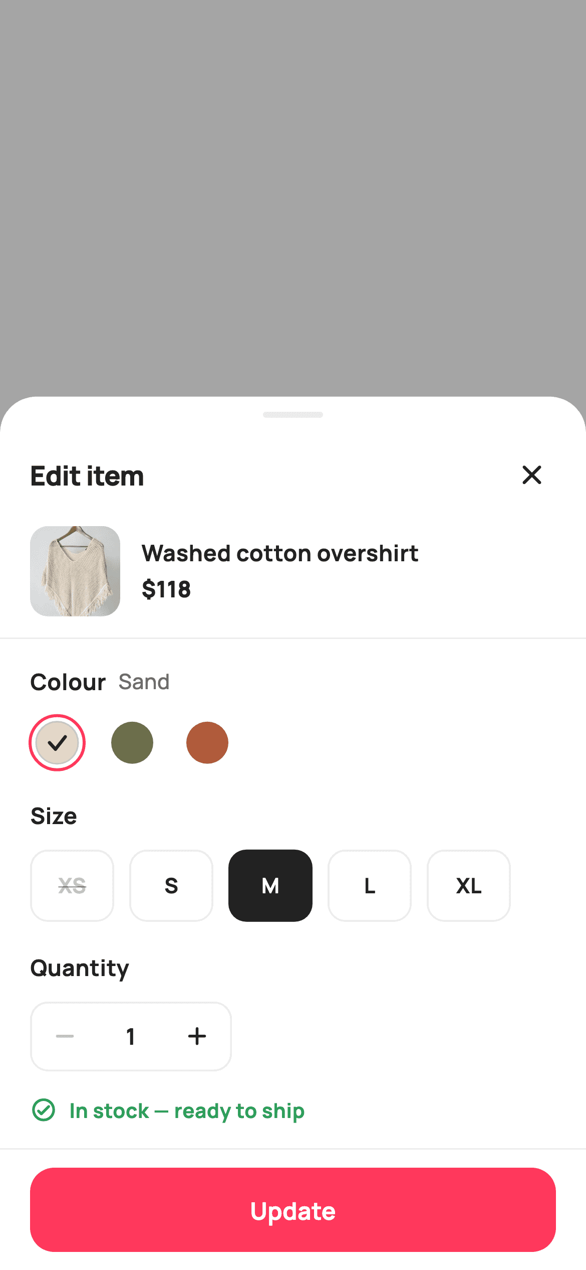
Changing the size of something already in your bag shouldn't mean leaving the cart. This tutorial builds StyleCart's edit-item sheet in Flutter — a dimmed scrim over a rounded panel with painted colour swatches, a size grid that strikes through sold-out options for the chosen colour, a quantity stepper capped by real stock, and a live availability line. Stock is a two-dimensional list indexed by colour and size, so every control reacts to both.
Watch the Flutter UI walkthrough
A short screen recording of Edit Cart Item running, if you'd rather see it before you read the code. The written tutorial below covers everything in it.
Can't see the video? Watch it on YouTube.
What you'll build
- ✓A modal sheet built from a scrim and a panel — no showModalBottomSheet required
- ✓Colour swatches drawn with CustomPainter, including a check whose colour flips by luminance
- ✓A size grid that reads a per-colour stock table and disables sold-out options as you switch colours
- ✓A quantity stepper whose upper bound is the remaining stock for the exact colour-and-size pair
Step-by-step build
Create the file
Add a new file at lib/ecom_cart_item_options/ecom_cart_item_options_screen.dart in your Flutter project.
Register the bundled fonts
No external packages — this is pure Flutter. It does bundle its design font (Manrope), so drop the font file into fonts/ and declare it in pubspec.yaml:
flutter:
  fonts:
    - family: Manrope
      fonts:
- asset: fonts/Manrope-Regular.ttfBuild it, piece by piece
Here's how the screen goes together. Each block below is a real slice of the code with a plain-English explanation — paste them in order, or grab the whole file from the next section.
A two-dimensional stock table
import 'package:flutter/material.dart';

/// StyleCart — Edit Item.
///
/// A bottom-sheet for editing a line already in the bag: change its colour,
/// size and quantity, see the live availability for the picked combination,
/// then update. Built as a dimmed scrim over a rounded white sheet.
///
/// Self-contained per CONVENTIONS.md: pure Flutter, bundled Manrope, inline
/// Airbnb-style tokens, own light theme + SafeArea, bundled webp. The swatch is
/// a CustomPainter (no emoji glyph). Exposes callbacks only.
class EcomCartItemOptionsScreen extends StatefulWidget {
  const EcomCartItemOptionsScreen({
    super.key,
    this.onClose,
    this.onUpdate,
  });

  final VoidCallback? onClose;

  /// The edited "Colour · Size ×Qty" was confirmed.
  final ValueChanged<String>? onUpdate;

  @override
  State<EcomCartItemOptionsScreen> createState() =>
      _EcomCartItemOptionsScreenState();
}

class _EcomCartItemOptionsScreenState extends State<EcomCartItemOptionsScreen> {
  static const String _font = 'Manrope';
  static const Color _canvas = Color(0xFFFFFFFF);
  static const Color _ink = Color(0xFF222222);
  static const Color _muted = Color(0xFF6A6A6A);
  static const Color _faint = Color(0xFFC1C1C1);
  static const Color _brand = Color(0xFFFF385C);
  static const Color _surface = Color(0xFFF2F2F2);
  static const Color _imageBg = Color(0xFFF5F5F5);
  static const Color _success = Color(0xFF2E9E5B);
  static const Color _warn = Color(0xFFF5A623);
  static const Color _hairline = Color(0xFFEBEBEB);

  static const String _dir =
      'lib/screens/ecommerce/ecom_cart_item_options/images';

  static const List<_Sw> _colors = <_Sw>[
    _Sw('Sand', Color(0xFFE3D9C6)),
    _Sw('Olive', Color(0xFF6B6F4B)),
    _Sw('Rust', Color(0xFFB05B3B)),
  ];
  static const List<String> _sizes = <String>['XS', 'S', 'M', 'L', 'XL'];

  // stock[color][size]: 0 = sold out, 1-3 = low, >3 = in stock.
  static const List<List<int>> _stock = <List<int>>[
    <int>[0, 6, 9, 4, 2],
    <int>[3, 8, 0, 5, 7],
    <int>[2, 4, 6, 1, 0],
  ];

  int _color = 0;
  int _size = 2;
  int _qty = 1;

  int get _avail => _stock[_color][_size];
The screen holds three ints — `_color`, `_size` and `_qty` — and the interesting data is `_stock`, a `List<List<int>>` indexed as `_stock[colour][size]`. Three colours by five sizes gives fifteen cells, where 0 means sold out, 1–3 means low and anything higher is fine. That table is what makes the sheet feel real: Sand is out in XS while Olive is out in M, so switching colour genuinely changes which sizes you can pick. The `_avail` getter is one line — `_stock[_color][_size]` — and every piece of state below reads through it, so there's a single source of truth for availability.
Scrim and sheet without showModalBottomSheet
  @override
  Widget build(BuildContext context) {
    return Theme(
      data: ThemeData.light(useMaterial3: true),
      child: Scaffold(
        backgroundColor: Colors.black.withValues(alpha: 0.35),
        body: Column(
          children: <Widget>[
            Expanded(
              child: GestureDetector(
                onTap: widget.onClose,
                behavior: HitTestBehavior.opaque,
                child: const SizedBox.expand(),
              ),
            ),
            _sheet(),
          ],
        ),
      ),
    );
  }

  Widget _sheet() {
    return Container(
      decoration: const BoxDecoration(
        color: _canvas,
        borderRadius: BorderRadius.vertical(top: Radius.circular(24)),
      ),
      child: SafeArea(
        top: false,
        child: Column(
          mainAxisSize: MainAxisSize.min,
          children: <Widget>[
            const SizedBox(height: 10),
            Container(
              width: 40,
              height: 4,
              decoration: BoxDecoration(
                color: _hairline,
                borderRadius: BorderRadius.circular(2),
              ),
            ),
            Padding(
              padding: const EdgeInsets.fromLTRB(20, 14, 12, 6),
              child: Row(
                children: <Widget>[
                  const Expanded(
                    child: Text(
                      'Edit item',
                      style: TextStyle(
                        fontFamily: _font,
                        fontSize: 18,
                        fontWeight: FontWeight.w800,
                        letterSpacing: -0.3,
                        color: _ink,
                      ),
                    ),
                  ),
                  IconButton(
                    onPressed: widget.onClose,
                    icon: const Icon(Icons.close_rounded, size: 22, color: _ink),
                  ),
                ],
              ),
            ),
            _summary(),
            const Divider(height: 1, color: _hairline),
            Padding(
              padding: const EdgeInsets.fromLTRB(20, 18, 20, 0),
              child: Column(
                crossAxisAlignment: CrossAxisAlignment.start,
                children: <Widget>[
                  _label('Colour', _colors[_color].name),
                  const SizedBox(height: 12),
                  _swatchRow(),
                  const SizedBox(height: 20),
                  _label('Size', null),
                  const SizedBox(height: 12),
                  _sizeGrid(),
                  const SizedBox(height: 20),
                  _label('Quantity', null),
                  const SizedBox(height: 12),
                  _qtyRow(),
                  const SizedBox(height: 16),
                  _availability(),
                  const SizedBox(height: 16),
                ],
              ),
            ),
            _updateBar(),
          ],
        ),
      ),
    );
  }
This is a full screen presented as a sheet rather than a real modal route. The Scaffold's background is `Colors.black.withValues(alpha: 0.35)`, and the body is a Column of an `Expanded` tap-catcher above the panel. That Expanded wraps a `GestureDetector` with `behavior: HitTestBehavior.opaque` around a `SizedBox.expand()` — opaque is essential, because a gesture detector over an empty box registers no hits without it, and tapping the scrim would do nothing. The panel uses `BorderRadius.vertical(top: Radius.circular(24))` so only its top corners round, `SafeArea(top: false)` to clear the home indicator, and `mainAxisSize: MainAxisSize.min` so it hugs its content instead of filling the screen. The 40×4 rounded bar at the top is the grab handle.
The item summary and section labels
  Widget _summary() {
    return Padding(
      padding: const EdgeInsets.fromLTRB(20, 4, 20, 14),
      child: Row(
        children: <Widget>[
          ClipRRect(
            borderRadius: BorderRadius.circular(12),
            child: Container(
              width: 60,
              height: 60,
              color: _imageBg,
              child: Image.asset('$_dir/p01.webp', fit: BoxFit.cover),
            ),
          ),
          const SizedBox(width: 14),
          const Expanded(
            child: Column(
              crossAxisAlignment: CrossAxisAlignment.start,
              children: <Widget>[
                Text(
                  'Washed cotton overshirt',
                  maxLines: 1,
                  overflow: TextOverflow.ellipsis,
                  style: TextStyle(
                    fontFamily: _font,
                    fontSize: 15,
                    fontWeight: FontWeight.w700,
                    color: _ink,
                  ),
                ),
                SizedBox(height: 3),
                Text(
                  '\$118',
                  style: TextStyle(
                    fontFamily: _font,
                    fontSize: 15,
                    fontWeight: FontWeight.w800,
                    color: _ink,
                  ),
                ),
              ],
            ),
          ),
        ],
      ),
    );
  }

  Widget _label(String t, String? value) {
    return Row(
      children: <Widget>[
        Text(
          t,
          style: const TextStyle(
            fontFamily: _font,
            fontSize: 15,
            fontWeight: FontWeight.w700,
            color: _ink,
          ),
        ),
        if (value != null) ...<Widget>[
          const SizedBox(width: 8),
          Text(
            value,
            style: const TextStyle(
              fontFamily: _font,
              fontSize: 14,
              fontWeight: FontWeight.w500,
              color: _muted,
            ),
          ),
        ],
      ],
    );
  }
`_summary` is a compact 60px thumbnail beside the product name and price, reminding the user which line they're editing — necessary, since a cart can hold several similar items. The thumbnail's Container is filled `_imageBg` behind the Image.asset so there's neutral grey rather than a white flash while the WebP decodes. `_label` takes a title and a nullable value, using a conditional spread to append the current selection in muted text when one is passed. That's why the Colour heading reads 'Colour Sand' and updates as you tap, while Size and Quantity pass null and show the heading alone — their current value is already obvious from the controls below.
The swatch row and the size grid
  Widget _swatchRow() {
    return Row(
      children: List<Widget>.generate(_colors.length, (int i) {
        return GestureDetector(
          onTap: () => setState(() => _color = i),
          child: Padding(
            padding: const EdgeInsets.only(right: 14),
            child: SizedBox(
              width: 36,
              height: 36,
              child: CustomPaint(
                painter: _SwatchPainter(
                  color: _colors[i].color,
                  selected: i == _color,
                ),
              ),
            ),
          ),
        );
      }),
    );
  }

  Widget _sizeGrid() {
    return Wrap(
      spacing: 10,
      runSpacing: 10,
      children: List<Widget>.generate(_sizes.length, (int i) {
        final int stock = _stock[_color][i];
        final bool out = stock == 0;
        final bool on = i == _size && !out;
        return GestureDetector(
          onTap: out ? null : () => setState(() => _size = i),
          child: Container(
            width: 56,
            height: 48,
            alignment: Alignment.center,
            decoration: BoxDecoration(
              color: on ? _ink : _canvas,
              borderRadius: BorderRadius.circular(12),
              border: Border.all(color: on ? _ink : _hairline, width: 1.2),
            ),
            child: Text(
              _sizes[i],
              style: TextStyle(
                fontFamily: _font,
                fontSize: 14,
                fontWeight: FontWeight.w700,
                color: out
                    ? _faint
                    : on
                        ? _canvas
                        : _ink,
                decoration:
                    out ? TextDecoration.lineThrough : TextDecoration.none,
              ),
            ),
          ),
        );
      }),
    );
  }
Swatches are three 36px CustomPaints generated with `List<Widget>.generate`. The size grid is where the stock table earns its keep: for each size it reads `_stock[_color][i]`, derives `out` and `on`, then sets `onTap: out ? null : ...` so a sold-out size is genuinely inert rather than merely styled as such. Its label goes `_faint` with `TextDecoration.lineThrough`, the clearest possible 'not available'. Note `on` is `i == _size && !out` — so if you switch to a colour where your selected size is gone, nothing renders as selected, which is honest rather than showing a highlighted but unbuyable option. The grid is a Wrap, so five 56px tiles flow onto a second line on narrow phones.
A stepper bounded by real stock
  Widget _qtyRow() {
    return Container(
      decoration: BoxDecoration(
        border: Border.all(color: _hairline, width: 1.2),
        borderRadius: BorderRadius.circular(12),
      ),
      child: Row(
        mainAxisSize: MainAxisSize.min,
        children: <Widget>[
          _stepBtn(Icons.remove_rounded, _qty > 1,
              () => setState(() => _qty--)),
          SizedBox(
            width: 44,
            child: Text(
              '$_qty',
              textAlign: TextAlign.center,
              style: const TextStyle(
                fontFamily: _font,
                fontSize: 15,
                fontWeight: FontWeight.w700,
                color: _ink,
              ),
            ),
          ),
          _stepBtn(Icons.add_rounded, _avail == 0 ? false : _qty < _avail,
              () => setState(() => _qty++)),
        ],
      ),
    );
  }

  Widget _stepBtn(IconData icon, bool on, VoidCallback tap) {
    return GestureDetector(
      onTap: on ? tap : null,
      child: SizedBox(
        width: 44,
        height: 44,
        child: Icon(icon, size: 20, color: on ? _ink : _faint),
      ),
    );
  }

  Widget _availability() {
    final bool out = _avail == 0;
    final bool low = _avail > 0 && _avail <= 3;
    final Color tint = out
        ? _faint
        : low
            ? _warn
            : _success;
    final IconData icon = out
        ? Icons.remove_circle_outline_rounded
        : low
            ? Icons.error_outline_rounded
            : Icons.check_circle_outline_rounded;
    final String text = out
        ? 'This combination is sold out'
        : low
            ? 'Only $_avail left — order soon'
            : 'In stock — ready to ship';
    return Row(
      children: <Widget>[
        Icon(icon, size: 18, color: tint),
        const SizedBox(width: 8),
        Text(
          text,
          style: TextStyle(
            fontFamily: _font,
            fontSize: 13.5,
            fontWeight: FontWeight.w700,
            color: tint,
          ),
        ),
      ],
    );
  }
`_qtyRow` is a bordered Container holding a minus button, a fixed 44px-wide count and a plus button. Each `_stepBtn` takes an `on` flag that controls both the icon colour and whether `onTap` is null — passing null is what actually disables it, styling alone would leave it tappable. The bounds are the point: minus is enabled at `_qty > 1`, and plus at `_avail == 0 ? false : _qty < _avail`, so you can never step past the stock for the exact colour-and-size pair currently chosen. `_availability` then computes three parallel ternaries over the same `_avail` value — a tint, an icon and a message — producing 'sold out' in grey, 'Only 2 left — order soon' in amber, or 'In stock' in green.
The update bar and the composed result
  Widget _updateBar() {
    final bool out = _avail == 0;
    return Container(
      decoration: const BoxDecoration(
        color: _canvas,
        border: Border(top: BorderSide(color: _hairline)),
      ),
      child: Padding(
        padding: const EdgeInsets.fromLTRB(20, 12, 20, 12),
        child: SizedBox(
          height: 56,
          width: double.infinity,
          child: FilledButton(
            onPressed: out
                ? null
                : () => widget.onUpdate?.call(
                    '${_colors[_color].name} · ${_sizes[_size]} ×$_qty'),
            style: FilledButton.styleFrom(
              backgroundColor: _brand,
              foregroundColor: _canvas,
              disabledBackgroundColor: _surface,
              disabledForegroundColor: _faint,
              shape: RoundedRectangleBorder(
                borderRadius: BorderRadius.circular(16),
              ),
            ),
            child: Text(
              out ? 'Sold out' : 'Update',
              style: const TextStyle(
                fontFamily: _font,
                fontSize: 16,
                fontWeight: FontWeight.w700,
              ),
            ),
          ),
        ),
      ),
    );
  }
}

class _Sw {
  const _Sw(this.name, this.color);
  final String name;
  final Color color;
}
The bar reads `out` once and uses it twice: `onPressed` becomes null when the combination is sold out, which triggers the `disabledBackgroundColor` and `disabledForegroundColor` set in the style, and the label swaps from 'Update' to 'Sold out' so the disabled state explains itself rather than just sitting grey. When it is enabled, it calls `onUpdate` with a composed string — `'${_colors[_color].name} · ${_sizes[_size]} ×$_qty'`, producing something like 'Olive · M ×2'. Passing a formatted summary rather than three raw indices means the parent doesn't need to know how the option lists are ordered. `_Sw` below is the two-field swatch record.
Painting a swatch that works on any colour
/// Paints a colour swatch with a selected ring + check; light fills get a
/// hairline edge so they read on white.
class _SwatchPainter extends CustomPainter {
  _SwatchPainter({required this.color, required this.selected});
  final Color color;
  final bool selected;

  @override
  void paint(Canvas canvas, Size size) {
    final Offset c = Offset(size.width / 2, size.height / 2);
    final double r = size.width / 2;

    if (selected) {
      canvas.drawCircle(
        c,
        r,
        Paint()
          ..style = PaintingStyle.stroke
          ..strokeWidth = 2
          ..color = const Color(0xFFFF385C),
      );
    }
    canvas.drawCircle(c, r - 4, Paint()..color = color);

    final double lum = color.computeLuminance();
    if (lum > 0.7) {
      canvas.drawCircle(
        c,
        r - 4,
        Paint()
          ..style = PaintingStyle.stroke
          ..strokeWidth = 1
          ..color = const Color(0xFFC1C1C1),
      );
    }
    if (selected) {
      final Paint check = Paint()
        ..style = PaintingStyle.stroke
        ..strokeWidth = 2.2
        ..strokeCap = StrokeCap.round
        ..strokeJoin = StrokeJoin.round
        ..color = lum > 0.55 ? const Color(0xFF222222) : Colors.white;
      final Path p = Path()
        ..moveTo(c.dx - r * 0.28, c.dy)
        ..lineTo(c.dx - r * 0.06, c.dy + r * 0.24)
        ..lineTo(c.dx + r * 0.30, c.dy - r * 0.22);
      canvas.drawPath(p, check);
    }
  }

  @override
  bool shouldRepaint(_SwatchPainter old) =>
      old.color != color || old.selected != selected;
}
`_SwatchPainter` solves a real problem: a colour chip has to stay visible against white and its check mark has to stay visible against the chip. It draws a 2px coral selection ring only when selected, then the fill inset by 4px. Then it calls `color.computeLuminance()` — Flutter's built-in perceived-brightness measure returning 0 to 1 — and adds a faint grey outline when luminance exceeds 0.7, so a pale Sand chip doesn't vanish into the white sheet. The same technique picks the check colour at a 0.55 threshold: dark ink on light fills, white on dark ones. Deriving contrast from luminance rather than hard-coding it per swatch means any colour you add works automatically.
Full code
The complete, ready-to-paste source. Free to use in your projects — one click copies it all.
import 'package:flutter/material.dart';

/// StyleCart — Edit Item.
///
/// A bottom-sheet for editing a line already in the bag: change its colour,
/// size and quantity, see the live availability for the picked combination,
/// then update. Built as a dimmed scrim over a rounded white sheet.
///
/// Self-contained per CONVENTIONS.md: pure Flutter, bundled Manrope, inline
/// Airbnb-style tokens, own light theme + SafeArea, bundled webp. The swatch is
/// a CustomPainter (no emoji glyph). Exposes callbacks only.
class EcomCartItemOptionsScreen extends StatefulWidget {
  const EcomCartItemOptionsScreen({
    super.key,
    this.onClose,
    this.onUpdate,
  });

  final VoidCallback? onClose;

  /// The edited "Colour · Size ×Qty" was confirmed.
  final ValueChanged<String>? onUpdate;

  @override
  State<EcomCartItemOptionsScreen> createState() =>
      _EcomCartItemOptionsScreenState();
}

class _EcomCartItemOptionsScreenState extends State<EcomCartItemOptionsScreen> {
  static const String _font = 'Manrope';
  static const Color _canvas = Color(0xFFFFFFFF);
  static const Color _ink = Color(0xFF222222);
  static const Color _muted = Color(0xFF6A6A6A);
  static const Color _faint = Color(0xFFC1C1C1);
  static const Color _brand = Color(0xFFFF385C);
  static const Color _surface = Color(0xFFF2F2F2);
  static const Color _imageBg = Color(0xFFF5F5F5);
  static const Color _success = Color(0xFF2E9E5B);
  static const Color _warn = Color(0xFFF5A623);
  static const Color _hairline = Color(0xFFEBEBEB);

  static const String _dir =
      'lib/screens/ecommerce/ecom_cart_item_options/images';

  static const List<_Sw> _colors = <_Sw>[
    _Sw('Sand', Color(0xFFE3D9C6)),
    _Sw('Olive', Color(0xFF6B6F4B)),
    _Sw('Rust', Color(0xFFB05B3B)),
  ];
  static const List<String> _sizes = <String>['XS', 'S', 'M', 'L', 'XL'];

  // stock[color][size]: 0 = sold out, 1-3 = low, >3 = in stock.
  static const List<List<int>> _stock = <List<int>>[
    <int>[0, 6, 9, 4, 2],
    <int>[3, 8, 0, 5, 7],
    <int>[2, 4, 6, 1, 0],
  ];

  int _color = 0;
  int _size = 2;
  int _qty = 1;

  int get _avail => _stock[_color][_size];

  @override
  Widget build(BuildContext context) {
    return Theme(
      data: ThemeData.light(useMaterial3: true),
      child: Scaffold(
        backgroundColor: Colors.black.withValues(alpha: 0.35),
        body: Column(
          children: <Widget>[
            Expanded(
              child: GestureDetector(
                onTap: widget.onClose,
                behavior: HitTestBehavior.opaque,
                child: const SizedBox.expand(),
              ),
            ),
            _sheet(),
          ],
        ),
      ),
    );
  }

  Widget _sheet() {
    return Container(
      decoration: const BoxDecoration(
        color: _canvas,
        borderRadius: BorderRadius.vertical(top: Radius.circular(24)),
      ),
      child: SafeArea(
        top: false,
        child: Column(
          mainAxisSize: MainAxisSize.min,
          children: <Widget>[
            const SizedBox(height: 10),
            Container(
              width: 40,
              height: 4,
              decoration: BoxDecoration(
                color: _hairline,
                borderRadius: BorderRadius.circular(2),
              ),
            ),
            Padding(
              padding: const EdgeInsets.fromLTRB(20, 14, 12, 6),
              child: Row(
                children: <Widget>[
                  const Expanded(
                    child: Text(
                      'Edit item',
                      style: TextStyle(
                        fontFamily: _font,
                        fontSize: 18,
                        fontWeight: FontWeight.w800,
                        letterSpacing: -0.3,
                        color: _ink,
                      ),
                    ),
                  ),
                  IconButton(
                    onPressed: widget.onClose,
                    icon: const Icon(Icons.close_rounded, size: 22, color: _ink),
                  ),
                ],
              ),
            ),
            _summary(),
            const Divider(height: 1, color: _hairline),
            Padding(
              padding: const EdgeInsets.fromLTRB(20, 18, 20, 0),
              child: Column(
                crossAxisAlignment: CrossAxisAlignment.start,
                children: <Widget>[
                  _label('Colour', _colors[_color].name),
                  const SizedBox(height: 12),
                  _swatchRow(),
                  const SizedBox(height: 20),
                  _label('Size', null),
                  const SizedBox(height: 12),
                  _sizeGrid(),
                  const SizedBox(height: 20),
                  _label('Quantity', null),
                  const SizedBox(height: 12),
                  _qtyRow(),
                  const SizedBox(height: 16),
                  _availability(),
                  const SizedBox(height: 16),
                ],
              ),
            ),
            _updateBar(),
          ],
        ),
      ),
    );
  }

  Widget _summary() {
    return Padding(
      padding: const EdgeInsets.fromLTRB(20, 4, 20, 14),
      child: Row(
        children: <Widget>[
          ClipRRect(
            borderRadius: BorderRadius.circular(12),
            child: Container(
              width: 60,
              height: 60,
              color: _imageBg,
              child: Image.asset('$_dir/p01.webp', fit: BoxFit.cover),
            ),
          ),
          const SizedBox(width: 14),
          const Expanded(
            child: Column(
              crossAxisAlignment: CrossAxisAlignment.start,
              children: <Widget>[
                Text(
                  'Washed cotton overshirt',
                  maxLines: 1,
                  overflow: TextOverflow.ellipsis,
                  style: TextStyle(
                    fontFamily: _font,
                    fontSize: 15,
                    fontWeight: FontWeight.w700,
                    color: _ink,
                  ),
                ),
                SizedBox(height: 3),
                Text(
                  '\$118',
                  style: TextStyle(
                    fontFamily: _font,
                    fontSize: 15,
                    fontWeight: FontWeight.w800,
                    color: _ink,
                  ),
                ),
              ],
            ),
          ),
        ],
      ),
    );
  }

  Widget _label(String t, String? value) {
    return Row(
      children: <Widget>[
        Text(
          t,
          style: const TextStyle(
            fontFamily: _font,
            fontSize: 15,
            fontWeight: FontWeight.w700,
            color: _ink,
          ),
        ),
        if (value != null) ...<Widget>[
          const SizedBox(width: 8),
          Text(
            value,
            style: const TextStyle(
              fontFamily: _font,
              fontSize: 14,
              fontWeight: FontWeight.w500,
              color: _muted,
            ),
          ),
        ],
      ],
    );
  }

  Widget _swatchRow() {
    return Row(
      children: List<Widget>.generate(_colors.length, (int i) {
        return GestureDetector(
          onTap: () => setState(() => _color = i),
          child: Padding(
            padding: const EdgeInsets.only(right: 14),
            child: SizedBox(
              width: 36,
              height: 36,
              child: CustomPaint(
                painter: _SwatchPainter(
                  color: _colors[i].color,
                  selected: i == _color,
                ),
              ),
            ),
          ),
        );
      }),
    );
  }

  Widget _sizeGrid() {
    return Wrap(
      spacing: 10,
      runSpacing: 10,
      children: List<Widget>.generate(_sizes.length, (int i) {
        final int stock = _stock[_color][i];
        final bool out = stock == 0;
        final bool on = i == _size && !out;
        return GestureDetector(
          onTap: out ? null : () => setState(() => _size = i),
          child: Container(
            width: 56,
            height: 48,
            alignment: Alignment.center,
            decoration: BoxDecoration(
              color: on ? _ink : _canvas,
              borderRadius: BorderRadius.circular(12),
              border: Border.all(color: on ? _ink : _hairline, width: 1.2),
            ),
            child: Text(
              _sizes[i],
              style: TextStyle(
                fontFamily: _font,
                fontSize: 14,
                fontWeight: FontWeight.w700,
                color: out
                    ? _faint
                    : on
                        ? _canvas
                        : _ink,
                decoration:
                    out ? TextDecoration.lineThrough : TextDecoration.none,
              ),
            ),
          ),
        );
      }),
    );
  }

  Widget _qtyRow() {
    return Container(
      decoration: BoxDecoration(
        border: Border.all(color: _hairline, width: 1.2),
        borderRadius: BorderRadius.circular(12),
      ),
      child: Row(
        mainAxisSize: MainAxisSize.min,
        children: <Widget>[
          _stepBtn(Icons.remove_rounded, _qty > 1,
              () => setState(() => _qty--)),
          SizedBox(
            width: 44,
            child: Text(
              '$_qty',
              textAlign: TextAlign.center,
              style: const TextStyle(
                fontFamily: _font,
                fontSize: 15,
                fontWeight: FontWeight.w700,
                color: _ink,
              ),
            ),
          ),
          _stepBtn(Icons.add_rounded, _avail == 0 ? false : _qty < _avail,
              () => setState(() => _qty++)),
        ],
      ),
    );
  }

  Widget _stepBtn(IconData icon, bool on, VoidCallback tap) {
    return GestureDetector(
      onTap: on ? tap : null,
      child: SizedBox(
        width: 44,
        height: 44,
        child: Icon(icon, size: 20, color: on ? _ink : _faint),
      ),
    );
  }

  Widget _availability() {
    final bool out = _avail == 0;
    final bool low = _avail > 0 && _avail <= 3;
    final Color tint = out
        ? _faint
        : low
            ? _warn
            : _success;
    final IconData icon = out
        ? Icons.remove_circle_outline_rounded
        : low
            ? Icons.error_outline_rounded
            : Icons.check_circle_outline_rounded;
    final String text = out
        ? 'This combination is sold out'
        : low
            ? 'Only $_avail left — order soon'
            : 'In stock — ready to ship';
    return Row(
      children: <Widget>[
        Icon(icon, size: 18, color: tint),
        const SizedBox(width: 8),
        Text(
          text,
          style: TextStyle(
            fontFamily: _font,
            fontSize: 13.5,
            fontWeight: FontWeight.w700,
            color: tint,
          ),
        ),
      ],
    );
  }

  Widget _updateBar() {
    final bool out = _avail == 0;
    return Container(
      decoration: const BoxDecoration(
        color: _canvas,
        border: Border(top: BorderSide(color: _hairline)),
      ),
      child: Padding(
        padding: const EdgeInsets.fromLTRB(20, 12, 20, 12),
        child: SizedBox(
          height: 56,
          width: double.infinity,
          child: FilledButton(
            onPressed: out
                ? null
                : () => widget.onUpdate?.call(
                    '${_colors[_color].name} · ${_sizes[_size]} ×$_qty'),
            style: FilledButton.styleFrom(
              backgroundColor: _brand,
              foregroundColor: _canvas,
              disabledBackgroundColor: _surface,
              disabledForegroundColor: _faint,
              shape: RoundedRectangleBorder(
                borderRadius: BorderRadius.circular(16),
              ),
            ),
            child: Text(
              out ? 'Sold out' : 'Update',
              style: const TextStyle(
                fontFamily: _font,
                fontSize: 16,
                fontWeight: FontWeight.w700,
              ),
            ),
          ),
        ),
      ),
    );
  }
}

class _Sw {
  const _Sw(this.name, this.color);
  final String name;
  final Color color;
}

/// Paints a colour swatch with a selected ring + check; light fills get a
/// hairline edge so they read on white.
class _SwatchPainter extends CustomPainter {
  _SwatchPainter({required this.color, required this.selected});
  final Color color;
  final bool selected;

  @override
  void paint(Canvas canvas, Size size) {
    final Offset c = Offset(size.width / 2, size.height / 2);
    final double r = size.width / 2;

    if (selected) {
      canvas.drawCircle(
        c,
        r,
        Paint()
          ..style = PaintingStyle.stroke
          ..strokeWidth = 2
          ..color = const Color(0xFFFF385C),
      );
    }
    canvas.drawCircle(c, r - 4, Paint()..color = color);

    final double lum = color.computeLuminance();
    if (lum > 0.7) {
      canvas.drawCircle(
        c,
        r - 4,
        Paint()
          ..style = PaintingStyle.stroke
          ..strokeWidth = 1
          ..color = const Color(0xFFC1C1C1),
      );
    }
    if (selected) {
      final Paint check = Paint()
        ..style = PaintingStyle.stroke
        ..strokeWidth = 2.2
        ..strokeCap = StrokeCap.round
        ..strokeJoin = StrokeJoin.round
        ..color = lum > 0.55 ? const Color(0xFF222222) : Colors.white;
      final Path p = Path()
        ..moveTo(c.dx - r * 0.28, c.dy)
        ..lineTo(c.dx - r * 0.06, c.dy + r * 0.24)
        ..lineTo(c.dx + r * 0.30, c.dy - r * 0.22);
      canvas.drawPath(p, check);
    }
  }

  @override
  bool shouldRepaint(_SwatchPainter old) =>
      old.color != color || old.selected != selected;
}
Plus bundled 6 binary assets (fonts/images). The CLI and MCP install those for you automatically.
Two faster ways to add it
Copy-paste works, but you can skip it entirely.
1. FlutterKit CLI
One command drops this screen — and its fonts — straight into your project.
$ flutterkit add ecom-cart-item-options2. AI agent (MCP)
Connect FlutterKit's MCP server in Claude or Cursor and just ask your agent to install ecom-cart-item-options — it fetches and writes the files for you.
FAQ
Is this Flutter edit cart item sheet free to use?
Yes. The complete Dart source on this page is free for personal and commercial projects. Copy it directly, install it with the FlutterKit CLI (flutterkit add ecom-cart-item-options), or have an AI agent add it for you over MCP.
Why build the sheet manually instead of using showModalBottomSheet?
Because it's shipped as a standalone screen, so it renders in a gallery or a route without needing a parent to present it. The trade-off is that you don't get the drag-to-dismiss or the route transition for free. To use it as a real modal, pass `_sheet()` to showModalBottomSheet with `isScrollControlled: true` and drop the scrim Column — the panel itself needs no changes.
What happens if the selected size sells out after switching colour?
The size stays as the stored index, but `on` evaluates to false so nothing renders selected, `_avail` returns 0, the availability line reads 'This combination is sold out', the plus button locks and the CTA becomes an inert 'Sold out'. Every control reads through `_avail`, so there's no state to reconcile — though you may prefer to auto-select the nearest in-stock size in the colour tap handler.
Which Flutter version does it target?
It uses Color.withValues() and super parameters, so Flutter 3.22+ (Dart 3). On an older SDK, change the single withValues(alpha: 0.35) call on the scrim to withOpacity(0.35). It bundles the Manrope font plus one WebP product photo, registered in pubspec.yaml as shown in step 2.


