How to Build a Gift Options Screen with a Live Painted Preview in Flutter (Full Code + Preview)
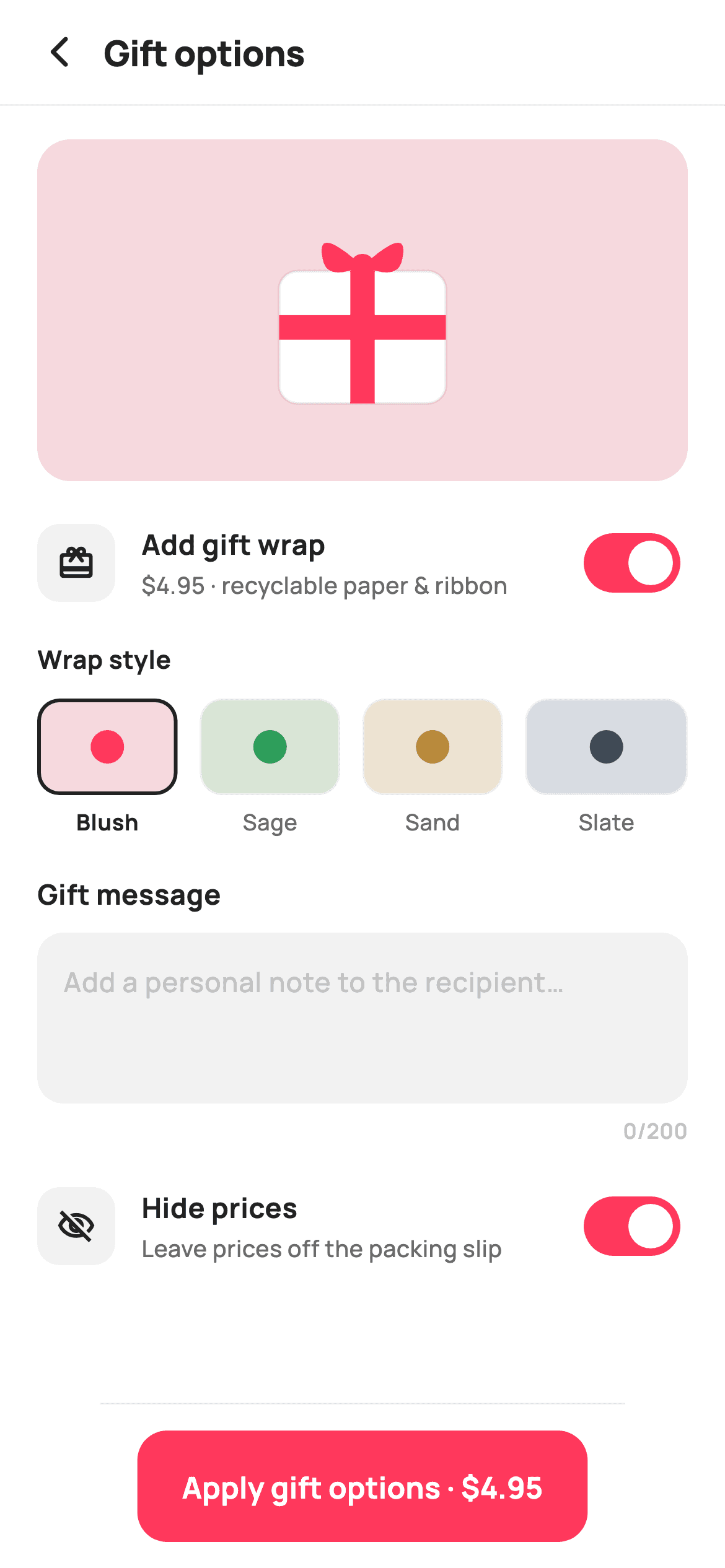
Gift wrapping is an upsell that only converts if the shopper can see what they're buying. This tutorial builds a Flutter screen where a painted gift box — rounded box, crossed ribbons and a two-loop Bézier bow — recolours live as you pick between four wrap styles, and greys out entirely when the toggle is off. Underneath sit a character-counted message field with Flutter's built-in counter suppressed, and a hide-prices switch for the packing slip.
Watch the Flutter UI walkthrough
A short screen recording of Gift options running, if you'd rather see it before you read the code. The written tutorial below covers everything in it.
Can't see the video? Watch it on YouTube.
What you'll build
- ✓A painted gift box whose ribbon and background recolour with the selected wrap
- ✓A preview that visibly de-saturates when gift wrap is switched off
- ✓An `AnimatedCrossFade` that reveals the style picker only when wrapping is on
- ✓A `TextField` with `buildCounter` returning null, so you can place your own counter
- ✓A grapheme-safe character count using `.characters.length`
- ✓A Bézier bow drawn by translating the canvas and mirroring one path
Step-by-step build
Create the file
Add a new file at lib/ecom_cart_gift/ecom_cart_gift_screen.dart in your Flutter project.
Register the bundled fonts
No external packages — this is pure Flutter. It does bundle its design font (Manrope), so drop the font file into fonts/ and declare it in pubspec.yaml:
flutter:
  fonts:
    - family: Manrope
      fonts:
- asset: fonts/Manrope-Regular.ttfBuild it, piece by piece
Here's how the screen goes together. Each block below is a real slice of the code with a plain-English explanation — paste them in order, or grab the whole file from the next section.
Four wrap styles and the controller lifecycle
class _EcomCartGiftScreenState extends State<EcomCartGiftScreen> {
  static const String _font = 'Manrope';
  static const Color _canvas = Color(0xFFFFFFFF);
  static const Color _ink = Color(0xFF222222);
  static const Color _muted = Color(0xFF6A6A6A);
  static const Color _faint = Color(0xFFC1C1C1);
  static const Color _brand = Color(0xFFFF385C);
  static const Color _surface = Color(0xFFF2F2F2);
  static const Color _hairline = Color(0xFFEBEBEB);

  static const List<_Wrap> _wraps = <_Wrap>[
    _Wrap('Blush', Color(0xFFF6D9DE), Color(0xFFFF385C)),
    _Wrap('Sage', Color(0xFFD9E5D6), Color(0xFF2E9E5B)),
    _Wrap('Sand', Color(0xFFEDE3D2), Color(0xFFB8893B)),
    _Wrap('Slate', Color(0xFFD7DCE2), Color(0xFF3B4A5B)),
  ];
  static const int _maxMsg = 200;

  bool _wrap = true;
  bool _hidePrices = true;
  int _style = 0;
  final TextEditingController _msg = TextEditingController();

  @override
  void initState() {
    super.initState();
    _msg.addListener(() => setState(() {}));
  }

  @override
  void dispose() {
    _msg.dispose();
    super.dispose();
  }
Each `_Wrap` holds a name plus two colours — a pale `bg` and a saturated `ribbon` — which is all the painter needs to retheme the box. State is three simple fields (`_wrap`, `_hidePrices`, `_style`) plus a `TextEditingController`. The two lifecycle methods matter: `initState` attaches `_msg.addListener(() => setState(() {}))` so the character counter rebuilds on every keystroke, and `dispose()` releases the controller. A `TextEditingController` you create must be disposed, and a listener you add keeps the widget rebuilding — both are easy to forget and both leak.
Revealing the style picker with AnimatedCrossFade
  @override
  Widget build(BuildContext context) {
    final _Wrap w = _wraps[_style];
    return Theme(
      data: ThemeData.light(useMaterial3: true),
      child: Scaffold(
        backgroundColor: _canvas,
        body: SafeArea(
          child: Column(
            children: <Widget>[
              _header(),
              const Divider(height: 1, color: _hairline),
              Expanded(
                child: ListView(
                  padding: const EdgeInsets.fromLTRB(20, 18, 20, 16),
                  children: <Widget>[
                    _preview(w),
                    const SizedBox(height: 20),
                    _wrapToggle(),
                    const SizedBox(height: 4),
                    AnimatedCrossFade(
                      firstChild: const SizedBox(width: double.infinity),
                      secondChild: _stylePicker(),
                      crossFadeState: _wrap
                          ? CrossFadeState.showSecond
                          : CrossFadeState.showFirst,
                      duration: const Duration(milliseconds: 180),
                    ),
                    const SizedBox(height: 20),
                    _messageField(),
                    const SizedBox(height: 20),
                    _hidePricesToggle(),
                  ],
                ),
              ),
              _applyBar(),
            ],
          ),
        ),
      ),
    );
  }
`final _Wrap w = _wraps[_style]` is resolved once at the top of `build` and passed down, so the preview and picker can't disagree about which style is active. The picker's reveal uses `AnimatedCrossFade` rather than a collection-`if`: `firstChild` is an empty `SizedBox(width: double.infinity)` and `secondChild` is the picker, with `crossFadeState` driven by `_wrap`. Unlike an `if`, this animates the height *and* fades between the two over 180ms — the right choice here because the picker sits mid-scroll, where a sudden height jump would shift everything below it.
The live preview
  Widget _preview(_Wrap w) {
    return Container(
      height: 184,
      decoration: BoxDecoration(
        color: _wrap ? w.bg : _surface,
        borderRadius: BorderRadius.circular(18),
      ),
      alignment: Alignment.center,
      child: SizedBox(
        width: 132,
        height: 132,
        child: CustomPaint(
          painter: _GiftPainter(
            ribbon: _wrap ? w.ribbon : _faint,
            box: _wrap ? Colors.white : const Color(0xFFE6E6E6),
          ),
        ),
      ),
    );
  }
Eighteen lines that do all the selling. The 184px container's background is `_wrap ? w.bg : _surface`, and the `_GiftPainter` receives `ribbon: _wrap ? w.ribbon : _faint` and `box: _wrap ? Colors.white : Color(0xFFE6E6E6)`. So toggling gift wrap off doesn't hide the preview — it drains the colour out of it, which communicates 'this is what you're not getting' far better than an empty space would. Changing `_style` swaps both colours at once, and because `_GiftPainter.shouldRepaint` compares them, the canvas redraws only when a colour actually changes.
The swatch picker
  Widget _stylePicker() {
    return Padding(
      padding: const EdgeInsets.only(top: 14),
      child: Column(
        crossAxisAlignment: CrossAxisAlignment.start,
        children: <Widget>[
          const Text(
            'Wrap style',
            style: TextStyle(
              fontFamily: _font,
              fontSize: 13.5,
              fontWeight: FontWeight.w700,
              color: _ink,
            ),
          ),
          const SizedBox(height: 12),
          Row(
            children: List<Widget>.generate(_wraps.length, (int i) {
              final _Wrap w = _wraps[i];
              final bool on = i == _style;
              return Expanded(
                child: GestureDetector(
                  onTap: () => setState(() => _style = i),
                  child: Padding(
                    padding: EdgeInsets.only(
                        right: i == _wraps.length - 1 ? 0 : 12),
                    child: Column(
                      children: <Widget>[
                        Container(
                          height: 52,
                          decoration: BoxDecoration(
                            color: w.bg,
                            borderRadius: BorderRadius.circular(12),
                            border: Border.all(
                              color: on ? _ink : _hairline,
                              width: on ? 2 : 1,
                            ),
                          ),
                          alignment: Alignment.center,
                          child: Container(
                            width: 18,
                            height: 18,
                            decoration: BoxDecoration(
                              color: w.ribbon,
                              shape: BoxShape.circle,
                            ),
                          ),
                        ),
                        const SizedBox(height: 6),
                        Text(
                          w.name,
                          style: TextStyle(
                            fontFamily: _font,
                            fontSize: 12,
                            fontWeight: on ? FontWeight.w700 : FontWeight.w500,
                            color: on ? _ink : _muted,
                          ),
                        ),
                      ],
                    ),
                  ),
                ),
              );
            }),
          ),
        ],
      ),
    );
  }
`List<Widget>.generate` builds four `Expanded` swatches so they divide the width evenly at any screen size. The gap is done with `EdgeInsets.only(right: i == _wraps.length - 1 ? 0 : 12)` — trailing padding on all but the last — which keeps the four columns equal, whereas inserting `SizedBox` separators would make the outer swatches wider than the inner ones. Each swatch is a 52px tile in the wrap's `bg` holding an 18px circle of its `ribbon`, so both colours are visible before you commit. Selection shows as a 2px ink border plus a `w700` label, deliberately *not* brand pink — the swatch's own colour is the content, so the selection ring must stay neutral.
A message field with its own counter
  Widget _messageField() {
    return Column(
      crossAxisAlignment: CrossAxisAlignment.start,
      children: <Widget>[
        const Text(
          'Gift message',
          style: TextStyle(
            fontFamily: _font,
            fontSize: 15,
            fontWeight: FontWeight.w700,
            color: _ink,
          ),
        ),
        const SizedBox(height: 10),
        Container(
          padding: const EdgeInsets.fromLTRB(14, 12, 14, 12),
          decoration: BoxDecoration(
            color: _surface,
            borderRadius: BorderRadius.circular(14),
          ),
          child: TextField(
            controller: _msg,
            maxLines: 3,
            maxLength: _maxMsg,
            cursorColor: _brand,
            buildCounter: (BuildContext c,
                    {required int currentLength,
                    required bool isFocused,
                    int? maxLength}) =>
                null,
            style: const TextStyle(
              fontFamily: _font,
              fontSize: 14.5,
              fontWeight: FontWeight.w500,
              height: 1.4,
              color: _ink,
            ),
            decoration: const InputDecoration(
              isDense: true,
              border: InputBorder.none,
              hintText: 'Add a personal note to the recipient…',
              hintStyle: TextStyle(
                fontFamily: _font,
                fontSize: 14.5,
                fontWeight: FontWeight.w500,
                color: _faint,
              ),
            ),
          ),
        ),
        const SizedBox(height: 6),
        Align(
          alignment: Alignment.centerRight,
          child: Text(
            '${_msg.text.characters.length}/$_maxMsg',
            style: const TextStyle(
              fontFamily: _font,
              fontSize: 11.5,
              fontWeight: FontWeight.w600,
              color: _faint,
            ),
          ),
        ),
      ],
    );
  }
`maxLength: _maxMsg` enforces the 200-character cap, but Flutter's built-in counter is suppressed by `buildCounter: (...) => null` — that's the supported way to opt out, and it lets the count live where the design wants it, right-aligned below the box in `_faint`. The count itself uses `_msg.text.characters.length` rather than `.length`: `.characters` counts grapheme clusters, so an emoji in a gift message counts as one character instead of two. The `TextField` runs with `border: InputBorder.none` and `isDense: true` so the surrounding `Container` provides all the chrome.
Toggle rows and the conditional CTA
  Widget _hidePricesToggle() {
    return _toggleRow(
      Icons.visibility_off_outlined,
      'Hide prices',
      'Leave prices off the packing slip',
      _hidePrices,
      (bool v) => setState(() => _hidePrices = v),
    );
  }

  Widget _toggleRow(
      IconData icon, String title, String sub, bool value, ValueChanged<bool> on) {
    return Row(
      children: <Widget>[
        Container(
          width: 42,
          height: 42,
          alignment: Alignment.center,
          decoration: BoxDecoration(
            color: _surface,
            borderRadius: BorderRadius.circular(12),
          ),
          child: Icon(icon, size: 21, color: _ink),
        ),
        const SizedBox(width: 14),
        Expanded(
          child: Column(
            crossAxisAlignment: CrossAxisAlignment.start,
            children: <Widget>[
              Text(
                title,
                style: const TextStyle(
                  fontFamily: _font,
                  fontSize: 15,
                  fontWeight: FontWeight.w700,
                  color: _ink,
                ),
              ),
              const SizedBox(height: 2),
              Text(
                sub,
                style: const TextStyle(
                  fontFamily: _font,
                  fontSize: 12.5,
                  fontWeight: FontWeight.w500,
                  color: _muted,
                ),
              ),
            ],
          ),
        ),
        const SizedBox(width: 12),
        Switch(
          value: value,
          onChanged: on,
          activeThumbColor: _canvas,
          activeTrackColor: _brand,
          inactiveThumbColor: _canvas,
          inactiveTrackColor: _faint,
          trackOutlineColor:
              WidgetStateProperty.all<Color>(Colors.transparent),
        ),
      ],
    );
  }

  Widget _applyBar() {
    return Container(
      decoration: const BoxDecoration(
        color: _canvas,
        border: Border(top: BorderSide(color: _hairline)),
      ),
      child: SafeArea(
        top: false,
        child: SizedBox(
          height: 88,
          child: Padding(
            padding: const EdgeInsets.fromLTRB(20, 14, 20, 14),
            child: SizedBox(
              height: 56,
              child: FilledButton(
                onPressed: widget.onApply,
                style: FilledButton.styleFrom(
                  backgroundColor: _brand,
                  foregroundColor: _canvas,
                  shape: RoundedRectangleBorder(
                    borderRadius: BorderRadius.circular(16),
                  ),
                ),
                child: Text(
                  _wrap ? 'Apply gift options · \$4.95' : 'Apply gift options',
                  style: const TextStyle(
                    fontFamily: _font,
                    fontSize: 16,
                    fontWeight: FontWeight.w700,
                  ),
                ),
              ),
            ),
          ),
        ),
      ),
    );
  }
`_toggleRow` is shared by both switches, so the gift-wrap and hide-prices rows are structurally identical: a 42px neutral icon tile, an `Expanded` title-and-subtitle column, and a `Switch`. The switch styling is fully specified — active and inactive thumb and track colours plus `trackOutlineColor: WidgetStateProperty.all(Colors.transparent)`, which removes the outline Material 3 draws around an off switch by default. The Apply button's label is conditional: `_wrap ? 'Apply gift options · \$4.95' : 'Apply gift options'`, so the fee appears only when it's actually being charged.
Painting the gift box and bow
/// Paints a wrapped gift box: a rounded box with a vertical + horizontal ribbon
/// and a simple bow on top.
class _GiftPainter extends CustomPainter {
  _GiftPainter({required this.ribbon, required this.box});
  final Color ribbon;
  final Color box;

  @override
  void paint(Canvas canvas, Size size) {
    final double w = size.width;
    final double h = size.height;

    final Rect boxRect = Rect.fromLTWH(w * 0.16, h * 0.34, w * 0.68, h * 0.54);
    final RRect boxRRect =
        RRect.fromRectAndRadius(boxRect, const Radius.circular(10));
    canvas.drawRRect(boxRRect, Paint()..color = box);
    canvas.drawRRect(
      boxRRect,
      Paint()
        ..style = PaintingStyle.stroke
        ..strokeWidth = 1.5
        ..color = const Color(0x14000000),
    );

    final Paint rib = Paint()..color = ribbon;
    // Vertical ribbon.
    canvas.drawRect(
      Rect.fromLTWH(w * 0.45, h * 0.34, w * 0.10, h * 0.54),
      rib,
    );
    // Horizontal ribbon.
    canvas.drawRect(
      Rect.fromLTWH(w * 0.16, h * 0.52, w * 0.68, h * 0.10),
      rib,
    );

    // Bow: two ellipse loops + a knot.
    final Offset knot = Offset(w * 0.50, h * 0.32);
    canvas.save();
    canvas.translate(knot.dx, knot.dy);
    for (final double sign in <double>[-1, 1]) {
      final Path loop = Path()
        ..moveTo(0, 0)
        ..quadraticBezierTo(
            sign * w * 0.20, -h * 0.18, sign * w * 0.16, -h * 0.02)
        ..quadraticBezierTo(sign * w * 0.14, h * 0.06, 0, 0)
        ..close();
      canvas.drawPath(loop, rib);
    }
    canvas.drawCircle(Offset.zero, w * 0.05, rib);
    canvas.restore();
  }

  @override
  bool shouldRepaint(_GiftPainter old) =>
      old.ribbon != ribbon || old.box != box;
}
Every measurement is a fraction of `w` and `h`, so the drawing scales with its `SizedBox`. The box is one `RRect` filled with `box`, then stroked again at 1.5px in `0x14000000` — a 8%-black hairline that gives the white box an edge against a pale background. The two ribbons are plain rects crossing at the centre. The bow is the clever part: `canvas.save()`, `translate` to the knot, then a `for` loop over `[-1, 1]` draws the *same* two-curve `Path` with each x-offset multiplied by `sign`, mirroring one loop into two. `canvas.restore()` puts the origin back. Writing the loop once and mirroring it guarantees the bow is symmetrical.
Full code
The complete, ready-to-paste source. Free to use in your projects — one click copies it all.
import 'package:flutter/material.dart';

/// StyleCart — Gift Options.
///
/// Turn the order into a gift: toggle gift wrap (with a painted preview card and
/// a choice of wrap styles), add a personal message, and hide prices on the
/// packing slip. A pinned bar applies the options.
///
/// Self-contained per CONVENTIONS.md: pure Flutter, bundled Manrope, inline
/// Airbnb-style tokens, own light theme + SafeArea, no images. The gift preview
/// and wrap swatches are CustomPainters (no emoji glyph). Callbacks only.
class EcomCartGiftScreen extends StatefulWidget {
  const EcomCartGiftScreen({
    super.key,
    this.onBack,
    this.onApply,
  });

  final VoidCallback? onBack;
  final VoidCallback? onApply;

  @override
  State<EcomCartGiftScreen> createState() => _EcomCartGiftScreenState();
}

class _EcomCartGiftScreenState extends State<EcomCartGiftScreen> {
  static const String _font = 'Manrope';
  static const Color _canvas = Color(0xFFFFFFFF);
  static const Color _ink = Color(0xFF222222);
  static const Color _muted = Color(0xFF6A6A6A);
  static const Color _faint = Color(0xFFC1C1C1);
  static const Color _brand = Color(0xFFFF385C);
  static const Color _surface = Color(0xFFF2F2F2);
  static const Color _hairline = Color(0xFFEBEBEB);

  static const List<_Wrap> _wraps = <_Wrap>[
    _Wrap('Blush', Color(0xFFF6D9DE), Color(0xFFFF385C)),
    _Wrap('Sage', Color(0xFFD9E5D6), Color(0xFF2E9E5B)),
    _Wrap('Sand', Color(0xFFEDE3D2), Color(0xFFB8893B)),
    _Wrap('Slate', Color(0xFFD7DCE2), Color(0xFF3B4A5B)),
  ];
  static const int _maxMsg = 200;

  bool _wrap = true;
  bool _hidePrices = true;
  int _style = 0;
  final TextEditingController _msg = TextEditingController();

  @override
  void initState() {
    super.initState();
    _msg.addListener(() => setState(() {}));
  }

  @override
  void dispose() {
    _msg.dispose();
    super.dispose();
  }

  @override
  Widget build(BuildContext context) {
    final _Wrap w = _wraps[_style];
    return Theme(
      data: ThemeData.light(useMaterial3: true),
      child: Scaffold(
        backgroundColor: _canvas,
        body: SafeArea(
          child: Column(
            children: <Widget>[
              _header(),
              const Divider(height: 1, color: _hairline),
              Expanded(
                child: ListView(
                  padding: const EdgeInsets.fromLTRB(20, 18, 20, 16),
                  children: <Widget>[
                    _preview(w),
                    const SizedBox(height: 20),
                    _wrapToggle(),
                    const SizedBox(height: 4),
                    AnimatedCrossFade(
                      firstChild: const SizedBox(width: double.infinity),
                      secondChild: _stylePicker(),
                      crossFadeState: _wrap
                          ? CrossFadeState.showSecond
                          : CrossFadeState.showFirst,
                      duration: const Duration(milliseconds: 180),
                    ),
                    const SizedBox(height: 20),
                    _messageField(),
                    const SizedBox(height: 20),
                    _hidePricesToggle(),
                  ],
                ),
              ),
              _applyBar(),
            ],
          ),
        ),
      ),
    );
  }

  Widget _header() {
    return Padding(
      padding: const EdgeInsets.fromLTRB(8, 4, 20, 4),
      child: Row(
        children: <Widget>[
          IconButton(
            onPressed: widget.onBack,
            icon: const Icon(Icons.arrow_back_ios_new_rounded,
                size: 20, color: _ink),
          ),
          const Expanded(
            child: Text(
              'Gift options',
              style: TextStyle(
                fontFamily: _font,
                fontSize: 19,
                fontWeight: FontWeight.w800,
                letterSpacing: -0.3,
                color: _ink,
              ),
            ),
          ),
        ],
      ),
    );
  }

  Widget _preview(_Wrap w) {
    return Container(
      height: 184,
      decoration: BoxDecoration(
        color: _wrap ? w.bg : _surface,
        borderRadius: BorderRadius.circular(18),
      ),
      alignment: Alignment.center,
      child: SizedBox(
        width: 132,
        height: 132,
        child: CustomPaint(
          painter: _GiftPainter(
            ribbon: _wrap ? w.ribbon : _faint,
            box: _wrap ? Colors.white : const Color(0xFFE6E6E6),
          ),
        ),
      ),
    );
  }

  Widget _wrapToggle() {
    return _toggleRow(
      Icons.redeem_rounded,
      'Add gift wrap',
      '\$4.95 · recyclable paper & ribbon',
      _wrap,
      (bool v) => setState(() => _wrap = v),
    );
  }

  Widget _stylePicker() {
    return Padding(
      padding: const EdgeInsets.only(top: 14),
      child: Column(
        crossAxisAlignment: CrossAxisAlignment.start,
        children: <Widget>[
          const Text(
            'Wrap style',
            style: TextStyle(
              fontFamily: _font,
              fontSize: 13.5,
              fontWeight: FontWeight.w700,
              color: _ink,
            ),
          ),
          const SizedBox(height: 12),
          Row(
            children: List<Widget>.generate(_wraps.length, (int i) {
              final _Wrap w = _wraps[i];
              final bool on = i == _style;
              return Expanded(
                child: GestureDetector(
                  onTap: () => setState(() => _style = i),
                  child: Padding(
                    padding: EdgeInsets.only(
                        right: i == _wraps.length - 1 ? 0 : 12),
                    child: Column(
                      children: <Widget>[
                        Container(
                          height: 52,
                          decoration: BoxDecoration(
                            color: w.bg,
                            borderRadius: BorderRadius.circular(12),
                            border: Border.all(
                              color: on ? _ink : _hairline,
                              width: on ? 2 : 1,
                            ),
                          ),
                          alignment: Alignment.center,
                          child: Container(
                            width: 18,
                            height: 18,
                            decoration: BoxDecoration(
                              color: w.ribbon,
                              shape: BoxShape.circle,
                            ),
                          ),
                        ),
                        const SizedBox(height: 6),
                        Text(
                          w.name,
                          style: TextStyle(
                            fontFamily: _font,
                            fontSize: 12,
                            fontWeight: on ? FontWeight.w700 : FontWeight.w500,
                            color: on ? _ink : _muted,
                          ),
                        ),
                      ],
                    ),
                  ),
                ),
              );
            }),
          ),
        ],
      ),
    );
  }

  Widget _messageField() {
    return Column(
      crossAxisAlignment: CrossAxisAlignment.start,
      children: <Widget>[
        const Text(
          'Gift message',
          style: TextStyle(
            fontFamily: _font,
            fontSize: 15,
            fontWeight: FontWeight.w700,
            color: _ink,
          ),
        ),
        const SizedBox(height: 10),
        Container(
          padding: const EdgeInsets.fromLTRB(14, 12, 14, 12),
          decoration: BoxDecoration(
            color: _surface,
            borderRadius: BorderRadius.circular(14),
          ),
          child: TextField(
            controller: _msg,
            maxLines: 3,
            maxLength: _maxMsg,
            cursorColor: _brand,
            buildCounter: (BuildContext c,
                    {required int currentLength,
                    required bool isFocused,
                    int? maxLength}) =>
                null,
            style: const TextStyle(
              fontFamily: _font,
              fontSize: 14.5,
              fontWeight: FontWeight.w500,
              height: 1.4,
              color: _ink,
            ),
            decoration: const InputDecoration(
              isDense: true,
              border: InputBorder.none,
              hintText: 'Add a personal note to the recipient…',
              hintStyle: TextStyle(
                fontFamily: _font,
                fontSize: 14.5,
                fontWeight: FontWeight.w500,
                color: _faint,
              ),
            ),
          ),
        ),
        const SizedBox(height: 6),
        Align(
          alignment: Alignment.centerRight,
          child: Text(
            '${_msg.text.characters.length}/$_maxMsg',
            style: const TextStyle(
              fontFamily: _font,
              fontSize: 11.5,
              fontWeight: FontWeight.w600,
              color: _faint,
            ),
          ),
        ),
      ],
    );
  }

  Widget _hidePricesToggle() {
    return _toggleRow(
      Icons.visibility_off_outlined,
      'Hide prices',
      'Leave prices off the packing slip',
      _hidePrices,
      (bool v) => setState(() => _hidePrices = v),
    );
  }

  Widget _toggleRow(
      IconData icon, String title, String sub, bool value, ValueChanged<bool> on) {
    return Row(
      children: <Widget>[
        Container(
          width: 42,
          height: 42,
          alignment: Alignment.center,
          decoration: BoxDecoration(
            color: _surface,
            borderRadius: BorderRadius.circular(12),
          ),
          child: Icon(icon, size: 21, color: _ink),
        ),
        const SizedBox(width: 14),
        Expanded(
          child: Column(
            crossAxisAlignment: CrossAxisAlignment.start,
            children: <Widget>[
              Text(
                title,
                style: const TextStyle(
                  fontFamily: _font,
                  fontSize: 15,
                  fontWeight: FontWeight.w700,
                  color: _ink,
                ),
              ),
              const SizedBox(height: 2),
              Text(
                sub,
                style: const TextStyle(
                  fontFamily: _font,
                  fontSize: 12.5,
                  fontWeight: FontWeight.w500,
                  color: _muted,
                ),
              ),
            ],
          ),
        ),
        const SizedBox(width: 12),
        Switch(
          value: value,
          onChanged: on,
          activeThumbColor: _canvas,
          activeTrackColor: _brand,
          inactiveThumbColor: _canvas,
          inactiveTrackColor: _faint,
          trackOutlineColor:
              WidgetStateProperty.all<Color>(Colors.transparent),
        ),
      ],
    );
  }

  Widget _applyBar() {
    return Container(
      decoration: const BoxDecoration(
        color: _canvas,
        border: Border(top: BorderSide(color: _hairline)),
      ),
      child: SafeArea(
        top: false,
        child: SizedBox(
          height: 88,
          child: Padding(
            padding: const EdgeInsets.fromLTRB(20, 14, 20, 14),
            child: SizedBox(
              height: 56,
              child: FilledButton(
                onPressed: widget.onApply,
                style: FilledButton.styleFrom(
                  backgroundColor: _brand,
                  foregroundColor: _canvas,
                  shape: RoundedRectangleBorder(
                    borderRadius: BorderRadius.circular(16),
                  ),
                ),
                child: Text(
                  _wrap ? 'Apply gift options · \$4.95' : 'Apply gift options',
                  style: const TextStyle(
                    fontFamily: _font,
                    fontSize: 16,
                    fontWeight: FontWeight.w700,
                  ),
                ),
              ),
            ),
          ),
        ),
      ),
    );
  }
}

class _Wrap {
  const _Wrap(this.name, this.bg, this.ribbon);
  final String name;
  final Color bg;
  final Color ribbon;
}

/// Paints a wrapped gift box: a rounded box with a vertical + horizontal ribbon
/// and a simple bow on top.
class _GiftPainter extends CustomPainter {
  _GiftPainter({required this.ribbon, required this.box});
  final Color ribbon;
  final Color box;

  @override
  void paint(Canvas canvas, Size size) {
    final double w = size.width;
    final double h = size.height;

    final Rect boxRect = Rect.fromLTWH(w * 0.16, h * 0.34, w * 0.68, h * 0.54);
    final RRect boxRRect =
        RRect.fromRectAndRadius(boxRect, const Radius.circular(10));
    canvas.drawRRect(boxRRect, Paint()..color = box);
    canvas.drawRRect(
      boxRRect,
      Paint()
        ..style = PaintingStyle.stroke
        ..strokeWidth = 1.5
        ..color = const Color(0x14000000),
    );

    final Paint rib = Paint()..color = ribbon;
    // Vertical ribbon.
    canvas.drawRect(
      Rect.fromLTWH(w * 0.45, h * 0.34, w * 0.10, h * 0.54),
      rib,
    );
    // Horizontal ribbon.
    canvas.drawRect(
      Rect.fromLTWH(w * 0.16, h * 0.52, w * 0.68, h * 0.10),
      rib,
    );

    // Bow: two ellipse loops + a knot.
    final Offset knot = Offset(w * 0.50, h * 0.32);
    canvas.save();
    canvas.translate(knot.dx, knot.dy);
    for (final double sign in <double>[-1, 1]) {
      final Path loop = Path()
        ..moveTo(0, 0)
        ..quadraticBezierTo(
            sign * w * 0.20, -h * 0.18, sign * w * 0.16, -h * 0.02)
        ..quadraticBezierTo(sign * w * 0.14, h * 0.06, 0, 0)
        ..close();
      canvas.drawPath(loop, rib);
    }
    canvas.drawCircle(Offset.zero, w * 0.05, rib);
    canvas.restore();
  }

  @override
  bool shouldRepaint(_GiftPainter old) =>
      old.ribbon != ribbon || old.box != box;
}
Plus bundled 5 binary assets (fonts/images). The CLI and MCP install those for you automatically.
Two faster ways to add it
Copy-paste works, but you can skip it entirely.
1. FlutterKit CLI
One command drops this screen — and its fonts — straight into your project.
$ flutterkit add ecom-cart-gift2. AI agent (MCP)
Connect FlutterKit's MCP server in Claude or Cursor and just ask your agent to install ecom-cart-gift — it fetches and writes the files for you.
FAQ
Is this gift options screen free to use?
Yes. The complete Dart source on this page is free for personal and commercial apps. Copy it from the code block, install it with the FlutterKit CLI (flutterkit add ecom-cart-gift), or add it through an AI agent over MCP.
How do I hide the default TextField character counter?
Pass buildCounter: (context, {required currentLength, required isFocused, maxLength}) => null. Returning null from that builder removes Flutter's counter while maxLength still enforces the limit, freeing you to render your own count wherever the design needs it.
Why .characters.length instead of .length for the count?
String.length counts UTF-16 code units, so a single emoji counts as two. .characters counts grapheme clusters — what a person perceives as one character — so the counter matches what the shopper actually typed.
Does the gift illustration need an asset?
No. _GiftPainter draws the box, ribbons and bow with rects, an RRect and Bézier paths on a Canvas. That's what lets it recolour instantly per wrap style — an image would need four separate files and a swap.
Which Flutter version does it target?
It uses Switch's activeThumbColor plus WidgetStateProperty (renamed from MaterialStateProperty in 3.22), so target Flutter 3.27+. On older versions use activeColor and MaterialStateProperty instead.


