How to Build a Sign-Up Form with a Password Strength Meter in Flutter (Full Code + Preview)
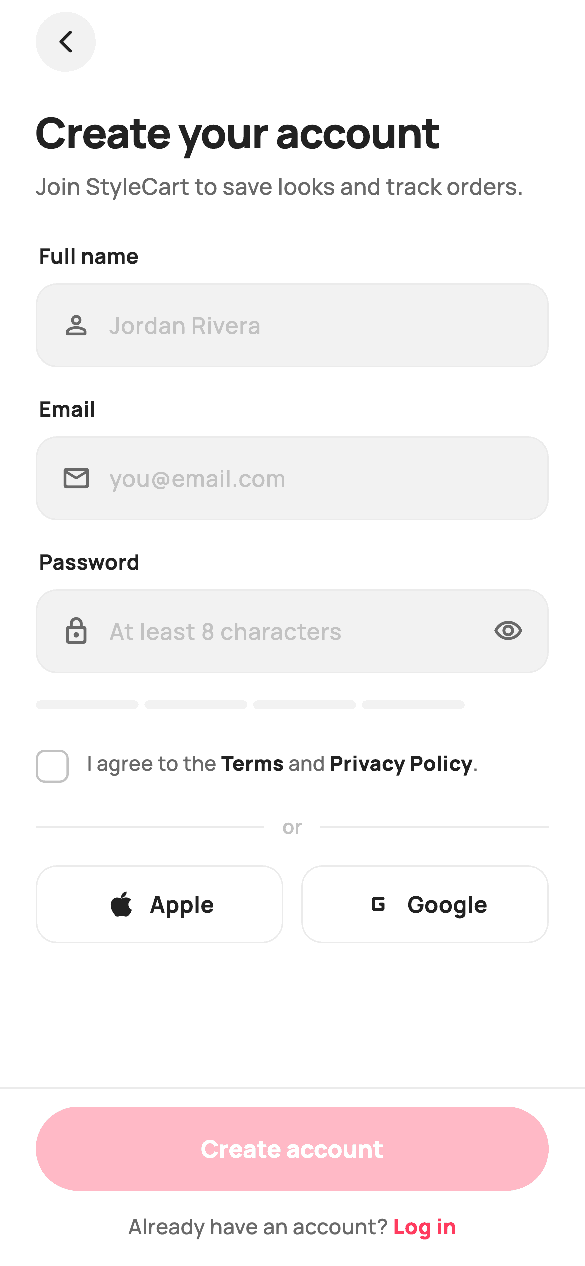
A sign-up form is really a validation problem wearing a layout. This tutorial builds one in Flutter where a `_strength` getter scores the password 0–4 from length and character-class variety, a four-segment painted meter renders that score live, and a `_valid` getter gates the Create Account button on name, email, strength *and* the terms checkbox. Around it sit a reusable field widget, a `Text.rich` terms line with emphasised links, and two social buttons.
Watch the Flutter UI walkthrough
A short screen recording of Create Account running, if you'd rather see it before you read the code. The written tutorial below covers everything in it.
Can't see the video? Watch it on YouTube.
What you'll build
- ✓A 0–4 password score derived from length plus four character-class regex tests
- ✓A four-segment strength meter painted with `CustomPainter` — no package
- ✓Colour and label that shift together: Weak → Fair → Good → Strong
- ✓A form-wide `_valid` getter that disables the CTA until every rule passes
- ✓A reusable `_Field` widget with optional icon, trailing widget and obscuring
- ✓A `Text.rich` terms line where Terms and Privacy Policy are emphasised inline
Step-by-step build
Create the file
Add a new file at lib/ecom_auth_signup/ecom_auth_signup_screen.dart in your Flutter project.
Register the bundled fonts
No external packages — this is pure Flutter. It does bundle its design font (Manrope), so drop the font file into fonts/ and declare it in pubspec.yaml:
flutter:
  fonts:
    - family: Manrope
      fonts:
- asset: fonts/Manrope-Regular.ttfBuild it, piece by piece
Here's how the screen goes together. Each block below is a real slice of the code with a plain-English explanation — paste them in order, or grab the whole file from the next section.
Three controllers and the lifecycle they need
class _EcomAuthSignupScreenState extends State<EcomAuthSignupScreen> {
  static const String _font = 'Manrope';
  static const Color _canvas = Color(0xFFFFFFFF);
  static const Color _ink = Color(0xFF222222);
  static const Color _muted = Color(0xFF6A6A6A);
  static const Color _faint = Color(0xFFC1C1C1);
  static const Color _brand = Color(0xFFFF385C);
  static const Color _surface = Color(0xFFF2F2F2);
  static const Color _hairline = Color(0xFFEBEBEB);
  static const Color _success = Color(0xFF2E9E5B);
  static const Color _warn = Color(0xFFF5A623);
  static const Color _danger = Color(0xFFE5484D);

  final TextEditingController _name = TextEditingController();
  final TextEditingController _email = TextEditingController();
  final TextEditingController _password = TextEditingController();
  bool _obscure = true;
  bool _agreed = false;

  @override
  void initState() {
    super.initState();
    _password.addListener(() => setState(() {}));
  }

  @override
  void dispose() {
    _name.dispose();
    _email.dispose();
    _password.dispose();
    super.dispose();
  }
Three `TextEditingController`s plus two booleans (`_obscure`, `_agreed`) hold everything. `initState` attaches a listener to `_password` only — `_password.addListener(() => setState(() {}))` — because the strength meter must repaint on every keystroke; the name and email fields instead call `setState` through their `onChanged`, which is cheaper. `dispose()` releases all three controllers. A controller you construct must be disposed or it leaks, and this is the one part of a form screen that's easy to skip and hard to notice.
Scoring the password, and gating the form
  /// 0..4 password strength from length + character-class variety.
  int get _strength {
    final String p = _password.text;
    if (p.isEmpty) return 0;
    int score = 0;
    if (p.length >= 8) score++;
    if (RegExp(r'[A-Z]').hasMatch(p) && RegExp(r'[a-z]').hasMatch(p)) score++;
    if (RegExp(r'[0-9]').hasMatch(p)) score++;
    if (RegExp(r'[^A-Za-z0-9]').hasMatch(p)) score++;
    return score;
  }

  bool get _valid =>
      _name.text.trim().isNotEmpty &&
      _email.text.contains('@') &&
      _strength >= 2 &&
      _agreed;
`_strength` returns 0 for an empty password, then adds one point each for: length ≥ 8, having *both* upper and lower case, containing a digit, and containing a non-alphanumeric character. That's a maximum of 4, matching the meter's four segments exactly. `_valid` then composes the whole form's rules in one expression — a non-empty trimmed name, an email containing '@', `_strength >= 2`, and `_agreed`. Keeping both as getters rather than stored fields means they're recomputed on every build and can never go stale.
Turning the score into colour and words
  @override
  Widget build(BuildContext context) {
    final int s = _strength;
    final Color barColor =
        s <= 1 ? _danger : (s == 2 ? _warn : _success);
    final String label = _password.text.isEmpty
        ? ''
        : (s <= 1 ? 'Weak' : (s == 2 ? 'Fair' : (s == 3 ? 'Good' : 'Strong')));
Three lines at the top of `build` translate the score into presentation: `barColor` steps danger → warn → success at the 1/2/3 boundaries, and `label` maps 0–4 onto 'Weak', 'Fair', 'Good', 'Strong' — with an empty string when the field is untouched, so no verdict appears before the user has typed anything. Deriving both from the same `s` is what keeps the bar's colour and the word beside it in agreement; computing them separately is where these two usually drift apart.
The form fields and the meter row
          child: Column(
            children: <Widget>[
              Expanded(
                child: SingleChildScrollView(
                  padding: const EdgeInsets.fromLTRB(24, 8, 24, 24),
                  child: Column(
                    crossAxisAlignment: CrossAxisAlignment.stretch,
                    children: <Widget>[
                      Align(
                        alignment: Alignment.centerLeft,
                        child: _CircleIcon(
                          icon: Icons.arrow_back_ios_new_rounded,
                          onTap: () => Navigator.maybePop(context),
                        ),
                      ),
                      const SizedBox(height: 20),
                      const Text(
                        'Create your account',
                        style: TextStyle(
                          fontFamily: _font,
                          fontSize: 28,
                          fontWeight: FontWeight.w800,
                          letterSpacing: -0.6,
                          color: _ink,
                        ),
                      ),
                      const SizedBox(height: 6),
                      const Text(
                        'Join StyleCart to save looks and track orders.',
                        style: TextStyle(
                          fontFamily: _font,
                          fontSize: 15,
                          fontWeight: FontWeight.w500,
                          color: _muted,
                        ),
                      ),
                      const SizedBox(height: 26),
                      const _Label('Full name'),
                      _Field(
                        controller: _name,
                        hint: 'Jordan Rivera',
                        icon: Icons.person_outline_rounded,
                        onChanged: (_) => setState(() {}),
                      ),
                      const SizedBox(height: 18),
                      const _Label('Email'),
                      _Field(
                        controller: _email,
                        hint: 'you@email.com',
                        icon: Icons.mail_outline_rounded,
                        keyboardType: TextInputType.emailAddress,
                        onChanged: (_) => setState(() {}),
                      ),
                      const SizedBox(height: 18),
                      const _Label('Password'),
                      _Field(
                        controller: _password,
                        hint: 'At least 8 characters',
                        icon: Icons.lock_outline_rounded,
                        obscure: _obscure,
                        trailing: GestureDetector(
                          onTap: () => setState(() => _obscure = !_obscure),
                          child: Icon(
                            _obscure
                                ? Icons.visibility_outlined
                                : Icons.visibility_off_outlined,
                            size: 20,
                            color: _muted,
                          ),
                        ),
                      ),
                      const SizedBox(height: 12),
                      Row(
                        children: <Widget>[
                          Expanded(
                            child: ClipRRect(
                              borderRadius: BorderRadius.circular(99),
                              child: SizedBox(
                                height: 6,
                                child: CustomPaint(
                                  painter: _StrengthPainter(
                                    score: s,
                                    color: barColor,
                                    track: _surface,
                                  ),
                                ),
                              ),
                            ),
                          ),
                          SizedBox(
                            width: 56,
                            child: Text(
                              label,
                              textAlign: TextAlign.right,
                              style: TextStyle(
                                fontFamily: _font,
                                fontSize: 12,
                                fontWeight: FontWeight.w800,
                                color: _password.text.isEmpty ? _faint : barColor,
                              ),
                            ),
                          ),
                        ],
                      ),
Each field is a `_Label` plus a `_Field`, with the password one passing `obscure: _obscure` and a `trailing` eye `GestureDetector` that flips it. The meter row pairs an `Expanded` `ClipRRect(99)` wrapping a 6px `CustomPaint` with a fixed `SizedBox(width: 56)` for the label — fixing that width is what stops the bar's length jittering as the word changes from 'Weak' to 'Strong'. The label's colour is `_password.text.isEmpty ? _faint : barColor`, so it stays neutral until there's something to judge.
Terms, divider and social buttons
                      const SizedBox(height: 20),
                      _TermsRow(
                        value: _agreed,
                        onChanged: (bool v) => setState(() => _agreed = v),
                      ),
                      const SizedBox(height: 20),
                      Row(
                        children: <Widget>[
                          const Expanded(child: Divider(color: _hairline, height: 1)),
                          Padding(
                            padding: const EdgeInsets.symmetric(horizontal: 12),
                            child: Text(
                              'or',
                              style: TextStyle(
                                fontFamily: _font,
                                fontSize: 13,
                                fontWeight: FontWeight.w600,
                                color: _faint,
                              ),
                            ),
                          ),
                          const Expanded(child: Divider(color: _hairline, height: 1)),
                        ],
                      ),
                      const SizedBox(height: 16),
                      Row(
                        children: <Widget>[
                          Expanded(
                            child: _SocialButton(
                              label: 'Apple',
                              icon: Icons.apple,
                              onTap: () => widget.onContinueWith?.call('apple'),
                            ),
                          ),
                          const SizedBox(width: 12),
                          Expanded(
                            child: _SocialButton(
                              label: 'Google',
                              icon: Icons.g_mobiledata_rounded,
                              onTap: () => widget.onContinueWith?.call('google'),
                            ),
                          ),
                        ],
                      ),
The 'or' divider is the standard recipe: two `Expanded` `Divider`s with a padded `Text` between them, so the rules fill whatever space the word doesn't. The social buttons are two `Expanded` `_SocialButton`s sharing one `ValueChanged<String>` callback keyed by provider name ('apple', 'google'), so the host app handles both in a single handler. Both are outlined rather than filled, keeping them visually subordinate to the brand-filled Create Account button below.
The pinned CTA that stays disabled
              Container(
                padding: const EdgeInsets.fromLTRB(24, 12, 24, 16),
                decoration: const BoxDecoration(
                  color: _canvas,
                  border: Border(top: BorderSide(color: _hairline)),
                ),
                child: Column(
                  mainAxisSize: MainAxisSize.min,
                  children: <Widget>[
                    SizedBox(
                      height: 56,
                      width: double.infinity,
                      child: FilledButton(
                        onPressed: _valid ? widget.onCreateAccount : null,
                        style: FilledButton.styleFrom(
                          backgroundColor: _brand,
                          foregroundColor: _canvas,
                          disabledBackgroundColor: _brand.withValues(alpha: 0.35),
                          disabledForegroundColor: _canvas,
                          shape: const StadiumBorder(),
                          textStyle: const TextStyle(
                            fontFamily: _font,
                            fontSize: 16,
                            fontWeight: FontWeight.w800,
                          ),
                        ),
                        child: const Text('Create account'),
                      ),
                    ),
                    const SizedBox(height: 14),
                    Row(
                      mainAxisAlignment: MainAxisAlignment.center,
                      children: <Widget>[
                        const Text(
                          'Already have an account? ',
                          style: TextStyle(
                            fontFamily: _font,
                            fontSize: 14,
                            fontWeight: FontWeight.w500,
                            color: _muted,
                          ),
                        ),
                        GestureDetector(
                          onTap: widget.onLogin,
                          child: const Text(
                            'Log in',
                            style: TextStyle(
                              fontFamily: _font,
                              fontSize: 14,
                              fontWeight: FontWeight.w800,
                              color: _brand,
                            ),
                          ),
                        ),
                      ],
                    ),
                  ],
                ),
              ),
The footer sits outside the `Expanded` scroll view with a top hairline border, so it stays visible while the form scrolls. `onPressed: _valid ? widget.onCreateAccount : null` — passing literal `null` is what actually disables a `FilledButton`, and `disabledBackgroundColor: _brand.withValues(alpha: 0.35)` keeps it recognisably brand-coloured rather than grey, reading as 'not yet' instead of 'broken'. Below it, the 'Already have an account? Log in' row splits into a plain `Text` and a tappable `GestureDetector`, which is simpler than a `TapGestureRecognizer` inside a span when only the tail is interactive.
The reusable field and terms checkbox
class _Field extends StatelessWidget {
  const _Field({
    required this.controller,
    required this.hint,
    this.icon,
    this.trailing,
    this.obscure = false,
    this.keyboardType,
    this.onChanged,
  });

  final TextEditingController controller;
  final String hint;
  final IconData? icon;
  final Widget? trailing;
  final bool obscure;
  final TextInputType? keyboardType;
  final ValueChanged<String>? onChanged;

  @override
  Widget build(BuildContext context) {
    return Container(
      height: 56,
      padding: const EdgeInsets.symmetric(horizontal: 16),
      decoration: BoxDecoration(
        color: _EcomAuthSignupScreenState._surface,
        borderRadius: BorderRadius.circular(14),
        border: Border.all(color: _EcomAuthSignupScreenState._hairline),
      ),
      child: Row(
        children: <Widget>[
          if (icon != null) ...<Widget>[
            Icon(icon, size: 20, color: _EcomAuthSignupScreenState._muted),
            const SizedBox(width: 12),
          ],
          Expanded(
            child: TextField(
              controller: controller,
              obscureText: obscure,
              keyboardType: keyboardType,
              onChanged: onChanged,
              style: const TextStyle(
                fontFamily: _EcomAuthSignupScreenState._font,
                fontSize: 15,
                fontWeight: FontWeight.w600,
                color: _EcomAuthSignupScreenState._ink,
              ),
              cursorColor: _EcomAuthSignupScreenState._brand,
              decoration: InputDecoration(
                isCollapsed: true,
                border: InputBorder.none,
                hintText: hint,
                hintStyle: const TextStyle(
                  fontFamily: _EcomAuthSignupScreenState._font,
                  fontSize: 15,
                  fontWeight: FontWeight.w500,
                  color: _EcomAuthSignupScreenState._faint,
                ),
              ),
            ),
          ),
          if (trailing != null) ...<Widget>[
            const SizedBox(width: 8),
            trailing!,
          ],
        ],
      ),
    );
  }
}

class _TermsRow extends StatelessWidget {
  const _TermsRow({required this.value, required this.onChanged});
  final bool value;
  final ValueChanged<bool> onChanged;

  @override
  Widget build(BuildContext context) {
    return GestureDetector(
      onTap: () => onChanged(!value),
      behavior: HitTestBehavior.opaque,
      child: Row(
        crossAxisAlignment: CrossAxisAlignment.start,
        children: <Widget>[
          AnimatedContainer(
            duration: const Duration(milliseconds: 140),
            width: 22,
            height: 22,
            margin: const EdgeInsets.only(top: 1),
            decoration: BoxDecoration(
              color: value
                  ? _EcomAuthSignupScreenState._brand
                  : _EcomAuthSignupScreenState._canvas,
              borderRadius: BorderRadius.circular(6),
              border: Border.all(
                color: value
                    ? _EcomAuthSignupScreenState._brand
                    : _EcomAuthSignupScreenState._faint,
                width: 1.5,
              ),
            ),
            child: value
                ? const Icon(Icons.check_rounded,
                    size: 16, color: _EcomAuthSignupScreenState._canvas)
                : null,
          ),
          const SizedBox(width: 12),
          Expanded(
            child: Text.rich(
              const TextSpan(
                text: 'I agree to the ',
                style: TextStyle(
                  fontFamily: _EcomAuthSignupScreenState._font,
                  fontSize: 13.5,
                  height: 1.4,
                  fontWeight: FontWeight.w500,
                  color: _EcomAuthSignupScreenState._muted,
                ),
                children: <InlineSpan>[
                  TextSpan(
                    text: 'Terms',
                    style: TextStyle(
                      fontWeight: FontWeight.w800,
                      color: _EcomAuthSignupScreenState._ink,
                    ),
                  ),
                  TextSpan(text: ' and '),
                  TextSpan(
                    text: 'Privacy Policy',
                    style: TextStyle(
                      fontWeight: FontWeight.w800,
                      color: _EcomAuthSignupScreenState._ink,
                    ),
                  ),
                  TextSpan(text: '.'),
                ],
              ),
            ),
          ),
        ],
      ),
    );
  }
}
`_Field` is a 56px container wrapping a `TextField` with `isCollapsed: true` and `border: InputBorder.none` — that pair strips every bit of Material's own padding and underline so the surrounding `Container` provides all the chrome. Both the leading icon and the trailing widget are spliced in with collection-`if` spreads, so a field without them costs nothing. `_TermsRow` builds its own checkbox from an `AnimatedContainer` (140ms, so the fill tweens) whose child is a check `Icon` when on and `null` when off, and wraps the whole row in a `GestureDetector` with `HitTestBehavior.opaque` — tapping the sentence toggles the box, which is what makes a terms row usable. The sentence itself is `Text.rich`, with 'Terms' and 'Privacy Policy' inheriting the base span's size and only overriding weight and colour.
Painting the four-segment meter
/// Paints a 4-segment password-strength meter — filled segments use [color].
class _StrengthPainter extends CustomPainter {
  const _StrengthPainter({
    required this.score,
    required this.color,
    required this.track,
  });

  final int score;
  final Color color;
  final Color track;

  @override
  void paint(Canvas c, Size size) {
    const int segments = 4;
    const double gap = 4;
    final double segW = (size.width - gap * (segments - 1)) / segments;
    for (int i = 0; i < segments; i++) {
      final double x = i * (segW + gap);
      final Paint p = Paint()..color = i < score ? color : track;
      c.drawRRect(
        RRect.fromRectAndRadius(
          Rect.fromLTWH(x, 0, segW, size.height),
          const Radius.circular(3),
        ),
        p,
      );
    }
  }

  @override
  bool shouldRepaint(_StrengthPainter oldDelegate) =>
      oldDelegate.score != score || oldDelegate.color != color;
}
The painter divides the width into four segments with 4px gaps: `segW = (size.width - gap * (segments - 1)) / segments` — subtracting the *three* gaps before dividing is what makes the segments equal and the row end flush. Each segment is a 3px-radius `RRect` filled with `color` when `i < score` and the track colour otherwise, so the meter fills left to right. `shouldRepaint` compares both `score` and `color`, so it redraws when the password crosses a threshold and not on every unrelated rebuild.
Full code
The complete, ready-to-paste source. Free to use in your projects — one click copies it all.
import 'package:flutter/material.dart';
/// StyleCart — Create Account.
///
/// Name / email / password sign-up with a painted password-strength meter, a
/// terms checkbox gating the CTA, and a pinned primary action. Self-contained per
/// CONVENTIONS.md: pure Flutter, bundled Manrope, inline Airbnb-style tokens, own
/// light theme + SafeArea. The strength meter is a CustomPainter (no asset, no
/// emoji glyph). Exposes callbacks only — the gallery wires navigation.
class EcomAuthSignupScreen extends StatefulWidget {
const EcomAuthSignupScreen({
super.key,
this.onCreateAccount,
this.onLogin,
this.onContinueWith,
});
/// Submitted a valid form with terms accepted.
final VoidCallback? onCreateAccount;
/// Tapped "Log in".
final VoidCallback? onLogin;
/// Continue with a social provider.
final ValueChanged<String>? onContinueWith;
@override
State<EcomAuthSignupScreen> createState() => _EcomAuthSignupScreenState();
}
class _EcomAuthSignupScreenState extends State<EcomAuthSignupScreen> {
static const String _font = 'Manrope';
static const Color _canvas = Color(0xFFFFFFFF);
static const Color _ink = Color(0xFF222222);
static const Color _muted = Color(0xFF6A6A6A);
static const Color _faint = Color(0xFFC1C1C1);
static const Color _brand = Color(0xFFFF385C);
static const Color _surface = Color(0xFFF2F2F2);
static const Color _hairline = Color(0xFFEBEBEB);
static const Color _success = Color(0xFF2E9E5B);
static const Color _warn = Color(0xFFF5A623);
static const Color _danger = Color(0xFFE5484D);
final TextEditingController _name = TextEditingController();
final TextEditingController _email = TextEditingController();
final TextEditingController _password = TextEditingController();
bool _obscure = true;
bool _agreed = false;
@override
void initState() {
super.initState();
_password.addListener(() => setState(() {}));
}
@override
void dispose() {
_name.dispose();
_email.dispose();
_password.dispose();
super.dispose();
}
/// 0..4 password strength from length + character-class variety.
int get _strength {
final String p = _password.text;
if (p.isEmpty) return 0;
int score = 0;
if (p.length >= 8) score++;
if (RegExp(r'[A-Z]').hasMatch(p) && RegExp(r'[a-z]').hasMatch(p)) score++;
if (RegExp(r'[0-9]').hasMatch(p)) score++;
if (RegExp(r'[^A-Za-z0-9]').hasMatch(p)) score++;
return score;
}
bool get _valid =>
_name.text.trim().isNotEmpty &&
_email.text.contains('@') &&
_strength >= 2 &&
_agreed;
@override
Widget build(BuildContext context) {
final int s = _strength;
final Color barColor =
s <= 1 ? _danger : (s == 2 ? _warn : _success);
final String label = _password.text.isEmpty
? ''
: (s <= 1 ? 'Weak' : (s == 2 ? 'Fair' : (s == 3 ? 'Good' : 'Strong')));
return Theme(
data: ThemeData.light(useMaterial3: true),
child: Scaffold(
backgroundColor: _canvas,
body: SafeArea(
child: Column(
children: <Widget>[
Expanded(
child: SingleChildScrollView(
padding: const EdgeInsets.fromLTRB(24, 8, 24, 24),
child: Column(
crossAxisAlignment: CrossAxisAlignment.stretch,
children: <Widget>[
Align(
alignment: Alignment.centerLeft,
child: _CircleIcon(
icon: Icons.arrow_back_ios_new_rounded,
onTap: () => Navigator.maybePop(context),
),
),
const SizedBox(height: 20),
const Text(
'Create your account',
style: TextStyle(
fontFamily: _font,
fontSize: 28,
fontWeight: FontWeight.w800,
letterSpacing: -0.6,
color: _ink,
),
),
const SizedBox(height: 6),
const Text(
'Join StyleCart to save looks and track orders.',
style: TextStyle(
fontFamily: _font,
fontSize: 15,
fontWeight: FontWeight.w500,
color: _muted,
),
),
const SizedBox(height: 26),
const _Label('Full name'),
_Field(
controller: _name,
hint: 'Jordan Rivera',
icon: Icons.person_outline_rounded,
onChanged: (_) => setState(() {}),
),
const SizedBox(height: 18),
const _Label('Email'),
_Field(
controller: _email,
hint: 'you@email.com',
icon: Icons.mail_outline_rounded,
keyboardType: TextInputType.emailAddress,
onChanged: (_) => setState(() {}),
),
const SizedBox(height: 18),
const _Label('Password'),
_Field(
controller: _password,
hint: 'At least 8 characters',
icon: Icons.lock_outline_rounded,
obscure: _obscure,
trailing: GestureDetector(
onTap: () => setState(() => _obscure = !_obscure),
child: Icon(
_obscure
? Icons.visibility_outlined
: Icons.visibility_off_outlined,
size: 20,
color: _muted,
),
),
),
const SizedBox(height: 12),
Row(
children: <Widget>[
Expanded(
child: ClipRRect(
borderRadius: BorderRadius.circular(99),
child: SizedBox(
height: 6,
child: CustomPaint(
painter: _StrengthPainter(
score: s,
color: barColor,
track: _surface,
),
),
),
),
),
SizedBox(
width: 56,
child: Text(
label,
textAlign: TextAlign.right,
style: TextStyle(
fontFamily: _font,
fontSize: 12,
fontWeight: FontWeight.w800,
color: _password.text.isEmpty ? _faint : barColor,
),
),
),
],
),
const SizedBox(height: 20),
_TermsRow(
value: _agreed,
onChanged: (bool v) => setState(() => _agreed = v),
),
const SizedBox(height: 20),
Row(
children: <Widget>[
const Expanded(child: Divider(color: _hairline, height: 1)),
Padding(
padding: const EdgeInsets.symmetric(horizontal: 12),
child: Text(
'or',
style: TextStyle(
fontFamily: _font,
fontSize: 13,
fontWeight: FontWeight.w600,
color: _faint,
),
),
),
const Expanded(child: Divider(color: _hairline, height: 1)),
],
),
const SizedBox(height: 16),
Row(
children: <Widget>[
Expanded(
child: _SocialButton(
label: 'Apple',
icon: Icons.apple,
onTap: () => widget.onContinueWith?.call('apple'),
),
),
const SizedBox(width: 12),
Expanded(
child: _SocialButton(
label: 'Google',
icon: Icons.g_mobiledata_rounded,
onTap: () => widget.onContinueWith?.call('google'),
),
),
],
),
],
),
),
),
Container(
padding: const EdgeInsets.fromLTRB(24, 12, 24, 16),
decoration: const BoxDecoration(
color: _canvas,
border: Border(top: BorderSide(color: _hairline)),
),
child: Column(
mainAxisSize: MainAxisSize.min,
children: <Widget>[
SizedBox(
height: 56,
width: double.infinity,
child: FilledButton(
onPressed: _valid ? widget.onCreateAccount : null,
style: FilledButton.styleFrom(
backgroundColor: _brand,
foregroundColor: _canvas,
disabledBackgroundColor: _brand.withValues(alpha: 0.35),
disabledForegroundColor: _canvas,
shape: const StadiumBorder(),
textStyle: const TextStyle(
fontFamily: _font,
fontSize: 16,
fontWeight: FontWeight.w800,
),
),
child: const Text('Create account'),
),
),
const SizedBox(height: 14),
Row(
mainAxisAlignment: MainAxisAlignment.center,
children: <Widget>[
const Text(
'Already have an account? ',
style: TextStyle(
fontFamily: _font,
fontSize: 14,
fontWeight: FontWeight.w500,
color: _muted,
),
),
GestureDetector(
onTap: widget.onLogin,
child: const Text(
'Log in',
style: TextStyle(
fontFamily: _font,
fontSize: 14,
fontWeight: FontWeight.w800,
color: _brand,
),
),
),
],
),
],
),
),
],
),
),
),
);
}
}
class _Label extends StatelessWidget {
const _Label(this.text);
final String text;
@override
Widget build(BuildContext context) {
return Padding(
padding: const EdgeInsets.only(bottom: 8, left: 2),
child: Text(
text,
style: const TextStyle(
fontFamily: _EcomAuthSignupScreenState._font,
fontSize: 14,
fontWeight: FontWeight.w700,
color: _EcomAuthSignupScreenState._ink,
),
),
);
}
}
class _Field extends StatelessWidget {
const _Field({
required this.controller,
required this.hint,
this.icon,
this.trailing,
this.obscure = false,
this.keyboardType,
this.onChanged,
});
final TextEditingController controller;
final String hint;
final IconData? icon;
final Widget? trailing;
final bool obscure;
final TextInputType? keyboardType;
final ValueChanged<String>? onChanged;
@override
Widget build(BuildContext context) {
return Container(
height: 56,
padding: const EdgeInsets.symmetric(horizontal: 16),
decoration: BoxDecoration(
color: _EcomAuthSignupScreenState._surface,
borderRadius: BorderRadius.circular(14),
border: Border.all(color: _EcomAuthSignupScreenState._hairline),
),
child: Row(
children: <Widget>[
if (icon != null) ...<Widget>[
Icon(icon, size: 20, color: _EcomAuthSignupScreenState._muted),
const SizedBox(width: 12),
],
Expanded(
child: TextField(
controller: controller,
obscureText: obscure,
keyboardType: keyboardType,
onChanged: onChanged,
style: const TextStyle(
fontFamily: _EcomAuthSignupScreenState._font,
fontSize: 15,
fontWeight: FontWeight.w600,
color: _EcomAuthSignupScreenState._ink,
),
cursorColor: _EcomAuthSignupScreenState._brand,
decoration: InputDecoration(
isCollapsed: true,
border: InputBorder.none,
hintText: hint,
hintStyle: const TextStyle(
fontFamily: _EcomAuthSignupScreenState._font,
fontSize: 15,
fontWeight: FontWeight.w500,
color: _EcomAuthSignupScreenState._faint,
),
),
),
),
if (trailing != null) ...<Widget>[
const SizedBox(width: 8),
trailing!,
],
],
),
);
}
}
class _TermsRow extends StatelessWidget {
const _TermsRow({required this.value, required this.onChanged});
final bool value;
final ValueChanged<bool> onChanged;
@override
Widget build(BuildContext context) {
return GestureDetector(
onTap: () => onChanged(!value),
behavior: HitTestBehavior.opaque,
child: Row(
crossAxisAlignment: CrossAxisAlignment.start,
children: <Widget>[
AnimatedContainer(
duration: const Duration(milliseconds: 140),
width: 22,
height: 22,
margin: const EdgeInsets.only(top: 1),
decoration: BoxDecoration(
color: value
? _EcomAuthSignupScreenState._brand
: _EcomAuthSignupScreenState._canvas,
borderRadius: BorderRadius.circular(6),
border: Border.all(
color: value
? _EcomAuthSignupScreenState._brand
: _EcomAuthSignupScreenState._faint,
width: 1.5,
),
),
child: value
? const Icon(Icons.check_rounded,
size: 16, color: _EcomAuthSignupScreenState._canvas)
: null,
),
const SizedBox(width: 12),
Expanded(
child: Text.rich(
const TextSpan(
text: 'I agree to the ',
style: TextStyle(
fontFamily: _EcomAuthSignupScreenState._font,
fontSize: 13.5,
height: 1.4,
fontWeight: FontWeight.w500,
color: _EcomAuthSignupScreenState._muted,
),
children: <InlineSpan>[
TextSpan(
text: 'Terms',
style: TextStyle(
fontWeight: FontWeight.w800,
color: _EcomAuthSignupScreenState._ink,
),
),
TextSpan(text: ' and '),
TextSpan(
text: 'Privacy Policy',
style: TextStyle(
fontWeight: FontWeight.w800,
color: _EcomAuthSignupScreenState._ink,
),
),
TextSpan(text: '.'),
],
),
),
),
],
),
);
}
}
class _SocialButton extends StatelessWidget {
const _SocialButton({
required this.label,
required this.icon,
required this.onTap,
});
final String label;
final IconData icon;
final VoidCallback onTap;
@override
Widget build(BuildContext context) {
return GestureDetector(
onTap: onTap,
child: Container(
height: 52,
decoration: BoxDecoration(
color: _EcomAuthSignupScreenState._canvas,
borderRadius: BorderRadius.circular(14),
border: Border.all(color: _EcomAuthSignupScreenState._hairline),
),
child: Row(
mainAxisAlignment: MainAxisAlignment.center,
children: <Widget>[
Icon(icon, size: 22, color: _EcomAuthSignupScreenState._ink),
const SizedBox(width: 8),
Text(
label,
style: const TextStyle(
fontFamily: _EcomAuthSignupScreenState._font,
fontSize: 15,
fontWeight: FontWeight.w700,
color: _EcomAuthSignupScreenState._ink,
),
),
],
),
),
);
}
}
class _CircleIcon extends StatelessWidget {
const _CircleIcon({required this.icon, required this.onTap});
final IconData icon;
final VoidCallback onTap;
@override
Widget build(BuildContext context) {
return GestureDetector(
onTap: onTap,
child: Container(
width: 40,
height: 40,
decoration: const BoxDecoration(
color: _EcomAuthSignupScreenState._surface,
shape: BoxShape.circle,
),
child: Icon(icon, size: 18, color: _EcomAuthSignupScreenState._ink),
),
);
}
}
/// Paints a 4-segment password-strength meter — filled segments use [color].
class _StrengthPainter extends CustomPainter {
const _StrengthPainter({
required this.score,
required this.color,
required this.track,
});
final int score;
final Color color;
final Color track;
@override
void paint(Canvas c, Size size) {
const int segments = 4;
const double gap = 4;
final double segW = (size.width - gap * (segments - 1)) / segments;
for (int i = 0; i < segments; i++) {
final double x = i * (segW + gap);
final Paint p = Paint()..color = i < score ? color : track;
c.drawRRect(
RRect.fromRectAndRadius(
Rect.fromLTWH(x, 0, segW, size.height),
const Radius.circular(3),
),
p,
);
}
}
@override
bool shouldRepaint(_StrengthPainter oldDelegate) =>
oldDelegate.score != score || oldDelegate.color != color;
}
Plus bundled 5 binary assets (fonts/images). The CLI and MCP install those for you automatically.
Two faster ways to add it
Copy-paste works, but you can skip it entirely.
1. FlutterKit CLI
One command drops this screen — and its fonts — straight into your project.
$ flutterkit add ecom-auth-signup2. AI agent (MCP)
Connect FlutterKit's MCP server in Claude or Cursor and just ask your agent to install ecom-auth-signup — it fetches and writes the files for you.
FAQ
Is this sign-up screen free to use?
Yes. The complete Dart source on this page is free for personal and commercial apps. Copy it from the code block, install it with the FlutterKit CLI (flutterkit add ecom-auth-signup), or add it through an AI agent over MCP.
How is the password strength calculated?
_strength awards one point each for length ≥ 8, having both upper and lower case, containing a digit, and containing a symbol — a 0–4 score matching the meter's four segments. It's a heuristic for user feedback, not a security control; enforce your real policy on the server.
Why does the button stay disabled?
_valid requires all four rules at once: a non-empty name, an email containing '@', a strength of at least 2, and the terms checkbox ticked. Until every one passes, onPressed is null and the button renders at 35% brand opacity.
Does the strength meter need a package?
No. _StrengthPainter is about 20 lines of CustomPainter drawing four rounded rects. The whole screen is pure Flutter with no third-party dependencies — the only asset is the bundled Manrope font.
Which Flutter version does it target?
It uses Color.withValues(alpha:), FilledButton and Material 3, so it targets Flutter 3.27+ (Dart 3). On an older SDK, replace the single withValues(alpha: 0.35) with withOpacity(0.35).


