How to Build a Password Reset Success Screen in Flutter (Full Code + Preview)
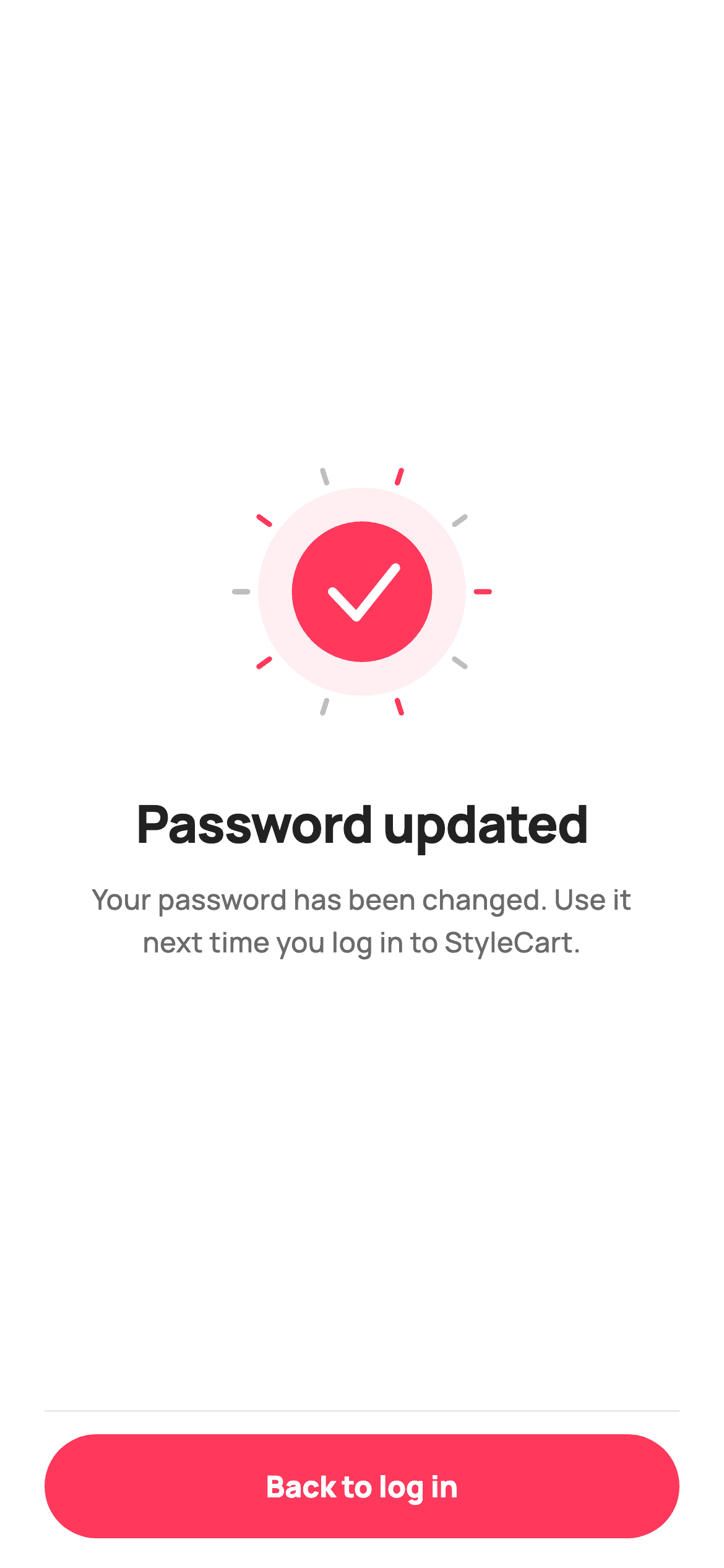
The screen that confirms a password change has one job, and it should feel like a small celebration. This tutorial builds StyleCart's password-updated confirmation in Flutter — a 140px check badge that pops in on an easeOutBack curve, ringed by ten alternating confetti ticks over a soft halo, above a headline, a reassuring line and a pinned 'Back to log in' pill. The whole hero is drawn with CustomPainter and animated by a single ScaleTransition.
Watch the Flutter UI walkthrough
A short screen recording of Password Updated running, if you'd rather see it before you read the code. The written tutorial below covers everything in it.
Can't see the video? Watch it on YouTube.
What you'll build
- ✓A success hero that scales in with an overshoot curve, so it settles rather than simply appearing
- ✓A confetti burst drawn as ten radial ticks alternating between two colours around a check badge
- ✓A centred content block that stays vertically balanced using Expanded rather than fixed spacing
- ✓A footer CTA separated by a hairline that appears only above the button, not across the page
Step-by-step build
Create the file
Add a new file at lib/ecom_auth_reset_success/ecom_auth_reset_success_screen.dart in your Flutter project.
Register the bundled fonts
No external packages — this is pure Flutter. It does bundle its design font (Manrope), so drop the font file into fonts/ and declare it in pubspec.yaml:
flutter:
  fonts:
    - family: Manrope
      fonts:
- asset: fonts/Manrope-Regular.ttfBuild it, piece by piece
Here's how the screen goes together. Each block below is a real slice of the code with a plain-English explanation — paste them in order, or grab the whole file from the next section.
The animation controller and its overshoot curve
import 'dart:math' as math;

import 'package:flutter/material.dart';

/// StyleCart — Password Updated.
///
/// Success confirmation after a password reset: a painted check-burst hero and a
/// "Back to log in" CTA. Self-contained per CONVENTIONS.md: pure Flutter, bundled
/// Manrope, inline Airbnb-style tokens, own light theme + SafeArea. The success art
/// is a CustomPainter (no asset, no emoji glyph). Exposes a callback only — the
/// gallery wires navigation.
class EcomAuthResetSuccessScreen extends StatefulWidget {
  const EcomAuthResetSuccessScreen({super.key, this.onBackToLogin});

  /// Tapped "Back to log in".
  final VoidCallback? onBackToLogin;

  @override
  State<EcomAuthResetSuccessScreen> createState() =>
      _EcomAuthResetSuccessScreenState();
}

class _EcomAuthResetSuccessScreenState extends State<EcomAuthResetSuccessScreen>
    with SingleTickerProviderStateMixin {
  static const String _font = 'Manrope';
  static const Color _canvas = Color(0xFFFFFFFF);
  static const Color _ink = Color(0xFF222222);
  static const Color _muted = Color(0xFF6A6A6A);
  static const Color _brand = Color(0xFFFF385C);
  static const Color _hairline = Color(0xFFEBEBEB);

  late final AnimationController _controller = AnimationController(
    vsync: this,
    duration: const Duration(milliseconds: 700),
  )..forward();
  late final Animation<double> _pop = CurvedAnimation(
    parent: _controller,
    curve: Curves.easeOutBack,
  );

  @override
  void dispose() {
    _controller.dispose();
    super.dispose();
  }
The screen is stateful purely to own an animation, and mixes in `SingleTickerProviderStateMixin` to supply the `vsync`. The controller is declared with `late final` and a trailing `..forward()` cascade, so it's created and started in one expression the first time it's read — no initState needed. Its 700ms output is wrapped in a `CurvedAnimation` using `Curves.easeOutBack`, which is the important choice: easeOutBack overshoots past 1.0 before settling back, so the badge grows slightly too large and springs back. That tiny overshoot is what reads as celebratory rather than mechanical. `dispose()` disposes the controller, which is mandatory.
Centring the hero with Expanded
  @override
  Widget build(BuildContext context) {
    return Theme(
      data: ThemeData.light(useMaterial3: true),
      child: Scaffold(
        backgroundColor: _canvas,
        body: SafeArea(
          child: Padding(
            padding: const EdgeInsets.fromLTRB(24, 8, 24, 16),
            child: Column(
              children: <Widget>[
                Expanded(
                  child: Column(
                    mainAxisAlignment: MainAxisAlignment.center,
                    children: <Widget>[
                      ScaleTransition(
                        scale: _pop,
                        child: SizedBox(
                          width: 140,
                          height: 140,
                          child: CustomPaint(painter: _CheckBurstPainter()),
                        ),
                      ),
                      const SizedBox(height: 34),
                      const Text(
                        'Password updated',
                        textAlign: TextAlign.center,
                        style: TextStyle(
                          fontFamily: _font,
                          fontSize: 28,
                          fontWeight: FontWeight.w800,
                          letterSpacing: -0.6,
                          color: _ink,
                        ),
                      ),
                      const SizedBox(height: 10),
                      const Padding(
                        padding: EdgeInsets.symmetric(horizontal: 12),
                        child: Text(
                          'Your password has been changed. Use it next time you log in to StyleCart.',
                          textAlign: TextAlign.center,
                          style: TextStyle(
                            fontFamily: _font,
                            fontSize: 15,
                            height: 1.5,
                            fontWeight: FontWeight.w500,
                            color: _muted,
                          ),
                        ),
                      ),
                    ],
                  ),
                ),
The outer Column has two children: an `Expanded` holding the content and the footer below it. Because the Expanded absorbs all leftover height and its inner Column uses `mainAxisAlignment: MainAxisAlignment.center`, the badge and text stay optically centred in the space above the button on any device — no MediaQuery, no hard-coded top padding. The badge itself is wrapped in `ScaleTransition(scale: _pop, ...)`, which is the cheapest way to animate size: it applies a transform during paint rather than triggering a layout pass on every frame. The headline is 28px w800 with `-0.6` letterSpacing, and the body line sets `height: 1.5` with extra horizontal padding so it wraps to a comfortable measure rather than running the full width.
The footer and its single hairline
                Container(
                  padding: const EdgeInsets.only(top: 12),
                  decoration: const BoxDecoration(
                    border: Border(top: BorderSide(color: _hairline)),
                  ),
                  child: SizedBox(
                    height: 56,
                    width: double.infinity,
                    child: FilledButton(
                      onPressed: widget.onBackToLogin,
                      style: FilledButton.styleFrom(
                        backgroundColor: _brand,
                        foregroundColor: _canvas,
                        shape: const StadiumBorder(),
                        textStyle: const TextStyle(
                          fontFamily: _font,
                          fontSize: 16,
                          fontWeight: FontWeight.w800,
                        ),
                      ),
                      child: const Text('Back to log in'),
                    ),
                  ),
                ),
              ],
            ),
          ),
        ),
      ),
    );
  }
}
The CTA sits in a Container whose decoration is a `Border(top: BorderSide(color: _hairline))` — a top edge only, so the rule appears above the button and nowhere else. Note the padding is `EdgeInsets.only(top: 12)`, which puts space between the rule and the button while the outer Padding on the Scaffold body already handles the screen margins. The button is a 56px full-width FilledButton in the coral brand colour with a `StadiumBorder()` for the fully-rounded pill. It's the only interactive element on the screen, which is correct for a terminal confirmation — anything else invites hesitation.
The halo and the confetti burst
/// Paints a brand check badge inside a soft halo, ringed by a celebratory burst
/// of brand/ink confetti ticks. Pure vector — the success "empty-art" hero.
class _CheckBurstPainter extends CustomPainter {
  @override
  void paint(Canvas c, Size size) {
    const Color brand = Color(0xFFFF385C);
    const Color ink = Color(0xFF222222);
    final double w = size.width;
    final Offset center = Offset(w / 2, w / 2);
    final double r = w * 0.27;

    // Soft halo.
    c.drawCircle(center, w * 0.40, Paint()..color = brand.withValues(alpha: 0.08));

    // Confetti burst ticks.
    const int ticks = 10;
    for (int i = 0; i < ticks; i++) {
      final double a = (i / ticks) * 2 * math.pi;
      final double inner = w * 0.44;
      final double outer = w * 0.49;
      final Offset p1 =
          center + Offset(inner * math.cos(a), inner * math.sin(a));
      final Offset p2 =
          center + Offset(outer * math.cos(a), outer * math.sin(a));
      c.drawLine(
        p1,
        p2,
        Paint()
          ..color = i.isEven ? brand : ink.withValues(alpha: 0.30)
          ..strokeWidth = w * 0.02
          ..strokeCap = StrokeCap.round,
      );
    }
The painter works outward-in. First a halo: a circle at 40% of the width filled with the brand at 8% opacity, faint enough to suggest a glow without competing with the badge. Then the burst — a loop of ten ticks where each angle is `(i / ticks) * 2 * math.pi`, dividing the full circle evenly. Each tick is a short line drawn between two radii, 44% and 49% of the width, so all ten sit in a ring outside the badge. The detail that makes it look designed rather than generated is `i.isEven ? brand : ink.withValues(alpha: 0.30)` — alternating coral and translucent dark ticks, so the burst has rhythm instead of being a uniform starburst. Round stroke caps soften each tick's ends.
The check badge
    // Badge.
    c.drawCircle(center, r, Paint()..color = brand);
    final Path check = Path()
      ..moveTo(center.dx - r * 0.42, center.dy)
      ..lineTo(center.dx - r * 0.08, center.dy + r * 0.36)
      ..lineTo(center.dx + r * 0.48, center.dy - r * 0.34);
    c.drawPath(
      check,
      Paint()
        ..style = PaintingStyle.stroke
        ..strokeWidth = w * 0.035
        ..strokeCap = StrokeCap.round
        ..strokeJoin = StrokeJoin.round
        ..color = Colors.white,
    );
  }

  @override
  bool shouldRepaint(_CheckBurstPainter oldDelegate) => false;
}
The badge is a solid coral circle at 27% of the width, with the tick drawn on top as a three-point Path: down-left, to the low middle, then up-right past the centre. Those proportions matter — the right arm extends to `r * 0.48` while the left only reaches `r * 0.42`, and the elbow sits below centre, which is what makes it read as a checkmark rather than a symmetrical V. The stroke is `w * 0.035` with round caps and joins, so the corner at the elbow is rounded rather than mitred. Every dimension derives from `w`, so the whole hero scales if you change the 140px SizedBox. `shouldRepaint` returns false because the drawing never varies — the animation happens in the widget layer via ScaleTransition, not in the painter.
Full code
The complete, ready-to-paste source. Free to use in your projects — one click copies it all.
import 'dart:math' as math;

import 'package:flutter/material.dart';

/// StyleCart — Password Updated.
///
/// Success confirmation after a password reset: a painted check-burst hero and a
/// "Back to log in" CTA. Self-contained per CONVENTIONS.md: pure Flutter, bundled
/// Manrope, inline Airbnb-style tokens, own light theme + SafeArea. The success art
/// is a CustomPainter (no asset, no emoji glyph). Exposes a callback only — the
/// gallery wires navigation.
class EcomAuthResetSuccessScreen extends StatefulWidget {
  const EcomAuthResetSuccessScreen({super.key, this.onBackToLogin});

  /// Tapped "Back to log in".
  final VoidCallback? onBackToLogin;

  @override
  State<EcomAuthResetSuccessScreen> createState() =>
      _EcomAuthResetSuccessScreenState();
}

class _EcomAuthResetSuccessScreenState extends State<EcomAuthResetSuccessScreen>
    with SingleTickerProviderStateMixin {
  static const String _font = 'Manrope';
  static const Color _canvas = Color(0xFFFFFFFF);
  static const Color _ink = Color(0xFF222222);
  static const Color _muted = Color(0xFF6A6A6A);
  static const Color _brand = Color(0xFFFF385C);
  static const Color _hairline = Color(0xFFEBEBEB);

  late final AnimationController _controller = AnimationController(
    vsync: this,
    duration: const Duration(milliseconds: 700),
  )..forward();
  late final Animation<double> _pop = CurvedAnimation(
    parent: _controller,
    curve: Curves.easeOutBack,
  );

  @override
  void dispose() {
    _controller.dispose();
    super.dispose();
  }

  @override
  Widget build(BuildContext context) {
    return Theme(
      data: ThemeData.light(useMaterial3: true),
      child: Scaffold(
        backgroundColor: _canvas,
        body: SafeArea(
          child: Padding(
            padding: const EdgeInsets.fromLTRB(24, 8, 24, 16),
            child: Column(
              children: <Widget>[
                Expanded(
                  child: Column(
                    mainAxisAlignment: MainAxisAlignment.center,
                    children: <Widget>[
                      ScaleTransition(
                        scale: _pop,
                        child: SizedBox(
                          width: 140,
                          height: 140,
                          child: CustomPaint(painter: _CheckBurstPainter()),
                        ),
                      ),
                      const SizedBox(height: 34),
                      const Text(
                        'Password updated',
                        textAlign: TextAlign.center,
                        style: TextStyle(
                          fontFamily: _font,
                          fontSize: 28,
                          fontWeight: FontWeight.w800,
                          letterSpacing: -0.6,
                          color: _ink,
                        ),
                      ),
                      const SizedBox(height: 10),
                      const Padding(
                        padding: EdgeInsets.symmetric(horizontal: 12),
                        child: Text(
                          'Your password has been changed. Use it next time you log in to StyleCart.',
                          textAlign: TextAlign.center,
                          style: TextStyle(
                            fontFamily: _font,
                            fontSize: 15,
                            height: 1.5,
                            fontWeight: FontWeight.w500,
                            color: _muted,
                          ),
                        ),
                      ),
                    ],
                  ),
                ),
                Container(
                  padding: const EdgeInsets.only(top: 12),
                  decoration: const BoxDecoration(
                    border: Border(top: BorderSide(color: _hairline)),
                  ),
                  child: SizedBox(
                    height: 56,
                    width: double.infinity,
                    child: FilledButton(
                      onPressed: widget.onBackToLogin,
                      style: FilledButton.styleFrom(
                        backgroundColor: _brand,
                        foregroundColor: _canvas,
                        shape: const StadiumBorder(),
                        textStyle: const TextStyle(
                          fontFamily: _font,
                          fontSize: 16,
                          fontWeight: FontWeight.w800,
                        ),
                      ),
                      child: const Text('Back to log in'),
                    ),
                  ),
                ),
              ],
            ),
          ),
        ),
      ),
    );
  }
}

/// Paints a brand check badge inside a soft halo, ringed by a celebratory burst
/// of brand/ink confetti ticks. Pure vector — the success "empty-art" hero.
class _CheckBurstPainter extends CustomPainter {
  @override
  void paint(Canvas c, Size size) {
    const Color brand = Color(0xFFFF385C);
    const Color ink = Color(0xFF222222);
    final double w = size.width;
    final Offset center = Offset(w / 2, w / 2);
    final double r = w * 0.27;

    // Soft halo.
    c.drawCircle(center, w * 0.40, Paint()..color = brand.withValues(alpha: 0.08));

    // Confetti burst ticks.
    const int ticks = 10;
    for (int i = 0; i < ticks; i++) {
      final double a = (i / ticks) * 2 * math.pi;
      final double inner = w * 0.44;
      final double outer = w * 0.49;
      final Offset p1 =
          center + Offset(inner * math.cos(a), inner * math.sin(a));
      final Offset p2 =
          center + Offset(outer * math.cos(a), outer * math.sin(a));
      c.drawLine(
        p1,
        p2,
        Paint()
          ..color = i.isEven ? brand : ink.withValues(alpha: 0.30)
          ..strokeWidth = w * 0.02
          ..strokeCap = StrokeCap.round,
      );
    }

    // Badge.
    c.drawCircle(center, r, Paint()..color = brand);
    final Path check = Path()
      ..moveTo(center.dx - r * 0.42, center.dy)
      ..lineTo(center.dx - r * 0.08, center.dy + r * 0.36)
      ..lineTo(center.dx + r * 0.48, center.dy - r * 0.34);
    c.drawPath(
      check,
      Paint()
        ..style = PaintingStyle.stroke
        ..strokeWidth = w * 0.035
        ..strokeCap = StrokeCap.round
        ..strokeJoin = StrokeJoin.round
        ..color = Colors.white,
    );
  }

  @override
  bool shouldRepaint(_CheckBurstPainter oldDelegate) => false;
}
Plus bundled 5 binary assets (fonts/images). The CLI and MCP install those for you automatically.
Two faster ways to add it
Copy-paste works, but you can skip it entirely.
1. FlutterKit CLI
One command drops this screen — and its fonts — straight into your project.
$ flutterkit add ecom-auth-reset-success2. AI agent (MCP)
Connect FlutterKit's MCP server in Claude or Cursor and just ask your agent to install ecom-auth-reset-success — it fetches and writes the files for you.
FAQ
Is this Flutter password reset success screen free to use?
Yes. The complete Dart source on this page is free for personal and commercial projects. Copy it directly, install it with the FlutterKit CLI (flutterkit add ecom-auth-reset-success), or have an AI agent add it for you over MCP.
Can I reuse this as a generic success screen?
Yes — it's built for it. The only screen-specific parts are the two strings and the button label, so add constructor fields for the title, body and CTA text and the same hero serves order confirmations, payment success or profile updates. _CheckBurstPainter takes no arguments at all, so it drops into any screen unchanged; lift its two `const Color` locals into fields if you need it in a different palette.
Why animate with ScaleTransition instead of AnimatedContainer?
ScaleTransition applies a transform during the paint phase, so it never triggers layout on any of the 60 frames — whereas animating a size with AnimatedContainer relayouts each frame. For a one-shot hero pop that difference is small, but the transform approach is the right habit, and it's also what lets the easeOutBack curve overshoot past the final size without the surrounding Column reflowing.
Which Flutter version does it target?
It uses Color.withValues() and super parameters, so Flutter 3.22+ (Dart 3). On an older SDK, change the two withValues(alpha: ...) calls in the painter to withOpacity(...). The only bundled asset is the Manrope font, registered in pubspec.yaml as shown in step 2 — the hero is drawn, not loaded.


