How to Build a Wallet Backup Reminder Screen in Flutter (Full Code + Preview)
In a self-custodial wallet nobody can reset a lost recovery phrase, so the backup nag is the one warning that has to land before it is needed. This tutorial builds Aurum's back-up-now screen in Flutter: a painted amber shield with a blurred glow, a red callout spelling out that lost funds are unrecoverable, a custom acknowledgement checkbox, and a Back up now button that stays grey and inert until the box is ticked, with a softer Remind me later exit beneath.
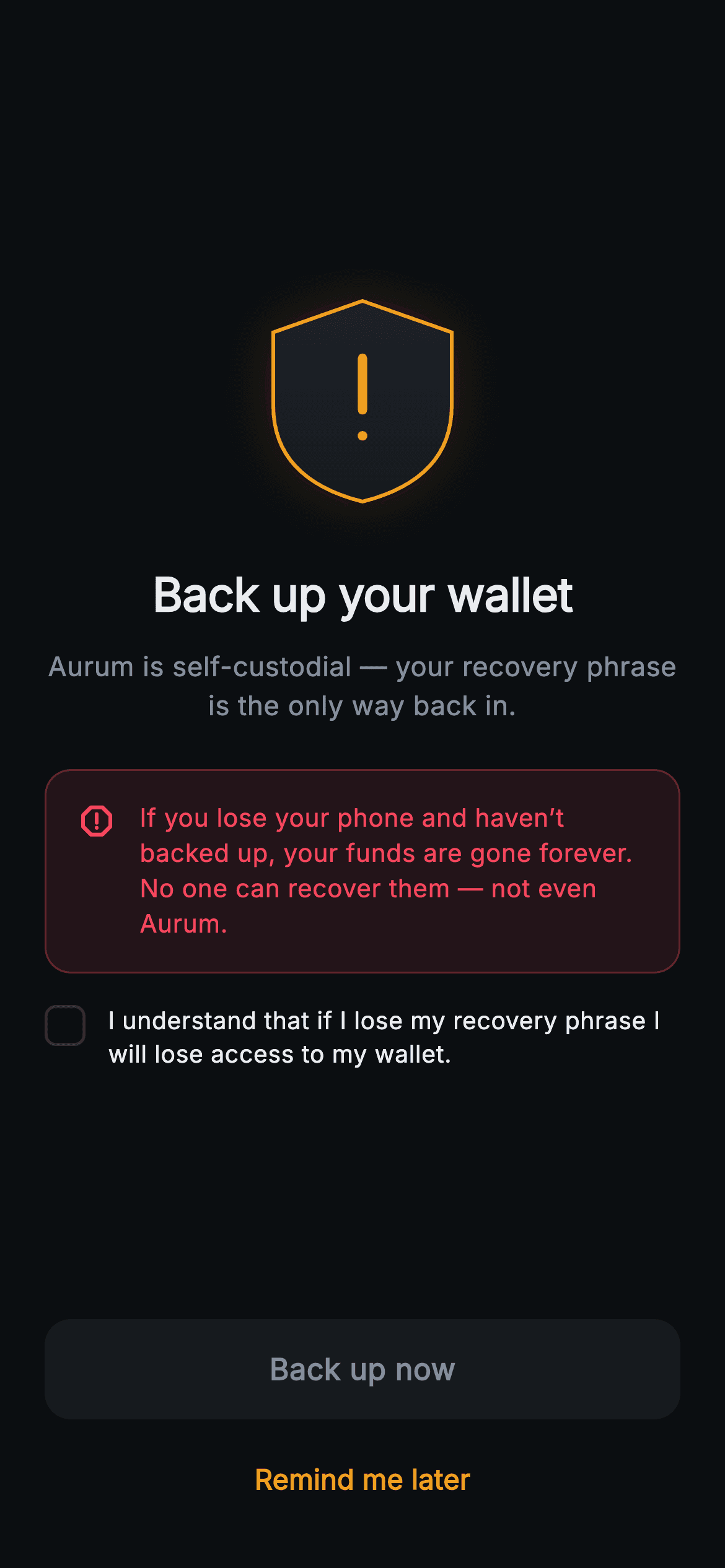
What you'll build
- ✓A shield-and-exclamation warning badge painted with Path, a MaskFilter.blur glow, a gradient fill and a 2px amber outline
- ✓A red-tinted risk callout that states the worst case in plain words, with the icon pinned to the first line of text
- ✓A hand-built _AckRow checkbox whose whole row, label included, is one tap target
- ✓A primary button driven by a single _acked flag: surface grey with a null onTap until ticked, brand amber and live afterwards
- ✓A Remind me later TextButton that is never gated, so the user can always defer without agreeing to anything
Step-by-step build
Create the file
Add a new file at lib/web3_security_backup_reminder/web3_security_backup_reminder_screen.dart in your Flutter project.
Register the bundled fonts
No external packages — this is pure Flutter. It does bundle its design font (Inter), so drop the font file into fonts/ and declare it in pubspec.yaml:
flutter:
  fonts:
    - family: Inter
      fonts:
- asset: fonts/Inter-Regular.ttfBuild it, piece by piece
Here's how the screen goes together. Each block below is a real slice of the code with a plain-English explanation — paste them in order, or grab the whole file from the next section.
One boolean of state and two different ambers
import 'package:flutter/material.dart';

/// Web3 security — Back Up Now. A risk-warning screen with a painted shield,
/// "no recovery if lost" messaging and back-up-vs-later actions, gated by an
/// acknowledgement checkbox. Self-contained per CONVENTIONS.md: pure Flutter,
/// bundled Inter font, painted shield (no network image), forced dark theme so
/// it renders standalone as a route.
class Web3SecurityBackupReminderScreen extends StatefulWidget {
  const Web3SecurityBackupReminderScreen({
    super.key,
    this.onBackUp,
    this.onLater,
  });

  final VoidCallback? onBackUp;
  final VoidCallback? onLater;

  @override
  State<Web3SecurityBackupReminderScreen> createState() =>
      _Web3SecurityBackupReminderScreenState();
}

class _Web3SecurityBackupReminderScreenState
    extends State<Web3SecurityBackupReminderScreen> {
  static const String _font = 'Inter';
  static const Color _bg = Color(0xFF0B0E11);
  static const Color _surface = Color(0xFF161A1E);
  static const Color _brand = Color(0xFFF0B90B);
  static const Color _warn = Color(0xFFF0A020);
  static const Color _down = Color(0xFFF6465D);
  static const Color _text = Color(0xFFEAECEF);
  static const Color _muted = Color(0xFF848E9C);
  static const Color _hairline = Color(0xFF2B3139);

  bool _acked = false;
The screen exposes only `onBackUp` and `onLater`, yet it is a `StatefulWidget` because it owns one thing the host does not care about: `bool _acked = false`, the acknowledgement tick. Nothing about it is persisted, so every fresh push of the route starts unticked. The palette is worth reading closely because it carries three warm colours with separate jobs. `_brand` `#F0B90B` is the wallet's gold, reserved for the action you want taken. `_warn` `#F0A020` is a deeper orange-amber used for the shield and the deferral link, so caution and branding never blur together. `_down` `#F6465D` is the market-loss red, borrowed here for the risk statement because it already means 'you lose money' in this app.
A centred stack: shield, headline, one-line reason
  @override
  Widget build(BuildContext context) {
    return Theme(
      data: ThemeData.dark(useMaterial3: true),
      child: Scaffold(
        backgroundColor: _bg,
        body: SafeArea(
          child: Padding(
            padding: const EdgeInsets.fromLTRB(24, 24, 24, 24),
            child: Column(
              crossAxisAlignment: CrossAxisAlignment.stretch,
              children: <Widget>[
                const Spacer(),
                Center(
                  child: SizedBox(
                    width: 104,
                    height: 116,
                    child: CustomPaint(painter: _ShieldAlertPainter()),
                  ),
                ),
                const SizedBox(height: 28),
                const Text(
                  'Back up your wallet',
                  textAlign: TextAlign.center,
                  style: TextStyle(
                    fontFamily: _font,
                    fontSize: 25,
                    fontWeight: FontWeight.w700,
                    letterSpacing: -0.3,
                    color: _text,
                  ),
                ),
                const SizedBox(height: 10),
                const Text(
                  'Aurum is self-custodial — your recovery phrase is the only '
                  'way back in.',
                  textAlign: TextAlign.center,
                  style: TextStyle(
                    fontFamily: _font,
                    fontSize: 14.5,
                    height: 1.45,
                    color: _muted,
                  ),
                ),
Inside the usual forced-dark `Theme`, a stretched `Column` opens with `const Spacer()` and later closes the content with a second one, splitting the free height so the warning sits mid-screen and the actions drop to the thumb zone. The shield is a `CustomPaint` in a `SizedBox` of 104 by 116 — taller than wide because a shield is, and the painter derives every point from that box. The headline 'Back up your wallet' is 25px `w700` with `-0.3` tracking; the muted 14.5px subline then gives the reason in a single clause: 'your recovery phrase is the only way back in'. Note there is no scroll view here, so very large accessibility text on a short phone can overflow; wrapping the Column in a `SingleChildScrollView` with a `ConstrainedBox` fixes it if you need that.
The red callout that names the worst case
                const SizedBox(height: 24),
                Container(
                  padding: const EdgeInsets.all(16),
                  decoration: BoxDecoration(
                    color: _down.withValues(alpha: 0.10),
                    borderRadius: BorderRadius.circular(14),
                    border: Border.all(color: _down.withValues(alpha: 0.3)),
                  ),
                  child: const Row(
                    crossAxisAlignment: CrossAxisAlignment.start,
                    children: <Widget>[
                      Icon(Icons.report_gmailerrorred_rounded,
                          size: 22, color: _down),
                      SizedBox(width: 12),
                      Expanded(
                        child: Text(
                          'If you lose your phone and haven’t backed up, your '
                          'funds are gone forever. No one can recover them — '
                          'not even Aurum.',
                          style: TextStyle(
                            fontFamily: _font,
                            fontSize: 13.5,
                            height: 1.4,
                            fontWeight: FontWeight.w500,
                            color: _down,
                          ),
                        ),
                      ),
                    ],
                  ),
                ),
The callout is a plain `Container` with 16px padding, a 14px radius, a fill of `_down.withValues(alpha: 0.10)` and a border of the same red at 0.3 — a tinted panel whose edge reads clearly on near-black without a shadow. Inside, a `const Row` uses `CrossAxisAlignment.start` so the 22px `Icons.report_gmailerrorred_rounded` stays level with the first line as the three-line message wraps inside `Expanded`. The copy is the screen's real argument: lose the phone without a backup and 'your funds are gone forever. No one can recover them — not even Aurum.' Naming the company as powerless is deliberate; users assume support can reset anything, and this sentence removes that safety net in their head. The text is `w500` in full `_down` red so it outweighs the muted subline above.
The acknowledgement gate on the primary button
                const SizedBox(height: 16),
                _AckRow(
                  checked: _acked,
                  onTap: () => setState(() => _acked = !_acked),
                ),
                const Spacer(),
                SizedBox(
                  height: 54,
                  child: Material(
                    color: _acked ? _brand : _surface,
                    borderRadius: BorderRadius.circular(14),
                    child: InkWell(
                      borderRadius: BorderRadius.circular(14),
                      onTap: _acked ? widget.onBackUp : null,
                      child: Center(
                        child: Text(
                          'Back up now',
                          style: TextStyle(
                            fontFamily: _font,
                            fontSize: 16,
                            fontWeight: FontWeight.w600,
                            color: _acked ? _bg : _muted,
                          ),
                        ),
                      ),
                    ),
                  ),
                ),
`_AckRow` receives `checked: _acked` and an `onTap` that runs `setState(() => _acked = !_acked)`, so ticking and unticking both work and the button follows either way. The button is a 54px `SizedBox` around `Material` plus `InkWell`, and `_acked` drives three properties at once: the Material `color` swaps between `_surface` and `_brand`, the label colour swaps between `_muted` and `_bg`, and the InkWell's `onTap` is `_acked ? widget.onBackUp : null`. Passing null is the real disable — the InkWell shows no ripple and nothing fires — while the colour change is only the visual signal of it. The point of the gate is friction: the user has to read and agree to the consequence before the main action unlocks, which makes the warning impossible to skim past.
Remind me later, deliberately left ungated
                const SizedBox(height: 8),
                SizedBox(
                  height: 48,
                  child: TextButton(
                    onPressed: widget.onLater,
                    child: const Text(
                      'Remind me later',
                      style: TextStyle(
                        fontFamily: _font,
                        fontSize: 15,
                        fontWeight: FontWeight.w600,
                        color: _warn,
                      ),
                    ),
                  ),
                ),
              ],
            ),
          ),
        ),
      ),
    );
  }
}
Below an 8px gap sits a 48px `TextButton` reading 'Remind me later', wired straight to `widget.onLater` with no reference to `_acked`. That is the right call: requiring someone to agree that they will lose access just to postpone would be a dark pattern, and a user who feels trapped tends to kill the app instead. The ranking between the two actions is carried by fill — a solid 54px amber block versus a frameless text link — but the link is still coloured `_warn` rather than muted grey, so deferring never looks like a neutral or safe choice. If `onLater` is left null the TextButton disables itself automatically, which is useful if your product decides backup is mandatory.
_AckRow: a checkbox drawn from a Container
class _AckRow extends StatelessWidget {
  const _AckRow({required this.checked, required this.onTap});

  final bool checked;
  final VoidCallback onTap;

  @override
  Widget build(BuildContext context) {
    return GestureDetector(
      onTap: onTap,
      behavior: HitTestBehavior.opaque,
      child: Row(
        crossAxisAlignment: CrossAxisAlignment.start,
        children: <Widget>[
          Container(
            width: 22,
            height: 22,
            margin: const EdgeInsets.only(top: 1),
            decoration: BoxDecoration(
              color: checked
                  ? _Web3SecurityBackupReminderScreenState._brand
                  : Colors.transparent,
              borderRadius: BorderRadius.circular(6),
              border: Border.all(
                color: checked
                    ? _Web3SecurityBackupReminderScreenState._brand
                    : _Web3SecurityBackupReminderScreenState._hairline,
                width: 1.6,
              ),
            ),
            child: checked
                ? const Icon(Icons.check_rounded,
                    size: 15, color: _Web3SecurityBackupReminderScreenState._bg)
                : null,
          ),
          const SizedBox(width: 12),
          const Expanded(
            child: Text(
              'I understand that if I lose my recovery phrase I will lose '
              'access to my wallet.',
              style: TextStyle(
                fontFamily: _Web3SecurityBackupReminderScreenState._font,
                fontSize: 13,
                height: 1.4,
                color: _Web3SecurityBackupReminderScreenState._text,
              ),
            ),
          ),
        ],
      ),
    );
  }
}
Rather than a Material `Checkbox`, `_AckRow` builds its own 22px box with a 6px radius and a 1.6px border, so it matches the screen's rounded corners exactly. Unchecked it is transparent with a `_hairline` border; checked, both fill and border become `_brand` and an `Icons.check_rounded` at 15px appears in `_bg`, a dark tick on gold. `margin: EdgeInsets.only(top: 1)` nudges the box down to sit level with the first line of the 13px label. The whole Row is wrapped in a `GestureDetector` with `HitTestBehavior.opaque`, which makes the gap between box and text tappable too — without it, taps landing on empty space inside the row would fall through. Colours are read as `_Web3SecurityBackupReminderScreenState._brand` and friends, so the palette is still defined only once.
Painting the shield: outline path, glow, fill, stroke, mark
class _ShieldAlertPainter extends CustomPainter {
  const _ShieldAlertPainter();

  @override
  void paint(Canvas canvas, Size size) {
    final double w = size.width, h = size.height;
    final Offset c = Offset(w / 2, h * 0.5);
    final Path shield = Path()
      ..moveTo(c.dx, 4)
      ..lineTo(w - 4, h * 0.18)
      ..lineTo(w - 4, h * 0.52)
      ..quadraticBezierTo(w - 4, h * 0.86, c.dx, h - 4)
      ..quadraticBezierTo(4, h * 0.86, 4, h * 0.52)
      ..lineTo(4, h * 0.18)
      ..close();

    canvas.drawPath(
      shield,
      Paint()
        ..color = const Color(0xFFF0A020).withValues(alpha: 0.18)
        ..maskFilter = const MaskFilter.blur(BlurStyle.normal, 14),
    );
    canvas.drawPath(
      shield,
      Paint()
        ..shader = const LinearGradient(
          begin: Alignment.topCenter,
          end: Alignment.bottomCenter,
          colors: <Color>[Color(0xFF1E2329), Color(0xFF161A1E)],
        ).createShader(shield.getBounds()),
    );
    canvas.drawPath(
      shield,
      Paint()
        ..style = PaintingStyle.stroke
        ..strokeWidth = 2
        ..color = const Color(0xFFF0A020),
    );

    // Exclamation mark.
    final Paint mark = Paint()
      ..style = PaintingStyle.stroke
      ..strokeWidth = 5
      ..strokeCap = StrokeCap.round
      ..color = const Color(0xFFF0A020);
    canvas.drawLine(
        Offset(c.dx, h * 0.30), Offset(c.dx, h * 0.54), mark);
    canvas.drawCircle(
      Offset(c.dx, h * 0.66),
      2.6,
      Paint()..color = const Color(0xFFF0A020),
    );
  }

  @override
  bool shouldRepaint(_ShieldAlertPainter oldDelegate) => false;
}
`_ShieldAlertPainter` builds one `Path` and draws it three times. The outline starts at the top centre `(w/2, 4)`, runs to the shoulders at 18% height, drops straight down the sides to 52%, then two `quadraticBezierTo` calls with control points at 86% curve inward to the point at `h - 4`. The 4px inset keeps the 2px stroke inside the box. Pass one paints the path in `#F0A020` at 0.18 alpha through `MaskFilter.blur(BlurStyle.normal, 14)` — the soft halo, which spills past the box because CustomPaint does not clip. Pass two fills it with a top-to-bottom `#1E2329` to `#161A1E` gradient sized from `shield.getBounds()`, giving a faint domed face. Pass three strokes the amber outline. The exclamation is a 5px round-capped line from 30% to 54% height plus a 2.6px-radius dot at 66%, the radius chosen to match the stroke's thickness. The amber is hardcoded rather than read from `_warn`, so update both if you rebrand.
Full code
The complete, ready-to-paste source. Free to use in your projects — one click copies it all.
import 'package:flutter/material.dart';

/// Web3 security — Back Up Now. A risk-warning screen with a painted shield,
/// "no recovery if lost" messaging and back-up-vs-later actions, gated by an
/// acknowledgement checkbox. Self-contained per CONVENTIONS.md: pure Flutter,
/// bundled Inter font, painted shield (no network image), forced dark theme so
/// it renders standalone as a route.
class Web3SecurityBackupReminderScreen extends StatefulWidget {
  const Web3SecurityBackupReminderScreen({
    super.key,
    this.onBackUp,
    this.onLater,
  });

  final VoidCallback? onBackUp;
  final VoidCallback? onLater;

  @override
  State<Web3SecurityBackupReminderScreen> createState() =>
      _Web3SecurityBackupReminderScreenState();
}

class _Web3SecurityBackupReminderScreenState
    extends State<Web3SecurityBackupReminderScreen> {
  static const String _font = 'Inter';
  static const Color _bg = Color(0xFF0B0E11);
  static const Color _surface = Color(0xFF161A1E);
  static const Color _brand = Color(0xFFF0B90B);
  static const Color _warn = Color(0xFFF0A020);
  static const Color _down = Color(0xFFF6465D);
  static const Color _text = Color(0xFFEAECEF);
  static const Color _muted = Color(0xFF848E9C);
  static const Color _hairline = Color(0xFF2B3139);

  bool _acked = false;

  @override
  Widget build(BuildContext context) {
    return Theme(
      data: ThemeData.dark(useMaterial3: true),
      child: Scaffold(
        backgroundColor: _bg,
        body: SafeArea(
          child: Padding(
            padding: const EdgeInsets.fromLTRB(24, 24, 24, 24),
            child: Column(
              crossAxisAlignment: CrossAxisAlignment.stretch,
              children: <Widget>[
                const Spacer(),
                Center(
                  child: SizedBox(
                    width: 104,
                    height: 116,
                    child: CustomPaint(painter: _ShieldAlertPainter()),
                  ),
                ),
                const SizedBox(height: 28),
                const Text(
                  'Back up your wallet',
                  textAlign: TextAlign.center,
                  style: TextStyle(
                    fontFamily: _font,
                    fontSize: 25,
                    fontWeight: FontWeight.w700,
                    letterSpacing: -0.3,
                    color: _text,
                  ),
                ),
                const SizedBox(height: 10),
                const Text(
                  'Aurum is self-custodial — your recovery phrase is the only '
                  'way back in.',
                  textAlign: TextAlign.center,
                  style: TextStyle(
                    fontFamily: _font,
                    fontSize: 14.5,
                    height: 1.45,
                    color: _muted,
                  ),
                ),
                const SizedBox(height: 24),
                Container(
                  padding: const EdgeInsets.all(16),
                  decoration: BoxDecoration(
                    color: _down.withValues(alpha: 0.10),
                    borderRadius: BorderRadius.circular(14),
                    border: Border.all(color: _down.withValues(alpha: 0.3)),
                  ),
                  child: const Row(
                    crossAxisAlignment: CrossAxisAlignment.start,
                    children: <Widget>[
                      Icon(Icons.report_gmailerrorred_rounded,
                          size: 22, color: _down),
                      SizedBox(width: 12),
                      Expanded(
                        child: Text(
                          'If you lose your phone and haven’t backed up, your '
                          'funds are gone forever. No one can recover them — '
                          'not even Aurum.',
                          style: TextStyle(
                            fontFamily: _font,
                            fontSize: 13.5,
                            height: 1.4,
                            fontWeight: FontWeight.w500,
                            color: _down,
                          ),
                        ),
                      ),
                    ],
                  ),
                ),
                const SizedBox(height: 16),
                _AckRow(
                  checked: _acked,
                  onTap: () => setState(() => _acked = !_acked),
                ),
                const Spacer(),
                SizedBox(
                  height: 54,
                  child: Material(
                    color: _acked ? _brand : _surface,
                    borderRadius: BorderRadius.circular(14),
                    child: InkWell(
                      borderRadius: BorderRadius.circular(14),
                      onTap: _acked ? widget.onBackUp : null,
                      child: Center(
                        child: Text(
                          'Back up now',
                          style: TextStyle(
                            fontFamily: _font,
                            fontSize: 16,
                            fontWeight: FontWeight.w600,
                            color: _acked ? _bg : _muted,
                          ),
                        ),
                      ),
                    ),
                  ),
                ),
                const SizedBox(height: 8),
                SizedBox(
                  height: 48,
                  child: TextButton(
                    onPressed: widget.onLater,
                    child: const Text(
                      'Remind me later',
                      style: TextStyle(
                        fontFamily: _font,
                        fontSize: 15,
                        fontWeight: FontWeight.w600,
                        color: _warn,
                      ),
                    ),
                  ),
                ),
              ],
            ),
          ),
        ),
      ),
    );
  }
}

class _AckRow extends StatelessWidget {
  const _AckRow({required this.checked, required this.onTap});

  final bool checked;
  final VoidCallback onTap;

  @override
  Widget build(BuildContext context) {
    return GestureDetector(
      onTap: onTap,
      behavior: HitTestBehavior.opaque,
      child: Row(
        crossAxisAlignment: CrossAxisAlignment.start,
        children: <Widget>[
          Container(
            width: 22,
            height: 22,
            margin: const EdgeInsets.only(top: 1),
            decoration: BoxDecoration(
              color: checked
                  ? _Web3SecurityBackupReminderScreenState._brand
                  : Colors.transparent,
              borderRadius: BorderRadius.circular(6),
              border: Border.all(
                color: checked
                    ? _Web3SecurityBackupReminderScreenState._brand
                    : _Web3SecurityBackupReminderScreenState._hairline,
                width: 1.6,
              ),
            ),
            child: checked
                ? const Icon(Icons.check_rounded,
                    size: 15, color: _Web3SecurityBackupReminderScreenState._bg)
                : null,
          ),
          const SizedBox(width: 12),
          const Expanded(
            child: Text(
              'I understand that if I lose my recovery phrase I will lose '
              'access to my wallet.',
              style: TextStyle(
                fontFamily: _Web3SecurityBackupReminderScreenState._font,
                fontSize: 13,
                height: 1.4,
                color: _Web3SecurityBackupReminderScreenState._text,
              ),
            ),
          ),
        ],
      ),
    );
  }
}

class _ShieldAlertPainter extends CustomPainter {
  const _ShieldAlertPainter();

  @override
  void paint(Canvas canvas, Size size) {
    final double w = size.width, h = size.height;
    final Offset c = Offset(w / 2, h * 0.5);
    final Path shield = Path()
      ..moveTo(c.dx, 4)
      ..lineTo(w - 4, h * 0.18)
      ..lineTo(w - 4, h * 0.52)
      ..quadraticBezierTo(w - 4, h * 0.86, c.dx, h - 4)
      ..quadraticBezierTo(4, h * 0.86, 4, h * 0.52)
      ..lineTo(4, h * 0.18)
      ..close();

    canvas.drawPath(
      shield,
      Paint()
        ..color = const Color(0xFFF0A020).withValues(alpha: 0.18)
        ..maskFilter = const MaskFilter.blur(BlurStyle.normal, 14),
    );
    canvas.drawPath(
      shield,
      Paint()
        ..shader = const LinearGradient(
          begin: Alignment.topCenter,
          end: Alignment.bottomCenter,
          colors: <Color>[Color(0xFF1E2329), Color(0xFF161A1E)],
        ).createShader(shield.getBounds()),
    );
    canvas.drawPath(
      shield,
      Paint()
        ..style = PaintingStyle.stroke
        ..strokeWidth = 2
        ..color = const Color(0xFFF0A020),
    );

    // Exclamation mark.
    final Paint mark = Paint()
      ..style = PaintingStyle.stroke
      ..strokeWidth = 5
      ..strokeCap = StrokeCap.round
      ..color = const Color(0xFFF0A020);
    canvas.drawLine(
        Offset(c.dx, h * 0.30), Offset(c.dx, h * 0.54), mark);
    canvas.drawCircle(
      Offset(c.dx, h * 0.66),
      2.6,
      Paint()..color = const Color(0xFFF0A020),
    );
  }

  @override
  bool shouldRepaint(_ShieldAlertPainter oldDelegate) => false;
}
Plus bundled 1 binary asset (fonts/images). The CLI and MCP install those for you automatically.
Two faster ways to add it
Copy-paste works, but you can skip it entirely.
1. FlutterKit CLI
One command drops this screen — and its fonts — straight into your project.
$ flutterkit add web3-security-backup-reminder2. AI agent (MCP)
Connect FlutterKit's MCP server in Claude or Cursor and just ask your agent to install web3-security-backup-reminder — it fetches and writes the files for you.
FAQ
Can I ship this backup reminder in a commercial wallet app?
Yes. It is free for personal and commercial apps, with no licence key and no attribution. Copy the Dart from this page, add it with the FlutterKit CLI, or fetch it over MCP.
Do I need any packages or assets for the shield?
No. The screen imports only `package:flutter/material.dart`; the shield, glow and exclamation mark are all drawn by `_ShieldAlertPainter`, so there is no SVG or image file. The only bundled resource is the Inter font, which the code references through `fontFamily: 'Inter'`.
What is the minimum Flutter version?
Flutter 3.22 or later, because the callout and the shield glow use `Color.withValues(alpha: ...)`, and the constructor uses `super.key`. For an older SDK, replace each `withValues(alpha: x)` with `withOpacity(x)` and rewrite the constructor as `{Key? key, this.onBackUp, this.onLater}) : super(key: key)`.
How do I make the reminder actually come back later?
The widget only reports the choice; scheduling is yours. In `onLater`, save a timestamp (shared_preferences or your own store) and show the screen again on next launch once a day or so has passed, or before the first outgoing transaction. In `onBackUp`, navigate to your recovery-phrase reveal flow and clear the reminder only after the user has confirmed the words, not merely on tap.
Will screen readers announce the custom checkbox correctly?
Not as written. `_AckRow` is a GestureDetector over a Container, so TalkBack and VoiceOver read the label but not a checked state. Wrap it in `Semantics(checked: checked, onTap: onTap, child: ...)`, or swap the box for a Material `Checkbox` styled with `activeColor` and `side`, and the gate becomes fully accessible.


