How to Build a Crypto Price Alerts List Screen in Flutter (Full Code + Preview)
A trader who sets a price alert and can't find it again just deletes your app. This screen is the management hub for those alerts: an exchange-dark list where Bitcoin, Ethereum, Solana and Chainlink each get a card showing their above-or-below target in green or red, a live toggle to silence the alert without deleting it, and a 'New alert' FAB. You'll build it as a single self-contained Flutter file — typed alert model, tinted ticker badges with no logo assets, and setState-driven switches — ready to wire to any backend through four callbacks.
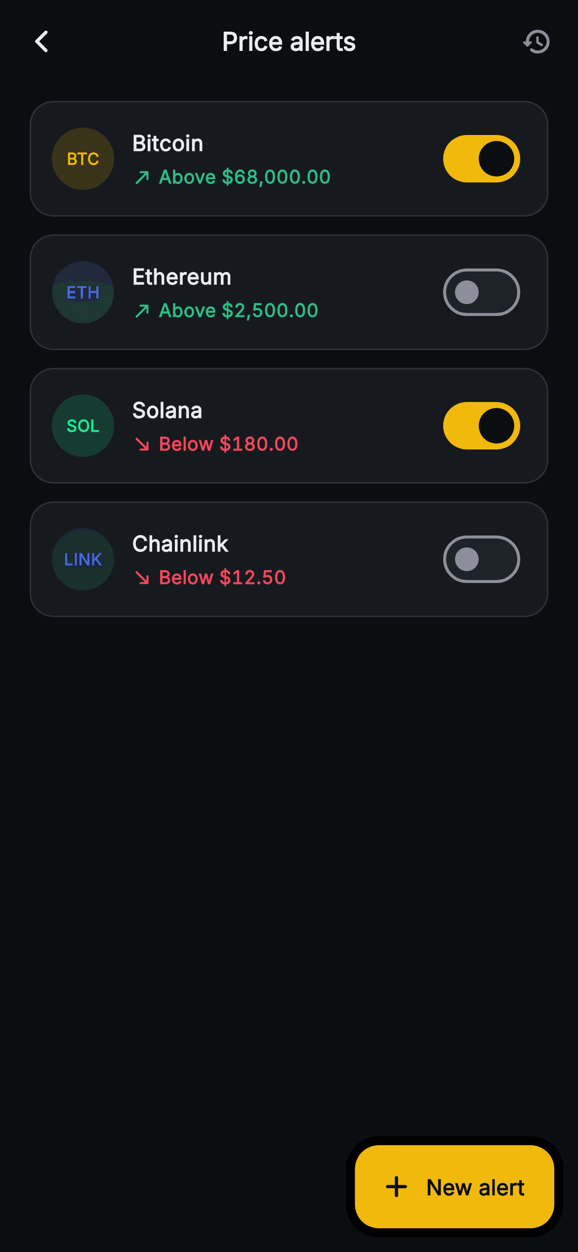
What you'll build
- ✓An exchange-dark card list with tinted circular ticker badges — each coin's brand colour at 16% alpha, no logo images
- ✓A condition line pairing a north-east or south-east arrow with a green 'Above' or red 'Below' price in tabular figures
- ✓Per-row Material Switches that flip an alert on or off in place via setState, with an amber active track
- ✓An extended 'New alert' FAB plus a history action for triggered alerts, kept backend-agnostic through four callbacks
- ✓A tiny _Alert model whose one mutable field is exactly the one piece of per-row state — the toggle
Step-by-step build
Create the file
Add a new file at lib/web3_alerts_list/web3_alerts_list_screen.dart in your Flutter project.
Register the bundled fonts
No external packages — this is pure Flutter. It does bundle its design font (Inter), so drop the font file into fonts/ and declare it in pubspec.yaml:
flutter:
  fonts:
    - family: Inter
      fonts:
- asset: fonts/Inter-Regular.ttfBuild it, piece by piece
Here's how the screen goes together. Each block below is a real slice of the code with a plain-English explanation — paste them in order, or grab the whole file from the next section.
A stateful list with four exits
import 'package:flutter/material.dart';

/// Web3 — Price Alerts. A list of active alert rows (coin, condition, target,
/// on/off toggle) with an add-alert FAB. Self-contained per CONVENTIONS.md:
/// pure Flutter, bundled Inter font, ticker-badge CustomPaint avoided in favour
/// of tinted circles (no glyphs / no network image), forced dark theme so it
/// renders standalone as a route.
class Web3AlertsListScreen extends StatefulWidget {
  const Web3AlertsListScreen({
    super.key,
    this.onBack,
    this.onCreate,
    this.onViewTriggered,
    this.onAlertTap,
  });

  final VoidCallback? onBack;
  final VoidCallback? onCreate;
  final VoidCallback? onViewTriggered;
  final VoidCallback? onAlertTap;

  @override
  State<Web3AlertsListScreen> createState() => _Web3AlertsListScreenState();
}
`Web3AlertsListScreen` is a `StatefulWidget` for one reason only: the per-row toggles mutate. Everything else that could change the world leaves through four nullable `VoidCallback`s — `onBack`, `onCreate`, `onViewTriggered`, `onAlertTap`. Creating an alert, opening one, and jumping to fired-alert history are all navigation concerns, so the screen fires a callback and lets the host app decide what a 'create alert' route even looks like. The doc comment spells out the constraints the file honours: pure Flutter, bundled Inter, tinted circles instead of a ticker-badge `CustomPaint`, and a forced dark theme so the screen renders correctly as a standalone route.
The exchange palette and four seed alerts
class _Web3AlertsListScreenState extends State<Web3AlertsListScreen> {
  static const String _font = 'Inter';
  static const Color _bg = Color(0xFF0B0E11);
  static const Color _surface = Color(0xFF161A1E);
  static const Color _surfaceAlt = Color(0xFF1E2329);
  static const Color _brand = Color(0xFFF0B90B);
  static const Color _up = Color(0xFF2EBD85);
  static const Color _down = Color(0xFFF6465D);
  static const Color _text = Color(0xFFEAECEF);
  static const Color _muted = Color(0xFF848E9C);
  static const Color _hairline = Color(0xFF2B3139);

  final List<_Alert> _alerts = <_Alert>[
    _Alert('BTC', 'Bitcoin', true, '68,000.00', Color(0xFFF0B90B), true),
    _Alert('ETH', 'Ethereum', false, '2,500.00', Color(0xFF627EEA), true),
    _Alert('SOL', 'Solana', true, '180.00', Color(0xFF14F195), false),
    _Alert('LINK', 'Chainlink', false, '12.50', Color(0xFF2A5ADA), false),
  ];
The palette is straight off a trading terminal: near-black `#0B0E11` background, `#161A1E` card surface, amber `#F0B90B` brand, and the classic pair `_up` green `#2EBD85` / `_down` red `#F6465D` that will colour every condition. `_muted` `#848E9C` and `_hairline` `#2B3139` handle secondary text and borders. The seed list holds four positional `_Alert` records — BTC, ETH, SOL, LINK — each carrying its coin's real brand colour as `tint` (Ethereum's `#627EEA`, Solana's `#14F195`, Chainlink's `#2A5ADA`). Notice the combinations: BTC is on+above, ETH on+below, SOL off+above, LINK off+below — the demo data deliberately covers all four visual states. The list is `final` but not `const`, because each row's `on` flag must stay mutable.
Forced dark chrome: AppBar, history action, and the FAB
  @override
  Widget build(BuildContext context) {
    return Theme(
      data: ThemeData.dark(useMaterial3: true),
      child: Scaffold(
        backgroundColor: _bg,
        appBar: AppBar(
          backgroundColor: _bg,
          elevation: 0,
          centerTitle: true,
          leading: IconButton(
            onPressed: widget.onBack,
            icon: const Icon(Icons.arrow_back_ios_new_rounded,
                size: 18, color: _text),
          ),
          title: const Text(
            'Price alerts',
            style: TextStyle(
              fontFamily: _font,
              fontSize: 17,
              fontWeight: FontWeight.w700,
              color: _text,
            ),
          ),
          actions: <Widget>[
            IconButton(
              onPressed: widget.onViewTriggered,
              icon: const Icon(Icons.history_rounded, size: 21, color: _muted),
            ),
            const SizedBox(width: 4),
          ],
        ),
        floatingActionButton: FloatingActionButton.extended(
          onPressed: widget.onCreate,
          backgroundColor: _brand,
          icon: const Icon(Icons.add_rounded, color: _bg),
          label: const Text(
            'New alert',
            style: TextStyle(
              fontFamily: _font,
              fontSize: 14.5,
              fontWeight: FontWeight.w700,
              color: _bg,
            ),
          ),
        ),
`build` wraps everything in `Theme(data: ThemeData.dark(useMaterial3: true))`, so the screen stays dark even inside a light-themed host app — without it, the Material `Switch` and `AppBar` defaults would leak the ambient theme into an exchange-dark design. The AppBar is flat (`elevation: 0`) on the same `_bg` as the body, with an 18px back chevron and a centred 'Price alerts' title at 17px `w700`. The one action is `Icons.history_rounded` in `_muted`, wired to `onViewTriggered` — standing alerts and already-fired alerts are different mental lists, so history gets its own screen instead of mixing triggered rows in here. The `FloatingActionButton.extended` reads 'New alert' in amber with dark icon and label, because on `#F0B90B` dark text has far better contrast than white.
The list plumbing and the tinted ticker badge
        body: SafeArea(
          top: false,
          child: ListView.separated(
            padding: const EdgeInsets.fromLTRB(20, 12, 20, 96),
            itemCount: _alerts.length,
            separatorBuilder: (BuildContext context, int i) =>
                const SizedBox(height: 12),
            itemBuilder: (BuildContext context, int i) {
              final _Alert a = _alerts[i];
              final Color condColor = a.above ? _up : _down;
              return GestureDetector(
                onTap: widget.onAlertTap,
                behavior: HitTestBehavior.opaque,
                child: Container(
                  padding: const EdgeInsets.all(14),
                  decoration: BoxDecoration(
                    color: _surface,
                    borderRadius: BorderRadius.circular(16),
                    border: Border.all(color: _hairline),
                  ),
                  child: Row(
                    children: <Widget>[
                      Container(
                        width: 42,
                        height: 42,
                        decoration: BoxDecoration(
                          color: a.tint.withValues(alpha: 0.16),
                          shape: BoxShape.circle,
                        ),
                        alignment: Alignment.center,
                        child: Text(
                          a.ticker,
                          style: TextStyle(
                            fontFamily: _font,
                            fontSize: 11,
                            fontWeight: FontWeight.w800,
                            color: a.tint,
                          ),
                        ),
                      ),
`SafeArea(top: false)` skips the top inset since the AppBar already owns it, and `ListView.separated` puts a 12px gap between cards with padding `fromLTRB(20, 12, 20, 96)` — the 96px bottom is what stops the last card from hiding behind the FAB. Each row derives `condColor` once (`a.above ? _up : _down`) and reuses it for both the arrow and the price. The card is a `GestureDetector` with `HitTestBehavior.opaque`, so taps on the padding between texts still register, wrapping a `_surface` container with a 16px radius and `_hairline` border. The badge is the file's neatest trick: a 42px circle filled with `a.tint.withValues(alpha: 0.16)` holding the ticker text at 11px `w800` in the full tint — coin identity from typography alone, with no logo assets and no network images to fail.
The condition line: direction, colour, and tabular figures
                      const SizedBox(width: 12),
                      Expanded(
                        child: Column(
                          crossAxisAlignment: CrossAxisAlignment.start,
                          children: <Widget>[
                            Text(
                              a.name,
                              style: const TextStyle(
                                fontFamily: _font,
                                fontSize: 14.5,
                                fontWeight: FontWeight.w700,
                                color: _text,
                              ),
                            ),
                            const SizedBox(height: 4),
                            Row(
                              children: <Widget>[
                                Icon(
                                  a.above
                                      ? Icons.north_east_rounded
                                      : Icons.south_east_rounded,
                                  size: 14,
                                  color: condColor,
                                ),
                                const SizedBox(width: 4),
                                Text(
                                  '${a.above ? 'Above' : 'Below'} \$${a.target}',
                                  style: TextStyle(
                                    fontFamily: _font,
                                    fontSize: 12.5,
                                    fontWeight: FontWeight.w600,
                                    fontFeatures: const <FontFeature>[
                                      FontFeature.tabularFigures()
                                    ],
                                    color: condColor,
                                  ),
                                ),
                              ],
                            ),
                          ],
                        ),
                      ),
The expanded middle column stacks the coin name at 14.5px `w700` over the condition row. That row is where the data becomes glanceable: a 14px `Icons.north_east_rounded` or `south_east_rounded` picked by `a.above`, then the interpolated string `'${a.above ? 'Above' : 'Below'} \$${a.target}'` at 12.5px `w600` — arrow, word, and price all in `condColor`, so green consistently means an above target and red a below target, matching trading conventions. The price style sets `FontFeature.tabularFigures()`, which forces every digit to the same width; without it, '68,000.00' and '12.50' would jitter out of alignment across rows and the list would look untidy the moment two prices differ in digits.
Live toggles and the one-mutable-field model
                      Switch(
                        value: a.on,
                        onChanged: (bool v) => setState(() => a.on = v),
                        activeThumbColor: _bg,
                        activeTrackColor: _brand,
                        inactiveThumbColor: _muted,
                        inactiveTrackColor: _surfaceAlt,
                      ),
                    ],
                  ),
                ),
              );
            },
          ),
        ),
      ),
    );
  }
}

class _Alert {
  _Alert(this.ticker, this.name, this.on, this.target, this.tint, this.above);

  final String ticker;
  final String name;
  bool on;
  final String target;
  final Color tint;
  final bool above;
}
The trailing `Switch` reads `a.on` and its `onChanged` is a one-liner — `setState(() => a.on = v)` — mutating the row's model directly and rebuilding. It works because `_Alert` is designed for exactly this: five `final` fields (ticker, name, target, tint, above) and a single non-final `bool on`, so the toggle is the only per-row state that can change and nothing else can drift. The switch colours are hand-set rather than themed: `activeThumbColor: _bg` on an amber `_brand` track makes an enabled alert pop, while the inactive pair `_muted` on `_surfaceAlt` lets disabled rows recede into the card. In a real app, this `onChanged` is where your pause-alert API call belongs — flip optimistically, then revert on failure.
Full code
The complete, ready-to-paste source. Free to use in your projects — one click copies it all.
import 'package:flutter/material.dart';

/// Web3 — Price Alerts. A list of active alert rows (coin, condition, target,
/// on/off toggle) with an add-alert FAB. Self-contained per CONVENTIONS.md:
/// pure Flutter, bundled Inter font, ticker-badge CustomPaint avoided in favour
/// of tinted circles (no glyphs / no network image), forced dark theme so it
/// renders standalone as a route.
class Web3AlertsListScreen extends StatefulWidget {
  const Web3AlertsListScreen({
    super.key,
    this.onBack,
    this.onCreate,
    this.onViewTriggered,
    this.onAlertTap,
  });

  final VoidCallback? onBack;
  final VoidCallback? onCreate;
  final VoidCallback? onViewTriggered;
  final VoidCallback? onAlertTap;

  @override
  State<Web3AlertsListScreen> createState() => _Web3AlertsListScreenState();
}

class _Web3AlertsListScreenState extends State<Web3AlertsListScreen> {
  static const String _font = 'Inter';
  static const Color _bg = Color(0xFF0B0E11);
  static const Color _surface = Color(0xFF161A1E);
  static const Color _surfaceAlt = Color(0xFF1E2329);
  static const Color _brand = Color(0xFFF0B90B);
  static const Color _up = Color(0xFF2EBD85);
  static const Color _down = Color(0xFFF6465D);
  static const Color _text = Color(0xFFEAECEF);
  static const Color _muted = Color(0xFF848E9C);
  static const Color _hairline = Color(0xFF2B3139);

  final List<_Alert> _alerts = <_Alert>[
    _Alert('BTC', 'Bitcoin', true, '68,000.00', Color(0xFFF0B90B), true),
    _Alert('ETH', 'Ethereum', false, '2,500.00', Color(0xFF627EEA), true),
    _Alert('SOL', 'Solana', true, '180.00', Color(0xFF14F195), false),
    _Alert('LINK', 'Chainlink', false, '12.50', Color(0xFF2A5ADA), false),
  ];

  @override
  Widget build(BuildContext context) {
    return Theme(
      data: ThemeData.dark(useMaterial3: true),
      child: Scaffold(
        backgroundColor: _bg,
        appBar: AppBar(
          backgroundColor: _bg,
          elevation: 0,
          centerTitle: true,
          leading: IconButton(
            onPressed: widget.onBack,
            icon: const Icon(Icons.arrow_back_ios_new_rounded,
                size: 18, color: _text),
          ),
          title: const Text(
            'Price alerts',
            style: TextStyle(
              fontFamily: _font,
              fontSize: 17,
              fontWeight: FontWeight.w700,
              color: _text,
            ),
          ),
          actions: <Widget>[
            IconButton(
              onPressed: widget.onViewTriggered,
              icon: const Icon(Icons.history_rounded, size: 21, color: _muted),
            ),
            const SizedBox(width: 4),
          ],
        ),
        floatingActionButton: FloatingActionButton.extended(
          onPressed: widget.onCreate,
          backgroundColor: _brand,
          icon: const Icon(Icons.add_rounded, color: _bg),
          label: const Text(
            'New alert',
            style: TextStyle(
              fontFamily: _font,
              fontSize: 14.5,
              fontWeight: FontWeight.w700,
              color: _bg,
            ),
          ),
        ),
        body: SafeArea(
          top: false,
          child: ListView.separated(
            padding: const EdgeInsets.fromLTRB(20, 12, 20, 96),
            itemCount: _alerts.length,
            separatorBuilder: (BuildContext context, int i) =>
                const SizedBox(height: 12),
            itemBuilder: (BuildContext context, int i) {
              final _Alert a = _alerts[i];
              final Color condColor = a.above ? _up : _down;
              return GestureDetector(
                onTap: widget.onAlertTap,
                behavior: HitTestBehavior.opaque,
                child: Container(
                  padding: const EdgeInsets.all(14),
                  decoration: BoxDecoration(
                    color: _surface,
                    borderRadius: BorderRadius.circular(16),
                    border: Border.all(color: _hairline),
                  ),
                  child: Row(
                    children: <Widget>[
                      Container(
                        width: 42,
                        height: 42,
                        decoration: BoxDecoration(
                          color: a.tint.withValues(alpha: 0.16),
                          shape: BoxShape.circle,
                        ),
                        alignment: Alignment.center,
                        child: Text(
                          a.ticker,
                          style: TextStyle(
                            fontFamily: _font,
                            fontSize: 11,
                            fontWeight: FontWeight.w800,
                            color: a.tint,
                          ),
                        ),
                      ),
                      const SizedBox(width: 12),
                      Expanded(
                        child: Column(
                          crossAxisAlignment: CrossAxisAlignment.start,
                          children: <Widget>[
                            Text(
                              a.name,
                              style: const TextStyle(
                                fontFamily: _font,
                                fontSize: 14.5,
                                fontWeight: FontWeight.w700,
                                color: _text,
                              ),
                            ),
                            const SizedBox(height: 4),
                            Row(
                              children: <Widget>[
                                Icon(
                                  a.above
                                      ? Icons.north_east_rounded
                                      : Icons.south_east_rounded,
                                  size: 14,
                                  color: condColor,
                                ),
                                const SizedBox(width: 4),
                                Text(
                                  '${a.above ? 'Above' : 'Below'} \$${a.target}',
                                  style: TextStyle(
                                    fontFamily: _font,
                                    fontSize: 12.5,
                                    fontWeight: FontWeight.w600,
                                    fontFeatures: const <FontFeature>[
                                      FontFeature.tabularFigures()
                                    ],
                                    color: condColor,
                                  ),
                                ),
                              ],
                            ),
                          ],
                        ),
                      ),
                      Switch(
                        value: a.on,
                        onChanged: (bool v) => setState(() => a.on = v),
                        activeThumbColor: _bg,
                        activeTrackColor: _brand,
                        inactiveThumbColor: _muted,
                        inactiveTrackColor: _surfaceAlt,
                      ),
                    ],
                  ),
                ),
              );
            },
          ),
        ),
      ),
    );
  }
}

class _Alert {
  _Alert(this.ticker, this.name, this.on, this.target, this.tint, this.above);

  final String ticker;
  final String name;
  bool on;
  final String target;
  final Color tint;
  final bool above;
}
Plus bundled 1 binary asset (fonts/images). The CLI and MCP install those for you automatically.
Two faster ways to add it
Copy-paste works, but you can skip it entirely.
1. FlutterKit CLI
One command drops this screen — and its fonts — straight into your project.
$ flutterkit add web3-alerts-list2. AI agent (MCP)
Connect FlutterKit's MCP server in Claude or Cursor and just ask your agent to install web3-alerts-list — it fetches and writes the files for you.
FAQ
Is this price alerts screen free to use in a commercial app?
Yes — copy it from this page, install it with the CLI command, or pull it through MCP and ship it in a paid product. There is no licence key, no attribution requirement, and no sign-up.
Does it need any packages or icon assets?
No. It is pure Flutter — Material icons for the arrows and history glyph, and tinted-circle ticker badges instead of coin logo images, so there is nothing to download at runtime. The only asset is the bundled Inter font file referenced by `fontFamily: 'Inter'`.
Which Flutter version does this need?
A recent one. The badge tint uses `Color.withValues(alpha: 0.16)`, which needs Flutter 3.22+ (swap to `withOpacity(0.16)` on older SDKs), and the switch uses `activeThumbColor`, the newer name for the deprecated `activeColor` — rename it back if your SDK predates that change. The constructor also uses `super.key`.
How do I make these alerts fire real notifications?
The screen is deliberately backend-agnostic — it renders alert state but watches no prices. Run the comparisons server-side against a price feed and deliver pushes via FCM or APNs, since a phone can't reliably watch markets in the background. The `Switch.onChanged` callback is where you sync a pause/resume to that backend, and `onViewTriggered` is meant to route to a fired-alerts history screen.
How do I load real alerts instead of the four hard-coded ones?
Replace the seeded `_alerts` list with data from your API, keeping the `_Alert` shape: ticker, name, on, target string, tint colour, and the `above` flag. Format the target with thousands separators before it reaches the widget — the row renders the string verbatim, which is also why `tabularFigures` keeps the prices aligned.


