How to Build a Crypto Price Alert Setup Screen in Flutter (Full Code + Preview)
A price alert is only as good as the number behind it, and a target typed blind on a system keyboard is easy to get wrong by a digit. This tutorial builds Aurum's alert setup screen in Flutter: a coin card, an Above/Below condition track, a 42px target readout that reports its distance from spot as you type, an in-page numpad that stops at two decimal places, a repeat switch, and a Create alert button that stays locked until the target is above zero.
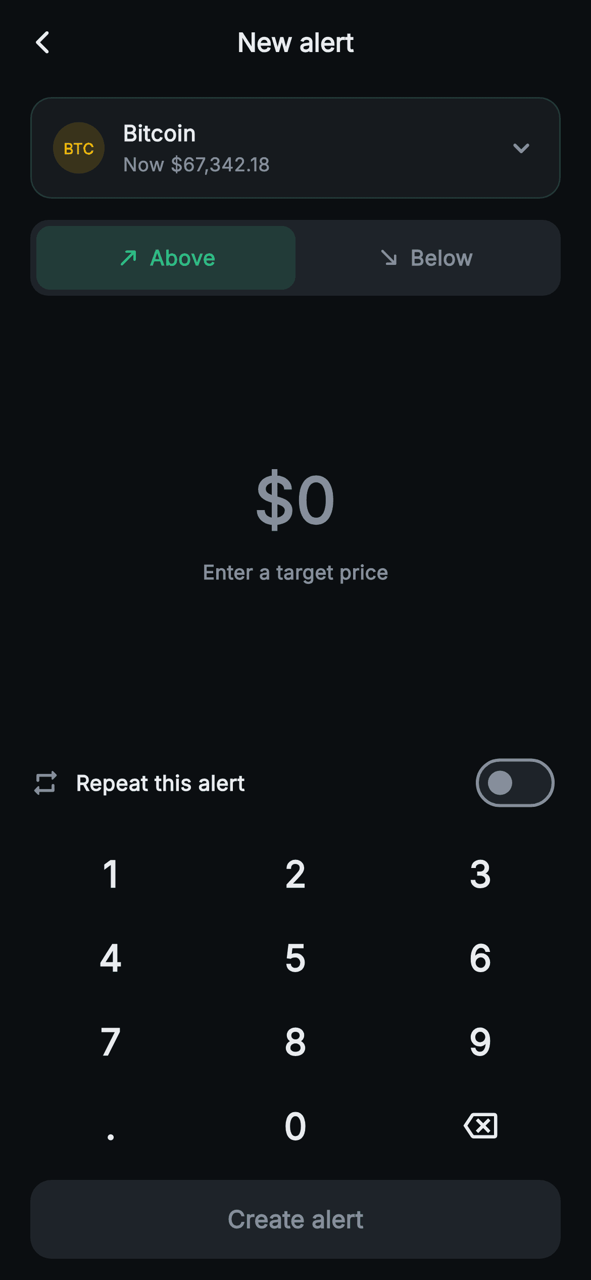
What you'll build
- ✓A string-backed keypad reducer that swallows leading zeros, allows one decimal point and refuses a third decimal digit
- ✓A 42px tabular-figure target readout with a live percent-from-spot caption calculated against a BTC spot constant
- ✓An Above/Below pill track whose active half tints green or red at 16% alpha behind a matching directional arrow
- ✓A repeat row where both the whole line and its Switch flip the same flag, swapping the icon to repeat_on
- ✓A Create alert button gated on a derived _valid getter, with its label colour switched by hand to suit the disabled fill
Step-by-step build
Create the file
Add a new file at lib/web3_alerts_create/web3_alerts_create_screen.dart in your Flutter project.
Register the bundled fonts
No external packages — this is pure Flutter. It does bundle its design font (Inter), so drop the font file into fonts/ and declare it in pubspec.yaml:
flutter:
  fonts:
    - family: Inter
      fonts:
- asset: fonts/Inter-Regular.ttfBuild it, piece by piece
Here's how the screen goes together. Each block below is a real slice of the code with a plain-English explanation — paste them in order, or grab the whole file from the next section.
Two callbacks, three fields, two getters
import 'package:flutter/material.dart';

/// Web3 — Create Alert. A coin selector, an above/below condition toggle, a
/// target-price entry with a painted numpad, a repeat option and a save bar.
/// Self-contained per CONVENTIONS.md: pure Flutter, bundled Inter font, no
/// glyphs / no network image, forced dark theme so it renders standalone as a
/// route.
class Web3AlertsCreateScreen extends StatefulWidget {
  const Web3AlertsCreateScreen({super.key, this.onBack, this.onSave});

  final VoidCallback? onBack;
  final VoidCallback? onSave;

  @override
  State<Web3AlertsCreateScreen> createState() => _Web3AlertsCreateScreenState();
}

class _Web3AlertsCreateScreenState extends State<Web3AlertsCreateScreen> {
  static const String _font = 'Inter';
  static const Color _bg = Color(0xFF0B0E11);
  static const Color _surface = Color(0xFF161A1E);
  static const Color _surfaceAlt = Color(0xFF1E2329);
  static const Color _brand = Color(0xFFF0B90B);
  static const Color _up = Color(0xFF2EBD85);
  static const Color _down = Color(0xFFF6465D);
  static const Color _text = Color(0xFFEAECEF);
  static const Color _muted = Color(0xFF848E9C);
  static const Color _hairline = Color(0xFF2B3139);

  static const double _spot = 67342.18; // BTC spot

  String _entry = '0';
  bool _above = true;
  bool _repeat = false;

  double get _target => double.tryParse(_entry) ?? 0;
  bool get _valid => _target > 0;
The widget exposes only `onBack` and `onSave`, both plain `VoidCallback`s — note that `onSave` carries no payload, which matters later. All the interesting state is three fields. `_entry` is a `String`, not a `double`, on purpose: a number cannot represent an in-progress value like `67000.` or tell `12.5` from `12.50`, so the typed text is the source of truth and `_target` derives the number with `double.tryParse(_entry) ?? 0`. Dart accepts a trailing point, so `67000.` still parses to 67000 mid-typing. `_valid` is simply `_target > 0`. `_above` starts true, `_repeat` false, and `static const double _spot = 67342.18` is the baseline every distance calculation uses. The palette is the shared Aurum set, with `_surfaceAlt` doing triple duty as toggle track, inactive switch track and disabled button fill.
The keypad reducer: one function, twelve tokens
  void _tap(String k) {
    setState(() {
      if (k == '<') {
        _entry =
            _entry.length <= 1 ? '0' : _entry.substring(0, _entry.length - 1);
      } else if (k == '.') {
        if (!_entry.contains('.')) _entry = '$_entry.';
      } else {
        if (_entry == '0') {
          _entry = k;
        } else {
          final int dot = _entry.indexOf('.');
          if (dot >= 0 && _entry.length - dot > 2) return;
          _entry = '$_entry$k';
        }
      }
    });
  }
`_tap(String k)` turns every key press into a single string edit inside `setState`. Backspace arrives as `'<'`: if one character or fewer remains the entry resets to `'0'` rather than empty, so the readout never shows a bare dollar sign. A `'.'` is appended only when `_entry` has no point yet, which is why pressing the point first produces `$0.`. For digits, an entry of exactly `'0'` is replaced outright, so you never get `$007`, and pressing 0 on 0 changes nothing. Otherwise the code finds the point and bails with `if (dot >= 0 && _entry.length - dot > 2) return;` — two digits already follow it, so a third is refused. Returning early inside the `setState` closure is legal; it just rebuilds with nothing changed. Nothing caps the whole-number part, so add a length check there if you want one.
Fixed-height chrome and a coin card that only looks tappable
  @override
  Widget build(BuildContext context) {
    return Theme(
      data: ThemeData.dark(useMaterial3: true),
      child: Scaffold(
        backgroundColor: _bg,
        appBar: AppBar(
          backgroundColor: _bg,
          elevation: 0,
          centerTitle: true,
          leading: IconButton(
            onPressed: widget.onBack,
            icon: const Icon(Icons.arrow_back_ios_new_rounded,
                size: 18, color: _text),
          ),
          title: const Text(
            'New alert',
            style: TextStyle(
              fontFamily: _font,
              fontSize: 17,
              fontWeight: FontWeight.w700,
              color: _text,
            ),
          ),
        ),
        body: SafeArea(
          top: false,
          child: Column(
            children: <Widget>[
              const SizedBox(height: 8),
              Padding(
                padding: const EdgeInsets.symmetric(horizontal: 20),
                child: Container(
                  padding:
                      const EdgeInsets.symmetric(horizontal: 14, vertical: 12),
                  decoration: BoxDecoration(
                    color: _surface,
                    borderRadius: BorderRadius.circular(14),
                    border: Border.all(color: _hairline),
                  ),
                  child: Row(
                    children: <Widget>[
                      Container(
                        width: 34,
                        height: 34,
                        decoration: BoxDecoration(
                          color: _brand.withValues(alpha: 0.16),
                          shape: BoxShape.circle,
                        ),
                        alignment: Alignment.center,
                        child: const Text(
                          'BTC',
                          style: TextStyle(
                            fontFamily: _font,
                            fontSize: 10,
                            fontWeight: FontWeight.w800,
                            color: _brand,
                          ),
                        ),
                      ),
                      const SizedBox(width: 12),
                      const Expanded(
                        child: Column(
                          crossAxisAlignment: CrossAxisAlignment.start,
                          children: <Widget>[
                            Text(
                              'Bitcoin',
                              style: TextStyle(
                                fontFamily: _font,
                                fontSize: 14.5,
                                fontWeight: FontWeight.w700,
                                color: _text,
                              ),
                            ),
                            SizedBox(height: 2),
                            Text(
                              'Now \$67,342.18',
                              style: TextStyle(
                                fontFamily: _font,
                                fontSize: 12.5,
                                color: _muted,
                              ),
                            ),
                          ],
                        ),
                      ),
                      const Icon(Icons.keyboard_arrow_down_rounded,
                          size: 22, color: _muted),
                    ],
                  ),
                ),
              ),
Beyond the forced dark `Theme`, the AppBar is flat with a centred 17px `w700` 'New alert' title and an 18px back chevron wired to `widget.onBack`. The body is a `Column` under `SafeArea(top: false)`, not a `ListView` — this is a calculator-style layout meant to fit one viewport with the keypad pinned to the bottom. The coin card is a `_surface` container with a 14px radius and `_hairline` border holding a 34px circle filled with `_brand.withValues(alpha: 0.16)` and the text 'BTC' at 10px `w800`, then 'Bitcoin' over 'Now \$67,342.18'. Two honest caveats: that spot line is a string literal separate from the `_spot` constant, so wire both to the same source; and the `keyboard_arrow_down_rounded` chevron has no gesture or callback behind it, so the coin picker is visual only until you add one.
Condition track, floating readout, and the distance maths
              const SizedBox(height: 14),
              Padding(
                padding: const EdgeInsets.symmetric(horizontal: 20),
                child: Container(
                  padding: const EdgeInsets.all(4),
                  decoration: BoxDecoration(
                    color: _surfaceAlt,
                    borderRadius: BorderRadius.circular(12),
                  ),
                  child: Row(
                    children: <Widget>[
                      _condTab('Above', _up, true),
                      _condTab('Below', _down, false),
                    ],
                  ),
                ),
              ),
              const Spacer(),
              Text(
                '\$$_entry',
                style: TextStyle(
                  fontFamily: _font,
                  fontSize: 42,
                  fontWeight: FontWeight.w800,
                  fontFeatures: const <FontFeature>[
                    FontFeature.tabularFigures()
                  ],
                  color: _valid ? _text : _muted,
                ),
              ),
              const SizedBox(height: 8),
              Text(
                _valid
                    ? '${(((_target - _spot) / _spot) * 100).toStringAsFixed(1)}% from spot'
                    : 'Enter a target price',
                style: const TextStyle(
                  fontFamily: _font,
                  fontSize: 13,
                  fontWeight: FontWeight.w600,
                  color: _muted,
                ),
              ),
The condition control is a `_surfaceAlt` track with 4px padding and a 12px radius, holding `_condTab('Above', _up, true)` and `_condTab('Below', _down, false)`. Then come two `const Spacer()`s with the readout between them; they split leftover height equally, so the figure floats centred in whatever room the keypad leaves, with no hard-coded heights. The readout string `'\$$_entry'` is an escaped dollar followed by interpolation, drawn at 42px `w800` with `FontFeature.tabularFigures()` so digits keep a fixed width and the number doesn't shimmy as it grows. It sits in `_muted` until `_valid` flips it to `_text`. The caption computes `((_target - _spot) / _spot) * 100` to one decimal: 70,000 reads '3.9% from spot', 60,000 reads '-10.9% from spot'. Positive values get no plus sign, so prepend one when `pct >= 0` if you want explicit direction.
A repeat row with two ways to toggle
              const Spacer(),
              Padding(
                padding: const EdgeInsets.symmetric(horizontal: 20),
                child: GestureDetector(
                  onTap: () => setState(() => _repeat = !_repeat),
                  behavior: HitTestBehavior.opaque,
                  child: Row(
                    children: <Widget>[
                      Icon(
                        _repeat
                            ? Icons.repeat_on_rounded
                            : Icons.repeat_rounded,
                        size: 20,
                        color: _repeat ? _brand : _muted,
                      ),
                      const SizedBox(width: 10),
                      const Expanded(
                        child: Text(
                          'Repeat this alert',
                          style: TextStyle(
                            fontFamily: _font,
                            fontSize: 14,
                            fontWeight: FontWeight.w600,
                            color: _text,
                          ),
                        ),
                      ),
                      Switch(
                        value: _repeat,
                        onChanged: (bool v) => setState(() => _repeat = v),
                        activeThumbColor: _bg,
                        activeTrackColor: _brand,
                        inactiveThumbColor: _muted,
                        inactiveTrackColor: _surfaceAlt,
                      ),
                    ],
                  ),
                ),
              ),
The repeat option is the screen's only frequency setting — there is no channel picker for push versus email in this file. The whole row is wrapped in a `GestureDetector` with `HitTestBehavior.opaque`, so tapping the label or the empty space beside it flips `_repeat`, while the trailing `Switch` sets the same field through its own `onChanged`. The two don't double-fire: the Switch wins the gesture arena for taps on itself. State is mirrored in the leading icon too, which swaps from `Icons.repeat_rounded` in `_muted` to `Icons.repeat_on_rounded` in amber when enabled. The switch colours are hand-set: a `_bg` thumb on a `_brand` track when on, `_muted` on `_surfaceAlt` when off. What 'repeat' actually means — re-arm after firing, or keep firing on every crossing — is entirely up to your backend; the screen stores just a bool.
Mounting the keypad and gating the save button
              const SizedBox(height: 8),
              _Numpad(onTap: _tap),
              Padding(
                padding: const EdgeInsets.fromLTRB(20, 8, 20, 14),
                child: SizedBox(
                  width: double.infinity,
                  height: 52,
                  child: FilledButton(
                    onPressed: _valid ? widget.onSave : null,
                    style: FilledButton.styleFrom(
                      backgroundColor: _brand,
                      disabledBackgroundColor: _surfaceAlt,
                      shape: RoundedRectangleBorder(
                        borderRadius: BorderRadius.circular(14),
                      ),
                    ),
                    child: Text(
                      'Create alert',
                      style: TextStyle(
                        fontFamily: _font,
                        fontSize: 16,
                        fontWeight: FontWeight.w700,
                        color: _valid ? _bg : _muted,
                      ),
                    ),
                  ),
                ),
              ),
            ],
          ),
        ),
      ),
    );
  }
`_Numpad(onTap: _tap)` hands the reducer straight to the keypad, so every press lands in the same `setState`. Below it, a 52px full-width `FilledButton` with a 14px radius — matching the coin card — reads 'Create alert'. The gate is `onPressed: _valid ? widget.onSave : null`; passing `null` is how Flutter disables a button, and `disabledBackgroundColor: _surfaceAlt` takes over the fill. The subtle part is the label: because its `TextStyle` sets an explicit colour, that colour overrides the button's own disabled foreground, so the code has to switch it by hand with `_valid ? _bg : _muted`. Without that ternary the disabled button would print near-black text on a dark grey fill and become unreadable. Note the gate checks only that the target exceeds zero; it never compares the target against spot or the chosen direction.
The condition tab helper
  Widget _condTab(String label, Color color, bool above) {
    final bool active = _above == above;
    return Expanded(
      child: GestureDetector(
        onTap: () => setState(() => _above = above),
        behavior: HitTestBehavior.opaque,
        child: Container(
          padding: const EdgeInsets.symmetric(vertical: 11),
          decoration: BoxDecoration(
            color: active ? color.withValues(alpha: 0.16) : Colors.transparent,
            borderRadius: BorderRadius.circular(9),
          ),
          child: Row(
            mainAxisAlignment: MainAxisAlignment.center,
            children: <Widget>[
              Icon(
                above ? Icons.north_east_rounded : Icons.south_east_rounded,
                size: 16,
                color: active ? color : _muted,
              ),
              const SizedBox(width: 6),
              Text(
                label,
                style: TextStyle(
                  fontFamily: _font,
                  fontSize: 14,
                  fontWeight: FontWeight.w700,
                  color: active ? color : _muted,
                ),
              ),
            ],
          ),
        ),
      ),
    );
  }
`_condTab(label, color, above)` builds one half of the track. `active` is just `_above == above`, and each tab is `Expanded`, so the two halves always split the width evenly. A tap sets `_above` inside `setState`, with `HitTestBehavior.opaque` making the full padded area hit-testable. The active tab fills with `color.withValues(alpha: 0.16)` while the inactive one is `Colors.transparent`, letting the `_surfaceAlt` track show through — a segmented control with no extra widget. The arrow is chosen by the `above` parameter, not by `active`, so Above always keeps `Icons.north_east_rounded` and Below `Icons.south_east_rounded`; only their colour moves between the tab's own green or red and `_muted`. The 9px inner radius nests inside the track's 12px corner minus its 4px padding. Worth knowing: `_above` is read nowhere else on the screen.
A stateless numpad that emits tokens
class _Numpad extends StatelessWidget {
  const _Numpad({required this.onTap});

  final ValueChanged<String> onTap;

  static const List<String> _keys = <String>[
    '1', '2', '3',
    '4', '5', '6',
    '7', '8', '9',
    '.', '0', '<',
  ];

  @override
  Widget build(BuildContext context) {
    return Padding(
      padding: const EdgeInsets.symmetric(horizontal: 12),
      child: GridView.count(
        crossAxisCount: 3,
        shrinkWrap: true,
        physics: const NeverScrollableScrollPhysics(),
        childAspectRatio: 2.2,
        children: _keys.map((String k) {
          return InkWell(
            onTap: () => onTap(k),
            borderRadius: BorderRadius.circular(12),
            child: Center(
              child: k == '<'
                  ? const Icon(Icons.backspace_outlined,
                      size: 22, color: _Web3AlertsCreateScreenState._text)
                  : Text(
                      k,
                      style: const TextStyle(
                        fontFamily: _Web3AlertsCreateScreenState._font,
                        fontSize: 24,
                        fontWeight: FontWeight.w700,
                        color: _Web3AlertsCreateScreenState._text,
                      ),
                    ),
            ),
          );
        }).toList(),
      ),
    );
  }
}
`_Numpad` owns no state; it emits string tokens through a `ValueChanged<String>`, so the parent's reducer stays the single source of truth. The `_keys` list is laid out three per line in source to mirror the grid, with `'<'` standing in for backspace and rendered as `Icons.backspace_outlined`. `GridView.count` with `crossAxisCount: 3` needs `shrinkWrap: true` and `NeverScrollableScrollPhysics()` to live inside a `Column`: the first sizes the grid to its content instead of demanding infinite height, the second stops it scrolling. `childAspectRatio: 2.2` makes keys wide and short, roughly 122×55 on a 390pt phone, so four rows fit under the readout. Each key is an `InkWell` with a 12px ripple radius, borrowing the Scaffold's Material. Text styles reach into `_Web3AlertsCreateScreenState._text` and `._font` — private statics visible because both classes share one library. A token pad, unlike a system keyboard, never covers the layout and can only produce digits and one point.
Full code
The complete, ready-to-paste source. Free to use in your projects — one click copies it all.
import 'package:flutter/material.dart';
/// Web3 — Create Alert. A coin selector, an above/below condition toggle, a
/// target-price entry with a painted numpad, a repeat option and a save bar.
/// Self-contained per CONVENTIONS.md: pure Flutter, bundled Inter font, no
/// glyphs / no network image, forced dark theme so it renders standalone as a
/// route.
class Web3AlertsCreateScreen extends StatefulWidget {
const Web3AlertsCreateScreen({super.key, this.onBack, this.onSave});
final VoidCallback? onBack;
final VoidCallback? onSave;
@override
State<Web3AlertsCreateScreen> createState() => _Web3AlertsCreateScreenState();
}
class _Web3AlertsCreateScreenState extends State<Web3AlertsCreateScreen> {
static const String _font = 'Inter';
static const Color _bg = Color(0xFF0B0E11);
static const Color _surface = Color(0xFF161A1E);
static const Color _surfaceAlt = Color(0xFF1E2329);
static const Color _brand = Color(0xFFF0B90B);
static const Color _up = Color(0xFF2EBD85);
static const Color _down = Color(0xFFF6465D);
static const Color _text = Color(0xFFEAECEF);
static const Color _muted = Color(0xFF848E9C);
static const Color _hairline = Color(0xFF2B3139);
static const double _spot = 67342.18; // BTC spot
String _entry = '0';
bool _above = true;
bool _repeat = false;
double get _target => double.tryParse(_entry) ?? 0;
bool get _valid => _target > 0;
void _tap(String k) {
setState(() {
if (k == '<') {
_entry =
_entry.length <= 1 ? '0' : _entry.substring(0, _entry.length - 1);
} else if (k == '.') {
if (!_entry.contains('.')) _entry = '$_entry.';
} else {
if (_entry == '0') {
_entry = k;
} else {
final int dot = _entry.indexOf('.');
if (dot >= 0 && _entry.length - dot > 2) return;
_entry = '$_entry$k';
}
}
});
}
@override
Widget build(BuildContext context) {
return Theme(
data: ThemeData.dark(useMaterial3: true),
child: Scaffold(
backgroundColor: _bg,
appBar: AppBar(
backgroundColor: _bg,
elevation: 0,
centerTitle: true,
leading: IconButton(
onPressed: widget.onBack,
icon: const Icon(Icons.arrow_back_ios_new_rounded,
size: 18, color: _text),
),
title: const Text(
'New alert',
style: TextStyle(
fontFamily: _font,
fontSize: 17,
fontWeight: FontWeight.w700,
color: _text,
),
),
),
body: SafeArea(
top: false,
child: Column(
children: <Widget>[
const SizedBox(height: 8),
Padding(
padding: const EdgeInsets.symmetric(horizontal: 20),
child: Container(
padding:
const EdgeInsets.symmetric(horizontal: 14, vertical: 12),
decoration: BoxDecoration(
color: _surface,
borderRadius: BorderRadius.circular(14),
border: Border.all(color: _hairline),
),
child: Row(
children: <Widget>[
Container(
width: 34,
height: 34,
decoration: BoxDecoration(
color: _brand.withValues(alpha: 0.16),
shape: BoxShape.circle,
),
alignment: Alignment.center,
child: const Text(
'BTC',
style: TextStyle(
fontFamily: _font,
fontSize: 10,
fontWeight: FontWeight.w800,
color: _brand,
),
),
),
const SizedBox(width: 12),
const Expanded(
child: Column(
crossAxisAlignment: CrossAxisAlignment.start,
children: <Widget>[
Text(
'Bitcoin',
style: TextStyle(
fontFamily: _font,
fontSize: 14.5,
fontWeight: FontWeight.w700,
color: _text,
),
),
SizedBox(height: 2),
Text(
'Now \$67,342.18',
style: TextStyle(
fontFamily: _font,
fontSize: 12.5,
color: _muted,
),
),
],
),
),
const Icon(Icons.keyboard_arrow_down_rounded,
size: 22, color: _muted),
],
),
),
),
const SizedBox(height: 14),
Padding(
padding: const EdgeInsets.symmetric(horizontal: 20),
child: Container(
padding: const EdgeInsets.all(4),
decoration: BoxDecoration(
color: _surfaceAlt,
borderRadius: BorderRadius.circular(12),
),
child: Row(
children: <Widget>[
_condTab('Above', _up, true),
_condTab('Below', _down, false),
],
),
),
),
const Spacer(),
Text(
'\$$_entry',
style: TextStyle(
fontFamily: _font,
fontSize: 42,
fontWeight: FontWeight.w800,
fontFeatures: const <FontFeature>[
FontFeature.tabularFigures()
],
color: _valid ? _text : _muted,
),
),
const SizedBox(height: 8),
Text(
_valid
? '${(((_target - _spot) / _spot) * 100).toStringAsFixed(1)}% from spot'
: 'Enter a target price',
style: const TextStyle(
fontFamily: _font,
fontSize: 13,
fontWeight: FontWeight.w600,
color: _muted,
),
),
const Spacer(),
Padding(
padding: const EdgeInsets.symmetric(horizontal: 20),
child: GestureDetector(
onTap: () => setState(() => _repeat = !_repeat),
behavior: HitTestBehavior.opaque,
child: Row(
children: <Widget>[
Icon(
_repeat
? Icons.repeat_on_rounded
: Icons.repeat_rounded,
size: 20,
color: _repeat ? _brand : _muted,
),
const SizedBox(width: 10),
const Expanded(
child: Text(
'Repeat this alert',
style: TextStyle(
fontFamily: _font,
fontSize: 14,
fontWeight: FontWeight.w600,
color: _text,
),
),
),
Switch(
value: _repeat,
onChanged: (bool v) => setState(() => _repeat = v),
activeThumbColor: _bg,
activeTrackColor: _brand,
inactiveThumbColor: _muted,
inactiveTrackColor: _surfaceAlt,
),
],
),
),
),
const SizedBox(height: 8),
_Numpad(onTap: _tap),
Padding(
padding: const EdgeInsets.fromLTRB(20, 8, 20, 14),
child: SizedBox(
width: double.infinity,
height: 52,
child: FilledButton(
onPressed: _valid ? widget.onSave : null,
style: FilledButton.styleFrom(
backgroundColor: _brand,
disabledBackgroundColor: _surfaceAlt,
shape: RoundedRectangleBorder(
borderRadius: BorderRadius.circular(14),
),
),
child: Text(
'Create alert',
style: TextStyle(
fontFamily: _font,
fontSize: 16,
fontWeight: FontWeight.w700,
color: _valid ? _bg : _muted,
),
),
),
),
),
],
),
),
),
);
}
Widget _condTab(String label, Color color, bool above) {
final bool active = _above == above;
return Expanded(
child: GestureDetector(
onTap: () => setState(() => _above = above),
behavior: HitTestBehavior.opaque,
child: Container(
padding: const EdgeInsets.symmetric(vertical: 11),
decoration: BoxDecoration(
color: active ? color.withValues(alpha: 0.16) : Colors.transparent,
borderRadius: BorderRadius.circular(9),
),
child: Row(
mainAxisAlignment: MainAxisAlignment.center,
children: <Widget>[
Icon(
above ? Icons.north_east_rounded : Icons.south_east_rounded,
size: 16,
color: active ? color : _muted,
),
const SizedBox(width: 6),
Text(
label,
style: TextStyle(
fontFamily: _font,
fontSize: 14,
fontWeight: FontWeight.w700,
color: active ? color : _muted,
),
),
],
),
),
),
);
}
}
class _Numpad extends StatelessWidget {
const _Numpad({required this.onTap});
final ValueChanged<String> onTap;
static const List<String> _keys = <String>[
'1', '2', '3',
'4', '5', '6',
'7', '8', '9',
'.', '0', '<',
];
@override
Widget build(BuildContext context) {
return Padding(
padding: const EdgeInsets.symmetric(horizontal: 12),
child: GridView.count(
crossAxisCount: 3,
shrinkWrap: true,
physics: const NeverScrollableScrollPhysics(),
childAspectRatio: 2.2,
children: _keys.map((String k) {
return InkWell(
onTap: () => onTap(k),
borderRadius: BorderRadius.circular(12),
child: Center(
child: k == '<'
? const Icon(Icons.backspace_outlined,
size: 22, color: _Web3AlertsCreateScreenState._text)
: Text(
k,
style: const TextStyle(
fontFamily: _Web3AlertsCreateScreenState._font,
fontSize: 24,
fontWeight: FontWeight.w700,
color: _Web3AlertsCreateScreenState._text,
),
),
),
);
}).toList(),
),
);
}
}
Plus bundled 1 binary asset (fonts/images). The CLI and MCP install those for you automatically.
Two faster ways to add it
Copy-paste works, but you can skip it entirely.
1. FlutterKit CLI
One command drops this screen — and its fonts — straight into your project.
$ flutterkit add web3-alerts-create2. AI agent (MCP)
Connect FlutterKit's MCP server in Claude or Cursor and just ask your agent to install web3-alerts-create — it fetches and writes the files for you.
FAQ
Can I use this create-alert screen in a commercial trading app?
Yes. Copy the file from this page, add it with the CLI command or fetch it over MCP, and ship it in a paid or free product. There is no licence key to configure and no attribution line to include.
Does the numpad or the font need a package?
No. The keypad is a plain `GridView` of `InkWell`s, the arrows and repeat glyphs are stock Material icons, and there are no images at all. The one asset is the bundled Inter font named by `fontFamily: 'Inter'`; nothing goes into `pubspec.yaml` beyond that font entry.
What Flutter version is required?
Flutter 3.22 or newer, since the badge and condition tabs call `Color.withValues(alpha: 0.16)` — swap in `withOpacity(0.16)` on older SDKs. The repeat `Switch` uses `activeThumbColor`, the newer name for `activeColor`; rename it back if your SDK predates it. The constructor's `super.key` needs Dart 2.17+.
How do I get the target, direction and repeat setting out when the user taps Create alert?
As written you can't — `onSave` is a bare `VoidCallback`. Change it to something like `void Function(double target, bool above, bool repeat)? onSave`, then in the button use `onPressed: _valid ? () => widget.onSave?.call(_target, _above, _repeat) : null`. Add the coin symbol too once the picker is real.
Why can I save an Above alert at a price below the current spot?
Because `_valid` only checks `_target > 0` and `_above` never feeds the gate or the caption. Such an alert would trigger immediately. Tighten the getter to `_target > 0 && (_above ? _target > _spot : _target < _spot)`, or flip `_above` automatically from the sign of the distance so the toggle can't contradict the number.


