How to Build a Fintech Notifications Screen in Flutter (Full Code + Preview)
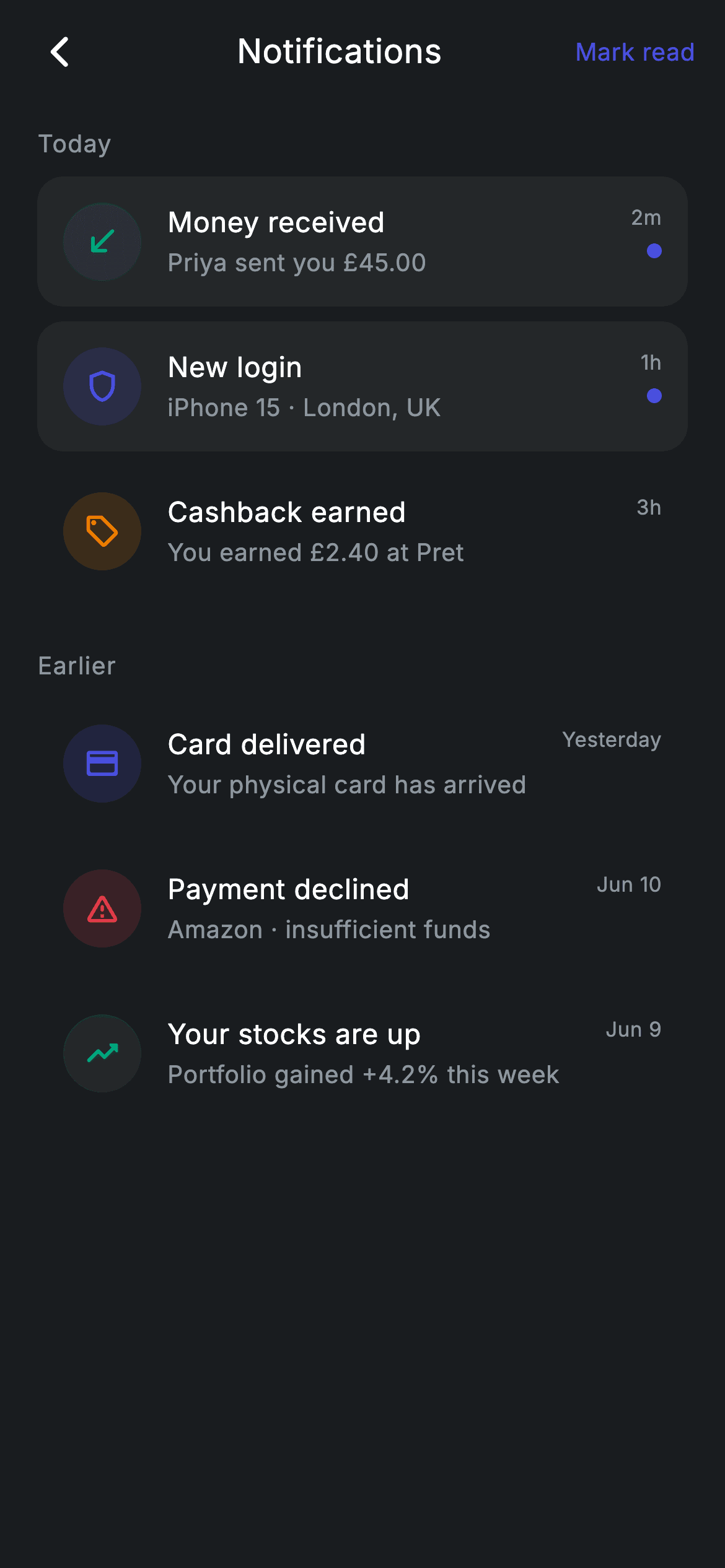
A notification centre is one of the few screens where a single row has to say six different things — money in, a new sign-in, cashback, a declined card. This tutorial builds that inbox in Flutter: a dark #191C1F canvas, 'Today' and 'Earlier' recency labels, and rows carrying a colour-tinted circular icon, a title, a body line, a relative timestamp and an indigo unread dot. Unread rows sit on a raised #242729 surface while read rows go transparent, so the eye finds them instantly. Six const notifications, pure Flutter, zero packages.
Watch the Flutter UI walkthrough
A short screen recording of Fintech · Notifications running, if you'd rather see it before you read the code. The written tutorial below covers everything in it.
Can't see the video? Watch it on YouTube.
What you'll build
- ✓A scrollable dark notification inbox split into 'Today' and 'Earlier' groups by a reusable section-label helper
- ✓A notification row widget that reads its icon, tint colour, title, body, time and unread flag from one small data class
- ✓Colour-coded event types — teal for money in, indigo for security, amber for rewards, red for failures — using a 16% tinted circle behind each icon
- ✓An unread treatment that raises the row onto a surface colour and adds an 8px brand dot beside the timestamp
- ✓A compact app bar with a back button that falls back to Navigator.maybePop() plus a 'Mark read' text action
Step-by-step build
Create the file
Add a new file at lib/fintech_notifications/fintech_notifications_screen.dart in your Flutter project.
Register the bundled fonts
No external packages — this is pure Flutter. It does bundle its design font (Inter), so drop the font file into fonts/ and declare it in pubspec.yaml:
flutter:
  fonts:
    - family: Inter
      fonts:
- asset: fonts/Inter-Regular.ttfBuild it, piece by piece
Here's how the screen goes together. Each block below is a real slice of the code with a plain-English explanation — paste them in order, or grab the whole file from the next section.
The screen class, callbacks, and the colour palette
import 'package:flutter/material.dart';

/// Notifications — the notification centre, grouped by recency. Self-contained
/// per CONVENTIONS.md: pure Flutter, bundled Inter font, forced dark theme.
class FintechNotificationsScreen extends StatelessWidget {
  const FintechNotificationsScreen({super.key, this.onBack, this.onTap});

  final VoidCallback? onBack;
  final VoidCallback? onTap;

  static const String _font = 'Inter';
  static const Color _bg = Color(0xFF191C1F);
  static const Color _surface = Color(0xFF242729);
  static const Color _brand = Color(0xFF494FDF);
  static const Color _teal = Color(0xFF00A87E);
  static const Color _red = Color(0xFFE23B4A);
  static const Color _amber = Color(0xFFEC7E00);
  static const Color _muted = Color(0xFF8D969E);
FintechNotificationsScreen is a StatelessWidget — nothing on this screen mutates, the list is fixed data, so there is no need for setState. Its constructor takes two optional VoidCallbacks, onBack and onTap, which is how you wire the screen into your own navigation without editing it. Below that sits the design system as static consts: _font ('Inter'), _bg (#191C1F) for the page, _surface (#242729) for raised unread rows, _brand (#494FDF) indigo for accents, and three semantic tints — _teal (#00A87E), _red (#E23B4A) and _amber (#EC7E00) — plus _muted (#8D969E) for secondary text. Naming the tints by colour rather than by meaning keeps them reusable across notification types.
The notification data, grouped by recency
  static const List<_Notif> _today = <_Notif>[
    _Notif(Icons.south_west_rounded, _teal, 'Money received',
        'Priya sent you £45.00', '2m', true),
    _Notif(Icons.shield_outlined, _brand, 'New login',
        'iPhone 15 · London, UK', '1h', true),
    _Notif(Icons.local_offer_outlined, _amber, 'Cashback earned',
        'You earned £2.40 at Pret', '3h', false),
  ];
  static const List<_Notif> _earlier = <_Notif>[
    _Notif(Icons.credit_card_rounded, _brand, 'Card delivered',
        'Your physical card has arrived', 'Yesterday', false),
    _Notif(Icons.warning_amber_rounded, _red, 'Payment declined',
        'Amazon · insufficient funds', 'Jun 10', false),
    _Notif(Icons.trending_up_rounded, _teal, 'Your stocks are up',
        'Portfolio gained +4.2% this week', 'Jun 9', false),
  ];
Two const lists hold the mock content: _today with three entries and _earlier with three more. Each _Notif packs an icon, a tint, a title, a body, a timestamp string and an unread bool — for example Icons.south_west_rounded + _teal + 'Money received' + 'Priya sent you £45.00' + '2m' + true. The pairing is deliberate: an inbound arrow in teal for money in, a shield in indigo for 'New login', a price tag in amber for 'Cashback earned', and Icons.warning_amber_rounded in red for 'Payment declined'. Grouping is done by which list an item lives in, not by parsing the timestamp, so the '2m' / 'Yesterday' / 'Jun 10' strings are pure display text. Swap these lists for your API models and nothing else in the file changes.
Fixed header, scrolling body
  @override
  Widget build(BuildContext context) {
    return Theme(
      data: ThemeData.dark(useMaterial3: true),
      child: Scaffold(
        backgroundColor: _bg,
        body: SafeArea(
          child: Column(
            crossAxisAlignment: CrossAxisAlignment.stretch,
            children: <Widget>[
              _appBar(context),
              Expanded(
                child: ListView(
                  physics: const BouncingScrollPhysics(),
                  padding: const EdgeInsets.fromLTRB(20, 8, 20, 24),
                  children: <Widget>[
                    _label('Today'),
                    for (final _Notif n in _today) _row(n),
                    const SizedBox(height: 20),
                    _label('Earlier'),
                    for (final _Notif n in _earlier) _row(n),
                  ],
                ),
              ),
            ],
          ),
        ),
      ),
    );
  }
build() wraps everything in Theme(data: ThemeData.dark(useMaterial3: true)) so the screen renders correctly even inside a light-themed app — useful when you drop it in as a standalone route. Inside, a Scaffold painted with _bg and a SafeArea host a Column with crossAxisAlignment.stretch, so children fill the width. The structure is the classic two-part layout: _appBar(context) keeps its natural height at the top, and Expanded wraps the ListView so only the list scrolls. The list uses BouncingScrollPhysics for an iOS-style overscroll and padding of (20, 8, 20, 24). Its children are built with inline for-loops — `for (final _Notif n in _today) _row(n)` — a collection-for that splices the rows straight into the children list, with _label('Today'), a 20px SizedBox gap, and _label('Earlier') separating the two groups.
The app bar with a safe back fallback
  Widget _appBar(BuildContext context) {
    return Padding(
      padding: const EdgeInsets.fromLTRB(8, 4, 16, 8),
      child: Row(
        children: <Widget>[
          IconButton(
            onPressed: onBack ?? () => Navigator.of(context).maybePop(),
            icon: const Icon(Icons.arrow_back_ios_new_rounded,
                size: 20, color: Colors.white),
          ),
          const Expanded(
            child: Text(
              'Notifications',
              textAlign: TextAlign.center,
              style: TextStyle(
                fontFamily: _font,
                fontSize: 18,
                fontWeight: FontWeight.w500,
                letterSpacing: 0.24,
                color: Colors.white,
              ),
            ),
          ),
          const Text(
            'Mark read',
            style: TextStyle(
              fontFamily: _font,
              fontSize: 13,
              fontWeight: FontWeight.w500,
              letterSpacing: 0.24,
              color: _brand,
            ),
          ),
        ],
      ),
    );
  }
_appBar is a hand-rolled Row rather than an AppBar, which keeps the height tight and the padding exact: EdgeInsets.fromLTRB(8, 4, 16, 8). The leading IconButton uses `onBack ?? () => Navigator.of(context).maybePop()` — if the parent supplied a callback it wins, otherwise the screen pops itself, and maybePop is the safe choice because it does nothing when there is no route below. The title 'Notifications' sits in an Expanded with textAlign.center, so it centres in whatever space is left between the two side items rather than in the screen; because the back button is wider than the 'Mark read' label, the title lands very slightly off true centre. Both texts share the Inter family and a 0.24 letterSpacing, with 'Mark read' at 13px in _brand to read as a tappable action — note it is plain Text here, so you would wrap it in a GestureDetector or TextButton to actually handle the tap.
Section labels and the row shell
  Widget _label(String s) => Padding(
        padding: const EdgeInsets.only(bottom: 8),
        child: Text(
          s,
          style: const TextStyle(
            fontFamily: _font,
            fontSize: 13,
            fontWeight: FontWeight.w500,
            letterSpacing: 0.5,
            color: _muted,
          ),
        ),
      );

  Widget _row(_Notif n) {
    return GestureDetector(
      onTap: onTap,
      behavior: HitTestBehavior.opaque,
      child: Container(
        margin: const EdgeInsets.only(bottom: 8),
        padding: const EdgeInsets.all(14),
        decoration: BoxDecoration(
          color: n.unread ? _surface : Colors.transparent,
          borderRadius: BorderRadius.circular(14),
        ),
        child: Row(
          crossAxisAlignment: CrossAxisAlignment.start,
          children: <Widget>[
            Container(
              width: 42,
              height: 42,
              decoration: BoxDecoration(
                shape: BoxShape.circle,
                color: n.tint.withValues(alpha: 0.16),
              ),
              child: Icon(n.icon, size: 20, color: n.tint),
            ),
_label is a one-line expression-bodied helper returning a Padding with 8px of bottom space and 13px medium Inter text in _muted with 0.5 letterSpacing — the wider tracking is what makes 'Today' and 'Earlier' read as quiet section headers rather than content. _row then builds each notification: a GestureDetector with behavior: HitTestBehavior.opaque so the whole card area is tappable including its transparent padding, wrapping a Container with 8px bottom margin, 14px inner padding and a 14px corner radius. The key line is `color: n.unread ? _surface : Colors.transparent` — unread notifications float on the lighter #242729 card while read ones dissolve into the background. Inside, the leading element is a 42×42 circle filled with `n.tint.withValues(alpha: 0.16)` and holding a 20px Icon in the full-strength tint, which is how one colour produces both the soft badge and the crisp glyph.
Title, body, timestamp, unread dot — and the model
            const SizedBox(width: 14),
            Expanded(
              child: Column(
                crossAxisAlignment: CrossAxisAlignment.start,
                children: <Widget>[
                  Text(
                    n.title,
                    style: const TextStyle(
                      fontFamily: _font,
                      fontSize: 15,
                      fontWeight: FontWeight.w500,
                      letterSpacing: 0.24,
                      color: Colors.white,
                    ),
                  ),
                  const SizedBox(height: 3),
                  Text(
                    n.body,
                    style: const TextStyle(
                      fontFamily: _font,
                      fontSize: 13,
                      height: 1.3,
                      letterSpacing: 0.24,
                      color: _muted,
                    ),
                  ),
                ],
              ),
            ),
            const SizedBox(width: 10),
            Column(
              crossAxisAlignment: CrossAxisAlignment.end,
              children: <Widget>[
                Text(
                  n.time,
                  style: const TextStyle(
                    fontFamily: _font,
                    fontSize: 11,
                    letterSpacing: 0.24,
                    color: _muted,
                  ),
                ),
                const SizedBox(height: 6),
                if (n.unread)
                  Container(
                    width: 8,
                    height: 8,
                    decoration: const BoxDecoration(
                      shape: BoxShape.circle,
                      color: _brand,
                    ),
                  ),
              ],
            ),
          ],
        ),
      ),
    );
  }
}

class _Notif {
  const _Notif(this.icon, this.tint, this.title, this.body, this.time, this.unread);

  final IconData icon;
  final Color tint;
  final String title;
  final String body;
  final String time;
  final bool unread;
}
After a 14px gap, an Expanded Column holds the text block: n.title at 15px medium white, a 3px SizedBox, then n.body at 13px in _muted with height: 1.3 so wrapped bodies like 'Portfolio gained +4.2% this week' breathe. Expanded is what lets that column take all the leftover width and wrap instead of overflowing. A 10px gap separates it from the trailing Column, aligned to CrossAxisAlignment.end, which shows n.time at 11px muted and — behind `if (n.unread)`, a collection-if that simply omits the widget when false — an 8×8 indigo circle 6px below it. The parent Row uses crossAxisAlignment.start so the icon, text and timestamp all top-align no matter how tall the body grows. Finally, the private _Notif class at the bottom is a plain const data holder with six final fields; because it is const-constructible, both lists compile to constants and cost nothing to rebuild.
Full code
The complete, ready-to-paste source. Free to use in your projects — one click copies it all.
import 'package:flutter/material.dart';

/// Notifications — the notification centre, grouped by recency. Self-contained
/// per CONVENTIONS.md: pure Flutter, bundled Inter font, forced dark theme.
class FintechNotificationsScreen extends StatelessWidget {
  const FintechNotificationsScreen({super.key, this.onBack, this.onTap});

  final VoidCallback? onBack;
  final VoidCallback? onTap;

  static const String _font = 'Inter';
  static const Color _bg = Color(0xFF191C1F);
  static const Color _surface = Color(0xFF242729);
  static const Color _brand = Color(0xFF494FDF);
  static const Color _teal = Color(0xFF00A87E);
  static const Color _red = Color(0xFFE23B4A);
  static const Color _amber = Color(0xFFEC7E00);
  static const Color _muted = Color(0xFF8D969E);

  static const List<_Notif> _today = <_Notif>[
    _Notif(Icons.south_west_rounded, _teal, 'Money received',
        'Priya sent you £45.00', '2m', true),
    _Notif(Icons.shield_outlined, _brand, 'New login',
        'iPhone 15 · London, UK', '1h', true),
    _Notif(Icons.local_offer_outlined, _amber, 'Cashback earned',
        'You earned £2.40 at Pret', '3h', false),
  ];
  static const List<_Notif> _earlier = <_Notif>[
    _Notif(Icons.credit_card_rounded, _brand, 'Card delivered',
        'Your physical card has arrived', 'Yesterday', false),
    _Notif(Icons.warning_amber_rounded, _red, 'Payment declined',
        'Amazon · insufficient funds', 'Jun 10', false),
    _Notif(Icons.trending_up_rounded, _teal, 'Your stocks are up',
        'Portfolio gained +4.2% this week', 'Jun 9', false),
  ];

  @override
  Widget build(BuildContext context) {
    return Theme(
      data: ThemeData.dark(useMaterial3: true),
      child: Scaffold(
        backgroundColor: _bg,
        body: SafeArea(
          child: Column(
            crossAxisAlignment: CrossAxisAlignment.stretch,
            children: <Widget>[
              _appBar(context),
              Expanded(
                child: ListView(
                  physics: const BouncingScrollPhysics(),
                  padding: const EdgeInsets.fromLTRB(20, 8, 20, 24),
                  children: <Widget>[
                    _label('Today'),
                    for (final _Notif n in _today) _row(n),
                    const SizedBox(height: 20),
                    _label('Earlier'),
                    for (final _Notif n in _earlier) _row(n),
                  ],
                ),
              ),
            ],
          ),
        ),
      ),
    );
  }

  Widget _appBar(BuildContext context) {
    return Padding(
      padding: const EdgeInsets.fromLTRB(8, 4, 16, 8),
      child: Row(
        children: <Widget>[
          IconButton(
            onPressed: onBack ?? () => Navigator.of(context).maybePop(),
            icon: const Icon(Icons.arrow_back_ios_new_rounded,
                size: 20, color: Colors.white),
          ),
          const Expanded(
            child: Text(
              'Notifications',
              textAlign: TextAlign.center,
              style: TextStyle(
                fontFamily: _font,
                fontSize: 18,
                fontWeight: FontWeight.w500,
                letterSpacing: 0.24,
                color: Colors.white,
              ),
            ),
          ),
          const Text(
            'Mark read',
            style: TextStyle(
              fontFamily: _font,
              fontSize: 13,
              fontWeight: FontWeight.w500,
              letterSpacing: 0.24,
              color: _brand,
            ),
          ),
        ],
      ),
    );
  }

  Widget _label(String s) => Padding(
        padding: const EdgeInsets.only(bottom: 8),
        child: Text(
          s,
          style: const TextStyle(
            fontFamily: _font,
            fontSize: 13,
            fontWeight: FontWeight.w500,
            letterSpacing: 0.5,
            color: _muted,
          ),
        ),
      );

  Widget _row(_Notif n) {
    return GestureDetector(
      onTap: onTap,
      behavior: HitTestBehavior.opaque,
      child: Container(
        margin: const EdgeInsets.only(bottom: 8),
        padding: const EdgeInsets.all(14),
        decoration: BoxDecoration(
          color: n.unread ? _surface : Colors.transparent,
          borderRadius: BorderRadius.circular(14),
        ),
        child: Row(
          crossAxisAlignment: CrossAxisAlignment.start,
          children: <Widget>[
            Container(
              width: 42,
              height: 42,
              decoration: BoxDecoration(
                shape: BoxShape.circle,
                color: n.tint.withValues(alpha: 0.16),
              ),
              child: Icon(n.icon, size: 20, color: n.tint),
            ),
            const SizedBox(width: 14),
            Expanded(
              child: Column(
                crossAxisAlignment: CrossAxisAlignment.start,
                children: <Widget>[
                  Text(
                    n.title,
                    style: const TextStyle(
                      fontFamily: _font,
                      fontSize: 15,
                      fontWeight: FontWeight.w500,
                      letterSpacing: 0.24,
                      color: Colors.white,
                    ),
                  ),
                  const SizedBox(height: 3),
                  Text(
                    n.body,
                    style: const TextStyle(
                      fontFamily: _font,
                      fontSize: 13,
                      height: 1.3,
                      letterSpacing: 0.24,
                      color: _muted,
                    ),
                  ),
                ],
              ),
            ),
            const SizedBox(width: 10),
            Column(
              crossAxisAlignment: CrossAxisAlignment.end,
              children: <Widget>[
                Text(
                  n.time,
                  style: const TextStyle(
                    fontFamily: _font,
                    fontSize: 11,
                    letterSpacing: 0.24,
                    color: _muted,
                  ),
                ),
                const SizedBox(height: 6),
                if (n.unread)
                  Container(
                    width: 8,
                    height: 8,
                    decoration: const BoxDecoration(
                      shape: BoxShape.circle,
                      color: _brand,
                    ),
                  ),
              ],
            ),
          ],
        ),
      ),
    );
  }
}

class _Notif {
  const _Notif(this.icon, this.tint, this.title, this.body, this.time, this.unread);

  final IconData icon;
  final Color tint;
  final String title;
  final String body;
  final String time;
  final bool unread;
}
Plus bundled 1 binary asset (fonts/images). The CLI and MCP install those for you automatically.
Two faster ways to add it
Copy-paste works, but you can skip it entirely.
1. FlutterKit CLI
One command drops this screen — and its fonts — straight into your project.
$ flutterkit add fintech-notifications2. AI agent (MCP)
Connect FlutterKit's MCP server in Claude or Cursor and just ask your agent to install fintech-notifications — it fetches and writes the files for you.
FAQ
Can I ship this notification centre in a commercial app?
Yes. The Dart on this page is free to copy into personal or commercial projects, including paid apps. Paste it as-is, run flutterkit add fintech-notifications in your project, or let an AI agent install it for you over MCP.
Do the tinted icons or the dark theme need any plugins?
No. Every icon here — Icons.south_west_rounded, Icons.shield_outlined, Icons.local_offer_outlined, Icons.credit_card_rounded, Icons.warning_amber_rounded and Icons.trending_up_rounded — ships with Flutter's material library, and the dark look is just ThemeData.dark(useMaterial3: true) plus hard-coded colours. The only asset is the bundled Inter font, registered in pubspec.yaml as shown in step 2; the CLI and MCP copy the font files in for you.
What Flutter SDK does the notifications screen need?
Flutter 3.22+ (Dart 3). The icon badge calls n.tint.withValues(alpha: 0.16) and the constructor uses the super.key super-parameter shorthand. On an older SDK, change withValues(alpha: 0.16) to withOpacity(0.16) and rewrite the constructor as ({Key? key, this.onBack, this.onTap}) : super(key: key) — everything else, including the collection-for and collection-if in the list, works on Dart 2.3+.


