How to Build a Notification Detail Screen in Flutter (Full Code + Preview)
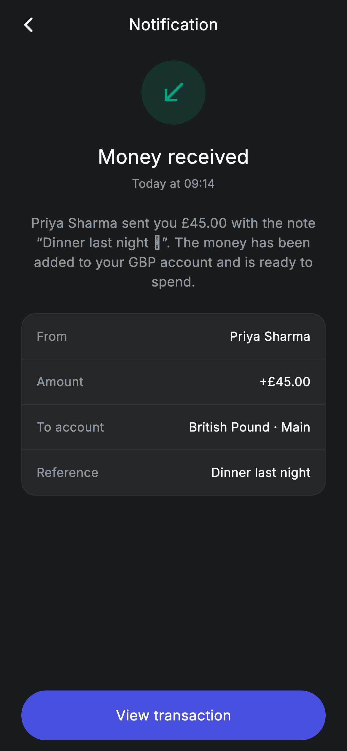
Tapping a push notification in a banking app should give you more than the one-line summary — you want who sent the money, how much, and which account it landed in. This tutorial builds that expanded view in Flutter: a teal-tinted circle with a south-west arrow announcing 'Money received', the £45.00 story told in a centred paragraph, a four-row details card (From, Amount, To account, Reference) split by hairline dividers, and a 'View transaction' pill pinned below the scroll area so it never scrolls out of reach.
Watch the Flutter UI walkthrough
A short screen recording of Fintech · Notification Detail running, if you'd rather see it before you read the code. The written tutorial below covers everything in it.
Can't see the video? Watch it on YouTube.
What you'll build
- ✓A dark #191C1F notification route with a centred title bar and a working back button
- ✓A 72px teal-tinted circular icon badge that signals an incoming transfer at a glance
- ✓A headline, timestamp and plain-English summary paragraph stacked in a bouncing ListView
- ✓A rounded details card whose From / Amount / To account / Reference rows come from one reusable helper
- ✓A full-width pill CTA pinned outside the scroll view, wired to an onPrimary callback
Step-by-step build
Create the file
Add a new file at lib/fintech_notification_detail/fintech_notification_detail_screen.dart in your Flutter project.
Register the bundled fonts
No external packages — this is pure Flutter. It does bundle its design font (Inter), so drop the font file into fonts/ and declare it in pubspec.yaml:
flutter:
  fonts:
    - family: Inter
      fonts:
- asset: fonts/Inter-Regular.ttfBuild it, piece by piece
Here's how the screen goes together. Each block below is a real slice of the code with a plain-English explanation — paste them in order, or grab the whole file from the next section.
A stateless screen with two callbacks and a six-colour palette
import 'package:flutter/material.dart';

/// Notification Detail — an expanded notification with context and a CTA.
/// Self-contained per CONVENTIONS.md: pure Flutter, bundled Inter font, forced
/// dark theme so it renders standalone as a route.
class FintechNotificationDetailScreen extends StatelessWidget {
  const FintechNotificationDetailScreen(
      {super.key, this.onBack, this.onPrimary});

  final VoidCallback? onBack;
  final VoidCallback? onPrimary;

  static const String _font = 'Inter';
  static const Color _bg = Color(0xFF191C1F);
  static const Color _surface = Color(0xFF242729);
  static const Color _brand = Color(0xFF494FDF);
  static const Color _teal = Color(0xFF00A87E);
  static const Color _muted = Color(0xFF8D969E);
  static const Color _hairline = Color(0xFF2E3235);
Only the material library is imported — there is nothing else to pull in. FintechNotificationDetailScreen is a StatelessWidget because every value on the page is a hard-coded string; nothing here changes after the first frame. The two nullable VoidCallbacks, onBack and onPrimary, are the screen's entire API: the host app decides what 'back' and 'View transaction' actually do. Below them sit the design tokens — _bg (#191C1F) for the canvas, _surface (#242729) for the details card, _brand (#494FDF) indigo for the CTA, _teal (#00A87E) for the money-in accent, _muted (#8D969E) for secondary text and _hairline (#2E3235) for the 1px borders and dividers — plus _font = 'Inter', repeated in every TextStyle so the screen keeps its typeface even inside an app with a different default.
Forcing dark mode and pinning the CTA outside the scroll
  @override
  Widget build(BuildContext context) {
    return Theme(
      data: ThemeData.dark(useMaterial3: true),
      child: Scaffold(
        backgroundColor: _bg,
        body: SafeArea(
          child: Column(
            crossAxisAlignment: CrossAxisAlignment.stretch,
            children: <Widget>[
              _appBar(context),
              Expanded(
                child: ListView(
                  physics: const BouncingScrollPhysics(),
                  padding: const EdgeInsets.fromLTRB(24, 12, 24, 24),
                  children: <Widget>[
                    Center(
                      child: Container(
                        width: 72,
                        height: 72,
                        decoration: BoxDecoration(
                          shape: BoxShape.circle,
                          color: _teal.withValues(alpha: 0.16),
                        ),
                        child: const Icon(Icons.south_west_rounded,
                            size: 34, color: _teal),
                      ),
                    ),
                    const SizedBox(height: 20),
build() wraps everything in a Theme with ThemeData.dark(useMaterial3: true), so the screen renders correctly as a standalone route even if the surrounding app is light. Inside the Scaffold, SafeArea then a Column with crossAxisAlignment.stretch makes every child full width. The Column has exactly three parts: the title bar, an Expanded holding the scrollable ListView, and the button block — that structure is why the CTA stays glued to the bottom while only the content between them moves. The ListView uses BouncingScrollPhysics for an iOS-style rubber-band and pads its content 24px on the sides. Its first child is the status badge: a 72×72 Container with BoxShape.circle filled with _teal.withValues(alpha: 0.16) — the same teal as the icon, at 16% opacity — holding a 34px Icons.south_west_rounded, the arrow-into-your-account shorthand for an incoming payment.
Headline, timestamp, and the summary paragraph
                    const Text(
                      'Money received',
                      textAlign: TextAlign.center,
                      style: TextStyle(
                        fontFamily: _font,
                        fontSize: 22,
                        fontWeight: FontWeight.w500,
                        letterSpacing: 0.24,
                        color: Colors.white,
                      ),
                    ),
                    const SizedBox(height: 6),
                    const Text(
                      'Today at 09:14',
                      textAlign: TextAlign.center,
                      style: TextStyle(
                        fontFamily: _font,
                        fontSize: 13,
                        letterSpacing: 0.24,
                        color: _muted,
                      ),
                    ),
                    const SizedBox(height: 24),
                    const Text(
                      'Priya Sharma sent you £45.00 with the note “Dinner last '
                      'night 🍝”. The money has been added to your GBP account '
                      'and is ready to spend.',
                      textAlign: TextAlign.center,
                      style: TextStyle(
                        fontFamily: _font,
                        fontSize: 15,
                        height: 1.45,
                        letterSpacing: 0.24,
                        color: _muted,
                      ),
                    ),
                    const SizedBox(height: 24),
Three centred Texts do all the storytelling. 'Money received' is 22px, FontWeight.w500 and white; six pixels below it 'Today at 09:14' is 13px in the _muted grey, so the timestamp reads as a caption rather than a second headline. After a 24px gap comes the body: 'Priya Sharma sent you £45.00 with the note “Dinner last night 🍝”. The money has been added to your GBP account and is ready to spend.' — written across three adjacent string literals that Dart concatenates at compile time, which is how you keep a long sentence inside the line limit without a runtime join. That paragraph is 15px with height: 1.45, giving it roughly 22px line spacing so multi-line copy stays readable. Every style also carries letterSpacing: 0.24, the small consistent tracking used across the whole screen.
The details card built from repeated rows and dividers
                    Container(
                      decoration: BoxDecoration(
                        color: _surface,
                        borderRadius: BorderRadius.circular(16),
                        border: Border.all(color: _hairline),
                      ),
                      child: Column(
                        children: <Widget>[
                          _row('From', 'Priya Sharma'),
                          const Divider(color: _hairline, height: 1),
                          _row('Amount', '+£45.00'),
                          const Divider(color: _hairline, height: 1),
                          _row('To account', 'British Pound · Main'),
                          const Divider(color: _hairline, height: 1),
                          _row('Reference', 'Dinner last night'),
                        ],
                      ),
                    ),
                  ],
                ),
              ),
The structured facts live in a Container filled with _surface, rounded to a 16px radius and outlined with a 1px _hairline border — the standard grouped-list look. Its child Column alternates four _row() calls with three const Dividers, each also _hairline coloured and given height: 1 so the divider occupies exactly one pixel instead of Material's default 16px of built-in padding. The four rows are From / Priya Sharma, Amount / +£45.00, To account / British Pound · Main and Reference / Dinner last night. Note the leading + on the amount and the teal icon above: colour and sign together carry the 'this is money in' meaning without a single extra label.
The pinned 'View transaction' pill
              Padding(
                padding: const EdgeInsets.fromLTRB(24, 4, 24, 12),
                child: SizedBox(
                  height: 56,
                  child: Material(
                    color: _brand,
                    borderRadius: BorderRadius.circular(9999),
                    child: InkWell(
                      borderRadius: BorderRadius.circular(9999),
                      onTap: onPrimary,
                      child: const Center(
                        child: Text(
                          'View transaction',
                          style: TextStyle(
                            fontFamily: _font,
                            fontSize: 16,
                            fontWeight: FontWeight.w500,
                            letterSpacing: 0.24,
                            color: Colors.white,
                          ),
                        ),
                      ),
                    ),
                  ),
                ),
              ),
            ],
          ),
        ),
      ),
    );
  }
Because this Padding is the Column's last child rather than a ListView item, the button sits above the home indicator at all times. A SizedBox fixes the height at 56 — comfortably above the 48px minimum tap target — and the pill shape comes from Material(color: _brand) with borderRadius: BorderRadius.circular(9999); any radius larger than half the height produces a full capsule. The InkWell inside repeats that same radius so the ripple is clipped to the pill instead of splashing into the corners, and its onTap simply forwards the onPrimary callback. Passing null there leaves the button visually unchanged but inert, which is why the ripple lives on InkWell rather than on a disabled-aware ElevatedButton.
The title bar and the reusable label/value row
  Widget _appBar(BuildContext context) {
    return Padding(
      padding: const EdgeInsets.fromLTRB(8, 4, 8, 4),
      child: Row(
        children: <Widget>[
          IconButton(
            onPressed: onBack ?? () => Navigator.of(context).maybePop(),
            icon: const Icon(Icons.arrow_back_ios_new_rounded,
                size: 20, color: Colors.white),
          ),
          const Expanded(
            child: Text(
              'Notification',
              textAlign: TextAlign.center,
              style: TextStyle(
                fontFamily: _font,
                fontSize: 18,
                fontWeight: FontWeight.w500,
                letterSpacing: 0.24,
                color: Colors.white,
              ),
            ),
          ),
          const SizedBox(width: 48),
        ],
      ),
    );
  }

  Widget _row(String label, String value) {
    return Padding(
      padding: const EdgeInsets.symmetric(horizontal: 16, vertical: 15),
      child: Row(
        children: <Widget>[
          Expanded(
            child: Text(
              label,
              style: const TextStyle(
                fontFamily: _font,
                fontSize: 14,
                letterSpacing: 0.24,
                color: _muted,
              ),
            ),
          ),
          Text(
            value,
            style: const TextStyle(
              fontFamily: _font,
              fontSize: 14,
              fontWeight: FontWeight.w500,
              letterSpacing: 0.24,
              color: Colors.white,
            ),
          ),
        ],
      ),
    );
  }
_appBar() is a hand-rolled Row rather than an AppBar, which keeps the padding tight (8px sides, 4px top and bottom) and the background exactly _bg. Its back IconButton uses onBack ?? () => Navigator.of(context).maybePop(), so the screen pops itself when no callback is supplied — maybePop rather than pop, so it does nothing harmless if it is the only route on the stack. The 'Notification' title sits in an Expanded with textAlign: TextAlign.center, and the trailing const SizedBox(width: 48) mirrors the IconButton's default 48px width so the title lands on the true centre instead of drifting right. _row(label, value) is the card's building block: 16px horizontal and 15px vertical padding, an Expanded holding the 14px _muted label so it absorbs all leftover width, and the white w500 value pushed hard against the right edge. Adding a fifth detail is one more _row plus one more Divider.
Full code
The complete, ready-to-paste source. Free to use in your projects — one click copies it all.
import 'package:flutter/material.dart';

/// Notification Detail — an expanded notification with context and a CTA.
/// Self-contained per CONVENTIONS.md: pure Flutter, bundled Inter font, forced
/// dark theme so it renders standalone as a route.
class FintechNotificationDetailScreen extends StatelessWidget {
  const FintechNotificationDetailScreen(
      {super.key, this.onBack, this.onPrimary});

  final VoidCallback? onBack;
  final VoidCallback? onPrimary;

  static const String _font = 'Inter';
  static const Color _bg = Color(0xFF191C1F);
  static const Color _surface = Color(0xFF242729);
  static const Color _brand = Color(0xFF494FDF);
  static const Color _teal = Color(0xFF00A87E);
  static const Color _muted = Color(0xFF8D969E);
  static const Color _hairline = Color(0xFF2E3235);

  @override
  Widget build(BuildContext context) {
    return Theme(
      data: ThemeData.dark(useMaterial3: true),
      child: Scaffold(
        backgroundColor: _bg,
        body: SafeArea(
          child: Column(
            crossAxisAlignment: CrossAxisAlignment.stretch,
            children: <Widget>[
              _appBar(context),
              Expanded(
                child: ListView(
                  physics: const BouncingScrollPhysics(),
                  padding: const EdgeInsets.fromLTRB(24, 12, 24, 24),
                  children: <Widget>[
                    Center(
                      child: Container(
                        width: 72,
                        height: 72,
                        decoration: BoxDecoration(
                          shape: BoxShape.circle,
                          color: _teal.withValues(alpha: 0.16),
                        ),
                        child: const Icon(Icons.south_west_rounded,
                            size: 34, color: _teal),
                      ),
                    ),
                    const SizedBox(height: 20),
                    const Text(
                      'Money received',
                      textAlign: TextAlign.center,
                      style: TextStyle(
                        fontFamily: _font,
                        fontSize: 22,
                        fontWeight: FontWeight.w500,
                        letterSpacing: 0.24,
                        color: Colors.white,
                      ),
                    ),
                    const SizedBox(height: 6),
                    const Text(
                      'Today at 09:14',
                      textAlign: TextAlign.center,
                      style: TextStyle(
                        fontFamily: _font,
                        fontSize: 13,
                        letterSpacing: 0.24,
                        color: _muted,
                      ),
                    ),
                    const SizedBox(height: 24),
                    const Text(
                      'Priya Sharma sent you £45.00 with the note “Dinner last '
                      'night 🍝”. The money has been added to your GBP account '
                      'and is ready to spend.',
                      textAlign: TextAlign.center,
                      style: TextStyle(
                        fontFamily: _font,
                        fontSize: 15,
                        height: 1.45,
                        letterSpacing: 0.24,
                        color: _muted,
                      ),
                    ),
                    const SizedBox(height: 24),
                    Container(
                      decoration: BoxDecoration(
                        color: _surface,
                        borderRadius: BorderRadius.circular(16),
                        border: Border.all(color: _hairline),
                      ),
                      child: Column(
                        children: <Widget>[
                          _row('From', 'Priya Sharma'),
                          const Divider(color: _hairline, height: 1),
                          _row('Amount', '+£45.00'),
                          const Divider(color: _hairline, height: 1),
                          _row('To account', 'British Pound · Main'),
                          const Divider(color: _hairline, height: 1),
                          _row('Reference', 'Dinner last night'),
                        ],
                      ),
                    ),
                  ],
                ),
              ),
              Padding(
                padding: const EdgeInsets.fromLTRB(24, 4, 24, 12),
                child: SizedBox(
                  height: 56,
                  child: Material(
                    color: _brand,
                    borderRadius: BorderRadius.circular(9999),
                    child: InkWell(
                      borderRadius: BorderRadius.circular(9999),
                      onTap: onPrimary,
                      child: const Center(
                        child: Text(
                          'View transaction',
                          style: TextStyle(
                            fontFamily: _font,
                            fontSize: 16,
                            fontWeight: FontWeight.w500,
                            letterSpacing: 0.24,
                            color: Colors.white,
                          ),
                        ),
                      ),
                    ),
                  ),
                ),
              ),
            ],
          ),
        ),
      ),
    );
  }

  Widget _appBar(BuildContext context) {
    return Padding(
      padding: const EdgeInsets.fromLTRB(8, 4, 8, 4),
      child: Row(
        children: <Widget>[
          IconButton(
            onPressed: onBack ?? () => Navigator.of(context).maybePop(),
            icon: const Icon(Icons.arrow_back_ios_new_rounded,
                size: 20, color: Colors.white),
          ),
          const Expanded(
            child: Text(
              'Notification',
              textAlign: TextAlign.center,
              style: TextStyle(
                fontFamily: _font,
                fontSize: 18,
                fontWeight: FontWeight.w500,
                letterSpacing: 0.24,
                color: Colors.white,
              ),
            ),
          ),
          const SizedBox(width: 48),
        ],
      ),
    );
  }

  Widget _row(String label, String value) {
    return Padding(
      padding: const EdgeInsets.symmetric(horizontal: 16, vertical: 15),
      child: Row(
        children: <Widget>[
          Expanded(
            child: Text(
              label,
              style: const TextStyle(
                fontFamily: _font,
                fontSize: 14,
                letterSpacing: 0.24,
                color: _muted,
              ),
            ),
          ),
          Text(
            value,
            style: const TextStyle(
              fontFamily: _font,
              fontSize: 14,
              fontWeight: FontWeight.w500,
              letterSpacing: 0.24,
              color: Colors.white,
            ),
          ),
        ],
      ),
    );
  }
}
Plus bundled 1 binary asset (fonts/images). The CLI and MCP install those for you automatically.
Two faster ways to add it
Copy-paste works, but you can skip it entirely.
1. FlutterKit CLI
One command drops this screen — and its fonts — straight into your project.
$ flutterkit add fintech-notification-detail2. AI agent (MCP)
Connect FlutterKit's MCP server in Claude or Cursor and just ask your agent to install fintech-notification-detail — it fetches and writes the files for you.
FAQ
Can I ship this notification detail screen in a commercial banking app?
Yes. The full Dart source on this page is free to copy and use in personal or commercial projects. Paste it in, install it with the FlutterKit CLI (flutterkit add fintech-notification-detail), or let an AI agent add it through MCP. Swap the hard-coded strings — 'Money received', the £45.00 paragraph and the four _row() values — for your own notification payload.
Do the details card and the pill button need any packages?
No. It is pure Flutter: Material, InkWell, ListView, Divider and Icons.south_west_rounded all ship with the framework, so there is nothing to add to your dependencies. The only extra asset is the bundled Inter font referenced by the _font constant, which you register in pubspec.yaml as shown in step 2 — the CLI and MCP copy those font files in for you.
What Flutter SDK does this screen need?
Flutter 3.22+ (Dart 3), because the teal icon badge tints itself with _teal.withValues(alpha: 0.16) and the constructor uses the super.key super-parameter. On an older SDK, change that call to _teal.withOpacity(0.16) and rewrite the constructor as Key? key ... : super(key: key); ThemeData.dark(useMaterial3: true) works from Flutter 3.10 onward.


