How to Build a Hub Screen in Flutter (Full Code + Preview)
The Hub tab is where a super-app parks everything that didn't fit on the home screen. This tutorial builds Nova's version in Flutter: twelve tinted shortcut tiles — Accounts, Cards, Crypto, Rewards, Statements and more — laid out three across under a large 'Hub' heading, with a five-tab bottom bar underneath and the Hub tab lit indigo. The interesting part is that one const list of Dart records drives every tile, so adding a thirteenth shortcut is a single line of data, not a new widget.
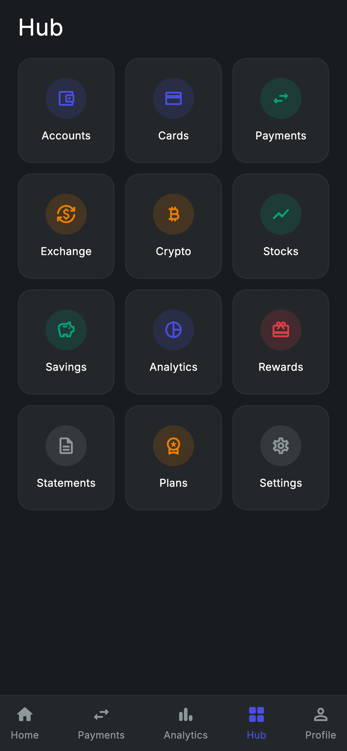
Watch the Flutter UI walkthrough
A short screen recording of Fintech · Hub running, if you'd rather see it before you read the code. The written tutorial below covers everything in it.
Can't see the video? Watch it on YouTube.
What you'll build
- ✓A 3-column GridView of 12 feature tiles, each a rounded dark card with a tinted circular icon and a label
- ✓A single typed record list that is the only place you edit to add, rename, retint or reorder a shortcut
- ✓A five-tab bottom navigation bar that highlights the Hub tab and reports taps by index
- ✓Two callbacks — onOpen(key) and onTabSelected(index) — so the screen carries no navigation logic of its own
- ✓A forced dark Material 3 theme and Inter typography, so the screen renders standalone as a route
Step-by-step build
Create the file
Add a new file at lib/fintech_hub/fintech_hub_screen.dart in your Flutter project.
Register the bundled fonts
No external packages — this is pure Flutter. It does bundle its design font (Inter), so drop the font file into fonts/ and declare it in pubspec.yaml:
flutter:
  fonts:
    - family: Inter
      fonts:
- asset: fonts/Inter-Regular.ttfBuild it, piece by piece
Here's how the screen goes together. Each block below is a real slice of the code with a plain-English explanation — paste them in order, or grab the whole file from the next section.
A stateless screen, two callbacks, and the palette
import 'package:flutter/material.dart';

/// Hub — the "everything" grid of Nova features. A primary bottom-nav
/// destination (Hub tab). Self-contained per CONVENTIONS.md: pure Flutter,
/// bundled Inter font, forced dark theme so it renders standalone as a route.
class FintechHubScreen extends StatelessWidget {
  const FintechHubScreen({super.key, this.onTabSelected, this.onOpen});

  /// Bottom-nav tab callback (Home=0, Payments=1, Analytics=2, Hub=3, Profile=4).
  final ValueChanged<int>? onTabSelected;

  /// Opens a feature by key (e.g. 'accounts', 'payments'). Unknown keys are
  /// no-ops in the gallery until the target screen is built.
  final ValueChanged<String>? onOpen;

  static const String _font = 'Inter';
  static const Color _bg = Color(0xFF191C1F);
  static const Color _surface = Color(0xFF242729);
  static const Color _brand = Color(0xFF494FDF);
  static const Color _teal = Color(0xFF00A87E);
  static const Color _amber = Color(0xFFEC7E00);
  static const Color _red = Color(0xFFE23B4A);
  static const Color _muted = Color(0xFF8D969E);
  static const Color _hairline = Color(0xFF2E3235);
FintechHubScreen is a StatelessWidget — the grid never changes and nothing is selected, so there is no state to hold. It takes two optional callbacks: onTabSelected, a ValueChanged<int> for the bottom bar (Home=0, Payments=1, Analytics=2, Hub=3, Profile=4), and onOpen, a ValueChanged<String> that fires the tapped tile's key such as 'accounts' or 'payments'. Both are nullable and called with ?., so the screen is a no-op launcher until you wire real routes. The palette below them is all static const: _bg (#191C1F) is the canvas, _surface (#242729) is used by both the tiles and the nav bar, _hairline (#2E3235) is their 1px border, and four accent tints — _brand indigo #494FDF, _teal #00A87E, _amber #EC7E00 and _red #E23B4A — plus _muted grey #8D969E colour the icons.
The record list that drives every tile
  static const List<({String key, IconData icon, String label, Color tint})>
      _items = <({String key, IconData icon, String label, Color tint})>[
    (key: 'accounts', icon: Icons.account_balance_wallet_outlined, label: 'Accounts', tint: _brand),
    (key: 'cards', icon: Icons.credit_card_rounded, label: 'Cards', tint: _brand),
    (key: 'payments', icon: Icons.swap_horiz_rounded, label: 'Payments', tint: _teal),
    (key: 'exchange', icon: Icons.currency_exchange_rounded, label: 'Exchange', tint: _amber),
    (key: 'crypto', icon: Icons.currency_bitcoin_rounded, label: 'Crypto', tint: _amber),
    (key: 'stocks', icon: Icons.show_chart_rounded, label: 'Stocks', tint: _teal),
    (key: 'savings', icon: Icons.savings_outlined, label: 'Savings', tint: _teal),
    (key: 'analytics', icon: Icons.pie_chart_outline_rounded, label: 'Analytics', tint: _brand),
    (key: 'rewards', icon: Icons.card_giftcard_rounded, label: 'Rewards', tint: _red),
    (key: 'statements', icon: Icons.description_outlined, label: 'Statements', tint: _muted),
    (key: 'plans', icon: Icons.workspace_premium_outlined, label: 'Plans', tint: _amber),
    (key: 'settings', icon: Icons.settings_outlined, label: 'Settings', tint: _muted),
  ];
Instead of twelve hand-written tile widgets, the screen holds one const list of Dart 3 records typed ({String key, IconData icon, String label, Color tint}). Each entry pairs a routing key with its Material icon, its visible label, and which accent it wears — money features like Accounts, Cards and Analytics take _brand, movement and growth (Payments, Stocks, Savings) take _teal, Exchange, Crypto and Plans take _amber, Rewards alone takes _red, and the utility rows Statements and Settings take _muted so they visually recede. Because the list is const and typed, adding a shortcut means adding one tuple; the grid, the tint and the tap key all follow automatically.
Dark theme, the heading, and the grid
  @override
  Widget build(BuildContext context) {
    return Theme(
      data: ThemeData.dark(useMaterial3: true),
      child: Scaffold(
        backgroundColor: _bg,
        body: SafeArea(
          bottom: false,
          child: Column(
            crossAxisAlignment: CrossAxisAlignment.stretch,
            children: <Widget>[
              const Padding(
                padding: EdgeInsets.fromLTRB(20, 12, 20, 12),
                child: Text(
                  'Hub',
                  style: TextStyle(
                    fontFamily: _font,
                    fontSize: 26,
                    fontWeight: FontWeight.w500,
                    letterSpacing: 0.24,
                    color: Colors.white,
                  ),
                ),
              ),
              Expanded(
                child: GridView.count(
                  crossAxisCount: 3,
                  physics: const BouncingScrollPhysics(),
                  padding: const EdgeInsets.fromLTRB(20, 4, 20, 20),
                  mainAxisSpacing: 12,
                  crossAxisSpacing: 12,
                  childAspectRatio: 0.92,
                  children: <Widget>[
                    for (final ({String key, IconData icon, String label, Color tint}) it in _items)
                      _tile(it),
                  ],
                ),
              ),
              _BottomNav(onTabSelected: onTabSelected),
            ],
          ),
        ),
      ),
    );
  }
build() wraps everything in Theme(data: ThemeData.dark(useMaterial3: true)) so the screen looks right even if the host app runs a light theme — that is what makes it droppable as a standalone route. Inside, a Scaffold painted _bg holds a SafeArea with bottom: false, deliberately letting the nav bar handle the home-indicator inset itself. The Column stretches its children and holds three things: the 26px w500 'Hub' title in Inter with 0.24 letter-spacing, padded 20/12; an Expanded GridView.count with crossAxisCount: 3, 12px spacing on both axes, BouncingScrollPhysics and childAspectRatio: 0.92 (slightly taller than square, which leaves room for the icon-plus-label stack); and finally the _BottomNav. The grid's children come from a collection-for loop over _items calling _tile(it), so the twelve records become twelve widgets in one line.
The tile builder
  Widget _tile(({String key, IconData icon, String label, Color tint}) it) {
    return GestureDetector(
      onTap: () => onOpen?.call(it.key),
      behavior: HitTestBehavior.opaque,
      child: Container(
        decoration: BoxDecoration(
          color: _surface,
          borderRadius: BorderRadius.circular(16),
          border: Border.all(color: _hairline),
        ),
        child: Column(
          mainAxisAlignment: MainAxisAlignment.center,
          children: <Widget>[
            Container(
              width: 46,
              height: 46,
              decoration: BoxDecoration(
                shape: BoxShape.circle,
                color: it.tint.withValues(alpha: 0.16),
              ),
              child: Icon(it.icon, size: 22, color: it.tint),
            ),
            const SizedBox(height: 10),
            Text(
              it.label,
              style: const TextStyle(
                fontFamily: _font,
                fontSize: 12,
                fontWeight: FontWeight.w500,
                letterSpacing: 0.24,
                color: Colors.white,
              ),
            ),
          ],
        ),
      ),
    );
  }
}
_tile takes one record and returns a GestureDetector whose onTap calls onOpen?.call(it.key) — the tile itself never knows what a route is. behavior: HitTestBehavior.opaque makes the whole card tappable, including the padding around the icon, not just the painted pixels. The card is a Container filled _surface with a 16px BorderRadius and a _hairline border, and its centred Column stacks a 46x46 circle whose colour is the record's own tint at 16% alpha — it.tint.withValues(alpha: 0.16) — holding the 22px Icon in the full-strength tint. That two-layer trick is what gives each tile a coloured glow without shouting. A 10px SizedBox separates the circle from the 12px w500 Inter label in white.
The five-tab bottom navigation bar
class _BottomNav extends StatelessWidget {
  const _BottomNav({this.onTabSelected});

  final ValueChanged<int>? onTabSelected;

  static const List<({IconData icon, String label})> _tabs =
      <({IconData icon, String label})>[
    (icon: Icons.home_rounded, label: 'Home'),
    (icon: Icons.swap_horiz_rounded, label: 'Payments'),
    (icon: Icons.bar_chart_rounded, label: 'Analytics'),
    (icon: Icons.grid_view_rounded, label: 'Hub'),
    (icon: Icons.person_outline_rounded, label: 'Profile'),
  ];

  @override
  Widget build(BuildContext context) {
    return Container(
      decoration: const BoxDecoration(
        color: FintechHubScreen._surface,
        border: Border(
          top: BorderSide(color: FintechHubScreen._hairline),
        ),
      ),
      child: SafeArea(
        top: false,
        child: Padding(
          padding: const EdgeInsets.symmetric(horizontal: 12, vertical: 10),
          child: Row(
            mainAxisAlignment: MainAxisAlignment.spaceBetween,
            children: <Widget>[
              for (int i = 0; i < _tabs.length; i++)
                GestureDetector(
                  onTap: () => onTabSelected?.call(i),
                  behavior: HitTestBehavior.opaque,
                  child: Column(
                    mainAxisSize: MainAxisSize.min,
                    children: <Widget>[
                      Icon(
                        _tabs[i].icon,
                        size: 22,
                        color: i == 3
                            ? FintechHubScreen._brand
                            : FintechHubScreen._muted,
                      ),
                      const SizedBox(height: 4),
                      Text(
                        _tabs[i].label,
                        style: TextStyle(
                          fontFamily: FintechHubScreen._font,
                          fontSize: 11,
                          fontWeight:
                              i == 3 ? FontWeight.w500 : FontWeight.w400,
                          letterSpacing: 0.24,
                          color: i == 3
                              ? FintechHubScreen._brand
                              : FintechHubScreen._muted,
                        ),
                      ),
                    ],
                  ),
                ),
            ],
          ),
        ),
      ),
    );
  }
}
_BottomNav is a private StatelessWidget with its own const list of ({IconData icon, String label}) records: Home, Payments, Analytics, Hub and Profile. It reuses the parent's tokens directly — FintechHubScreen._surface for its fill and a single top BorderSide in _hairline, so the bar reads as a raised strip against the darker canvas. SafeArea(top: false) adds the bottom inset here, which is why the screen's outer SafeArea skipped it. A Row with spaceBetween and a plain for loop builds the five items; each is a GestureDetector calling onTabSelected?.call(i). Selection is hard-coded rather than stateful: the comparison i == 3 switches the 22px icon and 11px label from _muted to _brand and bumps the label weight from w400 to w500, permanently marking Hub as the current tab. Point that comparison at a variable if you want the bar to be reusable across tabs.
Full code
The complete, ready-to-paste source. Free to use in your projects — one click copies it all.
import 'package:flutter/material.dart';

/// Hub — the "everything" grid of Nova features. A primary bottom-nav
/// destination (Hub tab). Self-contained per CONVENTIONS.md: pure Flutter,
/// bundled Inter font, forced dark theme so it renders standalone as a route.
class FintechHubScreen extends StatelessWidget {
  const FintechHubScreen({super.key, this.onTabSelected, this.onOpen});

  /// Bottom-nav tab callback (Home=0, Payments=1, Analytics=2, Hub=3, Profile=4).
  final ValueChanged<int>? onTabSelected;

  /// Opens a feature by key (e.g. 'accounts', 'payments'). Unknown keys are
  /// no-ops in the gallery until the target screen is built.
  final ValueChanged<String>? onOpen;

  static const String _font = 'Inter';
  static const Color _bg = Color(0xFF191C1F);
  static const Color _surface = Color(0xFF242729);
  static const Color _brand = Color(0xFF494FDF);
  static const Color _teal = Color(0xFF00A87E);
  static const Color _amber = Color(0xFFEC7E00);
  static const Color _red = Color(0xFFE23B4A);
  static const Color _muted = Color(0xFF8D969E);
  static const Color _hairline = Color(0xFF2E3235);

  static const List<({String key, IconData icon, String label, Color tint})>
      _items = <({String key, IconData icon, String label, Color tint})>[
    (key: 'accounts', icon: Icons.account_balance_wallet_outlined, label: 'Accounts', tint: _brand),
    (key: 'cards', icon: Icons.credit_card_rounded, label: 'Cards', tint: _brand),
    (key: 'payments', icon: Icons.swap_horiz_rounded, label: 'Payments', tint: _teal),
    (key: 'exchange', icon: Icons.currency_exchange_rounded, label: 'Exchange', tint: _amber),
    (key: 'crypto', icon: Icons.currency_bitcoin_rounded, label: 'Crypto', tint: _amber),
    (key: 'stocks', icon: Icons.show_chart_rounded, label: 'Stocks', tint: _teal),
    (key: 'savings', icon: Icons.savings_outlined, label: 'Savings', tint: _teal),
    (key: 'analytics', icon: Icons.pie_chart_outline_rounded, label: 'Analytics', tint: _brand),
    (key: 'rewards', icon: Icons.card_giftcard_rounded, label: 'Rewards', tint: _red),
    (key: 'statements', icon: Icons.description_outlined, label: 'Statements', tint: _muted),
    (key: 'plans', icon: Icons.workspace_premium_outlined, label: 'Plans', tint: _amber),
    (key: 'settings', icon: Icons.settings_outlined, label: 'Settings', tint: _muted),
  ];

  @override
  Widget build(BuildContext context) {
    return Theme(
      data: ThemeData.dark(useMaterial3: true),
      child: Scaffold(
        backgroundColor: _bg,
        body: SafeArea(
          bottom: false,
          child: Column(
            crossAxisAlignment: CrossAxisAlignment.stretch,
            children: <Widget>[
              const Padding(
                padding: EdgeInsets.fromLTRB(20, 12, 20, 12),
                child: Text(
                  'Hub',
                  style: TextStyle(
                    fontFamily: _font,
                    fontSize: 26,
                    fontWeight: FontWeight.w500,
                    letterSpacing: 0.24,
                    color: Colors.white,
                  ),
                ),
              ),
              Expanded(
                child: GridView.count(
                  crossAxisCount: 3,
                  physics: const BouncingScrollPhysics(),
                  padding: const EdgeInsets.fromLTRB(20, 4, 20, 20),
                  mainAxisSpacing: 12,
                  crossAxisSpacing: 12,
                  childAspectRatio: 0.92,
                  children: <Widget>[
                    for (final ({String key, IconData icon, String label, Color tint}) it in _items)
                      _tile(it),
                  ],
                ),
              ),
              _BottomNav(onTabSelected: onTabSelected),
            ],
          ),
        ),
      ),
    );
  }

  Widget _tile(({String key, IconData icon, String label, Color tint}) it) {
    return GestureDetector(
      onTap: () => onOpen?.call(it.key),
      behavior: HitTestBehavior.opaque,
      child: Container(
        decoration: BoxDecoration(
          color: _surface,
          borderRadius: BorderRadius.circular(16),
          border: Border.all(color: _hairline),
        ),
        child: Column(
          mainAxisAlignment: MainAxisAlignment.center,
          children: <Widget>[
            Container(
              width: 46,
              height: 46,
              decoration: BoxDecoration(
                shape: BoxShape.circle,
                color: it.tint.withValues(alpha: 0.16),
              ),
              child: Icon(it.icon, size: 22, color: it.tint),
            ),
            const SizedBox(height: 10),
            Text(
              it.label,
              style: const TextStyle(
                fontFamily: _font,
                fontSize: 12,
                fontWeight: FontWeight.w500,
                letterSpacing: 0.24,
                color: Colors.white,
              ),
            ),
          ],
        ),
      ),
    );
  }
}

class _BottomNav extends StatelessWidget {
  const _BottomNav({this.onTabSelected});

  final ValueChanged<int>? onTabSelected;

  static const List<({IconData icon, String label})> _tabs =
      <({IconData icon, String label})>[
    (icon: Icons.home_rounded, label: 'Home'),
    (icon: Icons.swap_horiz_rounded, label: 'Payments'),
    (icon: Icons.bar_chart_rounded, label: 'Analytics'),
    (icon: Icons.grid_view_rounded, label: 'Hub'),
    (icon: Icons.person_outline_rounded, label: 'Profile'),
  ];

  @override
  Widget build(BuildContext context) {
    return Container(
      decoration: const BoxDecoration(
        color: FintechHubScreen._surface,
        border: Border(
          top: BorderSide(color: FintechHubScreen._hairline),
        ),
      ),
      child: SafeArea(
        top: false,
        child: Padding(
          padding: const EdgeInsets.symmetric(horizontal: 12, vertical: 10),
          child: Row(
            mainAxisAlignment: MainAxisAlignment.spaceBetween,
            children: <Widget>[
              for (int i = 0; i < _tabs.length; i++)
                GestureDetector(
                  onTap: () => onTabSelected?.call(i),
                  behavior: HitTestBehavior.opaque,
                  child: Column(
                    mainAxisSize: MainAxisSize.min,
                    children: <Widget>[
                      Icon(
                        _tabs[i].icon,
                        size: 22,
                        color: i == 3
                            ? FintechHubScreen._brand
                            : FintechHubScreen._muted,
                      ),
                      const SizedBox(height: 4),
                      Text(
                        _tabs[i].label,
                        style: TextStyle(
                          fontFamily: FintechHubScreen._font,
                          fontSize: 11,
                          fontWeight:
                              i == 3 ? FontWeight.w500 : FontWeight.w400,
                          letterSpacing: 0.24,
                          color: i == 3
                              ? FintechHubScreen._brand
                              : FintechHubScreen._muted,
                        ),
                      ),
                    ],
                  ),
                ),
            ],
          ),
        ),
      ),
    );
  }
}
Plus bundled 1 binary asset (fonts/images). The CLI and MCP install those for you automatically.
Two faster ways to add it
Copy-paste works, but you can skip it entirely.
1. FlutterKit CLI
One command drops this screen — and its fonts — straight into your project.
$ flutterkit add fintech-hub2. AI agent (MCP)
Connect FlutterKit's MCP server in Claude or Cursor and just ask your agent to install fintech-hub — it fetches and writes the files for you.
FAQ
Can I ship this Hub grid in a commercial app?
Yes. The Dart on this page is free to copy into personal or client work, including paid apps. Paste it straight in, run flutterkit add fintech-hub with the CLI, or let an AI agent install it for you over MCP.
Do the tile icons or the grid need any packages?
No — this is pure Flutter. Every icon (account_balance_wallet_outlined, currency_bitcoin_rounded, grid_view_rounded and the rest) ships in Material's built-in Icons set, and GridView.count is core framework. The only asset is the bundled Inter font, which you register in pubspec.yaml as shown in step 2; the CLI and MCP copy the font files in for you.
What Flutter SDK does the Hub screen need?
Dart 3 at minimum, because both _items and _BottomNav._tabs are record lists with named fields — that syntax simply won't parse on Dart 2. It also calls it.tint.withValues(alpha: 0.16) on the icon circle, which lands in Flutter 3.22+; on an older 3.x SDK change that one call to withOpacity(0.16) and the rest compiles as-is.


