Fintech67 views

How to Build a Passcode Login Screen in Flutter (Full Code + Preview)

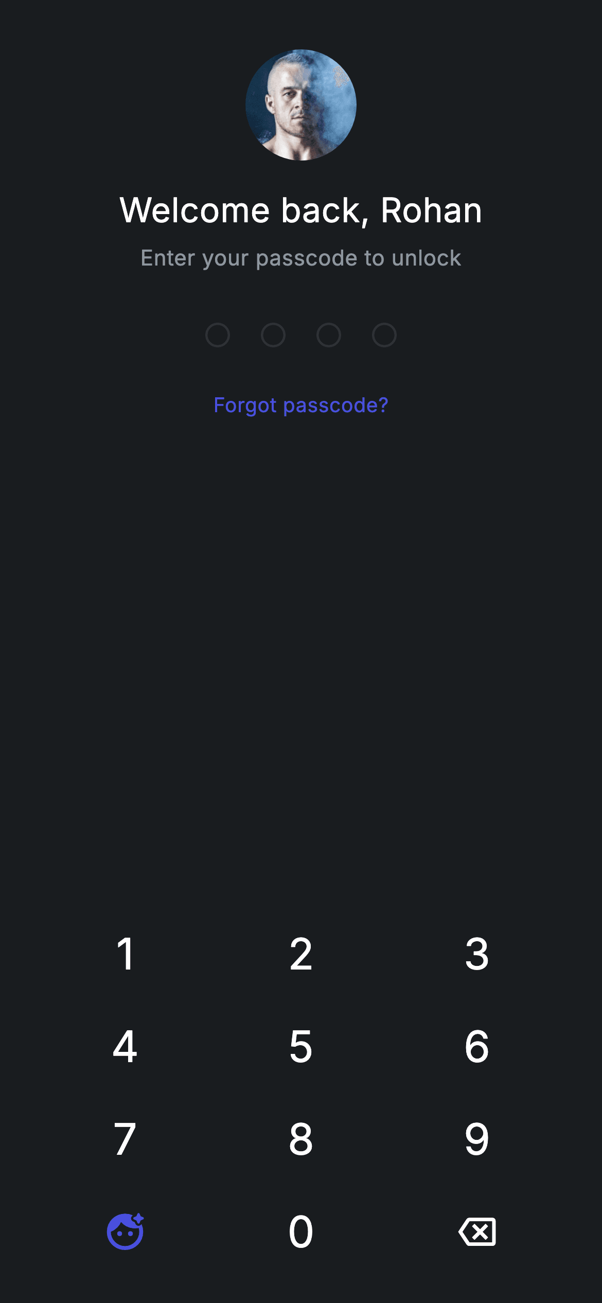
A returning user shouldn't be asked who they are — they should be greeted, shown their own face, and given four dots to fill. This tutorial builds that unlock screen: a bundled avatar in a ClipOval that degrades to a tinted 'R' if the image ever fails to decode, a 'Welcome back, Rohan' greeting, four dots that fill with #494FDF, a 'Forgot passcode?' link, and a keypad whose bottom-left cell is a Face ID key rather than a blank. The three key types are rendered by one Dart 3 switch expression.

Fintech · Log In — Fintech Flutter UI screen
Live preview — Fintech · Log In, built in pure Flutter.

Watch the Flutter UI walkthrough

A short screen recording of Fintech · Log In running, if you'd rather see it before you read the code. The written tutorial below covers everything in it.

Can't see the video? Watch it on YouTube.

What you'll build

  • A dark unlock screen that identifies the returning user with an avatar and a name, not a form
  • An _Avatar widget that never renders blank — Image.asset with an errorBuilder that swaps in a brand-tinted initial
  • Four passcode dots whose fill and border both come from one i < _code.length comparison
  • A 3×4 keypad with a Face ID key in place of the usual empty cell, built with a Dart 3 switch expression
  • Shared design tokens declared once on the State class and read by the child widgets

Step-by-step build

1

Create the file

Add a new file at lib/fintech_login/fintech_login_screen.dart in your Flutter project.

2

Register the bundled fonts

No external packages — this is pure Flutter. It does bundle its design font (Inter), so drop the font file into fonts/ and declare it in pubspec.yaml:

pubspec.yaml
flutter:
  fonts:
    - family: Inter
      fonts:
        - asset: fonts/Inter-Regular.ttf
3

Build it, piece by piece

Here's how the screen goes together. Each block below is a real slice of the code with a plain-English explanation — paste them in order, or grab the whole file from the next section.

Callbacks, design tokens, and the key handler

fintech_login_screen.dart
import 'package:flutter/material.dart';

/// Login — unlock with the 4-digit passcode (or Face ID). Self-contained per
/// CONVENTIONS.md: pure Flutter, bundled Inter font, forced dark theme. Stateful:
/// the numpad fills the passcode dots and unlocks when complete.
class FintechLoginScreen extends StatefulWidget {
  const FintechLoginScreen({super.key, this.onUnlock, this.onForgot});

  final VoidCallback? onUnlock;
  final VoidCallback? onForgot;

  @override
  State<FintechLoginScreen> createState() => _FintechLoginScreenState();
}

class _FintechLoginScreenState extends State<FintechLoginScreen> {
  static const String _font = 'Inter';
  static const Color _bg = Color(0xFF191C1F);
  static const Color _brand = Color(0xFF494FDF);
  static const Color _muted = Color(0xFF8D969E);
  static const Color _hairline = Color(0xFF2E3235);
  static const int _len = 4;

  String _code = '';

  void _onKey(String k) {
    setState(() {
      if (k == '⌫') {
        if (_code.isNotEmpty) _code = _code.substring(0, _code.length - 1);
      } else if (_code.length < _len) {
        _code += k;
      }
    });
    if (_code.length == _len) {
      widget.onUnlock?.call();
    }
  }

FintechLoginScreen takes two optional callbacks, onUnlock and onForgot, so the screen stays a pure UI piece and the parent decides what unlocking means. The State class declares the whole palette as static consts — _bg (#191C1F), _brand (#494FDF), _muted (#8D969E), _hairline (#2E3235) — plus _font = 'Inter' and _len = 4. Declaring them static matters here: the private _Numpad and _Avatar widgets further down the file reach them as _FintechLoginScreenState._brand, so one file shares one palette without a separate theme file. State is a single String _code. _onKey edits it inside setState — '⌫' trims the last character when there is one, any other key appends while under _len — and then, outside the setState, fires widget.onUnlock?.call() the moment the fourth digit lands. Note what it does not do: there is no comparison against a stored passcode, so any four digits unlock. That check belongs in your onUnlock handler.

Dark theme, the avatar, and the greeting

fintech_login_screen.dart
  @override
  Widget build(BuildContext context) {
    return Theme(
      data: ThemeData.dark(useMaterial3: true),
      child: Scaffold(
        backgroundColor: _bg,
        body: SafeArea(
          child: Padding(
            padding: const EdgeInsets.fromLTRB(24, 16, 24, 16),
            child: Column(
              crossAxisAlignment: CrossAxisAlignment.stretch,
              children: <Widget>[
                const SizedBox(height: 16),
                const Center(
                  child: ClipOval(
                    child: _Avatar(
                      url: 'lib/screens/fintech/fintech_login/images/avatar_3.jpg',
                      initial: 'R',
                      size: 72,
                    ),
                  ),
                ),
                const SizedBox(height: 16),
                const Text(
                  'Welcome back, Rohan',
                  textAlign: TextAlign.center,
                  style: TextStyle(
                    fontFamily: _font,
                    fontSize: 22,
                    fontWeight: FontWeight.w500,
                    letterSpacing: 0.24,
                    color: Colors.white,
                  ),
                ),
                const SizedBox(height: 6),
                const Text(
                  'Enter your passcode to unlock',
                  textAlign: TextAlign.center,
                  style: TextStyle(
                    fontFamily: _font,
                    fontSize: 14,
                    letterSpacing: 0.24,
                    color: _muted,
                  ),
                ),
                const SizedBox(height: 32),

build() wraps everything in Theme(data: ThemeData.dark(useMaterial3: true)) so the screen keeps its dark styling even inside a light host app, then a Scaffold painted _bg with SafeArea and 24px side padding. The Column uses crossAxisAlignment.stretch, which is why the numpad at the bottom fills the full width while the centred items opt out with their own Center wrappers. The avatar is a ClipOval around _Avatar at size: 72 — clipping outside the widget means _Avatar itself stays a plain square and can be reused rectangular elsewhere. Under it, 'Welcome back, Rohan' at 22px w500 white, then 'Enter your passcode to unlock' at 14px in _muted. Both carry letterSpacing: 0.24, the tracking used across this fintech set. The name is hard-coded here; swap it for your user's first name and this becomes the personalisation that separates a lock screen from a login form.

Passcode dots and the forgot link

fintech_login_screen.dart
                Row(
                  mainAxisAlignment: MainAxisAlignment.center,
                  children: <Widget>[
                    for (int i = 0; i < _len; i++)
                      Container(
                        width: 16,
                        height: 16,
                        margin: const EdgeInsets.symmetric(horizontal: 10),
                        decoration: BoxDecoration(
                          shape: BoxShape.circle,
                          color: i < _code.length ? _brand : Colors.transparent,
                          border: Border.all(
                            color: i < _code.length ? _brand : _hairline,
                            width: 1.5,
                          ),
                        ),
                      ),
                  ],
                ),
                const SizedBox(height: 20),
                Center(
                  child: GestureDetector(
                    onTap: widget.onForgot,
                    behavior: HitTestBehavior.opaque,
                    child: const Padding(
                      padding: EdgeInsets.all(8),
                      child: Text(
                        'Forgot passcode?',
                        style: TextStyle(
                          fontFamily: _font,
                          fontSize: 13,
                          fontWeight: FontWeight.w500,
                          letterSpacing: 0.24,
                          color: _brand,
                        ),
                      ),
                    ),
                  ),
                ),
                const Spacer(),
                _Numpad(onKey: _onKey, onFaceId: widget.onUnlock),
              ],
            ),
          ),
        ),
      ),
    );
  }
}

A centred Row builds the dots with a collection-for over _len. Each dot is a 16px circle with 10px horizontal margins, and there is only one piece of logic in the whole group: i < _code.length, asked twice — once for the fill (_brand or Colors.transparent) and once for the 1.5px border (_brand or _hairline). That gives an unfilled dot as a thin grey ring and a filled one as a solid indigo disc, with no second widget to keep in sync and nothing to animate. Twenty pixels below, 'Forgot passcode?' is a GestureDetector calling widget.onForgot, wrapped in EdgeInsets.all(8) with HitTestBehavior.opaque so the padding is part of the hit area — a 13px label alone would be a frustratingly small target. Then const Spacer() eats all remaining height, pinning _Numpad to the bottom of the screen where a thumb reaches it, whatever the device height.

The keypad, with Face ID in the twelfth slot

fintech_login_screen.dart
class _Numpad extends StatelessWidget {
  const _Numpad({required this.onKey, required this.onFaceId});

  final ValueChanged<String> onKey;
  final VoidCallback? onFaceId;

  @override
  Widget build(BuildContext context) {
    const List<String> keys = <String>[
      '1', '2', '3', '4', '5', '6', '7', '8', '9', 'face', '0', '⌫',
    ];
    return GridView.count(
      crossAxisCount: 3,
      shrinkWrap: true,
      physics: const NeverScrollableScrollPhysics(),
      childAspectRatio: 1.9,
      children: <Widget>[
        for (final String k in keys)
          GestureDetector(
            onTap: () {
              if (k == 'face') {
                onFaceId?.call();
              } else {
                onKey(k);
              }
            },
            behavior: HitTestBehavior.opaque,
            child: Center(
              child: switch (k) {
                'face' => const Icon(Icons.face_retouching_natural_rounded,
                    size: 28, color: _FintechLoginScreenState._brand),
                '⌫' => const Icon(Icons.backspace_outlined,
                    size: 24, color: Colors.white),
                _ => Text(
                    k,
                    style: const TextStyle(
                      fontFamily: _FintechLoginScreenState._font,
                      fontSize: 28,
                      fontWeight: FontWeight.w500,
                      color: Colors.white,
                    ),
                  ),
              },
            ),
          ),
      ],
    );
  }
}

_Numpad is stateless — it owns no digits, it just reports keys up through onKey. Its GridView.count runs three across with childAspectRatio: 1.9, so each key is roughly twice as wide as tall; shrinkWrap: true lets the grid size itself to its twelve children instead of demanding infinite height from the Column above it, and NeverScrollableScrollPhysics stops it stealing drags from the page. The key list is where this screen differs from a plain passcode pad: index 9, normally blank, holds 'face'. The onTap routes it to onFaceId instead of onKey, and a Dart 3 switch expression picks the child — Icons.face_retouching_natural_rounded at 28px in _brand for 'face', Icons.backspace_outlined at 24px white for '⌫', and otherwise the digit itself at 28px w500. Because the icon is the only brand-coloured key, biometrics reads as the promoted action without any extra chrome. HitTestBehavior.opaque again makes the whole grid cell tappable, not just the glyph.

An avatar that can't render blank

fintech_login_screen.dart
/// Network avatar that never renders blank: tinted initial while loading and as
/// a permanent fallback if the request fails.
class _Avatar extends StatelessWidget {
  const _Avatar({required this.url, required this.initial, required this.size});

  final String url;
  final String initial;
  final double size;

  Widget _fallback() => Container(
        width: size,
        height: size,
        color: _FintechLoginScreenState._brand.withValues(alpha: 0.22),
        alignment: Alignment.center,
        child: Text(
          initial,
          style: TextStyle(
            fontFamily: _FintechLoginScreenState._font,
            fontSize: size * 0.4,
            fontWeight: FontWeight.w500,
            color: _FintechLoginScreenState._brand,
          ),
        ),
      );

  @override
  Widget build(BuildContext context) {
    return Image.asset(
      url,
      width: size,
      height: size,
      fit: BoxFit.cover,
      gaplessPlayback: true,
      errorBuilder: (BuildContext c, Object e, StackTrace? s) => _fallback(),
    );
  }
}

_Avatar loads a bundled asset with Image.asset (the doc comment says 'network', but the code reads from the images/avatar_3.jpg path you register in pubspec.yaml — no HTTP involved). Two details make it robust. errorBuilder returns _fallback() if the asset is missing or fails to decode, so a wrong pubspec path costs you a tinted circle instead of a red error box — worth keeping when you swap in your own image. _fallback() paints a square of _brand.withValues(alpha: 0.22) with the initial centred at size * 0.4 in full-strength _brand, so the placeholder scales with whatever size you pass rather than needing its own font size. gaplessPlayback: true keeps the previous frame on screen if the image is ever swapped, and fit: BoxFit.cover guarantees a non-square source still fills the circle the ClipOval draws.

Full code

The complete, ready-to-paste source. Free to use in your projects — one click copies it all.

import 'package:flutter/material.dart';

/// Login — unlock with the 4-digit passcode (or Face ID). Self-contained per
/// CONVENTIONS.md: pure Flutter, bundled Inter font, forced dark theme. Stateful:
/// the numpad fills the passcode dots and unlocks when complete.
class FintechLoginScreen extends StatefulWidget {
  const FintechLoginScreen({super.key, this.onUnlock, this.onForgot});

  final VoidCallback? onUnlock;
  final VoidCallback? onForgot;

  @override
  State<FintechLoginScreen> createState() => _FintechLoginScreenState();
}

class _FintechLoginScreenState extends State<FintechLoginScreen> {
  static const String _font = 'Inter';
  static const Color _bg = Color(0xFF191C1F);
  static const Color _brand = Color(0xFF494FDF);
  static const Color _muted = Color(0xFF8D969E);
  static const Color _hairline = Color(0xFF2E3235);
  static const int _len = 4;

  String _code = '';

  void _onKey(String k) {
    setState(() {
      if (k == '⌫') {
        if (_code.isNotEmpty) _code = _code.substring(0, _code.length - 1);
      } else if (_code.length < _len) {
        _code += k;
      }
    });
    if (_code.length == _len) {
      widget.onUnlock?.call();
    }
  }

  @override
  Widget build(BuildContext context) {
    return Theme(
      data: ThemeData.dark(useMaterial3: true),
      child: Scaffold(
        backgroundColor: _bg,
        body: SafeArea(
          child: Padding(
            padding: const EdgeInsets.fromLTRB(24, 16, 24, 16),
            child: Column(
              crossAxisAlignment: CrossAxisAlignment.stretch,
              children: <Widget>[
                const SizedBox(height: 16),
                const Center(
                  child: ClipOval(
                    child: _Avatar(
                      url: 'lib/screens/fintech/fintech_login/images/avatar_3.jpg',
                      initial: 'R',
                      size: 72,
                    ),
                  ),
                ),
                const SizedBox(height: 16),
                const Text(
                  'Welcome back, Rohan',
                  textAlign: TextAlign.center,
                  style: TextStyle(
                    fontFamily: _font,
                    fontSize: 22,
                    fontWeight: FontWeight.w500,
                    letterSpacing: 0.24,
                    color: Colors.white,
                  ),
                ),
                const SizedBox(height: 6),
                const Text(
                  'Enter your passcode to unlock',
                  textAlign: TextAlign.center,
                  style: TextStyle(
                    fontFamily: _font,
                    fontSize: 14,
                    letterSpacing: 0.24,
                    color: _muted,
                  ),
                ),
                const SizedBox(height: 32),
                Row(
                  mainAxisAlignment: MainAxisAlignment.center,
                  children: <Widget>[
                    for (int i = 0; i < _len; i++)
                      Container(
                        width: 16,
                        height: 16,
                        margin: const EdgeInsets.symmetric(horizontal: 10),
                        decoration: BoxDecoration(
                          shape: BoxShape.circle,
                          color: i < _code.length ? _brand : Colors.transparent,
                          border: Border.all(
                            color: i < _code.length ? _brand : _hairline,
                            width: 1.5,
                          ),
                        ),
                      ),
                  ],
                ),
                const SizedBox(height: 20),
                Center(
                  child: GestureDetector(
                    onTap: widget.onForgot,
                    behavior: HitTestBehavior.opaque,
                    child: const Padding(
                      padding: EdgeInsets.all(8),
                      child: Text(
                        'Forgot passcode?',
                        style: TextStyle(
                          fontFamily: _font,
                          fontSize: 13,
                          fontWeight: FontWeight.w500,
                          letterSpacing: 0.24,
                          color: _brand,
                        ),
                      ),
                    ),
                  ),
                ),
                const Spacer(),
                _Numpad(onKey: _onKey, onFaceId: widget.onUnlock),
              ],
            ),
          ),
        ),
      ),
    );
  }
}

class _Numpad extends StatelessWidget {
  const _Numpad({required this.onKey, required this.onFaceId});

  final ValueChanged<String> onKey;
  final VoidCallback? onFaceId;

  @override
  Widget build(BuildContext context) {
    const List<String> keys = <String>[
      '1', '2', '3', '4', '5', '6', '7', '8', '9', 'face', '0', '⌫',
    ];
    return GridView.count(
      crossAxisCount: 3,
      shrinkWrap: true,
      physics: const NeverScrollableScrollPhysics(),
      childAspectRatio: 1.9,
      children: <Widget>[
        for (final String k in keys)
          GestureDetector(
            onTap: () {
              if (k == 'face') {
                onFaceId?.call();
              } else {
                onKey(k);
              }
            },
            behavior: HitTestBehavior.opaque,
            child: Center(
              child: switch (k) {
                'face' => const Icon(Icons.face_retouching_natural_rounded,
                    size: 28, color: _FintechLoginScreenState._brand),
                '⌫' => const Icon(Icons.backspace_outlined,
                    size: 24, color: Colors.white),
                _ => Text(
                    k,
                    style: const TextStyle(
                      fontFamily: _FintechLoginScreenState._font,
                      fontSize: 28,
                      fontWeight: FontWeight.w500,
                      color: Colors.white,
                    ),
                  ),
              },
            ),
          ),
      ],
    );
  }
}

/// Network avatar that never renders blank: tinted initial while loading and as
/// a permanent fallback if the request fails.
class _Avatar extends StatelessWidget {
  const _Avatar({required this.url, required this.initial, required this.size});

  final String url;
  final String initial;
  final double size;

  Widget _fallback() => Container(
        width: size,
        height: size,
        color: _FintechLoginScreenState._brand.withValues(alpha: 0.22),
        alignment: Alignment.center,
        child: Text(
          initial,
          style: TextStyle(
            fontFamily: _FintechLoginScreenState._font,
            fontSize: size * 0.4,
            fontWeight: FontWeight.w500,
            color: _FintechLoginScreenState._brand,
          ),
        ),
      );

  @override
  Widget build(BuildContext context) {
    return Image.asset(
      url,
      width: size,
      height: size,
      fit: BoxFit.cover,
      gaplessPlayback: true,
      errorBuilder: (BuildContext c, Object e, StackTrace? s) => _fallback(),
    );
  }
}

Plus bundled 2 binary assets (fonts/images). The CLI and MCP install those for you automatically.

Two faster ways to add it

Copy-paste works, but you can skip it entirely.

1. FlutterKit CLI

One command drops this screen — and its fonts — straight into your project.

$ flutterkit add fintech-login

2. AI agent (MCP)

Connect FlutterKit's MCP server in Claude or Cursor and just ask your agent to install fintech-login — it fetches and writes the files for you.

FAQ

Can I use this passcode login screen in a commercial app?

Yes. The full Dart on this page — the screen, the _Numpad and the _Avatar fallback — is free to copy into personal or commercial projects. Paste it from here, run flutterkit add fintech-login with the CLI, or have an AI agent install it through MCP.

What do I need besides Flutter itself?

No packages — the whole screen is material.dart, and the Face ID key is Icons.face_retouching_natural_rounded, a built-in Material icon, not a biometrics plugin. Wire it to local_auth yourself if you want a real prompt. There are two bundled assets: the Inter font and the avatar_3.jpg image loaded on line 55, both registered in pubspec.yaml as shown in step 2 and installed automatically by the CLI and MCP.

Which Flutter version does this screen need?

Two modern APIs set the floor. The switch expression that picks each keypad child needs Dart 3, and _brand.withValues(alpha: 0.22) in the avatar fallback needs Flutter 3.27+. On an older SDK, change that one call to _brand.withOpacity(0.22) and rewrite the switch expression as an if/else chain returning the icon or Text — everything else, including ThemeData.dark(useMaterial3: true) and the super parameters, compiles from Flutter 3.16 onwards.

Related screens