How to Build a Face ID Opt-In Screen in Flutter (Full Code + Preview)
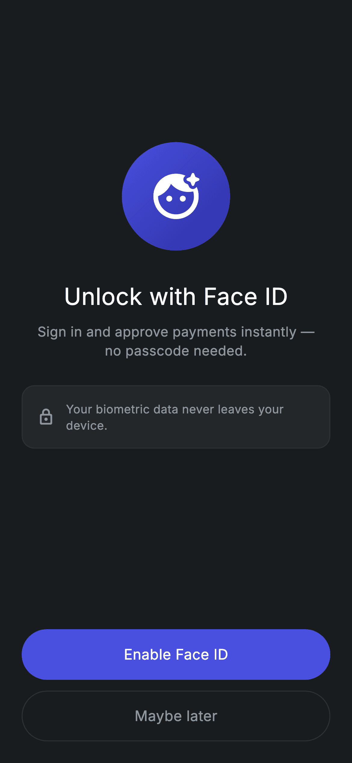
Asking for biometrics is asking for trust, so this screen spends most of its space earning it. This tutorial builds the dark Face ID opt-in: a 120px gradient circle with a face icon, an 'Unlock with Face ID' headline, a benefit line about skipping the passcode, and — the part that matters — a bordered reassurance card stating that biometric data never leaves the device. Two pill buttons close it out: a filled 'Enable Face ID' and an outlined 'Maybe later', both rendered by one widget.
Watch the Flutter UI walkthrough
A short screen recording of Fintech · Enable Face ID running, if you'd rather see it before you read the code. The written tutorial below covers everything in it.
Can't see the video? Watch it on YouTube.
What you'll build
- ✓A 120px gradient biometric badge built with BoxShape.circle and a diagonal LinearGradient
- ✓A bordered reassurance card — the privacy claim that makes the opt-in credible
- ✓One button widget covering both filled and outlined styles via a `filled` flag
- ✓A 2:3 Spacer split that centres the message block above bottom-anchored actions
- ✓A forced dark theme so the screen renders correctly inside a light-themed app
Step-by-step build
Create the file
Add a new file at lib/fintech_enable_biometrics/fintech_enable_biometrics_screen.dart in your Flutter project.
Register the bundled fonts
No external packages — this is pure Flutter. It does bundle its design font (Inter), so drop the font file into fonts/ and declare it in pubspec.yaml:
flutter:
  fonts:
    - family: Inter
      fonts:
- asset: fonts/Inter-Regular.ttfBuild it, piece by piece
Here's how the screen goes together. Each block below is a real slice of the code with a plain-English explanation — paste them in order, or grab the whole file from the next section.
Dark tokens and the gradient badge
import 'package:flutter/material.dart';

/// Enable Biometrics — opt in to Face ID / Touch ID. Self-contained per
/// CONVENTIONS.md: pure Flutter, bundled Inter font, forced dark theme so it
/// renders standalone as a route.
class FintechEnableBiometricsScreen extends StatelessWidget {
  const FintechEnableBiometricsScreen({super.key, this.onEnable, this.onSkip});

  final VoidCallback? onEnable;
  final VoidCallback? onSkip;

  static const String _font = 'Inter';
  static const Color _bg = Color(0xFF191C1F);
  static const Color _surface = Color(0xFF242729);
  static const Color _brand = Color(0xFF494FDF);
  static const Color _brandDeep = Color(0xFF2D31A6);
  static const Color _muted = Color(0xFF8D969E);
  static const Color _hairline = Color(0xFF2E3235);

  @override
  Widget build(BuildContext context) {
    return Theme(
      data: ThemeData.dark(useMaterial3: true),
      child: Scaffold(
        backgroundColor: _bg,
        body: SafeArea(
          child: Padding(
            padding: const EdgeInsets.fromLTRB(24, 24, 24, 24),
            child: Column(
              crossAxisAlignment: CrossAxisAlignment.stretch,
              children: <Widget>[
                const Spacer(flex: 2),
                Center(
                  child: Container(
                    width: 120,
                    height: 120,
                    decoration: BoxDecoration(
                      shape: BoxShape.circle,
                      gradient: const LinearGradient(
                        begin: Alignment.topLeft,
                        end: Alignment.bottomRight,
                        colors: <Color>[_brand, _brandDeep],
                      ),
                    ),
                    child: const Icon(Icons.face_retouching_natural_rounded,
                        size: 60, color: Colors.white),
                  ),
                ),
Six colour consts define the palette: the #191C1F canvas, a #242729 surface for the reassurance card, the #494FDF brand indigo with its darker #2D31A6 gradient partner, a muted grey and a #2E3235 hairline. Theme(data: ThemeData.dark(useMaterial3: true)) forces dark Material styling whatever the host app's theme is. The badge is a 120×120 Container using BoxShape.circle with a LinearGradient running topLeft to bottomRight — that diagonal is what stops a flat disc looking flat. It holds a 60px Icons.face_retouching_natural_rounded in white, and because the parent Column uses CrossAxisAlignment.stretch it has to be wrapped in Center or it would be stretched full width.
Headline and benefit copy
                const SizedBox(height: 32),
                const Text(
                  'Unlock with Face ID',
                  textAlign: TextAlign.center,
                  style: TextStyle(
                    fontFamily: _font,
                    fontSize: 26,
                    fontWeight: FontWeight.w500,
                    letterSpacing: 0.24,
                    color: Colors.white,
                  ),
                ),
                const SizedBox(height: 10),
                const Text(
                  'Sign in and approve payments instantly —\nno passcode needed.',
                  textAlign: TextAlign.center,
                  style: TextStyle(
                    fontFamily: _font,
                    fontSize: 15,
                    fontWeight: FontWeight.w400,
                    height: 1.4,
                    letterSpacing: 0.24,
                    color: _muted,
                  ),
                ),
                const SizedBox(height: 28),
'Unlock with Face ID' is 26px w500 — medium rather than bold, because heavy weights bloom on dark backgrounds and read heavier than they measure. Both texts set textAlign: TextAlign.center explicitly, which is required here since the stretched Column makes each Text as wide as the screen. The benefit line uses an embedded \n so it breaks after the em dash rather than wherever the device width lands, at height: 1.4 in the muted grey. Note the copy leads with the benefit ('sign in and approve payments instantly'), not the mechanism — the reason to say yes comes before the ask.
The privacy reassurance card
                Container(
                  padding: const EdgeInsets.all(16),
                  decoration: BoxDecoration(
                    color: _surface,
                    borderRadius: BorderRadius.circular(14),
                    border: Border.all(color: _hairline),
                  ),
                  child: const Row(
                    children: <Widget>[
                      Icon(Icons.lock_outline_rounded, size: 20, color: _muted),
                      SizedBox(width: 12),
                      Expanded(
                        child: Text(
                          'Your biometric data never leaves your device.',
                          style: TextStyle(
                            fontFamily: _font,
                            fontSize: 13,
                            fontWeight: FontWeight.w400,
                            height: 1.35,
                            letterSpacing: 0.24,
                            color: _muted,
                          ),
                        ),
                      ),
                    ],
                  ),
                ),
This is the most important block on the screen. It's a Container in the surface colour with a 14px radius and a hairline border — visually a distinct object rather than more body copy, which is what makes the claim register as a commitment. Inside, a muted lock icon, a 12px gap, and the sentence in an Expanded so it wraps rather than overflowing. Everything is deliberately quiet: 13px, regular weight, muted grey. A reassurance that shouts reads as a sales pitch; one set in small calm type reads as a fact.
Spacers and the two actions
                const Spacer(flex: 3),
                _Button(label: 'Enable Face ID', filled: true, onTap: onEnable),
                const SizedBox(height: 12),
                _Button(label: 'Maybe later', filled: false, onTap: onSkip),
              ],
            ),
          ),
        ),
      ),
    );
  }
}
Spacer(flex: 2) at the top against Spacer(flex: 3) here gives a 2:3 split, parking the badge-and-copy group slightly above centre and pushing the buttons to the bottom of the screen. Both CTAs are the same _Button widget: filled: true for 'Enable Face ID' and false for 'Maybe later', 12px apart. Giving the skip option a real outlined button rather than a bare text link is a deliberate choice — a genuinely optional prompt shouldn't make declining feel like a trick.
One button, two styles
class _Button extends StatelessWidget {
  const _Button({
    required this.label,
    required this.filled,
    required this.onTap,
  });

  final String label;
  final bool filled;
  final VoidCallback? onTap;

  @override
  Widget build(BuildContext context) {
    return SizedBox(
      height: 56,
      child: Material(
        color:
            filled ? FintechEnableBiometricsScreen._brand : Colors.transparent,
        shape: RoundedRectangleBorder(
          borderRadius: BorderRadius.circular(9999),
          side: filled
              ? BorderSide.none
              : const BorderSide(color: FintechEnableBiometricsScreen._hairline),
        ),
        child: InkWell(
          borderRadius: BorderRadius.circular(9999),
          onTap: onTap,
          child: Center(
            child: Text(
              label,
              style: TextStyle(
                fontFamily: FintechEnableBiometricsScreen._font,
                fontSize: 16,
                fontWeight: FontWeight.w500,
                letterSpacing: 0.24,
                color: filled
                    ? Colors.white
                    : FintechEnableBiometricsScreen._muted,
              ),
            ),
          ),
        ),
      ),
    );
  }
}
The filled flag drives three things. Material's colour becomes the brand indigo or Colors.transparent; its shape is a RoundedRectangleBorder whose side is either BorderSide.none or a hairline border; and the label goes white or muted. Using Material's shape: rather than borderRadius: is what makes one widget cover both variants — shape carries the corner radius and the border together, so no Container wrapper is needed. Note the radius appears twice, once on the shape and once on the InkWell: the first rounds the fill, the second confines the tap splash to the capsule. Drop the second and the ripple spills into the corners the shape just cut away.
Full code
The complete, ready-to-paste source. Free to use in your projects — one click copies it all.
import 'package:flutter/material.dart';

/// Enable Biometrics — opt in to Face ID / Touch ID. Self-contained per
/// CONVENTIONS.md: pure Flutter, bundled Inter font, forced dark theme so it
/// renders standalone as a route.
class FintechEnableBiometricsScreen extends StatelessWidget {
  const FintechEnableBiometricsScreen({super.key, this.onEnable, this.onSkip});

  final VoidCallback? onEnable;
  final VoidCallback? onSkip;

  static const String _font = 'Inter';
  static const Color _bg = Color(0xFF191C1F);
  static const Color _surface = Color(0xFF242729);
  static const Color _brand = Color(0xFF494FDF);
  static const Color _brandDeep = Color(0xFF2D31A6);
  static const Color _muted = Color(0xFF8D969E);
  static const Color _hairline = Color(0xFF2E3235);

  @override
  Widget build(BuildContext context) {
    return Theme(
      data: ThemeData.dark(useMaterial3: true),
      child: Scaffold(
        backgroundColor: _bg,
        body: SafeArea(
          child: Padding(
            padding: const EdgeInsets.fromLTRB(24, 24, 24, 24),
            child: Column(
              crossAxisAlignment: CrossAxisAlignment.stretch,
              children: <Widget>[
                const Spacer(flex: 2),
                Center(
                  child: Container(
                    width: 120,
                    height: 120,
                    decoration: BoxDecoration(
                      shape: BoxShape.circle,
                      gradient: const LinearGradient(
                        begin: Alignment.topLeft,
                        end: Alignment.bottomRight,
                        colors: <Color>[_brand, _brandDeep],
                      ),
                    ),
                    child: const Icon(Icons.face_retouching_natural_rounded,
                        size: 60, color: Colors.white),
                  ),
                ),
                const SizedBox(height: 32),
                const Text(
                  'Unlock with Face ID',
                  textAlign: TextAlign.center,
                  style: TextStyle(
                    fontFamily: _font,
                    fontSize: 26,
                    fontWeight: FontWeight.w500,
                    letterSpacing: 0.24,
                    color: Colors.white,
                  ),
                ),
                const SizedBox(height: 10),
                const Text(
                  'Sign in and approve payments instantly —\nno passcode needed.',
                  textAlign: TextAlign.center,
                  style: TextStyle(
                    fontFamily: _font,
                    fontSize: 15,
                    fontWeight: FontWeight.w400,
                    height: 1.4,
                    letterSpacing: 0.24,
                    color: _muted,
                  ),
                ),
                const SizedBox(height: 28),
                Container(
                  padding: const EdgeInsets.all(16),
                  decoration: BoxDecoration(
                    color: _surface,
                    borderRadius: BorderRadius.circular(14),
                    border: Border.all(color: _hairline),
                  ),
                  child: const Row(
                    children: <Widget>[
                      Icon(Icons.lock_outline_rounded, size: 20, color: _muted),
                      SizedBox(width: 12),
                      Expanded(
                        child: Text(
                          'Your biometric data never leaves your device.',
                          style: TextStyle(
                            fontFamily: _font,
                            fontSize: 13,
                            fontWeight: FontWeight.w400,
                            height: 1.35,
                            letterSpacing: 0.24,
                            color: _muted,
                          ),
                        ),
                      ),
                    ],
                  ),
                ),
                const Spacer(flex: 3),
                _Button(label: 'Enable Face ID', filled: true, onTap: onEnable),
                const SizedBox(height: 12),
                _Button(label: 'Maybe later', filled: false, onTap: onSkip),
              ],
            ),
          ),
        ),
      ),
    );
  }
}

class _Button extends StatelessWidget {
  const _Button({
    required this.label,
    required this.filled,
    required this.onTap,
  });

  final String label;
  final bool filled;
  final VoidCallback? onTap;

  @override
  Widget build(BuildContext context) {
    return SizedBox(
      height: 56,
      child: Material(
        color:
            filled ? FintechEnableBiometricsScreen._brand : Colors.transparent,
        shape: RoundedRectangleBorder(
          borderRadius: BorderRadius.circular(9999),
          side: filled
              ? BorderSide.none
              : const BorderSide(color: FintechEnableBiometricsScreen._hairline),
        ),
        child: InkWell(
          borderRadius: BorderRadius.circular(9999),
          onTap: onTap,
          child: Center(
            child: Text(
              label,
              style: TextStyle(
                fontFamily: FintechEnableBiometricsScreen._font,
                fontSize: 16,
                fontWeight: FontWeight.w500,
                letterSpacing: 0.24,
                color: filled
                    ? Colors.white
                    : FintechEnableBiometricsScreen._muted,
              ),
            ),
          ),
        ),
      ),
    );
  }
}
Plus bundled 1 binary asset (fonts/images). The CLI and MCP install those for you automatically.
Two faster ways to add it
Copy-paste works, but you can skip it entirely.
1. FlutterKit CLI
One command drops this screen — and its fonts — straight into your project.
$ flutterkit add fintech-enable-biometrics2. AI agent (MCP)
Connect FlutterKit's MCP server in Claude or Cursor and just ask your agent to install fintech-enable-biometrics — it fetches and writes the files for you.
FAQ
Is this Flutter Face ID screen free to use?
Yes. The full Dart source on this page is free for personal and commercial projects. Copy it here, install it with the FlutterKit CLI (flutterkit add fintech-enable-biometrics), or have an AI agent add it via MCP.
Does it actually run Face ID?
No — this is the opt-in UI, which is the right separation. Wire the onEnable callback to the local_auth package's authenticate() call, and remember the platform setup it needs: NSFaceIDUsageDescription in Info.plist on iOS, and a FragmentActivity host on Android.
Does it need any external packages or images?
Not for the screen itself — the badge is a gradient Container with a Material icon, so there's no image asset, and the only bundled asset is the Inter font registered in pubspec.yaml as shown in step 2. You'd add local_auth only when you wire up the real biometric prompt.
Which Flutter version does it target?
It uses ThemeData.dark(useMaterial3: true), super parameters and a const Row with children, so Flutter 3.16+ with Dart 3. There are no withValues() calls in this screen, so it compiles on slightly older SDKs without edits.

