How to Build a Passcode Setup Screen in Flutter (Full Code + Preview)
A passcode screen has no Continue button — the fourth digit is the confirmation. This tutorial builds that: four masked dots that fill with brand indigo as you type on a built-in 3×4 numpad, and an auto-advance that fires onContinue the instant the fourth digit lands. The layout lives in a reusable PasscodeScaffold that also carries a red error state for the confirm step, so one widget covers both screens of a create-then-confirm flow.
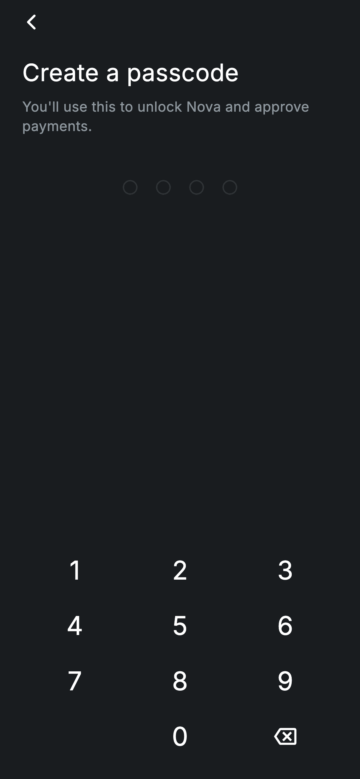
Watch the Flutter UI walkthrough
A short screen recording of Fintech · Create Passcode running, if you'd rather see it before you read the code. The written tutorial below covers everything in it.
Can't see the video? Watch it on YouTube.
What you'll build
- ✓A passcode held as one String, with no TextFields, focus nodes or system keyboard
- ✓Four masked dots that switch between filled and outlined from a single index comparison
- ✓Auto-advance on the last digit — no Continue button to tap
- ✓A reusable PasscodeScaffold taking its palette as parameters, with an optional error state
- ✓A 3×4 numpad built from a GridView.count with a blank bottom-left cell
Step-by-step build
Create the file
Add a new file at lib/fintech_create_passcode/fintech_create_passcode_screen.dart in your Flutter project.
Register the bundled fonts
No external packages — this is pure Flutter. It does bundle its design font (Inter), so drop the font file into fonts/ and declare it in pubspec.yaml:
flutter:
  fonts:
    - family: Inter
      fonts:
- asset: fonts/Inter-Regular.ttfBuild it, piece by piece
Here's how the screen goes together. Each block below is a real slice of the code with a plain-English explanation — paste them in order, or grab the whole file from the next section.
One string, and auto-advance on the last digit
import 'package:flutter/material.dart';

/// Create Passcode — set a 4-digit app passcode. Self-contained per
/// CONVENTIONS.md: pure Flutter, bundled Inter font, forced dark theme. Stateful:
/// a numpad fills the passcode dots and auto-advances when 4 digits are entered.
class FintechCreatePasscodeScreen extends StatefulWidget {
  const FintechCreatePasscodeScreen({super.key, this.onContinue, this.onBack});

  final VoidCallback? onContinue;
  final VoidCallback? onBack;

  @override
  State<FintechCreatePasscodeScreen> createState() =>
      _FintechCreatePasscodeScreenState();
}

class _FintechCreatePasscodeScreenState
    extends State<FintechCreatePasscodeScreen> {
  static const String _font = 'Inter';
  static const Color _bg = Color(0xFF191C1F);
  static const Color _brand = Color(0xFF494FDF);
  static const Color _muted = Color(0xFF8D969E);
  static const Color _hairline = Color(0xFF2E3235);
  static const int _len = 4;

  String _code = '';

  void _onKey(String k) {
    setState(() {
      if (k == '⌫') {
        if (_code.isNotEmpty) _code = _code.substring(0, _code.length - 1);
      } else if (_code.length < _len) {
        _code += k;
      }
    });
    if (_code.length == _len) {
      widget.onContinue?.call();
    }
  }
The screen holds a single String _code and a const _len of 4 — no controllers, no focus nodes. _onKey does the editing inside setState: '⌫' trims the last character when there is one, anything else appends while under the limit. The interesting part comes after the setState: if the code just reached full length, widget.onContinue?.call() fires immediately. That's the auto-advance — the fourth digit is the submit action, which is why this screen has no Continue button at all. The null-aware ?.call() means it's safe when no callback was passed.
Handing everything to the scaffold
  @override
  Widget build(BuildContext context) {
    return Theme(
      data: ThemeData.dark(useMaterial3: true),
      child: PasscodeScaffold(
        font: _font,
        bg: _bg,
        brand: _brand,
        muted: _muted,
        hairline: _hairline,
        title: 'Create a passcode',
        subtitle: 'You\'ll use this to unlock Nova and approve payments.',
        filled: _code.length,
        length: _len,
        onKey: _onKey,
        onBack: widget.onBack,
      ),
    );
  }
}
build() is almost nothing: a forced dark Theme wrapping PasscodeScaffold, which receives the five palette values, the title and subtitle strings, filled: _code.length, the length, and the two callbacks. Passing the palette as parameters rather than reading it from a shared file is what makes the scaffold portable between the create and confirm screens without either one importing the other — each screen owns its copy, which is the kit's self-containment rule. Note the scaffold never sees the code itself, only how many digits are in it; it has no business knowing the secret.
The scaffold's parameters and back action
/// Shared passcode layout: title, masked dots, and a numpad. Kept inside this
/// screen's folder (self-contained) — the confirm screen has its own copy.
class PasscodeScaffold extends StatelessWidget {
  const PasscodeScaffold({
    super.key,
    required this.font,
    required this.bg,
    required this.brand,
    required this.muted,
    required this.hairline,
    required this.title,
    required this.subtitle,
    required this.filled,
    required this.length,
    required this.onKey,
    required this.onBack,
    this.error = false,
  });

  final String font;
  final Color bg;
  final Color brand;
  final Color muted;
  final Color hairline;
  final String title;
  final String subtitle;
  final int filled;
  final int length;
  final ValueChanged<String> onKey;
  final VoidCallback? onBack;
  final bool error;

  static const Color _red = Color(0xFFE23B4A);

  @override
  Widget build(BuildContext context) {
    final Color dotOn = error ? _red : brand;
    return Scaffold(
      backgroundColor: bg,
      body: SafeArea(
        child: Padding(
          padding: const EdgeInsets.fromLTRB(24, 4, 24, 16),
          child: Column(
            crossAxisAlignment: CrossAxisAlignment.stretch,
            children: <Widget>[
              Align(
                alignment: Alignment.centerLeft,
                child: GestureDetector(
                  onTap: onBack ?? () => Navigator.of(context).maybePop(),
                  behavior: HitTestBehavior.opaque,
                  child: const SizedBox(
                    width: 40,
                    height: 40,
                    child: Align(
                      alignment: Alignment.centerLeft,
                      child: Icon(Icons.arrow_back_ios_new_rounded,
                          size: 20, color: Colors.white),
                    ),
                  ),
                ),
              ),
              const SizedBox(height: 16),
PasscodeScaffold is a StatelessWidget with eleven required parameters plus an optional error flag defaulting to false. dotOn is computed once at the top of build as error ? _red : brand, so a single value drives every dot's colour. The back affordance is a GestureDetector over a 40×40 SizedBox with HitTestBehavior.opaque — a 20px glyph with a real touch target — falling back to Navigator.of(context).maybePop() when no onBack is given, which is safe even when this is the first route on the stack.
Title, dots and the error state
              Text(
                title,
                style: TextStyle(
                  fontFamily: font,
                  fontSize: 26,
                  fontWeight: FontWeight.w500,
                  letterSpacing: 0.24,
                  color: Colors.white,
                ),
              ),
              const SizedBox(height: 8),
              Text(
                subtitle,
                style: TextStyle(
                  fontFamily: font,
                  fontSize: 15,
                  fontWeight: FontWeight.w400,
                  height: 1.4,
                  letterSpacing: 0.24,
                  color: muted,
                ),
              ),
              const SizedBox(height: 48),
              Row(
                mainAxisAlignment: MainAxisAlignment.center,
                children: <Widget>[
                  for (int i = 0; i < length; i++)
                    Container(
                      width: 16,
                      height: 16,
                      margin: const EdgeInsets.symmetric(horizontal: 10),
                      decoration: BoxDecoration(
                        shape: BoxShape.circle,
                        color: i < filled ? dotOn : Colors.transparent,
                        border: Border.all(
                          color: i < filled ? dotOn : hairline,
                          width: 1.5,
                        ),
                      ),
                    ),
                ],
              ),
              if (error) ...<Widget>[
                const SizedBox(height: 20),
                const Text(
                  'Passcodes don\'t match. Try again.',
                  textAlign: TextAlign.center,
                  style: TextStyle(
                    fontFamily: 'Inter',
                    fontSize: 13,
                    color: _red,
                    letterSpacing: 0.24,
                  ),
                ),
              ],
              const Spacer(),
              _Numpad(font: font, onKey: onKey),
            ],
          ),
        ),
      ),
    );
  }
}
The heading is 26px w500 and the subtitle 15px muted at height: 1.4, both driven by the title/subtitle parameters. After a 48px gap, a centred Row generates the dots with a collection-for: each is a 16px circle with 10px horizontal margins, and one comparison — i < filled — sets both its fill (dotOn or transparent) and its border colour (dotOn or hairline). So an empty dot is a 1.5px ring and a filled one is a solid disc, from a single expression. The error block below uses a conditional spread, so when error is true a red 'Passcodes don't match' line appears and the dots turn red at the same time. Then Spacer() pushes the numpad to the bottom.
The numpad
class _Numpad extends StatelessWidget {
  const _Numpad({required this.font, required this.onKey});

  final String font;
  final ValueChanged<String> onKey;

  static const List<String> _keys = <String>[
    '1', '2', '3', '4', '5', '6', '7', '8', '9', '', '0', '⌫',
  ];

  @override
  Widget build(BuildContext context) {
    return GridView.count(
      crossAxisCount: 3,
      shrinkWrap: true,
      physics: const NeverScrollableScrollPhysics(),
      childAspectRatio: 1.9,
      children: <Widget>[
        for (final String k in _keys)
          if (k.isEmpty)
            const SizedBox.shrink()
          else
            GestureDetector(
              onTap: () => onKey(k),
              behavior: HitTestBehavior.opaque,
              child: Center(
                child: k == '⌫'
                    ? const Icon(Icons.backspace_outlined,
                        size: 24, color: Colors.white)
                    : Text(
                        k,
                        style: TextStyle(
                          fontFamily: font,
                          fontSize: 28,
                          fontWeight: FontWeight.w500,
                          color: Colors.white,
                        ),
                      ),
              ),
            ),
      ],
    );
  }
}
GridView.count with crossAxisCount: 3, shrinkWrap: true and NeverScrollableScrollPhysics — the last two are what allow a GridView to live inside a Column without unbounded-height errors or competing scroll gestures. The twelve-entry key list has an empty string at index 9, rendered as SizedBox.shrink() so the bottom-left cell stays blank and 0 sits centred like a phone dialler. childAspectRatio: 1.9 keeps each key wide and short. The '⌫' entry renders Icons.backspace_outlined rather than the character, and every key uses HitTestBehavior.opaque so the entire cell responds, not just the glyph — essential for a keypad used one-handed.
Full code
The complete, ready-to-paste source. Free to use in your projects — one click copies it all.
import 'package:flutter/material.dart';

/// Create Passcode — set a 4-digit app passcode. Self-contained per
/// CONVENTIONS.md: pure Flutter, bundled Inter font, forced dark theme. Stateful:
/// a numpad fills the passcode dots and auto-advances when 4 digits are entered.
class FintechCreatePasscodeScreen extends StatefulWidget {
  const FintechCreatePasscodeScreen({super.key, this.onContinue, this.onBack});

  final VoidCallback? onContinue;
  final VoidCallback? onBack;

  @override
  State<FintechCreatePasscodeScreen> createState() =>
      _FintechCreatePasscodeScreenState();
}

class _FintechCreatePasscodeScreenState
    extends State<FintechCreatePasscodeScreen> {
  static const String _font = 'Inter';
  static const Color _bg = Color(0xFF191C1F);
  static const Color _brand = Color(0xFF494FDF);
  static const Color _muted = Color(0xFF8D969E);
  static const Color _hairline = Color(0xFF2E3235);
  static const int _len = 4;

  String _code = '';

  void _onKey(String k) {
    setState(() {
      if (k == '⌫') {
        if (_code.isNotEmpty) _code = _code.substring(0, _code.length - 1);
      } else if (_code.length < _len) {
        _code += k;
      }
    });
    if (_code.length == _len) {
      widget.onContinue?.call();
    }
  }

  @override
  Widget build(BuildContext context) {
    return Theme(
      data: ThemeData.dark(useMaterial3: true),
      child: PasscodeScaffold(
        font: _font,
        bg: _bg,
        brand: _brand,
        muted: _muted,
        hairline: _hairline,
        title: 'Create a passcode',
        subtitle: 'You\'ll use this to unlock Nova and approve payments.',
        filled: _code.length,
        length: _len,
        onKey: _onKey,
        onBack: widget.onBack,
      ),
    );
  }
}

/// Shared passcode layout: title, masked dots, and a numpad. Kept inside this
/// screen's folder (self-contained) — the confirm screen has its own copy.
class PasscodeScaffold extends StatelessWidget {
  const PasscodeScaffold({
    super.key,
    required this.font,
    required this.bg,
    required this.brand,
    required this.muted,
    required this.hairline,
    required this.title,
    required this.subtitle,
    required this.filled,
    required this.length,
    required this.onKey,
    required this.onBack,
    this.error = false,
  });

  final String font;
  final Color bg;
  final Color brand;
  final Color muted;
  final Color hairline;
  final String title;
  final String subtitle;
  final int filled;
  final int length;
  final ValueChanged<String> onKey;
  final VoidCallback? onBack;
  final bool error;

  static const Color _red = Color(0xFFE23B4A);

  @override
  Widget build(BuildContext context) {
    final Color dotOn = error ? _red : brand;
    return Scaffold(
      backgroundColor: bg,
      body: SafeArea(
        child: Padding(
          padding: const EdgeInsets.fromLTRB(24, 4, 24, 16),
          child: Column(
            crossAxisAlignment: CrossAxisAlignment.stretch,
            children: <Widget>[
              Align(
                alignment: Alignment.centerLeft,
                child: GestureDetector(
                  onTap: onBack ?? () => Navigator.of(context).maybePop(),
                  behavior: HitTestBehavior.opaque,
                  child: const SizedBox(
                    width: 40,
                    height: 40,
                    child: Align(
                      alignment: Alignment.centerLeft,
                      child: Icon(Icons.arrow_back_ios_new_rounded,
                          size: 20, color: Colors.white),
                    ),
                  ),
                ),
              ),
              const SizedBox(height: 16),
              Text(
                title,
                style: TextStyle(
                  fontFamily: font,
                  fontSize: 26,
                  fontWeight: FontWeight.w500,
                  letterSpacing: 0.24,
                  color: Colors.white,
                ),
              ),
              const SizedBox(height: 8),
              Text(
                subtitle,
                style: TextStyle(
                  fontFamily: font,
                  fontSize: 15,
                  fontWeight: FontWeight.w400,
                  height: 1.4,
                  letterSpacing: 0.24,
                  color: muted,
                ),
              ),
              const SizedBox(height: 48),
              Row(
                mainAxisAlignment: MainAxisAlignment.center,
                children: <Widget>[
                  for (int i = 0; i < length; i++)
                    Container(
                      width: 16,
                      height: 16,
                      margin: const EdgeInsets.symmetric(horizontal: 10),
                      decoration: BoxDecoration(
                        shape: BoxShape.circle,
                        color: i < filled ? dotOn : Colors.transparent,
                        border: Border.all(
                          color: i < filled ? dotOn : hairline,
                          width: 1.5,
                        ),
                      ),
                    ),
                ],
              ),
              if (error) ...<Widget>[
                const SizedBox(height: 20),
                const Text(
                  'Passcodes don\'t match. Try again.',
                  textAlign: TextAlign.center,
                  style: TextStyle(
                    fontFamily: 'Inter',
                    fontSize: 13,
                    color: _red,
                    letterSpacing: 0.24,
                  ),
                ),
              ],
              const Spacer(),
              _Numpad(font: font, onKey: onKey),
            ],
          ),
        ),
      ),
    );
  }
}

class _Numpad extends StatelessWidget {
  const _Numpad({required this.font, required this.onKey});

  final String font;
  final ValueChanged<String> onKey;

  static const List<String> _keys = <String>[
    '1', '2', '3', '4', '5', '6', '7', '8', '9', '', '0', '⌫',
  ];

  @override
  Widget build(BuildContext context) {
    return GridView.count(
      crossAxisCount: 3,
      shrinkWrap: true,
      physics: const NeverScrollableScrollPhysics(),
      childAspectRatio: 1.9,
      children: <Widget>[
        for (final String k in _keys)
          if (k.isEmpty)
            const SizedBox.shrink()
          else
            GestureDetector(
              onTap: () => onKey(k),
              behavior: HitTestBehavior.opaque,
              child: Center(
                child: k == '⌫'
                    ? const Icon(Icons.backspace_outlined,
                        size: 24, color: Colors.white)
                    : Text(
                        k,
                        style: TextStyle(
                          fontFamily: font,
                          fontSize: 28,
                          fontWeight: FontWeight.w500,
                          color: Colors.white,
                        ),
                      ),
              ),
            ),
      ],
    );
  }
}
Plus bundled 1 binary asset (fonts/images). The CLI and MCP install those for you automatically.
Two faster ways to add it
Copy-paste works, but you can skip it entirely.
1. FlutterKit CLI
One command drops this screen — and its fonts — straight into your project.
$ flutterkit add fintech-create-passcode2. AI agent (MCP)
Connect FlutterKit's MCP server in Claude or Cursor and just ask your agent to install fintech-create-passcode — it fetches and writes the files for you.
FAQ
Is this Flutter passcode screen free to use?
Yes. The full Dart source on this page, including the reusable PasscodeScaffold and numpad, is free for personal and commercial projects. Copy it here, install it with the FlutterKit CLI (flutterkit add fintech-create-passcode), or have an AI agent add it via MCP.
Where do I actually store the passcode?
Not in this widget. Read the code in your onContinue handler and hand it to secure storage — flutter_secure_storage, or the platform Keychain / Keystore. Never persist it in SharedPreferences, and hash it if you compare it server-side.
How do I use the error state?
PasscodeScaffold takes an error flag that turns the dots red and shows a mismatch message. The confirm-passcode screen in this kit is the natural place for it: compare the re-entered code, set error to true on a mismatch, and clear it on the next keypress.
Which Flutter version does it target?
It uses ThemeData.dark(useMaterial3: true), super parameters and collection-if/spread inside widget lists, so Flutter 3.16+ with Dart 3. There are no withValues() calls in this screen, so it compiles on slightly older SDKs without edits.

