How to Build a KYC Selfie Screen in Flutter (Full Code + Preview)
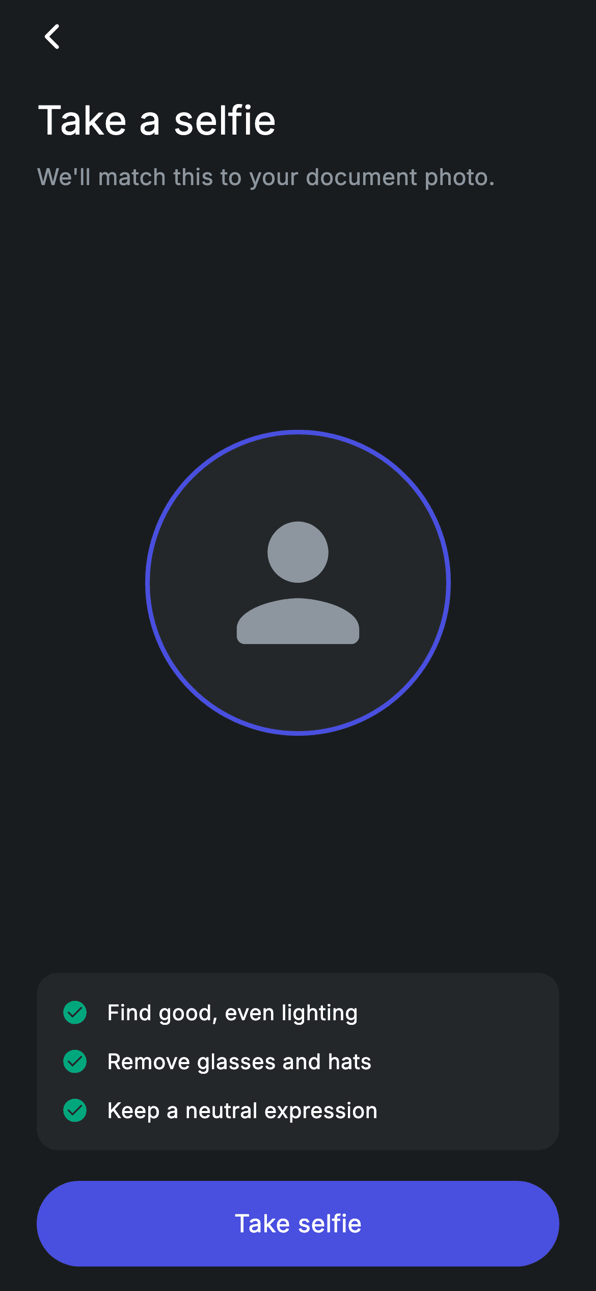
Face-match KYC fails when the photo is bad, so the capture screen has to coach the user before the camera opens. This tutorial builds that coaching screen in Flutter: a 200px circular placeholder ringed in indigo, a 'Take a selfie' heading, a subtitle explaining the document match, and a tips card that lists lighting, glasses and expression rules with teal check marks. You'll see how two Spacers center the ring, how a collection-for builds the tip rows with 12px gaps, and how the pill button hands control back to your camera code.
Watch the Flutter UI walkthrough
A short screen recording of Fintech · KYC Selfie running, if you'd rather see it before you read the code. The written tutorial below covers everything in it.
Can't see the video? Watch it on YouTube.
What you'll build
- ✓A 200x200 circular selfie target with a 3px #494FDF border and a grey person_rounded icon standing in for the camera preview
- ✓A heading and subtitle pair that tells the user exactly why the selfie is being taken
- ✓A rounded #242729 tips card whose rows are generated from a const list, with teal check_circle_rounded icons
- ✓A full-width 56px pill button built from Material + InkWell so the ripple follows the rounded shape
- ✓A screen that forces its own dark theme and bundled Inter font, so it looks identical dropped into any app
Step-by-step build
Create the file
Add a new file at lib/fintech_kyc_selfie/fintech_kyc_selfie_screen.dart in your Flutter project.
Register the bundled fonts
No external packages — this is pure Flutter. It does bundle its design font (Inter), so drop the font file into fonts/ and declare it in pubspec.yaml:
flutter:
  fonts:
    - family: Inter
      fonts:
- asset: fonts/Inter-Regular.ttfBuild it, piece by piece
Here's how the screen goes together. Each block below is a real slice of the code with a plain-English explanation — paste them in order, or grab the whole file from the next section.
The widget, its callbacks, and the palette
import 'package:flutter/material.dart';

/// KYC — selfie / liveness capture. Self-contained per CONVENTIONS.md: pure
/// Flutter, bundled Inter font, forced dark theme so it renders standalone.
class FintechKycSelfieScreen extends StatelessWidget {
  const FintechKycSelfieScreen({super.key, this.onContinue, this.onBack});

  final VoidCallback? onContinue;
  final VoidCallback? onBack;

  static const String _font = 'Inter';
  static const Color _bg = Color(0xFF191C1F);
  static const Color _surface = Color(0xFF242729);
  static const Color _brand = Color(0xFF494FDF);
  static const Color _teal = Color(0xFF00A87E);
  static const Color _muted = Color(0xFF8D969E);

  static const List<String> _tips = <String>[
    'Find good, even lighting',
    'Remove glasses and hats',
    'Keep a neutral expression',
  ];
FintechKycSelfieScreen is a StatelessWidget because nothing on the screen changes until the camera actually opens — the capture itself is delegated to the parent through two optional callbacks, onContinue (fired by the button) and onBack. The palette lives in private statics: _bg (#191C1F) is the near-black canvas, _surface (#242729) is the lighter grey used for both the circle fill and the tips card, _brand (#494FDF) is the indigo accent, _teal (#00A87E) colours the check marks, and _muted (#8D969E) is the secondary text grey. _tips is a const List<String> holding the three coaching lines, so adding a fourth tip later means editing one list, not the layout.
Forcing dark mode and the back affordance
  @override
  Widget build(BuildContext context) {
    return Theme(
      data: ThemeData.dark(useMaterial3: true),
      child: Scaffold(
        backgroundColor: _bg,
        body: SafeArea(
          child: Padding(
            padding: const EdgeInsets.fromLTRB(24, 4, 24, 16),
            child: Column(
              crossAxisAlignment: CrossAxisAlignment.stretch,
              children: <Widget>[
                Align(
                  alignment: Alignment.centerLeft,
                  child: GestureDetector(
                    onTap:
                        onBack ?? () => Navigator.of(context).maybePop(),
                    behavior: HitTestBehavior.opaque,
                    child: const SizedBox(
                      width: 40,
                      height: 40,
                      child: Align(
                        alignment: Alignment.centerLeft,
                        child: Icon(Icons.arrow_back_ios_new_rounded,
                            size: 20, color: Colors.white),
                      ),
                    ),
                  ),
                ),
                const SizedBox(height: 16),
build() wraps everything in a Theme with ThemeData.dark(useMaterial3: true). That override matters: the screen renders correctly even if the host app runs a light theme, which is what makes it droppable into any project. Inside, the Scaffold paints _bg, SafeArea keeps content clear of the notch and home indicator, and the padding is asymmetric — EdgeInsets.fromLTRB(24, 4, 24, 16) — so the back arrow sits close to the top while the button keeps breathing room at the bottom. The back control is a GestureDetector wrapping a 40x40 SizedBox with behavior: HitTestBehavior.opaque, which gives the small 20px arrow_back_ios_new_rounded icon a comfortable tap target. Its onTap uses onBack ?? () => Navigator.of(context).maybePop(), so it pops by default but the parent can intercept.
Heading, subtitle, and the centered selfie ring
                const Text(
                  'Take a selfie',
                  style: TextStyle(
                    fontFamily: _font,
                    fontSize: 26,
                    fontWeight: FontWeight.w500,
                    letterSpacing: 0.24,
                    color: Colors.white,
                  ),
                ),
                const SizedBox(height: 8),
                const Text(
                  'We\'ll match this to your document photo.',
                  style: TextStyle(
                    fontFamily: _font,
                    fontSize: 15,
                    fontWeight: FontWeight.w400,
                    letterSpacing: 0.24,
                    color: _muted,
                  ),
                ),
                const Spacer(),
                Center(
                  child: Container(
                    width: 200,
                    height: 200,
                    decoration: BoxDecoration(
                      shape: BoxShape.circle,
                      color: _surface,
                      border: Border.all(color: _brand, width: 3),
                    ),
                    child: const Icon(Icons.person_rounded,
                        size: 120, color: _muted),
                  ),
                ),
                const Spacer(),
The copy is two Texts: 'Take a selfie' at 26px with FontWeight.w500 in white, then the reason — "We'll match this to your document photo." — at 15px w400 in _muted, 8px below. Both carry letterSpacing: 0.24, which is applied consistently to every string on this screen. Then a pair of bare Spacer() widgets sandwich the capture target, so it floats in the leftover space between the copy block and the tips card rather than at a fixed offset. The target itself is a 200x200 Container with BoxShape.circle, filled with _surface and outlined by Border.all(color: _brand, width: 3) — that indigo ring is the visual cue for where the face goes. The 120px person_rounded icon in _muted is a placeholder; in a real build you'd swap the Container's child for a live camera preview and keep the circular border as an overlay.
Generating the tips card rows
                Container(
                  padding: const EdgeInsets.all(16),
                  decoration: BoxDecoration(
                    color: _surface,
                    borderRadius: BorderRadius.circular(14),
                  ),
                  child: Column(
                    children: <Widget>[
                      for (int i = 0; i < _tips.length; i++) ...<Widget>[
                        Row(
                          children: <Widget>[
                            const Icon(Icons.check_circle_rounded,
                                size: 18, color: _teal),
                            const SizedBox(width: 12),
                            Text(
                              _tips[i],
                              style: const TextStyle(
                                fontFamily: _font,
                                fontSize: 14,
                                letterSpacing: 0.24,
                                color: Colors.white,
                              ),
                            ),
                          ],
                        ),
                        if (i != _tips.length - 1) const SizedBox(height: 12),
                      ],
                    ],
                  ),
                ),
The tips sit in a Container with 16px padding, the _surface fill and a 14px BorderRadius. Its Column children are produced by a collection-for: `for (int i = 0; i < _tips.length; i++) ...<Widget>[ ... ]` spreads two widgets per iteration — the Row itself, and a 12px SizedBox guarded by `if (i != _tips.length - 1)` so no trailing gap appears after 'Keep a neutral expression'. Each Row is an 18px check_circle_rounded in _teal, a 12px spacer, and the tip text at 14px white. This is the idiomatic Flutter way to build a separated list inside a Column without reaching for ListView.separated, and it keeps the card sized to its content.
The pill capture button
                const SizedBox(height: 20),
                SizedBox(
                  height: 56,
                  child: Material(
                    color: _brand,
                    borderRadius: BorderRadius.circular(9999),
                    child: InkWell(
                      borderRadius: BorderRadius.circular(9999),
                      onTap: onContinue,
                      child: const Center(
                        child: Text(
                          'Take selfie',
                          style: TextStyle(
                            fontFamily: _font,
                            fontSize: 16,
                            fontWeight: FontWeight.w500,
                            letterSpacing: 0.24,
                            color: Colors.white,
                          ),
                        ),
                      ),
                    ),
                  ),
                ),
              ],
            ),
          ),
        ),
      ),
    );
  }
}
After a 20px gap, the CTA is a SizedBox(height: 56) containing a Material coloured _brand with borderRadius: BorderRadius.circular(9999) — the huge radius is the standard trick for a fully rounded pill. The InkWell inside repeats the same radius, which is required: without it the ripple would splash as a rectangle and spill past the rounded corners. Because the parent Column uses CrossAxisAlignment.stretch, the button automatically spans the full content width. onTap is wired straight to the onContinue callback, so the screen never touches the camera itself — you pass in the function that launches image_picker, camera, or your KYC vendor's SDK. The label is 'Take selfie' at 16px w500 white in Inter.
Full code
The complete, ready-to-paste source. Free to use in your projects — one click copies it all.
import 'package:flutter/material.dart';

/// KYC — selfie / liveness capture. Self-contained per CONVENTIONS.md: pure
/// Flutter, bundled Inter font, forced dark theme so it renders standalone.
class FintechKycSelfieScreen extends StatelessWidget {
  const FintechKycSelfieScreen({super.key, this.onContinue, this.onBack});

  final VoidCallback? onContinue;
  final VoidCallback? onBack;

  static const String _font = 'Inter';
  static const Color _bg = Color(0xFF191C1F);
  static const Color _surface = Color(0xFF242729);
  static const Color _brand = Color(0xFF494FDF);
  static const Color _teal = Color(0xFF00A87E);
  static const Color _muted = Color(0xFF8D969E);

  static const List<String> _tips = <String>[
    'Find good, even lighting',
    'Remove glasses and hats',
    'Keep a neutral expression',
  ];

  @override
  Widget build(BuildContext context) {
    return Theme(
      data: ThemeData.dark(useMaterial3: true),
      child: Scaffold(
        backgroundColor: _bg,
        body: SafeArea(
          child: Padding(
            padding: const EdgeInsets.fromLTRB(24, 4, 24, 16),
            child: Column(
              crossAxisAlignment: CrossAxisAlignment.stretch,
              children: <Widget>[
                Align(
                  alignment: Alignment.centerLeft,
                  child: GestureDetector(
                    onTap:
                        onBack ?? () => Navigator.of(context).maybePop(),
                    behavior: HitTestBehavior.opaque,
                    child: const SizedBox(
                      width: 40,
                      height: 40,
                      child: Align(
                        alignment: Alignment.centerLeft,
                        child: Icon(Icons.arrow_back_ios_new_rounded,
                            size: 20, color: Colors.white),
                      ),
                    ),
                  ),
                ),
                const SizedBox(height: 16),
                const Text(
                  'Take a selfie',
                  style: TextStyle(
                    fontFamily: _font,
                    fontSize: 26,
                    fontWeight: FontWeight.w500,
                    letterSpacing: 0.24,
                    color: Colors.white,
                  ),
                ),
                const SizedBox(height: 8),
                const Text(
                  'We\'ll match this to your document photo.',
                  style: TextStyle(
                    fontFamily: _font,
                    fontSize: 15,
                    fontWeight: FontWeight.w400,
                    letterSpacing: 0.24,
                    color: _muted,
                  ),
                ),
                const Spacer(),
                Center(
                  child: Container(
                    width: 200,
                    height: 200,
                    decoration: BoxDecoration(
                      shape: BoxShape.circle,
                      color: _surface,
                      border: Border.all(color: _brand, width: 3),
                    ),
                    child: const Icon(Icons.person_rounded,
                        size: 120, color: _muted),
                  ),
                ),
                const Spacer(),
                Container(
                  padding: const EdgeInsets.all(16),
                  decoration: BoxDecoration(
                    color: _surface,
                    borderRadius: BorderRadius.circular(14),
                  ),
                  child: Column(
                    children: <Widget>[
                      for (int i = 0; i < _tips.length; i++) ...<Widget>[
                        Row(
                          children: <Widget>[
                            const Icon(Icons.check_circle_rounded,
                                size: 18, color: _teal),
                            const SizedBox(width: 12),
                            Text(
                              _tips[i],
                              style: const TextStyle(
                                fontFamily: _font,
                                fontSize: 14,
                                letterSpacing: 0.24,
                                color: Colors.white,
                              ),
                            ),
                          ],
                        ),
                        if (i != _tips.length - 1) const SizedBox(height: 12),
                      ],
                    ],
                  ),
                ),
                const SizedBox(height: 20),
                SizedBox(
                  height: 56,
                  child: Material(
                    color: _brand,
                    borderRadius: BorderRadius.circular(9999),
                    child: InkWell(
                      borderRadius: BorderRadius.circular(9999),
                      onTap: onContinue,
                      child: const Center(
                        child: Text(
                          'Take selfie',
                          style: TextStyle(
                            fontFamily: _font,
                            fontSize: 16,
                            fontWeight: FontWeight.w500,
                            letterSpacing: 0.24,
                            color: Colors.white,
                          ),
                        ),
                      ),
                    ),
                  ),
                ),
              ],
            ),
          ),
        ),
      ),
    );
  }
}
Plus bundled 1 binary asset (fonts/images). The CLI and MCP install those for you automatically.
Two faster ways to add it
Copy-paste works, but you can skip it entirely.
1. FlutterKit CLI
One command drops this screen — and its fonts — straight into your project.
$ flutterkit add fintech-kyc-selfie2. AI agent (MCP)
Connect FlutterKit's MCP server in Claude or Cursor and just ask your agent to install fintech-kyc-selfie — it fetches and writes the files for you.
FAQ
Can I ship this KYC selfie screen in a commercial app?
Yes. The FintechKycSelfieScreen source on this page is free to copy and use in personal or commercial projects, including paid banking and wallet apps. Grab it from the code block, run flutterkit add fintech-kyc-selfie, or let an AI agent install it through MCP.
Does the selfie capture need the camera package?
Not for this screen. Everything here is pure Flutter material — Container, Spacer, InkWell, Icons.person_rounded — with an empty dependency list, because the circle is a placeholder and onContinue is where you plug in camera, image_picker, or a liveness SDK. The only bundled asset is the Inter font used by the heading, tips and button label; the CLI and MCP copy that .ttf and register it for you.
What Flutter SDK does this screen need?
Flutter 3.10 or newer with Dart 3. It uses super parameters in the constructor (super.key) and ThemeData.dark(useMaterial3: true). On an older SDK, replace super.key with the classic {Key? key} : super(key: key) form and drop the useMaterial3 argument — the dark palette is hard-coded in the _bg / _surface constants, so the screen still looks the same without Material 3.


