How to Build an Account Ready Success Screen in Flutter (Full Code + Preview)
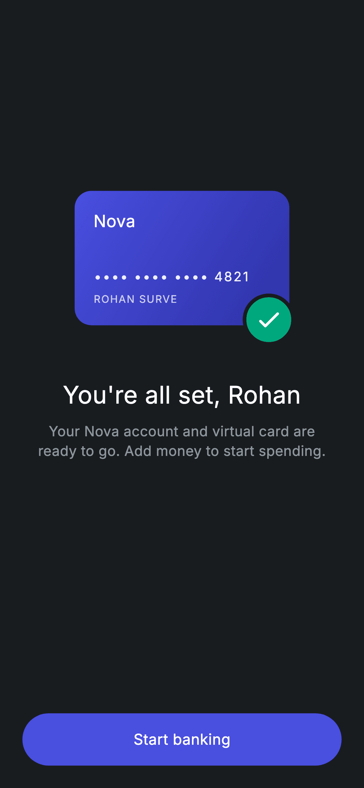
Onboarding only feels finished when someone can see the card they just opened. This tutorial builds Nova's account-ready screen in Flutter: a 230x144 gradient card sitting on a dark background with a teal check badge punched through its bottom-right corner, a personalised headline, and one pill button that drops the reader into the app. It is a plain StatelessWidget with no controllers and no packages, and the vertical balance comes entirely from two Spacers carrying different flex weights instead of hard-coded padding.
Watch the Flutter UI walkthrough
A short screen recording of Fintech · Account Ready running, if you'd rather see it before you read the code. The written tutorial below covers everything in it.
Can't see the video? Watch it on YouTube.
What you'll build
- ✓A virtual-card mockup painted with a diagonal LinearGradient and masked card digits
- ✓A teal confirmation badge that overhangs the card corner using Stack with clipBehavior: Clip.none
- ✓A 2:3 Spacer split that parks the card above optical centre on any screen height
- ✓A 56px full-width pill CTA built from Material and InkWell rather than ElevatedButton
Step-by-step build
Create the file
Add a new file at lib/fintech_account_ready/fintech_account_ready_screen.dart in your Flutter project.
Register the bundled fonts
No external packages — this is pure Flutter. It does bundle its design font (Inter), so drop the font file into fonts/ and declare it in pubspec.yaml:
flutter:
  fonts:
    - family: Inter
      fonts:
- asset: fonts/Inter-Regular.ttfBuild it, piece by piece
Here's how the screen goes together. Each block below is a real slice of the code with a plain-English explanation — paste them in order, or grab the whole file from the next section.
The widget contract and a five-colour palette
import 'package:flutter/material.dart';

/// Account Ready — onboarding success, enter the app. Self-contained per
/// CONVENTIONS.md: pure Flutter, bundled Inter font, forced dark theme.
class FintechAccountReadyScreen extends StatelessWidget {
  const FintechAccountReadyScreen({super.key, this.onStart});

  final VoidCallback? onStart;

  static const String _font = 'Inter';
  static const Color _bg = Color(0xFF191C1F);
  static const Color _brand = Color(0xFF494FDF);
  static const Color _brandDeep = Color(0xFF2D31A6);
  static const Color _teal = Color(0xFF00A87E);
  static const Color _muted = Color(0xFF8D969E);
The screen is a `StatelessWidget` because nothing on it ever changes — there is no animation controller and no timer, just a final layout. Its only input is `onStart`, a nullable `VoidCallback` the host app supplies to navigate onward; leaving it null makes the button inert rather than crashing. Everything below is driven by six `static const` values: `_font` ('Inter', the bundled family), `_bg` (#191C1F, the near-black canvas), `_brand` (#494FDF) and `_brandDeep` (#2D31A6) which become the card's gradient stops, `_teal` (#00A87E) for the success badge, and `_muted` (#8D969E) for secondary text. Declaring them `static const` means they are created once for the whole class rather than per build.
Forcing dark mode and stacking the content
  @override
  Widget build(BuildContext context) {
    return Theme(
      data: ThemeData.dark(useMaterial3: true),
      child: Scaffold(
        backgroundColor: _bg,
        body: SafeArea(
          child: Padding(
            padding: const EdgeInsets.fromLTRB(24, 24, 24, 24),
            child: Column(
              crossAxisAlignment: CrossAxisAlignment.stretch,
              children: <Widget>[
                const Spacer(flex: 2),
                Center(child: _cardWithBadge()),
                const SizedBox(height: 40),
                const Text(
                  'You\'re all set, Rohan',
                  textAlign: TextAlign.center,
                  style: TextStyle(
                    fontFamily: _font,
                    fontSize: 26,
                    fontWeight: FontWeight.w500,
                    letterSpacing: 0.24,
                    color: Colors.white,
                  ),
                ),
                const SizedBox(height: 10),
                const Text(
                  'Your Nova account and virtual card are\nready to go. Add money to start spending.',
                  textAlign: TextAlign.center,
                  style: TextStyle(
                    fontFamily: _font,
                    fontSize: 15,
                    fontWeight: FontWeight.w400,
                    height: 1.4,
                    letterSpacing: 0.24,
                    color: _muted,
                  ),
                ),
                const Spacer(flex: 3),
`Theme(data: ThemeData.dark(useMaterial3: true))` wraps the Scaffold so the screen renders identically no matter what theme the surrounding app uses — a useful habit for a screen you drop into someone else's project. Inside, `SafeArea` keeps content clear of the notch and `EdgeInsets.fromLTRB(24, 24, 24, 24)` gives an even gutter. The Column sets `crossAxisAlignment: CrossAxisAlignment.stretch`, which is why the button further down spans the full width without needing a `SizedBox(width: double.infinity)`. `Spacer(flex: 2)` opens the top, then the card, a 40px gap, the 26px headline at `FontWeight.w500`, and 15px support copy in `_muted` at `height: 1.4`. That support line uses an explicit `\n` so the break lands where the designer wanted it instead of wherever the device width happens to wrap it.
The pill CTA and why the Spacers are uneven
                const Spacer(flex: 3),
                SizedBox(
                  height: 56,
                  child: Material(
                    color: _brand,
                    borderRadius: BorderRadius.circular(9999),
                    child: InkWell(
                      borderRadius: BorderRadius.circular(9999),
                      onTap: onStart,
                      child: const Center(
                        child: Text(
                          'Start banking',
                          style: TextStyle(
                            fontFamily: _font,
                            fontSize: 16,
                            fontWeight: FontWeight.w500,
                            letterSpacing: 0.24,
                            color: Colors.white,
                          ),
                        ),
                      ),
                    ),
                  ),
                ),
              ],
            ),
          ),
        ),
      ),
    );
  }
`Spacer(flex: 3)` below the text against `Spacer(flex: 2)` above the card splits the leftover space 40/60, which lifts the whole card-and-headline group above the exact middle of the screen. That is deliberate: content centred by eye reads higher than content centred by maths. The button itself is a `SizedBox(height: 56)` holding a `Material` filled with `_brand` at `BorderRadius.circular(9999)` — an arbitrarily large radius is the standard way to get a true pill regardless of height. The `InkWell` inside repeats the same radius so the ripple is clipped to the pill instead of splashing into the corners, and its `onTap` is wired straight to `onStart`.
Painting the gradient card
  Widget _cardWithBadge() {
    return SizedBox(
      width: 230,
      height: 160,
      child: Stack(
        clipBehavior: Clip.none,
        children: <Widget>[
          Container(
            width: 230,
            height: 144,
            padding: const EdgeInsets.all(20),
            decoration: BoxDecoration(
              borderRadius: BorderRadius.circular(18),
              gradient: const LinearGradient(
                begin: Alignment.topLeft,
                end: Alignment.bottomRight,
                colors: <Color>[_brand, _brandDeep],
              ),
            ),
            child: Column(
              crossAxisAlignment: CrossAxisAlignment.start,
              children: <Widget>[
                const Text(
                  'Nova',
                  style: TextStyle(
                    fontFamily: _font,
                    fontSize: 18,
                    fontWeight: FontWeight.w500,
                    color: Colors.white,
                  ),
                ),
                const Spacer(),
                Text(
                  '•••• •••• •••• 4821',
                  style: TextStyle(
                    fontFamily: _font,
                    fontSize: 14,
                    fontWeight: FontWeight.w500,
                    letterSpacing: 1.5,
                    color: Colors.white.withValues(alpha: 0.92),
                  ),
                ),
                const SizedBox(height: 6),
                Text(
                  'ROHAN SURVE',
                  style: TextStyle(
                    fontFamily: _font,
                    fontSize: 11,
                    fontWeight: FontWeight.w400,
                    letterSpacing: 1.0,
                    color: Colors.white.withValues(alpha: 0.75),
                  ),
                ),
              ],
            ),
          ),
`_cardWithBadge` returns a `SizedBox` of 230x160 even though the card Container inside is only 144 tall. That extra 16px is deliberate headroom so the badge can hang off the bottom edge without being cut. The card is a `Container` with `BorderRadius.circular(18)` and a `LinearGradient` running `topLeft` to `bottomRight` from `_brand` into `_brandDeep` — a two-stop diagonal is enough to suggest a physical card without any image asset. Its Column holds the 'Nova' wordmark, a `Spacer()` that pushes the rest to the bottom, the masked number at `letterSpacing: 1.5`, and the holder name. Notice the descending opacities: the digits use `Colors.white.withValues(alpha: 0.92)` and the name `alpha: 0.75`. Fading one colour rather than introducing new greys is what keeps the card looking like a single printed surface.
The badge that hangs off the corner
          Positioned(
            right: -6,
            bottom: -6,
            child: Container(
              width: 56,
              height: 56,
              decoration: BoxDecoration(
                shape: BoxShape.circle,
                color: _teal,
                border: Border.all(color: _bg, width: 4),
              ),
              child: const Icon(Icons.check_rounded,
                  size: 30, color: Colors.white),
            ),
          ),
        ],
      ),
    );
  }
The badge is a `Positioned` with `right: -6` and `bottom: -6`, so it deliberately sits outside its Stack's bounds. That only renders because the Stack above declares `clipBehavior: Clip.none` — with Flutter's default clipping the overhanging pixels would simply disappear, which is the usual reason this effect 'doesn't work'. The badge is a 56px circle filled with `_teal` carrying `Border.all(color: _bg, width: 4)`. Painting that ring in the page background colour rather than a lighter grey is the trick: it reads as a gap cut through the card, visually detaching the badge from the gradient underneath it.
Full code
The complete, ready-to-paste source. Free to use in your projects — one click copies it all.
import 'package:flutter/material.dart';

/// Account Ready — onboarding success, enter the app. Self-contained per
/// CONVENTIONS.md: pure Flutter, bundled Inter font, forced dark theme.
class FintechAccountReadyScreen extends StatelessWidget {
  const FintechAccountReadyScreen({super.key, this.onStart});

  final VoidCallback? onStart;

  static const String _font = 'Inter';
  static const Color _bg = Color(0xFF191C1F);
  static const Color _brand = Color(0xFF494FDF);
  static const Color _brandDeep = Color(0xFF2D31A6);
  static const Color _teal = Color(0xFF00A87E);
  static const Color _muted = Color(0xFF8D969E);

  @override
  Widget build(BuildContext context) {
    return Theme(
      data: ThemeData.dark(useMaterial3: true),
      child: Scaffold(
        backgroundColor: _bg,
        body: SafeArea(
          child: Padding(
            padding: const EdgeInsets.fromLTRB(24, 24, 24, 24),
            child: Column(
              crossAxisAlignment: CrossAxisAlignment.stretch,
              children: <Widget>[
                const Spacer(flex: 2),
                Center(child: _cardWithBadge()),
                const SizedBox(height: 40),
                const Text(
                  'You\'re all set, Rohan',
                  textAlign: TextAlign.center,
                  style: TextStyle(
                    fontFamily: _font,
                    fontSize: 26,
                    fontWeight: FontWeight.w500,
                    letterSpacing: 0.24,
                    color: Colors.white,
                  ),
                ),
                const SizedBox(height: 10),
                const Text(
                  'Your Nova account and virtual card are\nready to go. Add money to start spending.',
                  textAlign: TextAlign.center,
                  style: TextStyle(
                    fontFamily: _font,
                    fontSize: 15,
                    fontWeight: FontWeight.w400,
                    height: 1.4,
                    letterSpacing: 0.24,
                    color: _muted,
                  ),
                ),
                const Spacer(flex: 3),
                SizedBox(
                  height: 56,
                  child: Material(
                    color: _brand,
                    borderRadius: BorderRadius.circular(9999),
                    child: InkWell(
                      borderRadius: BorderRadius.circular(9999),
                      onTap: onStart,
                      child: const Center(
                        child: Text(
                          'Start banking',
                          style: TextStyle(
                            fontFamily: _font,
                            fontSize: 16,
                            fontWeight: FontWeight.w500,
                            letterSpacing: 0.24,
                            color: Colors.white,
                          ),
                        ),
                      ),
                    ),
                  ),
                ),
              ],
            ),
          ),
        ),
      ),
    );
  }

  Widget _cardWithBadge() {
    return SizedBox(
      width: 230,
      height: 160,
      child: Stack(
        clipBehavior: Clip.none,
        children: <Widget>[
          Container(
            width: 230,
            height: 144,
            padding: const EdgeInsets.all(20),
            decoration: BoxDecoration(
              borderRadius: BorderRadius.circular(18),
              gradient: const LinearGradient(
                begin: Alignment.topLeft,
                end: Alignment.bottomRight,
                colors: <Color>[_brand, _brandDeep],
              ),
            ),
            child: Column(
              crossAxisAlignment: CrossAxisAlignment.start,
              children: <Widget>[
                const Text(
                  'Nova',
                  style: TextStyle(
                    fontFamily: _font,
                    fontSize: 18,
                    fontWeight: FontWeight.w500,
                    color: Colors.white,
                  ),
                ),
                const Spacer(),
                Text(
                  '•••• •••• •••• 4821',
                  style: TextStyle(
                    fontFamily: _font,
                    fontSize: 14,
                    fontWeight: FontWeight.w500,
                    letterSpacing: 1.5,
                    color: Colors.white.withValues(alpha: 0.92),
                  ),
                ),
                const SizedBox(height: 6),
                Text(
                  'ROHAN SURVE',
                  style: TextStyle(
                    fontFamily: _font,
                    fontSize: 11,
                    fontWeight: FontWeight.w400,
                    letterSpacing: 1.0,
                    color: Colors.white.withValues(alpha: 0.75),
                  ),
                ),
              ],
            ),
          ),
          Positioned(
            right: -6,
            bottom: -6,
            child: Container(
              width: 56,
              height: 56,
              decoration: BoxDecoration(
                shape: BoxShape.circle,
                color: _teal,
                border: Border.all(color: _bg, width: 4),
              ),
              child: const Icon(Icons.check_rounded,
                  size: 30, color: Colors.white),
            ),
          ),
        ],
      ),
    );
  }
}
Plus bundled 1 binary asset (fonts/images). The CLI and MCP install those for you automatically.
Two faster ways to add it
Copy-paste works, but you can skip it entirely.
1. FlutterKit CLI
One command drops this screen — and its fonts — straight into your project.
$ flutterkit add fintech-account-ready2. AI agent (MCP)
Connect FlutterKit's MCP server in Claude or Cursor and just ask your agent to install fintech-account-ready — it fetches and writes the files for you.
FAQ
Can I use this account-ready screen in a commercial app?
Yes. FlutterKit is free and always will be. Copy the Dart from this page, pull it with the CLI, or have your AI editor install it over MCP — then ship it in a client project or a paid app with no licence, attribution or sign-up.
Does this screen need any packages?
No pub packages at all — it is `package:flutter/material.dart` and nothing else. The only extra is the Inter font, which ships with the screen; register it under the `fonts:` section of your pubspec.yaml or delete the `fontFamily: _font` lines to fall back to the system face.
Why is my check badge getting cut off at the card corner?
Because the Stack is clipping it. Negative `Positioned` offsets only paint when the parent Stack sets `clipBehavior: Clip.none`, and the parent must also be tall enough to contain the overhang — that is why the SizedBox here is 160 tall for a 144 card.
Which Flutter version does this need?
Flutter 3.22 or newer, because the card text uses `Colors.white.withValues(alpha: ...)` and the constructor uses the `super.key` shorthand from Dart 3. On an older SDK swap `withValues(alpha: x)` for `withOpacity(x)` and write the constructor as `const FintechAccountReadyScreen({Key? key, this.onStart}) : super(key: key);`.
How do I make the Start banking button navigate somewhere?
Pass a callback in: `FintechAccountReadyScreen(onStart: () => Navigator.of(context).pushReplacementNamed('/home'))`. Because `InkWell.onTap` receives that value directly, leaving `onStart` null simply makes the button unresponsive instead of throwing.


