How to Build a KYC ID Document Screen in Flutter (Full Code + Preview)
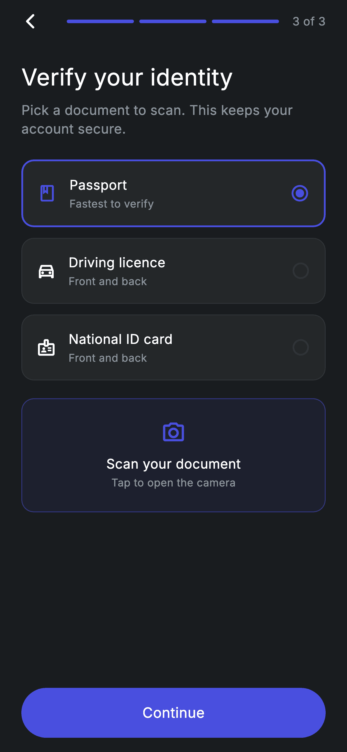
Before a bank app can open the camera, it has to ask which document you are holding. This tutorial builds that step — screen 3 of 3 in a dark KYC flow — as a radio group made of full-width cards: Passport, Driving licence and National ID card, each with an outline icon, a one-line hint like 'Front and back', and a radio dot on the right. A single int called _selected decides which card wears the indigo 2px border. Below them sits a tinted 'Scan your document' panel and a pill Continue button.
Watch the Flutter UI walkthrough
A short screen recording of Fintech · KYC ID Document running, if you'd rather see it before you read the code. The written tutorial below covers everything in it.
Can't see the video? Watch it on YouTube.
What you'll build
- ✓A three-option document picker where tapping any card moves the indigo border, icon tint and radio dot to it
- ✓A Dart 3 record list that holds each option's icon, label and subtitle, so adding a fourth document is one line
- ✓A compact step header: back arrow, three filled progress segments, and a '3 of 3' counter
- ✓An accent-tinted scan panel drawn with Color.withValues() for both its 8% fill and its 45% border
- ✓A reusable pill button built from Material + InkWell so the ripple follows the rounded shape
Step-by-step build
Create the file
Add a new file at lib/fintech_kyc_id_doc/fintech_kyc_id_doc_screen.dart in your Flutter project.
Register the bundled fonts
No external packages — this is pure Flutter. It does bundle its design font (Inter), so drop the font file into fonts/ and declare it in pubspec.yaml:
flutter:
  fonts:
    - family: Inter
      fonts:
- asset: fonts/Inter-Regular.ttfBuild it, piece by piece
Here's how the screen goes together. Each block below is a real slice of the code with a plain-English explanation — paste them in order, or grab the whole file from the next section.
Tokens and the document list as Dart 3 records
import 'package:flutter/material.dart';

/// KYC 3/3 — choose & capture an ID document. Self-contained per CONVENTIONS.md:
/// pure Flutter, bundled Inter font, forced dark theme. Stateful: the selected
/// document type drives the capture card and Continue CTA.
class FintechKycIdDocScreen extends StatefulWidget {
  const FintechKycIdDocScreen({super.key, this.onContinue, this.onBack});

  final VoidCallback? onContinue;
  final VoidCallback? onBack;

  @override
  State<FintechKycIdDocScreen> createState() => _FintechKycIdDocScreenState();
}

class _FintechKycIdDocScreenState extends State<FintechKycIdDocScreen> {
  static const String _font = 'Inter';
  static const Color _bg = Color(0xFF191C1F);
  static const Color _surface = Color(0xFF242729);
  static const Color _brand = Color(0xFF494FDF);
  static const Color _muted = Color(0xFF8D969E);
  static const Color _hairline = Color(0xFF2E3235);

  static const List<({IconData icon, String label, String sub})> _docs =
      <({IconData icon, String label, String sub})>[
    (icon: Icons.book_outlined, label: 'Passport', sub: 'Fastest to verify'),
    (
      icon: Icons.directions_car_outlined,
      label: 'Driving licence',
      sub: 'Front and back'
    ),
    (
      icon: Icons.badge_outlined,
      label: 'National ID card',
      sub: 'Front and back'
    ),
  ];

  int _selected = 0;
Only material.dart is imported — nothing else. FintechKycIdDocScreen is a StatefulWidget because one value changes at runtime, and it takes two optional callbacks, onContinue and onBack, so the screen stays navigation-agnostic. The State class opens with five design tokens: _bg (#191C1F) for the canvas, _surface (#242729) for the option cards, _brand (#494FDF) indigo for anything selected, _muted (#8D969E) for secondary text, and _hairline (#2E3235) for unselected borders. Then _docs is a const list of Dart 3 records typed ({IconData icon, String label, String sub}) — a lightweight alternative to writing a small model class. Each entry pairs an outline icon with its label and hint: book_outlined/'Passport'/'Fastest to verify', directions_car_outlined/'Driving licence'/'Front and back', badge_outlined/'National ID card'/'Front and back'. Finally int _selected = 0 means Passport starts chosen.
build(): forced dark theme and the vertical stack
  @override
  Widget build(BuildContext context) {
    return Theme(
      data: ThemeData.dark(useMaterial3: true),
      child: Scaffold(
        backgroundColor: _bg,
        body: SafeArea(
          child: Padding(
            padding: const EdgeInsets.fromLTRB(24, 4, 24, 16),
            child: Column(
              crossAxisAlignment: CrossAxisAlignment.stretch,
              children: <Widget>[
                _progressHeader(),
                const SizedBox(height: 24),
                const Text(
                  'Verify your identity',
                  style: TextStyle(
                    fontFamily: _font,
                    fontSize: 26,
                    fontWeight: FontWeight.w500,
                    letterSpacing: 0.24,
                    color: Colors.white,
                  ),
                ),
                const SizedBox(height: 8),
                const Text(
                  'Pick a document to scan. This keeps your account secure.',
                  style: TextStyle(
                    fontFamily: _font,
                    fontSize: 15,
                    fontWeight: FontWeight.w400,
                    height: 1.4,
                    letterSpacing: 0.24,
                    color: _muted,
                  ),
                ),
                const SizedBox(height: 24),
                for (int i = 0; i < _docs.length; i++) ...<Widget>[
                  _docRow(i),
                  const SizedBox(height: 12),
                ],
                const SizedBox(height: 8),
                _uploadCard(),
                const Spacer(),
                _Button(label: 'Continue', onTap: widget.onContinue),
              ],
            ),
          ),
        ),
      ),
    );
  }
The whole tree is wrapped in Theme(data: ThemeData.dark(useMaterial3: true)) so the screen renders dark even if the host app is running a light theme — handy when you drop one screen into an existing project. Inside, a Scaffold painted _bg, a SafeArea, and asymmetric padding of fromLTRB(24, 4, 24, 16): only 4px on top because the back arrow already carries its own 40px hit box. The Column uses crossAxisAlignment: stretch so every child spans the full width. Order: the progress header, the 26px w500 'Verify your identity' title, the 15px muted subtitle 'Pick a document to scan. This keeps your account secure.' with height: 1.4 line spacing, then a collection-for loop that emits _docRow(i) plus a 12px gap for each of the three documents. After the upload card, a Spacer eats the leftover height and pins the Continue button to the bottom on any device size. Note that Continue is always enabled — it fires widget.onContinue regardless of which row is selected.
Back arrow, progress segments and the step counter
  Widget _progressHeader() {
    return Row(
      children: <Widget>[
        GestureDetector(
          onTap: widget.onBack ?? () => Navigator.of(context).maybePop(),
          behavior: HitTestBehavior.opaque,
          child: const SizedBox(
            width: 40,
            height: 40,
            child: Align(
              alignment: Alignment.centerLeft,
              child: Icon(Icons.arrow_back_ios_new_rounded,
                  size: 20, color: Colors.white),
            ),
          ),
        ),
        const SizedBox(width: 8),
        Expanded(
          child: Row(
            children: <Widget>[
              for (int i = 1; i <= 3; i++)
                Expanded(
                  child: Container(
                    height: 4,
                    margin: const EdgeInsets.symmetric(horizontal: 3),
                    decoration: BoxDecoration(
                      color: _brand,
                      borderRadius: BorderRadius.circular(9999),
                    ),
                  ),
                ),
            ],
          ),
        ),
        const SizedBox(width: 12),
        const Text(
          '3 of 3',
          style: TextStyle(
            fontFamily: _font,
            fontSize: 13,
            letterSpacing: 0.24,
            color: _muted,
          ),
        ),
      ],
    );
  }
_progressHeader() is a single Row. The back affordance is a GestureDetector with behavior: HitTestBehavior.opaque wrapped around a 40×40 SizedBox — the box guarantees a comfortable tap target even though the arrow_back_ios_new_rounded icon is only 20px, and Align(centerLeft) keeps the glyph flush with the 24px page padding. Its onTap uses widget.onBack ?? () => Navigator.of(context).maybePop(), so the screen pops itself when the parent doesn't supply a handler. The progress bar is an Expanded Row containing three more Expanded segments, each a 4px-tall Container with 3px horizontal margins and a 9999 radius for fully rounded ends. Because this is the last step, all three are painted _brand unconditionally — there is no progress variable to pass in; to reuse this header on step 1 or 2 you would compare i against a current-step field. A 13px muted '3 of 3' closes the row.
The selectable document row
  Widget _docRow(int i) {
    final bool active = i == _selected;
    final ({IconData icon, String label, String sub}) d = _docs[i];
    return GestureDetector(
      onTap: () => setState(() => _selected = i),
      behavior: HitTestBehavior.opaque,
      child: Container(
        padding: const EdgeInsets.all(16),
        decoration: BoxDecoration(
          color: _surface,
          borderRadius: BorderRadius.circular(14),
          border: Border.all(
            color: active ? _brand : _hairline,
            width: active ? 2 : 1,
          ),
        ),
        child: Row(
          children: <Widget>[
            Icon(d.icon, size: 22, color: active ? _brand : Colors.white),
            const SizedBox(width: 14),
            Expanded(
              child: Column(
                crossAxisAlignment: CrossAxisAlignment.start,
                children: <Widget>[
                  Text(
                    d.label,
                    style: const TextStyle(
                      fontFamily: _font,
                      fontSize: 15,
                      fontWeight: FontWeight.w500,
                      letterSpacing: 0.24,
                      color: Colors.white,
                    ),
                  ),
                  const SizedBox(height: 2),
                  Text(
                    d.sub,
                    style: const TextStyle(
                      fontFamily: _font,
                      fontSize: 12,
                      letterSpacing: 0.24,
                      color: _muted,
                    ),
                  ),
                ],
              ),
            ),
            Icon(
              active
                  ? Icons.radio_button_checked_rounded
                  : Icons.radio_button_unchecked_rounded,
              size: 22,
              color: active ? _brand : _hairline,
            ),
          ],
        ),
      ),
    );
  }
_docRow(int i) is where the interactivity lives. It computes final bool active = i == _selected once and reuses it four times, then pulls the record d = _docs[i]. Tapping calls setState(() => _selected = i), which rebuilds all three rows — the newly tapped one turns active and the previous one turns inactive, which is exactly how a radio group behaves without any radio widget or group value. The visual difference is driven entirely by active: the card border is _brand at 2px when selected and _hairline at 1px when not (note the width change nudges the content by a pixel — swap to a constant width if you want it pixel-stable), the leading 22px icon is _brand or plain white, and the trailing icon switches between radio_button_checked_rounded and radio_button_unchecked_rounded, tinted _brand or _hairline. Everything sits on a _surface Container with 16px padding and a 14px radius, and the label (15px w500 white) plus sub (12px muted) go in an Expanded Column so long document names wrap instead of overflowing.
The tinted scan panel
  Widget _uploadCard() {
    return Container(
      padding: const EdgeInsets.symmetric(vertical: 24),
      decoration: BoxDecoration(
        color: _brand.withValues(alpha: 0.08),
        borderRadius: BorderRadius.circular(14),
        border: Border.all(color: _brand.withValues(alpha: 0.45)),
      ),
      child: const Column(
        children: <Widget>[
          Icon(Icons.photo_camera_outlined, size: 28, color: _brand),
          SizedBox(height: 10),
          Text(
            'Scan your document',
            style: TextStyle(
              fontFamily: _font,
              fontSize: 15,
              fontWeight: FontWeight.w500,
              letterSpacing: 0.24,
              color: Colors.white,
            ),
          ),
          SizedBox(height: 2),
          Text(
            'Tap to open the camera',
            style: TextStyle(
              fontFamily: _font,
              fontSize: 12,
              letterSpacing: 0.24,
              color: _muted,
            ),
          ),
        ],
      ),
    );
  }
}
_uploadCard() is a purely decorative call-to-action, and it is worth being clear about that: it is a plain Container with no GestureDetector, so despite the caption 'Tap to open the camera' nothing happens when you press it. Wiring it up means wrapping this Container in an InkWell or GestureDetector and calling your own camera or image-picker code. The styling is the two-layer accent trick: the same _brand indigo used at alpha 0.08 for the fill and alpha 0.45 for the 1px border via Color.withValues(), which reads as a highlighted drop zone without introducing a new colour. Inside, a const Column centres a 28px photo_camera_outlined icon in _brand, the 15px w500 white 'Scan your document', and the 12px muted hint. The Column is const because none of it depends on state — a small rebuild win, since this widget is reconstructed every time you tap a document row.
The reusable pill button
class _Button extends StatelessWidget {
  const _Button({required this.label, required this.onTap});

  final String label;
  final VoidCallback? onTap;

  @override
  Widget build(BuildContext context) {
    return SizedBox(
      height: 56,
      child: Material(
        color: _FintechKycIdDocScreenState._brand,
        borderRadius: BorderRadius.circular(9999),
        child: InkWell(
          borderRadius: BorderRadius.circular(9999),
          onTap: onTap,
          child: Center(
            child: Text(
              label,
              style: const TextStyle(
                fontFamily: _FintechKycIdDocScreenState._font,
                fontSize: 16,
                fontWeight: FontWeight.w500,
                letterSpacing: 0.24,
                color: Colors.white,
              ),
            ),
          ),
        ),
      ),
    );
  }
}
_Button is a private StatelessWidget at the bottom of the file taking just a label and a nullable onTap. Its 56px SizedBox sets the height, and the Material + InkWell pairing is what makes the ripple behave: Material carries the _brand fill and the 9999 borderRadius, and the identical radius is repeated on the InkWell so the splash is clipped to the pill instead of spilling into a rectangle. Because onTap is VoidCallback? and the screen passes widget.onContinue straight through, leaving that callback null makes the button visually identical but inert — Flutter treats a null onTap as disabled. The label is 16px w500 white Inter with the same 0.24 letterSpacing used across the screen. Note the button reaches back into the state class for _FintechKycIdDocScreenState._brand and ._font; that works because both live in the same file, and it is why this widget is private rather than something to extract as-is.
Full code
The complete, ready-to-paste source. Free to use in your projects — one click copies it all.
import 'package:flutter/material.dart';

/// KYC 3/3 — choose & capture an ID document. Self-contained per CONVENTIONS.md:
/// pure Flutter, bundled Inter font, forced dark theme. Stateful: the selected
/// document type drives the capture card and Continue CTA.
class FintechKycIdDocScreen extends StatefulWidget {
  const FintechKycIdDocScreen({super.key, this.onContinue, this.onBack});

  final VoidCallback? onContinue;
  final VoidCallback? onBack;

  @override
  State<FintechKycIdDocScreen> createState() => _FintechKycIdDocScreenState();
}

class _FintechKycIdDocScreenState extends State<FintechKycIdDocScreen> {
  static const String _font = 'Inter';
  static const Color _bg = Color(0xFF191C1F);
  static const Color _surface = Color(0xFF242729);
  static const Color _brand = Color(0xFF494FDF);
  static const Color _muted = Color(0xFF8D969E);
  static const Color _hairline = Color(0xFF2E3235);

  static const List<({IconData icon, String label, String sub})> _docs =
      <({IconData icon, String label, String sub})>[
    (icon: Icons.book_outlined, label: 'Passport', sub: 'Fastest to verify'),
    (
      icon: Icons.directions_car_outlined,
      label: 'Driving licence',
      sub: 'Front and back'
    ),
    (
      icon: Icons.badge_outlined,
      label: 'National ID card',
      sub: 'Front and back'
    ),
  ];

  int _selected = 0;

  @override
  Widget build(BuildContext context) {
    return Theme(
      data: ThemeData.dark(useMaterial3: true),
      child: Scaffold(
        backgroundColor: _bg,
        body: SafeArea(
          child: Padding(
            padding: const EdgeInsets.fromLTRB(24, 4, 24, 16),
            child: Column(
              crossAxisAlignment: CrossAxisAlignment.stretch,
              children: <Widget>[
                _progressHeader(),
                const SizedBox(height: 24),
                const Text(
                  'Verify your identity',
                  style: TextStyle(
                    fontFamily: _font,
                    fontSize: 26,
                    fontWeight: FontWeight.w500,
                    letterSpacing: 0.24,
                    color: Colors.white,
                  ),
                ),
                const SizedBox(height: 8),
                const Text(
                  'Pick a document to scan. This keeps your account secure.',
                  style: TextStyle(
                    fontFamily: _font,
                    fontSize: 15,
                    fontWeight: FontWeight.w400,
                    height: 1.4,
                    letterSpacing: 0.24,
                    color: _muted,
                  ),
                ),
                const SizedBox(height: 24),
                for (int i = 0; i < _docs.length; i++) ...<Widget>[
                  _docRow(i),
                  const SizedBox(height: 12),
                ],
                const SizedBox(height: 8),
                _uploadCard(),
                const Spacer(),
                _Button(label: 'Continue', onTap: widget.onContinue),
              ],
            ),
          ),
        ),
      ),
    );
  }

  Widget _progressHeader() {
    return Row(
      children: <Widget>[
        GestureDetector(
          onTap: widget.onBack ?? () => Navigator.of(context).maybePop(),
          behavior: HitTestBehavior.opaque,
          child: const SizedBox(
            width: 40,
            height: 40,
            child: Align(
              alignment: Alignment.centerLeft,
              child: Icon(Icons.arrow_back_ios_new_rounded,
                  size: 20, color: Colors.white),
            ),
          ),
        ),
        const SizedBox(width: 8),
        Expanded(
          child: Row(
            children: <Widget>[
              for (int i = 1; i <= 3; i++)
                Expanded(
                  child: Container(
                    height: 4,
                    margin: const EdgeInsets.symmetric(horizontal: 3),
                    decoration: BoxDecoration(
                      color: _brand,
                      borderRadius: BorderRadius.circular(9999),
                    ),
                  ),
                ),
            ],
          ),
        ),
        const SizedBox(width: 12),
        const Text(
          '3 of 3',
          style: TextStyle(
            fontFamily: _font,
            fontSize: 13,
            letterSpacing: 0.24,
            color: _muted,
          ),
        ),
      ],
    );
  }

  Widget _docRow(int i) {
    final bool active = i == _selected;
    final ({IconData icon, String label, String sub}) d = _docs[i];
    return GestureDetector(
      onTap: () => setState(() => _selected = i),
      behavior: HitTestBehavior.opaque,
      child: Container(
        padding: const EdgeInsets.all(16),
        decoration: BoxDecoration(
          color: _surface,
          borderRadius: BorderRadius.circular(14),
          border: Border.all(
            color: active ? _brand : _hairline,
            width: active ? 2 : 1,
          ),
        ),
        child: Row(
          children: <Widget>[
            Icon(d.icon, size: 22, color: active ? _brand : Colors.white),
            const SizedBox(width: 14),
            Expanded(
              child: Column(
                crossAxisAlignment: CrossAxisAlignment.start,
                children: <Widget>[
                  Text(
                    d.label,
                    style: const TextStyle(
                      fontFamily: _font,
                      fontSize: 15,
                      fontWeight: FontWeight.w500,
                      letterSpacing: 0.24,
                      color: Colors.white,
                    ),
                  ),
                  const SizedBox(height: 2),
                  Text(
                    d.sub,
                    style: const TextStyle(
                      fontFamily: _font,
                      fontSize: 12,
                      letterSpacing: 0.24,
                      color: _muted,
                    ),
                  ),
                ],
              ),
            ),
            Icon(
              active
                  ? Icons.radio_button_checked_rounded
                  : Icons.radio_button_unchecked_rounded,
              size: 22,
              color: active ? _brand : _hairline,
            ),
          ],
        ),
      ),
    );
  }

  Widget _uploadCard() {
    return Container(
      padding: const EdgeInsets.symmetric(vertical: 24),
      decoration: BoxDecoration(
        color: _brand.withValues(alpha: 0.08),
        borderRadius: BorderRadius.circular(14),
        border: Border.all(color: _brand.withValues(alpha: 0.45)),
      ),
      child: const Column(
        children: <Widget>[
          Icon(Icons.photo_camera_outlined, size: 28, color: _brand),
          SizedBox(height: 10),
          Text(
            'Scan your document',
            style: TextStyle(
              fontFamily: _font,
              fontSize: 15,
              fontWeight: FontWeight.w500,
              letterSpacing: 0.24,
              color: Colors.white,
            ),
          ),
          SizedBox(height: 2),
          Text(
            'Tap to open the camera',
            style: TextStyle(
              fontFamily: _font,
              fontSize: 12,
              letterSpacing: 0.24,
              color: _muted,
            ),
          ),
        ],
      ),
    );
  }
}

class _Button extends StatelessWidget {
  const _Button({required this.label, required this.onTap});

  final String label;
  final VoidCallback? onTap;

  @override
  Widget build(BuildContext context) {
    return SizedBox(
      height: 56,
      child: Material(
        color: _FintechKycIdDocScreenState._brand,
        borderRadius: BorderRadius.circular(9999),
        child: InkWell(
          borderRadius: BorderRadius.circular(9999),
          onTap: onTap,
          child: Center(
            child: Text(
              label,
              style: const TextStyle(
                fontFamily: _FintechKycIdDocScreenState._font,
                fontSize: 16,
                fontWeight: FontWeight.w500,
                letterSpacing: 0.24,
                color: Colors.white,
              ),
            ),
          ),
        ),
      ),
    );
  }
}
Plus bundled 1 binary asset (fonts/images). The CLI and MCP install those for you automatically.
Two faster ways to add it
Copy-paste works, but you can skip it entirely.
1. FlutterKit CLI
One command drops this screen — and its fonts — straight into your project.
$ flutterkit add fintech-kyc-id-doc2. AI agent (MCP)
Connect FlutterKit's MCP server in Claude or Cursor and just ask your agent to install fintech-kyc-id-doc — it fetches and writes the files for you.
FAQ
Can I use this KYC document picker in a commercial banking app?
Yes. The complete Dart for FintechKycIdDocScreen on this page is free to copy into personal or commercial projects. Paste it, run flutterkit add fintech-kyc-id-doc, or let an AI agent install it through MCP. Just remember the screen only collects a choice — the actual identity checks are on you and your KYC provider.
Do I need a camera or image-picker package for it?
No. The file imports only package:flutter/material.dart, and the scan panel is a static Container that never opens a camera — the document rows and Continue button are all real Flutter state. Add camera or image_picker yourself when you hook the panel up. The one asset is the bundled Inter font, registered in pubspec.yaml as shown in step 2, which the CLI and MCP copy in for you.
What SDK version does this screen need?
Flutter 3.27+ on Dart 3. Two things set the floor: the tinted upload card calls Color.withValues(alpha: 0.08) and (alpha: 0.45), and _docs is a list of Dart 3 records typed ({IconData icon, String label, String sub}). On an older SDK, change those calls to withOpacity(0.08) / withOpacity(0.45) and replace the record list with a tiny class holding icon, label and sub fields; the super parameter in the constructor also needs Dart 2.17 or newer.


