How to Build a KYC Review Screen in Flutter (Full Code + Preview)
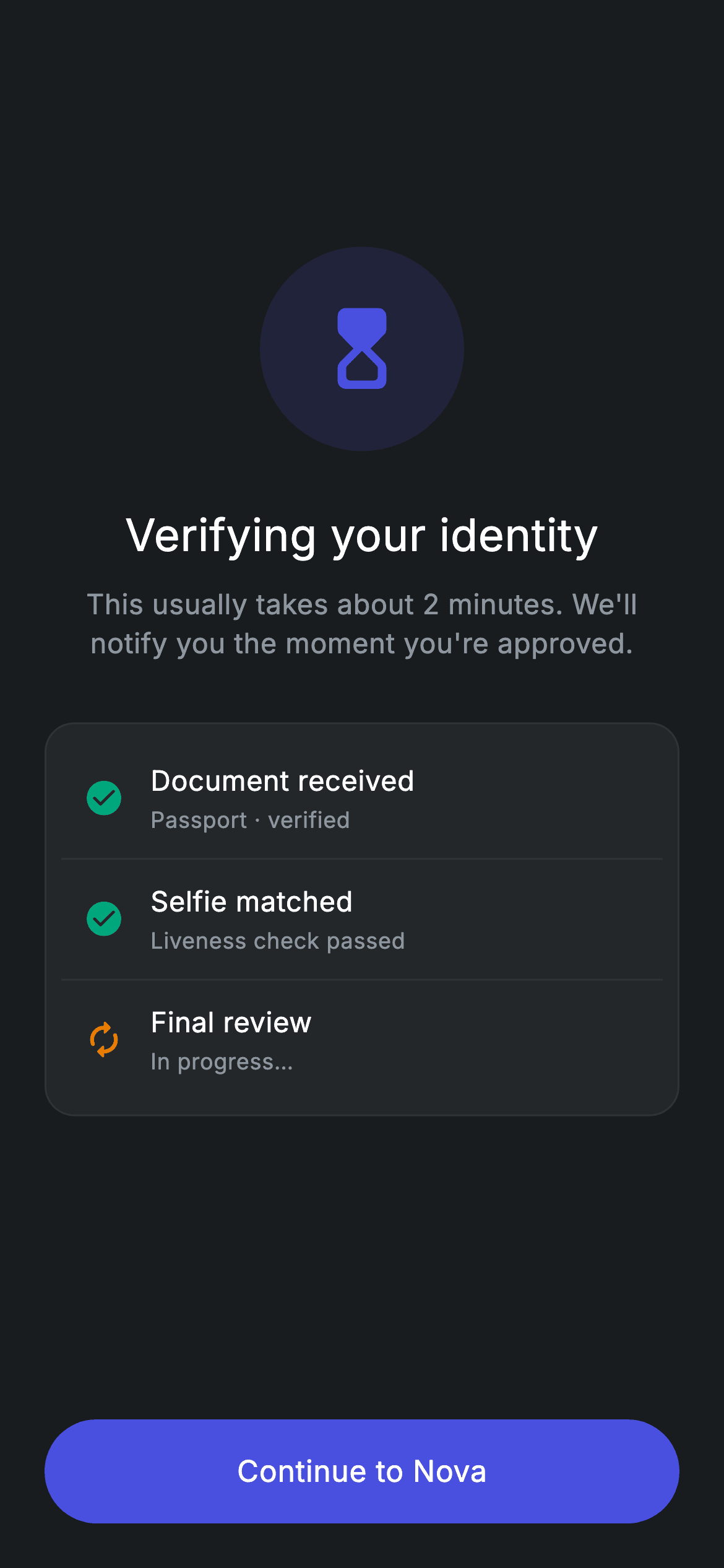
A KYC submission doesn't finish instantly, and this screen is what the user stares at while the checks run. You'll build a dark-theme waiting state in Flutter: a tinted circular hourglass badge, a 'Verifying your identity' heading with a two-minute expectation set below it, and a three-row status card where Document received and Selfie matched are already teal check marks while Final review sits amber and in progress. It ends in a pill 'Continue to Nova' button, and the whole thing is one stateless widget with no packages.
Watch the Flutter UI walkthrough
A short screen recording of Fintech · KYC Review running, if you'd rather see it before you read the code. The written tutorial below covers everything in it.
Can't see the video? Watch it on YouTube.
What you'll build
- ✓A 110px circular hourglass badge tinted with the brand indigo at 14% alpha
- ✓A centered heading and a subtitle that sets an honest 'about 2 minutes' expectation
- ✓A rounded checklist card that mixes finished teal steps with an amber in-progress step, split by hairline dividers
- ✓A reusable private _row() helper that renders every checklist line from an icon, a tint, a title and a subtitle
- ✓A 56px pill CTA built from Material + InkWell so the ripple follows the rounded shape
Step-by-step build
Create the file
Add a new file at lib/fintech_kyc_review/fintech_kyc_review_screen.dart in your Flutter project.
Register the bundled fonts
No external packages — this is pure Flutter. It does bundle its design font (Inter), so drop the font file into fonts/ and declare it in pubspec.yaml:
flutter:
  fonts:
    - family: Inter
      fonts:
- asset: fonts/Inter-Regular.ttfBuild it, piece by piece
Here's how the screen goes together. Each block below is a real slice of the code with a plain-English explanation — paste them in order, or grab the whole file from the next section.
One stateless widget and a seven-color palette
import 'package:flutter/material.dart';

/// KYC review — "we're verifying your identity" pending state. Self-contained
/// per CONVENTIONS.md: pure Flutter, bundled Inter font, forced dark theme.
class FintechKycReviewScreen extends StatelessWidget {
  const FintechKycReviewScreen({super.key, this.onContinue});

  final VoidCallback? onContinue;

  static const String _font = 'Inter';
  static const Color _bg = Color(0xFF191C1F);
  static const Color _surface = Color(0xFF242729);
  static const Color _brand = Color(0xFF494FDF);
  static const Color _teal = Color(0xFF00A87E);
  static const Color _amber = Color(0xFFEC7E00);
  static const Color _muted = Color(0xFF8D969E);
  static const Color _hairline = Color(0xFF2E3235);
Only material.dart is imported — there is no package dependency anywhere in this screen. FintechKycReviewScreen is a StatelessWidget because nothing on the page ever changes: the checklist is fixed mock data, and the single piece of wiring is the optional onContinue VoidCallback the parent passes in to advance the flow. Below the constructor sit eight static const tokens: the 'Inter' font name, _bg (#191C1F) for the page, _surface (#242729) for the card, _brand (#494FDF) indigo for the icon and button, _teal (#00A87E) for completed steps, _amber (#EC7E00) for the step still running, _muted (#8D969E) for secondary text, and _hairline (#2E3235) for borders and dividers. Because they are static, the private _row() helper further down can reach them without passing anything around.
Forcing dark mode and the hourglass badge
  @override
  Widget build(BuildContext context) {
    return Theme(
      data: ThemeData.dark(useMaterial3: true),
      child: Scaffold(
        backgroundColor: _bg,
        body: SafeArea(
          child: Padding(
            padding: const EdgeInsets.fromLTRB(24, 24, 24, 24),
            child: Column(
              crossAxisAlignment: CrossAxisAlignment.stretch,
              children: <Widget>[
                const Spacer(flex: 2),
                Center(
                  child: Container(
                    width: 110,
                    height: 110,
                    decoration: BoxDecoration(
                      shape: BoxShape.circle,
                      color: _brand.withValues(alpha: 0.14),
                    ),
                    child: const Icon(Icons.hourglass_top_rounded,
                        size: 52, color: _brand),
                  ),
                ),
build() wraps the Scaffold in a Theme with ThemeData.dark(useMaterial3: true), so the screen renders dark even if the host app is running a light theme — that is what makes it safe to drop into any project. The Scaffold's backgroundColor is _bg, SafeArea keeps content away from the notch and home indicator, and an even EdgeInsets.fromLTRB(24, 24, 24, 24) insets everything. Inside the Column, crossAxisAlignment: CrossAxisAlignment.stretch is what later lets the button span the full width without a SizedBox(width: double.infinity). The first child is a Spacer(flex: 2) — proportional space rather than a fixed gap — and then the badge: a 110×110 Container with BoxShape.circle filled with _brand.withValues(alpha: 0.14), holding a 52px Icons.hourglass_top_rounded in full-strength _brand. Tinting the same colour at low alpha behind the icon is what gives the halo effect without an image asset.
Heading and the honest waiting-time copy
                const SizedBox(height: 28),
                const Text(
                  'Verifying your identity',
                  textAlign: TextAlign.center,
                  style: TextStyle(
                    fontFamily: _font,
                    fontSize: 24,
                    fontWeight: FontWeight.w500,
                    letterSpacing: 0.24,
                    color: Colors.white,
                  ),
                ),
                const SizedBox(height: 10),
                const Text(
                  'This usually takes about 2 minutes. We\'ll notify you the '
                  'moment you\'re approved.',
                  textAlign: TextAlign.center,
                  style: TextStyle(
                    fontFamily: _font,
                    fontSize: 15,
                    fontWeight: FontWeight.w400,
                    height: 1.4,
                    letterSpacing: 0.24,
                    color: _muted,
                  ),
                ),
                const SizedBox(height: 32),
A 28px gap then the title 'Verifying your identity' at fontSize 24, FontWeight.w500, letterSpacing 0.24 and pure white, centred with textAlign: TextAlign.center. Ten pixels below it the subtitle explains the wait — 'This usually takes about 2 minutes. We'll notify you the moment you're approved.' — written across two adjacent string literals that Dart concatenates at compile time, a neat way to keep a long sentence inside the line limit. It is 15px w400 in _muted grey with height: 1.4, so the two wrapped lines breathe. Note the shared letterSpacing of 0.24 on both: keeping one tracking value across every text style is what makes the typography feel like a single system.
The status checklist card
                Container(
                  padding: const EdgeInsets.all(8),
                  decoration: BoxDecoration(
                    color: _surface,
                    borderRadius: BorderRadius.circular(16),
                    border: Border.all(color: _hairline),
                  ),
                  child: Column(
                    children: <Widget>[
                      _row(Icons.check_circle_rounded, _teal,
                          'Document received', 'Passport · verified'),
                      const Divider(color: _hairline, height: 1),
                      _row(Icons.check_circle_rounded, _teal, 'Selfie matched',
                          'Liveness check passed'),
                      const Divider(color: _hairline, height: 1),
                      _row(Icons.autorenew_rounded, _amber,
                          'Final review', 'In progress…'),
                    ],
                  ),
                ),
                const Spacer(flex: 3),
The card is a Container with only 8px of padding (each row supplies its own 12px inside), filled with _surface, rounded to a 16px radius and outlined with a 1px _hairline Border.all — the border is what separates the card from the near-black page, since the two greys are close in value. Its Column holds three calls to the _row() helper separated by Divider(color: _hairline, height: 1); passing height: 1 stops the Divider from claiming its default 16px of vertical space. The status story is told purely through the icon and tint arguments: two Icons.check_circle_rounded in _teal for 'Document received / Passport · verified' and 'Selfie matched / Liveness check passed', then Icons.autorenew_rounded in _amber for 'Final review / In progress…'. A Spacer(flex: 3) below the card pushes the CTA to the bottom while keeping the 2:3 ratio of empty space above and below the content group.
The pill CTA and its ripple
                SizedBox(
                  height: 56,
                  child: Material(
                    color: _brand,
                    borderRadius: BorderRadius.circular(9999),
                    child: InkWell(
                      borderRadius: BorderRadius.circular(9999),
                      onTap: onContinue,
                      child: const Center(
                        child: Text(
                          'Continue to Nova',
                          style: TextStyle(
                            fontFamily: _font,
                            fontSize: 16,
                            fontWeight: FontWeight.w500,
                            letterSpacing: 0.24,
                            color: Colors.white,
                          ),
                        ),
                      ),
                    ),
                  ),
                ),
              ],
            ),
          ),
        ),
      ),
    );
  }
The button is a SizedBox of height: 56 (width comes from the Column's stretch alignment) wrapping a Material coloured _brand with borderRadius: BorderRadius.circular(9999). The huge radius is the standard pill trick — any value beyond half the height clamps to a perfect capsule, so you never have to hard-code 28. The InkWell inside repeats the same 9999 radius, and that repetition matters: without it the ripple would splash out as a rectangle over the rounded corners. onTap is handed the onContinue callback straight from the constructor, so passing null leaves the button visually identical but inert — useful in previews. The label 'Continue to Nova' is centred at 16px w500 Inter in white.
The _row() helper that builds every checklist line
  Widget _row(IconData icon, Color tint, String title, String sub) {
    return Padding(
      padding: const EdgeInsets.all(12),
      child: Row(
        children: <Widget>[
          Icon(icon, size: 22, color: tint),
          const SizedBox(width: 14),
          Expanded(
            child: Column(
              crossAxisAlignment: CrossAxisAlignment.start,
              children: <Widget>[
                Text(
                  title,
                  style: const TextStyle(
                    fontFamily: _font,
                    fontSize: 15,
                    fontWeight: FontWeight.w500,
                    letterSpacing: 0.24,
                    color: Colors.white,
                  ),
                ),
                const SizedBox(height: 2),
                Text(
                  sub,
                  style: const TextStyle(
                    fontFamily: _font,
                    fontSize: 12,
                    letterSpacing: 0.24,
                    color: _muted,
                  ),
                ),
              ],
            ),
          ),
        ],
      ),
    );
  }
}
Rather than repeat forty lines of Row three times, _row(IconData icon, Color tint, String title, String sub) takes the four things that actually differ between steps and returns the shared structure. Inside a 12px Padding sits a Row: the 22px Icon painted with whatever tint was passed (teal for done, amber for pending), a 14px SizedBox gap, then an Expanded holding a left-aligned Column. Expanded is the important bit — it lets long titles wrap inside the card instead of overflowing the Row. The title is 15px w500 white, and 2px under it the subtitle is 12px in _muted. Because this is a plain method on a StatelessWidget and not a separate widget class, it rebuilds with the parent — perfectly fine here, since nothing on this screen ever rebuilds.
Full code
The complete, ready-to-paste source. Free to use in your projects — one click copies it all.
import 'package:flutter/material.dart';

/// KYC review — "we're verifying your identity" pending state. Self-contained
/// per CONVENTIONS.md: pure Flutter, bundled Inter font, forced dark theme.
class FintechKycReviewScreen extends StatelessWidget {
  const FintechKycReviewScreen({super.key, this.onContinue});

  final VoidCallback? onContinue;

  static const String _font = 'Inter';
  static const Color _bg = Color(0xFF191C1F);
  static const Color _surface = Color(0xFF242729);
  static const Color _brand = Color(0xFF494FDF);
  static const Color _teal = Color(0xFF00A87E);
  static const Color _amber = Color(0xFFEC7E00);
  static const Color _muted = Color(0xFF8D969E);
  static const Color _hairline = Color(0xFF2E3235);

  @override
  Widget build(BuildContext context) {
    return Theme(
      data: ThemeData.dark(useMaterial3: true),
      child: Scaffold(
        backgroundColor: _bg,
        body: SafeArea(
          child: Padding(
            padding: const EdgeInsets.fromLTRB(24, 24, 24, 24),
            child: Column(
              crossAxisAlignment: CrossAxisAlignment.stretch,
              children: <Widget>[
                const Spacer(flex: 2),
                Center(
                  child: Container(
                    width: 110,
                    height: 110,
                    decoration: BoxDecoration(
                      shape: BoxShape.circle,
                      color: _brand.withValues(alpha: 0.14),
                    ),
                    child: const Icon(Icons.hourglass_top_rounded,
                        size: 52, color: _brand),
                  ),
                ),
                const SizedBox(height: 28),
                const Text(
                  'Verifying your identity',
                  textAlign: TextAlign.center,
                  style: TextStyle(
                    fontFamily: _font,
                    fontSize: 24,
                    fontWeight: FontWeight.w500,
                    letterSpacing: 0.24,
                    color: Colors.white,
                  ),
                ),
                const SizedBox(height: 10),
                const Text(
                  'This usually takes about 2 minutes. We\'ll notify you the '
                  'moment you\'re approved.',
                  textAlign: TextAlign.center,
                  style: TextStyle(
                    fontFamily: _font,
                    fontSize: 15,
                    fontWeight: FontWeight.w400,
                    height: 1.4,
                    letterSpacing: 0.24,
                    color: _muted,
                  ),
                ),
                const SizedBox(height: 32),
                Container(
                  padding: const EdgeInsets.all(8),
                  decoration: BoxDecoration(
                    color: _surface,
                    borderRadius: BorderRadius.circular(16),
                    border: Border.all(color: _hairline),
                  ),
                  child: Column(
                    children: <Widget>[
                      _row(Icons.check_circle_rounded, _teal,
                          'Document received', 'Passport · verified'),
                      const Divider(color: _hairline, height: 1),
                      _row(Icons.check_circle_rounded, _teal, 'Selfie matched',
                          'Liveness check passed'),
                      const Divider(color: _hairline, height: 1),
                      _row(Icons.autorenew_rounded, _amber,
                          'Final review', 'In progress…'),
                    ],
                  ),
                ),
                const Spacer(flex: 3),
                SizedBox(
                  height: 56,
                  child: Material(
                    color: _brand,
                    borderRadius: BorderRadius.circular(9999),
                    child: InkWell(
                      borderRadius: BorderRadius.circular(9999),
                      onTap: onContinue,
                      child: const Center(
                        child: Text(
                          'Continue to Nova',
                          style: TextStyle(
                            fontFamily: _font,
                            fontSize: 16,
                            fontWeight: FontWeight.w500,
                            letterSpacing: 0.24,
                            color: Colors.white,
                          ),
                        ),
                      ),
                    ),
                  ),
                ),
              ],
            ),
          ),
        ),
      ),
    );
  }

  Widget _row(IconData icon, Color tint, String title, String sub) {
    return Padding(
      padding: const EdgeInsets.all(12),
      child: Row(
        children: <Widget>[
          Icon(icon, size: 22, color: tint),
          const SizedBox(width: 14),
          Expanded(
            child: Column(
              crossAxisAlignment: CrossAxisAlignment.start,
              children: <Widget>[
                Text(
                  title,
                  style: const TextStyle(
                    fontFamily: _font,
                    fontSize: 15,
                    fontWeight: FontWeight.w500,
                    letterSpacing: 0.24,
                    color: Colors.white,
                  ),
                ),
                const SizedBox(height: 2),
                Text(
                  sub,
                  style: const TextStyle(
                    fontFamily: _font,
                    fontSize: 12,
                    letterSpacing: 0.24,
                    color: _muted,
                  ),
                ),
              ],
            ),
          ),
        ],
      ),
    );
  }
}
Plus bundled 1 binary asset (fonts/images). The CLI and MCP install those for you automatically.
Two faster ways to add it
Copy-paste works, but you can skip it entirely.
1. FlutterKit CLI
One command drops this screen — and its fonts — straight into your project.
$ flutterkit add fintech-kyc-review2. AI agent (MCP)
Connect FlutterKit's MCP server in Claude or Cursor and just ask your agent to install fintech-kyc-review — it fetches and writes the files for you.
FAQ
Can I ship this KYC pending screen in a commercial app?
Yes. The complete FintechKycReviewScreen source on this page is free to copy and use in personal or commercial projects. Paste it into your project, run flutterkit add fintech-kyc-review with the CLI, or let an AI agent install it for you over MCP.
Do the checklist icons or the pill button need a plugin?
No. Everything here is pure Flutter material — Icons.hourglass_top_rounded, Icons.check_circle_rounded and Icons.autorenew_rounded all ship with Flutter, and the pill is just Material plus InkWell. The only extra asset is the bundled Inter font referenced by the _font constant, which you register in pubspec.yaml as shown in step 2; the CLI and MCP copy those font files in for you.
What Flutter SDK does this screen need?
Flutter 3.22 or newer (Dart 3). It uses _brand.withValues(alpha: 0.14) for the badge tint, the super.key super parameter in the constructor, and ThemeData.dark(useMaterial3: true). On an older SDK, change withValues(alpha: 0.14) to withOpacity(0.14) and declare the key as Key? key with super(key: key), and the rest compiles unchanged.


