How to Build a KYC Details Screen in Flutter (Full Code + Preview)
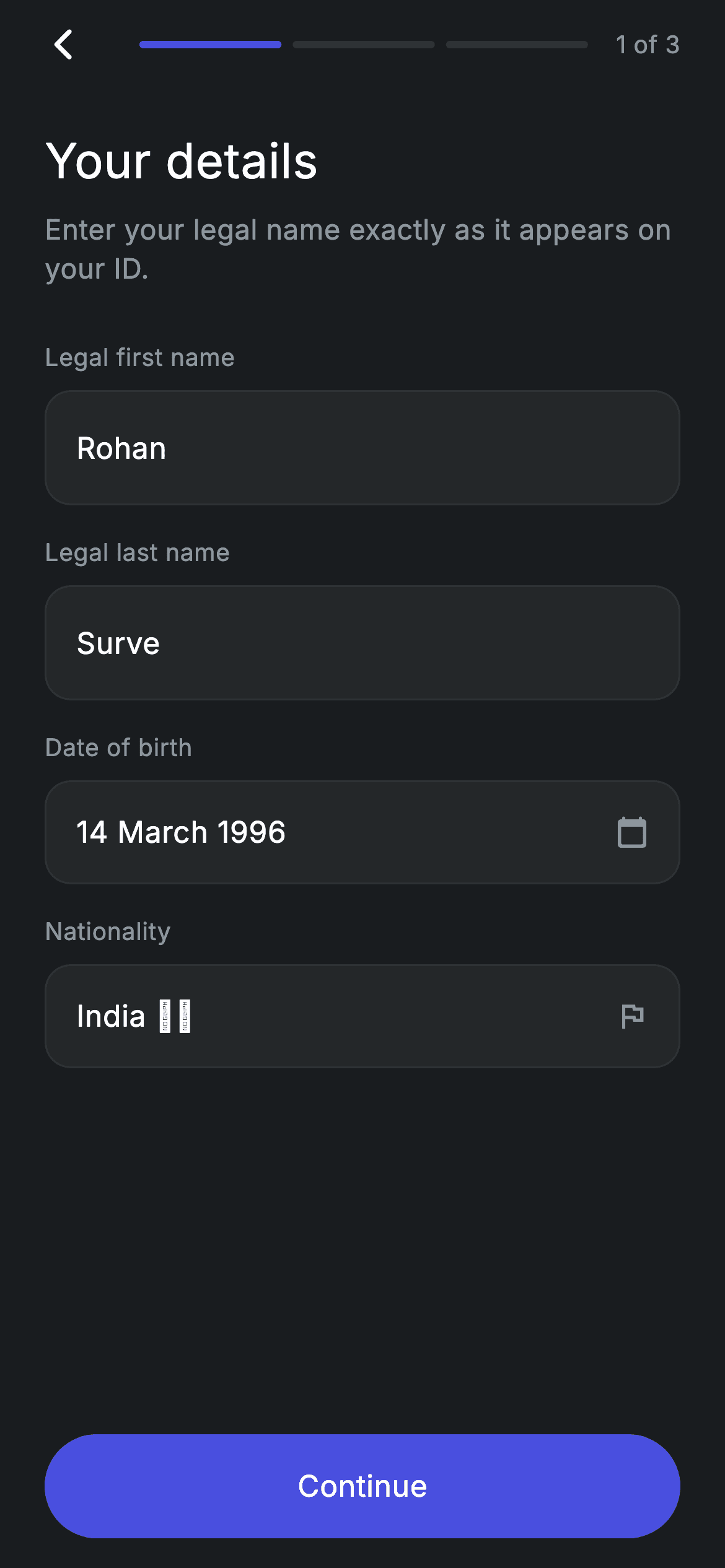
Identity-verification forms are where onboarding usually falls apart: too many inputs, no sense of how far you are, and a Continue button that lets people through half-filled. This screen is step 1 of 3 in a fintech KYC check — a three-segment progress bar with a '1 of 3' label, two editable legal-name fields, and read-only Date of birth and Nationality rows. Two TextEditingController listeners rebuild on every keystroke, so the pill button only turns indigo once both names have real text in them. Pure Flutter, forced dark theme.
Watch the Flutter UI walkthrough
A short screen recording of Fintech · KYC Details running, if you'd rather see it before you read the code. The written tutorial below covers everything in it.
Can't see the video? Watch it on YouTube.
What you'll build
- ✓A KYC step header combining a back arrow, a 3-segment progress bar, and a '1 of 3' counter — driven by a single `step` int you can reuse on steps 2 and 3
- ✓Editable 'Legal first name' and 'Legal last name' fields built from a borderless TextField inside your own rounded container
- ✓Read-only Date of birth and Nationality rows that look identical to the editable ones but carry a trailing icon instead of a cursor
- ✓A Continue button that computes its own enabled state from the live text and greys itself out when either name is blank
- ✓A scrollable form body that never overflows, with the CTA pinned below it
Step-by-step build
Create the file
Add a new file at lib/fintech_kyc_personal/fintech_kyc_personal_screen.dart in your Flutter project.
Register the bundled fonts
No external packages — this is pure Flutter. It does bundle its design font (Inter), so drop the font file into fonts/ and declare it in pubspec.yaml:
flutter:
  fonts:
    - family: Inter
      fonts:
- asset: fonts/Inter-Regular.ttfBuild it, piece by piece
Here's how the screen goes together. Each block below is a real slice of the code with a plain-English explanation — paste them in order, or grab the whole file from the next section.
Design tokens, controllers, and the validity getter
import 'package:flutter/material.dart';

/// KYC 1/3 — personal details. Self-contained per CONVENTIONS.md: pure Flutter,
/// bundled Inter font, forced dark theme. Stateful: live form input enables the
/// Continue CTA.
class FintechKycPersonalScreen extends StatefulWidget {
  const FintechKycPersonalScreen({super.key, this.onContinue, this.onBack});

  final VoidCallback? onContinue;
  final VoidCallback? onBack;

  @override
  State<FintechKycPersonalScreen> createState() =>
      _FintechKycPersonalScreenState();
}

class _FintechKycPersonalScreenState extends State<FintechKycPersonalScreen> {
  static const String _font = 'Inter';
  static const Color _bg = Color(0xFF191C1F);
  static const Color _surface = Color(0xFF242729);
  static const Color _brand = Color(0xFF494FDF);
  static const Color _muted = Color(0xFF8D969E);
  static const Color _hairline = Color(0xFF2E3235);

  final TextEditingController _first = TextEditingController(text: 'Rohan');
  final TextEditingController _last = TextEditingController(text: 'Surve');

  @override
  void initState() {
    super.initState();
    _first.addListener(() => setState(() {}));
    _last.addListener(() => setState(() {}));
  }

  @override
  void dispose() {
    _first.dispose();
    _last.dispose();
    super.dispose();
  }

  bool get _valid =>
      _first.text.trim().isNotEmpty && _last.text.trim().isNotEmpty;
`FintechKycPersonalScreen` is a StatefulWidget that takes two optional callbacks, `onContinue` and `onBack`, so the screen never navigates on its own — you decide where step 2 lives. The state class opens with the palette as private consts: `_bg` (#191C1F) for the page, `_surface` (#242729) for every field box, `_brand` (#494FDF) indigo for the active progress segments and the enabled CTA, `_muted` (#8D969E) for labels, and `_hairline` (#2E3235) for the 1px field borders. Two `TextEditingController`s are seeded with demo text ('Rohan', 'Surve'), and `initState` attaches a listener to each that calls `setState(() {})` — that empty setState is the whole trick: every keystroke triggers a rebuild so the button can re-evaluate itself. `dispose` releases both controllers to avoid a leak. The `_valid` getter is the rule the UI reads: both fields must be non-empty after `.trim()`, so a string of spaces will not unlock Continue.
Building the page: dark theme, header, and the scrolling form
  @override
  Widget build(BuildContext context) {
    return Theme(
      data: ThemeData.dark(useMaterial3: true),
      child: Scaffold(
        backgroundColor: _bg,
        body: SafeArea(
          child: Padding(
            padding: const EdgeInsets.fromLTRB(24, 4, 24, 16),
            child: Column(
              crossAxisAlignment: CrossAxisAlignment.stretch,
              children: <Widget>[
                _Header(
                  step: 1,
                  onBack: widget.onBack,
                  font: _font,
                  brand: _brand,
                  hairline: _hairline,
                  muted: _muted,
                ),
                const SizedBox(height: 24),
                const Text(
                  'Your details',
                  style: TextStyle(
                    fontFamily: _font,
                    fontSize: 26,
                    fontWeight: FontWeight.w500,
                    letterSpacing: 0.24,
                    color: Colors.white,
                  ),
                ),
                const SizedBox(height: 8),
                const Text(
                  'Enter your legal name exactly as it appears on your ID.',
                  style: TextStyle(
                    fontFamily: _font,
                    fontSize: 15,
                    fontWeight: FontWeight.w400,
                    height: 1.4,
                    letterSpacing: 0.24,
                    color: _muted,
                  ),
                ),
                const SizedBox(height: 28),
                Expanded(
                  child: ListView(
                    physics: const BouncingScrollPhysics(),
                    children: <Widget>[
                      _field('Legal first name', _first),
                      const SizedBox(height: 16),
                      _field('Legal last name', _last),
                      const SizedBox(height: 16),
                      _readonly('Date of birth', '14 March 1996',
                          Icons.calendar_today_rounded),
                      const SizedBox(height: 16),
                      _readonly('Nationality', 'India 🇮🇳',
                          Icons.flag_outlined),
                    ],
                  ),
                ),
                _continueButton(),
              ],
            ),
          ),
        ),
      ),
    );
  }
`build` wraps everything in a `Theme` with `ThemeData.dark(useMaterial3: true)` so the screen stays dark even if the host app is running a light theme — useful when you drop it into an existing project. Inside, a `Scaffold` painted `_bg` and a `SafeArea` keep content clear of the notch, with padding of `EdgeInsets.fromLTRB(24, 4, 24, 16)`. The `Column` uses `CrossAxisAlignment.stretch` so children fill the width — that alone makes the Continue button full-bleed without any extra sizing. Then comes the `_Header` (passed `step: 1`), the 26px 'Your details' title, and the 15px muted subtitle 'Enter your legal name exactly as it appears on your ID.' with `height: 1.4` line spacing. The form itself sits in `Expanded > ListView` with `BouncingScrollPhysics`, so the four rows scroll on small phones while `_continueButton()` stays anchored at the bottom of the Column, outside the scroll area.
The editable field: a TextField with the borders stripped out
  Widget _field(String label, TextEditingController c) {
    return Column(
      crossAxisAlignment: CrossAxisAlignment.start,
      children: <Widget>[
        Text(
          label,
          style: const TextStyle(
            fontFamily: _font,
            fontSize: 13,
            fontWeight: FontWeight.w400,
            letterSpacing: 0.24,
            color: _muted,
          ),
        ),
        const SizedBox(height: 8),
        Container(
          decoration: BoxDecoration(
            color: _surface,
            borderRadius: BorderRadius.circular(14),
            border: Border.all(color: _hairline),
          ),
          padding: const EdgeInsets.symmetric(horizontal: 16),
          child: TextField(
            controller: c,
            cursorColor: _brand,
            style: const TextStyle(
              fontFamily: _font,
              fontSize: 16,
              color: Colors.white,
              letterSpacing: 0.24,
            ),
            decoration: const InputDecoration(
              isCollapsed: true,
              contentPadding: EdgeInsets.symmetric(vertical: 18),
              border: InputBorder.none,
            ),
          ),
        ),
      ],
    );
  }
`_field(label, controller)` is the reusable input. The 13px muted label sits above a `Container` styled with `_surface` fill, a 14px `borderRadius`, and a `_hairline` border — the container owns the look, not the TextField. The TextField itself is deliberately stripped: `border: InputBorder.none` removes Material's underline, `isCollapsed: true` kills the default minimum height, and `contentPadding: EdgeInsets.symmetric(vertical: 18)` sets the real height, which together with the container's 16px horizontal padding gives an evenly padded box. `cursorColor: _brand` tints the caret indigo to match the CTA. This pattern — plain container plus a naked TextField — is usually easier to control than fighting `InputDecoration`'s built-in borders and fill.
Read-only rows that match the editable ones
  Widget _readonly(String label, String value, IconData icon) {
    return Column(
      crossAxisAlignment: CrossAxisAlignment.start,
      children: <Widget>[
        Text(
          label,
          style: const TextStyle(
            fontFamily: _font,
            fontSize: 13,
            fontWeight: FontWeight.w400,
            letterSpacing: 0.24,
            color: _muted,
          ),
        ),
        const SizedBox(height: 8),
        Container(
          height: 56,
          decoration: BoxDecoration(
            color: _surface,
            borderRadius: BorderRadius.circular(14),
            border: Border.all(color: _hairline),
          ),
          padding: const EdgeInsets.symmetric(horizontal: 16),
          child: Row(
            children: <Widget>[
              Expanded(
                child: Text(
                  value,
                  style: const TextStyle(
                    fontFamily: _font,
                    fontSize: 16,
                    color: Colors.white,
                    letterSpacing: 0.24,
                  ),
                ),
              ),
              Icon(icon, size: 18, color: _muted),
            ],
          ),
        ),
      ],
    );
  }
`_readonly(label, value, icon)` renders Date of birth ('14 March 1996', `Icons.calendar_today_rounded`) and Nationality ('India 🇮🇳', `Icons.flag_outlined`). It repeats the same label + `_surface` container + `_hairline` border recipe so the rows look like the inputs above them, but with a fixed `height: 56` instead of TextField padding, and a `Row` containing an `Expanded` white 16px value plus an 18px muted trailing icon. There is no tap handler here — the values are static strings, so if you want a date picker or a country sheet, wrap the container in a `GestureDetector`/`InkWell` and store the chosen value in state.
The state-driven Continue button
  Widget _continueButton() {
    return SizedBox(
      height: 56,
      child: Material(
        color: _valid ? _brand : _surface,
        borderRadius: BorderRadius.circular(9999),
        child: InkWell(
          borderRadius: BorderRadius.circular(9999),
          onTap: _valid ? widget.onContinue : null,
          child: Center(
            child: Text(
              'Continue',
              style: TextStyle(
                fontFamily: _font,
                fontSize: 16,
                fontWeight: FontWeight.w500,
                letterSpacing: 0.24,
                color: _valid ? Colors.white : _muted,
              ),
            ),
          ),
        ),
      ),
    );
  }
The CTA is a 56px-tall `Material` with `borderRadius: BorderRadius.circular(9999)` — a radius far larger than the height, which is the simplest way to get a perfect pill. Three things read `_valid` at once: the `Material` color (indigo `_brand` when valid, dark `_surface` when not), the `InkWell`'s `onTap` (`widget.onContinue` when valid, `null` when not — and a null onTap also removes the ripple, so a disabled button feels genuinely dead), and the label color (white vs `_muted`). Because the controller listeners rebuild the widget on every keystroke, clearing a name instantly greys the button back out with no validation call or form key involved.
The 3-segment KYC progress header
/// Back button + 3-segment KYC progress bar. Shared shape; the address screen
/// keeps its own copy (self-contained).
class _Header extends StatelessWidget {
  const _Header({
    required this.step,
    required this.onBack,
    required this.font,
    required this.brand,
    required this.hairline,
    required this.muted,
  });

  final int step;
  final VoidCallback? onBack;
  final String font;
  final Color brand;
  final Color hairline;
  final Color muted;

  @override
  Widget build(BuildContext context) {
    return Row(
      children: <Widget>[
        GestureDetector(
          onTap: onBack ?? () => Navigator.of(context).maybePop(),
          behavior: HitTestBehavior.opaque,
          child: const SizedBox(
            width: 40,
            height: 40,
            child: Align(
              alignment: Alignment.centerLeft,
              child: Icon(Icons.arrow_back_ios_new_rounded,
                  size: 20, color: Colors.white),
            ),
          ),
        ),
        const SizedBox(width: 8),
        Expanded(
          child: Row(
            children: <Widget>[
              for (int i = 1; i <= 3; i++)
                Expanded(
                  child: Container(
                    height: 4,
                    margin: const EdgeInsets.symmetric(horizontal: 3),
                    decoration: BoxDecoration(
                      color: i <= step ? brand : hairline,
                      borderRadius: BorderRadius.circular(9999),
                    ),
                  ),
                ),
            ],
          ),
        ),
        const SizedBox(width: 12),
        Text(
          '$step of 3',
          style: TextStyle(
            fontFamily: font,
            fontSize: 13,
            fontWeight: FontWeight.w400,
            letterSpacing: 0.24,
            color: muted,
          ),
        ),
      ],
    );
  }
}
`_Header` is a private StatelessWidget that takes `step` plus the font and colors, keeping the screen self-contained rather than depending on a shared theme file. On the left a `GestureDetector` with `behavior: HitTestBehavior.opaque` wraps a 40×40 `SizedBox` so the whole box is tappable, not just the 20px `Icons.arrow_back_ios_new_rounded` glyph; its `onTap` falls back to `Navigator.of(context).maybePop()` when no `onBack` was supplied. The bar itself is a `for (int i = 1; i <= 3; i++)` loop inside a `Row`, each iteration emitting an `Expanded` 4px-tall pill with 3px horizontal margin, coloured `brand` when `i <= step` and `hairline` otherwise. Change `step` to 2 or 3 and the same widget serves the later KYC screens; the trailing '$step of 3' text updates from the same value.
Full code
The complete, ready-to-paste source. Free to use in your projects — one click copies it all.
import 'package:flutter/material.dart';

/// KYC 1/3 — personal details. Self-contained per CONVENTIONS.md: pure Flutter,
/// bundled Inter font, forced dark theme. Stateful: live form input enables the
/// Continue CTA.
class FintechKycPersonalScreen extends StatefulWidget {
  const FintechKycPersonalScreen({super.key, this.onContinue, this.onBack});

  final VoidCallback? onContinue;
  final VoidCallback? onBack;

  @override
  State<FintechKycPersonalScreen> createState() =>
      _FintechKycPersonalScreenState();
}

class _FintechKycPersonalScreenState extends State<FintechKycPersonalScreen> {
  static const String _font = 'Inter';
  static const Color _bg = Color(0xFF191C1F);
  static const Color _surface = Color(0xFF242729);
  static const Color _brand = Color(0xFF494FDF);
  static const Color _muted = Color(0xFF8D969E);
  static const Color _hairline = Color(0xFF2E3235);

  final TextEditingController _first = TextEditingController(text: 'Rohan');
  final TextEditingController _last = TextEditingController(text: 'Surve');

  @override
  void initState() {
    super.initState();
    _first.addListener(() => setState(() {}));
    _last.addListener(() => setState(() {}));
  }

  @override
  void dispose() {
    _first.dispose();
    _last.dispose();
    super.dispose();
  }

  bool get _valid =>
      _first.text.trim().isNotEmpty && _last.text.trim().isNotEmpty;

  @override
  Widget build(BuildContext context) {
    return Theme(
      data: ThemeData.dark(useMaterial3: true),
      child: Scaffold(
        backgroundColor: _bg,
        body: SafeArea(
          child: Padding(
            padding: const EdgeInsets.fromLTRB(24, 4, 24, 16),
            child: Column(
              crossAxisAlignment: CrossAxisAlignment.stretch,
              children: <Widget>[
                _Header(
                  step: 1,
                  onBack: widget.onBack,
                  font: _font,
                  brand: _brand,
                  hairline: _hairline,
                  muted: _muted,
                ),
                const SizedBox(height: 24),
                const Text(
                  'Your details',
                  style: TextStyle(
                    fontFamily: _font,
                    fontSize: 26,
                    fontWeight: FontWeight.w500,
                    letterSpacing: 0.24,
                    color: Colors.white,
                  ),
                ),
                const SizedBox(height: 8),
                const Text(
                  'Enter your legal name exactly as it appears on your ID.',
                  style: TextStyle(
                    fontFamily: _font,
                    fontSize: 15,
                    fontWeight: FontWeight.w400,
                    height: 1.4,
                    letterSpacing: 0.24,
                    color: _muted,
                  ),
                ),
                const SizedBox(height: 28),
                Expanded(
                  child: ListView(
                    physics: const BouncingScrollPhysics(),
                    children: <Widget>[
                      _field('Legal first name', _first),
                      const SizedBox(height: 16),
                      _field('Legal last name', _last),
                      const SizedBox(height: 16),
                      _readonly('Date of birth', '14 March 1996',
                          Icons.calendar_today_rounded),
                      const SizedBox(height: 16),
                      _readonly('Nationality', 'India 🇮🇳',
                          Icons.flag_outlined),
                    ],
                  ),
                ),
                _continueButton(),
              ],
            ),
          ),
        ),
      ),
    );
  }

  Widget _field(String label, TextEditingController c) {
    return Column(
      crossAxisAlignment: CrossAxisAlignment.start,
      children: <Widget>[
        Text(
          label,
          style: const TextStyle(
            fontFamily: _font,
            fontSize: 13,
            fontWeight: FontWeight.w400,
            letterSpacing: 0.24,
            color: _muted,
          ),
        ),
        const SizedBox(height: 8),
        Container(
          decoration: BoxDecoration(
            color: _surface,
            borderRadius: BorderRadius.circular(14),
            border: Border.all(color: _hairline),
          ),
          padding: const EdgeInsets.symmetric(horizontal: 16),
          child: TextField(
            controller: c,
            cursorColor: _brand,
            style: const TextStyle(
              fontFamily: _font,
              fontSize: 16,
              color: Colors.white,
              letterSpacing: 0.24,
            ),
            decoration: const InputDecoration(
              isCollapsed: true,
              contentPadding: EdgeInsets.symmetric(vertical: 18),
              border: InputBorder.none,
            ),
          ),
        ),
      ],
    );
  }

  Widget _readonly(String label, String value, IconData icon) {
    return Column(
      crossAxisAlignment: CrossAxisAlignment.start,
      children: <Widget>[
        Text(
          label,
          style: const TextStyle(
            fontFamily: _font,
            fontSize: 13,
            fontWeight: FontWeight.w400,
            letterSpacing: 0.24,
            color: _muted,
          ),
        ),
        const SizedBox(height: 8),
        Container(
          height: 56,
          decoration: BoxDecoration(
            color: _surface,
            borderRadius: BorderRadius.circular(14),
            border: Border.all(color: _hairline),
          ),
          padding: const EdgeInsets.symmetric(horizontal: 16),
          child: Row(
            children: <Widget>[
              Expanded(
                child: Text(
                  value,
                  style: const TextStyle(
                    fontFamily: _font,
                    fontSize: 16,
                    color: Colors.white,
                    letterSpacing: 0.24,
                  ),
                ),
              ),
              Icon(icon, size: 18, color: _muted),
            ],
          ),
        ),
      ],
    );
  }

  Widget _continueButton() {
    return SizedBox(
      height: 56,
      child: Material(
        color: _valid ? _brand : _surface,
        borderRadius: BorderRadius.circular(9999),
        child: InkWell(
          borderRadius: BorderRadius.circular(9999),
          onTap: _valid ? widget.onContinue : null,
          child: Center(
            child: Text(
              'Continue',
              style: TextStyle(
                fontFamily: _font,
                fontSize: 16,
                fontWeight: FontWeight.w500,
                letterSpacing: 0.24,
                color: _valid ? Colors.white : _muted,
              ),
            ),
          ),
        ),
      ),
    );
  }
}

/// Back button + 3-segment KYC progress bar. Shared shape; the address screen
/// keeps its own copy (self-contained).
class _Header extends StatelessWidget {
  const _Header({
    required this.step,
    required this.onBack,
    required this.font,
    required this.brand,
    required this.hairline,
    required this.muted,
  });

  final int step;
  final VoidCallback? onBack;
  final String font;
  final Color brand;
  final Color hairline;
  final Color muted;

  @override
  Widget build(BuildContext context) {
    return Row(
      children: <Widget>[
        GestureDetector(
          onTap: onBack ?? () => Navigator.of(context).maybePop(),
          behavior: HitTestBehavior.opaque,
          child: const SizedBox(
            width: 40,
            height: 40,
            child: Align(
              alignment: Alignment.centerLeft,
              child: Icon(Icons.arrow_back_ios_new_rounded,
                  size: 20, color: Colors.white),
            ),
          ),
        ),
        const SizedBox(width: 8),
        Expanded(
          child: Row(
            children: <Widget>[
              for (int i = 1; i <= 3; i++)
                Expanded(
                  child: Container(
                    height: 4,
                    margin: const EdgeInsets.symmetric(horizontal: 3),
                    decoration: BoxDecoration(
                      color: i <= step ? brand : hairline,
                      borderRadius: BorderRadius.circular(9999),
                    ),
                  ),
                ),
            ],
          ),
        ),
        const SizedBox(width: 12),
        Text(
          '$step of 3',
          style: TextStyle(
            fontFamily: font,
            fontSize: 13,
            fontWeight: FontWeight.w400,
            letterSpacing: 0.24,
            color: muted,
          ),
        ),
      ],
    );
  }
}
Plus bundled 1 binary asset (fonts/images). The CLI and MCP install those for you automatically.
Two faster ways to add it
Copy-paste works, but you can skip it entirely.
1. FlutterKit CLI
One command drops this screen — and its fonts — straight into your project.
$ flutterkit add fintech-kyc-personal2. AI agent (MCP)
Connect FlutterKit's MCP server in Claude or Cursor and just ask your agent to install fintech-kyc-personal — it fetches and writes the files for you.
FAQ
Can I use this KYC screen in a commercial app?
Yes. The full Dart for FintechKycPersonalScreen on this page is free to copy into personal or commercial projects. Paste it, run `flutterkit add fintech-kyc-personal` with the CLI, or let an AI agent install it through MCP — no attribution or licence required.
Do I need a form package or an input library for this?
No — there are no dependencies. It is pure `package:flutter/material.dart`: two TextEditingControllers, a bare TextField with InputBorder.none, and Material/InkWell for the button. No Form or GlobalKey<FormState> either; validation is just the `_valid` getter. The one asset is the bundled Inter font referenced as `_font`, which you register in pubspec.yaml as shown in step 2 (the CLI and MCP copy the font files for you).
What Flutter SDK does the KYC screen need?
Flutter 3.10+ / Dart 3 is enough. It uses super parameters (`super.key` in both constructors) and `ThemeData.dark(useMaterial3: true)`; there are no Color.withValues() calls to swap. On a pre-Dart-3 SDK, rewrite the constructors as `const FintechKycPersonalScreen({Key? key, this.onContinue, this.onBack}) : super(key: key);`, and if you are on a Material 2 SDK just drop the `useMaterial3` argument.


