How to Build a KYC Address Screen in Flutter (Full Code + Preview)
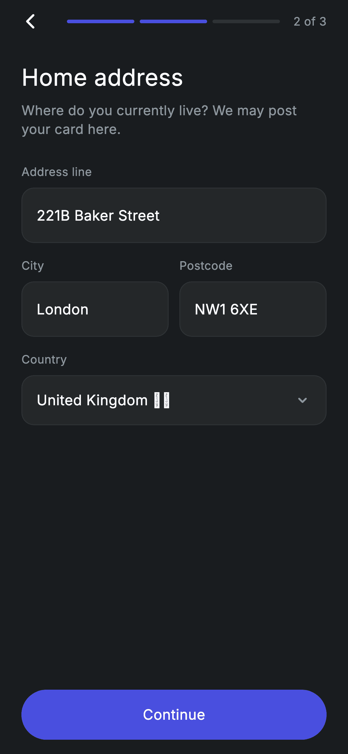
Address capture is the KYC step that usually looks worst — a stack of identical boxes with no sense of progress. This screen fixes that: a three-segment bar with two segments lit and a '2 of 3' counter, one full-width Address line field, City and Postcode sharing a row, and a read-only Country row reading 'United Kingdom 🇬🇧'. Three TextEditingControllers ship prefilled and rebuild the screen on every keystroke, so the pill Continue button flips from grey to indigo the moment no field is left empty.
Watch the Flutter UI walkthrough
A short screen recording of Fintech · KYC Address running, if you'd rather see it before you read the code. The written tutorial below covers everything in it.
Can't see the video? Watch it on YouTube.
What you'll build
- ✓A step header that pairs a 40×40 back-tap target with three rounded 4px progress segments (the first two filled with #494FDF) and a '2 of 3' label
- ✓One `_field` helper that wraps a border-less TextField inside your own rounded #242729 box, so every input on the screen is styled identically in one place
- ✓A City / Postcode row built from two Expanded fields and a 12px gap, inside a bouncing ListView that scrolls while the CTA stays pinned to the bottom
- ✓A read-only Country row with a chevron that matches the editable fields visually but has no TextField behind it
- ✓Live validation: controller listeners call setState, and a `_valid` getter switches the pill button's fill, label colour and onTap together
Step-by-step build
Create the file
Add a new file at lib/fintech_kyc_address/fintech_kyc_address_screen.dart in your Flutter project.
Register the bundled fonts
No external packages — this is pure Flutter. It does bundle its design font (Inter), so drop the font file into fonts/ and declare it in pubspec.yaml:
flutter:
  fonts:
    - family: Inter
      fonts:
- asset: fonts/Inter-Regular.ttfBuild it, piece by piece
Here's how the screen goes together. Each block below is a real slice of the code with a plain-English explanation — paste them in order, or grab the whole file from the next section.
Callbacks, colour tokens, and three prefilled controllers
import 'package:flutter/material.dart';

/// KYC 2/3 — residential address. Self-contained per CONVENTIONS.md: pure
/// Flutter, bundled Inter font, forced dark theme. Stateful: live form input
/// enables the Continue CTA.
class FintechKycAddressScreen extends StatefulWidget {
  const FintechKycAddressScreen({super.key, this.onContinue, this.onBack});

  final VoidCallback? onContinue;
  final VoidCallback? onBack;

  @override
  State<FintechKycAddressScreen> createState() =>
      _FintechKycAddressScreenState();
}

class _FintechKycAddressScreenState extends State<FintechKycAddressScreen> {
  static const String _font = 'Inter';
  static const Color _bg = Color(0xFF191C1F);
  static const Color _surface = Color(0xFF242729);
  static const Color _brand = Color(0xFF494FDF);
  static const Color _muted = Color(0xFF8D969E);
  static const Color _hairline = Color(0xFF2E3235);

  final TextEditingController _line1 =
      TextEditingController(text: '221B Baker Street');
  final TextEditingController _city = TextEditingController(text: 'London');
  final TextEditingController _postcode =
      TextEditingController(text: 'NW1 6XE');
Only `package:flutter/material.dart` is imported — there is no form package anywhere in this file. FintechKycAddressScreen is a StatefulWidget taking two optional VoidCallbacks, `onContinue` and `onBack`, so the screen never navigates by itself and the parent decides what step 3 is. The state class opens with the design tokens: `_font` = 'Inter', `_bg` = #191C1F for the canvas, `_surface` = #242729 for input boxes, `_brand` = #494FDF for the accent, `_muted` = #8D969E for secondary text, and `_hairline` = #2E3235 for borders and the unfilled progress segment. The three TextEditingControllers are created with seed text — '221B Baker Street', 'London', 'NW1 6XE' — so the preview is never an empty form; delete those `text:` arguments and you get a blank screen with a disabled CTA.
Listeners, disposal, and one validation getter
  @override
  void initState() {
    super.initState();
    for (final TextEditingController c in <TextEditingController>[
      _line1,
      _city,
      _postcode,
    ]) {
      c.addListener(() => setState(() {}));
    }
  }

  @override
  void dispose() {
    _line1.dispose();
    _city.dispose();
    _postcode.dispose();
    super.dispose();
  }

  bool get _valid =>
      _line1.text.trim().isNotEmpty &&
      _city.text.trim().isNotEmpty &&
      _postcode.text.trim().isNotEmpty;
initState loops over the three controllers in a list literal and attaches `c.addListener(() => setState(() {}))` to each. That is the whole reactivity story: any keystroke in any field triggers a rebuild, which is cheaper to write than a Form with per-field onChanged handlers and means the button state can be computed rather than stored. dispose releases all three controllers before calling `super.dispose()` — skip this and every visit to the screen leaks a controller. Validation is the `_valid` getter, which trims each field and requires all three to be non-empty. Because it's a getter rather than a bool field, there is no cached flag that can fall out of sync with the text.
Forced dark theme and the pinned-CTA layout
  @override
  Widget build(BuildContext context) {
    return Theme(
      data: ThemeData.dark(useMaterial3: true),
      child: Scaffold(
        backgroundColor: _bg,
        body: SafeArea(
          child: Padding(
            padding: const EdgeInsets.fromLTRB(24, 4, 24, 16),
            child: Column(
              crossAxisAlignment: CrossAxisAlignment.stretch,
              children: <Widget>[
                _progressHeader(),
                const SizedBox(height: 24),
                const Text(
                  'Home address',
                  style: TextStyle(
                    fontFamily: _font,
                    fontSize: 26,
                    fontWeight: FontWeight.w500,
                    letterSpacing: 0.24,
                    color: Colors.white,
                  ),
                ),
                const SizedBox(height: 8),
                const Text(
                  'Where do you currently live? We may post your card here.',
                  style: TextStyle(
                    fontFamily: _font,
                    fontSize: 15,
                    fontWeight: FontWeight.w400,
                    height: 1.4,
                    letterSpacing: 0.24,
                    color: _muted,
                  ),
                ),
                const SizedBox(height: 28),
                Expanded(
                  child: ListView(
                    physics: const BouncingScrollPhysics(),
                    children: <Widget>[
                      _field('Address line', _line1),
                      const SizedBox(height: 16),
                      Row(
                        crossAxisAlignment: CrossAxisAlignment.start,
                        children: <Widget>[
                          Expanded(child: _field('City', _city)),
                          const SizedBox(width: 12),
                          Expanded(child: _field('Postcode', _postcode)),
                        ],
                      ),
                      const SizedBox(height: 16),
                      _readonly('Country', 'United Kingdom 🇬🇧'),
                    ],
                  ),
                ),
                _continueButton(),
              ],
            ),
          ),
        ),
      ),
    );
  }
build wraps everything in a `Theme` with `ThemeData.dark(useMaterial3: true)` so the screen stays dark even if the host app is running a light theme — useful when you drop it into an existing project. Inside, a Scaffold painted `_bg`, a SafeArea, and `EdgeInsets.fromLTRB(24, 4, 24, 16)` padding. The Column uses `CrossAxisAlignment.stretch`, which is why the Continue button fills the width without any extra sizing. The heading 'Home address' is 26px w500 with 0.24 letter spacing, and the 15px muted subtitle 'Where do you currently live? We may post your card here.' uses `height: 1.4` for readable line spacing. The important structural bit is `Expanded(child: ListView(...))`: the fields scroll (with BouncingScrollPhysics) while `_continueButton()` sits outside the Expanded and stays pinned at the bottom. City and Postcode are two `Expanded(child: _field(...))` in a Row split by a 12px SizedBox, with `CrossAxisAlignment.start` so they top-align if one ever grows taller.
The back arrow and the 2-of-3 progress bar
  Widget _progressHeader() {
    return Row(
      children: <Widget>[
        GestureDetector(
          onTap: widget.onBack ?? () => Navigator.of(context).maybePop(),
          behavior: HitTestBehavior.opaque,
          child: const SizedBox(
            width: 40,
            height: 40,
            child: Align(
              alignment: Alignment.centerLeft,
              child: Icon(Icons.arrow_back_ios_new_rounded,
                  size: 20, color: Colors.white),
            ),
          ),
        ),
        const SizedBox(width: 8),
        Expanded(
          child: Row(
            children: <Widget>[
              for (int i = 1; i <= 3; i++)
                Expanded(
                  child: Container(
                    height: 4,
                    margin: const EdgeInsets.symmetric(horizontal: 3),
                    decoration: BoxDecoration(
                      color: i <= 2 ? _brand : _hairline,
                      borderRadius: BorderRadius.circular(9999),
                    ),
                  ),
                ),
            ],
          ),
        ),
        const SizedBox(width: 12),
        const Text(
          '2 of 3',
          style: TextStyle(
            fontFamily: _font,
            fontSize: 13,
            fontWeight: FontWeight.w400,
            letterSpacing: 0.24,
            color: _muted,
          ),
        ),
      ],
    );
  }
`_progressHeader` builds a Row. The back control is a GestureDetector with `behavior: HitTestBehavior.opaque` around a 40×40 SizedBox, so the entire square is tappable rather than just the 20px `Icons.arrow_back_ios_new_rounded` glyph — an easy accessibility win. Its onTap is `widget.onBack ?? () => Navigator.of(context).maybePop()`, meaning the screen still backs out sensibly when the parent passes nothing. The bar itself is a `for (int i = 1; i <= 3; i++)` loop inside a Row, each iteration an Expanded Container 4px tall with 3px horizontal margins and a 9999 radius so the ends round off. The colour is the ternary `i <= 2 ? _brand : _hairline` — that single `2` is what makes this step 2 of 3, so reusing the header on another step is a one-character change. The trailing '2 of 3' label is 13px muted text.
Making a TextField sit flush inside your own box
  Widget _field(String label, TextEditingController c) {
    return Column(
      crossAxisAlignment: CrossAxisAlignment.start,
      children: <Widget>[
        Text(
          label,
          style: const TextStyle(
            fontFamily: _font,
            fontSize: 13,
            letterSpacing: 0.24,
            color: _muted,
          ),
        ),
        const SizedBox(height: 8),
        Container(
          decoration: BoxDecoration(
            color: _surface,
            borderRadius: BorderRadius.circular(14),
            border: Border.all(color: _hairline),
          ),
          padding: const EdgeInsets.symmetric(horizontal: 16),
          child: TextField(
            controller: c,
            cursorColor: _brand,
            style: const TextStyle(
              fontFamily: _font,
              fontSize: 16,
              color: Colors.white,
              letterSpacing: 0.24,
            ),
            decoration: const InputDecoration(
              isCollapsed: true,
              contentPadding: EdgeInsets.symmetric(vertical: 18),
              border: InputBorder.none,
            ),
          ),
        ),
      ],
    );
  }
`_field(label, controller)` returns a left-aligned Column: a 13px `_muted` label, an 8px gap, then the input. The box is a Container filled `_surface`, 14px corner radius, a 1px `_hairline` border, and 16px horizontal padding. The TextField inside gets `cursorColor: _brand` and 16px white Inter text, but the real work is in its InputDecoration: `isCollapsed: true` removes Material's default 48px minimum height, `border: InputBorder.none` kills the underline, and `contentPadding: EdgeInsets.symmetric(vertical: 18)` supplies the height instead. Together they let the field's visual box be entirely yours — the Container — rather than Flutter's. Because both City and Postcode call this same helper, the three editable fields can never drift apart in styling.
The read-only Country row and a genuinely disabled CTA
  Widget _readonly(String label, String value) {
    return Column(
      crossAxisAlignment: CrossAxisAlignment.start,
      children: <Widget>[
        Text(
          label,
          style: const TextStyle(
            fontFamily: _font,
            fontSize: 13,
            letterSpacing: 0.24,
            color: _muted,
          ),
        ),
        const SizedBox(height: 8),
        Container(
          height: 56,
          decoration: BoxDecoration(
            color: _surface,
            borderRadius: BorderRadius.circular(14),
            border: Border.all(color: _hairline),
          ),
          padding: const EdgeInsets.symmetric(horizontal: 16),
          child: Row(
            children: <Widget>[
              Expanded(
                child: Text(
                  value,
                  style: const TextStyle(
                    fontFamily: _font,
                    fontSize: 16,
                    color: Colors.white,
                    letterSpacing: 0.24,
                  ),
                ),
              ),
              const Icon(Icons.keyboard_arrow_down_rounded,
                  size: 20, color: _muted),
            ],
          ),
        ),
      ],
    );
  }

  Widget _continueButton() {
    return SizedBox(
      height: 56,
      child: Material(
        color: _valid ? _brand : _surface,
        borderRadius: BorderRadius.circular(9999),
        child: InkWell(
          borderRadius: BorderRadius.circular(9999),
          onTap: _valid ? widget.onContinue : null,
          child: Center(
            child: Text(
              'Continue',
              style: TextStyle(
                fontFamily: _font,
                fontSize: 16,
                fontWeight: FontWeight.w500,
                letterSpacing: 0.24,
                color: _valid ? Colors.white : _muted,
              ),
            ),
          ),
        ),
      ),
    );
  }
`_readonly(label, value)` deliberately mirrors `_field`'s look — same `_surface` fill, 14px radius, `_hairline` border, 16px horizontal padding — but has a fixed `height: 56` and holds a plain Text plus `Icons.keyboard_arrow_down_rounded` in `_muted` instead of a TextField. The user reads 'United Kingdom 🇬🇧' as a picker without being able to type into it; wrap it in a GestureDetector and open a bottom sheet if you need real country selection. `_continueButton` is a 56px-tall Material whose `color` is `_valid ? _brand : _surface`, with a 9999 radius for the pill shape, and an InkWell that repeats that radius so the ripple clips to the pill. The disable is real, not cosmetic: `onTap: _valid ? widget.onContinue : null` — a null onTap makes InkWell stop responding entirely, so there is no ripple on an incomplete form. The 16px w500 label swaps between `Colors.white` and `_muted` on the same condition.
Full code
The complete, ready-to-paste source. Free to use in your projects — one click copies it all.
import 'package:flutter/material.dart';

/// KYC 2/3 — residential address. Self-contained per CONVENTIONS.md: pure
/// Flutter, bundled Inter font, forced dark theme. Stateful: live form input
/// enables the Continue CTA.
class FintechKycAddressScreen extends StatefulWidget {
  const FintechKycAddressScreen({super.key, this.onContinue, this.onBack});

  final VoidCallback? onContinue;
  final VoidCallback? onBack;

  @override
  State<FintechKycAddressScreen> createState() =>
      _FintechKycAddressScreenState();
}

class _FintechKycAddressScreenState extends State<FintechKycAddressScreen> {
  static const String _font = 'Inter';
  static const Color _bg = Color(0xFF191C1F);
  static const Color _surface = Color(0xFF242729);
  static const Color _brand = Color(0xFF494FDF);
  static const Color _muted = Color(0xFF8D969E);
  static const Color _hairline = Color(0xFF2E3235);

  final TextEditingController _line1 =
      TextEditingController(text: '221B Baker Street');
  final TextEditingController _city = TextEditingController(text: 'London');
  final TextEditingController _postcode =
      TextEditingController(text: 'NW1 6XE');

  @override
  void initState() {
    super.initState();
    for (final TextEditingController c in <TextEditingController>[
      _line1,
      _city,
      _postcode,
    ]) {
      c.addListener(() => setState(() {}));
    }
  }

  @override
  void dispose() {
    _line1.dispose();
    _city.dispose();
    _postcode.dispose();
    super.dispose();
  }

  bool get _valid =>
      _line1.text.trim().isNotEmpty &&
      _city.text.trim().isNotEmpty &&
      _postcode.text.trim().isNotEmpty;

  @override
  Widget build(BuildContext context) {
    return Theme(
      data: ThemeData.dark(useMaterial3: true),
      child: Scaffold(
        backgroundColor: _bg,
        body: SafeArea(
          child: Padding(
            padding: const EdgeInsets.fromLTRB(24, 4, 24, 16),
            child: Column(
              crossAxisAlignment: CrossAxisAlignment.stretch,
              children: <Widget>[
                _progressHeader(),
                const SizedBox(height: 24),
                const Text(
                  'Home address',
                  style: TextStyle(
                    fontFamily: _font,
                    fontSize: 26,
                    fontWeight: FontWeight.w500,
                    letterSpacing: 0.24,
                    color: Colors.white,
                  ),
                ),
                const SizedBox(height: 8),
                const Text(
                  'Where do you currently live? We may post your card here.',
                  style: TextStyle(
                    fontFamily: _font,
                    fontSize: 15,
                    fontWeight: FontWeight.w400,
                    height: 1.4,
                    letterSpacing: 0.24,
                    color: _muted,
                  ),
                ),
                const SizedBox(height: 28),
                Expanded(
                  child: ListView(
                    physics: const BouncingScrollPhysics(),
                    children: <Widget>[
                      _field('Address line', _line1),
                      const SizedBox(height: 16),
                      Row(
                        crossAxisAlignment: CrossAxisAlignment.start,
                        children: <Widget>[
                          Expanded(child: _field('City', _city)),
                          const SizedBox(width: 12),
                          Expanded(child: _field('Postcode', _postcode)),
                        ],
                      ),
                      const SizedBox(height: 16),
                      _readonly('Country', 'United Kingdom 🇬🇧'),
                    ],
                  ),
                ),
                _continueButton(),
              ],
            ),
          ),
        ),
      ),
    );
  }

  Widget _progressHeader() {
    return Row(
      children: <Widget>[
        GestureDetector(
          onTap: widget.onBack ?? () => Navigator.of(context).maybePop(),
          behavior: HitTestBehavior.opaque,
          child: const SizedBox(
            width: 40,
            height: 40,
            child: Align(
              alignment: Alignment.centerLeft,
              child: Icon(Icons.arrow_back_ios_new_rounded,
                  size: 20, color: Colors.white),
            ),
          ),
        ),
        const SizedBox(width: 8),
        Expanded(
          child: Row(
            children: <Widget>[
              for (int i = 1; i <= 3; i++)
                Expanded(
                  child: Container(
                    height: 4,
                    margin: const EdgeInsets.symmetric(horizontal: 3),
                    decoration: BoxDecoration(
                      color: i <= 2 ? _brand : _hairline,
                      borderRadius: BorderRadius.circular(9999),
                    ),
                  ),
                ),
            ],
          ),
        ),
        const SizedBox(width: 12),
        const Text(
          '2 of 3',
          style: TextStyle(
            fontFamily: _font,
            fontSize: 13,
            fontWeight: FontWeight.w400,
            letterSpacing: 0.24,
            color: _muted,
          ),
        ),
      ],
    );
  }

  Widget _field(String label, TextEditingController c) {
    return Column(
      crossAxisAlignment: CrossAxisAlignment.start,
      children: <Widget>[
        Text(
          label,
          style: const TextStyle(
            fontFamily: _font,
            fontSize: 13,
            letterSpacing: 0.24,
            color: _muted,
          ),
        ),
        const SizedBox(height: 8),
        Container(
          decoration: BoxDecoration(
            color: _surface,
            borderRadius: BorderRadius.circular(14),
            border: Border.all(color: _hairline),
          ),
          padding: const EdgeInsets.symmetric(horizontal: 16),
          child: TextField(
            controller: c,
            cursorColor: _brand,
            style: const TextStyle(
              fontFamily: _font,
              fontSize: 16,
              color: Colors.white,
              letterSpacing: 0.24,
            ),
            decoration: const InputDecoration(
              isCollapsed: true,
              contentPadding: EdgeInsets.symmetric(vertical: 18),
              border: InputBorder.none,
            ),
          ),
        ),
      ],
    );
  }

  Widget _readonly(String label, String value) {
    return Column(
      crossAxisAlignment: CrossAxisAlignment.start,
      children: <Widget>[
        Text(
          label,
          style: const TextStyle(
            fontFamily: _font,
            fontSize: 13,
            letterSpacing: 0.24,
            color: _muted,
          ),
        ),
        const SizedBox(height: 8),
        Container(
          height: 56,
          decoration: BoxDecoration(
            color: _surface,
            borderRadius: BorderRadius.circular(14),
            border: Border.all(color: _hairline),
          ),
          padding: const EdgeInsets.symmetric(horizontal: 16),
          child: Row(
            children: <Widget>[
              Expanded(
                child: Text(
                  value,
                  style: const TextStyle(
                    fontFamily: _font,
                    fontSize: 16,
                    color: Colors.white,
                    letterSpacing: 0.24,
                  ),
                ),
              ),
              const Icon(Icons.keyboard_arrow_down_rounded,
                  size: 20, color: _muted),
            ],
          ),
        ),
      ],
    );
  }

  Widget _continueButton() {
    return SizedBox(
      height: 56,
      child: Material(
        color: _valid ? _brand : _surface,
        borderRadius: BorderRadius.circular(9999),
        child: InkWell(
          borderRadius: BorderRadius.circular(9999),
          onTap: _valid ? widget.onContinue : null,
          child: Center(
            child: Text(
              'Continue',
              style: TextStyle(
                fontFamily: _font,
                fontSize: 16,
                fontWeight: FontWeight.w500,
                letterSpacing: 0.24,
                color: _valid ? Colors.white : _muted,
              ),
            ),
          ),
        ),
      ),
    );
  }
}
Plus bundled 1 binary asset (fonts/images). The CLI and MCP install those for you automatically.
Two faster ways to add it
Copy-paste works, but you can skip it entirely.
1. FlutterKit CLI
One command drops this screen — and its fonts — straight into your project.
$ flutterkit add fintech-kyc-address2. AI agent (MCP)
Connect FlutterKit's MCP server in Claude or Cursor and just ask your agent to install fintech-kyc-address — it fetches and writes the files for you.
FAQ
Can I use this KYC address screen in a commercial app?
Yes. The full FintechKycAddressScreen source on this page is free to copy and ship in personal or commercial projects. Paste it in, install it with the FlutterKit CLI (flutterkit add fintech-kyc-address), or have an AI agent add it for you via MCP.
Does the address form need a form library or a country-picker package?
No — it's pure Flutter on the material library, with no packages at all. Validation is one `_valid` getter over three TextEditingControllers rather than a Form/TextFormField validator stack, and the 🇬🇧 in the Country row is just an emoji inside a Dart string rendered by the platform's own font, not a flag package. The only asset is the bundled Inter font, which you register in pubspec.yaml as shown in step 2; the CLI and MCP copy the font files for you.
Which Flutter version does this screen need?
It uses super parameters (`const FintechKycAddressScreen({super.key, ...})`) and `ThemeData.dark(useMaterial3: true)`, so target Flutter 3.16+ on Dart 3. On an older SDK, rewrite the constructor in the classic form — `const FintechKycAddressScreen({Key? key, this.onContinue, this.onBack}) : super(key: key)` — and drop the `useMaterial3: true` argument. There are no newer APIs like Color.withValues() in this file, so nothing else has to change.


