How to Build a Card Settings Screen in Flutter (Full Code + Preview)
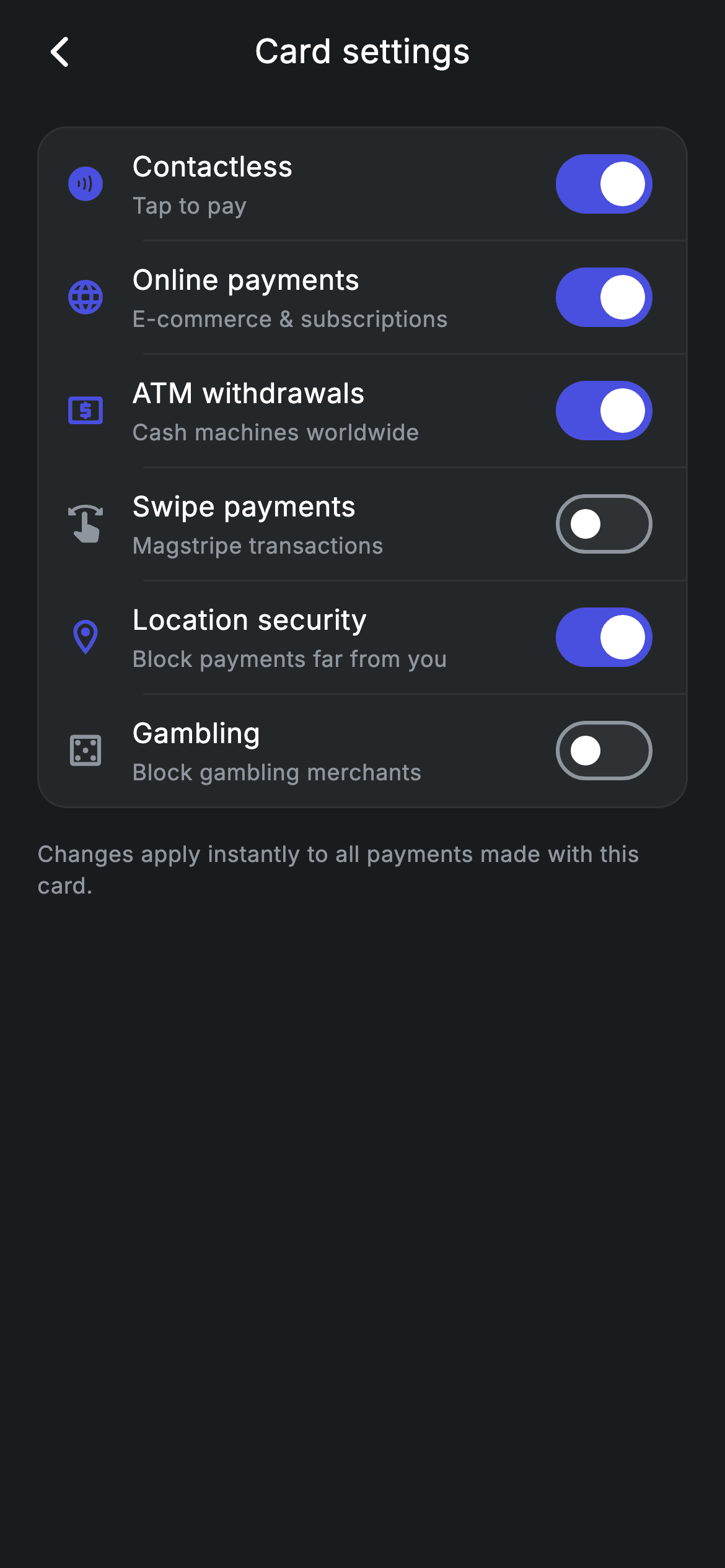
This screen is a card-controls panel: six switches that decide where a bank card is allowed to work — contactless, online payments, ATM withdrawals, magstripe swipes, location security and a gambling block. You'll build it as a single rounded #242729 panel with hairline dividers between rows, a leading icon that turns indigo the instant its switch goes on, and a small `_Toggle` data class holding each row's state. Every flip is local `setState`, so pointing a toggle at your card API later is a one-line change. Pure Flutter, forced dark theme, bundled Inter.
Watch the Flutter UI walkthrough
A short screen recording of Fintech · Card Settings running, if you'd rather see it before you read the code. The written tutorial below covers everything in it.
Can't see the video? Watch it on YouTube.
What you'll build
- ✓A grouped settings panel — one rounded, hairline-bordered container holding six switch rows with text-aligned dividers between them
- ✓A row widget where the leading icon recolors from grey to indigo based on that row's own on/off value
- ✓A tiny `_Toggle` model so adding a seventh control is one line, not a new widget
- ✓A centered app bar whose title stays visually centered despite the back button on one side
- ✓Custom Switch styling (white thumb, brand track) on a forced Material 3 dark theme, in the bundled Inter font
Step-by-step build
Create the file
Add a new file at lib/fintech_card_settings/fintech_card_settings_screen.dart in your Flutter project.
Register the bundled fonts
No external packages — this is pure Flutter. It does bundle its design font (Inter), so drop the font file into fonts/ and declare it in pubspec.yaml:
flutter:
  fonts:
    - family: Inter
      fonts:
- asset: fonts/Inter-Regular.ttfBuild it, piece by piece
Here's how the screen goes together. Each block below is a real slice of the code with a plain-English explanation — paste them in order, or grab the whole file from the next section.
Design tokens and the list of toggles
import 'package:flutter/material.dart';

/// Card Settings — toggle where and how the card can be used. Self-contained per
/// CONVENTIONS.md: pure Flutter, bundled Inter font, forced dark theme. Stateful:
/// each switch flips live.
class FintechCardSettingsScreen extends StatefulWidget {
  const FintechCardSettingsScreen({super.key, this.onBack});

  final VoidCallback? onBack;

  @override
  State<FintechCardSettingsScreen> createState() =>
      _FintechCardSettingsScreenState();
}

class _FintechCardSettingsScreenState extends State<FintechCardSettingsScreen> {
  static const String _font = 'Inter';
  static const Color _bg = Color(0xFF191C1F);
  static const Color _surface = Color(0xFF242729);
  static const Color _brand = Color(0xFF494FDF);
  static const Color _muted = Color(0xFF8D969E);
  static const Color _hairline = Color(0xFF2E3235);

  final List<_Toggle> _toggles = <_Toggle>[
    _Toggle(Icons.contactless_rounded, 'Contactless', 'Tap to pay', true),
    _Toggle(Icons.language_rounded, 'Online payments', 'E-commerce & subscriptions', true),
    _Toggle(Icons.local_atm_rounded, 'ATM withdrawals', 'Cash machines worldwide', true),
    _Toggle(Icons.swipe_rounded, 'Swipe payments', 'Magstripe transactions', false),
    _Toggle(Icons.location_on_outlined, 'Location security', 'Block payments far from you', true),
    _Toggle(Icons.casino_outlined, 'Gambling', 'Block gambling merchants', false),
  ];
`FintechCardSettingsScreen` is a StatefulWidget because the switches change while the user is on the screen. It takes one optional `onBack` callback so a parent can override what the back arrow does. The State class starts with six private constants that are the whole palette: `_bg` (#191C1F) for the page, `_surface` (#242729) for the settings panel, `_brand` (#494FDF) indigo for anything 'on', `_muted` (#8D969E) for secondary text, `_hairline` (#2E3235) for borders and dividers, plus `_font = 'Inter'`. Then comes `_toggles`, a `List<_Toggle>` built with positional arguments in the order (icon, title, subtitle, initial value): Contactless, Online payments, ATM withdrawals, Location security start `true`; Swipe payments and Gambling start `false` — safe defaults for a card. The list itself is `final`, which is fine because you never replace it; only each `_Toggle`'s `on` field changes.
The dark scaffold and the grouped panel
  @override
  Widget build(BuildContext context) {
    return Theme(
      data: ThemeData.dark(useMaterial3: true),
      child: Scaffold(
        backgroundColor: _bg,
        body: SafeArea(
          child: Column(
            crossAxisAlignment: CrossAxisAlignment.stretch,
            children: <Widget>[
              _appBar(context),
              Expanded(
                child: ListView(
                  physics: const BouncingScrollPhysics(),
                  padding: const EdgeInsets.fromLTRB(20, 8, 20, 24),
                  children: <Widget>[
                    Container(
                      decoration: BoxDecoration(
                        color: _surface,
                        borderRadius: BorderRadius.circular(16),
                        border: Border.all(color: _hairline),
                      ),
                      child: Column(
                        children: <Widget>[
                          for (int i = 0; i < _toggles.length; i++) ...<Widget>[
                            _row(i),
                            if (i != _toggles.length - 1)
                              const Divider(
                                  color: _hairline, height: 1, indent: 56),
                          ],
                        ],
                      ),
                    ),
                    const SizedBox(height: 16),
                    const Text(
                      'Changes apply instantly to all payments made with this '
                      'card.',
                      style: TextStyle(
                        fontFamily: _font,
                        fontSize: 12,
                        height: 1.4,
                        letterSpacing: 0.24,
                        color: _muted,
                      ),
                    ),
                  ],
                ),
              ),
            ],
          ),
        ),
      ),
    );
  }
`build()` wraps everything in `Theme(data: ThemeData.dark(useMaterial3: true))`, which forces Material 3 dark defaults for this screen no matter what theme the host app runs — that matters here because Switch pulls several colors from the theme. Inside, a Scaffold painted `_bg`, a SafeArea, and a Column with `crossAxisAlignment: CrossAxisAlignment.stretch` so children span the full width. The app bar sits at the top; the rest is an `Expanded` ListView with `BouncingScrollPhysics` and `EdgeInsets.fromLTRB(20, 8, 20, 24)` padding. The panel is a Container filled `_surface`, rounded 16, outlined with `Border.all(color: _hairline)`. Its children come from a collection-`for` that spreads two widgets per pass: `_row(i)`, then a `Divider(color: _hairline, height: 1, indent: 56)` — but only `if (i != _toggles.length - 1)`, so there's no dangling line under the last row. The 56px indent is what makes the divider start beside the text instead of cutting under the icons (14px row padding + 22px icon + 14px gap ≈ 50). Below the panel, a 16px gap and a 12px `_muted` footnote — two adjacent string literals that Dart joins into one sentence — with `height: 1.4` for comfortable line spacing.
A back button and a genuinely centered title
  Widget _appBar(BuildContext context) {
    return Padding(
      padding: const EdgeInsets.fromLTRB(8, 4, 8, 8),
      child: Row(
        children: <Widget>[
          IconButton(
            onPressed: widget.onBack ?? () => Navigator.of(context).maybePop(),
            icon: const Icon(Icons.arrow_back_ios_new_rounded,
                size: 20, color: Colors.white),
          ),
          const Expanded(
            child: Text(
              'Card settings',
              textAlign: TextAlign.center,
              style: TextStyle(
                fontFamily: _font,
                fontSize: 18,
                fontWeight: FontWeight.w500,
                letterSpacing: 0.24,
                color: Colors.white,
              ),
            ),
          ),
          const SizedBox(width: 48),
        ],
      ),
    );
  }
`_appBar` is a plain Row, not an AppBar widget, so it inherits the page background instead of a Material surface. The IconButton uses `widget.onBack ?? () => Navigator.of(context).maybePop()`: if the parent passed a callback it wins, otherwise the screen pops itself — and `maybePop` is the safe version, doing nothing when there's nothing to pop, so the screen still works as a standalone demo. The title 'Card settings' lives in an `Expanded` with `textAlign: TextAlign.center` at 18px, `FontWeight.w500`, `letterSpacing: 0.24`. The `SizedBox(width: 48)` on the trailing edge is the trick worth stealing: it matches the IconButton's 48px tap target so the Expanded region is symmetric and the title lands in the true centre of the screen rather than being nudged right.
One toggle row: icon, labels, and the Switch
  Widget _row(int i) {
    final _Toggle t = _toggles[i];
    return Padding(
      padding: const EdgeInsets.symmetric(horizontal: 14, vertical: 6),
      child: Row(
        children: <Widget>[
          Icon(t.icon, size: 22, color: t.on ? _brand : _muted),
          const SizedBox(width: 14),
          Expanded(
            child: Column(
              crossAxisAlignment: CrossAxisAlignment.start,
              children: <Widget>[
                Text(
                  t.title,
                  style: const TextStyle(
                    fontFamily: _font,
                    fontSize: 15,
                    fontWeight: FontWeight.w500,
                    letterSpacing: 0.24,
                    color: Colors.white,
                  ),
                ),
                const SizedBox(height: 2),
                Text(
                  t.sub,
                  style: const TextStyle(
                    fontFamily: _font,
                    fontSize: 12,
                    letterSpacing: 0.24,
                    color: _muted,
                  ),
                ),
              ],
            ),
          ),
          Switch(
            value: t.on,
            activeThumbColor: Colors.white,
            activeTrackColor: _brand,
            inactiveThumbColor: Colors.white,
            inactiveTrackColor: _hairline,
            onChanged: (bool v) => setState(() => t.on = v),
          ),
        ],
      ),
    );
  }
`_row(int i)` reads `_toggles[i]` into a local `t` and lays out a Row with `EdgeInsets.symmetric(horizontal: 14, vertical: 6)`. The leading `Icon(t.icon, size: 22, color: t.on ? _brand : _muted)` is the state feedback most settings lists skip — the icon is indigo while the control is on and grey when it's off, so you can read the whole panel at a glance. Next, a 14px gap and an `Expanded` Column pinned to `CrossAxisAlignment.start` with the 15px w500 white title, a 2px `SizedBox`, and the 12px `_muted` subtitle (for example 'Magstripe transactions' under 'Swipe payments'). The Switch is styled explicitly: `activeThumbColor` and `inactiveThumbColor` are both `Colors.white`, so only the track moves between `_brand` and `_hairline` — a cleaner read than letting the thumb change color too. `onChanged: (bool v) => setState(() => t.on = v)` mutates that one model object and rebuilds the State, which is why the icon recolors in the same frame as the switch slides. Note this is local UI state only: nothing is persisted or sent anywhere, so this is where you'd call your card API.
The `_Toggle` model
class _Toggle {
  _Toggle(this.icon, this.title, this.sub, this.on);

  final IconData icon;
  final String title;
  final String sub;
  bool on;
}
`_Toggle` is a nine-line plain Dart class — not a widget — with a positional constructor and four fields: `icon`, `title` and `sub` are `final`, while `on` is a mutable `bool`. Driving the list from data instead of hand-writing six row widgets is what keeps the screen short: adding a seventh control (say 'Recurring payments') is one more line in `_toggles`, and the loop in `build()` renders it with the right divider automatically. The mutable `on` is deliberately simple for a self-contained screen; if you connect this to a backend you'd typically make `_Toggle` immutable with a `copyWith`, and hold the list in a ChangeNotifier or your state manager of choice so a failed API call can roll the switch back.
Full code
The complete, ready-to-paste source. Free to use in your projects — one click copies it all.
import 'package:flutter/material.dart';

/// Card Settings — toggle where and how the card can be used. Self-contained per
/// CONVENTIONS.md: pure Flutter, bundled Inter font, forced dark theme. Stateful:
/// each switch flips live.
class FintechCardSettingsScreen extends StatefulWidget {
  const FintechCardSettingsScreen({super.key, this.onBack});

  final VoidCallback? onBack;

  @override
  State<FintechCardSettingsScreen> createState() =>
      _FintechCardSettingsScreenState();
}

class _FintechCardSettingsScreenState extends State<FintechCardSettingsScreen> {
  static const String _font = 'Inter';
  static const Color _bg = Color(0xFF191C1F);
  static const Color _surface = Color(0xFF242729);
  static const Color _brand = Color(0xFF494FDF);
  static const Color _muted = Color(0xFF8D969E);
  static const Color _hairline = Color(0xFF2E3235);

  final List<_Toggle> _toggles = <_Toggle>[
    _Toggle(Icons.contactless_rounded, 'Contactless', 'Tap to pay', true),
    _Toggle(Icons.language_rounded, 'Online payments', 'E-commerce & subscriptions', true),
    _Toggle(Icons.local_atm_rounded, 'ATM withdrawals', 'Cash machines worldwide', true),
    _Toggle(Icons.swipe_rounded, 'Swipe payments', 'Magstripe transactions', false),
    _Toggle(Icons.location_on_outlined, 'Location security', 'Block payments far from you', true),
    _Toggle(Icons.casino_outlined, 'Gambling', 'Block gambling merchants', false),
  ];

  @override
  Widget build(BuildContext context) {
    return Theme(
      data: ThemeData.dark(useMaterial3: true),
      child: Scaffold(
        backgroundColor: _bg,
        body: SafeArea(
          child: Column(
            crossAxisAlignment: CrossAxisAlignment.stretch,
            children: <Widget>[
              _appBar(context),
              Expanded(
                child: ListView(
                  physics: const BouncingScrollPhysics(),
                  padding: const EdgeInsets.fromLTRB(20, 8, 20, 24),
                  children: <Widget>[
                    Container(
                      decoration: BoxDecoration(
                        color: _surface,
                        borderRadius: BorderRadius.circular(16),
                        border: Border.all(color: _hairline),
                      ),
                      child: Column(
                        children: <Widget>[
                          for (int i = 0; i < _toggles.length; i++) ...<Widget>[
                            _row(i),
                            if (i != _toggles.length - 1)
                              const Divider(
                                  color: _hairline, height: 1, indent: 56),
                          ],
                        ],
                      ),
                    ),
                    const SizedBox(height: 16),
                    const Text(
                      'Changes apply instantly to all payments made with this '
                      'card.',
                      style: TextStyle(
                        fontFamily: _font,
                        fontSize: 12,
                        height: 1.4,
                        letterSpacing: 0.24,
                        color: _muted,
                      ),
                    ),
                  ],
                ),
              ),
            ],
          ),
        ),
      ),
    );
  }

  Widget _appBar(BuildContext context) {
    return Padding(
      padding: const EdgeInsets.fromLTRB(8, 4, 8, 8),
      child: Row(
        children: <Widget>[
          IconButton(
            onPressed: widget.onBack ?? () => Navigator.of(context).maybePop(),
            icon: const Icon(Icons.arrow_back_ios_new_rounded,
                size: 20, color: Colors.white),
          ),
          const Expanded(
            child: Text(
              'Card settings',
              textAlign: TextAlign.center,
              style: TextStyle(
                fontFamily: _font,
                fontSize: 18,
                fontWeight: FontWeight.w500,
                letterSpacing: 0.24,
                color: Colors.white,
              ),
            ),
          ),
          const SizedBox(width: 48),
        ],
      ),
    );
  }

  Widget _row(int i) {
    final _Toggle t = _toggles[i];
    return Padding(
      padding: const EdgeInsets.symmetric(horizontal: 14, vertical: 6),
      child: Row(
        children: <Widget>[
          Icon(t.icon, size: 22, color: t.on ? _brand : _muted),
          const SizedBox(width: 14),
          Expanded(
            child: Column(
              crossAxisAlignment: CrossAxisAlignment.start,
              children: <Widget>[
                Text(
                  t.title,
                  style: const TextStyle(
                    fontFamily: _font,
                    fontSize: 15,
                    fontWeight: FontWeight.w500,
                    letterSpacing: 0.24,
                    color: Colors.white,
                  ),
                ),
                const SizedBox(height: 2),
                Text(
                  t.sub,
                  style: const TextStyle(
                    fontFamily: _font,
                    fontSize: 12,
                    letterSpacing: 0.24,
                    color: _muted,
                  ),
                ),
              ],
            ),
          ),
          Switch(
            value: t.on,
            activeThumbColor: Colors.white,
            activeTrackColor: _brand,
            inactiveThumbColor: Colors.white,
            inactiveTrackColor: _hairline,
            onChanged: (bool v) => setState(() => t.on = v),
          ),
        ],
      ),
    );
  }
}

class _Toggle {
  _Toggle(this.icon, this.title, this.sub, this.on);

  final IconData icon;
  final String title;
  final String sub;
  bool on;
}
Plus bundled 1 binary asset (fonts/images). The CLI and MCP install those for you automatically.
Two faster ways to add it
Copy-paste works, but you can skip it entirely.
1. FlutterKit CLI
One command drops this screen — and its fonts — straight into your project.
$ flutterkit add fintech-card-settings2. AI agent (MCP)
Connect FlutterKit's MCP server in Claude or Cursor and just ask your agent to install fintech-card-settings — it fetches and writes the files for you.
FAQ
Can I use this card settings screen in a commercial banking app?
Yes — the full Dart source on this page is free to copy and ship in personal or commercial projects, with no attribution required. You can paste it straight in, install it with the FlutterKit CLI using `flutterkit add fintech-card-settings`, or let an AI agent add it for you over MCP.
Do the switches and icons need any plugins?
No. It's pure Flutter with a single `package:flutter/material.dart` import — the Switch is the stock Material widget and every icon (`Icons.contactless_rounded`, `Icons.local_atm_rounded`, `Icons.casino_outlined`, and the rest) ships with Flutter. The only asset is the bundled Inter font, which you register in pubspec.yaml as shown in step 2; the CLI and MCP copy the font file in for you.
Which Flutter version does this screen need?
Flutter 3.35+ is the safe target. The Switch uses `activeThumbColor`, the newer name for the property that used to be `activeColor`, and the file also uses super parameters (`super.key`) and `ThemeData.dark(useMaterial3: true)`. On an older SDK, rename `activeThumbColor: Colors.white` to `activeColor: Colors.white` — `activeTrackColor`, `inactiveThumbColor` and `inactiveTrackColor` are unchanged — and everything else compiles as-is on Flutter 3.10+ / Dart 3.


