How to Build a Card PIN Screen in Flutter (Full Code + Preview)
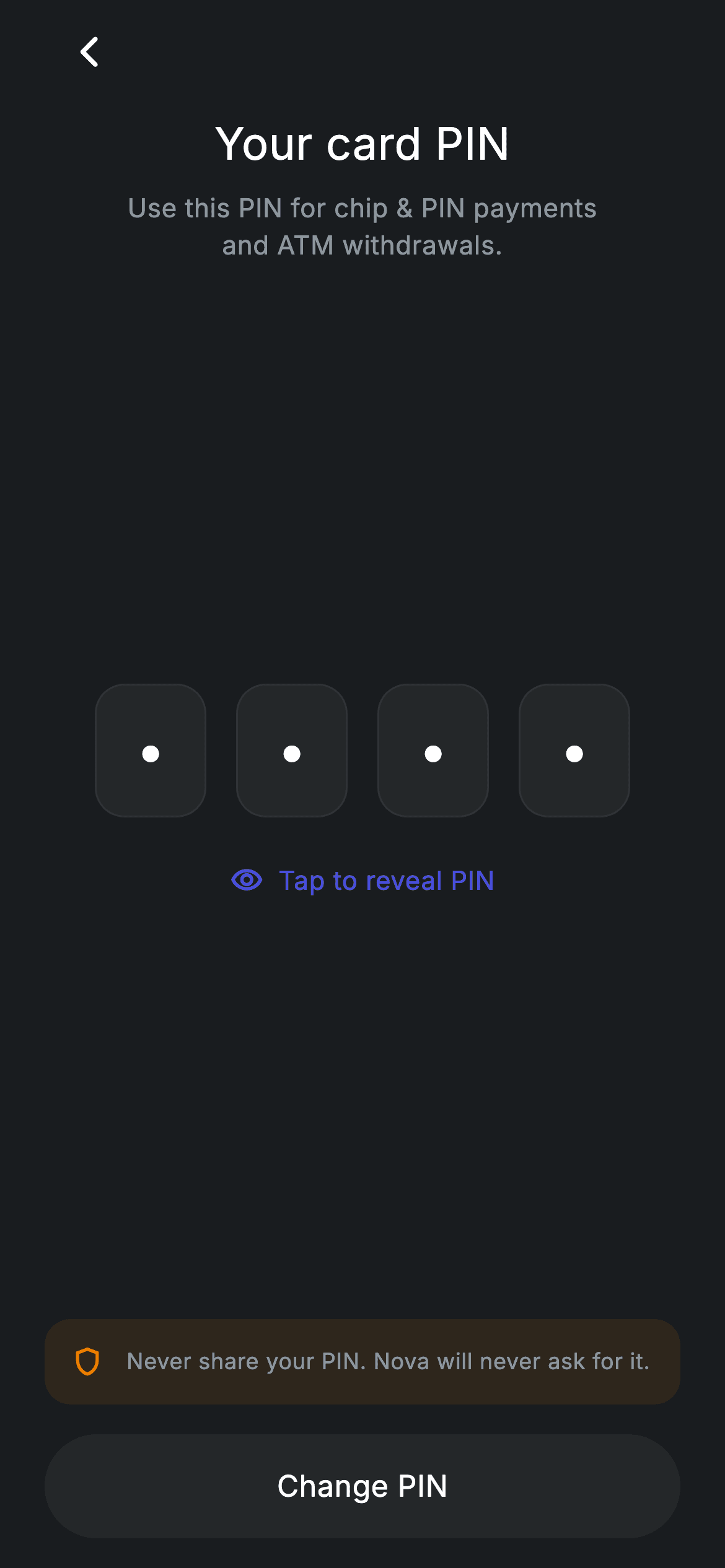
Showing a card PIN inside an app means showing it only when the user asks for it. This tutorial builds exactly that: four boxed cells that render a bullet character until one boolean flips, at which point each cell reveals a single character of the stored PIN. You'll wire the eye-icon toggle that swaps both its icon and its label, an amber shield notice that warns against sharing, and a rounded 'Change PIN' button that hands off to your own flow — all in pure Flutter on a dark canvas.
Watch the Flutter UI walkthrough
A short screen recording of Fintech · Card PIN running, if you'd rather see it before you read the code. The written tutorial below covers everything in it.
Can't see the video? Watch it on YouTube.
What you'll build
- ✓Four 60×72 rounded digit cells built from a single for-loop inside a Row
- ✓A tap-to-reveal toggle where one bool controls the dots, the eye icon and the label text
- ✓A tinted amber security banner made with a 10%-alpha background, no border needed
- ✓A pill-shaped 'Change PIN' button with a real Material ink ripple, wired to a callback you supply
- ✓A reusable set of dark-theme colour constants plus the bundled Inter font
Step-by-step build
Create the file
Add a new file at lib/fintech_card_pin/fintech_card_pin_screen.dart in your Flutter project.
Register the bundled fonts
No external packages — this is pure Flutter. It does bundle its design font (Inter), so drop the font file into fonts/ and declare it in pubspec.yaml:
flutter:
  fonts:
    - family: Inter
      fonts:
- asset: fonts/Inter-Regular.ttfBuild it, piece by piece
Here's how the screen goes together. Each block below is a real slice of the code with a plain-English explanation — paste them in order, or grab the whole file from the next section.
State class, colour tokens, and the two things that change
import 'package:flutter/material.dart';

/// Card PIN — view or change the card PIN. Self-contained per CONVENTIONS.md:
/// pure Flutter, bundled Inter font, forced dark theme. Stateful: tapping reveal
/// shows the masked PIN.
class FintechCardPinScreen extends StatefulWidget {
  const FintechCardPinScreen({super.key, this.onBack, this.onChange});

  final VoidCallback? onBack;
  final VoidCallback? onChange;

  @override
  State<FintechCardPinScreen> createState() => _FintechCardPinScreenState();
}

class _FintechCardPinScreenState extends State<FintechCardPinScreen> {
  static const String _font = 'Inter';
  static const Color _bg = Color(0xFF191C1F);
  static const Color _surface = Color(0xFF242729);
  static const Color _brand = Color(0xFF494FDF);
  static const Color _amber = Color(0xFFEC7E00);
  static const Color _muted = Color(0xFF8D969E);
  static const Color _hairline = Color(0xFF2E3235);

  static const String _pin = '4821';
  bool _revealed = false;
FintechCardPinScreen is a StatefulWidget because one value on this screen changes at runtime. It takes two optional callbacks — onBack and onChange — so the screen never decides its own navigation; the parent does. The state class opens with seven private constants that act as design tokens: _bg (#191C1F) for the page, _surface (#242729) for the digit cells and the bottom button, _brand (#494FDF) indigo for the reveal link, _amber (#EC7E00) for the security notice, _muted (#8D969E) for secondary text, and _hairline (#2E3235) for the 1px cell borders. Below them sit the only two data members: _pin, a hard-coded '4821' string standing in for whatever your backend returns, and the _revealed bool that starts false.
Forcing dark theme and the back button
  @override
  Widget build(BuildContext context) {
    return Theme(
      data: ThemeData.dark(useMaterial3: true),
      child: Scaffold(
        backgroundColor: _bg,
        body: SafeArea(
          child: Padding(
            padding: const EdgeInsets.fromLTRB(24, 4, 24, 16),
            child: Column(
              crossAxisAlignment: CrossAxisAlignment.stretch,
              children: <Widget>[
                Align(
                  alignment: Alignment.centerLeft,
                  child: IconButton(
                    onPressed:
                        widget.onBack ?? () => Navigator.of(context).maybePop(),
                    icon: const Icon(Icons.arrow_back_ios_new_rounded,
                        size: 20, color: Colors.white),
                  ),
                ),
                const SizedBox(height: 8),
build() wraps the Scaffold in a Theme with ThemeData.dark(useMaterial3: true). That matters: the screen is self-contained, so it looks correct even when dropped into an app whose global theme is light. The Scaffold takes _bg, SafeArea clears the notch and home indicator, and a single Padding of EdgeInsets.fromLTRB(24, 4, 24, 16) sets the page gutters — only 4px at the top because the IconButton below brings its own padding. The Column uses CrossAxisAlignment.stretch so the button at the bottom automatically spans the full width. The back arrow is an Align(centerLeft) wrapping an IconButton with arrow_back_ios_new_rounded at size 20; its onPressed falls back to Navigator.of(context).maybePop() when no onBack is passed, so the screen still works standalone.
Title, subtitle, and the Spacer that centres the PIN
                const Text(
                  'Your card PIN',
                  textAlign: TextAlign.center,
                  style: TextStyle(
                    fontFamily: _font,
                    fontSize: 24,
                    fontWeight: FontWeight.w500,
                    letterSpacing: 0.24,
                    color: Colors.white,
                  ),
                ),
                const SizedBox(height: 8),
                const Text(
                  'Use this PIN for chip & PIN payments\nand ATM withdrawals.',
                  textAlign: TextAlign.center,
                  style: TextStyle(
                    fontFamily: _font,
                    fontSize: 14,
                    height: 1.4,
                    letterSpacing: 0.24,
                    color: _muted,
                  ),
                ),
                const Spacer(),
Two centred Text widgets introduce the screen. 'Your card PIN' is 24px with FontWeight.w500 and letterSpacing 0.24 in white; the subtitle drops to 14px in the _muted grey with height: 1.4 for comfortable line spacing, and a literal \n inside the string forces the break after 'payments' so the two lines stay balanced rather than wrapping wherever the device width happens to fall. The const Spacer() that follows is the first of two — the second appears later at line 130 — and because they carry equal flex, they split the leftover vertical space evenly and park the PIN block in the optical centre of the screen without any hard-coded offsets.
Four digit cells from one for-loop
                Row(
                  mainAxisAlignment: MainAxisAlignment.center,
                  children: <Widget>[
                    for (int i = 0; i < 4; i++)
                      Container(
                        width: 60,
                        height: 72,
                        margin: const EdgeInsets.symmetric(horizontal: 8),
                        alignment: Alignment.center,
                        decoration: BoxDecoration(
                          color: _surface,
                          borderRadius: BorderRadius.circular(16),
                          border: Border.all(color: _hairline),
                        ),
                        child: Text(
                          _revealed ? _pin[i] : '•',
                          style: const TextStyle(
                            fontFamily: _font,
                            fontSize: 28,
                            fontWeight: FontWeight.w500,
                            color: Colors.white,
                          ),
                        ),
                      ),
                  ],
                ),
This is the heart of the screen and it is only a Row with a collection-for inside its children list: `for (int i = 0; i < 4; i++)` emits four identical Containers, each 60 wide and 72 tall with 8px horizontal margins, a _surface fill, a 16px corner radius and a 1px _hairline border. The conditional is the single expression `_revealed ? _pin[i] : '•'` — when revealed, the cell shows the character at index i of the PIN string; otherwise it draws a bullet. Because the string index and the loop index are the same value, adding a fifth cell would only mean changing the loop bound and the PIN length. The digit itself is 28px w500 white, centred by the Container's alignment.
The reveal toggle
                const SizedBox(height: 24),
                Center(
                  child: GestureDetector(
                    onTap: () => setState(() => _revealed = !_revealed),
                    behavior: HitTestBehavior.opaque,
                    child: Row(
                      mainAxisSize: MainAxisSize.min,
                      children: <Widget>[
                        Icon(
                          _revealed
                              ? Icons.visibility_off_outlined
                              : Icons.visibility_outlined,
                          size: 18,
                          color: _brand,
                        ),
                        const SizedBox(width: 8),
                        Text(
                          _revealed ? 'Hide PIN' : 'Tap to reveal PIN',
                          style: const TextStyle(
                            fontFamily: _font,
                            fontSize: 14,
                            fontWeight: FontWeight.w500,
                            letterSpacing: 0.24,
                            color: _brand,
                          ),
                        ),
                      ],
                    ),
                  ),
                ),
                const Spacer(),
The toggle is a GestureDetector whose onTap runs setState(() => _revealed = !_revealed) — that single flip is what repaints all four cells above. behavior: HitTestBehavior.opaque is the important detail: the Row inside is mainAxisSize.min, so without it, taps landing on the transparent gaps between the icon and the text would be ignored; opaque makes the whole detector area hittable. The contents mirror the state twice over: the icon swaps between visibility_outlined and visibility_off_outlined, and the label swaps between 'Tap to reveal PIN' and 'Hide PIN'. Both are painted in the _brand indigo at 18px and 14px respectively, which reads as a link without needing an underline or a button chrome.
The amber security notice and the Change PIN button
                Container(
                  padding: const EdgeInsets.all(14),
                  decoration: BoxDecoration(
                    color: _amber.withValues(alpha: 0.10),
                    borderRadius: BorderRadius.circular(14),
                  ),
                  child: const Row(
                    children: <Widget>[
                      Icon(Icons.shield_outlined, size: 18, color: _amber),
                      SizedBox(width: 12),
                      Expanded(
                        child: Text(
                          'Never share your PIN. Nova will never ask for it.',
                          style: TextStyle(
                            fontFamily: _font,
                            fontSize: 12,
                            height: 1.35,
                            letterSpacing: 0.24,
                            color: _muted,
                          ),
                        ),
                      ),
                    ],
                  ),
                ),
                const SizedBox(height: 16),
                SizedBox(
                  height: 56,
                  child: Material(
                    color: _surface,
                    borderRadius: BorderRadius.circular(9999),
                    child: InkWell(
                      borderRadius: BorderRadius.circular(9999),
                      onTap: widget.onChange,
                      child: const Center(
                        child: Text(
                          'Change PIN',
                          style: TextStyle(
                            fontFamily: _font,
                            fontSize: 16,
                            fontWeight: FontWeight.w500,
                            letterSpacing: 0.24,
                            color: Colors.white,
                          ),
                        ),
                      ),
                    ),
                  ),
                ),
              ],
            ),
          ),
        ),
      ),
    );
  }
}
The warning banner is a Container with 14px padding and a 14px radius whose fill is _amber.withValues(alpha: 0.10) — a 10% tint of the same orange used for the shield_outlined icon, which is why the block reads as a coloured surface without needing a border. An Expanded around the 12px _muted text lets it wrap onto a second line inside the Row instead of overflowing. Below it, the 'Change PIN' action is a SizedBox(height: 56) containing a Material with the _surface colour and an InkWell on top; both take borderRadius: BorderRadius.circular(9999), which is the trick that makes it a full pill and, crucially, clips the ripple to that same pill shape. Its onTap is passed straight through to widget.onChange, so the screen only reports the intent — you supply the actual change-PIN route.
Full code
The complete, ready-to-paste source. Free to use in your projects — one click copies it all.
import 'package:flutter/material.dart';

/// Card PIN — view or change the card PIN. Self-contained per CONVENTIONS.md:
/// pure Flutter, bundled Inter font, forced dark theme. Stateful: tapping reveal
/// shows the masked PIN.
class FintechCardPinScreen extends StatefulWidget {
  const FintechCardPinScreen({super.key, this.onBack, this.onChange});

  final VoidCallback? onBack;
  final VoidCallback? onChange;

  @override
  State<FintechCardPinScreen> createState() => _FintechCardPinScreenState();
}

class _FintechCardPinScreenState extends State<FintechCardPinScreen> {
  static const String _font = 'Inter';
  static const Color _bg = Color(0xFF191C1F);
  static const Color _surface = Color(0xFF242729);
  static const Color _brand = Color(0xFF494FDF);
  static const Color _amber = Color(0xFFEC7E00);
  static const Color _muted = Color(0xFF8D969E);
  static const Color _hairline = Color(0xFF2E3235);

  static const String _pin = '4821';
  bool _revealed = false;

  @override
  Widget build(BuildContext context) {
    return Theme(
      data: ThemeData.dark(useMaterial3: true),
      child: Scaffold(
        backgroundColor: _bg,
        body: SafeArea(
          child: Padding(
            padding: const EdgeInsets.fromLTRB(24, 4, 24, 16),
            child: Column(
              crossAxisAlignment: CrossAxisAlignment.stretch,
              children: <Widget>[
                Align(
                  alignment: Alignment.centerLeft,
                  child: IconButton(
                    onPressed:
                        widget.onBack ?? () => Navigator.of(context).maybePop(),
                    icon: const Icon(Icons.arrow_back_ios_new_rounded,
                        size: 20, color: Colors.white),
                  ),
                ),
                const SizedBox(height: 8),
                const Text(
                  'Your card PIN',
                  textAlign: TextAlign.center,
                  style: TextStyle(
                    fontFamily: _font,
                    fontSize: 24,
                    fontWeight: FontWeight.w500,
                    letterSpacing: 0.24,
                    color: Colors.white,
                  ),
                ),
                const SizedBox(height: 8),
                const Text(
                  'Use this PIN for chip & PIN payments\nand ATM withdrawals.',
                  textAlign: TextAlign.center,
                  style: TextStyle(
                    fontFamily: _font,
                    fontSize: 14,
                    height: 1.4,
                    letterSpacing: 0.24,
                    color: _muted,
                  ),
                ),
                const Spacer(),
                Row(
                  mainAxisAlignment: MainAxisAlignment.center,
                  children: <Widget>[
                    for (int i = 0; i < 4; i++)
                      Container(
                        width: 60,
                        height: 72,
                        margin: const EdgeInsets.symmetric(horizontal: 8),
                        alignment: Alignment.center,
                        decoration: BoxDecoration(
                          color: _surface,
                          borderRadius: BorderRadius.circular(16),
                          border: Border.all(color: _hairline),
                        ),
                        child: Text(
                          _revealed ? _pin[i] : '•',
                          style: const TextStyle(
                            fontFamily: _font,
                            fontSize: 28,
                            fontWeight: FontWeight.w500,
                            color: Colors.white,
                          ),
                        ),
                      ),
                  ],
                ),
                const SizedBox(height: 24),
                Center(
                  child: GestureDetector(
                    onTap: () => setState(() => _revealed = !_revealed),
                    behavior: HitTestBehavior.opaque,
                    child: Row(
                      mainAxisSize: MainAxisSize.min,
                      children: <Widget>[
                        Icon(
                          _revealed
                              ? Icons.visibility_off_outlined
                              : Icons.visibility_outlined,
                          size: 18,
                          color: _brand,
                        ),
                        const SizedBox(width: 8),
                        Text(
                          _revealed ? 'Hide PIN' : 'Tap to reveal PIN',
                          style: const TextStyle(
                            fontFamily: _font,
                            fontSize: 14,
                            fontWeight: FontWeight.w500,
                            letterSpacing: 0.24,
                            color: _brand,
                          ),
                        ),
                      ],
                    ),
                  ),
                ),
                const Spacer(),
                Container(
                  padding: const EdgeInsets.all(14),
                  decoration: BoxDecoration(
                    color: _amber.withValues(alpha: 0.10),
                    borderRadius: BorderRadius.circular(14),
                  ),
                  child: const Row(
                    children: <Widget>[
                      Icon(Icons.shield_outlined, size: 18, color: _amber),
                      SizedBox(width: 12),
                      Expanded(
                        child: Text(
                          'Never share your PIN. Nova will never ask for it.',
                          style: TextStyle(
                            fontFamily: _font,
                            fontSize: 12,
                            height: 1.35,
                            letterSpacing: 0.24,
                            color: _muted,
                          ),
                        ),
                      ),
                    ],
                  ),
                ),
                const SizedBox(height: 16),
                SizedBox(
                  height: 56,
                  child: Material(
                    color: _surface,
                    borderRadius: BorderRadius.circular(9999),
                    child: InkWell(
                      borderRadius: BorderRadius.circular(9999),
                      onTap: widget.onChange,
                      child: const Center(
                        child: Text(
                          'Change PIN',
                          style: TextStyle(
                            fontFamily: _font,
                            fontSize: 16,
                            fontWeight: FontWeight.w500,
                            letterSpacing: 0.24,
                            color: Colors.white,
                          ),
                        ),
                      ),
                    ),
                  ),
                ),
              ],
            ),
          ),
        ),
      ),
    );
  }
}
Plus bundled 1 binary asset (fonts/images). The CLI and MCP install those for you automatically.
Two faster ways to add it
Copy-paste works, but you can skip it entirely.
1. FlutterKit CLI
One command drops this screen — and its fonts — straight into your project.
$ flutterkit add fintech-card-pin2. AI agent (MCP)
Connect FlutterKit's MCP server in Claude or Cursor and just ask your agent to install fintech-card-pin — it fetches and writes the files for you.
FAQ
Can I use this card PIN screen in a commercial banking app?
Yes. The full Dart source shown on this page is free to copy into personal or commercial projects. Paste it straight in, run flutterkit add fintech-card-pin with the CLI, or let an AI agent install it for you over MCP. Do remember the '4821' PIN and the 'Nova' brand name in the notice are placeholders you'll want to replace.
Do the digit cells or the reveal toggle need any package?
No. The packages list for this screen is empty — the cells, the GestureDetector toggle, the eye icons and the InkWell button are all plain material widgets, and the icons come from Flutter's built-in Icons set. The only asset is the bundled Inter font referenced by the _font constant, which you register in pubspec.yaml as shown in step 2; the CLI and MCP copy those font files in for you.
What Flutter version does this screen need?
Flutter 3.22 or newer (Dart 3). Two modern APIs appear here: Color.withValues(alpha: 0.10) on the amber notice background, and the super.key super-parameter in the constructor. On an older SDK, change that call to _amber.withOpacity(0.10) and rewrite the constructor as `const FintechCardPinScreen({Key? key, this.onBack, this.onChange}) : super(key: key);` — nothing else in the file needs touching.


