How to Build a Card Freeze Screen in Flutter (Full Code + Preview)
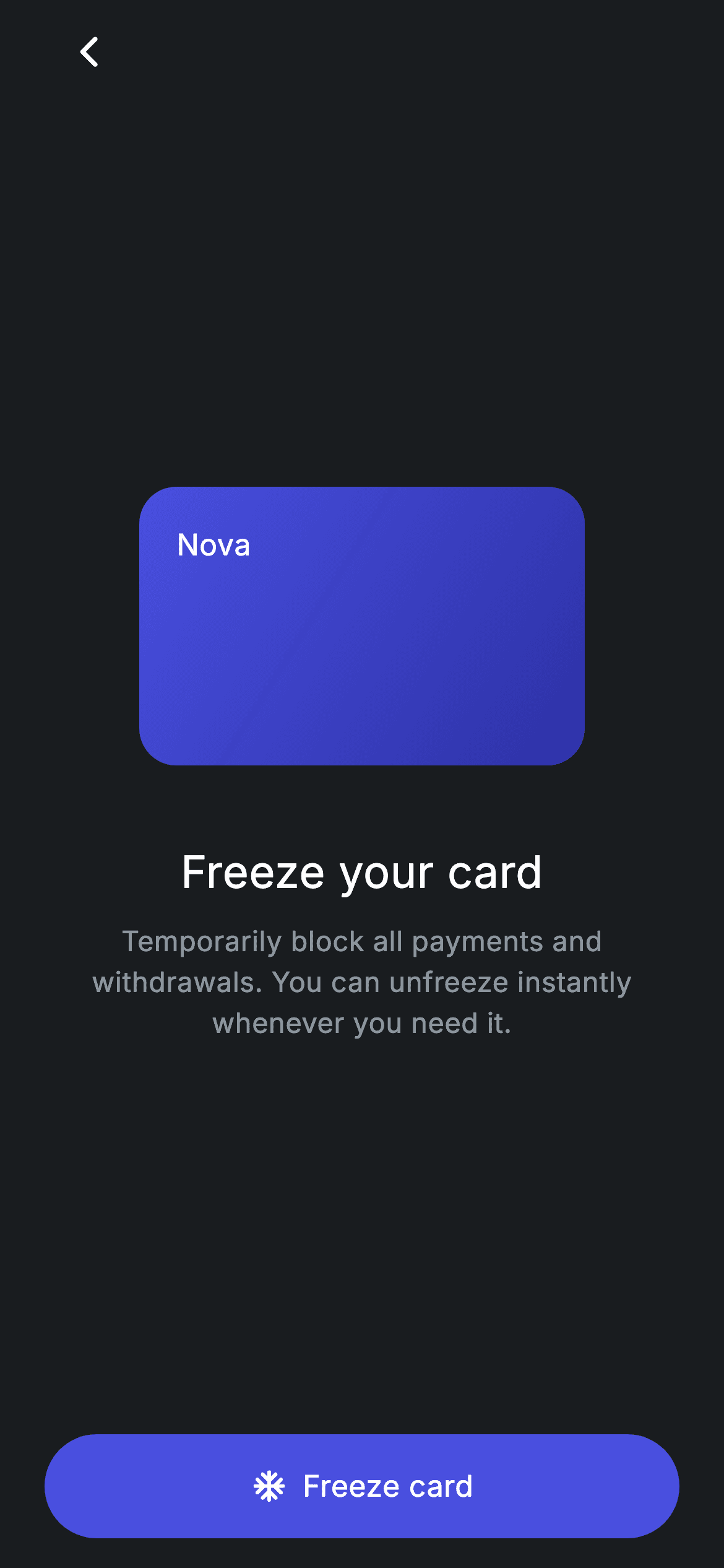
Freezing a card is a panic-moment feature: the user has just misplaced it and wants spending stopped now, not after a support call. This tutorial builds that one-tap control in Flutter — a 240×150 gradient mini card that fades to 35% opacity and gains a snowflake badge the moment it's frozen, a headline and body paragraph that rewrite themselves for each state, and a pill button that flips between a blue 'Freeze card' and a grey 'Unfreeze card'. Every one of those changes is driven by a single bool.
Watch the Flutter UI walkthrough
A short screen recording of Fintech · Freeze Card running, if you'd rather see it before you read the code. The written tutorial below covers everything in it.
Can't see the video? Watch it on YouTube.
What you'll build
- ✓A dark #191C1F screen with a back button, built as one self-contained StatefulWidget
- ✓A gradient Nova card that cross-fades to 35% opacity over 250ms and reveals a frosted snowflake badge when frozen
- ✓Headline and body copy that swap wording between 'Freeze your card' and 'Card is frozen'
- ✓A 56px pill button whose fill colour, icon and label all react to the same _frozen flag
- ✓A clean onBack hook and a single toggle point where you'd call your real card API
Step-by-step build
Create the file
Add a new file at lib/fintech_card_freeze/fintech_card_freeze_screen.dart in your Flutter project.
Register the bundled fonts
No external packages — this is pure Flutter. It does bundle its design font (Inter), so drop the font file into fonts/ and declare it in pubspec.yaml:
flutter:
  fonts:
    - family: Inter
      fonts:
- asset: fonts/Inter-Regular.ttfBuild it, piece by piece
Here's how the screen goes together. Each block below is a real slice of the code with a plain-English explanation — paste them in order, or grab the whole file from the next section.
The widget, the onBack hook, and the colour tokens
import 'package:flutter/material.dart';

/// Card Freeze — instantly freeze or unfreeze the card. Self-contained per
/// CONVENTIONS.md: pure Flutter, bundled Inter font, forced dark theme. Stateful:
/// the button toggles between frozen and active states.
class FintechCardFreezeScreen extends StatefulWidget {
  const FintechCardFreezeScreen({super.key, this.onBack});

  final VoidCallback? onBack;

  @override
  State<FintechCardFreezeScreen> createState() =>
      _FintechCardFreezeScreenState();
}

class _FintechCardFreezeScreenState extends State<FintechCardFreezeScreen> {
  static const String _font = 'Inter';
  static const Color _bg = Color(0xFF191C1F);
  static const Color _surface = Color(0xFF242729);
  static const Color _brand = Color(0xFF494FDF);
  static const Color _teal = Color(0xFF00A87E);
  static const Color _muted = Color(0xFF8D969E);

  bool _frozen = false;
Only material.dart is imported — nothing else is needed. FintechCardFreezeScreen is a StatefulWidget because the screen has to remember whether the card is currently frozen, and it takes one optional VoidCallback called onBack so the host app can decide what the back arrow does. Inside the State class, five private static const tokens hold the palette: _bg (#191C1F) is the near-black canvas, _surface (#242729) is the muted fill used for the button once the card is frozen, _brand (#494FDF) is the indigo, _teal (#00A87E) tints the unfreeze icon, and _muted (#8D969E) is the body-copy grey. _font pins every TextStyle to 'Inter'. The whole screen's state is then just one field: bool _frozen = false.
Forced dark theme, safe padding, and the back arrow
  @override
  Widget build(BuildContext context) {
    return Theme(
      data: ThemeData.dark(useMaterial3: true),
      child: Scaffold(
        backgroundColor: _bg,
        body: SafeArea(
          child: Padding(
            padding: const EdgeInsets.fromLTRB(24, 4, 24, 16),
            child: Column(
              crossAxisAlignment: CrossAxisAlignment.stretch,
              children: <Widget>[
                Align(
                  alignment: Alignment.centerLeft,
                  child: IconButton(
                    onPressed:
                        widget.onBack ?? () => Navigator.of(context).maybePop(),
                    icon: const Icon(Icons.arrow_back_ios_new_rounded,
                        size: 20, color: Colors.white),
                  ),
                ),
build() wraps everything in a Theme with ThemeData.dark(useMaterial3: true), which means the screen stays dark even when it's dropped into an app running a light theme — useful for a self-contained screen you paste into someone else's project. The Scaffold is painted with _bg, SafeArea keeps content off the notch and home indicator, and EdgeInsets.fromLTRB(24, 4, 24, 16) gives 24px side gutters with a tight 4px at the top. The Column uses CrossAxisAlignment.stretch so the button at the bottom automatically spans the full width. The back arrow is an IconButton with Icons.arrow_back_ios_new_rounded at size 20, wrapped in Align(centerLeft) so it hugs the left edge instead of stretching; its onPressed falls back to Navigator.of(context).maybePop() whenever no onBack is supplied — maybePop is the safe variant that does nothing if there is no route to pop.
The mini card and its frozen overlay
                const Spacer(),
                Center(
                  child: Stack(
                    alignment: Alignment.center,
                    children: <Widget>[
                      AnimatedOpacity(
                        duration: const Duration(milliseconds: 250),
                        opacity: _frozen ? 0.35 : 1,
                        child: Container(
                          width: 240,
                          height: 150,
                          padding: const EdgeInsets.all(20),
                          decoration: BoxDecoration(
                            borderRadius: BorderRadius.circular(20),
                            gradient: const LinearGradient(
                              begin: Alignment.topLeft,
                              end: Alignment.bottomRight,
                              colors: <Color>[_brand, Color(0xFF2D31A6)],
                            ),
                          ),
                          child: const Align(
                            alignment: Alignment.topLeft,
                            child: Text(
                              'Nova',
                              style: TextStyle(
                                fontFamily: _font,
                                fontSize: 16,
                                fontWeight: FontWeight.w500,
                                color: Colors.white,
                              ),
                            ),
                          ),
                        ),
                      ),
                      if (_frozen)
                        Container(
                          width: 64,
                          height: 64,
                          decoration: BoxDecoration(
                            shape: BoxShape.circle,
                            color: Colors.white.withValues(alpha: 0.12),
                          ),
                          child: const Icon(Icons.ac_unit_rounded,
                              size: 34, color: Colors.white),
                        ),
                    ],
                  ),
                ),
A Spacer above the Center pushes the card group down toward the middle. The card itself is a Stack with two layers. The bottom layer is an AnimatedOpacity with a 250ms duration whose opacity reads _frozen ? 0.35 : 1 — so toggling the flag dims the card smoothly instead of snapping. Inside it is a 240×150 Container with a 20px radius and a diagonal LinearGradient running topLeft → bottomRight from _brand (#494FDF) into a deeper #2D31A6, with the 'Nova' brand name aligned topLeft in 16px medium Inter. The second layer only exists when frozen: a collection-if adds a 64px circular Container filled with Colors.white.withValues(alpha: 0.12) — a translucent frosted disc — holding a 34px Icons.ac_unit_rounded snowflake. Because the Stack is centre-aligned, that badge lands exactly over the middle of the dimmed card.
Copy that rewrites itself for each state
                const SizedBox(height: 40),
                Text(
                  _frozen ? 'Card is frozen' : 'Freeze your card',
                  textAlign: TextAlign.center,
                  style: const TextStyle(
                    fontFamily: _font,
                    fontSize: 24,
                    fontWeight: FontWeight.w500,
                    letterSpacing: 0.24,
                    color: Colors.white,
                  ),
                ),
                const SizedBox(height: 10),
                Text(
                  _frozen
                      ? 'All payments and withdrawals are blocked. Unfreeze any '
                          'time — your card details stay the same.'
                      : 'Temporarily block all payments and withdrawals. You can '
                          'unfreeze instantly whenever you need it.',
                  textAlign: TextAlign.center,
                  style: const TextStyle(
                    fontFamily: _font,
                    fontSize: 15,
                    height: 1.45,
                    letterSpacing: 0.24,
                    color: _muted,
                  ),
                ),
                const Spacer(),
40px below the card sits the headline, a 24px medium Inter Text with 0.24 letterSpacing that reads 'Card is frozen' when _frozen is true and 'Freeze your card' otherwise — present tense for the current state, imperative for the action. Ten pixels under it, a 15px _muted paragraph with height: 1.45 (line height 1.45× the font size, for comfortable multi-line reading) does the same swap: the frozen copy reassures that 'All payments and withdrawals are blocked' and that card details stay the same, while the default copy explains what freezing will do. Both are centred with textAlign: TextAlign.center, and the long strings use Dart's adjacent-string-literal concatenation to wrap neatly in the source without inserting a line break in the output. A second Spacer then pushes the button to the bottom, balancing the first one.
The toggle button — one setState drives everything
                SizedBox(
                  height: 56,
                  child: Material(
                    color: _frozen ? _surface : _brand,
                    borderRadius: BorderRadius.circular(9999),
                    child: InkWell(
                      borderRadius: BorderRadius.circular(9999),
                      onTap: () => setState(() => _frozen = !_frozen),
                      child: Center(
                        child: Row(
                          mainAxisSize: MainAxisSize.min,
                          children: <Widget>[
                            Icon(
                              _frozen
                                  ? Icons.lock_open_rounded
                                  : Icons.ac_unit_rounded,
                              size: 20,
                              color: _frozen ? _teal : Colors.white,
                            ),
                            const SizedBox(width: 8),
                            Text(
                              _frozen ? 'Unfreeze card' : 'Freeze card',
                              style: TextStyle(
                                fontFamily: _font,
                                fontSize: 16,
                                fontWeight: FontWeight.w500,
                                letterSpacing: 0.24,
                                color: _frozen ? Colors.white : Colors.white,
                              ),
                            ),
                          ],
                        ),
                      ),
                    ),
                  ),
                ),
              ],
            ),
          ),
        ),
      ),
    );
  }
}
The action is a fixed 56px-tall Material whose colour is _frozen ? _surface : _brand, so it is a solid indigo call-to-action while the card is live and drops back to the quiet #242729 surface once the card is already frozen. Material plus InkWell (both given a 9999 borderRadius to force a full pill) is the pattern that gets you a proper ripple clipped to the rounded shape. Its onTap is the entire logic of the screen: setState(() => _frozen = !_frozen). The label is a Row with mainAxisSize.min so the icon and text stay centred as a pair — the icon flips between Icons.ac_unit_rounded in white and Icons.lock_open_rounded in _teal green, and the 16px medium label flips between 'Freeze card' and 'Unfreeze card'. Note the state lives only in this widget with no networking involved: to make it real, call your card API inside that onTap and set _frozen from the response.
Full code
The complete, ready-to-paste source. Free to use in your projects — one click copies it all.
import 'package:flutter/material.dart';

/// Card Freeze — instantly freeze or unfreeze the card. Self-contained per
/// CONVENTIONS.md: pure Flutter, bundled Inter font, forced dark theme. Stateful:
/// the button toggles between frozen and active states.
class FintechCardFreezeScreen extends StatefulWidget {
  const FintechCardFreezeScreen({super.key, this.onBack});

  final VoidCallback? onBack;

  @override
  State<FintechCardFreezeScreen> createState() =>
      _FintechCardFreezeScreenState();
}

class _FintechCardFreezeScreenState extends State<FintechCardFreezeScreen> {
  static const String _font = 'Inter';
  static const Color _bg = Color(0xFF191C1F);
  static const Color _surface = Color(0xFF242729);
  static const Color _brand = Color(0xFF494FDF);
  static const Color _teal = Color(0xFF00A87E);
  static const Color _muted = Color(0xFF8D969E);

  bool _frozen = false;

  @override
  Widget build(BuildContext context) {
    return Theme(
      data: ThemeData.dark(useMaterial3: true),
      child: Scaffold(
        backgroundColor: _bg,
        body: SafeArea(
          child: Padding(
            padding: const EdgeInsets.fromLTRB(24, 4, 24, 16),
            child: Column(
              crossAxisAlignment: CrossAxisAlignment.stretch,
              children: <Widget>[
                Align(
                  alignment: Alignment.centerLeft,
                  child: IconButton(
                    onPressed:
                        widget.onBack ?? () => Navigator.of(context).maybePop(),
                    icon: const Icon(Icons.arrow_back_ios_new_rounded,
                        size: 20, color: Colors.white),
                  ),
                ),
                const Spacer(),
                Center(
                  child: Stack(
                    alignment: Alignment.center,
                    children: <Widget>[
                      AnimatedOpacity(
                        duration: const Duration(milliseconds: 250),
                        opacity: _frozen ? 0.35 : 1,
                        child: Container(
                          width: 240,
                          height: 150,
                          padding: const EdgeInsets.all(20),
                          decoration: BoxDecoration(
                            borderRadius: BorderRadius.circular(20),
                            gradient: const LinearGradient(
                              begin: Alignment.topLeft,
                              end: Alignment.bottomRight,
                              colors: <Color>[_brand, Color(0xFF2D31A6)],
                            ),
                          ),
                          child: const Align(
                            alignment: Alignment.topLeft,
                            child: Text(
                              'Nova',
                              style: TextStyle(
                                fontFamily: _font,
                                fontSize: 16,
                                fontWeight: FontWeight.w500,
                                color: Colors.white,
                              ),
                            ),
                          ),
                        ),
                      ),
                      if (_frozen)
                        Container(
                          width: 64,
                          height: 64,
                          decoration: BoxDecoration(
                            shape: BoxShape.circle,
                            color: Colors.white.withValues(alpha: 0.12),
                          ),
                          child: const Icon(Icons.ac_unit_rounded,
                              size: 34, color: Colors.white),
                        ),
                    ],
                  ),
                ),
                const SizedBox(height: 40),
                Text(
                  _frozen ? 'Card is frozen' : 'Freeze your card',
                  textAlign: TextAlign.center,
                  style: const TextStyle(
                    fontFamily: _font,
                    fontSize: 24,
                    fontWeight: FontWeight.w500,
                    letterSpacing: 0.24,
                    color: Colors.white,
                  ),
                ),
                const SizedBox(height: 10),
                Text(
                  _frozen
                      ? 'All payments and withdrawals are blocked. Unfreeze any '
                          'time — your card details stay the same.'
                      : 'Temporarily block all payments and withdrawals. You can '
                          'unfreeze instantly whenever you need it.',
                  textAlign: TextAlign.center,
                  style: const TextStyle(
                    fontFamily: _font,
                    fontSize: 15,
                    height: 1.45,
                    letterSpacing: 0.24,
                    color: _muted,
                  ),
                ),
                const Spacer(),
                SizedBox(
                  height: 56,
                  child: Material(
                    color: _frozen ? _surface : _brand,
                    borderRadius: BorderRadius.circular(9999),
                    child: InkWell(
                      borderRadius: BorderRadius.circular(9999),
                      onTap: () => setState(() => _frozen = !_frozen),
                      child: Center(
                        child: Row(
                          mainAxisSize: MainAxisSize.min,
                          children: <Widget>[
                            Icon(
                              _frozen
                                  ? Icons.lock_open_rounded
                                  : Icons.ac_unit_rounded,
                              size: 20,
                              color: _frozen ? _teal : Colors.white,
                            ),
                            const SizedBox(width: 8),
                            Text(
                              _frozen ? 'Unfreeze card' : 'Freeze card',
                              style: TextStyle(
                                fontFamily: _font,
                                fontSize: 16,
                                fontWeight: FontWeight.w500,
                                letterSpacing: 0.24,
                                color: _frozen ? Colors.white : Colors.white,
                              ),
                            ),
                          ],
                        ),
                      ),
                    ),
                  ),
                ),
              ],
            ),
          ),
        ),
      ),
    );
  }
}
Plus bundled 1 binary asset (fonts/images). The CLI and MCP install those for you automatically.
Two faster ways to add it
Copy-paste works, but you can skip it entirely.
1. FlutterKit CLI
One command drops this screen — and its fonts — straight into your project.
$ flutterkit add fintech-card-freeze2. AI agent (MCP)
Connect FlutterKit's MCP server in Claude or Cursor and just ask your agent to install fintech-card-freeze — it fetches and writes the files for you.
FAQ
Can I use this card freeze screen in a commercial banking app?
Yes. The Dart on this page is free to copy and ship in personal or commercial projects. Paste it straight in, run flutterkit add fintech-card-freeze with the FlutterKit CLI, or let an AI agent install it for you over MCP. Bear in mind it is the UI layer only — _frozen is local state, so call your card-issuer endpoint inside the InkWell's onTap and set the flag from the response to make the freeze real.
Are there any packages or image assets to install?
None. It is pure Flutter material — the card is a gradient Container rather than an image, and the frost mark is the built-in Icons.ac_unit_rounded, so no artwork ships with it. The only asset is the bundled Inter font, registered in pubspec.yaml as shown in step 2; the CLI and MCP copy that file in automatically.
Which Flutter version does this screen need?
It calls Colors.white.withValues(alpha: 0.12) on the frost badge, which arrived in Flutter 3.27, and it also uses super parameters and ThemeData.dark(useMaterial3: true). On an older SDK, change that one line to Colors.white.withOpacity(0.12) and the screen compiles on Flutter 3.16+ with Dart 3.


