How to Build a Card Spending Limit Screen in Flutter (Full Code + Preview)
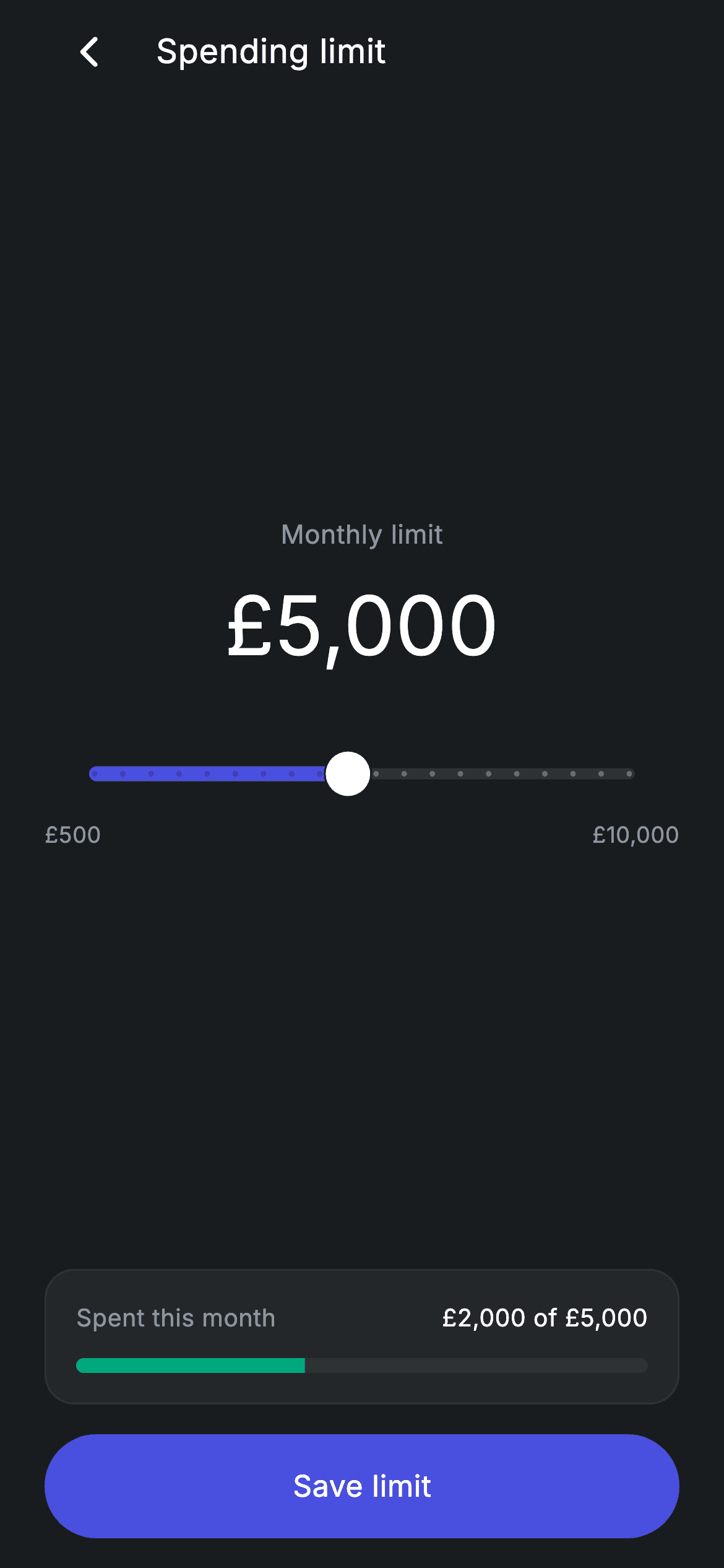
Spend controls only feel trustworthy when the number moves as you drag. This screen is a monthly card spending cap built around a single Flutter Slider: drag it and a 44px £ amount rewrites itself, while a progress bar underneath re-measures £2,000 of fixed spend against the new ceiling — and flips from teal to red once more than 90% of it is used. You'll build the dark layout, a comma-grouping money formatter written without the intl package, and a themed slider that steps in £500 increments.
Watch the Flutter UI walkthrough
A short screen recording of Fintech · Spending Limit running, if you'd rather see it before you read the code. The written tutorial below covers everything in it.
Can't see the video? Watch it on YouTube.
What you'll build
- ✓A live £500–£10,000 slider whose value drives a large headline amount, the min/max labels, and the progress bar together
- ✓A hand-rolled _money() formatter that turns 5000 into £5,000 with no intl dependency
- ✓A 'Spent this month' card whose LinearProgressIndicator switches from teal to red past 90% usage
- ✓A forced-dark palette (#191C1F canvas, #242729 surface, #494FDF brand) and a pill 'Save limit' button wired to an onSave callback
Step-by-step build
Create the file
Add a new file at lib/fintech_card_topup_limit/fintech_card_topup_limit_screen.dart in your Flutter project.
Register the bundled fonts
No external packages — this is pure Flutter. It does bundle its design font (Inter), so drop the font file into fonts/ and declare it in pubspec.yaml:
flutter:
  fonts:
    - family: Inter
      fonts:
- asset: fonts/Inter-Regular.ttfBuild it, piece by piece
Here's how the screen goes together. Each block below is a real slice of the code with a plain-English explanation — paste them in order, or grab the whole file from the next section.
The stateful shell, callbacks, and colour tokens
import 'package:flutter/material.dart';

/// Card Spending Limit — set a monthly spending cap with a slider. Self-
/// contained per CONVENTIONS.md: pure Flutter, bundled Inter font, forced dark
/// theme. Stateful: the slider updates the limit and progress live.
class FintechCardTopupLimitScreen extends StatefulWidget {
  const FintechCardTopupLimitScreen({super.key, this.onBack, this.onSave});

  final VoidCallback? onBack;
  final VoidCallback? onSave;

  @override
  State<FintechCardTopupLimitScreen> createState() =>
      _FintechCardTopupLimitScreenState();
}

class _FintechCardTopupLimitScreenState
    extends State<FintechCardTopupLimitScreen> {
  static const String _font = 'Inter';
  static const Color _bg = Color(0xFF191C1F);
  static const Color _surface = Color(0xFF242729);
  static const Color _brand = Color(0xFF494FDF);
  static const Color _teal = Color(0xFF00A87E);
  static const Color _muted = Color(0xFF8D969E);
  static const Color _hairline = Color(0xFF2E3235);

  static const double _spent = 2000;
  double _limit = 5000;
FintechCardTopupLimitScreen is a StatefulWidget because the slider value has to survive rebuilds. It takes two optional callbacks — onBack and onSave — so the screen stays reusable: it never calls a router or an API itself, it just tells the parent what happened. Inside the State class the palette is declared as private statics: _bg (#191C1F) is the canvas, _surface (#242729) the raised spend card, _brand (#494FDF) the indigo used for the slider track and CTA, _teal (#00A87E) the healthy progress colour, _muted (#8D969E) for secondary text and _hairline (#2E3235) for borders and inactive tracks. Two numbers hold the actual data: _spent is a const 2000 (mock spend — nothing fetches it) while _limit starts at 5000 and is the only mutable field on the screen.
Formatting money without a package, and deriving the progress
  String _money(double v) {
    final int n = v.round();
    final String s = n.toString();
    final StringBuffer out = StringBuffer();
    for (int i = 0; i < s.length; i++) {
      if (i > 0 && (s.length - i) % 3 == 0) out.write(',');
      out.write(s[i]);
    }
    return '£$out';
  }

  @override
  Widget build(BuildContext context) {
    final double pct = (_spent / _limit).clamp(0.0, 1.0);
    return Theme(
      data: ThemeData.dark(useMaterial3: true),
      child: Scaffold(
        backgroundColor: _bg,
        body: SafeArea(
          child: Padding(
            padding: const EdgeInsets.fromLTRB(24, 4, 24, 16),
            child: Column(
              crossAxisAlignment: CrossAxisAlignment.stretch,
              children: <Widget>[
_money() is a tiny hand-written formatter: it rounds the double to an int, walks the digits left to right and writes a comma whenever the number of digits still remaining is a multiple of three, then prefixes '£'. That's why 5000 renders as £5,000 with no intl import. In build(), pct is computed once as (_spent / _limit).clamp(0.0, 1.0) — a single derived value that both the progress bar and its colour read, so they can never disagree. Wrapping the Scaffold in Theme(data: ThemeData.dark(useMaterial3: true)) forces dark styling regardless of the host app's theme, and SafeArea plus EdgeInsets.fromLTRB(24, 4, 24, 16) sets the page gutters.
Header row and the headline limit amount
                Row(
                  children: <Widget>[
                    IconButton(
                      onPressed: widget.onBack ??
                          () => Navigator.of(context).maybePop(),
                      padding: EdgeInsets.zero,
                      constraints: const BoxConstraints(),
                      icon: const Icon(Icons.arrow_back_ios_new_rounded,
                          size: 20, color: Colors.white),
                    ),
                    const SizedBox(width: 12),
                    const Text(
                      'Spending limit',
                      style: TextStyle(
                        fontFamily: _font,
                        fontSize: 18,
                        fontWeight: FontWeight.w500,
                        letterSpacing: 0.24,
                        color: Colors.white,
                      ),
                    ),
                  ],
                ),
                const Spacer(),
                const Text(
                  'Monthly limit',
                  textAlign: TextAlign.center,
                  style: TextStyle(
                    fontFamily: _font,
                    fontSize: 14,
                    letterSpacing: 0.24,
                    color: _muted,
                  ),
                ),
                const SizedBox(height: 8),
                Text(
                  _money(_limit),
                  textAlign: TextAlign.center,
                  style: const TextStyle(
                    fontFamily: _font,
                    fontSize: 44,
                    fontWeight: FontWeight.w500,
                    letterSpacing: 0.24,
                    color: Colors.white,
                  ),
                ),
                const SizedBox(height: 24),
The header is a plain Row, not an AppBar, so it inherits the same 24px gutter as the body. Its IconButton falls back to Navigator.of(context).maybePop() when onBack is null, and padding: EdgeInsets.zero with constraints: BoxConstraints() strips Material's default 48px hit-box padding so the arrow_back_ios_new_rounded icon sits flush against the left edge, 12px from the 18px 'Spending limit' title. A Spacer() then pushes the next group down: the 14px muted 'Monthly limit' caption and, 8px under it, the 44px white amount built from _money(_limit). Because that Text reads _limit directly, every setState from the slider rewrites it on the same frame.
Theming and wiring the slider
                SliderTheme(
                  data: SliderThemeData(
                    trackHeight: 6,
                    activeTrackColor: _brand,
                    inactiveTrackColor: _hairline,
                    thumbColor: Colors.white,
                    overlayColor: _brand.withValues(alpha: 0.15),
                    thumbShape:
                        const RoundSliderThumbShape(enabledThumbRadius: 12),
                  ),
                  child: Slider(
                    min: 500,
                    max: 10000,
                    divisions: 19,
                    value: _limit,
                    onChanged: (double v) => setState(() => _limit = v),
                  ),
                ),
                Row(
                  mainAxisAlignment: MainAxisAlignment.spaceBetween,
                  children: const <Widget>[
                    Text(
                      '£500',
                      style: TextStyle(
                        fontFamily: _font,
                        fontSize: 12,
                        letterSpacing: 0.24,
                        color: _muted,
                      ),
                    ),
                    Text(
                      '£10,000',
                      style: TextStyle(
                        fontFamily: _font,
                        fontSize: 12,
                        letterSpacing: 0.24,
                        color: _muted,
                      ),
                    ),
                  ],
                ),
SliderTheme is what turns Material's default slider into something that matches the design: trackHeight 6, an indigo activeTrackColor, _hairline for the inactive part, a white thumb sized by RoundSliderThumbShape(enabledThumbRadius: 12), and an overlay of _brand at 15% alpha for the press halo. The Slider itself runs min: 500 to max: 10000 with divisions: 19 — that splits the 9,500 range into exactly 19 steps of £500, so the value always lands on a round number and the thumb snaps. onChanged does the only state mutation in the file: setState(() => _limit = v). Underneath, a spaceBetween Row hardcodes the '£500' and '£10,000' end labels in 12px muted text to anchor the scale.
The spend card and its colour-changing progress bar
                const Spacer(),
                Container(
                  padding: const EdgeInsets.all(16),
                  decoration: BoxDecoration(
                    color: _surface,
                    borderRadius: BorderRadius.circular(16),
                    border: Border.all(color: _hairline),
                  ),
                  child: Column(
                    children: <Widget>[
                      Row(
                        mainAxisAlignment: MainAxisAlignment.spaceBetween,
                        children: <Widget>[
                          Text(
                            'Spent this month',
                            style: const TextStyle(
                              fontFamily: _font,
                              fontSize: 13,
                              letterSpacing: 0.24,
                              color: _muted,
                            ),
                          ),
                          Text(
                            '${_money(_spent)} of ${_money(_limit)}',
                            style: const TextStyle(
                              fontFamily: _font,
                              fontSize: 13,
                              fontWeight: FontWeight.w500,
                              letterSpacing: 0.24,
                              color: Colors.white,
                            ),
                          ),
                        ],
                      ),
                      const SizedBox(height: 12),
                      ClipRRect(
                        borderRadius: BorderRadius.circular(9999),
                        child: LinearProgressIndicator(
                          value: pct,
                          minHeight: 8,
                          backgroundColor: _hairline,
                          valueColor: AlwaysStoppedAnimation<Color>(
                            pct > 0.9 ? const Color(0xFFE23B4A) : _teal,
                          ),
                        ),
                      ),
                    ],
                  ),
                ),
                const SizedBox(height: 16),
A second Spacer() drops the summary to the bottom of the column. The card is a Container filled with _surface, rounded 16 and outlined with a 1px _hairline border. Its top row pairs the muted 'Spent this month' label with '${_money(_spent)} of ${_money(_limit)}' — the same formatter used twice, so both figures stay in step as the slider moves. The bar below is a LinearProgressIndicator with value: pct and minHeight: 8, wrapped in a ClipRRect with a 9999 radius to round the caps. Its valueColor is an AlwaysStoppedAnimation that picks red (#E23B4A) when pct > 0.9 and _teal otherwise — so dragging the limit down towards the £2,000 already spent visibly turns the bar red.
The 'Save limit' pill button
                SizedBox(
                  height: 56,
                  child: Material(
                    color: _brand,
                    borderRadius: BorderRadius.circular(9999),
                    child: InkWell(
                      borderRadius: BorderRadius.circular(9999),
                      onTap: widget.onSave,
                      child: const Center(
                        child: Text(
                          'Save limit',
                          style: TextStyle(
                            fontFamily: _font,
                            fontSize: 16,
                            fontWeight: FontWeight.w500,
                            letterSpacing: 0.24,
                            color: Colors.white,
                          ),
                        ),
                      ),
                    ),
                  ),
                ),
              ],
            ),
          ),
        ),
      ),
    );
  }
}
The CTA is a 56px-tall SizedBox holding a Material in _brand with a 9999 corner radius, and an InkWell inside it given the same radius so the ripple is clipped to the pill instead of splashing into the corners. Its onTap is simply widget.onSave — the screen does not persist anything, so the parent decides whether that writes to a backend, closes the sheet, or shows a snackbar. If onSave is null the InkWell renders disabled automatically. The label is centred 16px medium Inter with the same 0.24 letterSpacing used throughout the file, which is what keeps the typography consistent from the header down to the button.
Full code
The complete, ready-to-paste source. Free to use in your projects — one click copies it all.
import 'package:flutter/material.dart';

/// Card Spending Limit — set a monthly spending cap with a slider. Self-
/// contained per CONVENTIONS.md: pure Flutter, bundled Inter font, forced dark
/// theme. Stateful: the slider updates the limit and progress live.
class FintechCardTopupLimitScreen extends StatefulWidget {
  const FintechCardTopupLimitScreen({super.key, this.onBack, this.onSave});

  final VoidCallback? onBack;
  final VoidCallback? onSave;

  @override
  State<FintechCardTopupLimitScreen> createState() =>
      _FintechCardTopupLimitScreenState();
}

class _FintechCardTopupLimitScreenState
    extends State<FintechCardTopupLimitScreen> {
  static const String _font = 'Inter';
  static const Color _bg = Color(0xFF191C1F);
  static const Color _surface = Color(0xFF242729);
  static const Color _brand = Color(0xFF494FDF);
  static const Color _teal = Color(0xFF00A87E);
  static const Color _muted = Color(0xFF8D969E);
  static const Color _hairline = Color(0xFF2E3235);

  static const double _spent = 2000;
  double _limit = 5000;

  String _money(double v) {
    final int n = v.round();
    final String s = n.toString();
    final StringBuffer out = StringBuffer();
    for (int i = 0; i < s.length; i++) {
      if (i > 0 && (s.length - i) % 3 == 0) out.write(',');
      out.write(s[i]);
    }
    return '£$out';
  }

  @override
  Widget build(BuildContext context) {
    final double pct = (_spent / _limit).clamp(0.0, 1.0);
    return Theme(
      data: ThemeData.dark(useMaterial3: true),
      child: Scaffold(
        backgroundColor: _bg,
        body: SafeArea(
          child: Padding(
            padding: const EdgeInsets.fromLTRB(24, 4, 24, 16),
            child: Column(
              crossAxisAlignment: CrossAxisAlignment.stretch,
              children: <Widget>[
                Row(
                  children: <Widget>[
                    IconButton(
                      onPressed: widget.onBack ??
                          () => Navigator.of(context).maybePop(),
                      padding: EdgeInsets.zero,
                      constraints: const BoxConstraints(),
                      icon: const Icon(Icons.arrow_back_ios_new_rounded,
                          size: 20, color: Colors.white),
                    ),
                    const SizedBox(width: 12),
                    const Text(
                      'Spending limit',
                      style: TextStyle(
                        fontFamily: _font,
                        fontSize: 18,
                        fontWeight: FontWeight.w500,
                        letterSpacing: 0.24,
                        color: Colors.white,
                      ),
                    ),
                  ],
                ),
                const Spacer(),
                const Text(
                  'Monthly limit',
                  textAlign: TextAlign.center,
                  style: TextStyle(
                    fontFamily: _font,
                    fontSize: 14,
                    letterSpacing: 0.24,
                    color: _muted,
                  ),
                ),
                const SizedBox(height: 8),
                Text(
                  _money(_limit),
                  textAlign: TextAlign.center,
                  style: const TextStyle(
                    fontFamily: _font,
                    fontSize: 44,
                    fontWeight: FontWeight.w500,
                    letterSpacing: 0.24,
                    color: Colors.white,
                  ),
                ),
                const SizedBox(height: 24),
                SliderTheme(
                  data: SliderThemeData(
                    trackHeight: 6,
                    activeTrackColor: _brand,
                    inactiveTrackColor: _hairline,
                    thumbColor: Colors.white,
                    overlayColor: _brand.withValues(alpha: 0.15),
                    thumbShape:
                        const RoundSliderThumbShape(enabledThumbRadius: 12),
                  ),
                  child: Slider(
                    min: 500,
                    max: 10000,
                    divisions: 19,
                    value: _limit,
                    onChanged: (double v) => setState(() => _limit = v),
                  ),
                ),
                Row(
                  mainAxisAlignment: MainAxisAlignment.spaceBetween,
                  children: const <Widget>[
                    Text(
                      '£500',
                      style: TextStyle(
                        fontFamily: _font,
                        fontSize: 12,
                        letterSpacing: 0.24,
                        color: _muted,
                      ),
                    ),
                    Text(
                      '£10,000',
                      style: TextStyle(
                        fontFamily: _font,
                        fontSize: 12,
                        letterSpacing: 0.24,
                        color: _muted,
                      ),
                    ),
                  ],
                ),
                const Spacer(),
                Container(
                  padding: const EdgeInsets.all(16),
                  decoration: BoxDecoration(
                    color: _surface,
                    borderRadius: BorderRadius.circular(16),
                    border: Border.all(color: _hairline),
                  ),
                  child: Column(
                    children: <Widget>[
                      Row(
                        mainAxisAlignment: MainAxisAlignment.spaceBetween,
                        children: <Widget>[
                          Text(
                            'Spent this month',
                            style: const TextStyle(
                              fontFamily: _font,
                              fontSize: 13,
                              letterSpacing: 0.24,
                              color: _muted,
                            ),
                          ),
                          Text(
                            '${_money(_spent)} of ${_money(_limit)}',
                            style: const TextStyle(
                              fontFamily: _font,
                              fontSize: 13,
                              fontWeight: FontWeight.w500,
                              letterSpacing: 0.24,
                              color: Colors.white,
                            ),
                          ),
                        ],
                      ),
                      const SizedBox(height: 12),
                      ClipRRect(
                        borderRadius: BorderRadius.circular(9999),
                        child: LinearProgressIndicator(
                          value: pct,
                          minHeight: 8,
                          backgroundColor: _hairline,
                          valueColor: AlwaysStoppedAnimation<Color>(
                            pct > 0.9 ? const Color(0xFFE23B4A) : _teal,
                          ),
                        ),
                      ),
                    ],
                  ),
                ),
                const SizedBox(height: 16),
                SizedBox(
                  height: 56,
                  child: Material(
                    color: _brand,
                    borderRadius: BorderRadius.circular(9999),
                    child: InkWell(
                      borderRadius: BorderRadius.circular(9999),
                      onTap: widget.onSave,
                      child: const Center(
                        child: Text(
                          'Save limit',
                          style: TextStyle(
                            fontFamily: _font,
                            fontSize: 16,
                            fontWeight: FontWeight.w500,
                            letterSpacing: 0.24,
                            color: Colors.white,
                          ),
                        ),
                      ),
                    ),
                  ),
                ),
              ],
            ),
          ),
        ),
      ),
    );
  }
}
Plus bundled 1 binary asset (fonts/images). The CLI and MCP install those for you automatically.
Two faster ways to add it
Copy-paste works, but you can skip it entirely.
1. FlutterKit CLI
One command drops this screen — and its fonts — straight into your project.
$ flutterkit add fintech-card-topup-limit2. AI agent (MCP)
Connect FlutterKit's MCP server in Claude or Cursor and just ask your agent to install fintech-card-topup-limit — it fetches and writes the files for you.
FAQ
Can I ship this spending-limit screen in a commercial app?
Yes — the full Dart above is free to copy and reuse in personal or commercial projects. Paste it straight in, run flutterkit add fintech-card-topup-limit, or let an AI agent install it for you over MCP.
Do I need intl or a slider package for the £ formatting and the slider?
No. The money grouping is done by the screen's own _money() helper, and the slider is Flutter's built-in Slider styled with SliderTheme — the packages list is empty. The only asset is the bundled Inter font, which you register in pubspec.yaml (step 2); the CLI and MCP copy the font files in for you.
What's the minimum Flutter SDK for this screen?
Flutter 3.22+ (Dart 3), because the slider overlay uses _brand.withValues(alpha: 0.15) and the constructor uses the super.key super-parameter. On an older SDK, change withValues(alpha: 0.15) to withOpacity(0.15) and rewrite the constructor as ({Key? key, this.onBack, this.onSave}) : super(key: key) — everything else, including ThemeData.dark(useMaterial3: true) and RoundSliderThumbShape, compiles unchanged.


