How to Build an Order Cancelled Confirmation Screen in Flutter (Full Code + Preview)
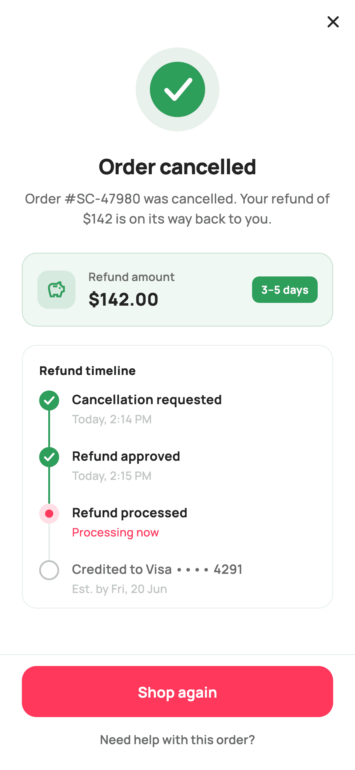
Cancelling an order leaves one question hanging: where is my money? This tutorial builds StyleCart's cancellation-confirmed screen in Flutter — the aftermath state, not the reason picker. You get a painted success check on a soft green disc, a headline naming order #SC-47980 and its $142 refund, a green refund card with a '3–5 days' pill, and a four-stage vertical refund timeline whose painter-drawn nodes and connectors stretch with IntrinsicHeight. A 'Shop again' button and a quiet help link close it out.
Watch the Flutter UI walkthrough
A short screen recording of Cancellation Confirmed running, if you'd rather see it before you read the code. The written tutorial below covers everything in it.
Can't see the video? Watch it on YouTube.
What you'll build
- ✓A 92×92 success check drawn by a CustomPainter — two circles and a three-point path, no emoji and no asset
- ✓A soft-green refund card pairing the $142.00 figure with a solid '3–5 days' expectation pill
- ✓A four-stage refund timeline (Requested, Approved, Processed, Credited to Visa •••• 4291) driven by a const list of _Step records
- ✓Painted node states — filled green check, brand-coloured active ring, hollow grey to-do — with connectors that span each row via IntrinsicHeight
- ✓A footer that ranks 'Shop again' as a filled CTA above a low-key 'Need help with this order?' text link
Step-by-step build
Create the file
Add a new file at lib/ecom_orders_cancelled/ecom_orders_cancelled_screen.dart in your Flutter project.
Register the bundled fonts
No external packages — this is pure Flutter. It does bundle its design font (Manrope), so drop the font file into fonts/ and declare it in pubspec.yaml:
flutter:
  fonts:
    - family: Manrope
      fonts:
- asset: fonts/Manrope-Regular.ttfBuild it, piece by piece
Here's how the screen goes together. Each block below is a real slice of the code with a plain-English explanation — paste them in order, or grab the whole file from the next section.
Tokens and the refund steps as data
import 'package:flutter/material.dart';

/// StyleCart — Cancellation Confirmed.
///
/// A painted success state (no glyph emoji — a CustomPainter check), the
/// cancelled-order summary, and a vertical refund timeline (Requested →
/// Approved → Processed → Credited) built with the IntrinsicHeight stepper so
/// the painted connector always spans each step's text. A "Shop again" CTA and
/// a help link close it out.
///
/// Self-contained per CONVENTIONS.md: pure Flutter, bundled Manrope, inline
/// Airbnb-style tokens, own light theme + SafeArea. Painter-only graphics.
/// Exposes callbacks only.
class EcomOrdersCancelledScreen extends StatelessWidget {
  const EcomOrdersCancelledScreen({
    super.key,
    this.onShopAgain,
    this.onHelp,
    this.onClose,
  });

  final VoidCallback? onShopAgain;
  final VoidCallback? onHelp;
  final VoidCallback? onClose;

  static const String _font = 'Manrope';
  static const Color _canvas = Color(0xFFFFFFFF);
  static const Color _ink = Color(0xFF222222);
  static const Color _muted = Color(0xFF6A6A6A);
  static const Color _faint = Color(0xFFC1C1C1);
  static const Color _brand = Color(0xFFFF385C);
  static const Color _success = Color(0xFF2E9E5B);
  static const Color _hairline = Color(0xFFEBEBEB);

  static const List<_Step> _steps = <_Step>[
    _Step('Cancellation requested', 'Today, 2:14 PM', _StepState.done),
    _Step('Refund approved', 'Today, 2:15 PM', _StepState.done),
    _Step('Refund processed', 'Processing now', _StepState.active),
    _Step('Credited to Visa •••• 4291', 'Est. by Fri, 20 Jun', _StepState.todo),
  ];
`EcomOrdersCancelledScreen` is a `StatelessWidget` exposing only `onShopAgain`, `onHelp` and `onClose` — the cancellation already happened server-side, so this screen reports a settled result rather than owning any mutable state. The palette pairs `_brand` `0xFFFF385C` with `_success` `0xFF2E9E5B`, and the split matters: green carries the refund story while coral is reserved for the one forward action. The four refund stages live in a `static const List<_Step>`, each a label, a timestamp string and a `_StepState`. Keeping them as data means the timeline widget never hard-codes a stage, so swapping in server values later is a list swap, not a widget rewrite.
Close affordance, painted check, and the refund sentence
  @override
  Widget build(BuildContext context) {
    return Theme(
      data: ThemeData.light(useMaterial3: true),
      child: Scaffold(
        backgroundColor: _canvas,
        body: SafeArea(
          child: Column(
            children: <Widget>[
              Align(
                alignment: Alignment.centerRight,
                child: IconButton(
                  onPressed: onClose,
                  icon: const Icon(Icons.close_rounded, size: 22, color: _ink),
                ),
              ),
              Expanded(
                child: ListView(
                  padding: const EdgeInsets.fromLTRB(24, 4, 24, 24),
                  children: <Widget>[
                    Center(
                      child: SizedBox(
                        width: 92,
                        height: 92,
                        child: CustomPaint(painter: _CheckPainter()),
                      ),
                    ),
                    const SizedBox(height: 22),
                    const Text(
                      'Order cancelled',
                      textAlign: TextAlign.center,
                      style: TextStyle(
                        fontFamily: _font,
                        fontSize: 23,
                        fontWeight: FontWeight.w800,
                        letterSpacing: -0.4,
                        color: _ink,
                      ),
                    ),
                    const SizedBox(height: 8),
                    const Text(
                      'Order #SC-47980 was cancelled. Your refund of \$142 is '
                      'on its way back to you.',
                      textAlign: TextAlign.center,
                      style: TextStyle(
                        fontFamily: _font,
                        fontSize: 14.5,
                        fontWeight: FontWeight.w500,
                        height: 1.5,
                        color: _muted,
                      ),
                    ),
                    const SizedBox(height: 26),
                    _refundCard(),
                    const SizedBox(height: 20),
                    _timeline(),
                  ],
                ),
              ),
              _footer(),
            ],
          ),
        ),
      ),
    );
  }
`build` wraps everything in a local `Theme(data: ThemeData.light(useMaterial3: true))` so the screen renders identically whatever the host app's theme is. A right-aligned close `IconButton` sits above an `Expanded` `ListView` — a dismiss glyph rather than a back arrow, because this is a terminal state, not a step you reverse into. The content scrolls, so the timeline never overflows on a short phone. The 92px `CustomPaint` check leads, then a 23px `w800` headline with `letterSpacing: -0.4`, then the line that actually matters: 'Order #SC-47980 was cancelled. Your refund of $142 is on its way back to you.' Naming the order and the amount in one sentence pre-empts the support ticket.
The refund amount card
  Widget _refundCard() {
    return Container(
      padding: const EdgeInsets.all(16),
      decoration: BoxDecoration(
        color: _success.withValues(alpha: 0.07),
        borderRadius: BorderRadius.circular(16),
        border: Border.all(color: _success.withValues(alpha: 0.2)),
      ),
      child: Row(
        children: <Widget>[
          Container(
            width: 42,
            height: 42,
            alignment: Alignment.center,
            decoration: BoxDecoration(
              color: _success.withValues(alpha: 0.14),
              borderRadius: BorderRadius.circular(12),
            ),
            child: const Icon(Icons.savings_outlined,
                size: 22, color: _success),
          ),
          const SizedBox(width: 14),
          const Expanded(
            child: Column(
              crossAxisAlignment: CrossAxisAlignment.start,
              children: <Widget>[
                Text(
                  'Refund amount',
                  style: TextStyle(
                    fontFamily: _font,
                    fontSize: 12.5,
                    fontWeight: FontWeight.w600,
                    color: _muted,
                  ),
                ),
                SizedBox(height: 2),
                Text(
                  '\$142.00',
                  style: TextStyle(
                    fontFamily: _font,
                    fontSize: 19,
                    fontWeight: FontWeight.w800,
                    color: _ink,
                  ),
                ),
              ],
            ),
          ),
          Container(
            padding: const EdgeInsets.symmetric(horizontal: 10, vertical: 6),
            decoration: BoxDecoration(
              color: _success,
              borderRadius: BorderRadius.circular(8),
            ),
            child: const Text(
              '3–5 days',
              style: TextStyle(
                fontFamily: _font,
                fontSize: 12,
                fontWeight: FontWeight.w700,
                color: _canvas,
              ),
            ),
          ),
        ],
      ),
    );
  }
`_refundCard` is a 16-radius `Container` tinted `_success.withValues(alpha: 0.07)` with a slightly stronger `alpha: 0.2` border — two steps of the same green rather than a new colour, so the card reads as a panel and not an alert. Inside, a 42×42 rounded tile at `alpha: 0.14` holds `Icons.savings_outlined`, an `Expanded` column stacks a 12.5px `_muted` 'Refund amount' caption over `$142.00` at 19px `w800`, and a solid `_success` pill reads '3–5 days'. That pill is the point of the card: the amount alone invites 'when?', so the expectation ships beside the number in the strongest weight on the row.
The timeline shell
  Widget _timeline() {
    return Container(
      padding: const EdgeInsets.fromLTRB(16, 18, 16, 6),
      decoration: BoxDecoration(
        color: _canvas,
        borderRadius: BorderRadius.circular(16),
        border: Border.all(color: _hairline),
      ),
      child: Column(
        crossAxisAlignment: CrossAxisAlignment.start,
        children: <Widget>[
          const Padding(
            padding: EdgeInsets.only(left: 2, bottom: 12),
            child: Text(
              'Refund timeline',
              style: TextStyle(
                fontFamily: _font,
                fontSize: 13,
                fontWeight: FontWeight.w800,
                letterSpacing: 0.3,
                color: _ink,
              ),
            ),
          ),
          for (int i = 0; i < _steps.length; i++)
            _stepTile(_steps[i], i == _steps.length - 1),
        ],
      ),
    );
  }
The timeline is a white `Container` with only a `_hairline` border, deliberately flatter than the tinted refund card so the eye lands on the money first. Its padding is asymmetric — `fromLTRB(16, 18, 16, 6)` — because the last step tile supplies its own 6px bottom gap, and a symmetric 18px would double up into a hollow strip under the final node. A 13px `w800` 'Refund timeline' label with `letterSpacing: 0.3` sits above a `for` loop that emits `_stepTile(_steps[i], i == _steps.length - 1)`. Passing the is-last flag down is what lets each node decide whether to draw a connector.
One step row, and why IntrinsicHeight
  Widget _stepTile(_Step s, bool last) {
    return IntrinsicHeight(
      child: Row(
        crossAxisAlignment: CrossAxisAlignment.stretch,
        children: <Widget>[
          SizedBox(
            width: 26,
            child: CustomPaint(painter: _NodePainter(s.state, last)),
          ),
          Expanded(
            child: Padding(
              padding: EdgeInsets.only(left: 12, bottom: last ? 6 : 22),
              child: Column(
                crossAxisAlignment: CrossAxisAlignment.start,
                children: <Widget>[
                  Text(
                    s.label,
                    style: TextStyle(
                      fontFamily: _font,
                      fontSize: 14,
                      fontWeight: s.state == _StepState.todo
                          ? FontWeight.w600
                          : FontWeight.w700,
                      color: s.state == _StepState.todo ? _muted : _ink,
                    ),
                  ),
                  const SizedBox(height: 2),
                  Text(
                    s.time,
                    style: TextStyle(
                      fontFamily: _font,
                      fontSize: 12.5,
                      fontWeight: FontWeight.w500,
                      color: s.state == _StepState.active ? _brand : _faint,
                    ),
                  ),
                ],
              ),
            ),
          ),
        ],
      ),
    );
  }
`_stepTile` wraps a Row in `IntrinsicHeight` with `crossAxisAlignment: CrossAxisAlignment.stretch`. That combination is the whole trick: the 26px-wide `CustomPaint` column has no intrinsic height of its own, so without it the connector line would collapse to nothing. Stretching it to the text column's measured height means the connector always reaches the next node, however long a label wraps. The text padding uses `bottom: last ? 6 : 22` to space steps without a trailing gap. Typography encodes state too — a `todo` label drops to `w600` in `_muted`, and only an `active` timestamp turns `_brand` coral, marking 'Processing now' as the live line.
Footer: one CTA, one quiet link
  Widget _footer() {
    return Container(
      decoration: const BoxDecoration(
        color: _canvas,
        border: Border(top: BorderSide(color: _hairline)),
      ),
      child: SafeArea(
        top: false,
        child: Padding(
          padding: const EdgeInsets.fromLTRB(24, 12, 24, 10),
          child: Column(
            mainAxisSize: MainAxisSize.min,
            children: <Widget>[
              SizedBox(
                height: 56,
                child: FilledButton(
                  onPressed: onShopAgain,
                  style: FilledButton.styleFrom(
                    backgroundColor: _brand,
                    foregroundColor: _canvas,
                    minimumSize: const Size.fromHeight(56),
                    shape: RoundedRectangleBorder(
                      borderRadius: BorderRadius.circular(16),
                    ),
                  ),
                  child: const Text(
                    'Shop again',
                    style: TextStyle(
                      fontFamily: _font,
                      fontSize: 16,
                      fontWeight: FontWeight.w700,
                    ),
                  ),
                ),
              ),
              TextButton(
                onPressed: onHelp,
                child: const Text(
                  'Need help with this order?',
                  style: TextStyle(
                    fontFamily: _font,
                    fontSize: 13.5,
                    fontWeight: FontWeight.w600,
                    color: _muted,
                  ),
                ),
              ),
            ],
          ),
        ),
      ),
    );
  }
}

enum _StepState { done, active, todo }

class _Step {
  const _Step(this.label, this.time, this.state);
  final String label;
  final String time;
  final _StepState state;
}
`_footer` is a `Container` carrying a top hairline that wraps `SafeArea(top: false)` from the inside, so the white bar extends beneath the home indicator while the buttons stay clear of it. A 56px `FilledButton` in `_brand` reads 'Shop again' — after a cancellation the merchant's best outcome is a re-purchase, so that gets the fill and a `Size.fromHeight(56)` minimum for full width. Below it a plain `TextButton` offers 'Need help with this order?' at 13.5px in `_muted`: available, never competing. Below the class sit the `_StepState` enum and the tiny immutable `_Step` record the timeline consumes.
Painting the three node states
/// Paints a timeline node (done check / active ring / todo hollow) plus the
/// connector down to the next node, spanning the full [IntrinsicHeight] row.
class _NodePainter extends CustomPainter {
  _NodePainter(this.state, this.last);
  final _StepState state;
  final bool last;

  static const Color _brand = Color(0xFFFF385C);
  static const Color _success = Color(0xFF2E9E5B);
  static const Color _faint = Color(0xFFC1C1C1);
  static const Color _hairline = Color(0xFFEBEBEB);

  @override
  void paint(Canvas canvas, Size size) {
    final double cx = size.width / 2;
    const double cy = 11;
    const double r = 11;

    // Connector to next node.
    if (!last) {
      canvas.drawLine(
        Offset(cx, cy + r),
        Offset(cx, size.height),
        Paint()
          ..color = state == _StepState.done ? _success : _hairline
          ..strokeWidth = 2,
      );
    }

    switch (state) {
      case _StepState.done:
        canvas.drawCircle(Offset(cx, cy), r, Paint()..color = _success);
        final Path check = Path()
          ..moveTo(cx - 4.6, cy + 0.3)
          ..lineTo(cx - 1.4, cy + 3.4)
          ..lineTo(cx + 4.8, cy - 3.6);
        canvas.drawPath(
          check,
          Paint()
            ..style = PaintingStyle.stroke
            ..strokeWidth = 2.2
            ..strokeCap = StrokeCap.round
            ..strokeJoin = StrokeJoin.round
            ..color = const Color(0xFFFFFFFF),
        );
      case _StepState.active:
        canvas.drawCircle(
          Offset(cx, cy),
          r,
          Paint()..color = _brand.withValues(alpha: 0.16),
        );
        canvas.drawCircle(Offset(cx, cy), 4.5, Paint()..color = _brand);
      case _StepState.todo:
        canvas.drawCircle(
          Offset(cx, cy),
          r - 1,
          Paint()
            ..style = PaintingStyle.stroke
            ..strokeWidth = 2
            ..color = _faint,
        );
    }
  }

  @override
  bool shouldRepaint(_NodePainter old) =>
      old.state != state || old.last != last;
}
`_NodePainter` draws a fixed 11px-radius node at `cy = 11` so every node aligns with the first line of its label regardless of row height. The connector is drawn first, from `cy + r` down to `size.height`, and takes `_success` when the step is done and `_hairline` otherwise — so the green line literally traces how far the refund has travelled. The switch then paints each state differently: `done` is a solid green disc with a white three-point check path at `strokeWidth: 2.2` and round caps; `active` is a `_brand` halo at `alpha: 0.16` around a solid 4.5px dot; `todo` is a hollow `r - 1` stroke in `_faint`. `shouldRepaint` compares both `state` and `last`.
The hero success check
/// A clean success check on a soft green disc — no emoji glyph.
class _CheckPainter extends CustomPainter {
  const _CheckPainter();

  static const Color _success = Color(0xFF2E9E5B);

  @override
  void paint(Canvas canvas, Size size) {
    final Offset c = Offset(size.width / 2, size.height / 2);
    final double r = size.width / 2;

    canvas.drawCircle(
      c,
      r,
      Paint()..color = _success.withValues(alpha: 0.12),
    );
    canvas.drawCircle(c, r * 0.66, Paint()..color = _success);

    final Path check = Path()
      ..moveTo(c.dx - r * 0.26, c.dy + r * 0.02)
      ..lineTo(c.dx - r * 0.07, c.dy + r * 0.22)
      ..lineTo(c.dx + r * 0.30, c.dy - r * 0.22);
    canvas.drawPath(
      check,
      Paint()
        ..style = PaintingStyle.stroke
        ..strokeWidth = r * 0.11
        ..strokeCap = StrokeCap.round
        ..strokeJoin = StrokeJoin.round
        ..color = const Color(0xFFFFFFFF),
    );
  }

  @override
  bool shouldRepaint(_CheckPainter old) => false;
}
`_CheckPainter` builds the badge from three primitives and no asset. A full-size disc at `_success.withValues(alpha: 0.12)` gives the soft halo, a solid circle at `r * 0.66` gives the body, and a `Path` with two `lineTo` calls forms the tick. Every coordinate is a multiple of `r` — the short arm starts at `-0.26r`, turns at `+0.22r` below centre and rises to `+0.30r` — and even the `strokeWidth` is `r * 0.11`, so resizing the 92px `SizedBox` scales the whole glyph proportionally with no re-tuning. `StrokeCap.round` plus `StrokeJoin.round` soften the tick's ends and elbow, and `shouldRepaint` returns `false` because nothing here depends on state.
Full code
The complete, ready-to-paste source. Free to use in your projects — one click copies it all.
import 'package:flutter/material.dart';

/// StyleCart — Cancellation Confirmed.
///
/// A painted success state (no glyph emoji — a CustomPainter check), the
/// cancelled-order summary, and a vertical refund timeline (Requested →
/// Approved → Processed → Credited) built with the IntrinsicHeight stepper so
/// the painted connector always spans each step's text. A "Shop again" CTA and
/// a help link close it out.
///
/// Self-contained per CONVENTIONS.md: pure Flutter, bundled Manrope, inline
/// Airbnb-style tokens, own light theme + SafeArea. Painter-only graphics.
/// Exposes callbacks only.
class EcomOrdersCancelledScreen extends StatelessWidget {
  const EcomOrdersCancelledScreen({
    super.key,
    this.onShopAgain,
    this.onHelp,
    this.onClose,
  });

  final VoidCallback? onShopAgain;
  final VoidCallback? onHelp;
  final VoidCallback? onClose;

  static const String _font = 'Manrope';
  static const Color _canvas = Color(0xFFFFFFFF);
  static const Color _ink = Color(0xFF222222);
  static const Color _muted = Color(0xFF6A6A6A);
  static const Color _faint = Color(0xFFC1C1C1);
  static const Color _brand = Color(0xFFFF385C);
  static const Color _success = Color(0xFF2E9E5B);
  static const Color _hairline = Color(0xFFEBEBEB);

  static const List<_Step> _steps = <_Step>[
    _Step('Cancellation requested', 'Today, 2:14 PM', _StepState.done),
    _Step('Refund approved', 'Today, 2:15 PM', _StepState.done),
    _Step('Refund processed', 'Processing now', _StepState.active),
    _Step('Credited to Visa •••• 4291', 'Est. by Fri, 20 Jun', _StepState.todo),
  ];

  @override
  Widget build(BuildContext context) {
    return Theme(
      data: ThemeData.light(useMaterial3: true),
      child: Scaffold(
        backgroundColor: _canvas,
        body: SafeArea(
          child: Column(
            children: <Widget>[
              Align(
                alignment: Alignment.centerRight,
                child: IconButton(
                  onPressed: onClose,
                  icon: const Icon(Icons.close_rounded, size: 22, color: _ink),
                ),
              ),
              Expanded(
                child: ListView(
                  padding: const EdgeInsets.fromLTRB(24, 4, 24, 24),
                  children: <Widget>[
                    Center(
                      child: SizedBox(
                        width: 92,
                        height: 92,
                        child: CustomPaint(painter: _CheckPainter()),
                      ),
                    ),
                    const SizedBox(height: 22),
                    const Text(
                      'Order cancelled',
                      textAlign: TextAlign.center,
                      style: TextStyle(
                        fontFamily: _font,
                        fontSize: 23,
                        fontWeight: FontWeight.w800,
                        letterSpacing: -0.4,
                        color: _ink,
                      ),
                    ),
                    const SizedBox(height: 8),
                    const Text(
                      'Order #SC-47980 was cancelled. Your refund of \$142 is '
                      'on its way back to you.',
                      textAlign: TextAlign.center,
                      style: TextStyle(
                        fontFamily: _font,
                        fontSize: 14.5,
                        fontWeight: FontWeight.w500,
                        height: 1.5,
                        color: _muted,
                      ),
                    ),
                    const SizedBox(height: 26),
                    _refundCard(),
                    const SizedBox(height: 20),
                    _timeline(),
                  ],
                ),
              ),
              _footer(),
            ],
          ),
        ),
      ),
    );
  }

  Widget _refundCard() {
    return Container(
      padding: const EdgeInsets.all(16),
      decoration: BoxDecoration(
        color: _success.withValues(alpha: 0.07),
        borderRadius: BorderRadius.circular(16),
        border: Border.all(color: _success.withValues(alpha: 0.2)),
      ),
      child: Row(
        children: <Widget>[
          Container(
            width: 42,
            height: 42,
            alignment: Alignment.center,
            decoration: BoxDecoration(
              color: _success.withValues(alpha: 0.14),
              borderRadius: BorderRadius.circular(12),
            ),
            child: const Icon(Icons.savings_outlined,
                size: 22, color: _success),
          ),
          const SizedBox(width: 14),
          const Expanded(
            child: Column(
              crossAxisAlignment: CrossAxisAlignment.start,
              children: <Widget>[
                Text(
                  'Refund amount',
                  style: TextStyle(
                    fontFamily: _font,
                    fontSize: 12.5,
                    fontWeight: FontWeight.w600,
                    color: _muted,
                  ),
                ),
                SizedBox(height: 2),
                Text(
                  '\$142.00',
                  style: TextStyle(
                    fontFamily: _font,
                    fontSize: 19,
                    fontWeight: FontWeight.w800,
                    color: _ink,
                  ),
                ),
              ],
            ),
          ),
          Container(
            padding: const EdgeInsets.symmetric(horizontal: 10, vertical: 6),
            decoration: BoxDecoration(
              color: _success,
              borderRadius: BorderRadius.circular(8),
            ),
            child: const Text(
              '3–5 days',
              style: TextStyle(
                fontFamily: _font,
                fontSize: 12,
                fontWeight: FontWeight.w700,
                color: _canvas,
              ),
            ),
          ),
        ],
      ),
    );
  }

  Widget _timeline() {
    return Container(
      padding: const EdgeInsets.fromLTRB(16, 18, 16, 6),
      decoration: BoxDecoration(
        color: _canvas,
        borderRadius: BorderRadius.circular(16),
        border: Border.all(color: _hairline),
      ),
      child: Column(
        crossAxisAlignment: CrossAxisAlignment.start,
        children: <Widget>[
          const Padding(
            padding: EdgeInsets.only(left: 2, bottom: 12),
            child: Text(
              'Refund timeline',
              style: TextStyle(
                fontFamily: _font,
                fontSize: 13,
                fontWeight: FontWeight.w800,
                letterSpacing: 0.3,
                color: _ink,
              ),
            ),
          ),
          for (int i = 0; i < _steps.length; i++)
            _stepTile(_steps[i], i == _steps.length - 1),
        ],
      ),
    );
  }

  Widget _stepTile(_Step s, bool last) {
    return IntrinsicHeight(
      child: Row(
        crossAxisAlignment: CrossAxisAlignment.stretch,
        children: <Widget>[
          SizedBox(
            width: 26,
            child: CustomPaint(painter: _NodePainter(s.state, last)),
          ),
          Expanded(
            child: Padding(
              padding: EdgeInsets.only(left: 12, bottom: last ? 6 : 22),
              child: Column(
                crossAxisAlignment: CrossAxisAlignment.start,
                children: <Widget>[
                  Text(
                    s.label,
                    style: TextStyle(
                      fontFamily: _font,
                      fontSize: 14,
                      fontWeight: s.state == _StepState.todo
                          ? FontWeight.w600
                          : FontWeight.w700,
                      color: s.state == _StepState.todo ? _muted : _ink,
                    ),
                  ),
                  const SizedBox(height: 2),
                  Text(
                    s.time,
                    style: TextStyle(
                      fontFamily: _font,
                      fontSize: 12.5,
                      fontWeight: FontWeight.w500,
                      color: s.state == _StepState.active ? _brand : _faint,
                    ),
                  ),
                ],
              ),
            ),
          ),
        ],
      ),
    );
  }

  Widget _footer() {
    return Container(
      decoration: const BoxDecoration(
        color: _canvas,
        border: Border(top: BorderSide(color: _hairline)),
      ),
      child: SafeArea(
        top: false,
        child: Padding(
          padding: const EdgeInsets.fromLTRB(24, 12, 24, 10),
          child: Column(
            mainAxisSize: MainAxisSize.min,
            children: <Widget>[
              SizedBox(
                height: 56,
                child: FilledButton(
                  onPressed: onShopAgain,
                  style: FilledButton.styleFrom(
                    backgroundColor: _brand,
                    foregroundColor: _canvas,
                    minimumSize: const Size.fromHeight(56),
                    shape: RoundedRectangleBorder(
                      borderRadius: BorderRadius.circular(16),
                    ),
                  ),
                  child: const Text(
                    'Shop again',
                    style: TextStyle(
                      fontFamily: _font,
                      fontSize: 16,
                      fontWeight: FontWeight.w700,
                    ),
                  ),
                ),
              ),
              TextButton(
                onPressed: onHelp,
                child: const Text(
                  'Need help with this order?',
                  style: TextStyle(
                    fontFamily: _font,
                    fontSize: 13.5,
                    fontWeight: FontWeight.w600,
                    color: _muted,
                  ),
                ),
              ),
            ],
          ),
        ),
      ),
    );
  }
}

enum _StepState { done, active, todo }

class _Step {
  const _Step(this.label, this.time, this.state);
  final String label;
  final String time;
  final _StepState state;
}

/// Paints a timeline node (done check / active ring / todo hollow) plus the
/// connector down to the next node, spanning the full [IntrinsicHeight] row.
class _NodePainter extends CustomPainter {
  _NodePainter(this.state, this.last);
  final _StepState state;
  final bool last;

  static const Color _brand = Color(0xFFFF385C);
  static const Color _success = Color(0xFF2E9E5B);
  static const Color _faint = Color(0xFFC1C1C1);
  static const Color _hairline = Color(0xFFEBEBEB);

  @override
  void paint(Canvas canvas, Size size) {
    final double cx = size.width / 2;
    const double cy = 11;
    const double r = 11;

    // Connector to next node.
    if (!last) {
      canvas.drawLine(
        Offset(cx, cy + r),
        Offset(cx, size.height),
        Paint()
          ..color = state == _StepState.done ? _success : _hairline
          ..strokeWidth = 2,
      );
    }

    switch (state) {
      case _StepState.done:
        canvas.drawCircle(Offset(cx, cy), r, Paint()..color = _success);
        final Path check = Path()
          ..moveTo(cx - 4.6, cy + 0.3)
          ..lineTo(cx - 1.4, cy + 3.4)
          ..lineTo(cx + 4.8, cy - 3.6);
        canvas.drawPath(
          check,
          Paint()
            ..style = PaintingStyle.stroke
            ..strokeWidth = 2.2
            ..strokeCap = StrokeCap.round
            ..strokeJoin = StrokeJoin.round
            ..color = const Color(0xFFFFFFFF),
        );
      case _StepState.active:
        canvas.drawCircle(
          Offset(cx, cy),
          r,
          Paint()..color = _brand.withValues(alpha: 0.16),
        );
        canvas.drawCircle(Offset(cx, cy), 4.5, Paint()..color = _brand);
      case _StepState.todo:
        canvas.drawCircle(
          Offset(cx, cy),
          r - 1,
          Paint()
            ..style = PaintingStyle.stroke
            ..strokeWidth = 2
            ..color = _faint,
        );
    }
  }

  @override
  bool shouldRepaint(_NodePainter old) =>
      old.state != state || old.last != last;
}

/// A clean success check on a soft green disc — no emoji glyph.
class _CheckPainter extends CustomPainter {
  const _CheckPainter();

  static const Color _success = Color(0xFF2E9E5B);

  @override
  void paint(Canvas canvas, Size size) {
    final Offset c = Offset(size.width / 2, size.height / 2);
    final double r = size.width / 2;

    canvas.drawCircle(
      c,
      r,
      Paint()..color = _success.withValues(alpha: 0.12),
    );
    canvas.drawCircle(c, r * 0.66, Paint()..color = _success);

    final Path check = Path()
      ..moveTo(c.dx - r * 0.26, c.dy + r * 0.02)
      ..lineTo(c.dx - r * 0.07, c.dy + r * 0.22)
      ..lineTo(c.dx + r * 0.30, c.dy - r * 0.22);
    canvas.drawPath(
      check,
      Paint()
        ..style = PaintingStyle.stroke
        ..strokeWidth = r * 0.11
        ..strokeCap = StrokeCap.round
        ..strokeJoin = StrokeJoin.round
        ..color = const Color(0xFFFFFFFF),
    );
  }

  @override
  bool shouldRepaint(_CheckPainter old) => false;
}
Plus bundled 5 binary assets (fonts/images). The CLI and MCP install those for you automatically.
Two faster ways to add it
Copy-paste works, but you can skip it entirely.
1. FlutterKit CLI
One command drops this screen — and its fonts — straight into your project.
$ flutterkit add ecom-orders-cancelled2. AI agent (MCP)
Connect FlutterKit's MCP server in Claude or Cursor and just ask your agent to install ecom-orders-cancelled — it fetches and writes the files for you.
FAQ
Is this cancellation confirmation screen free to use in a commercial app?
Yes. FlutterKit is free — there is no paid tier behind this page, no licence key and no sign-up. Copy the Dart from this page, install it with the CLI, or pull it through MCP, and ship it in a real store app. Attribution is not required.
Do I need any packages or a font file for this screen?
No packages at all — it is pure `material.dart`, and both graphics are `CustomPainter` work rather than SVGs or icon packs. The only external dependency is the Manrope font referenced as `_font`; declare it in `pubspec.yaml`, or delete the `fontFamily` lines and the screen falls back to your app's default typeface.
How do I plug in a real refund ETA instead of the hard-coded dates?
Turn `_steps` from a `static const` list into a constructor parameter and build it from your refund webhook. The tile reads only `label`, `time` and `state`, so your payment provider's status maps straight onto `_StepState.done` / `active` / `todo`, and the '3–5 days' pill plus 'Est. by Fri, 20 Jun' become formatted values from the same response.
Why use IntrinsicHeight for the timeline instead of a fixed-height row?
Because a step label can wrap. `IntrinsicHeight` measures the text column and stretches the 26px painter column to match, so `_NodePainter` can draw its connector down to `size.height` and always meet the next node. Fix the row height instead and a two-line label either clips or leaves a visible gap in the line.
Which Flutter version does this screen need?
Flutter 3.22 or newer, because the refund card and the node painter use `Color.withValues(alpha: ...)` and the constructor uses `super.key`. On an older SDK swap each call for `withOpacity(0.07)` and expand the constructor to the `{Key? key, ...}) : super(key: key)` form.


