How to Build a Crypto Withdrawal Confirmation Screen in Flutter (Full Code + Preview)
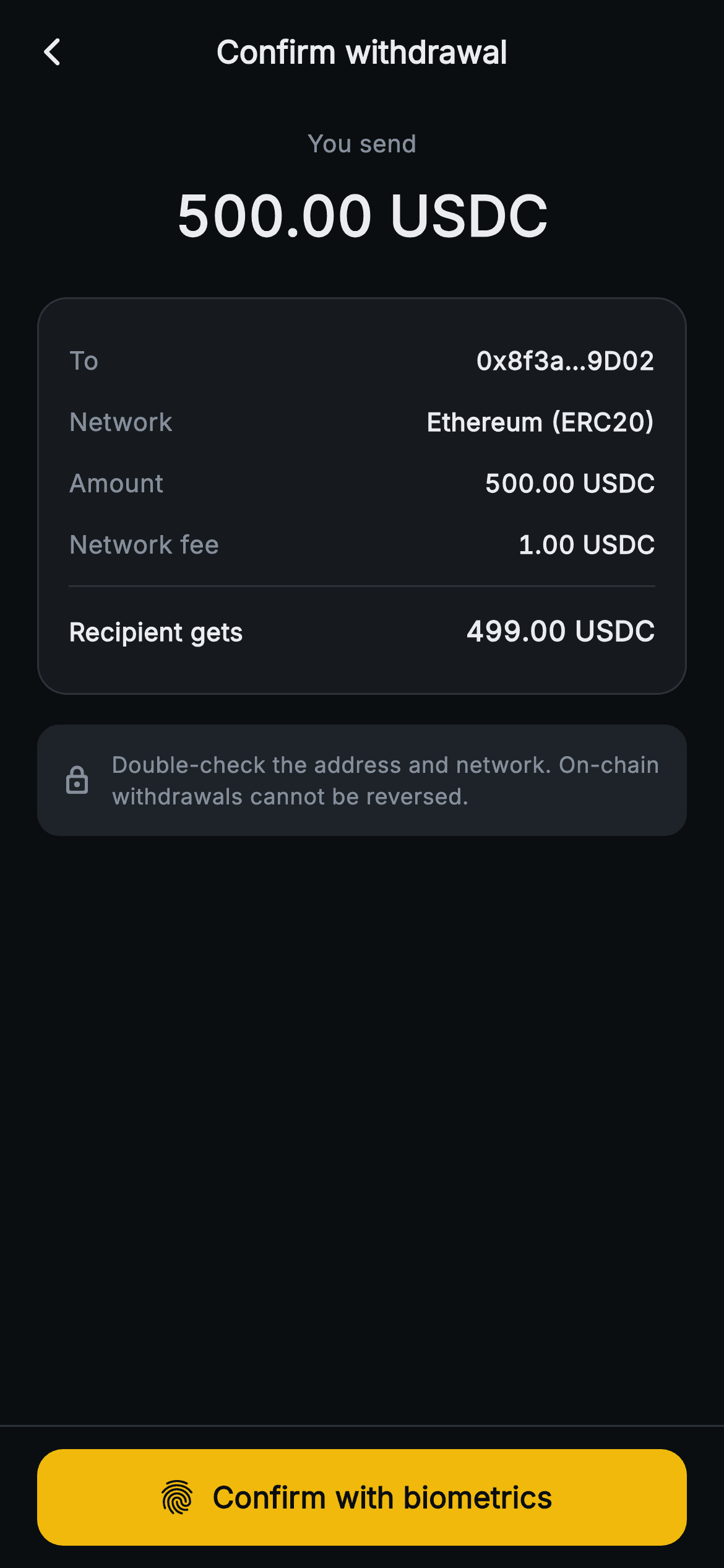
Once a withdrawal is signed it cannot be pulled back, so the review step is the last chance to spot a wrong address, network or fee. This tutorial builds Aurum's Confirm withdrawal screen in Flutter: a centred 500.00 USDC 'You send' figure, a bordered breakdown of recipient, network, amount and fee that closes on a bold 'Recipient gets' line, a quiet irreversibility notice, and a pinned amber confirm button with a fingerprint icon. The result is a stateless widget driven by two callbacks.
What you'll build
- ✓A 'You send' header that puts the gross amount in 30px w800 tabular figures at the top of the page
- ✓A hairline-bordered breakdown card of To, Network, Amount and Network fee rows built from one reusable _Row widget
- ✓A divider-separated 'Recipient gets' total promoted to bold through a single flag on the same row widget
- ✓A borderless lock-icon notice on the alt surface warning that on-chain withdrawals are irreversible
- ✓A pinned full-width FilledButton.icon reading 'Confirm with biometrics' that hands control back through onConfirm
Step-by-step build
Create the file
Add a new file at lib/web3_withdraw_review/web3_withdraw_review_screen.dart in your Flutter project.
Register the bundled fonts
No external packages — this is pure Flutter. It does bundle its design font (Inter), so drop the font file into fonts/ and declare it in pubspec.yaml:
flutter:
  fonts:
    - family: Inter
      fonts:
- asset: fonts/Inter-Regular.ttfBuild it, piece by piece
Here's how the screen goes together. Each block below is a real slice of the code with a plain-English explanation — paste them in order, or grab the whole file from the next section.
A stateless checkpoint with a shorter palette
import 'package:flutter/material.dart';

/// Web3 withdraw — Confirm withdrawal. Recipient, amount, network fee and a
/// "you receive" total with a biometric / 2FA confirm bar. Self-contained per
/// CONVENTIONS.md: pure Flutter, bundled Inter font, no glyphs / no network
/// image, forced dark theme so it renders standalone as a route.
class Web3WithdrawReviewScreen extends StatelessWidget {
  const Web3WithdrawReviewScreen({super.key, this.onBack, this.onConfirm});

  final VoidCallback? onBack;
  final VoidCallback? onConfirm;

  static const String _font = 'Inter';
  static const Color _bg = Color(0xFF0B0E11);
  static const Color _surface = Color(0xFF161A1E);
  static const Color _surfaceAlt = Color(0xFF1E2329);
  static const Color _brand = Color(0xFFF0B90B);
  static const Color _text = Color(0xFFEAECEF);
  static const Color _muted = Color(0xFF848E9C);
  static const Color _hairline = Color(0xFF2B3139);

  @override
  Widget build(BuildContext context) {
    return Theme(
      data: ThemeData.dark(useMaterial3: true),
      child: Scaffold(
        backgroundColor: _bg,
        appBar: AppBar(
          backgroundColor: _bg,
          elevation: 0,
          centerTitle: true,
          leading: IconButton(
            onPressed: onBack,
            icon: const Icon(Icons.arrow_back_ios_new_rounded,
                size: 18, color: _text),
          ),
          title: const Text(
            'Confirm withdrawal',
            style: TextStyle(
              fontFamily: _font,
              fontSize: 17,
              fontWeight: FontWeight.w700,
              color: _text,
            ),
          ),
        ),
The withdraw form before this screen was a `StatefulWidget` with controllers and validation getters; this one is a plain `StatelessWidget`, because everything has already been entered and nothing left here is editable. It exposes two nullable callbacks, `onBack` and `onConfirm`, and nothing else. The palette is noticeably shorter than the form's: seven constants, with no red or green entry at all, since no error state can appear on a summary. The `AppBar` matches its background to `_bg` with `elevation: 0` and centres 'Confirm withdrawal' at 17px `w700`. That title is a verb phrase rather than the asset name, which tells the reader this page asks for a decision and isn't another form to fill in. The back chevron is the small `arrow_back_ios_new_rounded` at 18px, kept low-key so returning to edit is available but quiet.
Leading with what leaves the wallet
        body: SafeArea(
          top: false,
          child: ListView(
            padding: const EdgeInsets.fromLTRB(20, 12, 20, 24),
            children: <Widget>[
              Center(
                child: Column(
                  children: const <Widget>[
                    Text(
                      'You send',
                      style: TextStyle(
                        fontFamily: _font,
                        fontSize: 13,
                        color: _muted,
                      ),
                    ),
                    SizedBox(height: 8),
                    Text(
                      '500.00 USDC',
                      style: TextStyle(
                        fontFamily: _font,
                        fontSize: 30,
                        fontWeight: FontWeight.w800,
                        fontFeatures: <FontFeature>[
                          FontFeature.tabularFigures()
                        ],
                        color: _text,
                      ),
                    ),
                  ],
                ),
              ),
The body is `SafeArea(top: false)` around a `ListView` padded `fromLTRB(20, 12, 20, 24)`. The AppBar already handles the top inset, and the ListView means the summary still scrolls on a short phone or at a large text scale. The first thing in it is a centred two-line header: 'You send' in 13px muted text, an 8px gap, then '500.00 USDC' at 30px `w800`, the biggest type on the screen. The gross amount gets the hero slot because that is the number leaving the user's balance; the net figure is saved for the end of the breakdown. `FontFeature.tabularFigures()` gives every digit the same advance width. That matters once the literal becomes a live value, because a 1 is otherwise narrower than an 8 and the centred figure would shift sideways between amounts.
The breakdown card as a list of declarations
              const SizedBox(height: 22),
              Container(
                padding: const EdgeInsets.all(16),
                decoration: BoxDecoration(
                  color: _surface,
                  borderRadius: BorderRadius.circular(16),
                  border: Border.all(color: _hairline),
                ),
                child: Column(
                  children: const <Widget>[
                    _Row(label: 'To', value: '0x8f3a…9D02'),
                    _Row(label: 'Network', value: 'Ethereum (ERC20)'),
                    _Row(label: 'Amount', value: '500.00 USDC'),
                    _Row(label: 'Network fee', value: '1.00 USDC'),
                    _Divider(),
                    _Row(
                        label: 'Recipient gets',
                        value: '499.00 USDC',
                        bold: true),
                  ],
                ),
              ),
The summary is a `_surface` Container with 16px padding, a 16px radius and a `Border.all(color: _hairline)` outline. That border is what makes it read as a receipt-like panel rather than loose text. Its Column is entirely `const`: four `_Row` calls (To, Network, Amount, Network fee), a `_Divider`, and a final `_Row` with `bold: true` for 'Recipient gets 499.00 USDC'. The order follows the questions a careful sender asks: where is it going, on which chain, how much, what does it cost, and what actually arrives. The address is shown as '0x8f3a…9D02', head and tail kept, with the mixed-case EIP-55 checksum letters left intact so it can be compared against the recipient's own wallet. Be aware that 499.00 is a typed string, not `500 - 1` worked out at runtime as the form did. The figures only agree because the demo literals were written to match.
A caution note that informs without alarming
              const SizedBox(height: 16),
              Container(
                padding: const EdgeInsets.all(13),
                decoration: BoxDecoration(
                  color: _surfaceAlt,
                  borderRadius: BorderRadius.circular(12),
                ),
                child: const Row(
                  children: <Widget>[
                    Icon(Icons.lock_outline_rounded, size: 17, color: _muted),
                    SizedBox(width: 10),
                    Expanded(
                      child: Text(
                        'Double-check the address and network. On-chain '
                        'withdrawals cannot be reversed.',
                        style: TextStyle(
                          fontFamily: _font,
                          fontSize: 12,
                          height: 1.4,
                          color: _muted,
                        ),
                      ),
                    ),
                  ],
                ),
              ),
Below the card sits a 13px-padded Container on `_surfaceAlt` (`#1E2329`) with a 12px radius and, deliberately, no border. Dropping the hairline and changing the fill sets it apart from the breakdown as commentary, not data. Inside a `const Row`, a 17px `lock_outline_rounded` icon sits beside an `Expanded` 12px muted line at `height: 1.4`: 'Double-check the address and network. On-chain withdrawals cannot be reversed.' Both icon and text are `_muted` rather than amber or red. The user isn't doing anything wrong, so a warning colour would just add friction at the point they're about to commit. There is no checkbox and no acknowledgement step either, and the confirm button never waits on this panel. It is advisory text only. If your compliance rules need explicit consent, add a bool and gate `onPressed` on it.
The pinned confirm bar
            ],
          ),
        ),
        bottomNavigationBar: Container(
          decoration: const BoxDecoration(
            color: _bg,
            border: Border(top: BorderSide(color: _hairline)),
          ),
          child: SafeArea(
            top: false,
            child: Padding(
              padding: const EdgeInsets.fromLTRB(20, 12, 20, 12),
              child: SizedBox(
                width: double.infinity,
                height: 52,
                child: FilledButton.icon(
                  onPressed: onConfirm,
                  style: FilledButton.styleFrom(
                    backgroundColor: _brand,
                    shape: RoundedRectangleBorder(
                      borderRadius: BorderRadius.circular(14),
                    ),
                  ),
                  icon: const Icon(Icons.fingerprint_rounded,
                      size: 22, color: _bg),
                  label: const Text(
                    'Confirm with biometrics',
                    style: TextStyle(
                      fontFamily: _font,
                      fontSize: 16,
                      fontWeight: FontWeight.w700,
                      color: _bg,
                    ),
                  ),
                ),
              ),
            ),
          ),
        ),
      ),
    );
  }
}
The action sits in `bottomNavigationBar`: a `_bg` Container with a single top `BorderSide` in `_hairline`, wrapping `SafeArea(top: false)` so the dark fill reaches under the home indicator while the button stays clear of it. The geometry matches the form's bar (20px side padding, a 52px full-width `SizedBox`, 14px radius), so the button stays in the same place between the two steps. What changes is the widget: `FilledButton.icon` with a 22px `fingerprint_rounded` glyph and the label 'Confirm with biometrics' at 16px `w700`, both coloured `_bg` so near-black sits on the `#F0B90B` amber fill. There is no `disabledBackgroundColor` because the button is always live. If you pass a null `onConfirm`, Material's default disabled fill appears, and the hard-coded dark label can become hard to read.
The _S typedef and the two row helpers
typedef _S = Web3WithdrawReviewScreen;

class _Row extends StatelessWidget {
  const _Row({required this.label, required this.value, this.bold = false});

  final String label;
  final String value;
  final bool bold;

  @override
  Widget build(BuildContext context) {
    return Padding(
      padding: const EdgeInsets.symmetric(vertical: 7),
      child: Row(
        children: <Widget>[
          Text(
            label,
            style: TextStyle(
              fontFamily: _S._font,
              fontSize: 13.5,
              fontWeight: bold ? FontWeight.w700 : FontWeight.w400,
              color: bold ? _S._text : _S._muted,
            ),
          ),
          const Spacer(),
          Text(
            value,
            style: TextStyle(
              fontFamily: _S._font,
              fontSize: bold ? 15 : 13.5,
              fontWeight: bold ? FontWeight.w800 : FontWeight.w600,
              fontFeatures: const <FontFeature>[FontFeature.tabularFigures()],
              color: _S._text,
            ),
          ),
        ],
      ),
    );
  }
}

class _Divider extends StatelessWidget {
  const _Divider();

  @override
  Widget build(BuildContext context) {
    return const Padding(
      padding: EdgeInsets.symmetric(vertical: 6),
      child: Divider(height: 1, thickness: 1, color: _S._hairline),
    );
  }
}
`typedef _S = Web3WithdrawReviewScreen;` is a small trick that lets the separate helper classes reach the screen's private statics as `_S._font`, `_S._muted` and so on, without repeating the long class name in every `TextStyle`. `_Row` takes `label`, `value` and a `bold` flag that changes four things together: label weight `w400` to `w700`, label colour muted to `_text`, value size 13.5 to 15, and value weight `w600` to `w800`. Values always use `tabularFigures`, so 500.00, 1.00 and 499.00 line up digit for digit down the right edge. Each row adds 7px of vertical padding, and the label and value are pushed apart by a `Spacer`. Neither Text is wrapped in `Flexible`, so a longer value such as a full address would overflow. Wrap the value in `Flexible` with `TextOverflow.ellipsis` before feeding it real data. `_Divider` is a 1px hairline `Divider` inside 6px of vertical padding.
Full code
The complete, ready-to-paste source. Free to use in your projects — one click copies it all.
import 'package:flutter/material.dart';

/// Web3 withdraw — Confirm withdrawal. Recipient, amount, network fee and a
/// "you receive" total with a biometric / 2FA confirm bar. Self-contained per
/// CONVENTIONS.md: pure Flutter, bundled Inter font, no glyphs / no network
/// image, forced dark theme so it renders standalone as a route.
class Web3WithdrawReviewScreen extends StatelessWidget {
  const Web3WithdrawReviewScreen({super.key, this.onBack, this.onConfirm});

  final VoidCallback? onBack;
  final VoidCallback? onConfirm;

  static const String _font = 'Inter';
  static const Color _bg = Color(0xFF0B0E11);
  static const Color _surface = Color(0xFF161A1E);
  static const Color _surfaceAlt = Color(0xFF1E2329);
  static const Color _brand = Color(0xFFF0B90B);
  static const Color _text = Color(0xFFEAECEF);
  static const Color _muted = Color(0xFF848E9C);
  static const Color _hairline = Color(0xFF2B3139);

  @override
  Widget build(BuildContext context) {
    return Theme(
      data: ThemeData.dark(useMaterial3: true),
      child: Scaffold(
        backgroundColor: _bg,
        appBar: AppBar(
          backgroundColor: _bg,
          elevation: 0,
          centerTitle: true,
          leading: IconButton(
            onPressed: onBack,
            icon: const Icon(Icons.arrow_back_ios_new_rounded,
                size: 18, color: _text),
          ),
          title: const Text(
            'Confirm withdrawal',
            style: TextStyle(
              fontFamily: _font,
              fontSize: 17,
              fontWeight: FontWeight.w700,
              color: _text,
            ),
          ),
        ),
        body: SafeArea(
          top: false,
          child: ListView(
            padding: const EdgeInsets.fromLTRB(20, 12, 20, 24),
            children: <Widget>[
              Center(
                child: Column(
                  children: const <Widget>[
                    Text(
                      'You send',
                      style: TextStyle(
                        fontFamily: _font,
                        fontSize: 13,
                        color: _muted,
                      ),
                    ),
                    SizedBox(height: 8),
                    Text(
                      '500.00 USDC',
                      style: TextStyle(
                        fontFamily: _font,
                        fontSize: 30,
                        fontWeight: FontWeight.w800,
                        fontFeatures: <FontFeature>[
                          FontFeature.tabularFigures()
                        ],
                        color: _text,
                      ),
                    ),
                  ],
                ),
              ),
              const SizedBox(height: 22),
              Container(
                padding: const EdgeInsets.all(16),
                decoration: BoxDecoration(
                  color: _surface,
                  borderRadius: BorderRadius.circular(16),
                  border: Border.all(color: _hairline),
                ),
                child: Column(
                  children: const <Widget>[
                    _Row(label: 'To', value: '0x8f3a…9D02'),
                    _Row(label: 'Network', value: 'Ethereum (ERC20)'),
                    _Row(label: 'Amount', value: '500.00 USDC'),
                    _Row(label: 'Network fee', value: '1.00 USDC'),
                    _Divider(),
                    _Row(
                        label: 'Recipient gets',
                        value: '499.00 USDC',
                        bold: true),
                  ],
                ),
              ),
              const SizedBox(height: 16),
              Container(
                padding: const EdgeInsets.all(13),
                decoration: BoxDecoration(
                  color: _surfaceAlt,
                  borderRadius: BorderRadius.circular(12),
                ),
                child: const Row(
                  children: <Widget>[
                    Icon(Icons.lock_outline_rounded, size: 17, color: _muted),
                    SizedBox(width: 10),
                    Expanded(
                      child: Text(
                        'Double-check the address and network. On-chain '
                        'withdrawals cannot be reversed.',
                        style: TextStyle(
                          fontFamily: _font,
                          fontSize: 12,
                          height: 1.4,
                          color: _muted,
                        ),
                      ),
                    ),
                  ],
                ),
              ),
            ],
          ),
        ),
        bottomNavigationBar: Container(
          decoration: const BoxDecoration(
            color: _bg,
            border: Border(top: BorderSide(color: _hairline)),
          ),
          child: SafeArea(
            top: false,
            child: Padding(
              padding: const EdgeInsets.fromLTRB(20, 12, 20, 12),
              child: SizedBox(
                width: double.infinity,
                height: 52,
                child: FilledButton.icon(
                  onPressed: onConfirm,
                  style: FilledButton.styleFrom(
                    backgroundColor: _brand,
                    shape: RoundedRectangleBorder(
                      borderRadius: BorderRadius.circular(14),
                    ),
                  ),
                  icon: const Icon(Icons.fingerprint_rounded,
                      size: 22, color: _bg),
                  label: const Text(
                    'Confirm with biometrics',
                    style: TextStyle(
                      fontFamily: _font,
                      fontSize: 16,
                      fontWeight: FontWeight.w700,
                      color: _bg,
                    ),
                  ),
                ),
              ),
            ),
          ),
        ),
      ),
    );
  }
}

typedef _S = Web3WithdrawReviewScreen;

class _Row extends StatelessWidget {
  const _Row({required this.label, required this.value, this.bold = false});

  final String label;
  final String value;
  final bool bold;

  @override
  Widget build(BuildContext context) {
    return Padding(
      padding: const EdgeInsets.symmetric(vertical: 7),
      child: Row(
        children: <Widget>[
          Text(
            label,
            style: TextStyle(
              fontFamily: _S._font,
              fontSize: 13.5,
              fontWeight: bold ? FontWeight.w700 : FontWeight.w400,
              color: bold ? _S._text : _S._muted,
            ),
          ),
          const Spacer(),
          Text(
            value,
            style: TextStyle(
              fontFamily: _S._font,
              fontSize: bold ? 15 : 13.5,
              fontWeight: bold ? FontWeight.w800 : FontWeight.w600,
              fontFeatures: const <FontFeature>[FontFeature.tabularFigures()],
              color: _S._text,
            ),
          ),
        ],
      ),
    );
  }
}

class _Divider extends StatelessWidget {
  const _Divider();

  @override
  Widget build(BuildContext context) {
    return const Padding(
      padding: EdgeInsets.symmetric(vertical: 6),
      child: Divider(height: 1, thickness: 1, color: _S._hairline),
    );
  }
}
Plus bundled 1 binary asset (fonts/images). The CLI and MCP install those for you automatically.
Two faster ways to add it
Copy-paste works, but you can skip it entirely.
1. FlutterKit CLI
One command drops this screen — and its fonts — straight into your project.
$ flutterkit add web3-withdraw-review2. AI agent (MCP)
Connect FlutterKit's MCP server in Claude or Cursor and just ask your agent to install web3-withdraw-review — it fetches and writes the files for you.
FAQ
Can I ship this withdrawal confirmation screen in a commercial wallet?
Yes. It is free for any project, commercial included. Copy the Dart from this page, add it with the CLI command, or fetch it over MCP. You don't need a licence key or a sign-up, and you don't need to credit anyone.
Does the fingerprint button actually run Face ID or a fingerprint scan?
No. The icon and label only describe what should happen. Pressing it just calls `onConfirm`. To make it real, call your biometric plugin (local_auth or similar) inside that handler. Sign and broadcast the withdrawal only after authentication succeeds, and if it fails or is cancelled, stay on this screen so the summary remains visible.
How do I feed it real withdrawal data instead of the demo strings?
Every figure is a literal, including the 499.00 net. Add constructor fields (or a small quote model) for amount, fee, network and address, then remove the `const` from the summary Column. Take 'Recipient gets' from the quote your backend returns rather than subtracting on the device, so the number the user confirms is the one that gets broadcast. Shorten the address with head and tail substrings, and keep its original letter casing.
Do I need any packages or font setup?
No. The file imports only `package:flutter/material.dart`, the fingerprint and lock glyphs are standard Material icons, and the screen uses no images. The one asset is the bundled Inter font, referenced through `fontFamily: 'Inter'`. Change the `_font` constant if your app already uses a different typeface.
Which Flutter version is required?
Any recent stable release. Unlike most Aurum screens this one never calls `Color.withValues`, so there's no `withOpacity` swap to make. Two constructs matter on an older SDK. `super.key` needs Dart 2.17; expand it to `{Key? key, ...} : super(key: key)` if yours is older. And if `ThemeData.dark(useMaterial3: true)` is rejected, use `ThemeData(brightness: Brightness.dark, useMaterial3: true)` instead.


