How to Build a Crypto Transaction History Screen in Flutter (Full Code + Preview)
Every crypto wallet needs an activity feed, and the hard part is not fetching transactions — it is making four different kinds of event (send, receive, swap, stake) readable in one scrolling list without labels shouting at each other. This tutorial builds Aurum's transaction history screen in Flutter: a dark exchange-style canvas, gold filter chips that live-filter the feed, date group headers that vanish when a filter empties them, and rows whose icon colour, sign, and fiat sub-value tell the story before you read a word.
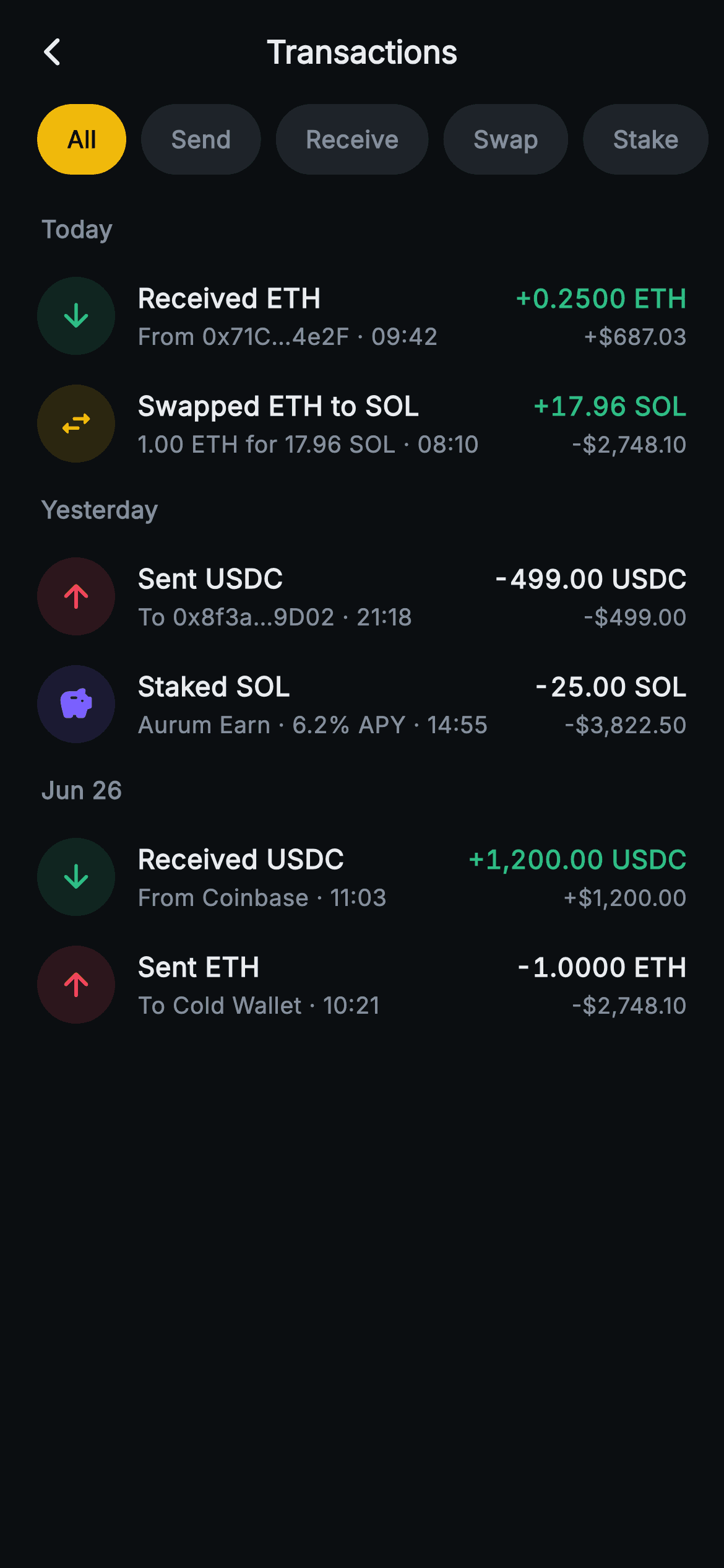
What you'll build
- ✓A horizontal filter-chip bar (All / Send / Receive / Swap / Stake) where the active pill fills gold and re-filters the whole feed through one setState
- ✓A date-grouped list (Today, Yesterday, Jun 26) built with expand(), whose section headers collapse automatically when a filter empties their group
- ✓An enum-driven row builder mapping each transaction kind to its own icon and a 42px tint circle at 14% alpha — red send, green receive, gold swap, purple stake
- ✓Signed token amounts set in tabular figures so the numeric column stays vertically aligned, with green reserved for value that arrived
- ✓A backend-agnostic screen whose transactions are plain const records, ready to swap for your chain-indexer or exchange API data
Step-by-step build
Create the file
Add a new file at lib/web3_tx_history/web3_tx_history_screen.dart in your Flutter project.
Register the bundled fonts
No external packages — this is pure Flutter. It does bundle its design font (Inter), so drop the font file into fonts/ and declare it in pubspec.yaml:
flutter:
  fonts:
    - family: Inter
      fonts:
- asset: fonts/Inter-Regular.ttfBuild it, piece by piece
Here's how the screen goes together. Each block below is a real slice of the code with a plain-English explanation — paste them in order, or grab the whole file from the next section.
Two callbacks and an exchange-dark palette
import 'package:flutter/material.dart';

/// Web3 — Transactions. A unified activity list grouped by date with per-type
/// icons (send / receive / swap / stake) and signed amounts; filter chips at
/// the top. Self-contained per CONVENTIONS.md: pure Flutter, bundled Inter
/// font, no glyphs / no network image, forced dark theme so it renders
/// standalone as a route.
class Web3TxHistoryScreen extends StatefulWidget {
  const Web3TxHistoryScreen({super.key, this.onBack, this.onTxTap});

  final VoidCallback? onBack;
  final VoidCallback? onTxTap;

  @override
  State<Web3TxHistoryScreen> createState() => _Web3TxHistoryScreenState();
}

class _Web3TxHistoryScreenState extends State<Web3TxHistoryScreen> {
  static const String _font = 'Inter';
  static const Color _bg = Color(0xFF0B0E11);
  static const Color _surfaceAlt = Color(0xFF1E2329);
  static const Color _brand = Color(0xFFF0B90B);
  static const Color _up = Color(0xFF2EBD85);
  static const Color _down = Color(0xFFF6465D);
  static const Color _text = Color(0xFFEAECEF);
  static const Color _muted = Color(0xFF848E9C);

  static const List<String> _filters = <String>[
    'All',
    'Send',
    'Receive',
    'Swap',
    'Stake',
  ];
`Web3TxHistoryScreen` is a `StatefulWidget` — it has to be, because the filter selection is real state — but it exposes only two callbacks, `onBack` and `onTxTap`, so nothing about wallets or RPC leaks into the widget. The palette is a classic exchange scheme: near-black `#0B0E11` canvas, `#1E2329` for inactive surfaces, gold `#F0B90B` as the single brand accent, and a strict `#2EBD85` green / `#F6465D` red pair for value direction. Text splits into `#EAECEF` primary and `#848E9C` muted. The five filter labels live in a `static const List<String>`, which matters later: the active filter is stored as an index into this list, so adding a sixth filter is a one-line change.
Transactions as pre-formatted const data
  static const List<_Group> _groups = <_Group>[
    _Group('Today', <_Tx>[
      _Tx(_TxKind.receive, 'Received ETH', 'From 0x71C…4e2F', '+0.2500 ETH',
          '+\$687.03', '09:42'),
      _Tx(_TxKind.swap, 'Swapped ETH to SOL', '1.00 ETH for 17.96 SOL',
          '+17.96 SOL', '-\$2,748.10', '08:10'),
    ]),
    _Group('Yesterday', <_Tx>[
      _Tx(_TxKind.send, 'Sent USDC', 'To 0x8f3a…9D02', '-499.00 USDC',
          '-\$499.00', '21:18'),
      _Tx(_TxKind.stake, 'Staked SOL', 'Aurum Earn · 6.2% APY', '-25.00 SOL',
          '-\$3,822.50', '14:55'),
    ]),
    _Group('Jun 26', <_Tx>[
      _Tx(_TxKind.receive, 'Received USDC', 'From Coinbase', '+1,200.00 USDC',
          '+\$1,200.00', '11:03'),
      _Tx(_TxKind.send, 'Sent ETH', 'To Cold Wallet', '-1.0000 ETH',
          '-\$2,748.10', '10:21'),
    ]),
  ];

  int _filter = 0;
The demo feed is a `static const List<_Group>` — three date buckets ('Today', 'Yesterday', 'Jun 26'), each holding `_Tx` records. Notice what a `_Tx` carries: not numbers, but display strings — `'+0.2500 ETH'`, `'-\$2,748.10'`, `'09:42'`. That is deliberate. Token formatting (decimal places per asset, thousands separators, sign) is a data-layer decision, and pushing it out of the widget means the tile code never needs to know that ETH shows four decimals while USDC shows two. The subtitles show the realistic variety a wallet feed has: a truncated counterparty address (`From 0x71C…4e2F`), a swap summary, an exchange name, and a staking product with its APY. `int _filter = 0` on line 57 is the screen's entire mutable state.
The filter predicate
  bool _show(_TxKind k) {
    if (_filter == 0) return true;
    switch (_filters[_filter]) {
      case 'Send':
        return k == _TxKind.send;
      case 'Receive':
        return k == _TxKind.receive;
      case 'Swap':
        return k == _TxKind.swap;
      case 'Stake':
        return k == _TxKind.stake;
    }
    return true;
  }
`_show` is a five-line predicate that decides a row's visibility. Index 0 ('All') short-circuits to `true` before the switch runs, then the switch matches the selected label string against a `_TxKind`. Keeping this as a method on the State — rather than inlining the comparison in the list builder — means the same rule filters every group identically, and there is exactly one place to extend when a new kind arrives. It returns `true` on fall-through, so an unmatched label fails open and shows everything rather than silently blanking the feed.
Forced dark theme and a flat app bar
  @override
  Widget build(BuildContext context) {
    return Theme(
      data: ThemeData.dark(useMaterial3: true),
      child: Scaffold(
        backgroundColor: _bg,
        appBar: AppBar(
          backgroundColor: _bg,
          elevation: 0,
          centerTitle: true,
          leading: IconButton(
            onPressed: widget.onBack,
            icon: const Icon(Icons.arrow_back_ios_new_rounded,
                size: 18, color: _text),
          ),
          title: const Text(
            'Transactions',
            style: TextStyle(
              fontFamily: _font,
              fontSize: 17,
              fontWeight: FontWeight.w700,
              color: _text,
            ),
          ),
        ),
        body: SafeArea(
          top: false,
          child: Column(
            children: <Widget>[
The whole screen is wrapped in `Theme(data: ThemeData.dark(useMaterial3: true))`, so it renders correctly as a standalone route even inside a light-themed app — no assumptions about the host's theme. The `AppBar` is stripped down: `elevation: 0` and the same `_bg` colour as the body, so it reads as part of the canvas rather than a bar sitting on it. The back chevron is `arrow_back_ios_new_rounded` at only 18px, and the centred 'Transactions' title is 17px `w700` Inter. `SafeArea` gets `top: false` because the `AppBar` already accounts for the status bar — double-padding the top is a common mistake this line avoids.
Gold filter chips in a 38px rail
              SizedBox(
                height: 38,
                child: ListView.separated(
                  scrollDirection: Axis.horizontal,
                  padding: const EdgeInsets.symmetric(horizontal: 20),
                  itemCount: _filters.length,
                  separatorBuilder: (BuildContext context, int i) =>
                      const SizedBox(width: 8),
                  itemBuilder: (BuildContext context, int i) {
                    final bool active = _filter == i;
                    return GestureDetector(
                      onTap: () => setState(() => _filter = i),
                      behavior: HitTestBehavior.opaque,
                      child: Container(
                        padding: const EdgeInsets.symmetric(horizontal: 16),
                        alignment: Alignment.center,
                        decoration: BoxDecoration(
                          color: active ? _brand : _surfaceAlt,
                          borderRadius: BorderRadius.circular(19),
                        ),
                        child: Text(
                          _filters[i],
                          style: TextStyle(
                            fontFamily: _font,
                            fontSize: 13,
                            fontWeight: FontWeight.w700,
                            color: active ? _bg : _muted,
                          ),
                        ),
                      ),
                    );
                  },
                ),
              ),
The chip rail is a `SizedBox` fixed at 38px holding a horizontal `ListView.separated` with 8px gaps and 20px edge padding, so chips can scroll off-screen if you add more. Each chip's `borderRadius` is 19 — exactly half the rail height, which is what makes a true pill instead of a rounded rectangle. The active chip inverts its colours: gold `_brand` fill with `_bg` near-black text, while inactive chips sit in `_surfaceAlt` grey with `_muted` text, so exactly one chip carries the accent at any moment. `GestureDetector` uses `HitTestBehavior.opaque` so the tap target covers the chip's full padded area, and `onTap` is just `setState(() => _filter = i)` — the entire filtering feature is one integer assignment.
Date groups that collapse when filtered empty
              Expanded(
                child: ListView(
                  padding: const EdgeInsets.fromLTRB(20, 12, 20, 24),
                  children: <Widget>[
                    ..._groups.expand((_Group g) {
                      final List<_Tx> rows =
                          g.items.where((_Tx t) => _show(t.kind)).toList();
                      if (rows.isEmpty) return <Widget>[];
                      return <Widget>[
                        Padding(
                          padding: const EdgeInsets.fromLTRB(2, 8, 0, 8),
                          child: Text(
                            g.label,
                            style: const TextStyle(
                              fontFamily: _font,
                              fontSize: 13,
                              fontWeight: FontWeight.w700,
                              color: _muted,
                            ),
                          ),
                        ),
                        ...rows.map(_txTile),
                      ];
                    }),
                  ],
                ),
              ),
            ],
          ),
        ),
      ),
    );
  }
The feed is a `ListView` whose children come from `_groups.expand(...)` — a collection spread that flattens each group into a header widget plus its rows. The critical line is the guard: each group first runs `g.items.where((t) => _show(t.kind))`, and `if (rows.isEmpty) return <Widget>[];` drops the whole group. Filter to 'Stake' and 'Today' vanishes entirely instead of leaving an orphaned header over nothing — the single most common bug in grouped-and-filtered lists. Headers are small and quiet: 13px `w700` in `_muted` grey with `EdgeInsets.fromLTRB(2, 8, 0, 8)`, the 2px left inset optically aligning the label with the tile icons below. Rows are emitted with `rows.map(_txTile)`, keeping the builder a plain method call.
One tile, four transaction kinds
  Widget _txTile(_Tx t) {
    final bool positive = t.amount.startsWith('+');
    final IconData icon;
    final Color tint;
    switch (t.kind) {
      case _TxKind.send:
        icon = Icons.arrow_upward_rounded;
        tint = _down;
        break;
      case _TxKind.receive:
        icon = Icons.arrow_downward_rounded;
        tint = _up;
        break;
      case _TxKind.swap:
        icon = Icons.swap_horiz_rounded;
        tint = _brand;
        break;
      case _TxKind.stake:
        icon = Icons.savings_rounded;
        tint = const Color(0xFF7B61FF);
        break;
    }
    return GestureDetector(
      onTap: widget.onTxTap,
      behavior: HitTestBehavior.opaque,
      child: Padding(
        padding: const EdgeInsets.symmetric(vertical: 8),
        child: Row(
          children: <Widget>[
            Container(
              width: 42,
              height: 42,
              decoration: BoxDecoration(
                color: tint.withValues(alpha: 0.14),
                shape: BoxShape.circle,
              ),
              child: Icon(icon, size: 20, color: tint),
            ),
            const SizedBox(width: 12),
            Expanded(
              child: Column(
                crossAxisAlignment: CrossAxisAlignment.start,
                children: <Widget>[
                  Text(
                    t.title,
                    style: const TextStyle(
                      fontFamily: _font,
                      fontSize: 14.5,
                      fontWeight: FontWeight.w700,
                      color: _text,
                    ),
                  ),
                  const SizedBox(height: 2),
                  Text(
                    '${t.subtitle} · ${t.time}',
                    maxLines: 1,
                    overflow: TextOverflow.ellipsis,
                    style: const TextStyle(
                      fontFamily: _font,
                      fontSize: 12.5,
                      color: _muted,
                    ),
                  ),
                ],
              ),
            ),
            const SizedBox(width: 10),
            Column(
              crossAxisAlignment: CrossAxisAlignment.end,
              children: <Widget>[
                Text(
                  t.amount,
                  style: TextStyle(
                    fontFamily: _font,
                    fontSize: 14,
                    fontWeight: FontWeight.w700,
                    fontFeatures: const <FontFeature>[
                      FontFeature.tabularFigures()
                    ],
                    color: positive ? _up : _text,
                  ),
                ),
                const SizedBox(height: 2),
                Text(
                  t.fiat,
                  style: const TextStyle(
                    fontFamily: _font,
                    fontSize: 12,
                    color: _muted,
                  ),
                ),
              ],
            ),
          ],
        ),
      ),
    );
  }
`_txTile` starts with an exhaustive switch over `_TxKind` that picks both icon and tint: send is an up arrow in `_down` red (value leaving), receive a down arrow in `_up` green, swap gets `swap_horiz_rounded` in brand gold, and stake `savings_rounded` in `#7B61FF` purple — the only colour not in the palette consts, added as a fourth semantic hue. The icon sits in a 42px circle of its tint at `withValues(alpha: 0.14)`, so all four kinds share one shape language and differ only by hue. `positive` is derived from `t.amount.startsWith('+')` — the sign already in the string — and drives the amount colour: green for incoming, but plain `_text` white for outgoing rather than red, because an everyday send is not a warning. The amount sets `FontFeature.tabularFigures()` so digits occupy equal widths and the right-hand column aligns row to row. Subtitle and time join with ' · ' under `maxLines: 1` with ellipsis, so a long address truncates instead of wrapping, and the whole row is one opaque `GestureDetector` firing `onTxTap`.
The enum and two record classes
enum _TxKind { send, receive, swap, stake }

class _Group {
  const _Group(this.label, this.items);

  final String label;
  final List<_Tx> items;
}

class _Tx {
  const _Tx(this.kind, this.title, this.subtitle, this.amount, this.fiat,
      this.time);

  final _TxKind kind;
  final String title;
  final String subtitle;
  final String amount;
  final String fiat;
  final String time;
}
Three private types close the file: the `_TxKind` enum with its four cases, `_Group` pairing a date label with its items, and `_Tx` holding kind, title, subtitle, amount, fiat, and time — all `final` strings with const constructors, which is what lets the entire demo feed live in a `static const` up top and cost nothing at runtime. This is also your integration seam: keep these shapes, map your indexer's response into `_Tx` records grouped by calendar day, and the widget layer above needs no changes at all. Adding a kind means one enum case, one switch arm in `_txTile`, and one label in `_filters` — the compiler's exhaustiveness check on the switch will point at the arm you forgot.
Full code
The complete, ready-to-paste source. Free to use in your projects — one click copies it all.
import 'package:flutter/material.dart';

/// Web3 — Transactions. A unified activity list grouped by date with per-type
/// icons (send / receive / swap / stake) and signed amounts; filter chips at
/// the top. Self-contained per CONVENTIONS.md: pure Flutter, bundled Inter
/// font, no glyphs / no network image, forced dark theme so it renders
/// standalone as a route.
class Web3TxHistoryScreen extends StatefulWidget {
  const Web3TxHistoryScreen({super.key, this.onBack, this.onTxTap});

  final VoidCallback? onBack;
  final VoidCallback? onTxTap;

  @override
  State<Web3TxHistoryScreen> createState() => _Web3TxHistoryScreenState();
}

class _Web3TxHistoryScreenState extends State<Web3TxHistoryScreen> {
  static const String _font = 'Inter';
  static const Color _bg = Color(0xFF0B0E11);
  static const Color _surfaceAlt = Color(0xFF1E2329);
  static const Color _brand = Color(0xFFF0B90B);
  static const Color _up = Color(0xFF2EBD85);
  static const Color _down = Color(0xFFF6465D);
  static const Color _text = Color(0xFFEAECEF);
  static const Color _muted = Color(0xFF848E9C);

  static const List<String> _filters = <String>[
    'All',
    'Send',
    'Receive',
    'Swap',
    'Stake',
  ];

  static const List<_Group> _groups = <_Group>[
    _Group('Today', <_Tx>[
      _Tx(_TxKind.receive, 'Received ETH', 'From 0x71C…4e2F', '+0.2500 ETH',
          '+\$687.03', '09:42'),
      _Tx(_TxKind.swap, 'Swapped ETH to SOL', '1.00 ETH for 17.96 SOL',
          '+17.96 SOL', '-\$2,748.10', '08:10'),
    ]),
    _Group('Yesterday', <_Tx>[
      _Tx(_TxKind.send, 'Sent USDC', 'To 0x8f3a…9D02', '-499.00 USDC',
          '-\$499.00', '21:18'),
      _Tx(_TxKind.stake, 'Staked SOL', 'Aurum Earn · 6.2% APY', '-25.00 SOL',
          '-\$3,822.50', '14:55'),
    ]),
    _Group('Jun 26', <_Tx>[
      _Tx(_TxKind.receive, 'Received USDC', 'From Coinbase', '+1,200.00 USDC',
          '+\$1,200.00', '11:03'),
      _Tx(_TxKind.send, 'Sent ETH', 'To Cold Wallet', '-1.0000 ETH',
          '-\$2,748.10', '10:21'),
    ]),
  ];

  int _filter = 0;

  bool _show(_TxKind k) {
    if (_filter == 0) return true;
    switch (_filters[_filter]) {
      case 'Send':
        return k == _TxKind.send;
      case 'Receive':
        return k == _TxKind.receive;
      case 'Swap':
        return k == _TxKind.swap;
      case 'Stake':
        return k == _TxKind.stake;
    }
    return true;
  }

  @override
  Widget build(BuildContext context) {
    return Theme(
      data: ThemeData.dark(useMaterial3: true),
      child: Scaffold(
        backgroundColor: _bg,
        appBar: AppBar(
          backgroundColor: _bg,
          elevation: 0,
          centerTitle: true,
          leading: IconButton(
            onPressed: widget.onBack,
            icon: const Icon(Icons.arrow_back_ios_new_rounded,
                size: 18, color: _text),
          ),
          title: const Text(
            'Transactions',
            style: TextStyle(
              fontFamily: _font,
              fontSize: 17,
              fontWeight: FontWeight.w700,
              color: _text,
            ),
          ),
        ),
        body: SafeArea(
          top: false,
          child: Column(
            children: <Widget>[
              SizedBox(
                height: 38,
                child: ListView.separated(
                  scrollDirection: Axis.horizontal,
                  padding: const EdgeInsets.symmetric(horizontal: 20),
                  itemCount: _filters.length,
                  separatorBuilder: (BuildContext context, int i) =>
                      const SizedBox(width: 8),
                  itemBuilder: (BuildContext context, int i) {
                    final bool active = _filter == i;
                    return GestureDetector(
                      onTap: () => setState(() => _filter = i),
                      behavior: HitTestBehavior.opaque,
                      child: Container(
                        padding: const EdgeInsets.symmetric(horizontal: 16),
                        alignment: Alignment.center,
                        decoration: BoxDecoration(
                          color: active ? _brand : _surfaceAlt,
                          borderRadius: BorderRadius.circular(19),
                        ),
                        child: Text(
                          _filters[i],
                          style: TextStyle(
                            fontFamily: _font,
                            fontSize: 13,
                            fontWeight: FontWeight.w700,
                            color: active ? _bg : _muted,
                          ),
                        ),
                      ),
                    );
                  },
                ),
              ),
              Expanded(
                child: ListView(
                  padding: const EdgeInsets.fromLTRB(20, 12, 20, 24),
                  children: <Widget>[
                    ..._groups.expand((_Group g) {
                      final List<_Tx> rows =
                          g.items.where((_Tx t) => _show(t.kind)).toList();
                      if (rows.isEmpty) return <Widget>[];
                      return <Widget>[
                        Padding(
                          padding: const EdgeInsets.fromLTRB(2, 8, 0, 8),
                          child: Text(
                            g.label,
                            style: const TextStyle(
                              fontFamily: _font,
                              fontSize: 13,
                              fontWeight: FontWeight.w700,
                              color: _muted,
                            ),
                          ),
                        ),
                        ...rows.map(_txTile),
                      ];
                    }),
                  ],
                ),
              ),
            ],
          ),
        ),
      ),
    );
  }

  Widget _txTile(_Tx t) {
    final bool positive = t.amount.startsWith('+');
    final IconData icon;
    final Color tint;
    switch (t.kind) {
      case _TxKind.send:
        icon = Icons.arrow_upward_rounded;
        tint = _down;
        break;
      case _TxKind.receive:
        icon = Icons.arrow_downward_rounded;
        tint = _up;
        break;
      case _TxKind.swap:
        icon = Icons.swap_horiz_rounded;
        tint = _brand;
        break;
      case _TxKind.stake:
        icon = Icons.savings_rounded;
        tint = const Color(0xFF7B61FF);
        break;
    }
    return GestureDetector(
      onTap: widget.onTxTap,
      behavior: HitTestBehavior.opaque,
      child: Padding(
        padding: const EdgeInsets.symmetric(vertical: 8),
        child: Row(
          children: <Widget>[
            Container(
              width: 42,
              height: 42,
              decoration: BoxDecoration(
                color: tint.withValues(alpha: 0.14),
                shape: BoxShape.circle,
              ),
              child: Icon(icon, size: 20, color: tint),
            ),
            const SizedBox(width: 12),
            Expanded(
              child: Column(
                crossAxisAlignment: CrossAxisAlignment.start,
                children: <Widget>[
                  Text(
                    t.title,
                    style: const TextStyle(
                      fontFamily: _font,
                      fontSize: 14.5,
                      fontWeight: FontWeight.w700,
                      color: _text,
                    ),
                  ),
                  const SizedBox(height: 2),
                  Text(
                    '${t.subtitle} · ${t.time}',
                    maxLines: 1,
                    overflow: TextOverflow.ellipsis,
                    style: const TextStyle(
                      fontFamily: _font,
                      fontSize: 12.5,
                      color: _muted,
                    ),
                  ),
                ],
              ),
            ),
            const SizedBox(width: 10),
            Column(
              crossAxisAlignment: CrossAxisAlignment.end,
              children: <Widget>[
                Text(
                  t.amount,
                  style: TextStyle(
                    fontFamily: _font,
                    fontSize: 14,
                    fontWeight: FontWeight.w700,
                    fontFeatures: const <FontFeature>[
                      FontFeature.tabularFigures()
                    ],
                    color: positive ? _up : _text,
                  ),
                ),
                const SizedBox(height: 2),
                Text(
                  t.fiat,
                  style: const TextStyle(
                    fontFamily: _font,
                    fontSize: 12,
                    color: _muted,
                  ),
                ),
              ],
            ),
          ],
        ),
      ),
    );
  }
}

enum _TxKind { send, receive, swap, stake }

class _Group {
  const _Group(this.label, this.items);

  final String label;
  final List<_Tx> items;
}

class _Tx {
  const _Tx(this.kind, this.title, this.subtitle, this.amount, this.fiat,
      this.time);

  final _TxKind kind;
  final String title;
  final String subtitle;
  final String amount;
  final String fiat;
  final String time;
}
Plus bundled 1 binary asset (fonts/images). The CLI and MCP install those for you automatically.
Two faster ways to add it
Copy-paste works, but you can skip it entirely.
1. FlutterKit CLI
One command drops this screen — and its fonts — straight into your project.
$ flutterkit add web3-tx-history2. AI agent (MCP)
Connect FlutterKit's MCP server in Claude or Cursor and just ask your agent to install web3-tx-history — it fetches and writes the files for you.
FAQ
Is this crypto transaction history screen free to use commercially?
Yes — the full source on this page is free, including for commercial wallets and exchange apps. Copy it, install it via the CLI command, or pull it through MCP; there is no licence key, no sign-up, and no attribution requirement.
Does this screen need any third-party packages?
No. It is pure Flutter — Material icons, a `ListView.separated` chip rail, and plain `Container` circles, with no charting, svg, or state-management dependency. The Inter font ships bundled with the screen (`lib/web3_tx_history/fonts/Inter.ttf`), so the typography works offline with no Google Fonts fetch.
Which Flutter version does this require?
Flutter 3.22 or newer: the icon tint circles use `Color.withValues(alpha: 0.14)` and the constructor uses `super.key`. On an older SDK, swap `withValues(alpha: 0.14)` for `withOpacity(0.14)` and expand the constructor to the `{Key? key} : super(key: key)` form.
How do I add a new transaction type, like an NFT mint or a bridge?
Three edits. Add the case to the `_TxKind` enum, add a label to `_filters` so it gets a chip, and add an arm to the switch in `_txTile` choosing an icon and a tint colour. Because the switch is exhaustive over the enum, the analyzer flags the missing arm the moment you add the case — you cannot ship a kind the tile does not know how to draw.
Why does the swap row show a positive token amount but a negative dollar value?
The two columns answer different questions. The token line ('+17.96 SOL') shows what arrived in the wallet, so it reads as a gain; the fiat line ('-$2,748.10') shows what the trade cost in the quote currency. Since `_Tx` stores both as pre-formatted strings, your data layer decides which side of a swap to headline — the widget just renders whatever signs you give it.


