How to Build a Crypto Send Address Screen in Flutter (Full Code + Preview)
Typing a 42-character hex address by hand is how crypto gets lost, so a wallet's send flow starts by making manual entry the last resort. This tutorial builds Aurum's recipient screen in Flutter: a dark exchange-style page with an address-or-ENS field, a one-tap Paste action wired to the system clipboard, a QR scan affordance, Recent and Saved contact lists with tinted monogram avatars, and a Continue button that stays grey until the input looks plausible. You finish with a self-contained StatefulWidget that drops into any send flow through three callbacks.
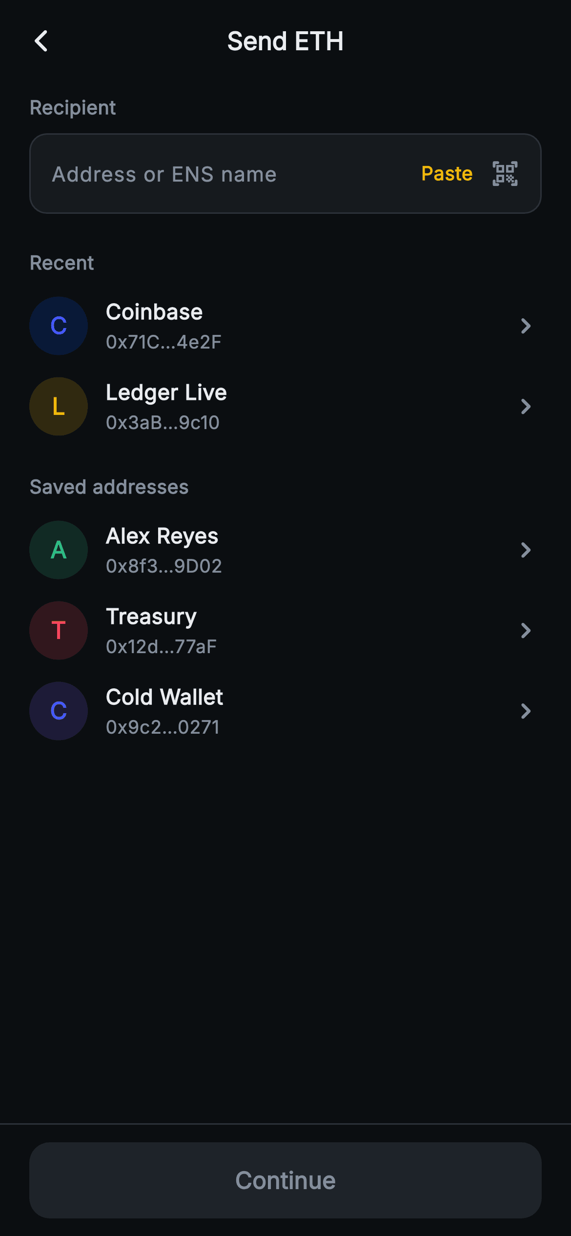
What you'll build
- ✓An address-or-ENS TextField sitting flush inside a hairline-bordered surface box with an amber cursor
- ✓A Paste action that reads the system clipboard through Clipboard.getData and fills the field in one tap
- ✓Recent and Saved contact lists rendered from a typed _Contact model with tinted circular monogram avatars
- ✓A Continue button gated on a live length check, flipping from grey to brand amber as the user types
- ✓A forced dark theme and pinned SafeArea bottom bar so the screen renders standalone as a route
Step-by-step build
Create the file
Add a new file at lib/web3_send_address/web3_send_address_screen.dart in your Flutter project.
Register the bundled fonts
No external packages — this is pure Flutter. It does bundle its design font (Inter), so drop the font file into fonts/ and declare it in pubspec.yaml:
flutter:
  fonts:
    - family: Inter
      fonts:
- asset: fonts/Inter-Regular.ttfBuild it, piece by piece
Here's how the screen goes together. Each block below is a real slice of the code with a plain-English explanation — paste them in order, or grab the whole file from the next section.
A stateful screen with three exits
import 'package:flutter/material.dart';
import 'package:flutter/services.dart';

/// Web3 send — Send (recipient). A recipient-address field with paste/scan, plus
/// recent and saved contact lists with monogram avatars. Self-contained per
/// CONVENTIONS.md: pure Flutter, bundled Inter font, no glyphs / no network
/// image, forced dark theme so it renders standalone as a route.
class Web3SendAddressScreen extends StatefulWidget {
  const Web3SendAddressScreen({
    super.key,
    this.onBack,
    this.onNext,
    this.onSelectContact,
  });

  final VoidCallback? onBack;
  final VoidCallback? onNext;
  final VoidCallback? onSelectContact;

  @override
  State<Web3SendAddressScreen> createState() => _Web3SendAddressScreenState();
}
`Web3SendAddressScreen` takes three nullable callbacks — `onBack`, `onNext`, `onSelectContact` — and nothing else, so the widget stays backend-agnostic: the host decides what 'continue' means and what tapping a contact does. Unlike a pure result page this one is a `StatefulWidget`, and the reason is a single boolean downstream — the Continue button's enabled state has to track the address field on every keystroke, and that means the text lives in state the screen owns. The constructor uses `super.key` shorthand, one of the two markers that pin the minimum SDK later on.
Palette, seed contacts, and a deliberately loose validity rule
class _Web3SendAddressScreenState extends State<Web3SendAddressScreen> {
  static const String _font = 'Inter';
  static const Color _bg = Color(0xFF0B0E11);
  static const Color _surface = Color(0xFF161A1E);
  static const Color _surfaceAlt = Color(0xFF1E2329);
  static const Color _brand = Color(0xFFF0B90B);
  static const Color _text = Color(0xFFEAECEF);
  static const Color _muted = Color(0xFF848E9C);
  static const Color _hairline = Color(0xFF2B3139);

  static const List<_Contact> _recent = <_Contact>[
    _Contact('Coinbase', '0x71C…4e2F', Color(0xFF0052FF)),
    _Contact('Ledger Live', '0x3aB…9c10', Color(0xFFF0B90B)),
  ];
  static const List<_Contact> _saved = <_Contact>[
    _Contact('Alex Reyes', '0x8f3…9D02', Color(0xFF2EBD85)),
    _Contact('Treasury', '0x12d…77aF', Color(0xFFF6465D)),
    _Contact('Cold Wallet', '0x9c2…0271', Color(0xFF7B61FF)),
  ];

  final TextEditingController _address = TextEditingController();

  @override
  void dispose() {
    _address.dispose();
    super.dispose();
  }

  bool get _valid => _address.text.trim().length >= 8;
The palette is a Binance-style dark scheme held in `static const` fields: near-black `#0B0E11` canvas, `#161A1E` surface, amber `#F0B90B` brand, `#EAECEF` text, `#848E9C` muted, `#2B3139` hairline. The demo data is two const lists of a typed `_Contact` — each entry carries a name, a pre-truncated address like `0x71C…4e2F`, and its own tint (Coinbase gets its real blue `#0052FF`, Ledger the amber, then green, red and violet for the saved three), which is what makes the avatar list read as an address book rather than five identical rows. The `_valid` getter is just `_address.text.trim().length >= 8` — a placeholder gate that keeps the demo honest without pretending to be checksum validation; the FAQ covers replacing it. The `TextEditingController` is disposed properly, a detail copy-paste code often drops.
Forcing dark mode and framing the page
  @override
  Widget build(BuildContext context) {
    return Theme(
      data: ThemeData.dark(useMaterial3: true),
      child: Scaffold(
        backgroundColor: _bg,
        appBar: AppBar(
          backgroundColor: _bg,
          elevation: 0,
          centerTitle: true,
          leading: IconButton(
            onPressed: widget.onBack,
            icon: const Icon(Icons.arrow_back_ios_new_rounded,
                size: 18, color: _text),
          ),
          title: const Text(
            'Send ETH',
            style: TextStyle(
              fontFamily: _font,
              fontSize: 17,
              fontWeight: FontWeight.w700,
              color: _text,
            ),
          ),
        ),
        body: SafeArea(
          top: false,
          child: ListView(
            padding: const EdgeInsets.fromLTRB(20, 8, 20, 20),
            children: <Widget>[
              const Text(
                'Recipient',
                style: TextStyle(
                  fontFamily: _font,
                  fontSize: 13,
                  fontWeight: FontWeight.w700,
                  color: _muted,
                ),
              ),
The whole build is wrapped in `Theme(data: ThemeData.dark(useMaterial3: true))`, so the screen renders correctly even inside a light-themed host app — important for a wallet screen where a white flash would look broken. The `AppBar` is flat (`elevation: 0`) on the same `_bg` as the body, with a centred 17px `w700` 'Send ETH' title and an 18px `arrow_back_ios_new_rounded` back button wired to `widget.onBack`. The body is a `ListView` under `SafeArea(top: false)` — the app bar already handles the notch, and a scroll view means five contacts plus the field never overflow on a short phone. The 'Recipient' label above the field is 13px `w700` in `_muted`, the same treatment the section headers get later, which keeps the page's typographic hierarchy to exactly two levels.
The address field: type, paste, or scan
              const SizedBox(height: 8),
              Container(
                padding: const EdgeInsets.symmetric(horizontal: 14),
                decoration: BoxDecoration(
                  color: _surface,
                  borderRadius: BorderRadius.circular(12),
                  border: Border.all(color: _hairline),
                ),
                child: Row(
                  children: <Widget>[
                    Expanded(
                      child: TextField(
                        controller: _address,
                        onChanged: (_) => setState(() {}),
                        style: const TextStyle(
                          fontFamily: _font,
                          fontSize: 14,
                          color: _text,
                        ),
                        cursorColor: _brand,
                        decoration: const InputDecoration(
                          isCollapsed: true,
                          border: InputBorder.none,
                          contentPadding: EdgeInsets.symmetric(vertical: 16),
                          hintText: 'Address or ENS name',
                          hintStyle: TextStyle(
                            fontFamily: _font,
                            fontSize: 14,
                            color: _muted,
                          ),
                        ),
                      ),
                    ),
                    GestureDetector(
                      onTap: () async {
                        final ClipboardData? d =
                            await Clipboard.getData('text/plain');
                        if (d?.text != null) {
                          setState(() => _address.text = d!.text!);
                        }
                      },
                      behavior: HitTestBehavior.opaque,
                      child: const Padding(
                        padding: EdgeInsets.symmetric(horizontal: 6),
                        child: Text(
                          'Paste',
                          style: TextStyle(
                            fontFamily: _font,
                            fontSize: 13,
                            fontWeight: FontWeight.w700,
                            color: _brand,
                          ),
                        ),
                      ),
                    ),
                    const SizedBox(width: 6),
                    const Icon(Icons.qr_code_scanner_rounded,
                        size: 20, color: _muted),
                  ],
                ),
              ),
The field is not a decorated `TextField` but a `Container` (surface fill, 12px radius, hairline `Border.all`) holding a Row of three inputs ranked by effort. The `TextField` itself is stripped bare — `isCollapsed: true`, `InputBorder.none`, vertical-only `contentPadding` of 16 — so the Container is the visual field and the height comes out right without fighting Material's default decoration box. `onChanged: (_) => setState(() {})` is the whole state machine: every keystroke re-runs build, which re-reads `_valid`. The hint 'Address or ENS name' quietly documents that the field accepts both. 'Paste' is a `GestureDetector` in brand amber that awaits `Clipboard.getData('text/plain')` and writes the result into the controller inside `setState` — the null-checks on `d?.text` matter because an empty clipboard returns null, not an empty string. `HitTestBehavior.opaque` plus 6px horizontal padding gives the small word a tappable footprint. The QR icon sits last in `_muted` with no handler — a visual affordance the FAQ shows how to wire.
Two contact sections from one tile builder
              const SizedBox(height: 24),
              _sectionLabel('Recent'),
              const SizedBox(height: 6),
              ..._recent.map(_contactTile),
              const SizedBox(height: 18),
              _sectionLabel('Saved addresses'),
              const SizedBox(height: 6),
              ..._saved.map(_contactTile),
            ],
          ),
The lists are assembled directly in the `ListView` children with spread-map: `..._recent.map(_contactTile)` and `..._saved.map(_contactTile)`. Because `_contactTile` is a method taking a `_Contact`, it can be passed to `map` by name — no closure, no separate list widget, no builder delegate for five rows. Spacing does the grouping work: 24px separates the field from 'Recent', 18px separates the two sections, and only 6px sits between a label and its rows, so proximity alone tells you which header owns which tiles.
The gated Continue bar
        bottomNavigationBar: Container(
          decoration: const BoxDecoration(
            color: _bg,
            border: Border(top: BorderSide(color: _hairline)),
          ),
          child: SafeArea(
            top: false,
            child: Padding(
              padding: const EdgeInsets.fromLTRB(20, 12, 20, 12),
              child: SizedBox(
                width: double.infinity,
                height: 52,
                child: FilledButton(
                  onPressed: _valid ? widget.onNext : null,
                  style: FilledButton.styleFrom(
                    backgroundColor: _brand,
                    disabledBackgroundColor: _surfaceAlt,
                    shape: RoundedRectangleBorder(
                      borderRadius: BorderRadius.circular(14),
                    ),
                  ),
                  child: Text(
                    'Continue',
                    style: TextStyle(
                      fontFamily: _font,
                      fontSize: 16,
                      fontWeight: FontWeight.w700,
                      color: _valid ? _bg : _muted,
                    ),
                  ),
                ),
              ),
            ),
          ),
        ),
      ),
    );
The bottom bar is a `Container` with a top hairline border wrapping `SafeArea(top: false)`, so the `_bg` fill runs beneath the home indicator while the 52px full-width `FilledButton` stays above it. The gate is `onPressed: _valid ? widget.onNext : null` — passing null is what actually disables a Material button, and `disabledBackgroundColor: _surfaceAlt` keeps the disabled state a visible dark panel rather than Material's default washed-out grey. The label colour flips with the same condition: `_valid ? _bg : _muted`, giving near-black text on the amber fill (amber is a light colour, so white text would fail contrast) and muted grey text while disabled. One expression drives fill, label and behaviour, so the three can never disagree.
Monogram tiles and the contact model
  Widget _sectionLabel(String s) => Text(
        s,
        style: const TextStyle(
          fontFamily: _font,
          fontSize: 13,
          fontWeight: FontWeight.w700,
          color: _muted,
        ),
      );

  Widget _contactTile(_Contact c) {
    final String monogram = c.name.isNotEmpty ? c.name[0].toUpperCase() : '?';
    return GestureDetector(
      onTap: widget.onSelectContact,
      behavior: HitTestBehavior.opaque,
      child: Padding(
        padding: const EdgeInsets.symmetric(vertical: 7),
        child: Row(
          children: <Widget>[
            Container(
              width: 40,
              height: 40,
              decoration: BoxDecoration(
                color: c.tint.withValues(alpha: 0.16),
                shape: BoxShape.circle,
              ),
              alignment: Alignment.center,
              child: Text(
                monogram,
                style: TextStyle(
                  fontFamily: _font,
                  fontSize: 16,
                  fontWeight: FontWeight.w800,
                  color: c.tint,
                ),
              ),
            ),
            const SizedBox(width: 12),
            Expanded(
              child: Column(
                crossAxisAlignment: CrossAxisAlignment.start,
                children: <Widget>[
                  Text(
                    c.name,
                    style: const TextStyle(
                      fontFamily: _font,
                      fontSize: 14.5,
                      fontWeight: FontWeight.w700,
                      color: _text,
                    ),
                  ),
                  const SizedBox(height: 2),
                  Text(
                    c.address,
                    style: const TextStyle(
                      fontFamily: _font,
                      fontSize: 12.5,
                      color: _muted,
                    ),
                  ),
                ],
              ),
            ),
            const Icon(Icons.keyboard_arrow_right_rounded,
                size: 22, color: _muted),
          ],
        ),
      ),
    );
  }
}

class _Contact {
  const _Contact(this.name, this.address, this.tint);

  final String name;
  final String address;
  final Color tint;
}
`_contactTile` derives its avatar from data: `c.name[0].toUpperCase()` with a `'?'` fallback for an empty name, drawn as a 16px `w800` letter in the contact's full-strength tint over a 40px circle of the same tint at `withValues(alpha: 0.16)`. That one-colour-two-strengths trick gives five distinct, legible avatars with no images and no asset files. The tile is a Row — avatar, then an `Expanded` column of 14.5px `w700` name over 12.5px muted truncated address, then a chevron — wrapped in a `GestureDetector` with `HitTestBehavior.opaque` so the entire row is tappable, including the gaps, and every tap routes to the single `widget.onSelectContact` callback. `_Contact` at the bottom is a three-field const class; because its constructor is const, the demo lists up in the state class can be `static const`, built once at compile time.
Full code
The complete, ready-to-paste source. Free to use in your projects — one click copies it all.
import 'package:flutter/material.dart';
import 'package:flutter/services.dart';

/// Web3 send — Send (recipient). A recipient-address field with paste/scan, plus
/// recent and saved contact lists with monogram avatars. Self-contained per
/// CONVENTIONS.md: pure Flutter, bundled Inter font, no glyphs / no network
/// image, forced dark theme so it renders standalone as a route.
class Web3SendAddressScreen extends StatefulWidget {
  const Web3SendAddressScreen({
    super.key,
    this.onBack,
    this.onNext,
    this.onSelectContact,
  });

  final VoidCallback? onBack;
  final VoidCallback? onNext;
  final VoidCallback? onSelectContact;

  @override
  State<Web3SendAddressScreen> createState() => _Web3SendAddressScreenState();
}

class _Web3SendAddressScreenState extends State<Web3SendAddressScreen> {
  static const String _font = 'Inter';
  static const Color _bg = Color(0xFF0B0E11);
  static const Color _surface = Color(0xFF161A1E);
  static const Color _surfaceAlt = Color(0xFF1E2329);
  static const Color _brand = Color(0xFFF0B90B);
  static const Color _text = Color(0xFFEAECEF);
  static const Color _muted = Color(0xFF848E9C);
  static const Color _hairline = Color(0xFF2B3139);

  static const List<_Contact> _recent = <_Contact>[
    _Contact('Coinbase', '0x71C…4e2F', Color(0xFF0052FF)),
    _Contact('Ledger Live', '0x3aB…9c10', Color(0xFFF0B90B)),
  ];
  static const List<_Contact> _saved = <_Contact>[
    _Contact('Alex Reyes', '0x8f3…9D02', Color(0xFF2EBD85)),
    _Contact('Treasury', '0x12d…77aF', Color(0xFFF6465D)),
    _Contact('Cold Wallet', '0x9c2…0271', Color(0xFF7B61FF)),
  ];

  final TextEditingController _address = TextEditingController();

  @override
  void dispose() {
    _address.dispose();
    super.dispose();
  }

  bool get _valid => _address.text.trim().length >= 8;

  @override
  Widget build(BuildContext context) {
    return Theme(
      data: ThemeData.dark(useMaterial3: true),
      child: Scaffold(
        backgroundColor: _bg,
        appBar: AppBar(
          backgroundColor: _bg,
          elevation: 0,
          centerTitle: true,
          leading: IconButton(
            onPressed: widget.onBack,
            icon: const Icon(Icons.arrow_back_ios_new_rounded,
                size: 18, color: _text),
          ),
          title: const Text(
            'Send ETH',
            style: TextStyle(
              fontFamily: _font,
              fontSize: 17,
              fontWeight: FontWeight.w700,
              color: _text,
            ),
          ),
        ),
        body: SafeArea(
          top: false,
          child: ListView(
            padding: const EdgeInsets.fromLTRB(20, 8, 20, 20),
            children: <Widget>[
              const Text(
                'Recipient',
                style: TextStyle(
                  fontFamily: _font,
                  fontSize: 13,
                  fontWeight: FontWeight.w700,
                  color: _muted,
                ),
              ),
              const SizedBox(height: 8),
              Container(
                padding: const EdgeInsets.symmetric(horizontal: 14),
                decoration: BoxDecoration(
                  color: _surface,
                  borderRadius: BorderRadius.circular(12),
                  border: Border.all(color: _hairline),
                ),
                child: Row(
                  children: <Widget>[
                    Expanded(
                      child: TextField(
                        controller: _address,
                        onChanged: (_) => setState(() {}),
                        style: const TextStyle(
                          fontFamily: _font,
                          fontSize: 14,
                          color: _text,
                        ),
                        cursorColor: _brand,
                        decoration: const InputDecoration(
                          isCollapsed: true,
                          border: InputBorder.none,
                          contentPadding: EdgeInsets.symmetric(vertical: 16),
                          hintText: 'Address or ENS name',
                          hintStyle: TextStyle(
                            fontFamily: _font,
                            fontSize: 14,
                            color: _muted,
                          ),
                        ),
                      ),
                    ),
                    GestureDetector(
                      onTap: () async {
                        final ClipboardData? d =
                            await Clipboard.getData('text/plain');
                        if (d?.text != null) {
                          setState(() => _address.text = d!.text!);
                        }
                      },
                      behavior: HitTestBehavior.opaque,
                      child: const Padding(
                        padding: EdgeInsets.symmetric(horizontal: 6),
                        child: Text(
                          'Paste',
                          style: TextStyle(
                            fontFamily: _font,
                            fontSize: 13,
                            fontWeight: FontWeight.w700,
                            color: _brand,
                          ),
                        ),
                      ),
                    ),
                    const SizedBox(width: 6),
                    const Icon(Icons.qr_code_scanner_rounded,
                        size: 20, color: _muted),
                  ],
                ),
              ),
              const SizedBox(height: 24),
              _sectionLabel('Recent'),
              const SizedBox(height: 6),
              ..._recent.map(_contactTile),
              const SizedBox(height: 18),
              _sectionLabel('Saved addresses'),
              const SizedBox(height: 6),
              ..._saved.map(_contactTile),
            ],
          ),
        ),
        bottomNavigationBar: Container(
          decoration: const BoxDecoration(
            color: _bg,
            border: Border(top: BorderSide(color: _hairline)),
          ),
          child: SafeArea(
            top: false,
            child: Padding(
              padding: const EdgeInsets.fromLTRB(20, 12, 20, 12),
              child: SizedBox(
                width: double.infinity,
                height: 52,
                child: FilledButton(
                  onPressed: _valid ? widget.onNext : null,
                  style: FilledButton.styleFrom(
                    backgroundColor: _brand,
                    disabledBackgroundColor: _surfaceAlt,
                    shape: RoundedRectangleBorder(
                      borderRadius: BorderRadius.circular(14),
                    ),
                  ),
                  child: Text(
                    'Continue',
                    style: TextStyle(
                      fontFamily: _font,
                      fontSize: 16,
                      fontWeight: FontWeight.w700,
                      color: _valid ? _bg : _muted,
                    ),
                  ),
                ),
              ),
            ),
          ),
        ),
      ),
    );
  }

  Widget _sectionLabel(String s) => Text(
        s,
        style: const TextStyle(
          fontFamily: _font,
          fontSize: 13,
          fontWeight: FontWeight.w700,
          color: _muted,
        ),
      );

  Widget _contactTile(_Contact c) {
    final String monogram = c.name.isNotEmpty ? c.name[0].toUpperCase() : '?';
    return GestureDetector(
      onTap: widget.onSelectContact,
      behavior: HitTestBehavior.opaque,
      child: Padding(
        padding: const EdgeInsets.symmetric(vertical: 7),
        child: Row(
          children: <Widget>[
            Container(
              width: 40,
              height: 40,
              decoration: BoxDecoration(
                color: c.tint.withValues(alpha: 0.16),
                shape: BoxShape.circle,
              ),
              alignment: Alignment.center,
              child: Text(
                monogram,
                style: TextStyle(
                  fontFamily: _font,
                  fontSize: 16,
                  fontWeight: FontWeight.w800,
                  color: c.tint,
                ),
              ),
            ),
            const SizedBox(width: 12),
            Expanded(
              child: Column(
                crossAxisAlignment: CrossAxisAlignment.start,
                children: <Widget>[
                  Text(
                    c.name,
                    style: const TextStyle(
                      fontFamily: _font,
                      fontSize: 14.5,
                      fontWeight: FontWeight.w700,
                      color: _text,
                    ),
                  ),
                  const SizedBox(height: 2),
                  Text(
                    c.address,
                    style: const TextStyle(
                      fontFamily: _font,
                      fontSize: 12.5,
                      color: _muted,
                    ),
                  ),
                ],
              ),
            ),
            const Icon(Icons.keyboard_arrow_right_rounded,
                size: 22, color: _muted),
          ],
        ),
      ),
    );
  }
}

class _Contact {
  const _Contact(this.name, this.address, this.tint);

  final String name;
  final String address;
  final Color tint;
}
Plus bundled 1 binary asset (fonts/images). The CLI and MCP install those for you automatically.
Two faster ways to add it
Copy-paste works, but you can skip it entirely.
1. FlutterKit CLI
One command drops this screen — and its fonts — straight into your project.
$ flutterkit add web3-send-address2. AI agent (MCP)
Connect FlutterKit's MCP server in Claude or Cursor and just ask your agent to install web3-send-address — it fetches and writes the files for you.
FAQ
Can I use this send address screen in a commercial app?
Yes. The screen is free, including commercial use — copy the code from this page or install it with the CLI and ship it in a production wallet. There is no licence key, no attribution requirement, and no paid tier behind it.
How does the address validation work, and how do I make it chain-aware?
In the file, `_valid` only checks that the trimmed input is 8+ characters — enough to gate the demo's Continue button. For a real Ethereum flow, replace the getter: match `^0x[a-fA-F0-9]{40}$` for raw addresses, verify the EIP-55 checksum on mixed-case input, and treat anything ending in `.eth` as an ENS name to resolve asynchronously before enabling Continue.
Does this need any third-party packages or font setup?
No packages. Both imports are Flutter SDK — `material.dart` and `services.dart`, the latter only for `Clipboard.getData` behind the Paste action. The Inter font ships bundled with the screen at `lib/web3_send_address/fonts/Inter.ttf`, so the typography works offline with no google_fonts dependency.
The QR icon does nothing — how do I wire a real scanner?
It is intentionally a static affordance, since camera access needs a plugin. Wrap the `Icons.qr_code_scanner_rounded` icon in a `GestureDetector`, push a scanner route using a package such as mobile_scanner, and on a successful decode write the value into `_address.text` inside `setState` — exactly what the Paste handler already does with clipboard text.
Which Flutter version does this screen require?
Flutter 3.22 or newer: the avatar tint uses `c.tint.withValues(alpha: 0.16)` and the constructors use `super.key`. On an older SDK, swap `withValues(alpha: 0.16)` for `withOpacity(0.16)` and expand the constructor to the `{Key? key} : super(key: key)` form.


