How to Build a Web3 Wallet Welcome Screen in Flutter (Full Code + Preview)
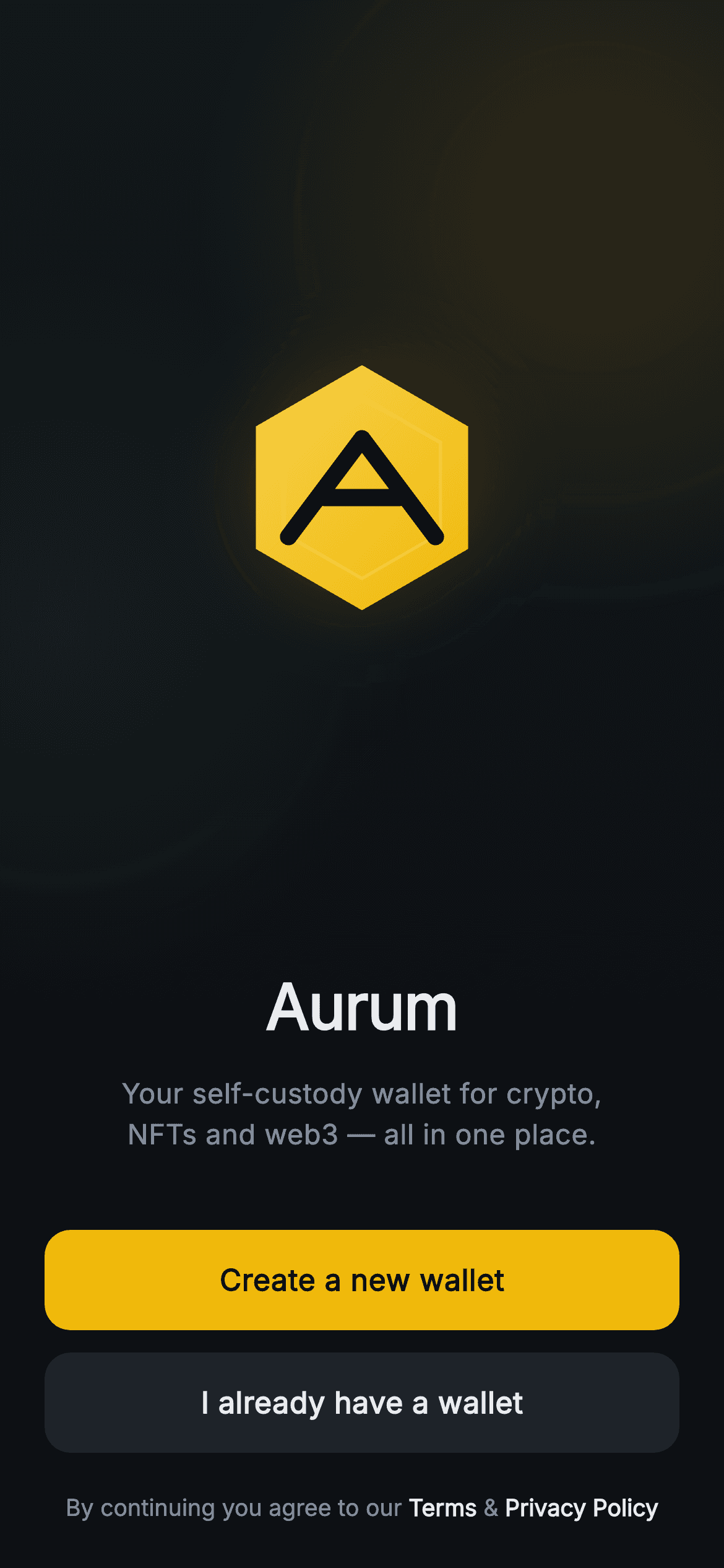
The first screen of a crypto wallet has to look trustworthy in a second, and this tutorial builds exactly that for the fictional 'Aurum' self-custody wallet. You'll paint a full-bleed dark gradient hero with two soft radial orbs, draw a 132px gold hexagon logo with an 'A' monogram entirely in code — no image files — then stack a wordmark, tagline, and two entry buttons: a gold 'Create a new wallet' and a dark 'I already have a wallet'. A tappable Terms line finishes it. It's pure Flutter with one bundled font and three callback hooks.
Watch the Flutter UI walkthrough
A short screen recording of Aurum · Welcome running, if you'd rather see it before you read the code. The written tutorial below covers everything in it.
Can't see the video? Watch it on YouTube.
What you'll build
- ✓A full-bleed dark hero painted by a CustomPainter — a vertical near-black gradient with a gold and a teal radial glow orb
- ✓A 132px pointy-top gold hexagon logo drawn from scratch, complete with a blurred glow, inner outline, and a knocked-out 'A' monogram
- ✓A centered 'Aurum' wordmark over a two-line muted tagline, sized in the bundled Inter font
- ✓Gold primary and dark secondary Material buttons with InkWell ripples, plus a tappable Terms & Privacy Policy footer
- ✓A forced dark theme and three injected VoidCallback hooks (onCreateWallet, onImportWallet, onTerms) so the screen stays backend-agnostic
Step-by-step build
Create the file
Add a new file at lib/web3_onboarding_welcome/web3_onboarding_welcome_screen.dart in your Flutter project.
Register the bundled fonts
No external packages — this is pure Flutter. It does bundle its design font (Inter), so drop the font file into fonts/ and declare it in pubspec.yaml:
flutter:
  fonts:
    - family: Inter
      fonts:
- asset: fonts/Inter-Regular.ttfBuild it, piece by piece
Here's how the screen goes together. Each block below is a real slice of the code with a plain-English explanation — paste them in order, or grab the whole file from the next section.
Imports, the stateless screen, and the exchange palette
import 'dart:math' as math;

import 'package:flutter/material.dart';

/// Web3 onboarding — Welcome. Full-bleed painted gradient hero with a hexagon
/// logo monogram and two entry CTAs (create vs import). Self-contained per
/// CONVENTIONS.md: pure Flutter, bundled Inter font, all graphics custom-painted
/// (no network image), forced dark theme so it renders standalone as a route.
class Web3OnboardingWelcomeScreen extends StatelessWidget {
  const Web3OnboardingWelcomeScreen({
    super.key,
    this.onCreateWallet,
    this.onImportWallet,
    this.onTerms,
  });

  final VoidCallback? onCreateWallet;
  final VoidCallback? onImportWallet;
  final VoidCallback? onTerms;

  static const String _font = 'Inter';
  static const Color _bg = Color(0xFF0B0E11);
  static const Color _surfaceAlt = Color(0xFF1E2329);
  static const Color _brand = Color(0xFFF0B90B);
  static const Color _text = Color(0xFFEAECEF);
  static const Color _muted = Color(0xFF848E9C);
The file imports dart:math (aliased as math, used later for the hexagon trigonometry) and Flutter's material library, then declares Web3OnboardingWelcomeScreen as a StatelessWidget — nothing on this screen changes, so stateless is correct. Its constructor takes three optional VoidCallback hooks (onCreateWallet, onImportWallet, onTerms) via super.key, which keeps the screen backend-agnostic — you decide what each button does. Six static const design tokens lock in the palette: _bg (#0B0E11) is the near-black canvas, _surfaceAlt (#1E2329) the dark button fill, _brand (#F0B90B) the signature gold, _text (#EAECEF) the near-white, and _muted (#848E9C) the grey used for secondary text. _font is 'Inter'.
Forced dark theme, the painted background, and the logo slot
  @override
  Widget build(BuildContext context) {
    return Theme(
      data: ThemeData.dark(useMaterial3: true),
      child: Scaffold(
        backgroundColor: _bg,
        body: Stack(
          fit: StackFit.expand,
          children: <Widget>[
            const Positioned.fill(
              child: CustomPaint(painter: _HeroGradientPainter()),
            ),
            SafeArea(
              child: Padding(
                padding: const EdgeInsets.fromLTRB(24, 8, 24, 24),
                child: Column(
                  crossAxisAlignment: CrossAxisAlignment.stretch,
                  children: <Widget>[
                    const Expanded(child: Center(child: _LogoMark())),
build() wraps everything in a Theme with ThemeData.dark(useMaterial3: true) so the screen renders correctly even if the host app is light — it's self-contained. Inside sits a Scaffold painted _bg, whose body is a Stack with StackFit.expand so children fill the whole screen. The first Stack child is a Positioned.fill hosting a CustomPaint(_HeroGradientPainter()) — that's the gradient hero drawn behind everything. On top, SafeArea keeps content clear of the notch, a Padding of EdgeInsets.fromLTRB(24, 8, 24, 24) insets it, and a Column with crossAxisAlignment.stretch makes children full-width. Its first child is an Expanded wrapping a centered _LogoMark, which pushes the logo into the upper space above the fold.
Wordmark, tagline, and the two entry buttons
                    const Text(
                      'Aurum',
                      textAlign: TextAlign.center,
                      style: TextStyle(
                        fontFamily: _font,
                        fontSize: 34,
                        fontWeight: FontWeight.w700,
                        letterSpacing: -0.5,
                        color: _text,
                      ),
                    ),
                    const SizedBox(height: 12),
                    const Text(
                      'Your self-custody wallet for crypto,\nNFTs and web3 — all in one place.',
                      textAlign: TextAlign.center,
                      style: TextStyle(
                        fontFamily: _font,
                        fontSize: 15,
                        fontWeight: FontWeight.w400,
                        height: 1.45,
                        color: _muted,
                      ),
                    ),
                    const SizedBox(height: 40),
                    _PrimaryButton(
                      label: 'Create a new wallet',
                      onTap: onCreateWallet,
                    ),
                    const SizedBox(height: 12),
                    _SecondaryButton(
                      label: 'I already have a wallet',
                      onTap: onImportWallet,
                    ),
                    const SizedBox(height: 20),
                    _TermsLine(onTerms: onTerms),
                  ],
                ),
              ),
            ),
          ],
        ),
      ),
    );
  }
}
Below the logo, a centered Text shows 'Aurum' in 34px Inter, FontWeight.w700, with letterSpacing -0.5 for a tight logotype feel, in the _text near-white. After a 12px gap, a second Text holds the tagline 'Your self-custody wallet for crypto,\nNFTs and web3 — all in one place.' — the \n forces the two-line break — sized 15px, height 1.45 for comfortable leading, in _muted grey. A 40px SizedBox separates the copy from the actions: a _PrimaryButton labelled 'Create a new wallet' wired to onCreateWallet, a 12px gap, a _SecondaryButton labelled 'I already have a wallet' wired to onImportWallet, a 20px gap, then the _TermsLine. This is the whole visible layout, top to bottom.
Painting the gold hexagon logo and its 'A' monogram
class _LogoPainter extends CustomPainter {
  const _LogoPainter();

  Path _hexPath(Offset c, double r) {
    final Path p = Path();
    for (int i = 0; i < 6; i++) {
      // Pointy-top hexagon.
      final double a = (-90 + i * 60) * math.pi / 180;
      final double x = c.dx + r * math.cos(a);
      final double y = c.dy + r * math.sin(a);
      if (i == 0) {
        p.moveTo(x, y);
      } else {
        p.lineTo(x, y);
      }
    }
    p.close();
    return p;
  }

  @override
  void paint(Canvas canvas, Size size) {
    final Offset c = Offset(size.width / 2, size.height / 2);
    final double r = size.width / 2;

    // Soft glow behind the mark.
    final Paint glow = Paint()
      ..color = Web3OnboardingWelcomeScreen._brand.withValues(alpha: 0.22)
      ..maskFilter = const MaskFilter.blur(BlurStyle.normal, 26);
    canvas.drawCircle(c, r * 0.86, glow);

    // Hex body — gold gradient.
    final Path hex = _hexPath(c, r);
    final Paint body = Paint()
      ..shader = const LinearGradient(
        begin: Alignment.topLeft,
        end: Alignment.bottomRight,
        colors: <Color>[Color(0xFFF7D14B), Web3OnboardingWelcomeScreen._brand],
      ).createShader(Rect.fromCircle(center: c, radius: r));
    canvas.drawPath(hex, body);

    // Subtle inner hex outline.
    final Paint inner = Paint()
      ..style = PaintingStyle.stroke
      ..strokeWidth = 1.5
      ..color = Colors.white.withValues(alpha: 0.18);
    canvas.drawPath(_hexPath(c, r * 0.74), inner);

    // "A" monogram — two strokes + crossbar, in the near-black bg color.
    final Paint mark = Paint()
      ..style = PaintingStyle.stroke
      ..strokeWidth = size.width * 0.07
      ..strokeCap = StrokeCap.round
      ..strokeJoin = StrokeJoin.round
      ..color = Web3OnboardingWelcomeScreen._bg;
    final double aw = size.width * 0.30;
    final double top = c.dy - size.height * 0.20;
    final double bot = c.dy + size.height * 0.20;
    final Path a = Path()
      ..moveTo(c.dx - aw, bot)
      ..lineTo(c.dx, top)
      ..lineTo(c.dx + aw, bot);
    canvas.drawPath(a, mark);
    canvas.drawLine(
      Offset(c.dx - aw * 0.52, c.dy + size.height * 0.04),
      Offset(c.dx + aw * 0.52, c.dy + size.height * 0.04),
      mark,
    );
  }

  @override
  bool shouldRepaint(_LogoPainter oldDelegate) => false;
}
_LogoPainter draws the mark with no image asset. _hexPath loops six times, placing vertices with cos/sin at 60-degree steps starting at -90 (a pointy-top hexagon) and closes the path. In paint(), a blurred Paint with a MaskFilter.blur of radius 26 draws a soft gold glow circle behind the mark at 22% opacity. The hex body is filled with a LinearGradient from #F7D14B to _brand gold, top-left to bottom-right. A thin 1.5px white stroke at 18% opacity draws a smaller inner hex (r * 0.74) for detail. Finally the 'A' is stroked in the _bg near-black color — two lines up to an apex plus a crossbar drawn with drawLine — so the letter reads as negative space cut into the gold. shouldRepaint returns false since the art never changes.
The full-bleed gradient hero with depth orbs
/// Full-bleed dark gradient with two soft gold/teal orbs and a faint hex grid.
class _HeroGradientPainter extends CustomPainter {
  const _HeroGradientPainter();

  @override
  void paint(Canvas canvas, Size size) {
    final Rect rect = Offset.zero & size;
    final Paint base = Paint()
      ..shader = const LinearGradient(
        begin: Alignment.topCenter,
        end: Alignment.bottomCenter,
        colors: <Color>[Color(0xFF12161B), Web3OnboardingWelcomeScreen._bg],
      ).createShader(rect);
    canvas.drawRect(rect, base);

    void orb(Offset center, double radius, Color color) {
      final Paint p = Paint()
        ..shader = RadialGradient(
          colors: <Color>[color, color.withValues(alpha: 0)],
        ).createShader(Rect.fromCircle(center: center, radius: radius));
      canvas.drawCircle(center, radius, p);
    }

    orb(Offset(size.width * 0.82, size.height * 0.14), size.width * 0.55,
        Web3OnboardingWelcomeScreen._brand.withValues(alpha: 0.14));
    orb(Offset(size.width * 0.08, size.height * 0.40), size.width * 0.5,
        const Color(0xFF2EBD85).withValues(alpha: 0.08));
  }

  @override
  bool shouldRepaint(_HeroGradientPainter oldDelegate) => false;
}
_HeroGradientPainter paints the background. It first fills the whole rect with a vertical LinearGradient from #12161B at the top to _bg at the bottom, giving a subtle top-to-bottom fade. A local orb() helper then draws a RadialGradient circle that fades from a color to fully transparent (color.withValues(alpha: 0)) — a soft glow. It's called twice: a large gold orb (55% of width) near the top-right at 14% opacity, and a fainter teal orb (#2EBD85, the exchange green) mid-left at 8% opacity. Together they add colored depth to an otherwise flat dark canvas without any image. shouldRepaint is false — the gradient is static.
The two Material buttons and the tappable Terms line
class _PrimaryButton extends StatelessWidget {
  const _PrimaryButton({required this.label, required this.onTap});

  final String label;
  final VoidCallback? onTap;

  @override
  Widget build(BuildContext context) {
    return SizedBox(
      height: 54,
      child: Material(
        color: Web3OnboardingWelcomeScreen._brand,
        borderRadius: BorderRadius.circular(14),
        child: InkWell(
          borderRadius: BorderRadius.circular(14),
          onTap: onTap,
          child: Center(
            child: Text(
              label,
              style: const TextStyle(
                fontFamily: Web3OnboardingWelcomeScreen._font,
                fontSize: 16,
                fontWeight: FontWeight.w600,
                color: Color(0xFF0B0E11),
              ),
            ),
          ),
        ),
      ),
    );
  }
}

class _SecondaryButton extends StatelessWidget {
  const _SecondaryButton({required this.label, required this.onTap});

  final String label;
  final VoidCallback? onTap;

  @override
  Widget build(BuildContext context) {
    return SizedBox(
      height: 54,
      child: Material(
        color: Web3OnboardingWelcomeScreen._surfaceAlt,
        borderRadius: BorderRadius.circular(14),
        child: InkWell(
          borderRadius: BorderRadius.circular(14),
          onTap: onTap,
          child: Center(
            child: Text(
              label,
              style: const TextStyle(
                fontFamily: Web3OnboardingWelcomeScreen._font,
                fontSize: 16,
                fontWeight: FontWeight.w600,
                color: Web3OnboardingWelcomeScreen._text,
              ),
            ),
          ),
        ),
      ),
    );
  }
}

class _TermsLine extends StatelessWidget {
  const _TermsLine({required this.onTerms});

  final VoidCallback? onTerms;

  @override
  Widget build(BuildContext context) {
    return GestureDetector(
      onTap: onTerms,
      behavior: HitTestBehavior.opaque,
      child: RichText(
        textAlign: TextAlign.center,
        text: const TextSpan(
          style: TextStyle(
            fontFamily: Web3OnboardingWelcomeScreen._font,
            fontSize: 12.5,
            height: 1.4,
            color: Web3OnboardingWelcomeScreen._muted,
          ),
          children: <TextSpan>[
            TextSpan(text: 'By continuing you agree to our '),
            TextSpan(
              text: 'Terms',
              style: TextStyle(
                color: Web3OnboardingWelcomeScreen._text,
                fontWeight: FontWeight.w600,
              ),
            ),
            TextSpan(text: ' & '),
            TextSpan(
              text: 'Privacy Policy',
              style: TextStyle(
                color: Web3OnboardingWelcomeScreen._text,
                fontWeight: FontWeight.w600,
              ),
            ),
          ],
        ),
      ),
    );
  }
}
_PrimaryButton is a 54px-tall SizedBox holding a Material tinted _brand gold with a 14px BorderRadius, wrapping an InkWell (matching radius) so taps ripple and route to onTap; its centered label is 16px Inter w600 in the dark #0B0E11 for contrast on gold. _SecondaryButton is identical in structure but uses the _surfaceAlt dark fill with _text near-white label, giving the visual hierarchy of primary vs secondary. _TermsLine is a GestureDetector with HitTestBehavior.opaque (so the gaps between words are still tappable) wrapping a RichText: a base TextSpan in 12.5px _muted grey with 'Terms' and 'Privacy Policy' as nested spans bumped to _text white and w600 to read as links, all firing the single onTerms callback.
Full code
The complete, ready-to-paste source. Free to use in your projects — one click copies it all.
import 'dart:math' as math;

import 'package:flutter/material.dart';

/// Web3 onboarding — Welcome. Full-bleed painted gradient hero with a hexagon
/// logo monogram and two entry CTAs (create vs import). Self-contained per
/// CONVENTIONS.md: pure Flutter, bundled Inter font, all graphics custom-painted
/// (no network image), forced dark theme so it renders standalone as a route.
class Web3OnboardingWelcomeScreen extends StatelessWidget {
  const Web3OnboardingWelcomeScreen({
    super.key,
    this.onCreateWallet,
    this.onImportWallet,
    this.onTerms,
  });

  final VoidCallback? onCreateWallet;
  final VoidCallback? onImportWallet;
  final VoidCallback? onTerms;

  static const String _font = 'Inter';
  static const Color _bg = Color(0xFF0B0E11);
  static const Color _surfaceAlt = Color(0xFF1E2329);
  static const Color _brand = Color(0xFFF0B90B);
  static const Color _text = Color(0xFFEAECEF);
  static const Color _muted = Color(0xFF848E9C);

  @override
  Widget build(BuildContext context) {
    return Theme(
      data: ThemeData.dark(useMaterial3: true),
      child: Scaffold(
        backgroundColor: _bg,
        body: Stack(
          fit: StackFit.expand,
          children: <Widget>[
            const Positioned.fill(
              child: CustomPaint(painter: _HeroGradientPainter()),
            ),
            SafeArea(
              child: Padding(
                padding: const EdgeInsets.fromLTRB(24, 8, 24, 24),
                child: Column(
                  crossAxisAlignment: CrossAxisAlignment.stretch,
                  children: <Widget>[
                    const Expanded(child: Center(child: _LogoMark())),
                    const Text(
                      'Aurum',
                      textAlign: TextAlign.center,
                      style: TextStyle(
                        fontFamily: _font,
                        fontSize: 34,
                        fontWeight: FontWeight.w700,
                        letterSpacing: -0.5,
                        color: _text,
                      ),
                    ),
                    const SizedBox(height: 12),
                    const Text(
                      'Your self-custody wallet for crypto,\nNFTs and web3 — all in one place.',
                      textAlign: TextAlign.center,
                      style: TextStyle(
                        fontFamily: _font,
                        fontSize: 15,
                        fontWeight: FontWeight.w400,
                        height: 1.45,
                        color: _muted,
                      ),
                    ),
                    const SizedBox(height: 40),
                    _PrimaryButton(
                      label: 'Create a new wallet',
                      onTap: onCreateWallet,
                    ),
                    const SizedBox(height: 12),
                    _SecondaryButton(
                      label: 'I already have a wallet',
                      onTap: onImportWallet,
                    ),
                    const SizedBox(height: 20),
                    _TermsLine(onTerms: onTerms),
                  ],
                ),
              ),
            ),
          ],
        ),
      ),
    );
  }
}

/// Hexagon logo with a gold gradient and an inner "A" cut from negative space.
class _LogoMark extends StatelessWidget {
  const _LogoMark();

  @override
  Widget build(BuildContext context) {
    return SizedBox(
      width: 132,
      height: 132,
      child: CustomPaint(painter: _LogoPainter()),
    );
  }
}

class _LogoPainter extends CustomPainter {
  const _LogoPainter();

  Path _hexPath(Offset c, double r) {
    final Path p = Path();
    for (int i = 0; i < 6; i++) {
      // Pointy-top hexagon.
      final double a = (-90 + i * 60) * math.pi / 180;
      final double x = c.dx + r * math.cos(a);
      final double y = c.dy + r * math.sin(a);
      if (i == 0) {
        p.moveTo(x, y);
      } else {
        p.lineTo(x, y);
      }
    }
    p.close();
    return p;
  }

  @override
  void paint(Canvas canvas, Size size) {
    final Offset c = Offset(size.width / 2, size.height / 2);
    final double r = size.width / 2;

    // Soft glow behind the mark.
    final Paint glow = Paint()
      ..color = Web3OnboardingWelcomeScreen._brand.withValues(alpha: 0.22)
      ..maskFilter = const MaskFilter.blur(BlurStyle.normal, 26);
    canvas.drawCircle(c, r * 0.86, glow);

    // Hex body — gold gradient.
    final Path hex = _hexPath(c, r);
    final Paint body = Paint()
      ..shader = const LinearGradient(
        begin: Alignment.topLeft,
        end: Alignment.bottomRight,
        colors: <Color>[Color(0xFFF7D14B), Web3OnboardingWelcomeScreen._brand],
      ).createShader(Rect.fromCircle(center: c, radius: r));
    canvas.drawPath(hex, body);

    // Subtle inner hex outline.
    final Paint inner = Paint()
      ..style = PaintingStyle.stroke
      ..strokeWidth = 1.5
      ..color = Colors.white.withValues(alpha: 0.18);
    canvas.drawPath(_hexPath(c, r * 0.74), inner);

    // "A" monogram — two strokes + crossbar, in the near-black bg color.
    final Paint mark = Paint()
      ..style = PaintingStyle.stroke
      ..strokeWidth = size.width * 0.07
      ..strokeCap = StrokeCap.round
      ..strokeJoin = StrokeJoin.round
      ..color = Web3OnboardingWelcomeScreen._bg;
    final double aw = size.width * 0.30;
    final double top = c.dy - size.height * 0.20;
    final double bot = c.dy + size.height * 0.20;
    final Path a = Path()
      ..moveTo(c.dx - aw, bot)
      ..lineTo(c.dx, top)
      ..lineTo(c.dx + aw, bot);
    canvas.drawPath(a, mark);
    canvas.drawLine(
      Offset(c.dx - aw * 0.52, c.dy + size.height * 0.04),
      Offset(c.dx + aw * 0.52, c.dy + size.height * 0.04),
      mark,
    );
  }

  @override
  bool shouldRepaint(_LogoPainter oldDelegate) => false;
}

/// Full-bleed dark gradient with two soft gold/teal orbs and a faint hex grid.
class _HeroGradientPainter extends CustomPainter {
  const _HeroGradientPainter();

  @override
  void paint(Canvas canvas, Size size) {
    final Rect rect = Offset.zero & size;
    final Paint base = Paint()
      ..shader = const LinearGradient(
        begin: Alignment.topCenter,
        end: Alignment.bottomCenter,
        colors: <Color>[Color(0xFF12161B), Web3OnboardingWelcomeScreen._bg],
      ).createShader(rect);
    canvas.drawRect(rect, base);

    void orb(Offset center, double radius, Color color) {
      final Paint p = Paint()
        ..shader = RadialGradient(
          colors: <Color>[color, color.withValues(alpha: 0)],
        ).createShader(Rect.fromCircle(center: center, radius: radius));
      canvas.drawCircle(center, radius, p);
    }

    orb(Offset(size.width * 0.82, size.height * 0.14), size.width * 0.55,
        Web3OnboardingWelcomeScreen._brand.withValues(alpha: 0.14));
    orb(Offset(size.width * 0.08, size.height * 0.40), size.width * 0.5,
        const Color(0xFF2EBD85).withValues(alpha: 0.08));
  }

  @override
  bool shouldRepaint(_HeroGradientPainter oldDelegate) => false;
}

class _PrimaryButton extends StatelessWidget {
  const _PrimaryButton({required this.label, required this.onTap});

  final String label;
  final VoidCallback? onTap;

  @override
  Widget build(BuildContext context) {
    return SizedBox(
      height: 54,
      child: Material(
        color: Web3OnboardingWelcomeScreen._brand,
        borderRadius: BorderRadius.circular(14),
        child: InkWell(
          borderRadius: BorderRadius.circular(14),
          onTap: onTap,
          child: Center(
            child: Text(
              label,
              style: const TextStyle(
                fontFamily: Web3OnboardingWelcomeScreen._font,
                fontSize: 16,
                fontWeight: FontWeight.w600,
                color: Color(0xFF0B0E11),
              ),
            ),
          ),
        ),
      ),
    );
  }
}

class _SecondaryButton extends StatelessWidget {
  const _SecondaryButton({required this.label, required this.onTap});

  final String label;
  final VoidCallback? onTap;

  @override
  Widget build(BuildContext context) {
    return SizedBox(
      height: 54,
      child: Material(
        color: Web3OnboardingWelcomeScreen._surfaceAlt,
        borderRadius: BorderRadius.circular(14),
        child: InkWell(
          borderRadius: BorderRadius.circular(14),
          onTap: onTap,
          child: Center(
            child: Text(
              label,
              style: const TextStyle(
                fontFamily: Web3OnboardingWelcomeScreen._font,
                fontSize: 16,
                fontWeight: FontWeight.w600,
                color: Web3OnboardingWelcomeScreen._text,
              ),
            ),
          ),
        ),
      ),
    );
  }
}

class _TermsLine extends StatelessWidget {
  const _TermsLine({required this.onTerms});

  final VoidCallback? onTerms;

  @override
  Widget build(BuildContext context) {
    return GestureDetector(
      onTap: onTerms,
      behavior: HitTestBehavior.opaque,
      child: RichText(
        textAlign: TextAlign.center,
        text: const TextSpan(
          style: TextStyle(
            fontFamily: Web3OnboardingWelcomeScreen._font,
            fontSize: 12.5,
            height: 1.4,
            color: Web3OnboardingWelcomeScreen._muted,
          ),
          children: <TextSpan>[
            TextSpan(text: 'By continuing you agree to our '),
            TextSpan(
              text: 'Terms',
              style: TextStyle(
                color: Web3OnboardingWelcomeScreen._text,
                fontWeight: FontWeight.w600,
              ),
            ),
            TextSpan(text: ' & '),
            TextSpan(
              text: 'Privacy Policy',
              style: TextStyle(
                color: Web3OnboardingWelcomeScreen._text,
                fontWeight: FontWeight.w600,
              ),
            ),
          ],
        ),
      ),
    );
  }
}
Plus bundled 1 binary asset (fonts/images). The CLI and MCP install those for you automatically.
Two faster ways to add it
Copy-paste works, but you can skip it entirely.
1. FlutterKit CLI
One command drops this screen — and its fonts — straight into your project.
$ flutterkit add web3-onboarding-welcome2. AI agent (MCP)
Connect FlutterKit's MCP server in Claude or Cursor and just ask your agent to install web3-onboarding-welcome — it fetches and writes the files for you.
FAQ
Is this Web3 welcome screen free to use?
Yes. The full Dart source on this page is free to copy into your own apps, personal or commercial. Paste it directly, install it with the FlutterKit CLI (flutterkit add web3-onboarding-welcome), or have an AI agent add it for you via MCP.
Does it need any external packages?
No — it's pure Flutter, built on the material library and dart:math for the hexagon geometry. The only extra asset is the bundled Inter font, which you register in pubspec.yaml as shown in step 2. The CLI and MCP install that font file for you. All graphics — the hero gradient and the gold hexagon logo — are custom-painted, so there are no image assets to ship.
Which Flutter version does it target?
It uses modern Flutter APIs like Color.withValues() (for the glow and orb opacities) and super parameters in the constructor, so it targets Flutter 3.22+ (Dart 3). On an older SDK, swap each withValues(alpha: x) for withOpacity(x) and it will compile.


