How to Build a Web3 Onboarding Carousel in Flutter (Full Code + Preview)
Onboarding is your one shot to explain why a crypto app is worth trusting, and a swipeable carousel does it without a wall of text. This tutorial builds a three-page Web3 onboarding flow in Flutter — Trade, Self-custody, and Stake — on a near-black, exchange-style canvas. Each page pairs a fully code-painted illustration (a price chart, a shield with a keyhole, a staking yield ring) with a headline and a short body. You'll wire a PageView, an animated dot indicator, a Skip shortcut, and a button that reads 'Next' until the last slide, then flips to 'Get started' — all in pure Flutter.
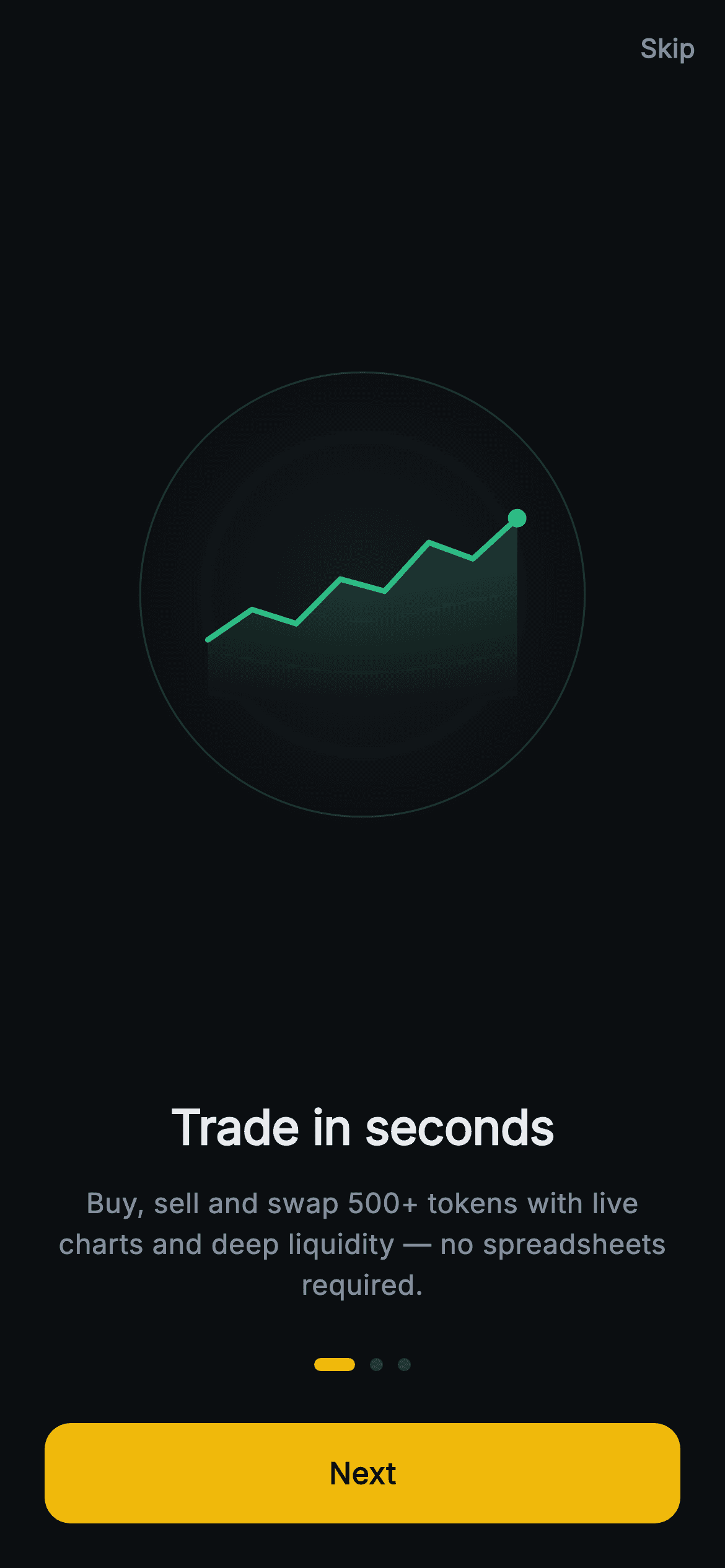
Watch the Flutter UI walkthrough
A short screen recording of Aurum · Feature Carousel running, if you'd rather see it before you read the code. The written tutorial below covers everything in it.
Can't see the video? Watch it on YouTube.
What you'll build
- ✓A three-page swipeable onboarding carousel (Trade / Self-custody / Stake) driven by a PageView.builder
- ✓Three CustomPainter illustrations drawn entirely in code — a green price chart, a gold shield with a keyhole, and a staking yield ring — with zero image assets
- ✓An animated pill dot indicator whose active dot stretches to 22px in the brand gold
- ✓A smart primary button that shows 'Next' and eases to the following page, then switches to 'Get started' on the final slide
- ✓A dark, exchange-style theme with a Skip shortcut, onDone/onSkip callbacks, and the bundled Inter font
Step-by-step build
Create the file
Add a new file at lib/web3_onboarding_carousel/web3_onboarding_carousel_screen.dart in your Flutter project.
Register the bundled fonts
No external packages — this is pure Flutter. It does bundle its design font (Inter), so drop the font file into fonts/ and declare it in pubspec.yaml:
flutter:
  fonts:
    - family: Inter
      fonts:
- asset: fonts/Inter-Regular.ttfBuild it, piece by piece
Here's how the screen goes together. Each block below is a real slice of the code with a plain-English explanation — paste them in order, or grab the whole file from the next section.
Imports, the stateful screen, and color tokens
import 'package:flutter/material.dart';

/// Web3 onboarding — Feature Carousel. A 3-page swipe (Trade / Self-custody /
/// Stake) with custom-painted illustrations and a dot indicator. Self-contained
/// per CONVENTIONS.md: pure Flutter, bundled Inter font, painted graphics only,
/// forced dark theme so it renders standalone as a route.
class Web3OnboardingCarouselScreen extends StatefulWidget {
  const Web3OnboardingCarouselScreen({
    super.key,
    this.onDone,
    this.onSkip,
  });

  final VoidCallback? onDone;
  final VoidCallback? onSkip;

  @override
  State<Web3OnboardingCarouselScreen> createState() =>
      _Web3OnboardingCarouselScreenState();
}

class _Web3OnboardingCarouselScreenState
    extends State<Web3OnboardingCarouselScreen> {
  static const String _font = 'Inter';
  static const Color _bg = Color(0xFF0B0E11);
  static const Color _brand = Color(0xFFF0B90B);
  static const Color _text = Color(0xFFEAECEF);
  static const Color _muted = Color(0xFF848E9C);
  static const Color _hairline = Color(0xFF2B3139);
The file imports only Flutter's material library and declares Web3OnboardingCarouselScreen as a StatefulWidget, because the current page index changes as the user swipes. Its constructor exposes two optional callbacks, onDone and onSkip, so the parent decides what happens when onboarding finishes or is skipped. Inside the State, six private const Colors act as design tokens: _bg (#0B0E11) is the near-black exchange canvas, _brand (#F0B90B) is the gold accent, _text (#EAECEF) is the near-white headline color, _muted (#848E9C) is the grey body text, and _hairline (#2B3139) is the faint inactive-dot / divider color.
The PageController, the three slides, and navigation logic
  final PageController _controller = PageController();
  int _page = 0;

  static const List<_Slide> _slides = <_Slide>[
    _Slide(
      kind: _SlideKind.trade,
      title: 'Trade in seconds',
      body: 'Buy, sell and swap 500+ tokens with live charts and deep '
          'liquidity — no spreadsheets required.',
    ),
    _Slide(
      kind: _SlideKind.custody,
      title: 'You hold the keys',
      body: 'Self-custody by design. Your recovery phrase never leaves your '
          'device, so only you control your assets.',
    ),
    _Slide(
      kind: _SlideKind.stake,
      title: 'Put crypto to work',
      body: 'Earn rewards by staking and lending, with transparent APYs and '
          'flexible lock periods.',
    ),
  ];

  @override
  void dispose() {
    _controller.dispose();
    super.dispose();
  }

  bool get _isLast => _page == _slides.length - 1;

  void _next() {
    if (_isLast) {
      widget.onDone?.call();
    } else {
      _controller.nextPage(
        duration: const Duration(milliseconds: 320),
        curve: Curves.easeOutCubic,
      );
    }
  }
A PageController drives the carousel and an int _page tracks which slide is showing. The _slides list defines three const _Slide records, each with a _SlideKind (trade, custody, stake), a title, and a body — so the content is data, not hard-coded widgets. dispose() releases the PageController to avoid a leak. The _isLast getter is true on the final slide, and _next() uses it: on the last page it fires widget.onDone, otherwise it calls _controller.nextPage with a 320ms easeOutCubic animation to glide to the following slide.
Dark theme, Scaffold, and the Skip shortcut
  @override
  Widget build(BuildContext context) {
    return Theme(
      data: ThemeData.dark(useMaterial3: true),
      child: Scaffold(
        backgroundColor: _bg,
        body: SafeArea(
          child: Column(
            crossAxisAlignment: CrossAxisAlignment.stretch,
            children: <Widget>[
              Align(
                alignment: Alignment.centerRight,
                child: GestureDetector(
                  onTap: widget.onSkip,
                  behavior: HitTestBehavior.opaque,
                  child: const Padding(
                    padding: EdgeInsets.all(16),
                    child: Text(
                      'Skip',
                      style: TextStyle(
                        fontFamily: _font,
                        fontSize: 14,
                        fontWeight: FontWeight.w600,
                        color: _muted,
                      ),
                    ),
                  ),
                ),
              ),
build() wraps everything in a Theme with ThemeData.dark(useMaterial3: true) so the screen renders correctly as a standalone dark route, then paints the Scaffold with _bg and uses SafeArea to clear the notch and home indicator. The outer Column stretches its children full-width. First inside it is the Skip control: an Align pinned to centerRight holds a GestureDetector (behavior: HitTestBehavior.opaque so the whole padded area is tappable) that calls widget.onSkip, showing 14px semibold 'Skip' text in the _muted grey.
The swipeable carousel with per-slide illustrations
              Expanded(
                child: PageView.builder(
                  controller: _controller,
                  itemCount: _slides.length,
                  onPageChanged: (int i) => setState(() => _page = i),
                  itemBuilder: (BuildContext context, int i) {
                    final _Slide s = _slides[i];
                    return Padding(
                      padding: const EdgeInsets.symmetric(horizontal: 24),
                      child: Column(
                        crossAxisAlignment: CrossAxisAlignment.stretch,
                        children: <Widget>[
                          Expanded(
                            child: Center(
                              child: SizedBox(
                                width: 260,
                                height: 260,
                                child: CustomPaint(
                                  painter: _SlidePainter(s.kind),
                                ),
                              ),
                            ),
                          ),
                          Text(
                            s.title,
                            textAlign: TextAlign.center,
                            style: const TextStyle(
                              fontFamily: _font,
                              fontSize: 26,
                              fontWeight: FontWeight.w700,
                              letterSpacing: -0.3,
                              color: _text,
                            ),
                          ),
                          const SizedBox(height: 12),
                          Text(
                            s.body,
                            textAlign: TextAlign.center,
                            style: const TextStyle(
                              fontFamily: _font,
                              fontSize: 15,
                              height: 1.45,
                              color: _muted,
                            ),
                          ),
                        ],
                      ),
                    );
                  },
                ),
              ),
An Expanded gives the PageView.builder all the leftover vertical space. It uses _controller, an itemCount from _slides, and onPageChanged to setState the current _page (which re-renders the dots below). Each page is padded 24px horizontally and stacks three things in a Column: an Expanded + Center holding a 260x260 CustomPaint whose painter is _SlidePainter(s.kind) — the code-drawn illustration — then the slide's title in 26px bold Inter (_text) with -0.3 letter-spacing, a 12px gap, and the body in 15px Inter (_muted) with 1.45 line height, all centered.
The animated dot indicator and the Next / Get started button
              const SizedBox(height: 28),
              Row(
                mainAxisAlignment: MainAxisAlignment.center,
                children: <Widget>[
                  for (int i = 0; i < _slides.length; i++)
                    AnimatedContainer(
                      duration: const Duration(milliseconds: 240),
                      margin: const EdgeInsets.symmetric(horizontal: 4),
                      width: i == _page ? 22 : 7,
                      height: 7,
                      decoration: BoxDecoration(
                        color: i == _page ? _brand : _hairline,
                        borderRadius: BorderRadius.circular(9999),
                      ),
                    ),
                ],
              ),
              const SizedBox(height: 28),
              Padding(
                padding: const EdgeInsets.fromLTRB(24, 0, 24, 24),
                child: SizedBox(
                  height: 54,
                  child: Material(
                    color: _brand,
                    borderRadius: BorderRadius.circular(14),
                    child: InkWell(
                      borderRadius: BorderRadius.circular(14),
                      onTap: _next,
                      child: Center(
                        child: Text(
                          _isLast ? 'Get started' : 'Next',
                          style: const TextStyle(
                            fontFamily: _font,
                            fontSize: 16,
                            fontWeight: FontWeight.w600,
                            color: _bg,
                          ),
                        ),
                      ),
                    ),
                  ),
                ),
              ),
            ],
          ),
        ),
      ),
    );
  }
}
A centered Row builds one dot per slide with a for-loop. Each dot is an AnimatedContainer that animates over 240ms: the active dot (i == _page) widens to 22px and turns _brand gold, while inactive dots stay 7px and _hairline grey, with fully rounded corners (radius 9999). Below, a 54px-tall Material in _brand with a 14px radius wraps an InkWell (for the ripple) whose onTap is _next. Its centered label reads _isLast ? 'Get started' : 'Next' in 16px semibold Inter, colored _bg so the dark text reads against the gold button.
The CustomPainter: shared disc plus the price-chart illustration
/// Procedural illustration per slide — a chart, a shield+key, or a yield ring.
class _SlidePainter extends CustomPainter {
  const _SlidePainter(this.kind);

  final _SlideKind kind;

  static const Color _brand = Color(0xFFF0B90B);
  static const Color _up = Color(0xFF2EBD85);
  static const Color _surface = Color(0xFF161A1E);
  static const Color _hairline = Color(0xFF2B3139);

  @override
  void paint(Canvas canvas, Size size) {
    final Offset c = Offset(size.width / 2, size.height / 2);
    final double r = size.width / 2;

    // Shared backing disc with a faint ring.
    final Paint disc = Paint()
      ..shader = RadialGradient(
        colors: <Color>[_surface, _surface.withValues(alpha: 0)],
      ).createShader(Rect.fromCircle(center: c, radius: r));
    canvas.drawCircle(c, r, disc);
    canvas.drawCircle(
      c,
      r * 0.92,
      Paint()
        ..style = PaintingStyle.stroke
        ..strokeWidth = 1
        ..color = _hairline,
    );

    switch (kind) {
      case _SlideKind.trade:
        _paintTrade(canvas, size);
        break;
      case _SlideKind.custody:
        _paintCustody(canvas, size);
        break;
      case _SlideKind.stake:
        _paintStake(canvas, size);
        break;
    }
  }

  void _paintTrade(Canvas canvas, Size size) {
    final double w = size.width, h = size.height;
    final Rect area = Rect.fromLTWH(w * 0.18, h * 0.30, w * 0.64, h * 0.42);
    final List<double> ys = <double>[0.7, 0.55, 0.62, 0.4, 0.46, 0.22, 0.3, 0.1];
    final Path line = Path();
    for (int i = 0; i < ys.length; i++) {
      final double x = area.left + area.width * i / (ys.length - 1);
      final double y = area.top + area.height * ys[i];
      if (i == 0) {
        line.moveTo(x, y);
      } else {
        line.lineTo(x, y);
      }
    }
    final Path fill = Path.from(line)
      ..lineTo(area.right, area.bottom)
      ..lineTo(area.left, area.bottom)
      ..close();
    canvas.drawPath(
      fill,
      Paint()
        ..shader = LinearGradient(
          begin: Alignment.topCenter,
          end: Alignment.bottomCenter,
          colors: <Color>[_up.withValues(alpha: 0.32), _up.withValues(alpha: 0)],
        ).createShader(area),
    );
    canvas.drawPath(
      line,
      Paint()
        ..style = PaintingStyle.stroke
        ..strokeWidth = 3
        ..strokeJoin = StrokeJoin.round
        ..strokeCap = StrokeCap.round
        ..color = _up,
    );
    // Last-price dot.
    canvas.drawCircle(
      Offset(area.right, area.top + area.height * ys.last),
      5,
      Paint()..color = _up,
    );
  }
_SlidePainter is one CustomPainter that draws a different graphic per _SlideKind. Its paint() first lays down a shared backing: a RadialGradient disc fading _surface (#161A1E) to transparent via withValues(alpha: 0), plus a 1px _hairline stroke ring at 92% radius, then switch-dispatches to _paintTrade, _paintCustody, or _paintStake. _paintTrade builds the price line by walking a list of normalized ys with Path.moveTo/lineTo, closes a duplicate path to the baseline for a green (_up #2EBD85) top-to-bottom gradient fill, strokes the line 3px with rounded caps, and drops a last-price dot at the end. The sibling _paintCustody (shield + keyhole) and _paintStake (yield ring + coin) below use the same Path-and-gradient approach.
Full code
The complete, ready-to-paste source. Free to use in your projects — one click copies it all.
import 'package:flutter/material.dart';

/// Web3 onboarding — Feature Carousel. A 3-page swipe (Trade / Self-custody /
/// Stake) with custom-painted illustrations and a dot indicator. Self-contained
/// per CONVENTIONS.md: pure Flutter, bundled Inter font, painted graphics only,
/// forced dark theme so it renders standalone as a route.
class Web3OnboardingCarouselScreen extends StatefulWidget {
  const Web3OnboardingCarouselScreen({
    super.key,
    this.onDone,
    this.onSkip,
  });

  final VoidCallback? onDone;
  final VoidCallback? onSkip;

  @override
  State<Web3OnboardingCarouselScreen> createState() =>
      _Web3OnboardingCarouselScreenState();
}

class _Web3OnboardingCarouselScreenState
    extends State<Web3OnboardingCarouselScreen> {
  static const String _font = 'Inter';
  static const Color _bg = Color(0xFF0B0E11);
  static const Color _brand = Color(0xFFF0B90B);
  static const Color _text = Color(0xFFEAECEF);
  static const Color _muted = Color(0xFF848E9C);
  static const Color _hairline = Color(0xFF2B3139);

  final PageController _controller = PageController();
  int _page = 0;

  static const List<_Slide> _slides = <_Slide>[
    _Slide(
      kind: _SlideKind.trade,
      title: 'Trade in seconds',
      body: 'Buy, sell and swap 500+ tokens with live charts and deep '
          'liquidity — no spreadsheets required.',
    ),
    _Slide(
      kind: _SlideKind.custody,
      title: 'You hold the keys',
      body: 'Self-custody by design. Your recovery phrase never leaves your '
          'device, so only you control your assets.',
    ),
    _Slide(
      kind: _SlideKind.stake,
      title: 'Put crypto to work',
      body: 'Earn rewards by staking and lending, with transparent APYs and '
          'flexible lock periods.',
    ),
  ];

  @override
  void dispose() {
    _controller.dispose();
    super.dispose();
  }

  bool get _isLast => _page == _slides.length - 1;

  void _next() {
    if (_isLast) {
      widget.onDone?.call();
    } else {
      _controller.nextPage(
        duration: const Duration(milliseconds: 320),
        curve: Curves.easeOutCubic,
      );
    }
  }

  @override
  Widget build(BuildContext context) {
    return Theme(
      data: ThemeData.dark(useMaterial3: true),
      child: Scaffold(
        backgroundColor: _bg,
        body: SafeArea(
          child: Column(
            crossAxisAlignment: CrossAxisAlignment.stretch,
            children: <Widget>[
              Align(
                alignment: Alignment.centerRight,
                child: GestureDetector(
                  onTap: widget.onSkip,
                  behavior: HitTestBehavior.opaque,
                  child: const Padding(
                    padding: EdgeInsets.all(16),
                    child: Text(
                      'Skip',
                      style: TextStyle(
                        fontFamily: _font,
                        fontSize: 14,
                        fontWeight: FontWeight.w600,
                        color: _muted,
                      ),
                    ),
                  ),
                ),
              ),
              Expanded(
                child: PageView.builder(
                  controller: _controller,
                  itemCount: _slides.length,
                  onPageChanged: (int i) => setState(() => _page = i),
                  itemBuilder: (BuildContext context, int i) {
                    final _Slide s = _slides[i];
                    return Padding(
                      padding: const EdgeInsets.symmetric(horizontal: 24),
                      child: Column(
                        crossAxisAlignment: CrossAxisAlignment.stretch,
                        children: <Widget>[
                          Expanded(
                            child: Center(
                              child: SizedBox(
                                width: 260,
                                height: 260,
                                child: CustomPaint(
                                  painter: _SlidePainter(s.kind),
                                ),
                              ),
                            ),
                          ),
                          Text(
                            s.title,
                            textAlign: TextAlign.center,
                            style: const TextStyle(
                              fontFamily: _font,
                              fontSize: 26,
                              fontWeight: FontWeight.w700,
                              letterSpacing: -0.3,
                              color: _text,
                            ),
                          ),
                          const SizedBox(height: 12),
                          Text(
                            s.body,
                            textAlign: TextAlign.center,
                            style: const TextStyle(
                              fontFamily: _font,
                              fontSize: 15,
                              height: 1.45,
                              color: _muted,
                            ),
                          ),
                        ],
                      ),
                    );
                  },
                ),
              ),
              const SizedBox(height: 28),
              Row(
                mainAxisAlignment: MainAxisAlignment.center,
                children: <Widget>[
                  for (int i = 0; i < _slides.length; i++)
                    AnimatedContainer(
                      duration: const Duration(milliseconds: 240),
                      margin: const EdgeInsets.symmetric(horizontal: 4),
                      width: i == _page ? 22 : 7,
                      height: 7,
                      decoration: BoxDecoration(
                        color: i == _page ? _brand : _hairline,
                        borderRadius: BorderRadius.circular(9999),
                      ),
                    ),
                ],
              ),
              const SizedBox(height: 28),
              Padding(
                padding: const EdgeInsets.fromLTRB(24, 0, 24, 24),
                child: SizedBox(
                  height: 54,
                  child: Material(
                    color: _brand,
                    borderRadius: BorderRadius.circular(14),
                    child: InkWell(
                      borderRadius: BorderRadius.circular(14),
                      onTap: _next,
                      child: Center(
                        child: Text(
                          _isLast ? 'Get started' : 'Next',
                          style: const TextStyle(
                            fontFamily: _font,
                            fontSize: 16,
                            fontWeight: FontWeight.w600,
                            color: _bg,
                          ),
                        ),
                      ),
                    ),
                  ),
                ),
              ),
            ],
          ),
        ),
      ),
    );
  }
}

enum _SlideKind { trade, custody, stake }

class _Slide {
  const _Slide({required this.kind, required this.title, required this.body});

  final _SlideKind kind;
  final String title;
  final String body;
}

/// Procedural illustration per slide — a chart, a shield+key, or a yield ring.
class _SlidePainter extends CustomPainter {
  const _SlidePainter(this.kind);

  final _SlideKind kind;

  static const Color _brand = Color(0xFFF0B90B);
  static const Color _up = Color(0xFF2EBD85);
  static const Color _surface = Color(0xFF161A1E);
  static const Color _hairline = Color(0xFF2B3139);

  @override
  void paint(Canvas canvas, Size size) {
    final Offset c = Offset(size.width / 2, size.height / 2);
    final double r = size.width / 2;

    // Shared backing disc with a faint ring.
    final Paint disc = Paint()
      ..shader = RadialGradient(
        colors: <Color>[_surface, _surface.withValues(alpha: 0)],
      ).createShader(Rect.fromCircle(center: c, radius: r));
    canvas.drawCircle(c, r, disc);
    canvas.drawCircle(
      c,
      r * 0.92,
      Paint()
        ..style = PaintingStyle.stroke
        ..strokeWidth = 1
        ..color = _hairline,
    );

    switch (kind) {
      case _SlideKind.trade:
        _paintTrade(canvas, size);
        break;
      case _SlideKind.custody:
        _paintCustody(canvas, size);
        break;
      case _SlideKind.stake:
        _paintStake(canvas, size);
        break;
    }
  }

  void _paintTrade(Canvas canvas, Size size) {
    final double w = size.width, h = size.height;
    final Rect area = Rect.fromLTWH(w * 0.18, h * 0.30, w * 0.64, h * 0.42);
    final List<double> ys = <double>[0.7, 0.55, 0.62, 0.4, 0.46, 0.22, 0.3, 0.1];
    final Path line = Path();
    for (int i = 0; i < ys.length; i++) {
      final double x = area.left + area.width * i / (ys.length - 1);
      final double y = area.top + area.height * ys[i];
      if (i == 0) {
        line.moveTo(x, y);
      } else {
        line.lineTo(x, y);
      }
    }
    final Path fill = Path.from(line)
      ..lineTo(area.right, area.bottom)
      ..lineTo(area.left, area.bottom)
      ..close();
    canvas.drawPath(
      fill,
      Paint()
        ..shader = LinearGradient(
          begin: Alignment.topCenter,
          end: Alignment.bottomCenter,
          colors: <Color>[_up.withValues(alpha: 0.32), _up.withValues(alpha: 0)],
        ).createShader(area),
    );
    canvas.drawPath(
      line,
      Paint()
        ..style = PaintingStyle.stroke
        ..strokeWidth = 3
        ..strokeJoin = StrokeJoin.round
        ..strokeCap = StrokeCap.round
        ..color = _up,
    );
    // Last-price dot.
    canvas.drawCircle(
      Offset(area.right, area.top + area.height * ys.last),
      5,
      Paint()..color = _up,
    );
  }

  void _paintCustody(Canvas canvas, Size size) {
    final double w = size.width, h = size.height;
    final Offset c = Offset(w / 2, h * 0.48);
    final double sw = w * 0.26;
    final Path shield = Path()
      ..moveTo(c.dx, c.dy - h * 0.22)
      ..lineTo(c.dx + sw, c.dy - h * 0.10)
      ..lineTo(c.dx + sw, c.dy + h * 0.06)
      ..quadraticBezierTo(
          c.dx + sw, c.dy + h * 0.22, c.dx, c.dy + h * 0.26)
      ..quadraticBezierTo(
          c.dx - sw, c.dy + h * 0.22, c.dx - sw, c.dy + h * 0.06)
      ..lineTo(c.dx - sw, c.dy - h * 0.10)
      ..close();
    canvas.drawPath(
      shield,
      Paint()
        ..shader = const LinearGradient(
          begin: Alignment.topLeft,
          end: Alignment.bottomRight,
          colors: <Color>[Color(0xFFF7D14B), _brand],
        ).createShader(shield.getBounds()),
    );
    // Keyhole in bg color.
    canvas.drawCircle(Offset(c.dx, c.dy - h * 0.02), w * 0.045,
        Paint()..color = const Color(0xFF0B0E11));
    final Path keyStem = Path()
      ..moveTo(c.dx, c.dy - h * 0.02)
      ..lineTo(c.dx, c.dy + h * 0.10);
    canvas.drawPath(
      keyStem,
      Paint()
        ..style = PaintingStyle.stroke
        ..strokeWidth = w * 0.05
        ..strokeCap = StrokeCap.round
        ..color = const Color(0xFF0B0E11),
    );
  }

  void _paintStake(Canvas canvas, Size size) {
    final Offset c = Offset(size.width / 2, size.height / 2);
    final double ringR = size.width * 0.26;
    final Rect rr = Rect.fromCircle(center: c, radius: ringR);
    canvas.drawArc(
      rr,
      0,
      6.2831853,
      false,
      Paint()
        ..style = PaintingStyle.stroke
        ..strokeWidth = 14
        ..color = _hairline,
    );
    canvas.drawArc(
      rr,
      -1.5707963,
      4.4,
      false,
      Paint()
        ..style = PaintingStyle.stroke
        ..strokeWidth = 14
        ..strokeCap = StrokeCap.round
        ..shader = const SweepGradient(
          colors: <Color>[_brand, Color(0xFFF7D14B), _brand],
        ).createShader(rr),
    );
    // Center coin.
    canvas.drawCircle(c, ringR * 0.52, Paint()..color = _surface);
    canvas.drawCircle(
      c,
      ringR * 0.52,
      Paint()
        ..style = PaintingStyle.stroke
        ..strokeWidth = 2
        ..color = _brand.withValues(alpha: 0.6),
    );
  }

  @override
  bool shouldRepaint(_SlidePainter oldDelegate) => oldDelegate.kind != kind;
}
Plus bundled 1 binary asset (fonts/images). The CLI and MCP install those for you automatically.
Two faster ways to add it
Copy-paste works, but you can skip it entirely.
1. FlutterKit CLI
One command drops this screen — and its fonts — straight into your project.
$ flutterkit add web3-onboarding-carousel2. AI agent (MCP)
Connect FlutterKit's MCP server in Claude or Cursor and just ask your agent to install web3-onboarding-carousel — it fetches and writes the files for you.
FAQ
Is this Web3 onboarding carousel free to use?
Yes. The full Dart source on this page is free to copy into your own apps, personal or commercial. Paste it directly, install it with the FlutterKit CLI (flutterkit add web3-onboarding-carousel), or have an AI agent add it for you via MCP.
Does it need any external packages?
No — it's pure Flutter, built entirely on the material library, and the illustrations are drawn with CustomPainter instead of image assets. The only extra is the bundled Inter font, which you register in pubspec.yaml as shown in step 2. The CLI and MCP install the font file for you.
Which Flutter version does it target?
It uses modern APIs like Color.withValues() (in the painter's gradients) and super parameters in the constructor, so it targets Flutter 3.22+ (Dart 3). On an older SDK, swap the withValues(alpha: 0) and withValues(alpha: 0.32) calls for withOpacity(0) and withOpacity(0.32) and it will compile.


