How to Build a Crypto Staking Detail Screen with Lock Periods in Flutter (Full Code + Preview)
Once someone taps a staking product, the question shifts from which product to which commitment: how long do I lock, and what does waiting buy me? This tutorial builds Aurum's Solana Staking detail page in Flutter, where four lock-period chips drive a single integer of state that retunes a 40px APY figure and rewrites the redemption term underneath. You'll also paint an eight-bar rewards chart whose opacity ramps left to right, build a reusable terms row, and pin a Stake now button.
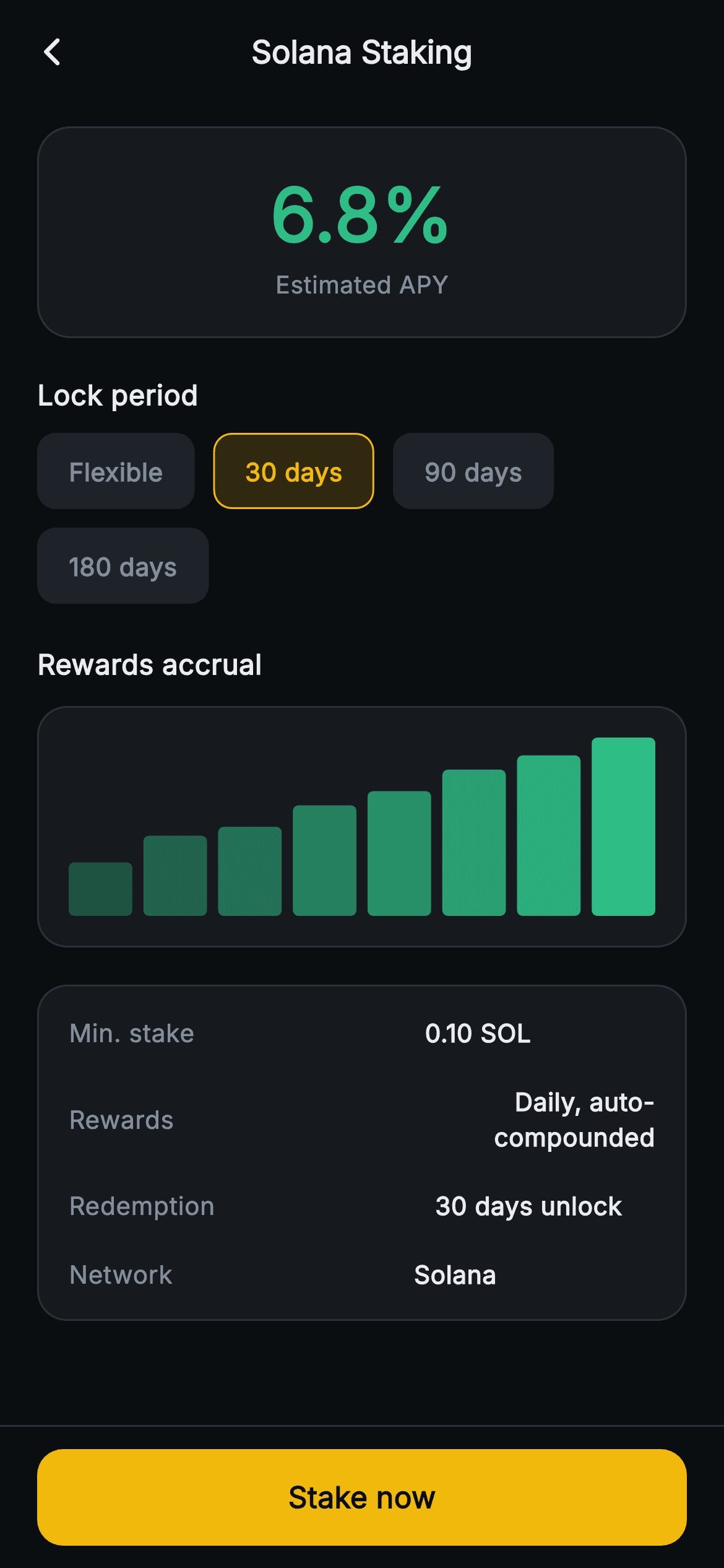
What you'll build
- ✓A lock-period selector of four Wrap chips (Flexible, 30, 90, 180 days) backed by one `_tier` index
- ✓A 40px green APY header that reads 4.2%, 6.8%, 9.5% or 12.4% from the selected `_Tier`
- ✓A `_BarMiniPainter` accrual chart: eight rounded bars sized by gap maths, fading from 35% to full opacity
- ✓A terms card from a `_kv` helper whose Redemption row is rebuilt from the chosen tier's label
- ✓A pinned, full-width yellow Stake now bar that hands control back through `onStake`
Step-by-step build
Create the file
Add a new file at lib/web3_earn_product_detail/web3_earn_product_detail_screen.dart in your Flutter project.
Register the bundled fonts
No external packages — this is pure Flutter. It does bundle its design font (Inter), so drop the font file into fonts/ and declare it in pubspec.yaml:
flutter:
  fonts:
    - family: Inter
      fonts:
- asset: fonts/Inter-Regular.ttfBuild it, piece by piece
Here's how the screen goes together. Each block below is a real slice of the code with a plain-English explanation — paste them in order, or grab the whole file from the next section.
Tiers as a const table and one int of state
import 'package:flutter/material.dart';

/// Web3 — Earn Product Detail. An APY header, selectable lock-period tiers, a
/// painted rewards-schedule bar chart, terms and a stake bar. Self-contained per
/// CONVENTIONS.md: pure Flutter, bundled Inter font, bar-chart CustomPaint (no
/// glyphs / no network image), forced dark theme so it renders standalone as a
/// route.
class Web3EarnProductDetailScreen extends StatefulWidget {
  const Web3EarnProductDetailScreen({super.key, this.onBack, this.onStake});

  final VoidCallback? onBack;
  final VoidCallback? onStake;

  @override
  State<Web3EarnProductDetailScreen> createState() =>
      _Web3EarnProductDetailScreenState();
}

class _Web3EarnProductDetailScreenState
    extends State<Web3EarnProductDetailScreen> {
  static const String _font = 'Inter';
  static const Color _bg = Color(0xFF0B0E11);
  static const Color _surface = Color(0xFF161A1E);
  static const Color _surfaceAlt = Color(0xFF1E2329);
  static const Color _brand = Color(0xFFF0B90B);
  static const Color _up = Color(0xFF2EBD85);
  static const Color _text = Color(0xFFEAECEF);
  static const Color _muted = Color(0xFF848E9C);
  static const Color _hairline = Color(0xFF2B3139);

  static const List<_Tier> _tiers = <_Tier>[
    _Tier('Flexible', 4.2),
    _Tier('30 days', 6.8),
    _Tier('90 days', 9.5),
    _Tier('180 days', 12.4),
  ];

  static const List<double> _schedule = <double>[
    0.3, 0.45, 0.5, 0.62, 0.7, 0.82, 0.9, 1.0
  ];

  int _tier = 1;
Where the parent Earn hub is a stateless list, this screen is a `StatefulWidget`, because the lock-period choice genuinely changes what is shown. It exposes only `onBack` and `onStake`. The palette constants are the shared Aurum set, so the interesting declarations are below them: `_tiers` is a `static const List<_Tier>` pairing each label with its APY — 'Flexible' 4.2, '30 days' 6.8, '90 days' 9.5, '180 days' 12.4 — so the reward for locking longer is encoded as data in one place. `_schedule` holds eight normalised heights (0.3 up to 1.0) for the chart. The only mutable field is `int _tier = 1`, which makes '30 days' the preselected option: a sensible default that shows a mid-range rate rather than the lowest or the most demanding lock.
Reading the tier once, then the APY hero card
  @override
  Widget build(BuildContext context) {
    final _Tier t = _tiers[_tier];
    return Theme(
      data: ThemeData.dark(useMaterial3: true),
      child: Scaffold(
        backgroundColor: _bg,
        appBar: AppBar(
          backgroundColor: _bg,
          elevation: 0,
          centerTitle: true,
          leading: IconButton(
            onPressed: widget.onBack,
            icon: const Icon(Icons.arrow_back_ios_new_rounded,
                size: 18, color: _text),
          ),
          title: const Text(
            'Solana Staking',
            style: TextStyle(
              fontFamily: _font,
              fontSize: 17,
              fontWeight: FontWeight.w700,
              color: _text,
            ),
          ),
        ),
        body: SafeArea(
          top: false,
          child: ListView(
            padding: const EdgeInsets.fromLTRB(20, 12, 20, 24),
            children: <Widget>[
              Container(
                padding: const EdgeInsets.all(18),
                decoration: BoxDecoration(
                  color: _surface,
                  borderRadius: BorderRadius.circular(18),
                  border: Border.all(color: _hairline),
                ),
                child: Column(
                  children: <Widget>[
                    Text(
                      '${t.apy.toStringAsFixed(1)}%',
                      style: const TextStyle(
                        fontFamily: _font,
                        fontSize: 40,
                        fontWeight: FontWeight.w800,
                        color: _up,
                      ),
                    ),
                    const Text(
                      'Estimated APY',
                      style: TextStyle(
                        fontFamily: _font,
                        fontSize: 13,
                        color: _muted,
                      ),
                    ),
                  ],
                ),
              ),
The first line of `build` is `final _Tier t = _tiers[_tier];` — every tier-dependent value below reads from `t`, so there is exactly one lookup per rebuild and no chance of two widgets disagreeing about the selection. The tree sits inside a forced dark `Theme`, with an AppBar carrying an 18px back chevron and a hardcoded 'Solana Staking' title. The hero card is a `_surface` panel with an 18px radius and a hairline border holding just two lines: `'${t.apy.toStringAsFixed(1)}%'` at 40px `w800` in `_up` green, and a muted 13px 'Estimated APY'. `toStringAsFixed(1)` keeps the figure at one decimal, so 12.4 and 4.2 render at a consistent width, and the word 'Estimated' is the honest label, since staking yields move.
Lock-period chips that retune the screen
              const SizedBox(height: 20),
              const Text(
                'Lock period',
                style: TextStyle(
                  fontFamily: _font,
                  fontSize: 15,
                  fontWeight: FontWeight.w700,
                  color: _text,
                ),
              ),
              const SizedBox(height: 10),
              Wrap(
                spacing: 10,
                runSpacing: 10,
                children: List<Widget>.generate(_tiers.length, (int i) {
                  final bool active = _tier == i;
                  return GestureDetector(
                    onTap: () => setState(() => _tier = i),
                    behavior: HitTestBehavior.opaque,
                    child: Container(
                      padding: const EdgeInsets.symmetric(
                          horizontal: 16, vertical: 10),
                      decoration: BoxDecoration(
                        color: active
                            ? _brand.withValues(alpha: 0.16)
                            : _surfaceAlt,
                        borderRadius: BorderRadius.circular(10),
                        border: Border.all(
                          color: active ? _brand : Colors.transparent,
                        ),
                      ),
                      child: Text(
                        _tiers[i].label,
                        style: TextStyle(
                          fontFamily: _font,
                          fontSize: 13.5,
                          fontWeight: FontWeight.w700,
                          color: active ? _brand : _muted,
                        ),
                      ),
                    ),
                  );
                }),
              ),
Under a 15px 'Lock period' heading, the chips come from `List<Widget>.generate(_tiers.length, ...)` inside a `Wrap` with 10px `spacing` and `runSpacing`, so on a narrow phone '180 days' drops to a second line instead of overflowing. Each chip is a `GestureDetector` with `HitTestBehavior.opaque`, so its padding is tappable too, and `onTap` calls `setState(() => _tier = i)` — that single assignment updates the APY header and the Redemption row. The active chip gets `_brand.withValues(alpha: 0.16)` fill, a yellow border and yellow text; inactive chips use `_surfaceAlt` with muted text. Note the inactive border is `Colors.transparent`, not absent: both states draw a 1px border, so selecting a chip never changes its size or shifts the row.
Hosting the accrual chart
              const SizedBox(height: 22),
              const Text(
                'Rewards accrual',
                style: TextStyle(
                  fontFamily: _font,
                  fontSize: 15,
                  fontWeight: FontWeight.w700,
                  color: _text,
                ),
              ),
              const SizedBox(height: 12),
              Container(
                padding: const EdgeInsets.all(16),
                decoration: BoxDecoration(
                  color: _surface,
                  borderRadius: BorderRadius.circular(16),
                  border: Border.all(color: _hairline),
                ),
                child: SizedBox(
                  height: 96,
                  child: CustomPaint(
                    size: Size.infinite,
                    painter: _BarMiniPainter(values: _schedule, color: _up),
                  ),
                ),
              ),
The 'Rewards accrual' card is a `_surface` container with 16px padding wrapping a `SizedBox(height: 96)` and a `CustomPaint`. Passing `size: Size.infinite` looks odd, but it is how a childless `CustomPaint` asks for as much room as it is allowed: the SizedBox caps the height at 96 and the card's width bounds the rest, so the painter receives the full inner width at 96px tall on any screen. The painter is handed the const `_schedule` list and `_up` green. Be aware that the chart is illustrative: it receives no tier, amount or dates, so switching from Flexible to 180 days leaves the bars unchanged. It conveys the shape of compounding growth, not a projection.
The terms card
              const SizedBox(height: 20),
              Container(
                padding: const EdgeInsets.symmetric(horizontal: 16, vertical: 6),
                decoration: BoxDecoration(
                  color: _surface,
                  borderRadius: BorderRadius.circular(16),
                  border: Border.all(color: _hairline),
                ),
                child: Column(
                  children: <Widget>[
                    _kv('Min. stake', '0.10 SOL'),
                    _kv('Rewards', 'Daily, auto-compounded'),
                    _kv('Redemption', '${t.label} unlock'),
                    _kv('Network', 'Solana'),
                  ],
                ),
              ),
            ],
          ),
        ),
The final body section is a hairline-bordered card listing four terms through the `_kv` helper: 'Min. stake' 0.10 SOL, 'Rewards' 'Daily, auto-compounded', 'Redemption' and 'Network' Solana. Three are fixed strings, but Redemption is built as `'${t.label} unlock'`, so it reads '30 days unlock' or '180 days unlock' and moves with the chip selection — the line that turns the abstract APY into a concrete commitment. The card uses only 6px of vertical padding because each `_kv` row brings 9px of its own, giving 15px at the top and bottom edges with no dividers. One wording catch: the Flexible tier produces 'Flexible unlock', so you may want a special case such as 'Anytime' for it.
The pinned Stake now bar
        bottomNavigationBar: Container(
          decoration: const BoxDecoration(
            color: _bg,
            border: Border(top: BorderSide(color: _hairline)),
          ),
          child: SafeArea(
            top: false,
            child: Padding(
              padding: const EdgeInsets.fromLTRB(20, 12, 20, 12),
              child: SizedBox(
                width: double.infinity,
                height: 52,
                child: FilledButton(
                  onPressed: widget.onStake,
                  style: FilledButton.styleFrom(
                    backgroundColor: _brand,
                    shape: RoundedRectangleBorder(
                      borderRadius: BorderRadius.circular(14),
                    ),
                  ),
                  child: const Text(
                    'Stake now',
                    style: TextStyle(
                      fontFamily: _font,
                      fontSize: 16,
                      fontWeight: FontWeight.w700,
                      color: _bg,
                    ),
                  ),
                ),
              ),
            ),
          ),
        ),
      ),
    );
  }
The call to action lives in `bottomNavigationBar`, so it stays put however far the terms scroll. The bar is a `_bg` Container with a top `_hairline` border wrapping `SafeArea(top: false)`, which lets the dark fill run under the home indicator while the button sits above it. Inside, a 52px-tall, full-width `FilledButton` in `_brand` yellow with a 14px radius reads 'Stake now' in 16px `w700`, set in near-black `_bg` for contrast on yellow. `onPressed` is wired straight to `widget.onStake`, which matters in practice: if you mount the screen without that callback, Flutter treats the button as disabled and paints its default disabled style, not the yellow you expect.
The _kv row and the _Tier value class
  Widget _kv(String k, String v) {
    return Padding(
      padding: const EdgeInsets.symmetric(vertical: 9),
      child: Row(
        children: <Widget>[
          Text(
            k,
            style: const TextStyle(
              fontFamily: _font,
              fontSize: 13.5,
              color: _muted,
            ),
          ),
          const Spacer(),
          Flexible(
            child: Text(
              v,
              textAlign: TextAlign.right,
              style: const TextStyle(
                fontFamily: _font,
                fontSize: 13.5,
                fontWeight: FontWeight.w700,
                color: _text,
              ),
            ),
          ),
        ],
      ),
    );
  }
}

class _Tier {
  const _Tier(this.label, this.apy);

  final String label;
  final double apy;
}
`_kv` returns a padded `Row`: the key in muted 13.5px, a `Spacer`, then the value in a `Flexible` with `textAlign: TextAlign.right` at 13.5px `w700`. Because `Spacer` and `Flexible` both default to flex 1, the value can claim at most half of the space left after the key, so a long value wraps onto a second right-aligned line instead of colliding with its label. That is enough for 'Daily, auto-compounded'; if your terms are longer, drop the Spacer and give the value `Expanded`. `_Tier` beneath is a two-field const class — `label` and `apy` — with no behaviour, which is what lets `_tiers` be a compile-time constant table.
_BarMiniPainter: gap maths and an opacity ramp
/// A compact growth bar chart, values normalised 0..1.
class _BarMiniPainter extends CustomPainter {
  const _BarMiniPainter({required this.values, required this.color});

  final List<double> values;
  final Color color;

  @override
  void paint(Canvas canvas, Size size) {
    if (values.isEmpty) return;
    final double gap = 6;
    final double bw = (size.width - gap * (values.length - 1)) / values.length;
    for (int i = 0; i < values.length; i++) {
      final double h = (values[i].clamp(0.0, 1.0)) * size.height;
      final double x = i * (bw + gap);
      final RRect r = RRect.fromRectAndRadius(
        Rect.fromLTWH(x, size.height - h, bw, h),
        const Radius.circular(3),
      );
      canvas.drawRRect(
        r,
        Paint()
          ..color = color.withValues(
              alpha: 0.35 + 0.65 * (i / (values.length - 1))),
      );
    }
  }

  @override
  bool shouldRepaint(_BarMiniPainter old) =>
      old.values != values || old.color != color;
The painter first returns if `values` is empty, then fixes a 6px `gap` and solves for bar width: `bw = (size.width - gap * (values.length - 1)) / values.length`, so eight bars and seven gaps exactly fill the width. Each height is `values[i].clamp(0.0, 1.0) * size.height`, and the bar is drawn from `size.height - h` downward, which anchors every bar to the baseline. Bars are `RRect`s with a 3px radius. Colour carries the story: alpha runs `0.35 + 0.65 * (i / (values.length - 1))`, so the first bar is faint and the last solid green. That divisor is zero for a one-value list, so guard it before feeding live data. `shouldRepaint` compares `values` by identity, which works when you pass a new list.
Full code
The complete, ready-to-paste source. Free to use in your projects — one click copies it all.
import 'package:flutter/material.dart';

/// Web3 — Earn Product Detail. An APY header, selectable lock-period tiers, a
/// painted rewards-schedule bar chart, terms and a stake bar. Self-contained per
/// CONVENTIONS.md: pure Flutter, bundled Inter font, bar-chart CustomPaint (no
/// glyphs / no network image), forced dark theme so it renders standalone as a
/// route.
class Web3EarnProductDetailScreen extends StatefulWidget {
  const Web3EarnProductDetailScreen({super.key, this.onBack, this.onStake});

  final VoidCallback? onBack;
  final VoidCallback? onStake;

  @override
  State<Web3EarnProductDetailScreen> createState() =>
      _Web3EarnProductDetailScreenState();
}

class _Web3EarnProductDetailScreenState
    extends State<Web3EarnProductDetailScreen> {
  static const String _font = 'Inter';
  static const Color _bg = Color(0xFF0B0E11);
  static const Color _surface = Color(0xFF161A1E);
  static const Color _surfaceAlt = Color(0xFF1E2329);
  static const Color _brand = Color(0xFFF0B90B);
  static const Color _up = Color(0xFF2EBD85);
  static const Color _text = Color(0xFFEAECEF);
  static const Color _muted = Color(0xFF848E9C);
  static const Color _hairline = Color(0xFF2B3139);

  static const List<_Tier> _tiers = <_Tier>[
    _Tier('Flexible', 4.2),
    _Tier('30 days', 6.8),
    _Tier('90 days', 9.5),
    _Tier('180 days', 12.4),
  ];

  static const List<double> _schedule = <double>[
    0.3, 0.45, 0.5, 0.62, 0.7, 0.82, 0.9, 1.0
  ];

  int _tier = 1;

  @override
  Widget build(BuildContext context) {
    final _Tier t = _tiers[_tier];
    return Theme(
      data: ThemeData.dark(useMaterial3: true),
      child: Scaffold(
        backgroundColor: _bg,
        appBar: AppBar(
          backgroundColor: _bg,
          elevation: 0,
          centerTitle: true,
          leading: IconButton(
            onPressed: widget.onBack,
            icon: const Icon(Icons.arrow_back_ios_new_rounded,
                size: 18, color: _text),
          ),
          title: const Text(
            'Solana Staking',
            style: TextStyle(
              fontFamily: _font,
              fontSize: 17,
              fontWeight: FontWeight.w700,
              color: _text,
            ),
          ),
        ),
        body: SafeArea(
          top: false,
          child: ListView(
            padding: const EdgeInsets.fromLTRB(20, 12, 20, 24),
            children: <Widget>[
              Container(
                padding: const EdgeInsets.all(18),
                decoration: BoxDecoration(
                  color: _surface,
                  borderRadius: BorderRadius.circular(18),
                  border: Border.all(color: _hairline),
                ),
                child: Column(
                  children: <Widget>[
                    Text(
                      '${t.apy.toStringAsFixed(1)}%',
                      style: const TextStyle(
                        fontFamily: _font,
                        fontSize: 40,
                        fontWeight: FontWeight.w800,
                        color: _up,
                      ),
                    ),
                    const Text(
                      'Estimated APY',
                      style: TextStyle(
                        fontFamily: _font,
                        fontSize: 13,
                        color: _muted,
                      ),
                    ),
                  ],
                ),
              ),
              const SizedBox(height: 20),
              const Text(
                'Lock period',
                style: TextStyle(
                  fontFamily: _font,
                  fontSize: 15,
                  fontWeight: FontWeight.w700,
                  color: _text,
                ),
              ),
              const SizedBox(height: 10),
              Wrap(
                spacing: 10,
                runSpacing: 10,
                children: List<Widget>.generate(_tiers.length, (int i) {
                  final bool active = _tier == i;
                  return GestureDetector(
                    onTap: () => setState(() => _tier = i),
                    behavior: HitTestBehavior.opaque,
                    child: Container(
                      padding: const EdgeInsets.symmetric(
                          horizontal: 16, vertical: 10),
                      decoration: BoxDecoration(
                        color: active
                            ? _brand.withValues(alpha: 0.16)
                            : _surfaceAlt,
                        borderRadius: BorderRadius.circular(10),
                        border: Border.all(
                          color: active ? _brand : Colors.transparent,
                        ),
                      ),
                      child: Text(
                        _tiers[i].label,
                        style: TextStyle(
                          fontFamily: _font,
                          fontSize: 13.5,
                          fontWeight: FontWeight.w700,
                          color: active ? _brand : _muted,
                        ),
                      ),
                    ),
                  );
                }),
              ),
              const SizedBox(height: 22),
              const Text(
                'Rewards accrual',
                style: TextStyle(
                  fontFamily: _font,
                  fontSize: 15,
                  fontWeight: FontWeight.w700,
                  color: _text,
                ),
              ),
              const SizedBox(height: 12),
              Container(
                padding: const EdgeInsets.all(16),
                decoration: BoxDecoration(
                  color: _surface,
                  borderRadius: BorderRadius.circular(16),
                  border: Border.all(color: _hairline),
                ),
                child: SizedBox(
                  height: 96,
                  child: CustomPaint(
                    size: Size.infinite,
                    painter: _BarMiniPainter(values: _schedule, color: _up),
                  ),
                ),
              ),
              const SizedBox(height: 20),
              Container(
                padding: const EdgeInsets.symmetric(horizontal: 16, vertical: 6),
                decoration: BoxDecoration(
                  color: _surface,
                  borderRadius: BorderRadius.circular(16),
                  border: Border.all(color: _hairline),
                ),
                child: Column(
                  children: <Widget>[
                    _kv('Min. stake', '0.10 SOL'),
                    _kv('Rewards', 'Daily, auto-compounded'),
                    _kv('Redemption', '${t.label} unlock'),
                    _kv('Network', 'Solana'),
                  ],
                ),
              ),
            ],
          ),
        ),
        bottomNavigationBar: Container(
          decoration: const BoxDecoration(
            color: _bg,
            border: Border(top: BorderSide(color: _hairline)),
          ),
          child: SafeArea(
            top: false,
            child: Padding(
              padding: const EdgeInsets.fromLTRB(20, 12, 20, 12),
              child: SizedBox(
                width: double.infinity,
                height: 52,
                child: FilledButton(
                  onPressed: widget.onStake,
                  style: FilledButton.styleFrom(
                    backgroundColor: _brand,
                    shape: RoundedRectangleBorder(
                      borderRadius: BorderRadius.circular(14),
                    ),
                  ),
                  child: const Text(
                    'Stake now',
                    style: TextStyle(
                      fontFamily: _font,
                      fontSize: 16,
                      fontWeight: FontWeight.w700,
                      color: _bg,
                    ),
                  ),
                ),
              ),
            ),
          ),
        ),
      ),
    );
  }

  Widget _kv(String k, String v) {
    return Padding(
      padding: const EdgeInsets.symmetric(vertical: 9),
      child: Row(
        children: <Widget>[
          Text(
            k,
            style: const TextStyle(
              fontFamily: _font,
              fontSize: 13.5,
              color: _muted,
            ),
          ),
          const Spacer(),
          Flexible(
            child: Text(
              v,
              textAlign: TextAlign.right,
              style: const TextStyle(
                fontFamily: _font,
                fontSize: 13.5,
                fontWeight: FontWeight.w700,
                color: _text,
              ),
            ),
          ),
        ],
      ),
    );
  }
}

class _Tier {
  const _Tier(this.label, this.apy);

  final String label;
  final double apy;
}

/// A compact growth bar chart, values normalised 0..1.
class _BarMiniPainter extends CustomPainter {
  const _BarMiniPainter({required this.values, required this.color});

  final List<double> values;
  final Color color;

  @override
  void paint(Canvas canvas, Size size) {
    if (values.isEmpty) return;
    final double gap = 6;
    final double bw = (size.width - gap * (values.length - 1)) / values.length;
    for (int i = 0; i < values.length; i++) {
      final double h = (values[i].clamp(0.0, 1.0)) * size.height;
      final double x = i * (bw + gap);
      final RRect r = RRect.fromRectAndRadius(
        Rect.fromLTWH(x, size.height - h, bw, h),
        const Radius.circular(3),
      );
      canvas.drawRRect(
        r,
        Paint()
          ..color = color.withValues(
              alpha: 0.35 + 0.65 * (i / (values.length - 1))),
      );
    }
  }

  @override
  bool shouldRepaint(_BarMiniPainter old) =>
      old.values != values || old.color != color;
}
Plus bundled 1 binary asset (fonts/images). The CLI and MCP install those for you automatically.
Two faster ways to add it
Copy-paste works, but you can skip it entirely.
1. FlutterKit CLI
One command drops this screen — and its fonts — straight into your project.
$ flutterkit add web3-earn-product-detail2. AI agent (MCP)
Connect FlutterKit's MCP server in Claude or Cursor and just ask your agent to install web3-earn-product-detail — it fetches and writes the files for you.
FAQ
Can I use this staking detail screen in a commercial app?
Yes. Copy it from this page, add it with the CLI command, or pull it through MCP, and ship it in a commercial wallet or exchange. It costs nothing, needs no licence key, and you don't have to credit anyone.
Does the screen need a charting package or any fonts?
No packages at all — the only import is `package:flutter/material.dart`, and the accrual chart is a 30-line `CustomPainter` rather than fl_chart or similar. Text uses the bundled Inter font via `fontFamily: 'Inter'`; change `_font` if your app already ships a different family.
What Flutter version is required?
Flutter 3.22 or newer, since the active chip fill and the bar opacity ramp call `Color.withValues(alpha: ...)`, and the constructor uses `super.key`. On an older SDK, change each `withValues(alpha: x)` to `withOpacity(x)` and write the key as `{Key? key, ...} : super(key: key)`.
When the user taps Stake now, how does my code know which lock period they picked?
As shipped, it can't: `onStake` is a plain `VoidCallback` and `_tier` is private state. Change the field to `ValueChanged<_Tier>?` (making `_Tier` public if the caller lives in another file) and call `onPressed: () => widget.onStake?.call(_tiers[_tier])`. Your confirm step then receives the label and APY, and can derive an unlock date from today plus the tier's days.
How do I make the accrual chart and the APY reflect real data for the chosen tier?
Load your product's tiers from the API into `_tiers`, then compute the chart from the selection — for example, compute the cumulative reward on a sample stake at eight points across the lock with `principal * (pow(1 + apy / 100 / 365, day) - 1)` (importing `dart:math`), divide each value by the largest, and pass that new list to `_BarMiniPainter`. Building a fresh list on each tier change is what trips the identity check in `shouldRepaint`, so the bars repaint.


