How to Build a Send Money Screen in Flutter (Full Code + Preview)
Every P2P payments app needs a hub that answers 'send money how, and to whom?' on one screen. This tutorial builds that hub from the Finco kit: a top bar, a 'Send Money' title, a four-way option selector (Bank, TopUp, QR Code, Nearby) driven by a single selected index, a recent-receipts avatar strip, and a white 'Add New Contact' card holding a search field and two invite rows in different states. You'll learn the data-driven Row pattern the selector uses, and how the card gets its own contained styling.
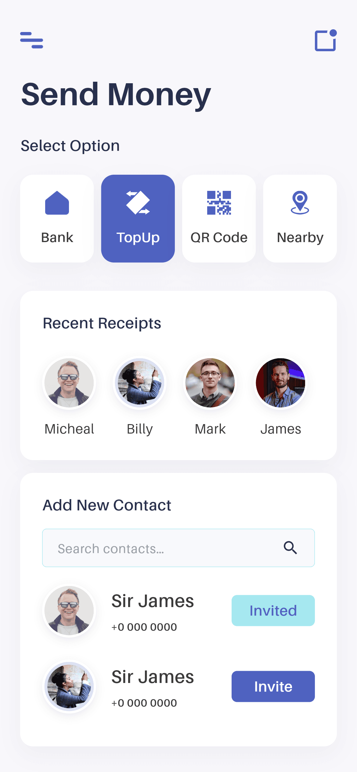
What you'll build
- ✓A four-way option selector generated from a const List<List<String>> rather than four copy-pasted widgets
- ✓A collection-for loop with spread syntax that inserts gaps between items but not after the last one
- ✓A single _option int of state that drives which card is highlighted
- ✓An 'Add New Contact' card with a shadowed white surface, a search field and Invited / Invite rows
- ✓A custom search field with the Material underline stripped out and a trailing search icon
Step-by-step build
Create the file
Add a new file at lib/wallet_send_money/wallet_send_money_screen.dart in your Flutter project.
Register the bundled fonts
No external packages — this is pure Flutter. It does bundle its design font (Aileron), so drop the font file into fonts/ and declare it in pubspec.yaml:
flutter:
  fonts:
    - family: Aileron
      fonts:
- asset: fonts/Aileron-Regular.ttfBuild it, piece by piece
Here's how the screen goes together. Each block below is a real slice of the code with a plain-English explanation — paste them in order, or grab the whole file from the next section.
The options table and the screen's single piece of state
import 'package:flutter/material.dart';

import 'widgets/palette.dart';
import 'widgets/sections.dart';

/// "Send Money" screen from the Wallet App UI Kit (Finco): a top bar, a header,
/// a four-way option selector, a recent-receipts strip and an "Add New Contact"
/// card with a search field and invite rows.
///
/// Self-contained, pure Flutter. Bundles its exact design font (Aileron) and
/// the kit's icons + avatars. Fully responsive — content scrolls and width caps
/// on large screens. Renders standalone when pushed as a route.
class WalletSendMoneyScreen extends StatefulWidget {
  const WalletSendMoneyScreen({super.key});

  @override
  State<WalletSendMoneyScreen> createState() => _WalletSendMoneyScreenState();
}

class _WalletSendMoneyScreenState extends State<WalletSendMoneyScreen> {
  int _option = 1; // TopUp selected by default.

  static const List<List<String>> _options = <List<String>>[
    <String>['icon_home.png', 'Bank'],
    <String>['topup_icon.png', 'TopUp'],
    <String>['qrcode_icon.png', 'QR Code'],
    <String>['nearby_icon.png', 'Nearby'],
  ];
Two local imports — the shared P palette and a sections file holding OptionCard, RecentReceipts and InviteRow — and no pub packages. The screen's entire state is one int, _option, initialised to 1 so TopUp is selected on first paint. Above it sits _options, a static const List<List<String>> where each inner list is [icon file, label]. Storing the four options as data rather than as four hand-written widgets is what keeps the build method short and makes adding a fifth option a one-line change.
The width-capped scrolling body
  @override
  Widget build(BuildContext context) {
    return Scaffold(
      backgroundColor: P.bg,
      body: SafeArea(
        child: Center(
          child: ConstrainedBox(
            constraints: const BoxConstraints(maxWidth: 480),
            child: SingleChildScrollView(
              physics: const BouncingScrollPhysics(),
              padding: const EdgeInsets.fromLTRB(22, 24, 22, 32),
              child: Column(
                crossAxisAlignment: CrossAxisAlignment.start,
                children: <Widget>[
                  const _TopBar(),
                  const SizedBox(height: 18),
                  const Text('Send Money', style: P.title),
                  const SizedBox(height: 25),
                  const Text('Select Option', style: P.sectionHeader),
                  const SizedBox(height: 20),
Scaffold takes P.bg from the palette, SafeArea clears the notch, and Center + ConstrainedBox(maxWidth: 480) stops the layout stretching across a tablet — on a phone that constraint does nothing, which is exactly the point. The SingleChildScrollView uses BouncingScrollPhysics for the iOS-style rubber-band feel and pads 22px left/right, 24px top, 32px bottom. CrossAxisAlignment.start left-aligns the header and section labels, both of which pull their styles (P.title, P.sectionHeader) from the palette so typography stays consistent with the rest of the kit.
Building the four-way selector
                  Row(
                    children: <Widget>[
                      for (int i = 0; i < _options.length; i++) ...<Widget>[
                        Expanded(
                          child: OptionCard(
                            asset: _options[i][0],
                            label: _options[i][1],
                            active: _option == i,
                            onTap: () => setState(() => _option = i),
                          ),
                        ),
                        if (i != _options.length - 1)
                          const SizedBox(width: 8),
                      ],
                    ],
                  ),
                  const SizedBox(height: 31),
                  const RecentReceipts(),
                  const SizedBox(height: 14),
                  const _AddContactCard(),
                ],
              ),
            ),
          ),
        ),
      ),
    );
  }
}
This Row is the most interesting code on the screen. A collection-for loop walks the _options list, and the ...<Widget>[] spread lets each iteration contribute more than one child: an Expanded OptionCard plus, conditionally, an 8px SizedBox. The if (i != _options.length - 1) guard is what prevents a trailing gap after 'Nearby', which would push the row's spacing off-centre. Each card is told whether it's active via _option == i and gets an onTap that calls setState — so the four cards share one integer instead of four booleans that could drift out of sync. Below, RecentReceipts and _AddContactCard finish the page.
The Add New Contact card
class _AddContactCard extends StatelessWidget {
  const _AddContactCard();

  @override
  Widget build(BuildContext context) {
    return Container(
      width: double.infinity,
      decoration: BoxDecoration(
        color: Colors.white,
        borderRadius: BorderRadius.circular(14),
        boxShadow: P.cardShadow,
      ),
      padding: const EdgeInsets.fromLTRB(24, 23, 24, 24),
      child: Column(
        crossAxisAlignment: CrossAxisAlignment.start,
        children: const <Widget>[
          Text('Add New Contact', style: P.sectionHeader),
          SizedBox(height: 14),
          _SearchField(),
          SizedBox(height: 6),
          InviteRow(
            asset: 'sendme_imgone.png',
            name: 'Sir James',
            phone: '+0 000 0000',
            invited: true,
          ),
          InviteRow(
            asset: 'sendme_imgtwo.png',
            name: 'Sir James',
            phone: '+0 000 0000',
            invited: false,
          ),
        ],
      ),
    );
  }
}
_AddContactCard is a full-width white Container with a 14px radius and P.cardShadow — the shared shadow every card-like surface in the kit uses, so they're all lit the same way. Its 24/23/24/24 padding is asymmetric by one pixel at the top, matching the original design rather than rounding it off. Inside, a section header, the search field, then two InviteRows that differ only by invited: true versus false — passing the state in as a flag means one widget renders both the 'Invited' and 'Invite' variants instead of two near-identical widgets.
The custom search field
class _SearchField extends StatelessWidget {
  const _SearchField();

  @override
  Widget build(BuildContext context) {
    return Container(
      decoration: BoxDecoration(
        color: P.searchFill,
        borderRadius: BorderRadius.circular(5),
        border: Border.all(color: P.cyan, width: 0.5),
      ),
      child: const Row(
        children: <Widget>[
          Expanded(
            child: TextField(
              cursorColor: P.blue,
              style: TextStyle(
                fontFamily: P.font,
                fontSize: 14,
                color: P.name,
              ),
              decoration: InputDecoration(
                hintText: 'Search contacts…',
                hintStyle: TextStyle(
                  fontFamily: P.font,
                  fontSize: 14,
                  color: Color(0xFF9AA3AD),
                ),
                isDense: true,
                border: InputBorder.none,
                contentPadding: EdgeInsets.symmetric(horizontal: 16, vertical: 14),
              ),
            ),
          ),
          Padding(
            padding: EdgeInsets.only(right: 16),
            child: Icon(Icons.search, size: 20, color: P.ink),
          ),
        ],
      ),
    );
  }
}
The field is a Container styled by hand — P.searchFill background, a small 5px radius, and a hairline 0.5px P.cyan border — with the TextField inside stripped of Material decoration: border: InputBorder.none, isDense: true, and explicit contentPadding of 16px horizontal / 14px vertical. That's the standard recipe when you want the visible box to be your own Container rather than Flutter's InputDecorator. The search icon is a sibling in the Row rather than a suffixIcon, which gives you exact control over its 16px right padding instead of inheriting InputDecoration's built-in spacing.
Full code
The complete, ready-to-paste source (3 files). Free to use in your projects — one click copies it all.
import 'package:flutter/material.dart';

import 'widgets/palette.dart';
import 'widgets/sections.dart';

/// "Send Money" screen from the Wallet App UI Kit (Finco): a top bar, a header,
/// a four-way option selector, a recent-receipts strip and an "Add New Contact"
/// card with a search field and invite rows.
///
/// Self-contained, pure Flutter. Bundles its exact design font (Aileron) and
/// the kit's icons + avatars. Fully responsive — content scrolls and width caps
/// on large screens. Renders standalone when pushed as a route.
class WalletSendMoneyScreen extends StatefulWidget {
  const WalletSendMoneyScreen({super.key});

  @override
  State<WalletSendMoneyScreen> createState() => _WalletSendMoneyScreenState();
}

class _WalletSendMoneyScreenState extends State<WalletSendMoneyScreen> {
  int _option = 1; // TopUp selected by default.

  static const List<List<String>> _options = <List<String>>[
    <String>['icon_home.png', 'Bank'],
    <String>['topup_icon.png', 'TopUp'],
    <String>['qrcode_icon.png', 'QR Code'],
    <String>['nearby_icon.png', 'Nearby'],
  ];

  @override
  Widget build(BuildContext context) {
    return Scaffold(
      backgroundColor: P.bg,
      body: SafeArea(
        child: Center(
          child: ConstrainedBox(
            constraints: const BoxConstraints(maxWidth: 480),
            child: SingleChildScrollView(
              physics: const BouncingScrollPhysics(),
              padding: const EdgeInsets.fromLTRB(22, 24, 22, 32),
              child: Column(
                crossAxisAlignment: CrossAxisAlignment.start,
                children: <Widget>[
                  const _TopBar(),
                  const SizedBox(height: 18),
                  const Text('Send Money', style: P.title),
                  const SizedBox(height: 25),
                  const Text('Select Option', style: P.sectionHeader),
                  const SizedBox(height: 20),
                  Row(
                    children: <Widget>[
                      for (int i = 0; i < _options.length; i++) ...<Widget>[
                        Expanded(
                          child: OptionCard(
                            asset: _options[i][0],
                            label: _options[i][1],
                            active: _option == i,
                            onTap: () => setState(() => _option = i),
                          ),
                        ),
                        if (i != _options.length - 1)
                          const SizedBox(width: 8),
                      ],
                    ],
                  ),
                  const SizedBox(height: 31),
                  const RecentReceipts(),
                  const SizedBox(height: 14),
                  const _AddContactCard(),
                ],
              ),
            ),
          ),
        ),
      ),
    );
  }
}

class _TopBar extends StatelessWidget {
  const _TopBar();

  @override
  Widget build(BuildContext context) {
    return SizedBox(
      height: 40,
      child: Row(
        children: <Widget>[
          Image.asset('${P.img}/icon_menu.png',
              height: 18, filterQuality: FilterQuality.high),
          const Spacer(),
          Image.asset('${P.img}/icon_dashboard.png',
              height: 24, filterQuality: FilterQuality.high),
        ],
      ),
    );
  }
}

class _AddContactCard extends StatelessWidget {
  const _AddContactCard();

  @override
  Widget build(BuildContext context) {
    return Container(
      width: double.infinity,
      decoration: BoxDecoration(
        color: Colors.white,
        borderRadius: BorderRadius.circular(14),
        boxShadow: P.cardShadow,
      ),
      padding: const EdgeInsets.fromLTRB(24, 23, 24, 24),
      child: Column(
        crossAxisAlignment: CrossAxisAlignment.start,
        children: const <Widget>[
          Text('Add New Contact', style: P.sectionHeader),
          SizedBox(height: 14),
          _SearchField(),
          SizedBox(height: 6),
          InviteRow(
            asset: 'sendme_imgone.png',
            name: 'Sir James',
            phone: '+0 000 0000',
            invited: true,
          ),
          InviteRow(
            asset: 'sendme_imgtwo.png',
            name: 'Sir James',
            phone: '+0 000 0000',
            invited: false,
          ),
        ],
      ),
    );
  }
}

class _SearchField extends StatelessWidget {
  const _SearchField();

  @override
  Widget build(BuildContext context) {
    return Container(
      decoration: BoxDecoration(
        color: P.searchFill,
        borderRadius: BorderRadius.circular(5),
        border: Border.all(color: P.cyan, width: 0.5),
      ),
      child: const Row(
        children: <Widget>[
          Expanded(
            child: TextField(
              cursorColor: P.blue,
              style: TextStyle(
                fontFamily: P.font,
                fontSize: 14,
                color: P.name,
              ),
              decoration: InputDecoration(
                hintText: 'Search contacts…',
                hintStyle: TextStyle(
                  fontFamily: P.font,
                  fontSize: 14,
                  color: Color(0xFF9AA3AD),
                ),
                isDense: true,
                border: InputBorder.none,
                contentPadding: EdgeInsets.symmetric(horizontal: 16, vertical: 14),
              ),
            ),
          ),
          Padding(
            padding: EdgeInsets.only(right: 16),
            child: Icon(Icons.search, size: 20, color: P.ink),
          ),
        ],
      ),
    );
  }
}
Plus bundled 13 binary assets (fonts/images). The CLI and MCP install those for you automatically.
Two faster ways to add it
Copy-paste works, but you can skip it entirely.
1. FlutterKit CLI
One command drops this screen — and its fonts — straight into your project.
$ flutterkit add wallet-send-money2. AI agent (MCP)
Connect FlutterKit's MCP server in Claude or Cursor and just ask your agent to install wallet-send-money — it fetches and writes the files for you.
FAQ
Is this Flutter send-money screen free to use?
Yes. The full Dart source on this page — the screen plus its palette and section widgets — is free for personal and commercial projects. Install it with the FlutterKit CLI (flutterkit add wallet-send-money) or have an AI agent add it via MCP.
How do I make the search field filter contacts?
Give the TextField a controller or an onChanged callback, lift the query into _WalletSendMoneyScreenState, and build the InviteRows from a filtered list instead of the two hard-coded demo rows. Nothing about the card's layout has to change.
Does it need any external packages?
No — it's pure Flutter on the material library. It bundles the Aileron font plus the kit's option icons and contact avatars, registered in pubspec.yaml as shown in step 2; the CLI and MCP install those files for you.
Which Flutter version does it target?
The supporting widgets use Color.withValues(), so it targets Flutter 3.22+ (Dart 3). It also uses const Row with children, which needs Dart 3's const-collection improvements. On an older SDK, swap withValues(alpha: x) for withOpacity(x).

