How to Build a Wallet Home Screen in Flutter (Full Code + Preview)
The home tab of a finance app has to pack a lot into one scroll without feeling busy. In this tutorial you'll build a full wallet dashboard in Flutter: a top bar, a personalised greeting with an avatar, two Budget / Expenses cards with custom ring charts, a six-tile operations grid, a 'Complete Profile' progress card and a floating pill-shaped bottom nav that animates its active label. You'll see how a Stack layers the scrolling content beneath a fixed nav bar, and how FittedBox and maxWidth keep everything readable across phone sizes. Pure Flutter.
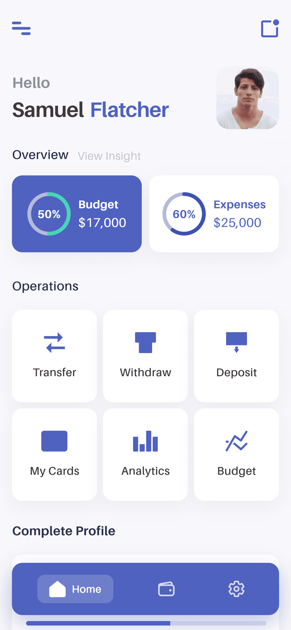
What you'll build
- ✓A scrolling dashboard that caps its width at 480px and floats a bottom nav on top via a Stack
- ✓A greeting row with a name that scales down to fit narrow screens and a rounded profile avatar
- ✓Two Budget / Expenses stat cards, each with a custom-painted circular progress ring
- ✓A 3x2 operations grid of tappable icon cards with a press-scale animation
- ✓A 'Complete Profile' card with a rounded LinearProgressIndicator and a bundled Aileron font
Step-by-step build
Create the file
Add a new file at lib/wallet_home/wallet_home_screen.dart in your Flutter project.
Register the bundled fonts
No external packages — this is pure Flutter. It does bundle its design font (Aileron), so drop the font file into fonts/ and declare it in pubspec.yaml:
flutter:
  fonts:
    - family: Aileron
      fonts:
- asset: fonts/Aileron-Regular.ttfBuild it, piece by piece
Here's how the screen goes together. Each block below is a real slice of the code with a plain-English explanation — paste them in order, or grab the whole file from the next section.
Imports, the stateful screen, and nav state
import 'package:flutter/material.dart';

import 'widgets/bottom_nav.dart';
import 'widgets/circular_progress.dart';
import 'widgets/palette.dart';

/// Home dashboard from the Wallet App UI Kit (Finco): a top bar, a personalised
/// greeting, a budget/expenses overview with ring charts, an operations grid,
/// a "Complete Profile" progress card and a floating bottom nav.
///
/// Self-contained, pure Flutter. Bundles its exact design font (Aileron) and
/// the kit's original icons + avatar. Fully responsive — scrolls and caps its
/// width on large screens. Renders standalone when pushed as a route.
class WalletHomeScreen extends StatefulWidget {
  const WalletHomeScreen({super.key});

  @override
  State<WalletHomeScreen> createState() => _WalletHomeScreenState();
}

class _WalletHomeScreenState extends State<WalletHomeScreen> {
  int _navIndex = 0;
The file imports Flutter's material library plus three local files: bottom_nav.dart (the floating nav), circular_progress.dart (the ring charts) and palette.dart (the shared design tokens, referenced everywhere as `P`). Splitting these out keeps this screen file about layout. WalletHomeScreen is a StatefulWidget because one thing does change — the selected bottom-nav tab — so its State declares `int _navIndex = 0` to remember which item is active.
The Stack layout: scrolling body under a fixed nav
  @override
  Widget build(BuildContext context) {
    return Scaffold(
      backgroundColor: P.bg,
      body: SafeArea(
        bottom: false,
        child: Center(
          child: ConstrainedBox(
            constraints: const BoxConstraints(maxWidth: 480),
            child: Stack(
              children: <Widget>[
                SingleChildScrollView(
                  physics: const BouncingScrollPhysics(),
                  padding: const EdgeInsets.fromLTRB(16, 18, 16, 120),
                  child: Column(
                    crossAxisAlignment: CrossAxisAlignment.start,
                    children: const <Widget>[
                      _TopBar(),
                      SizedBox(height: 31),
                      _Greeting(),
                      SizedBox(height: 22),
                      _OverviewHeader(),
                      SizedBox(height: 16),
                      _OverviewCards(),
                      SizedBox(height: 33),
                      _SectionLabel('Operations'),
                      SizedBox(height: 20),
                      _OperationsGrid(),
                      SizedBox(height: 28),
                      _SectionLabel('Complete Profile', bold: true),
                      SizedBox(height: 20),
                      _CompleteProfileCard(),
                    ],
                  ),
                ),
                Align(
                  alignment: Alignment.bottomCenter,
                  child: SafeArea(
                    top: false,
                    child: BottomNav(
                      currentIndex: _navIndex,
                      onChanged: (int i) => setState(() => _navIndex = i),
                    ),
                  ),
                ),
              ],
            ),
          ),
        ),
      ),
    );
  }
}
build() returns a Scaffold painted with the off-white P.bg, and SafeArea(bottom: false) clears the status bar while letting content run to the bottom edge. Center + ConstrainedBox(maxWidth: 480) stop the layout stretching too wide on tablets. The Stack layers two things: a SingleChildScrollView with BouncingScrollPhysics and 16px side padding (plus 120px bottom padding so content clears the nav) holding a Column of every section — _TopBar, _Greeting, _OverviewHeader, _OverviewCards, two _SectionLabels, _OperationsGrid and _CompleteProfileCard, separated by fixed SizedBox gaps — and, aligned to bottomCenter, the BottomNav whose onChanged calls setState to update _navIndex.
Top bar and the greeting with avatar
class _TopBar extends StatelessWidget {
  const _TopBar();

  @override
  Widget build(BuildContext context) {
    return SizedBox(
      height: 40,
      child: Row(
        children: <Widget>[
          Image.asset('${P.img}/icon_menu.png',
              height: 18, filterQuality: FilterQuality.high),
          const Spacer(),
          Image.asset('${P.img}/icon_dashboard.png',
              height: 24, filterQuality: FilterQuality.high),
        ],
      ),
    );
  }
}

class _Greeting extends StatelessWidget {
  const _Greeting();

  @override
  Widget build(BuildContext context) {
    return Row(
      crossAxisAlignment: CrossAxisAlignment.center,
      children: <Widget>[
        Expanded(
          child: Column(
            crossAxisAlignment: CrossAxisAlignment.start,
            children: <Widget>[
              const Text('Hello', style: P.hello),
              const SizedBox(height: 2),
              // Scale the full name down to fit narrow screens (never overflow).
              FittedBox(
                fit: BoxFit.scaleDown,
                alignment: Alignment.centerLeft,
                child: Row(
                  mainAxisSize: MainAxisSize.min,
                  children: const <Widget>[
                    Text('Samuel', style: P.nameStyle),
                    SizedBox(width: 8),
                    Text('Flatcher',
                        style: TextStyle(
                          fontFamily: P.font,
                          fontWeight: FontWeight.w700,
                          fontSize: 28,
                          letterSpacing: -0.56,
                          color: P.blue,
                        )),
                  ],
                ),
              ),
            ],
          ),
        ),
        const SizedBox(width: 16),
        ClipRRect(
          borderRadius: BorderRadius.circular(8),
          child: Image.asset(
            '${P.img}/profile.png',
            width: 84,
            height: 84,
            fit: BoxFit.cover,
            filterQuality: FilterQuality.high,
          ),
        ),
      ],
    );
  }
}
_TopBar is a 40px-tall Row with a menu icon on the left, a Spacer pushing them apart, and a dashboard icon on the right — both loaded with Image.asset at FilterQuality.high so they stay crisp. _Greeting is a Row: an Expanded Column shows 'Hello' in the grey P.hello style above the user's name, and the name sits inside a FittedBox(fit: scaleDown) so 'Samuel Flatcher' shrinks rather than overflows on small phones — 'Samuel' in P.nameStyle and 'Flatcher' in the same 28px bold but tinted P.blue. On the right, a ClipRRect with an 8px radius rounds the 84x84 profile.png avatar.
The overview header and the two stat cards
class _OverviewHeader extends StatelessWidget {
  const _OverviewHeader();

  @override
  Widget build(BuildContext context) {
    return Row(
      crossAxisAlignment: CrossAxisAlignment.end,
      children: <Widget>[
        const Flexible(child: Text('Overview', style: P.sectionHeader)),
        const SizedBox(width: 12),
        Flexible(
          child: Text(
            'View Insight',
            textAlign: TextAlign.right,
            maxLines: 1,
            overflow: TextOverflow.ellipsis,
            style: TextStyle(
              fontFamily: P.font,
              fontWeight: FontWeight.w400,
              fontSize: 15,
              color: P.greyLabel.withValues(alpha: 0.5),
            ),
          ),
        ),
      ],
    );
  }
}

class _OverviewCards extends StatelessWidget {
  const _OverviewCards();

  @override
  Widget build(BuildContext context) {
    return Row(
      children: const <Widget>[
        Expanded(
          child: _StatCard(
            background: P.blue,
            percent: 0.5,
            ringColor: P.green,
            ringLabel: '50%',
            ringLabelColor: Colors.white,
            title: 'Budget',
            amount: r'$17,000',
            textColor: Colors.white,
          ),
        ),
        SizedBox(width: 10),
        Expanded(
          child: _StatCard(
            background: Colors.white,
            percent: 0.6,
            ringColor: P.indigo,
            ringLabel: '60%',
            ringLabelColor: P.blue,
            title: 'Expenses',
            amount: r'$25,000',
            textColor: P.blue,
          ),
        ),
      ],
    );
  }
}
_OverviewHeader is a Row bottom-aligned (CrossAxisAlignment.end) with the 'Overview' section title and a faded 'View Insight' link on the right that ellipsizes if space runs out. _OverviewCards lays two _StatCard widgets side by side in Expanded slots with a 10px gap. The first is the Budget card: a blue background, a 50% green ring, white text and the amount $17,000. The second is Expenses: a white background, a 60% indigo ring, blue text and $25,000. Passing all the colours and figures in as parameters is what lets one card widget render both variants.
Inside a stat card, plus the section label and grid
class _StatCard extends StatelessWidget {
  const _StatCard({
    required this.background,
    required this.percent,
    required this.ringColor,
    required this.ringLabel,
    required this.ringLabelColor,
    required this.title,
    required this.amount,
    required this.textColor,
  });

  final Color background;
  final double percent;
  final Color ringColor;
  final String ringLabel;
  final Color ringLabelColor;
  final String title;
  final String amount;
  final Color textColor;

  @override
  Widget build(BuildContext context) {
    return Container(
      height: 103,
      padding: const EdgeInsets.symmetric(horizontal: 14),
      decoration: BoxDecoration(
        color: background,
        borderRadius: BorderRadius.circular(14),
        boxShadow: P.cardShadow,
      ),
      child: Row(
        mainAxisAlignment: MainAxisAlignment.center,
        children: <Widget>[
          CircularProgress(
            percent: percent,
            color: ringColor,
            label: ringLabel,
            labelColor: ringLabelColor,
            size: 58,
          ),
          const SizedBox(width: 10),
          Flexible(
            child: Column(
              mainAxisAlignment: MainAxisAlignment.center,
              crossAxisAlignment: CrossAxisAlignment.start,
              children: <Widget>[
                FittedBox(
                  fit: BoxFit.scaleDown,
                  alignment: Alignment.centerLeft,
                  child: Text(
                    title,
                    maxLines: 1,
                    style: TextStyle(
                      fontFamily: P.font,
                      fontWeight: FontWeight.w700,
                      fontSize: 15,
                      color: textColor,
                    ),
                  ),
                ),
                const SizedBox(height: 2),
                FittedBox(
                  fit: BoxFit.scaleDown,
                  alignment: Alignment.centerLeft,
                  child: Text(
                    amount,
                    maxLines: 1,
                    style: TextStyle(
                      fontFamily: P.font,
                      fontWeight: FontWeight.w400,
                      fontSize: 17,
                      color: textColor,
                    ),
                  ),
                ),
              ],
            ),
          ),
        ],
      ),
    );
  }
}

class _SectionLabel extends StatelessWidget {
  const _SectionLabel(this.text, {this.bold = false});

  final String text;
  final bool bold;

  @override
  Widget build(BuildContext context) {
    return Text(
      text,
      style: P.sectionHeader.copyWith(
        fontWeight: bold ? FontWeight.w700 : FontWeight.w600,
      ),
    );
  }
}

class _OperationsGrid extends StatelessWidget {
  const _OperationsGrid();

  static const List<List<String>> _ops = <List<String>>[
    <String>['icon_transfer.png', 'Transfer'],
    <String>['icon_withdraw.png', 'Withdraw'],
    <String>['icon_deposite.png', 'Deposit'],
    <String>['icon_mycard.png', 'My Cards'],
    <String>['icon_analytics.png', 'Analytics'],
    <String>['icon_budget.png', 'Budget'],
  ];

  @override
  Widget build(BuildContext context) {
    return Column(
      children: <Widget>[
        Row(children: _row(0)),
        const SizedBox(height: 8),
        Row(children: _row(3)),
      ],
    );
  }

  List<Widget> _row(int start) {
    final List<Widget> cells = <Widget>[];
    for (int i = start; i < start + 3; i++) {
      cells.add(Expanded(child: _OpCard(asset: _ops[i][0], label: _ops[i][1])));
      if (i != start + 2) cells.add(const SizedBox(width: 8));
    }
    return cells;
  }
}
_StatCard is a 103px Container with a 14px radius and the soft P.cardShadow. Its Row places the CircularProgress ring (sized 58) beside a Column showing the title and amount, each wrapped in a FittedBox so long numbers scale down instead of clipping. _SectionLabel is a tiny reusable Text that switches between semibold and bold via its `bold` flag. _OperationsGrid holds a static list of six [icon, label] pairs and builds two Rows of three via the `_row` helper, which wraps each _OpCard in an Expanded and inserts 8px SizedBox gaps between cells.
Tappable operation cards and the profile progress card
class _OpCard extends StatefulWidget {
  const _OpCard({required this.asset, required this.label});

  final String asset;
  final String label;

  @override
  State<_OpCard> createState() => _OpCardState();
}

class _OpCardState extends State<_OpCard> {
  bool _pressed = false;

  @override
  Widget build(BuildContext context) {
    return GestureDetector(
      onTapDown: (_) => setState(() => _pressed = true),
      onTapUp: (_) => setState(() => _pressed = false),
      onTapCancel: () => setState(() => _pressed = false),
      child: AnimatedScale(
        scale: _pressed ? 0.97 : 1,
        duration: const Duration(milliseconds: 150),
        child: Container(
          height: 124,
          decoration: BoxDecoration(
            color: Colors.white,
            borderRadius: BorderRadius.circular(14),
            boxShadow: P.cardShadow,
          ),
          child: Column(
            mainAxisAlignment: MainAxisAlignment.center,
            children: <Widget>[
              Image.asset(
                '${P.img}/${widget.asset}',
                height: 28,
                filterQuality: FilterQuality.high,
              ),
              const SizedBox(height: 15),
              Text(widget.label, style: P.opLabel),
            ],
          ),
        ),
      ),
    );
  }
}

class _CompleteProfileCard extends StatelessWidget {
  const _CompleteProfileCard();

  @override
  Widget build(BuildContext context) {
    return Container(
      height: 115,
      padding: const EdgeInsets.fromLTRB(19, 20, 17, 20),
      decoration: BoxDecoration(
        color: Colors.white,
        borderRadius: BorderRadius.circular(14),
        boxShadow: P.cardShadow,
      ),
      child: Column(
        crossAxisAlignment: CrossAxisAlignment.start,
        children: <Widget>[
          Row(
            crossAxisAlignment: CrossAxisAlignment.center,
            children: <Widget>[
              const Flexible(
                child: Text(
                  '60% Completed',
                  maxLines: 1,
                  overflow: TextOverflow.ellipsis,
                  style: TextStyle(
                    fontFamily: P.font,
                    fontWeight: FontWeight.w700,
                    fontSize: 17,
                    color: P.ink,
                  ),
                ),
              ),
              const SizedBox(width: 8),
              Flexible(
                child: Text(
                  '7 out of 10 completed',
                  textAlign: TextAlign.right,
                  maxLines: 1,
                  overflow: TextOverflow.ellipsis,
                  style: TextStyle(
                    fontFamily: P.font,
                    fontWeight: FontWeight.w400,
                    fontSize: 13,
                    color: P.greyLabel.withValues(alpha: 0.5),
                  ),
                ),
              ),
            ],
          ),
          const Spacer(),
          ClipRRect(
            borderRadius: BorderRadius.circular(4),
            child: LinearProgressIndicator(
              value: 0.6,
              minHeight: 6,
              backgroundColor: P.track.withValues(alpha: 0.4),
              valueColor: const AlwaysStoppedAnimation<Color>(P.blue),
            ),
          ),
        ],
      ),
    );
  }
}
_OpCard is a StatefulWidget so it can react to touch: a single _pressed boolean flips in onTapDown / onTapUp / onTapCancel, and AnimatedScale shrinks the card to 0.97 for 150ms while held — the same press feel as a real button. Each card is a 124px white Container (14px radius, card shadow) stacking a 28px icon over its label. _CompleteProfileCard is a 115px white card: a Row shows '60% Completed' opposite a faded '7 out of 10 completed', then a Spacer pushes a ClipRRect-rounded LinearProgressIndicator (value 0.6, 6px tall, blue on a faint track) to the bottom.
Full code
The complete, ready-to-paste source (4 files). Free to use in your projects — one click copies it all.
import 'package:flutter/material.dart';

import 'widgets/bottom_nav.dart';
import 'widgets/circular_progress.dart';
import 'widgets/palette.dart';

/// Home dashboard from the Wallet App UI Kit (Finco): a top bar, a personalised
/// greeting, a budget/expenses overview with ring charts, an operations grid,
/// a "Complete Profile" progress card and a floating bottom nav.
///
/// Self-contained, pure Flutter. Bundles its exact design font (Aileron) and
/// the kit's original icons + avatar. Fully responsive — scrolls and caps its
/// width on large screens. Renders standalone when pushed as a route.
class WalletHomeScreen extends StatefulWidget {
  const WalletHomeScreen({super.key});

  @override
  State<WalletHomeScreen> createState() => _WalletHomeScreenState();
}

class _WalletHomeScreenState extends State<WalletHomeScreen> {
  int _navIndex = 0;

  @override
  Widget build(BuildContext context) {
    return Scaffold(
      backgroundColor: P.bg,
      body: SafeArea(
        bottom: false,
        child: Center(
          child: ConstrainedBox(
            constraints: const BoxConstraints(maxWidth: 480),
            child: Stack(
              children: <Widget>[
                SingleChildScrollView(
                  physics: const BouncingScrollPhysics(),
                  padding: const EdgeInsets.fromLTRB(16, 18, 16, 120),
                  child: Column(
                    crossAxisAlignment: CrossAxisAlignment.start,
                    children: const <Widget>[
                      _TopBar(),
                      SizedBox(height: 31),
                      _Greeting(),
                      SizedBox(height: 22),
                      _OverviewHeader(),
                      SizedBox(height: 16),
                      _OverviewCards(),
                      SizedBox(height: 33),
                      _SectionLabel('Operations'),
                      SizedBox(height: 20),
                      _OperationsGrid(),
                      SizedBox(height: 28),
                      _SectionLabel('Complete Profile', bold: true),
                      SizedBox(height: 20),
                      _CompleteProfileCard(),
                    ],
                  ),
                ),
                Align(
                  alignment: Alignment.bottomCenter,
                  child: SafeArea(
                    top: false,
                    child: BottomNav(
                      currentIndex: _navIndex,
                      onChanged: (int i) => setState(() => _navIndex = i),
                    ),
                  ),
                ),
              ],
            ),
          ),
        ),
      ),
    );
  }
}

class _TopBar extends StatelessWidget {
  const _TopBar();

  @override
  Widget build(BuildContext context) {
    return SizedBox(
      height: 40,
      child: Row(
        children: <Widget>[
          Image.asset('${P.img}/icon_menu.png',
              height: 18, filterQuality: FilterQuality.high),
          const Spacer(),
          Image.asset('${P.img}/icon_dashboard.png',
              height: 24, filterQuality: FilterQuality.high),
        ],
      ),
    );
  }
}

class _Greeting extends StatelessWidget {
  const _Greeting();

  @override
  Widget build(BuildContext context) {
    return Row(
      crossAxisAlignment: CrossAxisAlignment.center,
      children: <Widget>[
        Expanded(
          child: Column(
            crossAxisAlignment: CrossAxisAlignment.start,
            children: <Widget>[
              const Text('Hello', style: P.hello),
              const SizedBox(height: 2),
              // Scale the full name down to fit narrow screens (never overflow).
              FittedBox(
                fit: BoxFit.scaleDown,
                alignment: Alignment.centerLeft,
                child: Row(
                  mainAxisSize: MainAxisSize.min,
                  children: const <Widget>[
                    Text('Samuel', style: P.nameStyle),
                    SizedBox(width: 8),
                    Text('Flatcher',
                        style: TextStyle(
                          fontFamily: P.font,
                          fontWeight: FontWeight.w700,
                          fontSize: 28,
                          letterSpacing: -0.56,
                          color: P.blue,
                        )),
                  ],
                ),
              ),
            ],
          ),
        ),
        const SizedBox(width: 16),
        ClipRRect(
          borderRadius: BorderRadius.circular(8),
          child: Image.asset(
            '${P.img}/profile.png',
            width: 84,
            height: 84,
            fit: BoxFit.cover,
            filterQuality: FilterQuality.high,
          ),
        ),
      ],
    );
  }
}

class _OverviewHeader extends StatelessWidget {
  const _OverviewHeader();

  @override
  Widget build(BuildContext context) {
    return Row(
      crossAxisAlignment: CrossAxisAlignment.end,
      children: <Widget>[
        const Flexible(child: Text('Overview', style: P.sectionHeader)),
        const SizedBox(width: 12),
        Flexible(
          child: Text(
            'View Insight',
            textAlign: TextAlign.right,
            maxLines: 1,
            overflow: TextOverflow.ellipsis,
            style: TextStyle(
              fontFamily: P.font,
              fontWeight: FontWeight.w400,
              fontSize: 15,
              color: P.greyLabel.withValues(alpha: 0.5),
            ),
          ),
        ),
      ],
    );
  }
}

class _OverviewCards extends StatelessWidget {
  const _OverviewCards();

  @override
  Widget build(BuildContext context) {
    return Row(
      children: const <Widget>[
        Expanded(
          child: _StatCard(
            background: P.blue,
            percent: 0.5,
            ringColor: P.green,
            ringLabel: '50%',
            ringLabelColor: Colors.white,
            title: 'Budget',
            amount: r'$17,000',
            textColor: Colors.white,
          ),
        ),
        SizedBox(width: 10),
        Expanded(
          child: _StatCard(
            background: Colors.white,
            percent: 0.6,
            ringColor: P.indigo,
            ringLabel: '60%',
            ringLabelColor: P.blue,
            title: 'Expenses',
            amount: r'$25,000',
            textColor: P.blue,
          ),
        ),
      ],
    );
  }
}

class _StatCard extends StatelessWidget {
  const _StatCard({
    required this.background,
    required this.percent,
    required this.ringColor,
    required this.ringLabel,
    required this.ringLabelColor,
    required this.title,
    required this.amount,
    required this.textColor,
  });

  final Color background;
  final double percent;
  final Color ringColor;
  final String ringLabel;
  final Color ringLabelColor;
  final String title;
  final String amount;
  final Color textColor;

  @override
  Widget build(BuildContext context) {
    return Container(
      height: 103,
      padding: const EdgeInsets.symmetric(horizontal: 14),
      decoration: BoxDecoration(
        color: background,
        borderRadius: BorderRadius.circular(14),
        boxShadow: P.cardShadow,
      ),
      child: Row(
        mainAxisAlignment: MainAxisAlignment.center,
        children: <Widget>[
          CircularProgress(
            percent: percent,
            color: ringColor,
            label: ringLabel,
            labelColor: ringLabelColor,
            size: 58,
          ),
          const SizedBox(width: 10),
          Flexible(
            child: Column(
              mainAxisAlignment: MainAxisAlignment.center,
              crossAxisAlignment: CrossAxisAlignment.start,
              children: <Widget>[
                FittedBox(
                  fit: BoxFit.scaleDown,
                  alignment: Alignment.centerLeft,
                  child: Text(
                    title,
                    maxLines: 1,
                    style: TextStyle(
                      fontFamily: P.font,
                      fontWeight: FontWeight.w700,
                      fontSize: 15,
                      color: textColor,
                    ),
                  ),
                ),
                const SizedBox(height: 2),
                FittedBox(
                  fit: BoxFit.scaleDown,
                  alignment: Alignment.centerLeft,
                  child: Text(
                    amount,
                    maxLines: 1,
                    style: TextStyle(
                      fontFamily: P.font,
                      fontWeight: FontWeight.w400,
                      fontSize: 17,
                      color: textColor,
                    ),
                  ),
                ),
              ],
            ),
          ),
        ],
      ),
    );
  }
}

class _SectionLabel extends StatelessWidget {
  const _SectionLabel(this.text, {this.bold = false});

  final String text;
  final bool bold;

  @override
  Widget build(BuildContext context) {
    return Text(
      text,
      style: P.sectionHeader.copyWith(
        fontWeight: bold ? FontWeight.w700 : FontWeight.w600,
      ),
    );
  }
}

class _OperationsGrid extends StatelessWidget {
  const _OperationsGrid();

  static const List<List<String>> _ops = <List<String>>[
    <String>['icon_transfer.png', 'Transfer'],
    <String>['icon_withdraw.png', 'Withdraw'],
    <String>['icon_deposite.png', 'Deposit'],
    <String>['icon_mycard.png', 'My Cards'],
    <String>['icon_analytics.png', 'Analytics'],
    <String>['icon_budget.png', 'Budget'],
  ];

  @override
  Widget build(BuildContext context) {
    return Column(
      children: <Widget>[
        Row(children: _row(0)),
        const SizedBox(height: 8),
        Row(children: _row(3)),
      ],
    );
  }

  List<Widget> _row(int start) {
    final List<Widget> cells = <Widget>[];
    for (int i = start; i < start + 3; i++) {
      cells.add(Expanded(child: _OpCard(asset: _ops[i][0], label: _ops[i][1])));
      if (i != start + 2) cells.add(const SizedBox(width: 8));
    }
    return cells;
  }
}

class _OpCard extends StatefulWidget {
  const _OpCard({required this.asset, required this.label});

  final String asset;
  final String label;

  @override
  State<_OpCard> createState() => _OpCardState();
}

class _OpCardState extends State<_OpCard> {
  bool _pressed = false;

  @override
  Widget build(BuildContext context) {
    return GestureDetector(
      onTapDown: (_) => setState(() => _pressed = true),
      onTapUp: (_) => setState(() => _pressed = false),
      onTapCancel: () => setState(() => _pressed = false),
      child: AnimatedScale(
        scale: _pressed ? 0.97 : 1,
        duration: const Duration(milliseconds: 150),
        child: Container(
          height: 124,
          decoration: BoxDecoration(
            color: Colors.white,
            borderRadius: BorderRadius.circular(14),
            boxShadow: P.cardShadow,
          ),
          child: Column(
            mainAxisAlignment: MainAxisAlignment.center,
            children: <Widget>[
              Image.asset(
                '${P.img}/${widget.asset}',
                height: 28,
                filterQuality: FilterQuality.high,
              ),
              const SizedBox(height: 15),
              Text(widget.label, style: P.opLabel),
            ],
          ),
        ),
      ),
    );
  }
}

class _CompleteProfileCard extends StatelessWidget {
  const _CompleteProfileCard();

  @override
  Widget build(BuildContext context) {
    return Container(
      height: 115,
      padding: const EdgeInsets.fromLTRB(19, 20, 17, 20),
      decoration: BoxDecoration(
        color: Colors.white,
        borderRadius: BorderRadius.circular(14),
        boxShadow: P.cardShadow,
      ),
      child: Column(
        crossAxisAlignment: CrossAxisAlignment.start,
        children: <Widget>[
          Row(
            crossAxisAlignment: CrossAxisAlignment.center,
            children: <Widget>[
              const Flexible(
                child: Text(
                  '60% Completed',
                  maxLines: 1,
                  overflow: TextOverflow.ellipsis,
                  style: TextStyle(
                    fontFamily: P.font,
                    fontWeight: FontWeight.w700,
                    fontSize: 17,
                    color: P.ink,
                  ),
                ),
              ),
              const SizedBox(width: 8),
              Flexible(
                child: Text(
                  '7 out of 10 completed',
                  textAlign: TextAlign.right,
                  maxLines: 1,
                  overflow: TextOverflow.ellipsis,
                  style: TextStyle(
                    fontFamily: P.font,
                    fontWeight: FontWeight.w400,
                    fontSize: 13,
                    color: P.greyLabel.withValues(alpha: 0.5),
                  ),
                ),
              ),
            ],
          ),
          const Spacer(),
          ClipRRect(
            borderRadius: BorderRadius.circular(4),
            child: LinearProgressIndicator(
              value: 0.6,
              minHeight: 6,
              backgroundColor: P.track.withValues(alpha: 0.4),
              valueColor: const AlwaysStoppedAnimation<Color>(P.blue),
            ),
          ),
        ],
      ),
    );
  }
}
Plus bundled 15 binary assets (fonts/images). The CLI and MCP install those for you automatically.
Two faster ways to add it
Copy-paste works, but you can skip it entirely.
1. FlutterKit CLI
One command drops this screen — and its fonts — straight into your project.
$ flutterkit add wallet-home2. AI agent (MCP)
Connect FlutterKit's MCP server in Claude or Cursor and just ask your agent to install wallet-home — it fetches and writes the files for you.
FAQ
Is this wallet home screen free to use?
Yes. The full Dart source on this page is free to copy into your own projects, personal or commercial. Paste it directly, install it with the FlutterKit CLI (flutterkit add wallet-home), or have an AI agent add it for you via MCP.
Does it need any external packages?
No — it's pure Flutter, built entirely on the material library, including the custom ring chart which is drawn with CustomPaint (no charting package). The only extra asset is the bundled Aileron font (Regular / SemiBold / Bold), which you register in pubspec.yaml as shown in step 2, along with the icon and avatar images. The CLI and MCP copy those files in for you.
Which Flutter version does it target?
It uses modern Flutter APIs like Color.withValues() and super parameters, so it targets Flutter 3.22+ (Dart 3). On an older SDK, swap calls such as withValues(alpha: 0.5) for withOpacity(0.5) and it will compile.

