How to Build an Onboarding Slide in Flutter with a Reusable Template (Full Code + Preview)
Most onboarding carousels are copy-pasted three times, and by slide three the padding has drifted. This tutorial shows the opposite approach: the 'Easy To Use' slide from the Finco wallet kit is only about twenty lines, because every pixel of layout lives in a shared OnboardingScaffold and the slide just supplies data. You'll learn how the illustration, headline, body copy and callbacks are passed in, why imageAspect exists, and how the scaffold turns those four values into a responsive, overflow-proof page with a blue Next button and a Skip link.
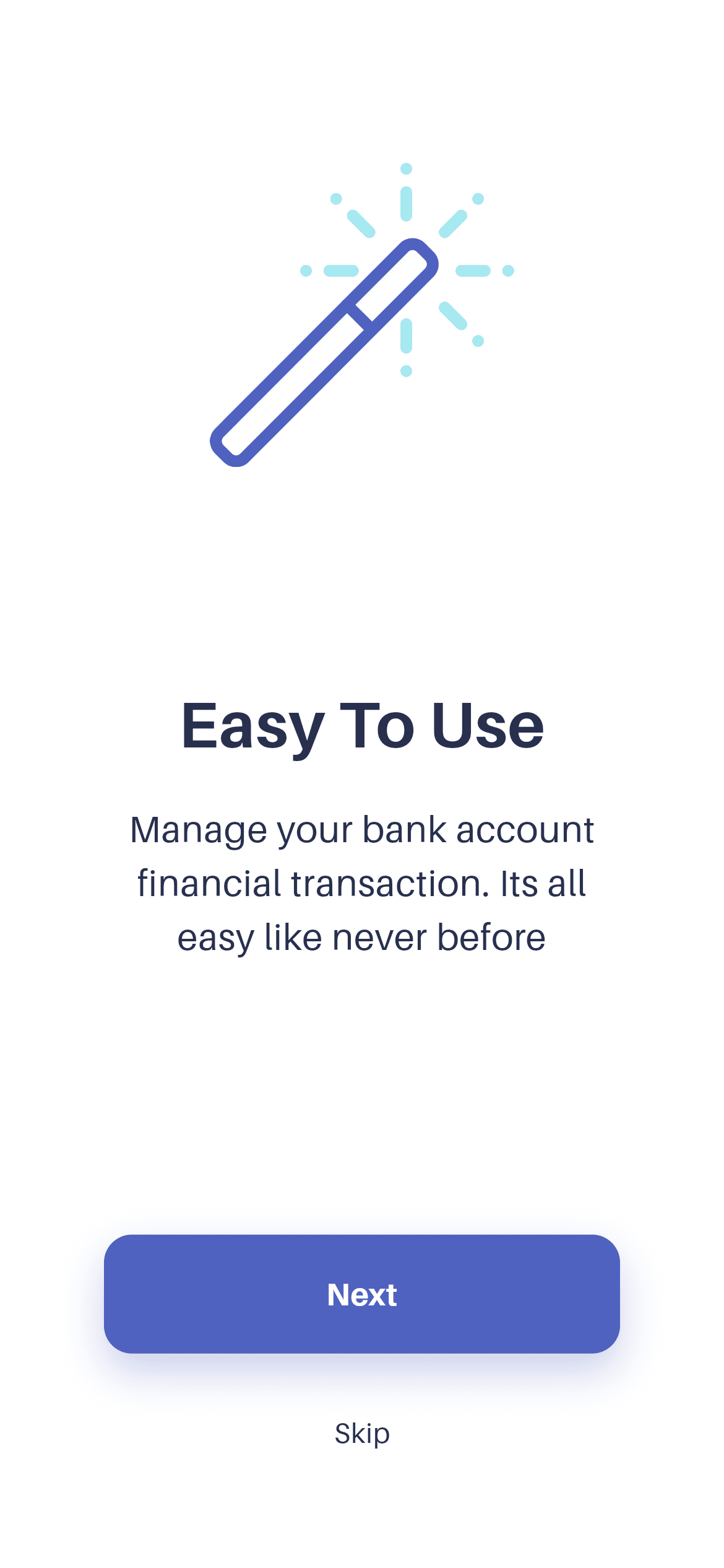
What you'll build
- ✓A content-only onboarding slide that stays readable at a glance
- ✓A reusable OnboardingScaffold you can call again for slide 3, 4 or 10
- ✓Aspect-ratio-driven illustration sizing that stays tasteful from small phones to tablets
- ✓onNext / onSkip hooks ready to wire to a PageController or Navigator
- ✓The bundled Aileron design font wired through pubspec.yaml
Step-by-step build
Create the file
Add a new file at lib/wallet_onboarding_2/wallet_onboarding_2_screen.dart in your Flutter project.
Register the bundled fonts
No external packages — this is pure Flutter. It does bundle its design font (Aileron), so drop the font file into fonts/ and declare it in pubspec.yaml:
flutter:
  fonts:
    - family: Aileron
      fonts:
- asset: fonts/Aileron-Regular.ttfBuild it, piece by piece
Here's how the screen goes together. Each block below is a real slice of the code with a plain-English explanation — paste them in order, or grab the whole file from the next section.
Importing the shared scaffold
import 'package:flutter/material.dart';

import 'widgets/onboarding_scaffold.dart';

/// Onboarding 2 — "Easy To Use" — from the Wallet App UI Kit (Finco).
///
/// Self-contained, pure Flutter. Bundles its exact design font (Aileron) and
/// the original kit illustration. Renders standalone when pushed as a route.
class WalletOnboardingTwoScreen extends StatelessWidget {
  const WalletOnboardingTwoScreen({super.key});
Two imports do all the work: Flutter's material library, and widgets/onboarding_scaffold.dart, which lives inside this screen's own folder. That local copy is intentional — each FlutterKit screen is self-contained so the CLI can install it without dragging in a shared library. WalletOnboardingTwoScreen is a StatelessWidget with a const constructor using a super parameter (super.key); const constructors matter here because Flutter can skip rebuilding a const widget entirely when its parent rebuilds.
Handing the illustration to the template
  @override
  Widget build(BuildContext context) {
    return OnboardingScaffold(
      imageAsset:
          'lib/screens/onboarding/wallet_onboarding_2/images/onboard_two.png',
      imageAspect: 182 / 182,
build() returns OnboardingScaffold directly — there is no Scaffold, no Column, no padding at this level. imageAsset points at the bundled onboard_two.png (a magic-wand illustration). imageAspect is 182 / 182, written as a division rather than 1.0 so the artwork's real pixel dimensions stay visible in the code. The scaffold uses it as width / height: it computes the image width from the viewport, then divides by this aspect to get the height, which means the art never stretches no matter how wide the screen gets.
The copy and the callbacks
      title: 'Easy To Use',
      subtitle:
          'Manage your bank account\nfinancial transaction. Its all\neasy like never before',
      onNext: () {},
      onSkip: () {},
    );
  }
}
title is the 'Easy To Use' headline the scaffold renders at 35px bold Aileron, and subtitle is the supporting line at 20px regular. The \n characters inside the subtitle force the three-line break from the original design instead of letting the text reflow at arbitrary widths. onNext and onSkip are empty closures in the standalone demo — replace them with _controller.nextPage(...) if this slide sits inside a PageView, or Navigator.pushReplacement(...) to jump straight to sign-up. Because these are the only four values the slide supplies, building slide 3 is a copy of this file with different strings.
Full code
The complete, ready-to-paste source (2 files). Free to use in your projects — one click copies it all.
import 'package:flutter/material.dart';

import 'widgets/onboarding_scaffold.dart';

/// Onboarding 2 — "Easy To Use" — from the Wallet App UI Kit (Finco).
///
/// Self-contained, pure Flutter. Bundles its exact design font (Aileron) and
/// the original kit illustration. Renders standalone when pushed as a route.
class WalletOnboardingTwoScreen extends StatelessWidget {
  const WalletOnboardingTwoScreen({super.key});

  @override
  Widget build(BuildContext context) {
    return OnboardingScaffold(
      imageAsset:
          'lib/screens/onboarding/wallet_onboarding_2/images/onboard_two.png',
      imageAspect: 182 / 182,
      title: 'Easy To Use',
      subtitle:
          'Manage your bank account\nfinancial transaction. Its all\neasy like never before',
      onNext: () {},
      onSkip: () {},
    );
  }
}
Plus bundled 3 binary assets (fonts/images). The CLI and MCP install those for you automatically.
Two faster ways to add it
Copy-paste works, but you can skip it entirely.
1. FlutterKit CLI
One command drops this screen — and its fonts — straight into your project.
$ flutterkit add wallet-onboarding-22. AI agent (MCP)
Connect FlutterKit's MCP server in Claude or Cursor and just ask your agent to install wallet-onboarding-2 — it fetches and writes the files for you.
FAQ
Is this Flutter onboarding screen free to use?
Yes. The full Dart source on this page — both the slide and the OnboardingScaffold it uses — is free to copy into personal or commercial projects. You can also install it with the FlutterKit CLI (flutterkit add wallet-onboarding-2) or have an AI agent add it via MCP.
How do I turn this into a real swipeable carousel?
Wrap the slides in a PageView with a PageController, put this screen and its siblings in the children list, and point onNext at controller.nextPage(). Because each slide is a plain widget with no internal navigation, they compose without any changes.
Does it need any external packages?
No — it's pure Flutter on the material library. It does ship two assets: the bundled Aileron font and the onboard_two.png illustration, both registered in pubspec.yaml as shown in step 2. The CLI and MCP copy those files across automatically.
Which Flutter version does it target?
It uses super parameters (super.key), so it needs Dart 3 / Flutter 3.10+, and the scaffold uses Color.withValues() for the button shadow, which needs Flutter 3.22+. On an older SDK, swap withValues(alpha: 0.30) for withOpacity(0.30).

