How to Build a Wallet Onboarding Screen in Flutter (Full Code + Preview)
Onboarding is where a fintech app earns a new user's trust before asking for anything. This tutorial builds the first slide of a wallet onboarding carousel — a 'Fast & Secure' screen with a centered shield illustration, a bold heading, a reassuring two-line subtitle, and Next / Skip actions. The clever part is reuse: the screen file itself is tiny because all the layout lives in one shared OnboardingScaffold widget you configure with a handful of props. Swap the image and copy and you have slide two or three. It's pure Flutter with a single bundled font.
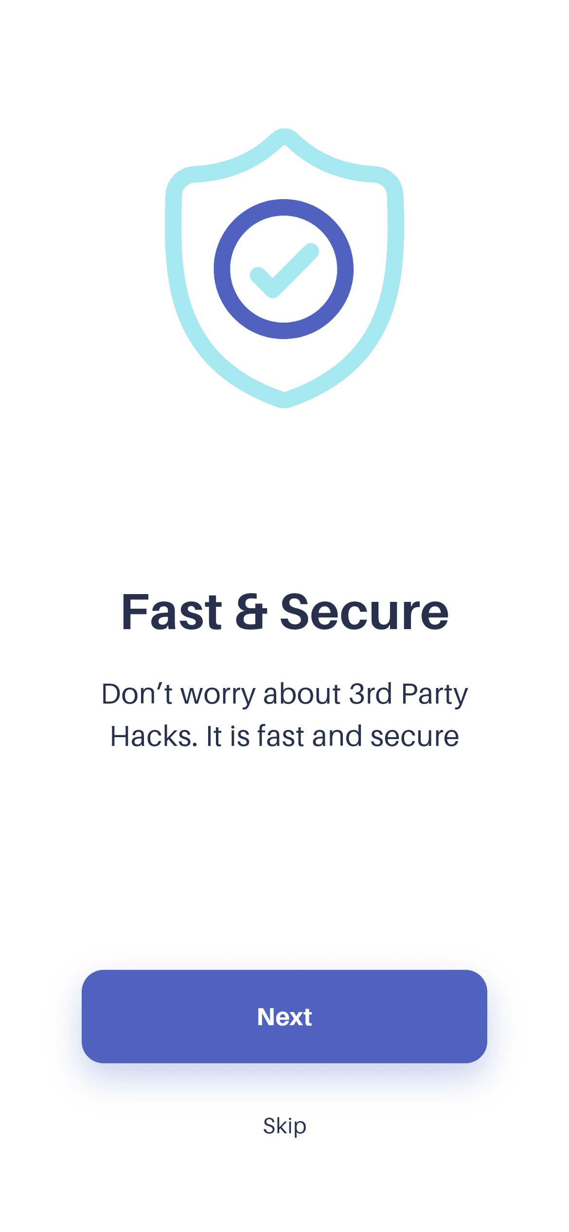
What you'll build
- ✓A reusable OnboardingScaffold you configure per slide with an image, aspect ratio, title, subtitle, and Next/Skip callbacks
- ✓A responsive body that centers with flex Spacers on tall phones and scrolls instead of overflowing on short ones
- ✓A press-animated blue 'Next' button (#4F62C0) and a low-key grey 'Skip' text link
- ✓The 'Fast & Secure' slide wired up in about a dozen lines by passing props into the shared scaffold
Step-by-step build
Create the file
Add a new file at lib/wallet_onboarding_1/wallet_onboarding_1_screen.dart in your Flutter project.
Register the bundled fonts
No external packages — this is pure Flutter. It does bundle its design font (Aileron), so drop the font file into fonts/ and declare it in pubspec.yaml:
flutter:
  fonts:
    - family: Aileron
      fonts:
- asset: fonts/Aileron-Regular.ttfBuild it, piece by piece
Here's how the screen goes together. Each block below is a real slice of the code with a plain-English explanation — paste them in order, or grab the whole file from the next section.
Imports and the screen's doc comment
import 'package:flutter/material.dart';

import 'widgets/onboarding_scaffold.dart';

/// Onboarding 1 — "Fast & Secure" — from the Wallet App UI Kit (Finco).
///
/// Self-contained, pure Flutter. Bundles its exact design font (Aileron) and
/// the original kit illustration. Renders standalone when pushed as a route.
The file imports Flutter's material library and one local widget, onboarding_scaffold.dart — every visual piece lives in that shared scaffold, which is exactly why this screen file stays so short. The doc comment above the class labels this as Onboarding 1, the 'Fast & Secure' slide from the Wallet (Finco) UI kit, and notes it is self-contained pure Flutter that bundles its own Aileron font and kit illustration so the slide can be pushed as a standalone route.
A stateless screen that returns the scaffold
class WalletOnboardingOneScreen extends StatelessWidget {
  const WalletOnboardingOneScreen({super.key});

  @override
  Widget build(BuildContext context) {
WalletOnboardingOneScreen is a StatelessWidget — the slide holds no changing state of its own, so stateless is the right choice. Its const constructor forwards super.key using a Dart 3 super-parameter. The build() method returns a single OnboardingScaffold: rather than laying out columns and buttons here, the screen just fills in that reusable template's parameters, which is what lets all three onboarding slides share one layout.
Wiring the illustration with an aspect ratio
    return OnboardingScaffold(
      imageAsset:
          'lib/screens/onboarding/wallet_onboarding_1/images/onboard_one.png',
      imageAspect: 152 / 178,
The first two arguments feed the artwork. imageAsset points at the bundled onboard_one.png shield illustration, and imageAspect is written as 152 / 178 — the raw width-over-height of the source image, passed as a division so it reads like the original spec instead of a rounded decimal. Inside the scaffold that ratio drives Image.asset's height while its width is clamped to about 42% of the screen (between 120 and 220px), keeping the picture proportional and crisp on any device.
The copy and the Next / Skip actions
      title: 'Fast & Secure',
      subtitle: 'Don’t worry about 3rd Party\nHacks. It is fast and secure',
      onNext: () {},
      onSkip: () {},
    );
  }
}
The remaining props supply the content and behaviour. title is 'Fast & Secure' (rendered as 35px bold Aileron by the scaffold) and subtitle carries the reassurance about third-party hacks, with a \n forcing the deliberate two-line break. onNext and onSkip are handed empty closures () {} — placeholders you replace with real navigation, such as advancing to the next slide or jumping straight to sign-up. The two closing braces end the compact build method.
Full code
The complete, ready-to-paste source (2 files). Free to use in your projects — one click copies it all.
import 'package:flutter/material.dart';

import 'widgets/onboarding_scaffold.dart';

/// Onboarding 1 — "Fast & Secure" — from the Wallet App UI Kit (Finco).
///
/// Self-contained, pure Flutter. Bundles its exact design font (Aileron) and
/// the original kit illustration. Renders standalone when pushed as a route.
class WalletOnboardingOneScreen extends StatelessWidget {
  const WalletOnboardingOneScreen({super.key});

  @override
  Widget build(BuildContext context) {
    return OnboardingScaffold(
      imageAsset:
          'lib/screens/onboarding/wallet_onboarding_1/images/onboard_one.png',
      imageAspect: 152 / 178,
      title: 'Fast & Secure',
      subtitle: 'Don’t worry about 3rd Party\nHacks. It is fast and secure',
      onNext: () {},
      onSkip: () {},
    );
  }
}
Plus bundled 3 binary assets (fonts/images). The CLI and MCP install those for you automatically.
Two faster ways to add it
Copy-paste works, but you can skip it entirely.
1. FlutterKit CLI
One command drops this screen — and its fonts — straight into your project.
$ flutterkit add wallet-onboarding-12. AI agent (MCP)
Connect FlutterKit's MCP server in Claude or Cursor and just ask your agent to install wallet-onboarding-1 — it fetches and writes the files for you.
FAQ
Is this Flutter onboarding screen free to use?
Yes. The full Dart on this page is free to copy into your own apps, personal or commercial. Paste it directly, install it with the FlutterKit CLI (flutterkit add wallet-onboarding-1), or have an AI agent add it for you via MCP.
Does it need any external packages?
No — it's pure Flutter, built only on package:flutter/material.dart. The single extra asset is the bundled Aileron font (used for the title, subtitle, and buttons), which you register in pubspec.yaml as shown in step 2. The CLI and MCP install the font files for you.
Which Flutter version does it target?
The shared OnboardingScaffold uses modern APIs — Color.withValues() for the Next button's shadow and super parameters on its constructors — so it targets Flutter 3.22+ (Dart 3). On an older SDK, swap withValues(alpha: 0.30) for withOpacity(0.30) and it will compile.

