How to Build a Your Cards Wallet Screen in Flutter (Full Code + Preview)
A card-management screen has to do three things at once: show the cards, let you switch between physical and virtual, and expose per-card controls. This tutorial builds exactly that from the Finco kit — a top bar, a 'Your Cards' header, a two-option segmented control, a horizontally-scrolling carousel of MasterCard-style cards, three toggle rows for Contactless / Online Payments / ATM Withdraws, and a floating bottom nav layered over the scroll with a Stack. You'll also see how a shared palette class keeps the whole screen's styling in one file.
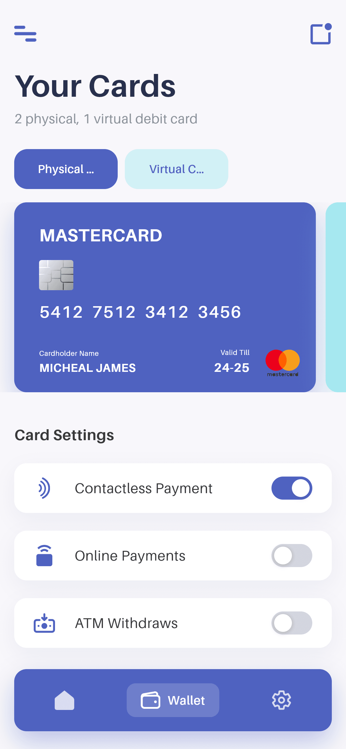
What you'll build
- ✓A Stack layout that floats the bottom nav above a scrolling body instead of stealing its height
- ✓A segmented control built from two AnimatedContainers that cross-fade their fill in 180ms
- ✓A horizontal card carousel whose card width is computed from the viewport and capped at the design's 340dp
- ✓Card-settings rows with icon, ellipsised label and a toggle, laid out so long labels never overflow
- ✓A shared P palette class holding colours, fonts, text styles and the card shadow
Step-by-step build
Create the file
Add a new file at lib/wallet_wallet/wallet_wallet_screen.dart in your Flutter project.
Register the bundled fonts
No external packages — this is pure Flutter. It does bundle its design font (Aileron), so drop the font file into fonts/ and declare it in pubspec.yaml:
flutter:
  fonts:
    - family: Aileron
      fonts:
- asset: fonts/Aileron-Regular.ttfBuild it, piece by piece
Here's how the screen goes together. Each block below is a real slice of the code with a plain-English explanation — paste them in order, or grab the whole file from the next section.
Two integers of state, and the Stack layout
import 'package:flutter/material.dart';

import 'widgets/bottom_nav.dart';
import 'widgets/credit_card.dart';
import 'widgets/palette.dart';
import 'widgets/toggle_switch.dart';

/// "Your Cards" wallet screen from the Wallet App UI Kit (Finco): a top bar,
/// a header, a physical/virtual segmented control, a horizontally-scrolling
/// card carousel, card-settings toggles and the floating bottom nav.
///
/// Self-contained, pure Flutter. Bundles its exact design font (Aileron) and
/// the kit's card art + icons. Fully responsive — content scrolls, cards size
/// to the viewport and width caps on large screens. Renders standalone when
/// pushed as a route.
class WalletWalletScreen extends StatefulWidget {
  const WalletWalletScreen({super.key});

  @override
  State<WalletWalletScreen> createState() => _WalletWalletScreenState();
}

class _WalletWalletScreenState extends State<WalletWalletScreen> {
  int _navIndex = 1; // Wallet tab.
  int _cardType = 0; // 0 = physical, 1 = virtual.

  @override
  Widget build(BuildContext context) {
    return Scaffold(
      backgroundColor: P.bg,
      body: SafeArea(
        bottom: false,
        child: Center(
          child: ConstrainedBox(
            constraints: const BoxConstraints(maxWidth: 480),
            child: Stack(
              children: <Widget>[
                SingleChildScrollView(
                  physics: const BouncingScrollPhysics(),
                  padding: const EdgeInsets.only(top: 18, bottom: 120),
Four local widget imports and no packages. The whole screen's state is two ints: _navIndex (which bottom-nav tab is lit) and _cardType (0 = physical, 1 = virtual). Background comes from P.bg — P is the shared palette class the kit uses so colours and text styles live in one place. SafeArea(bottom: false) is deliberate: the top inset is respected, but the bottom is left to the nav bar's own SafeArea further down. Then Center + ConstrainedBox(maxWidth: 480) caps the layout on tablets, and a Stack lets the scroll view and the floating nav occupy the same space. The scroll view's bottom padding of 120 is what stops the last toggle row hiding behind that nav.
Assembling the page body
                  child: Column(
                    crossAxisAlignment: CrossAxisAlignment.start,
                    children: <Widget>[
                      const Padding(
                        padding: EdgeInsets.symmetric(horizontal: 16),
                        child: _TopBar(),
                      ),
                      const SizedBox(height: 18),
                      const Padding(
                        padding: EdgeInsets.symmetric(horizontal: 16),
                        child: _Header(),
                      ),
                      const SizedBox(height: 24),
                      Padding(
                        padding: const EdgeInsets.symmetric(horizontal: 16),
                        child: _Tabs(
                          selected: _cardType,
                          onChanged: (int i) => setState(() => _cardType = i),
                        ),
                      ),
                      const SizedBox(height: 15),
                      const _CardCarousel(),
                      const SizedBox(height: 36),
                      const Padding(
                        padding: EdgeInsets.symmetric(horizontal: 16),
                        child: Text('Card Settings', style: P.sectionHeader),
                      ),
                      const SizedBox(height: 20),
                      const Padding(
                        padding: EdgeInsets.symmetric(horizontal: 16),
                        child: _Settings(),
                      ),
                    ],
                  ),
                ),
                Align(
                  alignment: Alignment.bottomCenter,
                  child: SafeArea(
                    top: false,
                    child: BottomNav(
                      currentIndex: _navIndex,
                      onChanged: (int i) => setState(() => _navIndex = i),
                    ),
                  ),
                ),
              ],
            ),
          ),
        ),
      ),
    );
  }
}
The Column is a straight list of sections with fixed gaps, and one detail is worth copying: horizontal padding is applied per section, not to the Column, because _CardCarousel deliberately needs the full width so cards can scroll off the edge. _Tabs receives the current _cardType and a callback that calls setState. Below the scroll view, the nav is positioned with Align(bottomCenter) wrapped in its own SafeArea(top: false) so it lifts above the home indicator on modern phones. Because it lives in the Stack rather than Scaffold's bottomNavigationBar, it floats over the content with the background visible around it.
The segmented control
/// Physical / Virtual segmented control.
class _Tabs extends StatelessWidget {
  const _Tabs({required this.selected, required this.onChanged});

  final int selected;
  final ValueChanged<int> onChanged;

  @override
  Widget build(BuildContext context) {
    return Row(
      children: <Widget>[
        Flexible(
          child: _Tab(
            label: 'Physical Card',
            active: selected == 0,
            onTap: () => onChanged(0),
          ),
        ),
        const SizedBox(width: 8),
        Flexible(
          child: _Tab(
            label: 'Virtual Card',
            active: selected == 1,
            onTap: () => onChanged(1),
          ),
        ),
        const Spacer(),
      ],
    );
  }
}

class _Tab extends StatelessWidget {
  const _Tab({required this.label, required this.active, required this.onTap});

  final String label;
  final bool active;
  final VoidCallback onTap;

  @override
  Widget build(BuildContext context) {
    return GestureDetector(
      behavior: HitTestBehavior.opaque,
      onTap: onTap,
      child: AnimatedContainer(
        duration: const Duration(milliseconds: 180),
        padding: const EdgeInsets.symmetric(horizontal: 24, vertical: 13),
        decoration: BoxDecoration(
          color: active ? P.blue : P.cyan.withValues(alpha: 0.45),
          borderRadius: BorderRadius.circular(15),
        ),
        child: Text(
          label,
          maxLines: 1,
          overflow: TextOverflow.ellipsis,
          textAlign: TextAlign.center,
          style: TextStyle(
            fontFamily: P.font,
            fontWeight: FontWeight.w600,
            fontSize: 13,
            color: active ? Colors.white : P.blue,
          ),
        ),
      ),
    );
  }
}
_Tabs is a Row of two Flexible tabs followed by a Spacer — the Spacer is what keeps the pair left-aligned rather than stretching to fill the width, while Flexible lets each tab shrink if the labels are long. Each _Tab is an AnimatedContainer with an 180ms duration, so switching selection animates the fill from P.blue to P.cyan at 45% alpha rather than snapping. The label colour flips between white and P.blue in the same frame. maxLines: 1 with TextOverflow.ellipsis on both the label and the header subtitle is cheap insurance against long translations breaking the layout.
The card carousel
/// Horizontally-scrolling card carousel.
class _CardCarousel extends StatelessWidget {
  const _CardCarousel();

  @override
  Widget build(BuildContext context) {
    return LayoutBuilder(
      builder: (BuildContext context, BoxConstraints constraints) {
        // Card width sizes to the viewport (with a peek of the next card),
        // capped at the source 340dp.
        final double cardWidth =
            (constraints.maxWidth - 48).clamp(240.0, 340.0);
        final double cardHeight = cardWidth / CreditCard.ratio;

        return SizedBox(
          height: cardHeight,
          child: ListView(
            scrollDirection: Axis.horizontal,
            physics: const BouncingScrollPhysics(),
            padding: const EdgeInsets.symmetric(horizontal: 16),
            children: <Widget>[
              SizedBox(
                width: cardWidth,
                child: const CreditCard(
                  background: P.blue,
                  foreground: Colors.white,
                  number: '5412  7512  3412  3456',
                  holder: 'MICHEAL JAMES',
                  validTill: '24-25',
                ),
              ),
              const SizedBox(width: 11),
              SizedBox(
                width: cardWidth,
                child: const CreditCard(
                  background: P.cyan,
                  foreground: P.blue,
                  number: '5412  7512  3412  3456',
                  holder: 'MICHEAL JAMES',
                  validTill: '24-25',
                ),
              ),
            ],
          ),
        );
      },
    );
  }
}
A LayoutBuilder computes cardWidth as (constraints.maxWidth - 48).clamp(240.0, 340.0) — subtracting 48 leaves a sliver of the next card visible at the edge, which is the visual cue that tells users the row scrolls. cardHeight comes from cardWidth / CreditCard.ratio, so the card art keeps its exact 340:214 proportions at any size. The whole thing is a fixed-height SizedBox wrapping a horizontal ListView with BouncingScrollPhysics; each CreditCard takes background, foreground, number, holder and validTill, and the two demo cards differ only by colour pair (blue-on-white vs cyan-on-blue). Replace the children with a ListView.builder over your card list and nothing else changes.
Card-settings toggle rows
class _Settings extends StatelessWidget {
  const _Settings();

  @override
  Widget build(BuildContext context) {
    return Column(
      children: const <Widget>[
        _SettingRow(
          icon: 'icon_contctless.png',
          label: 'Contactless Payment',
          value: true,
        ),
        SizedBox(height: 20),
        _SettingRow(
          icon: 'icon_onlinepay.png',
          label: 'Online Payments',
          value: false,
        ),
        SizedBox(height: 20),
        _SettingRow(
          icon: 'icon_atmwithdrae.png',
          label: 'ATM Withdraws',
          value: false,
        ),
      ],
    );
  }
}

class _SettingRow extends StatelessWidget {
  const _SettingRow({
    required this.icon,
    required this.label,
    required this.value,
  });

  final String icon;
  final String label;
  final bool value;

  @override
  Widget build(BuildContext context) {
    return Container(
      height: 56,
      padding: const EdgeInsets.symmetric(horizontal: 22),
      decoration: BoxDecoration(
        color: Colors.white,
        borderRadius: BorderRadius.circular(14),
        boxShadow: P.cardShadow,
      ),
      child: Row(
        children: <Widget>[
          SizedBox(
            width: 24,
            child: Image.asset('${P.img}/$icon',
                height: 24, filterQuality: FilterQuality.high),
          ),
          const SizedBox(width: 22),
          Expanded(
            child: Text(
              label,
              maxLines: 1,
              overflow: TextOverflow.ellipsis,
              style: const TextStyle(
                fontFamily: P.font,
                fontWeight: FontWeight.w400,
                fontSize: 16,
                color: P.name,
              ),
            ),
          ),
          const SizedBox(width: 12),
          ToggleSwitch(value: value),
        ],
      ),
    );
  }
}
_Settings is a const list of three _SettingRows, each naming an icon file, a label and a boolean. The row itself is a 56px-tall white Container with a 14px radius and P.cardShadow — pulling the shadow into the palette means every card-like surface in the kit is lit identically. Inside, the icon sits in a fixed 24px-wide SizedBox so all three labels start at exactly the same x position even if the icons differ in width, the label is Expanded with ellipsis so it truncates instead of overflowing, and the ToggleSwitch is last. Note the switches are presentational here — value is passed in and never written back, so wire each row to your card API and lift that boolean into state when you connect it.
Full code
The complete, ready-to-paste source (5 files). Free to use in your projects — one click copies it all.
import 'package:flutter/material.dart';

import 'widgets/bottom_nav.dart';
import 'widgets/credit_card.dart';
import 'widgets/palette.dart';
import 'widgets/toggle_switch.dart';

/// "Your Cards" wallet screen from the Wallet App UI Kit (Finco): a top bar,
/// a header, a physical/virtual segmented control, a horizontally-scrolling
/// card carousel, card-settings toggles and the floating bottom nav.
///
/// Self-contained, pure Flutter. Bundles its exact design font (Aileron) and
/// the kit's card art + icons. Fully responsive — content scrolls, cards size
/// to the viewport and width caps on large screens. Renders standalone when
/// pushed as a route.
class WalletWalletScreen extends StatefulWidget {
  const WalletWalletScreen({super.key});

  @override
  State<WalletWalletScreen> createState() => _WalletWalletScreenState();
}

class _WalletWalletScreenState extends State<WalletWalletScreen> {
  int _navIndex = 1; // Wallet tab.
  int _cardType = 0; // 0 = physical, 1 = virtual.

  @override
  Widget build(BuildContext context) {
    return Scaffold(
      backgroundColor: P.bg,
      body: SafeArea(
        bottom: false,
        child: Center(
          child: ConstrainedBox(
            constraints: const BoxConstraints(maxWidth: 480),
            child: Stack(
              children: <Widget>[
                SingleChildScrollView(
                  physics: const BouncingScrollPhysics(),
                  padding: const EdgeInsets.only(top: 18, bottom: 120),
                  child: Column(
                    crossAxisAlignment: CrossAxisAlignment.start,
                    children: <Widget>[
                      const Padding(
                        padding: EdgeInsets.symmetric(horizontal: 16),
                        child: _TopBar(),
                      ),
                      const SizedBox(height: 18),
                      const Padding(
                        padding: EdgeInsets.symmetric(horizontal: 16),
                        child: _Header(),
                      ),
                      const SizedBox(height: 24),
                      Padding(
                        padding: const EdgeInsets.symmetric(horizontal: 16),
                        child: _Tabs(
                          selected: _cardType,
                          onChanged: (int i) => setState(() => _cardType = i),
                        ),
                      ),
                      const SizedBox(height: 15),
                      const _CardCarousel(),
                      const SizedBox(height: 36),
                      const Padding(
                        padding: EdgeInsets.symmetric(horizontal: 16),
                        child: Text('Card Settings', style: P.sectionHeader),
                      ),
                      const SizedBox(height: 20),
                      const Padding(
                        padding: EdgeInsets.symmetric(horizontal: 16),
                        child: _Settings(),
                      ),
                    ],
                  ),
                ),
                Align(
                  alignment: Alignment.bottomCenter,
                  child: SafeArea(
                    top: false,
                    child: BottomNav(
                      currentIndex: _navIndex,
                      onChanged: (int i) => setState(() => _navIndex = i),
                    ),
                  ),
                ),
              ],
            ),
          ),
        ),
      ),
    );
  }
}

class _TopBar extends StatelessWidget {
  const _TopBar();

  @override
  Widget build(BuildContext context) {
    return SizedBox(
      height: 40,
      child: Row(
        children: <Widget>[
          Image.asset('${P.img}/icon_menu.png',
              height: 18, filterQuality: FilterQuality.high),
          const Spacer(),
          Image.asset('${P.img}/icon_dashboard.png',
              height: 24, filterQuality: FilterQuality.high),
        ],
      ),
    );
  }
}

class _Header extends StatelessWidget {
  const _Header();

  @override
  Widget build(BuildContext context) {
    return Column(
      crossAxisAlignment: CrossAxisAlignment.start,
      children: <Widget>[
        const Text('Your Cards', style: P.title),
        const SizedBox(height: 7),
        Text('2 physical, 1 virtual debit card',
            maxLines: 1, overflow: TextOverflow.ellipsis, style: P.subtitle),
      ],
    );
  }
}

/// Physical / Virtual segmented control.
class _Tabs extends StatelessWidget {
  const _Tabs({required this.selected, required this.onChanged});

  final int selected;
  final ValueChanged<int> onChanged;

  @override
  Widget build(BuildContext context) {
    return Row(
      children: <Widget>[
        Flexible(
          child: _Tab(
            label: 'Physical Card',
            active: selected == 0,
            onTap: () => onChanged(0),
          ),
        ),
        const SizedBox(width: 8),
        Flexible(
          child: _Tab(
            label: 'Virtual Card',
            active: selected == 1,
            onTap: () => onChanged(1),
          ),
        ),
        const Spacer(),
      ],
    );
  }
}

class _Tab extends StatelessWidget {
  const _Tab({required this.label, required this.active, required this.onTap});

  final String label;
  final bool active;
  final VoidCallback onTap;

  @override
  Widget build(BuildContext context) {
    return GestureDetector(
      behavior: HitTestBehavior.opaque,
      onTap: onTap,
      child: AnimatedContainer(
        duration: const Duration(milliseconds: 180),
        padding: const EdgeInsets.symmetric(horizontal: 24, vertical: 13),
        decoration: BoxDecoration(
          color: active ? P.blue : P.cyan.withValues(alpha: 0.45),
          borderRadius: BorderRadius.circular(15),
        ),
        child: Text(
          label,
          maxLines: 1,
          overflow: TextOverflow.ellipsis,
          textAlign: TextAlign.center,
          style: TextStyle(
            fontFamily: P.font,
            fontWeight: FontWeight.w600,
            fontSize: 13,
            color: active ? Colors.white : P.blue,
          ),
        ),
      ),
    );
  }
}

/// Horizontally-scrolling card carousel.
class _CardCarousel extends StatelessWidget {
  const _CardCarousel();

  @override
  Widget build(BuildContext context) {
    return LayoutBuilder(
      builder: (BuildContext context, BoxConstraints constraints) {
        // Card width sizes to the viewport (with a peek of the next card),
        // capped at the source 340dp.
        final double cardWidth =
            (constraints.maxWidth - 48).clamp(240.0, 340.0);
        final double cardHeight = cardWidth / CreditCard.ratio;

        return SizedBox(
          height: cardHeight,
          child: ListView(
            scrollDirection: Axis.horizontal,
            physics: const BouncingScrollPhysics(),
            padding: const EdgeInsets.symmetric(horizontal: 16),
            children: <Widget>[
              SizedBox(
                width: cardWidth,
                child: const CreditCard(
                  background: P.blue,
                  foreground: Colors.white,
                  number: '5412  7512  3412  3456',
                  holder: 'MICHEAL JAMES',
                  validTill: '24-25',
                ),
              ),
              const SizedBox(width: 11),
              SizedBox(
                width: cardWidth,
                child: const CreditCard(
                  background: P.cyan,
                  foreground: P.blue,
                  number: '5412  7512  3412  3456',
                  holder: 'MICHEAL JAMES',
                  validTill: '24-25',
                ),
              ),
            ],
          ),
        );
      },
    );
  }
}

class _Settings extends StatelessWidget {
  const _Settings();

  @override
  Widget build(BuildContext context) {
    return Column(
      children: const <Widget>[
        _SettingRow(
          icon: 'icon_contctless.png',
          label: 'Contactless Payment',
          value: true,
        ),
        SizedBox(height: 20),
        _SettingRow(
          icon: 'icon_onlinepay.png',
          label: 'Online Payments',
          value: false,
        ),
        SizedBox(height: 20),
        _SettingRow(
          icon: 'icon_atmwithdrae.png',
          label: 'ATM Withdraws',
          value: false,
        ),
      ],
    );
  }
}

class _SettingRow extends StatelessWidget {
  const _SettingRow({
    required this.icon,
    required this.label,
    required this.value,
  });

  final String icon;
  final String label;
  final bool value;

  @override
  Widget build(BuildContext context) {
    return Container(
      height: 56,
      padding: const EdgeInsets.symmetric(horizontal: 22),
      decoration: BoxDecoration(
        color: Colors.white,
        borderRadius: BorderRadius.circular(14),
        boxShadow: P.cardShadow,
      ),
      child: Row(
        children: <Widget>[
          SizedBox(
            width: 24,
            child: Image.asset('${P.img}/$icon',
                height: 24, filterQuality: FilterQuality.high),
          ),
          const SizedBox(width: 22),
          Expanded(
            child: Text(
              label,
              maxLines: 1,
              overflow: TextOverflow.ellipsis,
              style: const TextStyle(
                fontFamily: P.font,
                fontWeight: FontWeight.w400,
                fontSize: 16,
                color: P.name,
              ),
            ),
          ),
          const SizedBox(width: 12),
          ToggleSwitch(value: value),
        ],
      ),
    );
  }
}
Plus bundled 13 binary assets (fonts/images). The CLI and MCP install those for you automatically.
Two faster ways to add it
Copy-paste works, but you can skip it entirely.
1. FlutterKit CLI
One command drops this screen — and its fonts — straight into your project.
$ flutterkit add wallet-cards2. AI agent (MCP)
Connect FlutterKit's MCP server in Claude or Cursor and just ask your agent to install wallet-cards — it fetches and writes the files for you.
FAQ
Is this Flutter wallet cards screen free to use?
Yes. The full Dart source on this page — the screen plus its palette, bottom nav, credit card and toggle widgets — is free for personal and commercial projects. Install it with the FlutterKit CLI (flutterkit add wallet-cards) or have an AI agent add it via MCP.
Do the setting toggles actually save?
Not yet — each _SettingRow takes its value as a fixed bool, so the switches are display-only. To make them live, move the three booleans into _WalletWalletScreenState, pass an onChanged down to each row, and call your card-controls API from there.
Does it need any external packages?
No — it's pure Flutter on the material library. It bundles the Aileron font plus the kit's card art and icons (menu, dashboard, contactless, online pay, ATM), registered in pubspec.yaml as shown in step 2; the CLI and MCP install those files automatically.
Which Flutter version does it target?
It uses Color.withValues() in the tab fill and elsewhere, so it targets Flutter 3.22+ (Dart 3). On an older SDK, swap withValues(alpha: 0.45) for withOpacity(0.45) throughout.

