How to Build an Add Card Screen in Flutter (Full Code + Preview)
Adding a payment method is the highest-anxiety form in any wallet app, so the design puts a picture of a card at the top before asking for a single digit. This tutorial builds that screen from the Finco kit: a top bar, an 'Add New Card' title, a card preview held to its exact 340:214 aspect ratio, then a number field, a holder field, and a 3:2 split row for expiry and CCV, finished with a press-animated 'Add Card' button — all floating above the app's bottom nav.
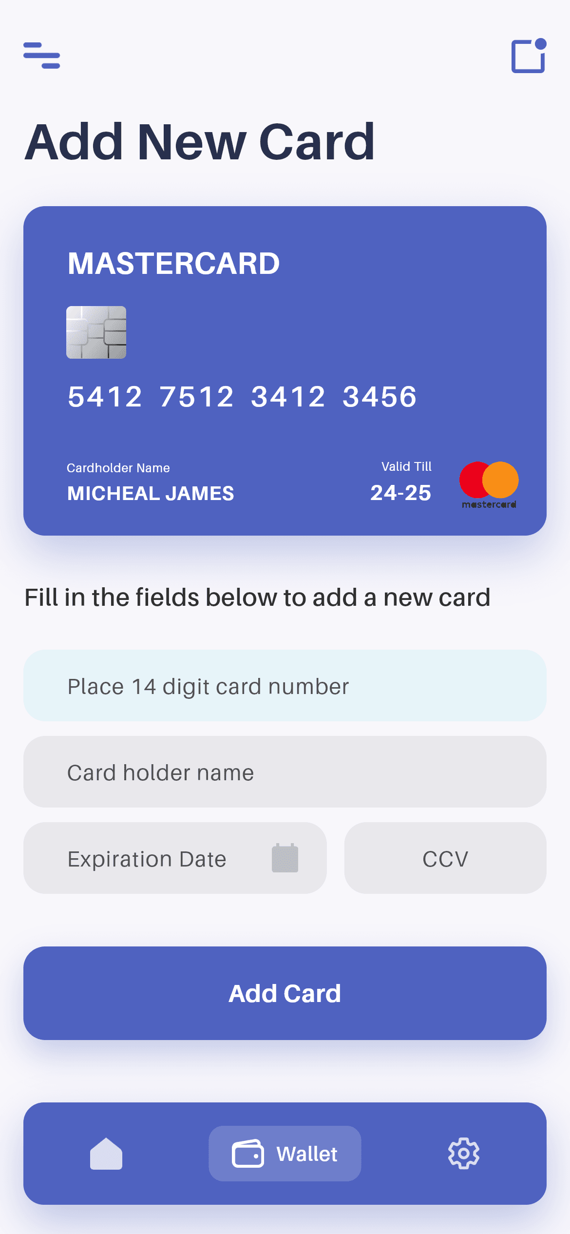
What you'll build
- ✓A card preview locked to the design's aspect ratio, so it scales without ever distorting
- ✓A 3:2 Expanded split that puts expiry and CCV on one row at a sensible width ratio
- ✓Four fields from a single reusable CardInput widget, varied only by hint, keyboard and flags
- ✓A Stack that floats the bottom nav above a scrolling form, with 120px of bottom padding to clear it
- ✓The bundled Aileron design font wired through pubspec.yaml
Step-by-step build
Create the file
Add a new file at lib/wallet_add_card/wallet_add_card_screen.dart in your Flutter project.
Register the bundled fonts
No external packages — this is pure Flutter. It does bundle its design font (Aileron), so drop the font file into fonts/ and declare it in pubspec.yaml:
flutter:
  fonts:
    - family: Aileron
      fonts:
- asset: fonts/Aileron-Regular.ttfBuild it, piece by piece
Here's how the screen goes together. Each block below is a real slice of the code with a plain-English explanation — paste them in order, or grab the whole file from the next section.
State, the width cap, and the floating-nav Stack
import 'package:flutter/material.dart';

import 'widgets/bottom_nav.dart';
import 'widgets/card_input.dart';
import 'widgets/credit_card.dart';
import 'widgets/palette.dart';

/// "Add New Card" screen from the Wallet App UI Kit (Finco): a top bar, a live
/// card preview, a form (number / holder / expiry + CCV) and a primary CTA,
/// over the floating bottom nav.
///
/// Self-contained, pure Flutter. Bundles its exact design font (Aileron) and
/// the kit's card art + icons. Fully responsive — content scrolls, the card
/// scales to the viewport and width caps on large screens. Renders standalone
/// when pushed as a route.
class WalletAddCardScreen extends StatefulWidget {
  const WalletAddCardScreen({super.key});

  @override
  State<WalletAddCardScreen> createState() => _WalletAddCardScreenState();
}

class _WalletAddCardScreenState extends State<WalletAddCardScreen> {
  int _navIndex = 1; // Wallet context.

  @override
  Widget build(BuildContext context) {
    return Scaffold(
      backgroundColor: P.bg,
      body: SafeArea(
        bottom: false,
        child: Center(
          child: ConstrainedBox(
            constraints: const BoxConstraints(maxWidth: 480),
            child: Stack(
              children: <Widget>[
                SingleChildScrollView(
                  physics: const BouncingScrollPhysics(),
                  padding: const EdgeInsets.fromLTRB(16, 18, 16, 120),
                  child: Column(
                    crossAxisAlignment: CrossAxisAlignment.start,
                    children: <Widget>[
                      const _TopBar(),
                      const SizedBox(height: 18),
                      const Text('Add New Card', style: P.title),
                      const SizedBox(height: 25),
Four local widget imports, zero packages. The only state is _navIndex, because the form fields manage their own text. P.bg paints the background from the shared palette class. SafeArea(bottom: false) lets the nav bar handle the bottom inset itself, Center + ConstrainedBox(maxWidth: 480) stops the form stretching across a tablet, and the Stack holds two children: the scrolling form and the pinned nav. The scroll padding EdgeInsets.fromLTRB(16, 18, 16, 120) is doing real work — that 120 at the bottom is what keeps the 'Add Card' button reachable above the floating nav instead of hidden behind it.
The card preview and its aspect ratio
                      // Card preview sized to the source 340:214 ratio.
                      AspectRatio(
                        aspectRatio: CreditCard.ratio,
                        child: const CreditCard(
                          background: P.blue,
                          foreground: Colors.white,
                          number: '5412  7512  3412  3456',
                          holder: 'MICHEAL JAMES',
                          validTill: '24-25',
                        ),
                      ),
                      const SizedBox(height: 30),
                      const Text(
                        'Fill in the fields below to add a new card',
                        style: TextStyle(
                          fontFamily: P.font,
                          fontWeight: FontWeight.w600,
                          fontSize: 17,
                          color: Color(0xFF323232),
                        ),
                      ),
                      const SizedBox(height: 24),
AspectRatio(aspectRatio: CreditCard.ratio) is the key line. Rather than hard-coding a height, the preview takes whatever width the column gives it and derives its height from the constant the CreditCard widget itself exposes — the design's 340:214 proportion. On a narrow phone it shrinks, on a 480px-capped tablet layout it grows, and the chip, number and MasterCard art keep their relative positions either way. Below it sits the instruction line at 17px w600 in #323232, which reads as a form heading rather than body copy.
The form fields
                      const CardInput(
                        hint: 'Place 14 digit card number',
                        keyboardType: TextInputType.number,
                        accent: true,
                      ),
                      const SizedBox(height: 10),
                      const CardInput(hint: 'Card holder name'),
                      const SizedBox(height: 10),
                      Row(
                        crossAxisAlignment: CrossAxisAlignment.start,
                        children: const <Widget>[
                          Expanded(
                            flex: 3,
                            child: CardInput(
                              hint: 'Expiration Date',
                              keyboardType: TextInputType.datetime,
                              trailingAsset: 'icon_ex_date.png',
                            ),
                          ),
                          SizedBox(width: 12),
                          Expanded(
                            flex: 2,
                            child: CardInput(
                              hint: 'CCV',
                              keyboardType: TextInputType.number,
                              center: true,
                            ),
                          ),
                        ],
                      ),
All four inputs are the same CardInput widget with different arguments, which is why they can't drift apart visually. The card-number field passes accent: true (the highlighted style) and TextInputType.number to raise the numeric keypad. The holder field takes only a hint, so it gets the default text keyboard. Expiry and CCV share a Row where Expanded(flex: 3) and Expanded(flex: 2) split the width 60/40 — expiry needs more room for 'Expiration Date' and its trailing calendar icon, CCV needs less and sets center: true so the three digits sit in the middle of their box. crossAxisAlignment: CrossAxisAlignment.start keeps both fields top-aligned if one grows taller.
The CTA and the floating nav
                      const SizedBox(height: 36),
                      _PrimaryButton(label: 'Add Card', onTap: () {}),
                    ],
                  ),
                ),
                Align(
                  alignment: Alignment.bottomCenter,
                  child: SafeArea(
                    top: false,
                    child: BottomNav(
                      currentIndex: _navIndex,
                      onChanged: (int i) => setState(() => _navIndex = i),
                    ),
                  ),
                ),
              ],
            ),
          ),
        ),
      ),
    );
  }
}
A 36px gap, then _PrimaryButton with the 'Add Card' label and an empty onTap — that's where you'd validate the fields and call your payments API or tokenise with Stripe. Underneath, the nav is the Stack's second child: Align(bottomCenter) with its own SafeArea(top: false) so it clears the home indicator, and BottomNav gets _navIndex plus a setState callback. Because the nav lives in a Stack rather than Scaffold's bottomNavigationBar, the form scrolls behind it and the page background stays visible around its floating edges.
The press-animated primary button
class _PrimaryButton extends StatefulWidget {
  const _PrimaryButton({required this.label, required this.onTap});

  final String label;
  final VoidCallback onTap;

  @override
  State<_PrimaryButton> createState() => _PrimaryButtonState();
}

class _PrimaryButtonState extends State<_PrimaryButton> {
  bool _pressed = false;

  @override
  Widget build(BuildContext context) {
    return GestureDetector(
      onTapDown: (_) => setState(() => _pressed = true),
      onTapUp: (_) => setState(() => _pressed = false),
      onTapCancel: () => setState(() => _pressed = false),
      onTap: widget.onTap,
      child: AnimatedScale(
        scale: _pressed ? 0.98 : 1,
        duration: const Duration(milliseconds: 150),
        child: Container(
          width: double.infinity,
          padding: const EdgeInsets.symmetric(vertical: 20),
          decoration: BoxDecoration(
            color: P.blue,
            borderRadius: BorderRadius.circular(15),
            boxShadow: <BoxShadow>[
              BoxShadow(
                color: P.blue.withValues(alpha: 0.30),
                blurRadius: 18,
                offset: const Offset(0, 10),
              ),
            ],
          ),
          child: Text(
            widget.label,
            textAlign: TextAlign.center,
            style: const TextStyle(
              fontFamily: P.font,
              fontWeight: FontWeight.w700,
              fontSize: 17,
              color: Colors.white,
            ),
          ),
        ),
      ),
    );
  }
}
_PrimaryButton keeps a single _pressed boolean, set on onTapDown and cleared on both onTapUp and onTapCancel so a finger dragged off the button restores it instead of leaving it stuck. AnimatedScale shrinks it to 0.98 over 150ms. The Container is filled with P.blue at a 15px radius and casts a BoxShadow in that same P.blue at 30% alpha, blurred 18px and offset 10px down — a tinted shadow reads as a glow, where a black one would read as grime. width: double.infinity makes it span the form, and the label is 17px w700 in the palette's font.
Full code
The complete, ready-to-paste source (5 files). Free to use in your projects — one click copies it all.
import 'package:flutter/material.dart';

import 'widgets/bottom_nav.dart';
import 'widgets/card_input.dart';
import 'widgets/credit_card.dart';
import 'widgets/palette.dart';

/// "Add New Card" screen from the Wallet App UI Kit (Finco): a top bar, a live
/// card preview, a form (number / holder / expiry + CCV) and a primary CTA,
/// over the floating bottom nav.
///
/// Self-contained, pure Flutter. Bundles its exact design font (Aileron) and
/// the kit's card art + icons. Fully responsive — content scrolls, the card
/// scales to the viewport and width caps on large screens. Renders standalone
/// when pushed as a route.
class WalletAddCardScreen extends StatefulWidget {
  const WalletAddCardScreen({super.key});

  @override
  State<WalletAddCardScreen> createState() => _WalletAddCardScreenState();
}

class _WalletAddCardScreenState extends State<WalletAddCardScreen> {
  int _navIndex = 1; // Wallet context.

  @override
  Widget build(BuildContext context) {
    return Scaffold(
      backgroundColor: P.bg,
      body: SafeArea(
        bottom: false,
        child: Center(
          child: ConstrainedBox(
            constraints: const BoxConstraints(maxWidth: 480),
            child: Stack(
              children: <Widget>[
                SingleChildScrollView(
                  physics: const BouncingScrollPhysics(),
                  padding: const EdgeInsets.fromLTRB(16, 18, 16, 120),
                  child: Column(
                    crossAxisAlignment: CrossAxisAlignment.start,
                    children: <Widget>[
                      const _TopBar(),
                      const SizedBox(height: 18),
                      const Text('Add New Card', style: P.title),
                      const SizedBox(height: 25),
                      // Card preview sized to the source 340:214 ratio.
                      AspectRatio(
                        aspectRatio: CreditCard.ratio,
                        child: const CreditCard(
                          background: P.blue,
                          foreground: Colors.white,
                          number: '5412  7512  3412  3456',
                          holder: 'MICHEAL JAMES',
                          validTill: '24-25',
                        ),
                      ),
                      const SizedBox(height: 30),
                      const Text(
                        'Fill in the fields below to add a new card',
                        style: TextStyle(
                          fontFamily: P.font,
                          fontWeight: FontWeight.w600,
                          fontSize: 17,
                          color: Color(0xFF323232),
                        ),
                      ),
                      const SizedBox(height: 24),
                      const CardInput(
                        hint: 'Place 14 digit card number',
                        keyboardType: TextInputType.number,
                        accent: true,
                      ),
                      const SizedBox(height: 10),
                      const CardInput(hint: 'Card holder name'),
                      const SizedBox(height: 10),
                      Row(
                        crossAxisAlignment: CrossAxisAlignment.start,
                        children: const <Widget>[
                          Expanded(
                            flex: 3,
                            child: CardInput(
                              hint: 'Expiration Date',
                              keyboardType: TextInputType.datetime,
                              trailingAsset: 'icon_ex_date.png',
                            ),
                          ),
                          SizedBox(width: 12),
                          Expanded(
                            flex: 2,
                            child: CardInput(
                              hint: 'CCV',
                              keyboardType: TextInputType.number,
                              center: true,
                            ),
                          ),
                        ],
                      ),
                      const SizedBox(height: 36),
                      _PrimaryButton(label: 'Add Card', onTap: () {}),
                    ],
                  ),
                ),
                Align(
                  alignment: Alignment.bottomCenter,
                  child: SafeArea(
                    top: false,
                    child: BottomNav(
                      currentIndex: _navIndex,
                      onChanged: (int i) => setState(() => _navIndex = i),
                    ),
                  ),
                ),
              ],
            ),
          ),
        ),
      ),
    );
  }
}

class _TopBar extends StatelessWidget {
  const _TopBar();

  @override
  Widget build(BuildContext context) {
    return SizedBox(
      height: 40,
      child: Row(
        children: <Widget>[
          Image.asset('${P.img}/icon_menu.png',
              height: 18, filterQuality: FilterQuality.high),
          const Spacer(),
          Image.asset('${P.img}/icon_dashboard.png',
              height: 24, filterQuality: FilterQuality.high),
        ],
      ),
    );
  }
}

class _PrimaryButton extends StatefulWidget {
  const _PrimaryButton({required this.label, required this.onTap});

  final String label;
  final VoidCallback onTap;

  @override
  State<_PrimaryButton> createState() => _PrimaryButtonState();
}

class _PrimaryButtonState extends State<_PrimaryButton> {
  bool _pressed = false;

  @override
  Widget build(BuildContext context) {
    return GestureDetector(
      onTapDown: (_) => setState(() => _pressed = true),
      onTapUp: (_) => setState(() => _pressed = false),
      onTapCancel: () => setState(() => _pressed = false),
      onTap: widget.onTap,
      child: AnimatedScale(
        scale: _pressed ? 0.98 : 1,
        duration: const Duration(milliseconds: 150),
        child: Container(
          width: double.infinity,
          padding: const EdgeInsets.symmetric(vertical: 20),
          decoration: BoxDecoration(
            color: P.blue,
            borderRadius: BorderRadius.circular(15),
            boxShadow: <BoxShadow>[
              BoxShadow(
                color: P.blue.withValues(alpha: 0.30),
                blurRadius: 18,
                offset: const Offset(0, 10),
              ),
            ],
          ),
          child: Text(
            widget.label,
            textAlign: TextAlign.center,
            style: const TextStyle(
              fontFamily: P.font,
              fontWeight: FontWeight.w700,
              fontSize: 17,
              color: Colors.white,
            ),
          ),
        ),
      ),
    );
  }
}
Plus bundled 11 binary assets (fonts/images). The CLI and MCP install those for you automatically.
Two faster ways to add it
Copy-paste works, but you can skip it entirely.
1. FlutterKit CLI
One command drops this screen — and its fonts — straight into your project.
$ flutterkit add wallet-add-card2. AI agent (MCP)
Connect FlutterKit's MCP server in Claude or Cursor and just ask your agent to install wallet-add-card — it fetches and writes the files for you.
FAQ
Is this Flutter add-card screen free to use?
Yes. The complete Dart source on this page — the screen plus its palette, bottom nav, credit card and input widgets — is free for personal and commercial use. Install it with the FlutterKit CLI (flutterkit add wallet-add-card) or have an AI agent add it via MCP.
Does the preview card update as you type?
Not out of the box — the preview takes fixed demo values ('5412 7512 3412 3456', 'MICHEAL JAMES', '24-25'). To make it live, give each CardInput a TextEditingController, hold the values in _WalletAddCardScreenState, and pass them into CreditCard so setState repaints the preview on every keystroke.
Does it need any external packages?
No — it's pure Flutter on the material library. It bundles the Aileron font and the kit's card art and icons, registered in pubspec.yaml as shown in step 2. For real card capture you'd add your own payments SDK on top; the UI doesn't assume one.
Which Flutter version does it target?
Color.withValues() in the button shadow puts it at Flutter 3.22+ (Dart 3). On an older SDK, swap withValues(alpha: 0.30) for withOpacity(0.30).

