How to Build a Wallet Signup Success Screen in Flutter (Full Code + Preview)
The screen after signup does emotional work, not functional work — it tells the user the anxious part is over. This tutorial builds the Finco kit's 'Account Created!' state: a circular check illustration sized to half the viewport width, a 35px heading, two lines of confirmation copy and a single blue Continue button. There is no second action and nothing to read carefully, which is the point. You'll learn the flex-spacer centring pattern that keeps it balanced on any device and the scroll fallback that stops it overflowing on short ones.
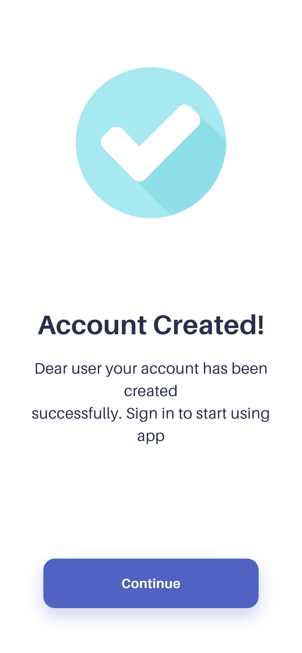
What you'll build
- ✓A success illustration sized at 50% of viewport width, clamped between 150 and 240 logical pixels
- ✓A 3 / 4 / 5 / 2 weighted-Spacer composition that stays balanced from an iPhone SE to a tablet
- ✓A single-CTA success layout with no competing secondary action
- ✓A scroll fallback that prevents overflow on short screens without adding a visible scrollbar
- ✓The bundled Aileron design font wired through pubspec.yaml
Step-by-step build
Create the file
Add a new file at lib/wallet_account_created/wallet_account_created_screen.dart in your Flutter project.
Register the bundled fonts
No external packages — this is pure Flutter. It does bundle its design font (Aileron), so drop the font file into fonts/ and declare it in pubspec.yaml:
flutter:
  fonts:
    - family: Aileron
      fonts:
- asset: fonts/Aileron-Regular.ttfBuild it, piece by piece
Here's how the screen goes together. Each block below is a real slice of the code with a plain-English explanation — paste them in order, or grab the whole file from the next section.
Tokens and a responsive image size
import 'package:flutter/material.dart';

/// "Account Created!" success screen from the Wallet App UI Kit (Finco): a
/// centred success illustration, a heading + supporting copy and a blue
/// "Continue" CTA.
///
/// Self-contained, pure Flutter. Bundles its exact design font (Aileron) and
/// the kit's original success illustration. Fully responsive — flex spacers
/// centre the content on tall devices and a scroll fallback prevents overflow
/// on short ones. Renders standalone when pushed as a route.
class WalletAccountCreatedScreen extends StatelessWidget {
  const WalletAccountCreatedScreen({super.key});

  static const Color _ink = Color(0xFF29304D);
  static const Color _blue = Color(0xFF4F62C0);
  static const String _image =
      'lib/screens/auth/wallet_account_created/images/account_created.png';

  @override
  Widget build(BuildContext context) {
    return Scaffold(
      backgroundColor: Colors.white,
      body: SafeArea(
        child: LayoutBuilder(
          builder: (BuildContext context, BoxConstraints constraints) {
            final double imgSize =
                (constraints.maxWidth * 0.5).clamp(150.0, 240.0);

            return SingleChildScrollView(
              physics: const ClampingScrollPhysics(),
              child: ConstrainedBox(
                constraints: BoxConstraints(minHeight: constraints.maxHeight),
                child: IntrinsicHeight(
                  child: Padding(
                    padding: const EdgeInsets.symmetric(horizontal: 24),
Two colour consts carry the palette — _ink (#29304D) for the text, _blue (#4F62C0) for the CTA — plus _image holding the illustration path as a const String so it's stated once. Inside the LayoutBuilder, imgSize is (constraints.maxWidth * 0.5).clamp(150.0, 240.0): the artwork takes half the width, but never drops below 150 or climbs past 240 logical pixels. The clamp is what makes the same file work on a small phone and a tablet. Then the overflow-proof trio: SingleChildScrollView with ClampingScrollPhysics, ConstrainedBox(minHeight: constraints.maxHeight) so the column fills at least one screen, and IntrinsicHeight so the Spacers below still have space to distribute.
The illustration and its flex spacers
                    child: Column(
                      crossAxisAlignment: CrossAxisAlignment.center,
                      children: <Widget>[
                        const Spacer(flex: 3),
                        Image.asset(
                          _image,
                          width: imgSize,
                          height: imgSize,
                          fit: BoxFit.contain,
                          filterQuality: FilterQuality.high,
                        ),
                        const Spacer(flex: 4),
The Column is centre-aligned and opens with Spacer(flex: 3), which is the top margin — proportional rather than fixed, so it grows on a tall device. Image.asset gets the same imgSize for both width and height because this artwork is square, with fit: BoxFit.contain guarding against any mismatch and filterQuality: FilterQuality.high asking for smoother scaling when the image is drawn at a non-native size. Spacer(flex: 4) then separates the art from the heading. Weighted spacers like this are why the layout re-balances instead of clumping when the screen height changes.
The heading and confirmation copy
                        const Text(
                          'Account Created!',
                          textAlign: TextAlign.center,
                          style: TextStyle(
                            fontFamily: 'Aileron',
                            fontWeight: FontWeight.w700,
                            fontSize: 35,
                            height: 1.2,
                            color: _ink,
                          ),
                        ),
                        const SizedBox(height: 21),
                        const Text(
                          'Dear user your account has been created\n'
                          'successfully. Sign in to start using app',
                          textAlign: TextAlign.center,
                          style: TextStyle(
                            fontFamily: 'Aileron',
                            fontWeight: FontWeight.w400,
                            fontSize: 20,
                            height: 1.45,
                            color: _ink,
                          ),
                        ),
'Account Created!' is 35px w700 Aileron with height: 1.2 in _ink, centred. Below a 21px SizedBox — a fixed gap this time, because the relationship between a heading and its own subtitle shouldn't stretch — comes the two-line confirmation, written as two adjacent string literals joined by an explicit \n so the break lands after 'created' exactly as designed. It renders at 20px regular with height: 1.45 in the same _ink colour rather than a lighter grey, which keeps the message feeling like a statement instead of fine print.
The single CTA
                        const Spacer(flex: 5),
                        _ContinueButton(onTap: () {}),
                        const Spacer(flex: 2),
                      ],
                    ),
                  ),
                ),
              ),
            );
          },
        ),
      ),
    );
  }
}
Spacer(flex: 5) is the largest gap in the file and it sits deliberately right before the button, pushing the action well clear of the copy. Then _ContinueButton, and a closing Spacer(flex: 2) that keeps it off the bottom edge. Notice what isn't here: no Skip, no 'go to dashboard' link, no secondary text. A success screen with one button can't be got wrong, and the empty onTap closure is where you'd call Navigator.pushReplacement into the app's home so the user can't swipe back into signup.
The press-animated Continue button
class _ContinueButton extends StatefulWidget {
  const _ContinueButton({required this.onTap});

  final VoidCallback onTap;

  @override
  State<_ContinueButton> createState() => _ContinueButtonState();
}

class _ContinueButtonState extends State<_ContinueButton> {
  bool _pressed = false;

  @override
  Widget build(BuildContext context) {
    return GestureDetector(
      onTapDown: (_) => setState(() => _pressed = true),
      onTapUp: (_) => setState(() => _pressed = false),
      onTapCancel: () => setState(() => _pressed = false),
      onTap: widget.onTap,
      child: AnimatedScale(
        scale: _pressed ? 0.98 : 1,
        duration: const Duration(milliseconds: 150),
        child: Container(
          width: double.infinity,
          margin: const EdgeInsets.symmetric(horizontal: 32),
          padding: const EdgeInsets.symmetric(vertical: 20),
          decoration: BoxDecoration(
            color: WalletAccountCreatedScreen._blue,
            borderRadius: BorderRadius.circular(15),
            boxShadow: <BoxShadow>[
              BoxShadow(
                color: WalletAccountCreatedScreen._blue
                    .withValues(alpha: 0.30),
                blurRadius: 18,
                offset: const Offset(0, 10),
              ),
            ],
          ),
          child: const Text(
            'Continue',
            textAlign: TextAlign.center,
            style: TextStyle(
              fontFamily: 'Aileron',
              fontWeight: FontWeight.w700,
              fontSize: 17,
              color: Colors.white,
            ),
          ),
        ),
      ),
    );
  }
}
_ContinueButton is a StatefulWidget with exactly one piece of state — the _pressed boolean — set on onTapDown and cleared on both onTapUp and onTapCancel so the button springs back even if the finger slides away. AnimatedScale takes it to 0.98 over 150ms. The Container fills with _blue at a 15px radius and casts a BoxShadow of the same blue at 30% alpha, 18px blur, offset 10px downward; matching the shadow to the fill is what reads as a glow. A 32px horizontal margin on top of the page's 24px padding gives the standard inset CTA width used across the whole Finco kit.
Full code
The complete, ready-to-paste source. Free to use in your projects — one click copies it all.
import 'package:flutter/material.dart';

/// "Account Created!" success screen from the Wallet App UI Kit (Finco): a
/// centred success illustration, a heading + supporting copy and a blue
/// "Continue" CTA.
///
/// Self-contained, pure Flutter. Bundles its exact design font (Aileron) and
/// the kit's original success illustration. Fully responsive — flex spacers
/// centre the content on tall devices and a scroll fallback prevents overflow
/// on short ones. Renders standalone when pushed as a route.
class WalletAccountCreatedScreen extends StatelessWidget {
  const WalletAccountCreatedScreen({super.key});

  static const Color _ink = Color(0xFF29304D);
  static const Color _blue = Color(0xFF4F62C0);
  static const String _image =
      'lib/screens/auth/wallet_account_created/images/account_created.png';

  @override
  Widget build(BuildContext context) {
    return Scaffold(
      backgroundColor: Colors.white,
      body: SafeArea(
        child: LayoutBuilder(
          builder: (BuildContext context, BoxConstraints constraints) {
            final double imgSize =
                (constraints.maxWidth * 0.5).clamp(150.0, 240.0);

            return SingleChildScrollView(
              physics: const ClampingScrollPhysics(),
              child: ConstrainedBox(
                constraints: BoxConstraints(minHeight: constraints.maxHeight),
                child: IntrinsicHeight(
                  child: Padding(
                    padding: const EdgeInsets.symmetric(horizontal: 24),
                    child: Column(
                      crossAxisAlignment: CrossAxisAlignment.center,
                      children: <Widget>[
                        const Spacer(flex: 3),
                        Image.asset(
                          _image,
                          width: imgSize,
                          height: imgSize,
                          fit: BoxFit.contain,
                          filterQuality: FilterQuality.high,
                        ),
                        const Spacer(flex: 4),
                        const Text(
                          'Account Created!',
                          textAlign: TextAlign.center,
                          style: TextStyle(
                            fontFamily: 'Aileron',
                            fontWeight: FontWeight.w700,
                            fontSize: 35,
                            height: 1.2,
                            color: _ink,
                          ),
                        ),
                        const SizedBox(height: 21),
                        const Text(
                          'Dear user your account has been created\n'
                          'successfully. Sign in to start using app',
                          textAlign: TextAlign.center,
                          style: TextStyle(
                            fontFamily: 'Aileron',
                            fontWeight: FontWeight.w400,
                            fontSize: 20,
                            height: 1.45,
                            color: _ink,
                          ),
                        ),
                        const Spacer(flex: 5),
                        _ContinueButton(onTap: () {}),
                        const Spacer(flex: 2),
                      ],
                    ),
                  ),
                ),
              ),
            );
          },
        ),
      ),
    );
  }
}

class _ContinueButton extends StatefulWidget {
  const _ContinueButton({required this.onTap});

  final VoidCallback onTap;

  @override
  State<_ContinueButton> createState() => _ContinueButtonState();
}

class _ContinueButtonState extends State<_ContinueButton> {
  bool _pressed = false;

  @override
  Widget build(BuildContext context) {
    return GestureDetector(
      onTapDown: (_) => setState(() => _pressed = true),
      onTapUp: (_) => setState(() => _pressed = false),
      onTapCancel: () => setState(() => _pressed = false),
      onTap: widget.onTap,
      child: AnimatedScale(
        scale: _pressed ? 0.98 : 1,
        duration: const Duration(milliseconds: 150),
        child: Container(
          width: double.infinity,
          margin: const EdgeInsets.symmetric(horizontal: 32),
          padding: const EdgeInsets.symmetric(vertical: 20),
          decoration: BoxDecoration(
            color: WalletAccountCreatedScreen._blue,
            borderRadius: BorderRadius.circular(15),
            boxShadow: <BoxShadow>[
              BoxShadow(
                color: WalletAccountCreatedScreen._blue
                    .withValues(alpha: 0.30),
                blurRadius: 18,
                offset: const Offset(0, 10),
              ),
            ],
          ),
          child: const Text(
            'Continue',
            textAlign: TextAlign.center,
            style: TextStyle(
              fontFamily: 'Aileron',
              fontWeight: FontWeight.w700,
              fontSize: 17,
              color: Colors.white,
            ),
          ),
        ),
      ),
    );
  }
}
Plus bundled 3 binary assets (fonts/images). The CLI and MCP install those for you automatically.
Two faster ways to add it
Copy-paste works, but you can skip it entirely.
1. FlutterKit CLI
One command drops this screen — and its fonts — straight into your project.
$ flutterkit add wallet-account-created2. AI agent (MCP)
Connect FlutterKit's MCP server in Claude or Cursor and just ask your agent to install wallet-account-created — it fetches and writes the files for you.
FAQ
Is this Flutter success screen free to use?
Yes. The complete Dart source on this page is free for personal and commercial use. Copy it here, install it with the FlutterKit CLI (flutterkit add wallet-account-created), or let an AI agent add it via MCP.
Can I reuse it for other success states?
Yes, and it's the cheapest kind of reuse: swap _image, the heading string and the two-line body, and you have a payment-sent, KYC-approved or order-confirmed screen. The layout makes no assumptions about signup beyond the copy.
Does it need any external packages?
No — pure Flutter on the material library. It bundles the Aileron font and the kit's success illustration, both registered in pubspec.yaml as shown in step 2; the CLI and MCP copy those files across for you.
Which Flutter version does it target?
It uses Color.withValues() in the button shadow, so it targets Flutter 3.22+ (Dart 3). On an older SDK, swap withValues(alpha: 0.30) for withOpacity(0.30) and it compiles.

