How to Build a Phone Registration Screen in Flutter (Full Code + Preview)
Phone-first signup is the default for fintech apps, and it starts with one screen: pick a country, type a number, send a code. This tutorial builds that step from the Finco wallet kit — a two-line 'Phone Registration' header, a tappable location card with a flag, an outlined cyan phone field wired to the numeric keyboard, a press-animated blue Continue button and a policy note. By the end you'll have a screen that centres itself on large displays, caps its width at 460px, and is ready to hand a number to Firebase Phone Auth or your own OTP backend.
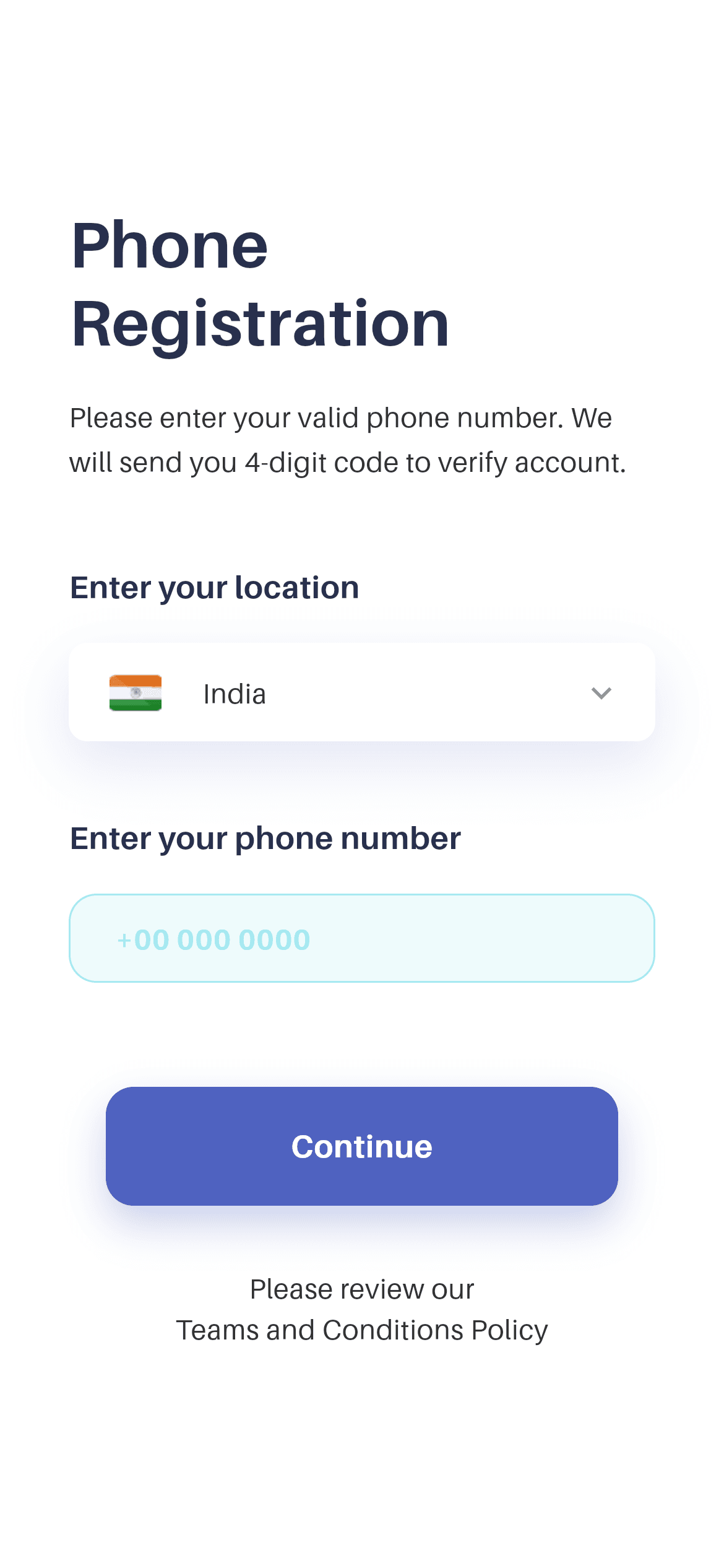
What you'll build
- ✓A width-capped, self-centring form that reads well on both a phone and a tablet
- ✓A custom outlined phone field — pale cyan fill, 1px cyan border, bold cyan text, no Material underline
- ✓A reusable bold _FieldLabel widget so both section labels stay identical
- ✓A press-scale Continue button with a colour-matched glow shadow
- ✓The bundled Aileron design font wired through pubspec.yaml
Step-by-step build
Create the file
Add a new file at lib/wallet_phone_registration/wallet_phone_registration_screen.dart in your Flutter project.
Register the bundled fonts
No external packages — this is pure Flutter. It does bundle its design font (Aileron), so drop the font file into fonts/ and declare it in pubspec.yaml:
flutter:
  fonts:
    - family: Aileron
      fonts:
- asset: fonts/Aileron-Regular.ttfBuild it, piece by piece
Here's how the screen goes together. Each block below is a real slice of the code with a plain-English explanation — paste them in order, or grab the whole file from the next section.
Colour tokens and a width-capped scroll layout
import 'package:flutter/material.dart';

import 'widgets/location_card.dart';

/// "Phone Registration" screen from the Wallet App UI Kit (Finco): a
/// left-aligned header, a country/location selector card, an outlined phone
/// number field, a blue "Continue" CTA and a policy note.
///
/// Self-contained, pure Flutter. Bundles its exact design font (Aileron) and
/// the kit's flag asset. Fully responsive — scrolls and caps its width on large
/// screens. Renders standalone when pushed as a route.
class WalletPhoneRegistrationScreen extends StatelessWidget {
  const WalletPhoneRegistrationScreen({super.key});

  static const Color _ink = Color(0xFF29304D);
  static const Color _blue = Color(0xFF4F62C0);
  static const Color _muted = Color(0xFF323232);
  static const Color _cyan = Color(0xFFA5E8F0);

  @override
  Widget build(BuildContext context) {
    return Scaffold(
      backgroundColor: Colors.white,
      body: SafeArea(
        child: Center(
          child: SingleChildScrollView(
            physics: const ClampingScrollPhysics(),
            padding: const EdgeInsets.fromLTRB(37, 40, 37, 48),
            child: ConstrainedBox(
              constraints: const BoxConstraints(maxWidth: 460),
              child: Column(
                crossAxisAlignment: CrossAxisAlignment.stretch,
                children: <Widget>[
Four static const Colors define the screen: _ink (#29304D) for the heading, _blue (#4F62C0) for the CTA, _muted (#323232) for body copy, and _cyan (#A5E8F0) for the input's border and text. The layout is a Center wrapping a SingleChildScrollView with ClampingScrollPhysics, and inside it a ConstrainedBox(maxWidth: 460). That combination is the whole responsive story: on a phone the form fills the width, on a tablet or desktop it stops at 460 logical pixels and sits centred instead of stretching a form field across 1200px. Padding of 37px left/right and 40/48px top/bottom matches the kit, and CrossAxisAlignment.stretch makes children span the full column width.
Header and instruction copy
                  // Header.
                  const Text(
                    'Phone\nRegistration',
                    style: TextStyle(
                      fontFamily: 'Aileron',
                      fontWeight: FontWeight.w700,
                      fontSize: 35,
                      height: 1.2,
                      color: _ink,
                    ),
                  ),
                  const SizedBox(height: 18),
                  const Padding(
                    padding: EdgeInsets.only(right: 10),
                    child: Text(
                      'Please enter your valid phone number. We will send '
                      'you 4-digit code to verify account.',
                      style: TextStyle(
                        fontFamily: 'Aileron',
                        fontWeight: FontWeight.w400,
                        fontSize: 15,
                        height: 1.6,
                        color: _muted,
                      ),
                    ),
                  ),
The header is a single Text with an embedded \n so 'Phone' and 'Registration' always break onto two lines — 35px w700 Aileron at height: 1.2 in _ink. Below it, the instruction line is wrapped in a Padding with only right: 10, a deliberate asymmetry that pulls the right edge in so the sentence wraps a little earlier than the heading and doesn't run flush to the margin. The copy itself is written as two adjacent string literals, which Dart joins at compile time — a readable way to keep long strings inside the line limit without introducing a line break in the output.
The two labelled inputs
                  // Location.
                  const SizedBox(height: 44),
                  const _FieldLabel('Enter your location'),
                  const SizedBox(height: 18),
                  LocationCard(country: 'India', onTap: () {}),

                  // Phone number.
                  const SizedBox(height: 40),
                  const _FieldLabel('Enter your phone number'),
                  const SizedBox(height: 18),
                  const _PhoneField(),
This is the form body, and it's deliberately boring: a 44px gap, the _FieldLabel 'Enter your location', an 18px gap, then LocationCard(country: 'India', onTap: () {}) — the tappable flag row you'd open a country picker from. The same pattern repeats 40px lower for the phone field. Using a shared _FieldLabel widget instead of two inline Text widgets means the two labels can never drift apart in size or weight, and the comment markers (// Location, // Phone number) make the form's sections scannable when you come back to add a third field.
Continue CTA and the policy note
                  // CTA.
                  const SizedBox(height: 56),
                  Padding(
                    padding: const EdgeInsets.symmetric(horizontal: 20),
                    child: _ContinueButton(onTap: () {}),
                  ),
                  const SizedBox(height: 33),
                  const Text(
                    'Please review our\nTeams and Conditions Policy',
                    textAlign: TextAlign.center,
                    style: TextStyle(
                      fontFamily: 'Aileron',
                      fontWeight: FontWeight.w400,
                      fontSize: 15,
                      height: 1.5,
                      color: _muted,
                    ),
                  ),
                ],
              ),
            ),
          ),
        ),
      ),
    );
  }
}
The button is inset by an extra 20px of horizontal padding on top of the page's 37px, so it's visibly narrower than the input fields above it — a small hierarchy cue that reads the CTA as an action rather than another field. Below it, a 33px gap and the terms note, centred, with \n splitting it across two lines. Note that the policy text is plain Text, not a link: if you need the second line tappable, swap it for a RichText with a TapGestureRecognizer on that TextSpan.
The custom outlined phone field
/// Outlined phone field — thin cyan border, pale cyan fill, bold cyan text,
/// matching the kit's `rect_lightcolor_outline`.
class _PhoneField extends StatelessWidget {
  const _PhoneField();

  @override
  Widget build(BuildContext context) {
    return Container(
      decoration: BoxDecoration(
        color: WalletPhoneRegistrationScreen._cyan.withValues(alpha: 0.18),
        borderRadius: BorderRadius.circular(15),
        border: Border.all(
          color: WalletPhoneRegistrationScreen._cyan,
          width: 1,
        ),
      ),
      child: const TextField(
        keyboardType: TextInputType.phone,
        cursorColor: WalletPhoneRegistrationScreen._cyan,
        style: TextStyle(
          fontFamily: 'Aileron',
          fontWeight: FontWeight.w700,
          fontSize: 15,
          color: WalletPhoneRegistrationScreen._cyan,
        ),
        decoration: InputDecoration(
          hintText: '+00 000 0000',
          hintStyle: TextStyle(
            fontFamily: 'Aileron',
            fontWeight: FontWeight.w700,
            fontSize: 15,
            color: WalletPhoneRegistrationScreen._cyan,
          ),
          isDense: true,
          border: InputBorder.none,
          contentPadding: EdgeInsets.fromLTRB(24, 16, 24, 16),
        ),
      ),
    );
  }
}
_PhoneField skips Flutter's OutlineInputBorder entirely and builds its own container: _cyan at 18% alpha as the fill, a 15px corner radius, and a 1px solid _cyan border. The TextField inside then removes every default Material decoration — border: InputBorder.none, isDense: true, and explicit contentPadding of 24px horizontal / 16px vertical — so the visible box is the Container, not the field. keyboardType: TextInputType.phone brings up the numeric pad, cursorColor matches the palette, and the hint '+00 000 0000' is styled identically to the input text so the field doesn't visually shift when the user starts typing.
The press-animated Continue button
class _ContinueButton extends StatefulWidget {
  const _ContinueButton({required this.onTap});

  final VoidCallback onTap;

  @override
  State<_ContinueButton> createState() => _ContinueButtonState();
}

class _ContinueButtonState extends State<_ContinueButton> {
  bool _pressed = false;

  @override
  Widget build(BuildContext context) {
    return GestureDetector(
      onTapDown: (_) => setState(() => _pressed = true),
      onTapUp: (_) => setState(() => _pressed = false),
      onTapCancel: () => setState(() => _pressed = false),
      onTap: widget.onTap,
      child: AnimatedScale(
        scale: _pressed ? 0.98 : 1,
        duration: const Duration(milliseconds: 150),
        child: Container(
          padding: const EdgeInsets.symmetric(vertical: 20),
          decoration: BoxDecoration(
            color: WalletPhoneRegistrationScreen._blue,
            borderRadius: BorderRadius.circular(15),
            boxShadow: <BoxShadow>[
              BoxShadow(
                color: WalletPhoneRegistrationScreen._blue
                    .withValues(alpha: 0.30),
                blurRadius: 18,
                offset: const Offset(0, 10),
              ),
            ],
          ),
          child: const Text(
            'Continue',
            textAlign: TextAlign.center,
            style: TextStyle(
              fontFamily: 'Aileron',
              fontWeight: FontWeight.w700,
              fontSize: 17,
              color: Colors.white,
            ),
          ),
        ),
      ),
    );
  }
}
_ContinueButton is a StatefulWidget holding a single _pressed boolean, set in onTapDown and cleared in both onTapUp and onTapCancel — the cancel handler is what prevents the button staying shrunk if the user slides a finger off it. AnimatedScale animates to 0.98 over 150ms for a light, physical press. The Container is _blue with a 15px radius and a BoxShadow using the same _blue at 30% alpha, blurred 18px and offset 10px down; tinting the shadow with the button colour is what turns it into a glow instead of a grey smudge. The 'Continue' label is 17px w700 Aileron in white.
Full code
The complete, ready-to-paste source (2 files). Free to use in your projects — one click copies it all.
import 'package:flutter/material.dart';

import 'widgets/location_card.dart';

/// "Phone Registration" screen from the Wallet App UI Kit (Finco): a
/// left-aligned header, a country/location selector card, an outlined phone
/// number field, a blue "Continue" CTA and a policy note.
///
/// Self-contained, pure Flutter. Bundles its exact design font (Aileron) and
/// the kit's flag asset. Fully responsive — scrolls and caps its width on large
/// screens. Renders standalone when pushed as a route.
class WalletPhoneRegistrationScreen extends StatelessWidget {
  const WalletPhoneRegistrationScreen({super.key});

  static const Color _ink = Color(0xFF29304D);
  static const Color _blue = Color(0xFF4F62C0);
  static const Color _muted = Color(0xFF323232);
  static const Color _cyan = Color(0xFFA5E8F0);

  @override
  Widget build(BuildContext context) {
    return Scaffold(
      backgroundColor: Colors.white,
      body: SafeArea(
        child: Center(
          child: SingleChildScrollView(
            physics: const ClampingScrollPhysics(),
            padding: const EdgeInsets.fromLTRB(37, 40, 37, 48),
            child: ConstrainedBox(
              constraints: const BoxConstraints(maxWidth: 460),
              child: Column(
                crossAxisAlignment: CrossAxisAlignment.stretch,
                children: <Widget>[
                  // Header.
                  const Text(
                    'Phone\nRegistration',
                    style: TextStyle(
                      fontFamily: 'Aileron',
                      fontWeight: FontWeight.w700,
                      fontSize: 35,
                      height: 1.2,
                      color: _ink,
                    ),
                  ),
                  const SizedBox(height: 18),
                  const Padding(
                    padding: EdgeInsets.only(right: 10),
                    child: Text(
                      'Please enter your valid phone number. We will send '
                      'you 4-digit code to verify account.',
                      style: TextStyle(
                        fontFamily: 'Aileron',
                        fontWeight: FontWeight.w400,
                        fontSize: 15,
                        height: 1.6,
                        color: _muted,
                      ),
                    ),
                  ),

                  // Location.
                  const SizedBox(height: 44),
                  const _FieldLabel('Enter your location'),
                  const SizedBox(height: 18),
                  LocationCard(country: 'India', onTap: () {}),

                  // Phone number.
                  const SizedBox(height: 40),
                  const _FieldLabel('Enter your phone number'),
                  const SizedBox(height: 18),
                  const _PhoneField(),

                  // CTA.
                  const SizedBox(height: 56),
                  Padding(
                    padding: const EdgeInsets.symmetric(horizontal: 20),
                    child: _ContinueButton(onTap: () {}),
                  ),
                  const SizedBox(height: 33),
                  const Text(
                    'Please review our\nTeams and Conditions Policy',
                    textAlign: TextAlign.center,
                    style: TextStyle(
                      fontFamily: 'Aileron',
                      fontWeight: FontWeight.w400,
                      fontSize: 15,
                      height: 1.5,
                      color: _muted,
                    ),
                  ),
                ],
              ),
            ),
          ),
        ),
      ),
    );
  }
}

/// Bold section label above each input.
class _FieldLabel extends StatelessWidget {
  const _FieldLabel(this.text);

  final String text;

  @override
  Widget build(BuildContext context) {
    return Align(
      alignment: Alignment.centerLeft,
      child: Text(
        text,
        style: const TextStyle(
          fontFamily: 'Aileron',
          fontWeight: FontWeight.w700,
          fontSize: 17,
          color: WalletPhoneRegistrationScreen._ink,
        ),
      ),
    );
  }
}

/// Outlined phone field — thin cyan border, pale cyan fill, bold cyan text,
/// matching the kit's `rect_lightcolor_outline`.
class _PhoneField extends StatelessWidget {
  const _PhoneField();

  @override
  Widget build(BuildContext context) {
    return Container(
      decoration: BoxDecoration(
        color: WalletPhoneRegistrationScreen._cyan.withValues(alpha: 0.18),
        borderRadius: BorderRadius.circular(15),
        border: Border.all(
          color: WalletPhoneRegistrationScreen._cyan,
          width: 1,
        ),
      ),
      child: const TextField(
        keyboardType: TextInputType.phone,
        cursorColor: WalletPhoneRegistrationScreen._cyan,
        style: TextStyle(
          fontFamily: 'Aileron',
          fontWeight: FontWeight.w700,
          fontSize: 15,
          color: WalletPhoneRegistrationScreen._cyan,
        ),
        decoration: InputDecoration(
          hintText: '+00 000 0000',
          hintStyle: TextStyle(
            fontFamily: 'Aileron',
            fontWeight: FontWeight.w700,
            fontSize: 15,
            color: WalletPhoneRegistrationScreen._cyan,
          ),
          isDense: true,
          border: InputBorder.none,
          contentPadding: EdgeInsets.fromLTRB(24, 16, 24, 16),
        ),
      ),
    );
  }
}

class _ContinueButton extends StatefulWidget {
  const _ContinueButton({required this.onTap});

  final VoidCallback onTap;

  @override
  State<_ContinueButton> createState() => _ContinueButtonState();
}

class _ContinueButtonState extends State<_ContinueButton> {
  bool _pressed = false;

  @override
  Widget build(BuildContext context) {
    return GestureDetector(
      onTapDown: (_) => setState(() => _pressed = true),
      onTapUp: (_) => setState(() => _pressed = false),
      onTapCancel: () => setState(() => _pressed = false),
      onTap: widget.onTap,
      child: AnimatedScale(
        scale: _pressed ? 0.98 : 1,
        duration: const Duration(milliseconds: 150),
        child: Container(
          padding: const EdgeInsets.symmetric(vertical: 20),
          decoration: BoxDecoration(
            color: WalletPhoneRegistrationScreen._blue,
            borderRadius: BorderRadius.circular(15),
            boxShadow: <BoxShadow>[
              BoxShadow(
                color: WalletPhoneRegistrationScreen._blue
                    .withValues(alpha: 0.30),
                blurRadius: 18,
                offset: const Offset(0, 10),
              ),
            ],
          ),
          child: const Text(
            'Continue',
            textAlign: TextAlign.center,
            style: TextStyle(
              fontFamily: 'Aileron',
              fontWeight: FontWeight.w700,
              fontSize: 17,
              color: Colors.white,
            ),
          ),
        ),
      ),
    );
  }
}
Plus bundled 3 binary assets (fonts/images). The CLI and MCP install those for you automatically.
Two faster ways to add it
Copy-paste works, but you can skip it entirely.
1. FlutterKit CLI
One command drops this screen — and its fonts — straight into your project.
$ flutterkit add wallet-phone-registration2. AI agent (MCP)
Connect FlutterKit's MCP server in Claude or Cursor and just ask your agent to install wallet-phone-registration — it fetches and writes the files for you.
FAQ
Is this Flutter phone registration screen free to use?
Yes. The complete Dart source on this page is free to use in personal and commercial projects. You can paste it, install it with the FlutterKit CLI (flutterkit add wallet-phone-registration), or have an AI agent add it for you over MCP.
How do I connect it to a real OTP flow?
Give the _PhoneField a TextEditingController, read it from _ContinueButton's onTap, and call your backend — with Firebase that's FirebaseAuth.instance.verifyPhoneNumber(). Then push the verify-account screen and pass the verification id along.
Does it need any external packages?
No — it's pure Flutter on the material library. It bundles the Aileron font and the kit's flag asset, both registered in pubspec.yaml as shown in step 2; the CLI and MCP install them automatically.
Which Flutter version does it target?
It uses Color.withValues() for the field fill and button shadow, so it targets Flutter 3.22+ (Dart 3). On an older SDK, swap withValues(alpha: 0.18) and withValues(alpha: 0.30) for withOpacity(0.18) and withOpacity(0.30).

