How to Build a Place Detail Screen in Flutter (Full Code + Preview)
This is the Travel Kit's landmark page, and its most interesting idea is typographic: the body is set in Lato, but the 'About' heading is set in Lora, a serif. That one switch is what makes a hotel listing read like an editorial page instead of a database record. You'll build the whole screen — a light app bar with a back arrow, a 30px title, a location line, a generated gold star rating, a full-bleed 210px photo, and the serif-headed About section — over the kit's shared four-tab bottom nav.
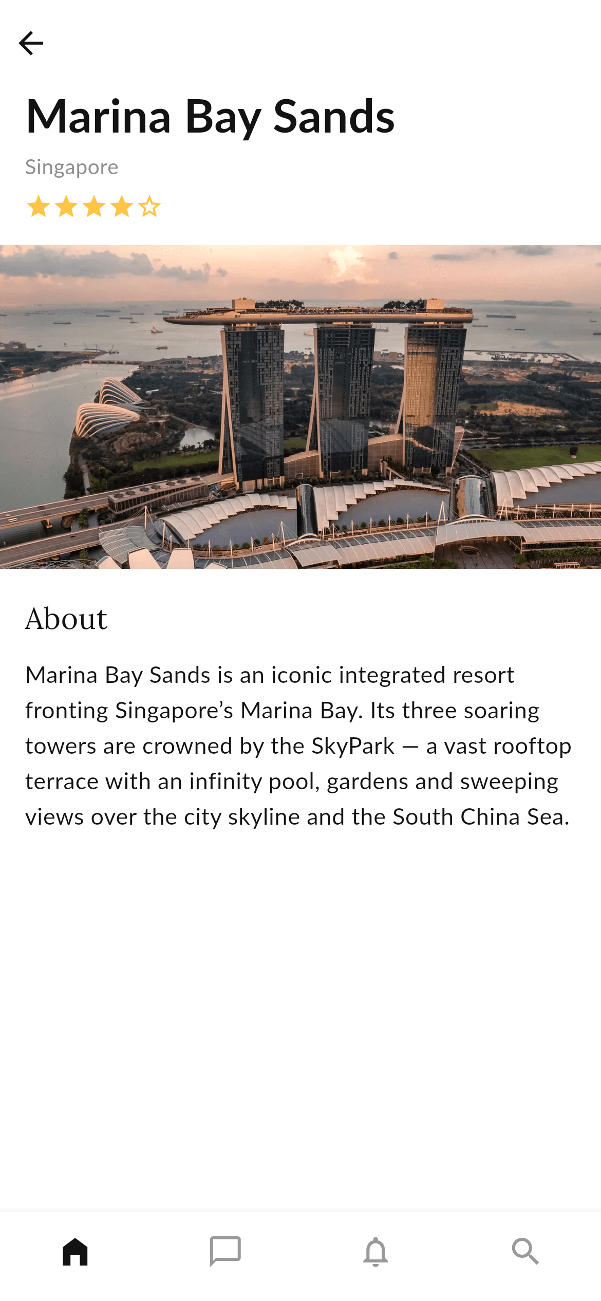
What you'll build
- ✓A two-font page: Lato for everything, Lora for the section heading
- ✓A five-star rating row generated from one int with List.generate, filled and outline icons swapped by index
- ✓A full-bleed hero photo that ignores the page's 16px text margins
- ✓A ListView-based body where each block owns its own padding, so the photo can break the margin
- ✓A nullable onBack callback with a ?? fallback, so the screen works standalone or inside a navigator
Step-by-step build
Create the file
Add a new file at lib/travel_place/travel_place_screen.dart in your Flutter project.
Register the bundled fonts
No external packages — this is pure Flutter. It does bundle its design fonts (Lato, Lora), so drop the font files into fonts/ and declare them in pubspec.yaml:
flutter:
  fonts:
    - family: Lato
      fonts:
        - asset: fonts/Lato-Regular.ttf
    - family: Lora
      fonts:
- asset: fonts/Lora-Regular.ttfBuild it, piece by piece
Here's how the screen goes together. Each block below is a real slice of the code with a plain-English explanation — paste them in order, or grab the whole file from the next section.
Two fonts, and an optional back callback
import 'package:flutter/material.dart';

/// "Place" detail screen from the Travel Kit: a light top app bar with a back
/// action, the place title + location + rating, a wide photo, an "About"
/// section, and the shared bottom navigation bar.
///
/// Self-contained, pure Flutter. Bundles its design fonts (Lato for body, Lora
/// for the "About" heading) and the kit's original photo (converted to WebP).
/// Fully responsive — the body scrolls, so nothing overflows. Renders
/// standalone when pushed as a route.
///
/// [onBack] is an optional callback for the back button; it defaults to a
/// no-op so the screen works on its own (the preview gallery wires it to pop).
class TravelPlaceScreen extends StatelessWidget {
  const TravelPlaceScreen({super.key, this.onBack});

  /// Invoked when the back button is tapped. No-op by default.
  final VoidCallback? onBack;

  static const Color _ink = Color(0xFF131314);
  static const Color _grey = Color(0xFF8F8F8F);
  static const Color _greyLow = Color(0xFF999999);
  static const String _lato = 'Lato';
  static const String _lora = 'Lora';
  static const String _image =
      'lib/screens/travel/travel_place/images/place_marina_bay.webp';
Only material.dart is imported. TravelPlaceScreen is stateless and takes a nullable VoidCallback onBack, which is what lets the same widget render inside a preview gallery and inside a real navigator stack. The consts are worth noting: three greys plus two font names, _lato and _lora. Holding both font families as named constants rather than typing the strings inline is what makes the two-typeface system explicit — you can see at a glance that this screen deliberately mixes them. _image points at the bundled WebP hero photo.
The light app bar
  @override
  Widget build(BuildContext context) {
    return Scaffold(
      backgroundColor: Colors.white,
      body: SafeArea(
        bottom: false,
        child: Column(
          children: <Widget>[
            // Light top app bar with a back action.
            SizedBox(
              height: 56,
              child: Row(
                children: <Widget>[
                  IconButton(
                    onPressed: onBack ?? () {},
                    icon: const Icon(Icons.arrow_back, color: _ink),
                  ),
                ],
              ),
            ),
            Expanded(
              child: ListView(
                physics: const ClampingScrollPhysics(),
                padding: const EdgeInsets.only(bottom: 20),
                children: <Widget>[
Rather than using Scaffold's appBar, the screen builds its own: a plain 56px SizedBox holding a Row with a single IconButton. That gives a completely flat bar with no elevation, no title and no default Material tint — much easier than fighting AppBar's theming when the design calls for the header to disappear into the page. onPressed: onBack ?? () {} is the idiomatic guard for a nullable callback: use the caller's handler if there is one, otherwise do nothing rather than crash. SafeArea(bottom: false) leaves the bottom inset to the nav bar.
Title, location and the star rating
                  const Padding(
                    padding: EdgeInsets.fromLTRB(16, 0, 16, 6),
                    child: Text(
                      'Marina Bay Sands',
                      style: TextStyle(
                        fontFamily: _lato,
                        fontWeight: FontWeight.w700,
                        fontSize: 30,
                        height: 1.2,
                        color: _ink,
                      ),
                    ),
                  ),
                  const Padding(
                    padding: EdgeInsets.fromLTRB(16, 0, 16, 8),
                    child: Text(
                      'Singapore',
                      style: TextStyle(
                        fontFamily: _lato,
                        fontSize: 13.5,
                        color: _grey,
                      ),
                    ),
                  ),
                  const Padding(
                    padding: EdgeInsets.fromLTRB(16, 0, 16, 16),
                    child: _Stars(rating: 4),
                  ),
The body is a ListView whose children each carry their own Padding — an unusual choice that pays off in the next chunk. 'Marina Bay Sands' is 30px w700 Lato at height: 1.2, then 'Singapore' at 13.5px in the mid _grey as a quiet subtitle, then the _Stars row. Every one of these is inset 16px left and right, and the varying bottom values (6, 8, 16) tighten the title-to-location relationship while opening more air before the photo — spacing that encodes hierarchy rather than applying one uniform gap.
A full-bleed photo and the serif About section
                  Image.asset(
                    _image,
                    height: 210,
                    width: double.infinity,
                    fit: BoxFit.cover,
                    filterQuality: FilterQuality.high,
                  ),
                  const Padding(
                    padding: EdgeInsets.fromLTRB(16, 18, 16, 0),
                    child: Text(
                      'About',
                      style: TextStyle(
                        fontFamily: _lora,
                        fontSize: 19,
                        color: _ink,
                      ),
                    ),
                  ),
                  const Padding(
                    padding: EdgeInsets.fromLTRB(16, 12, 16, 0),
                    child: Text(
                      'Marina Bay Sands is an iconic integrated resort '
                      'fronting Singapore’s Marina Bay. Its three soaring '
                      'towers are crowned by the SkyPark — a vast rooftop '
                      'terrace with an infinity pool, gardens and sweeping '
                      'views over the city skyline and the South China Sea.',
                      style: TextStyle(
                        fontFamily: _lato,
                        fontSize: 15,
                        height: 1.55,
                        color: _ink,
                      ),
                    ),
                  ),
                ],
              ),
            ),
          ],
        ),
      ),
      bottomNavigationBar: const _BottomNav(),
    );
  }
}
Here's why each block carries its own padding: Image.asset has none, so it spans edge to edge while the text around it stays inset 16px. It's a fixed 210px tall with width: double.infinity and fit: BoxFit.cover, so it crops rather than distorts on any device width. Then the payoff — 'About' at 19px in fontFamily: _lora, the serif, with no bold weight; the contrast comes from the typeface, not the weight. The description below returns to Lato at 15px with height: 1.55, generous leading that makes a five-line paragraph comfortable to read on a phone.
The generated star rating
/// A small five-star rating row.
class _Stars extends StatelessWidget {
  const _Stars({required this.rating});

  final int rating;

  @override
  Widget build(BuildContext context) {
    return Row(
      mainAxisSize: MainAxisSize.min,
      children: List<Widget>.generate(
        5,
        (int i) => Icon(
          i < rating ? Icons.star : Icons.star_border,
          size: 18,
          color: const Color(0xFFFFC444),
        ),
      ),
    );
  }
}
_Stars takes a single int and builds all five icons with List<Widget>.generate(5, ...), choosing Icons.star when i < rating and Icons.star_border otherwise. That's the whole widget: one comparison drives filled versus outline, so changing the rating is changing one number. mainAxisSize: MainAxisSize.min stops the Row from expanding to the full page width, which matters because it sits inside a ListView child that would otherwise stretch it and leave the stars floating in space. All five share the same 18px size and gold #FFC444 tint.
Full code
The complete, ready-to-paste source. Free to use in your projects — one click copies it all.
import 'package:flutter/material.dart';

/// "Place" detail screen from the Travel Kit: a light top app bar with a back
/// action, the place title + location + rating, a wide photo, an "About"
/// section, and the shared bottom navigation bar.
///
/// Self-contained, pure Flutter. Bundles its design fonts (Lato for body, Lora
/// for the "About" heading) and the kit's original photo (converted to WebP).
/// Fully responsive — the body scrolls, so nothing overflows. Renders
/// standalone when pushed as a route.
///
/// [onBack] is an optional callback for the back button; it defaults to a
/// no-op so the screen works on its own (the preview gallery wires it to pop).
class TravelPlaceScreen extends StatelessWidget {
  const TravelPlaceScreen({super.key, this.onBack});

  /// Invoked when the back button is tapped. No-op by default.
  final VoidCallback? onBack;

  static const Color _ink = Color(0xFF131314);
  static const Color _grey = Color(0xFF8F8F8F);
  static const Color _greyLow = Color(0xFF999999);
  static const String _lato = 'Lato';
  static const String _lora = 'Lora';
  static const String _image =
      'lib/screens/travel/travel_place/images/place_marina_bay.webp';

  @override
  Widget build(BuildContext context) {
    return Scaffold(
      backgroundColor: Colors.white,
      body: SafeArea(
        bottom: false,
        child: Column(
          children: <Widget>[
            // Light top app bar with a back action.
            SizedBox(
              height: 56,
              child: Row(
                children: <Widget>[
                  IconButton(
                    onPressed: onBack ?? () {},
                    icon: const Icon(Icons.arrow_back, color: _ink),
                  ),
                ],
              ),
            ),
            Expanded(
              child: ListView(
                physics: const ClampingScrollPhysics(),
                padding: const EdgeInsets.only(bottom: 20),
                children: <Widget>[
                  const Padding(
                    padding: EdgeInsets.fromLTRB(16, 0, 16, 6),
                    child: Text(
                      'Marina Bay Sands',
                      style: TextStyle(
                        fontFamily: _lato,
                        fontWeight: FontWeight.w700,
                        fontSize: 30,
                        height: 1.2,
                        color: _ink,
                      ),
                    ),
                  ),
                  const Padding(
                    padding: EdgeInsets.fromLTRB(16, 0, 16, 8),
                    child: Text(
                      'Singapore',
                      style: TextStyle(
                        fontFamily: _lato,
                        fontSize: 13.5,
                        color: _grey,
                      ),
                    ),
                  ),
                  const Padding(
                    padding: EdgeInsets.fromLTRB(16, 0, 16, 16),
                    child: _Stars(rating: 4),
                  ),
                  Image.asset(
                    _image,
                    height: 210,
                    width: double.infinity,
                    fit: BoxFit.cover,
                    filterQuality: FilterQuality.high,
                  ),
                  const Padding(
                    padding: EdgeInsets.fromLTRB(16, 18, 16, 0),
                    child: Text(
                      'About',
                      style: TextStyle(
                        fontFamily: _lora,
                        fontSize: 19,
                        color: _ink,
                      ),
                    ),
                  ),
                  const Padding(
                    padding: EdgeInsets.fromLTRB(16, 12, 16, 0),
                    child: Text(
                      'Marina Bay Sands is an iconic integrated resort '
                      'fronting Singapore’s Marina Bay. Its three soaring '
                      'towers are crowned by the SkyPark — a vast rooftop '
                      'terrace with an infinity pool, gardens and sweeping '
                      'views over the city skyline and the South China Sea.',
                      style: TextStyle(
                        fontFamily: _lato,
                        fontSize: 15,
                        height: 1.55,
                        color: _ink,
                      ),
                    ),
                  ),
                ],
              ),
            ),
          ],
        ),
      ),
      bottomNavigationBar: const _BottomNav(),
    );
  }
}

/// A small five-star rating row.
class _Stars extends StatelessWidget {
  const _Stars({required this.rating});

  final int rating;

  @override
  Widget build(BuildContext context) {
    return Row(
      mainAxisSize: MainAxisSize.min,
      children: List<Widget>.generate(
        5,
        (int i) => Icon(
          i < rating ? Icons.star : Icons.star_border,
          size: 18,
          color: const Color(0xFFFFC444),
        ),
      ),
    );
  }
}

/// Bottom navigation bar shared by the travel tab screens.
class _BottomNav extends StatelessWidget {
  const _BottomNav();

  @override
  Widget build(BuildContext context) {
    return BottomNavigationBar(
      currentIndex: 0,
      type: BottomNavigationBarType.fixed,
      backgroundColor: Colors.white,
      selectedItemColor: TravelPlaceScreen._ink,
      unselectedItemColor: TravelPlaceScreen._greyLow,
      showSelectedLabels: false,
      showUnselectedLabels: false,
      elevation: 8,
      items: const <BottomNavigationBarItem>[
        BottomNavigationBarItem(icon: Icon(Icons.home_filled), label: 'Home'),
        BottomNavigationBarItem(
            icon: Icon(Icons.chat_bubble_outline), label: 'Message'),
        BottomNavigationBarItem(
            icon: Icon(Icons.notifications_none), label: 'Notification'),
        BottomNavigationBarItem(icon: Icon(Icons.search), label: 'Search'),
      ],
    );
  }
}
Plus bundled 4 binary assets (fonts/images). The CLI and MCP install those for you automatically.
Two faster ways to add it
Copy-paste works, but you can skip it entirely.
1. FlutterKit CLI
One command drops this screen — and its fonts — straight into your project.
$ flutterkit add travel-place2. AI agent (MCP)
Connect FlutterKit's MCP server in Claude or Cursor and just ask your agent to install travel-place — it fetches and writes the files for you.
FAQ
Is this Flutter place detail screen free to use?
Yes. The full Dart source on this page is free for personal and commercial projects. Copy it here, install it with the FlutterKit CLI (flutterkit add travel-place), or have an AI agent add it via MCP.
Can I show half stars?
Yes, with a small change: make rating a double and pick between Icons.star, Icons.star_half and Icons.star_border by comparing i to rating.floor() and rating.ceil(). The rest of _Stars stays exactly as it is.
Does it need any external packages?
No — it's pure Flutter on the material library. It bundles two fonts, Lato for the body and Lora for the About heading, plus the hero photo as a WebP; all three are registered in pubspec.yaml as shown in step 2. The CLI and MCP install those files for you.
Which Flutter version does it target?
Super parameters put the floor at Dart 3 / Flutter 3.10+. There are no withValues() calls here, so it compiles unchanged on both current and slightly older SDKs. WebP images are supported on every current Flutter platform.

