How to Build a Travel Cities Browse Screen in Flutter (Full Code + Preview)
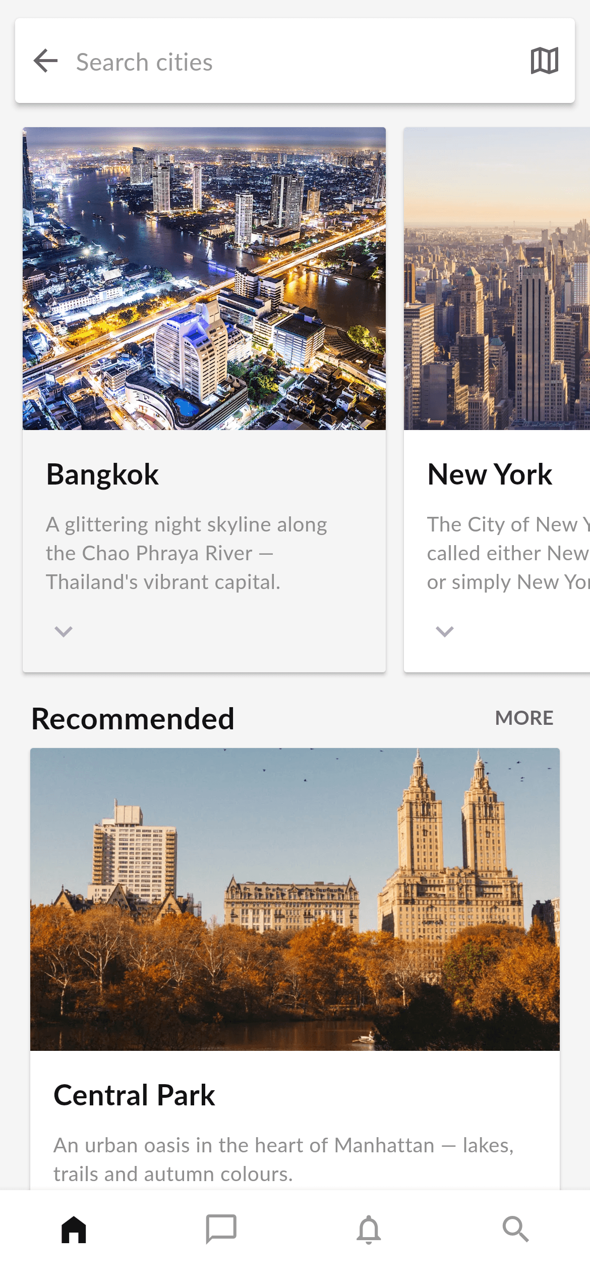
Travel and hotel apps usually open on a browse tab that invites you to pick a destination. This tutorial builds exactly that in pure Flutter: a floating elevated search bar over a light-grey canvas, a horizontally scrolling row of tall city cards (photo, bold name, three-line blurb, chevron), a 'Recommended' header with a MORE action, a full-width Central Park card, and a four-tab bottom navigation bar. You'll learn to model card data as a const list, drive both a horizontal ListView and a vertical scroll, and reuse Material + InkWell for tappable elevated cards.
What you'll build
- ✓A floating white elevated search bar with a back arrow, hint text and a map action
- ✓A horizontally scrolling row of 240px-wide city cards built with ListView.separated
- ✓A const data model (_City) that feeds both the carousel and a full-width recommended card
- ✓A 'Recommended' section header with a MORE text button and a wide Central Park card
- ✓A four-tab white bottom navigation bar with icon-only destinations
Step-by-step build
Create the file
Add a new file at lib/travel_cities/travel_cities_screen.dart in your Flutter project.
Register the bundled fonts
No external packages — this is pure Flutter. It does bundle its design font (Lato), so drop the font file into fonts/ and declare it in pubspec.yaml:
flutter:
  fonts:
    - family: Lato
      fonts:
- asset: fonts/Lato-Regular.ttfBuild it, piece by piece
Here's how the screen goes together. Each block below is a real slice of the code with a plain-English explanation — paste them in order, or grab the whole file from the next section.
The screen class, tap callbacks, and color tokens
import 'package:flutter/material.dart';

/// "Cities" screen from the Travel Kit: a floating search bar, a horizontally
/// scrolling row of tall city cards (photo + name + description), a
/// "Recommended" section, and a bottom navigation bar.
///
/// Self-contained, pure Flutter. Bundles its design font (Lato) and the kit's
/// original city photos (converted to WebP). Fully responsive — content
/// scrolls vertically and the city row scrolls horizontally, so nothing
/// overflows at any size. Renders standalone when pushed as a route.
///
/// [onCityTap] is an optional callback fired when a city card is tapped; it
/// defaults to a no-op so the screen works on its own (the preview gallery
/// wires it to open the city detail screen).
class TravelCitiesScreen extends StatelessWidget {
  const TravelCitiesScreen({super.key, this.onCityTap, this.onTabSelected});

  /// Invoked when a city card is tapped. No-op by default.
  final VoidCallback? onCityTap;

  /// Invoked with the bottom-nav index when a tab is tapped. No-op by default.
  final ValueChanged<int>? onTabSelected;

  static const Color _bg = Color(0xFFF5F5F5);
  static const Color _ink = Color(0xFF131314);
  static const Color _greyMedium = Color(0xFF666666);
  static const Color _greyLow = Color(0xFF999999);
  static const Color _desc = Color(0xFF8F8F8F);
  static const String _font = 'Lato';
  static const String _dir = 'lib/screens/travel/travel_cities/images';
After importing Flutter's material library, TravelCitiesScreen is declared as a StatelessWidget — the screen only displays data and delegates taps, so it never holds state. Its constructor uses super parameters (super.key) and exposes two optional callbacks: onCityTap fires when a card is tapped and onTabSelected (a ValueChanged<int>) reports which bottom-nav tab was pressed; both default to null so the screen runs standalone. Five private const Colors act as design tokens — _bg (#F5F5F5) is the light-grey canvas, _ink (#131314) the near-black text, _greyMedium/_greyLow the icon and hint greys, and _desc (#8F8F8F) the card description grey — plus _font ('Lato') and _dir, the shared asset folder path.
Modelling the cities as a const list
  static const List<_City> _cities = <_City>[
    _City(
      name: 'Bangkok',
      description:
          'A glittering night skyline along the Chao Phraya River — '
          "Thailand's vibrant capital.",
      image: '$_dir/city_bangkok.webp',
    ),
    _City(
      name: 'New York',
      description:
          'The City of New York, usually called either New York City '
          '(NYC) or simply New York (NY).',
      image: '$_dir/city_newyork.webp',
    ),
    _City(
      name: 'London',
      description:
          'London is the capital and largest city of England and the '
          'United Kingdom, set along the Thames.',
      image: '$_dir/city_london.webp',
    ),
  ];
_cities is a static const List<_City> holding three destinations — Bangkok, New York and London — each with a name, a description, and an image path built from the _dir constant (for example '$_dir/city_bangkok.webp'). Notice the descriptions use Dart's adjacent-string-literal concatenation: two quoted strings on consecutive lines are joined at compile time, which is how long copy is kept readable in source. Defining the data as a const list up front means the carousel below just maps over it instead of hard-coding widgets, so adding a fourth city is a one-line change.
The build method: search bar, carousel, recommended card and nav
  @override
  Widget build(BuildContext context) {
    return Scaffold(
      backgroundColor: _bg,
      body: SafeArea(
        bottom: false,
        child: Column(
          children: <Widget>[
            const _SearchBar(),
            Expanded(
              child: SingleChildScrollView(
                physics: const ClampingScrollPhysics(),
                child: Column(
                  crossAxisAlignment: CrossAxisAlignment.start,
                  children: <Widget>[
                    // Horizontally scrolling row of city cards.
                    SizedBox(
                      height: 372,
                      child: ListView.separated(
                        scrollDirection: Axis.horizontal,
                        padding: const EdgeInsets.fromLTRB(15, 6, 15, 6),
                        itemCount: _cities.length,
                        separatorBuilder: (BuildContext context, int i) =>
                            const SizedBox(width: 12),
                        itemBuilder: (BuildContext context, int i) =>
                            _CityCard(city: _cities[i], onTap: onCityTap),
                      ),
                    ),
                    // "Recommended" section header.
                    Padding(
                      padding: const EdgeInsets.fromLTRB(20, 8, 12, 0),
                      child: Row(
                        children: <Widget>[
                          const Expanded(
                            child: Text(
                              'Recommended',
                              style: TextStyle(
                                fontFamily: _font,
                                fontWeight: FontWeight.w700,
                                fontSize: 20,
                                color: _ink,
                              ),
                            ),
                          ),
                          TextButton(
                            onPressed: () {},
                            child: const Text(
                              'MORE',
                              style: TextStyle(
                                fontFamily: _font,
                                fontWeight: FontWeight.w700,
                                fontSize: 13,
                                color: _greyMedium,
                              ),
                            ),
                          ),
                        ],
                      ),
                    ),
                    Padding(
                      padding: const EdgeInsets.fromLTRB(20, 4, 20, 24),
                      child: _WideCity(
                        name: 'Central Park',
                        description:
                            'An urban oasis in the heart of Manhattan — '
                            'lakes, trails and autumn colours.',
                        image: '$_dir/city_central_park.webp',
                        onTap: onCityTap,
                      ),
                    ),
                  ],
                ),
              ),
            ),
          ],
        ),
      ),
      bottomNavigationBar: _BottomNav(onTap: onTabSelected),
    );
  }
}
build() returns a Scaffold painted with _bg and a SafeArea (bottom: false, so the content can run under the bottom nav). Inside, a Column stacks the fixed _SearchBar above an Expanded SingleChildScrollView with ClampingScrollPhysics — that makes the page scroll vertically without a bounce. The first child is a 372px-tall SizedBox wrapping a horizontal ListView.separated: scrollDirection Axis.horizontal, itemCount _cities.length, a 12px SizedBox separator between cards, and an itemBuilder that returns a _CityCard wired to onCityTap. Below it a Padding holds the 'Recommended' Row — an Expanded 20px bold Text plus a MORE TextButton — followed by a full-width _WideCity for Central Park. The Scaffold's bottomNavigationBar is a _BottomNav forwarding onTabSelected.
The floating search bar
/// Floating white search bar with a back button, hint label and a map action.
class _SearchBar extends StatelessWidget {
  const _SearchBar();

  @override
  Widget build(BuildContext context) {
    return Padding(
      padding: const EdgeInsets.fromLTRB(10, 12, 10, 10),
      child: Material(
        elevation: 3,
        borderRadius: BorderRadius.circular(3),
        color: Colors.white,
        child: SizedBox(
          height: 56,
          child: Row(
            children: <Widget>[
              IconButton(
                onPressed: () {},
                icon: const Icon(Icons.arrow_back,
                    color: TravelCitiesScreen._greyMedium),
              ),
              const Expanded(
                child: Text(
                  'Search cities',
                  style: TextStyle(
                    fontFamily: TravelCitiesScreen._font,
                    fontSize: 16,
                    color: TravelCitiesScreen._greyLow,
                  ),
                ),
              ),
              IconButton(
                onPressed: () {},
                icon: const Icon(Icons.map_outlined,
                    color: TravelCitiesScreen._greyMedium),
              ),
            ],
          ),
        ),
      ),
    );
  }
}
_SearchBar is a small StatelessWidget that gives the screen its signature floating control. A Material with elevation 3 and a 3px BorderRadius casts the shadow that makes it appear to hover over the canvas, and a fixed 56px SizedBox sets its height. Inside a Row sit three pieces: a leading IconButton with Icons.arrow_back in _greyMedium, an Expanded 'Search cities' hint Text in the lighter _greyLow so it reads as a placeholder, and a trailing Icons.map_outlined IconButton. It's a visual affordance — the icon buttons have empty onPressed callbacks, ready for you to open a real search route or map.
A tall, tappable city card
/// A tall city card used in the horizontal row: photo on top, then the city
/// name, description and a chevron.
class _CityCard extends StatelessWidget {
  const _CityCard({required this.city, this.onTap});

  final _City city;
  final VoidCallback? onTap;

  @override
  Widget build(BuildContext context) {
    return SizedBox(
      width: 240,
      child: Material(
        elevation: 2,
        borderRadius: BorderRadius.circular(2),
        clipBehavior: Clip.antiAlias,
        color: Colors.white,
        child: InkWell(
          onTap: onTap,
          child: Column(
          crossAxisAlignment: CrossAxisAlignment.start,
          children: <Widget>[
            Image.asset(
              city.image,
              width: 240,
              height: 200,
              fit: BoxFit.cover,
              filterQuality: FilterQuality.high,
            ),
            Expanded(
              child: Padding(
                padding: const EdgeInsets.all(15),
                child: Column(
                  crossAxisAlignment: CrossAxisAlignment.start,
                  children: <Widget>[
                    Text(
                      city.name,
                      maxLines: 1,
                      overflow: TextOverflow.ellipsis,
                      style: const TextStyle(
                        fontFamily: TravelCitiesScreen._font,
                        fontWeight: FontWeight.w700,
                        fontSize: 19,
                        color: TravelCitiesScreen._ink,
                      ),
                    ),
                    const SizedBox(height: 10),
                    Expanded(
                      child: Text(
                        city.description,
                        maxLines: 3,
                        overflow: TextOverflow.ellipsis,
                        style: const TextStyle(
                          fontFamily: TravelCitiesScreen._font,
                          fontSize: 13.5,
                          height: 1.4,
                          color: TravelCitiesScreen._desc,
                        ),
                      ),
                    ),
                    const Icon(Icons.keyboard_arrow_down,
                        color: Color(0xFFAEAEB8)),
                  ],
                ),
              ),
            ),
          ],
          ),
        ),
      ),
    );
  }
}
_CityCard is the carousel tile, pinned to a 240px width. A Material (elevation 2, 2px radius, clipBehavior Clip.antiAlias) wraps an InkWell so taps both ripple and fire the passed onTap. Its Column stacks an Image.asset — 240×200, BoxFit.cover, FilterQuality.high for a crisp WebP photo — above an Expanded Padding. Inside, the city name is 19px bold _ink capped at one line with TextOverflow.ellipsis, then a 10px gap, then an Expanded description at 13.5px _desc with height 1.4 line spacing, limited to three lines. A trailing Icons.keyboard_arrow_down chevron (colour #AEAEB8) hints the card expands.
The wide recommended card and bottom nav
/// Full-width recommended city card: a wide photo with name + description.
class _WideCity extends StatelessWidget {
  const _WideCity({
    required this.name,
    required this.description,
    required this.image,
    this.onTap,
  });

  final String name;
  final String description;
  final String image;
  final VoidCallback? onTap;

  @override
  Widget build(BuildContext context) {
    return Material(
      elevation: 2,
      borderRadius: BorderRadius.circular(2),
      clipBehavior: Clip.antiAlias,
      color: Colors.white,
      child: InkWell(
        onTap: onTap,
        child: Column(
        crossAxisAlignment: CrossAxisAlignment.start,
        children: <Widget>[
          Image.asset(
            image,
            height: 200,
            width: double.infinity,
            fit: BoxFit.cover,
            filterQuality: FilterQuality.high,
          ),
          Padding(
            padding: const EdgeInsets.all(15),
            child: Column(
              crossAxisAlignment: CrossAxisAlignment.start,
              children: <Widget>[
                Text(
                  name,
                  style: const TextStyle(
                    fontFamily: TravelCitiesScreen._font,
                    fontWeight: FontWeight.w700,
                    fontSize: 19,
                    color: TravelCitiesScreen._ink,
                  ),
                ),
                const SizedBox(height: 10),
                Text(
                  description,
                  style: const TextStyle(
                    fontFamily: TravelCitiesScreen._font,
                    fontSize: 13.5,
                    height: 1.4,
                    color: TravelCitiesScreen._desc,
                  ),
                ),
              ],
            ),
          ),
        ],
        ),
      ),
    );
  }
}

/// Bottom navigation bar with four destinations (Home selected).
class _BottomNav extends StatelessWidget {
  const _BottomNav({this.onTap});

  final ValueChanged<int>? onTap;

  @override
  Widget build(BuildContext context) {
    return BottomNavigationBar(
      currentIndex: 0,
      onTap: onTap,
      type: BottomNavigationBarType.fixed,
      backgroundColor: Colors.white,
      selectedItemColor: TravelCitiesScreen._ink,
      unselectedItemColor: TravelCitiesScreen._greyLow,
      showSelectedLabels: false,
      showUnselectedLabels: false,
      elevation: 8,
      items: const <BottomNavigationBarItem>[
        BottomNavigationBarItem(icon: Icon(Icons.home_filled), label: 'Home'),
        BottomNavigationBarItem(
            icon: Icon(Icons.chat_bubble_outline), label: 'Message'),
        BottomNavigationBarItem(
            icon: Icon(Icons.notifications_none), label: 'Notification'),
        BottomNavigationBarItem(icon: Icon(Icons.search), label: 'Search'),
      ],
    );
  }
}
_WideCity is the full-width variant used for Central Park: the same Material + InkWell recipe as the tile, but its Image.asset uses width: double.infinity to stretch edge to edge at a 200px height, with the name (19px bold _ink) and description (13.5px _desc, height 1.4) in a 15px Padding below. Because it isn't width-constrained or maxLines-capped, the text can wrap freely. Finally _BottomNav returns a fixed-type BottomNavigationBar with currentIndex 0 (Home selected), _ink for the selected item and _greyLow for the rest, labels hidden on both states, elevation 8, and four icon-only items — home, chat, notifications and search.
Full code
The complete, ready-to-paste source. Free to use in your projects — one click copies it all.
import 'package:flutter/material.dart';

/// "Cities" screen from the Travel Kit: a floating search bar, a horizontally
/// scrolling row of tall city cards (photo + name + description), a
/// "Recommended" section, and a bottom navigation bar.
///
/// Self-contained, pure Flutter. Bundles its design font (Lato) and the kit's
/// original city photos (converted to WebP). Fully responsive — content
/// scrolls vertically and the city row scrolls horizontally, so nothing
/// overflows at any size. Renders standalone when pushed as a route.
///
/// [onCityTap] is an optional callback fired when a city card is tapped; it
/// defaults to a no-op so the screen works on its own (the preview gallery
/// wires it to open the city detail screen).
class TravelCitiesScreen extends StatelessWidget {
  const TravelCitiesScreen({super.key, this.onCityTap, this.onTabSelected});

  /// Invoked when a city card is tapped. No-op by default.
  final VoidCallback? onCityTap;

  /// Invoked with the bottom-nav index when a tab is tapped. No-op by default.
  final ValueChanged<int>? onTabSelected;

  static const Color _bg = Color(0xFFF5F5F5);
  static const Color _ink = Color(0xFF131314);
  static const Color _greyMedium = Color(0xFF666666);
  static const Color _greyLow = Color(0xFF999999);
  static const Color _desc = Color(0xFF8F8F8F);
  static const String _font = 'Lato';
  static const String _dir = 'lib/screens/travel/travel_cities/images';

  static const List<_City> _cities = <_City>[
    _City(
      name: 'Bangkok',
      description:
          'A glittering night skyline along the Chao Phraya River — '
          "Thailand's vibrant capital.",
      image: '$_dir/city_bangkok.webp',
    ),
    _City(
      name: 'New York',
      description:
          'The City of New York, usually called either New York City '
          '(NYC) or simply New York (NY).',
      image: '$_dir/city_newyork.webp',
    ),
    _City(
      name: 'London',
      description:
          'London is the capital and largest city of England and the '
          'United Kingdom, set along the Thames.',
      image: '$_dir/city_london.webp',
    ),
  ];

  @override
  Widget build(BuildContext context) {
    return Scaffold(
      backgroundColor: _bg,
      body: SafeArea(
        bottom: false,
        child: Column(
          children: <Widget>[
            const _SearchBar(),
            Expanded(
              child: SingleChildScrollView(
                physics: const ClampingScrollPhysics(),
                child: Column(
                  crossAxisAlignment: CrossAxisAlignment.start,
                  children: <Widget>[
                    // Horizontally scrolling row of city cards.
                    SizedBox(
                      height: 372,
                      child: ListView.separated(
                        scrollDirection: Axis.horizontal,
                        padding: const EdgeInsets.fromLTRB(15, 6, 15, 6),
                        itemCount: _cities.length,
                        separatorBuilder: (BuildContext context, int i) =>
                            const SizedBox(width: 12),
                        itemBuilder: (BuildContext context, int i) =>
                            _CityCard(city: _cities[i], onTap: onCityTap),
                      ),
                    ),
                    // "Recommended" section header.
                    Padding(
                      padding: const EdgeInsets.fromLTRB(20, 8, 12, 0),
                      child: Row(
                        children: <Widget>[
                          const Expanded(
                            child: Text(
                              'Recommended',
                              style: TextStyle(
                                fontFamily: _font,
                                fontWeight: FontWeight.w700,
                                fontSize: 20,
                                color: _ink,
                              ),
                            ),
                          ),
                          TextButton(
                            onPressed: () {},
                            child: const Text(
                              'MORE',
                              style: TextStyle(
                                fontFamily: _font,
                                fontWeight: FontWeight.w700,
                                fontSize: 13,
                                color: _greyMedium,
                              ),
                            ),
                          ),
                        ],
                      ),
                    ),
                    Padding(
                      padding: const EdgeInsets.fromLTRB(20, 4, 20, 24),
                      child: _WideCity(
                        name: 'Central Park',
                        description:
                            'An urban oasis in the heart of Manhattan — '
                            'lakes, trails and autumn colours.',
                        image: '$_dir/city_central_park.webp',
                        onTap: onCityTap,
                      ),
                    ),
                  ],
                ),
              ),
            ),
          ],
        ),
      ),
      bottomNavigationBar: _BottomNav(onTap: onTabSelected),
    );
  }
}

class _City {
  const _City({
    required this.name,
    required this.description,
    required this.image,
  });

  final String name;
  final String description;
  final String image;
}

/// Floating white search bar with a back button, hint label and a map action.
class _SearchBar extends StatelessWidget {
  const _SearchBar();

  @override
  Widget build(BuildContext context) {
    return Padding(
      padding: const EdgeInsets.fromLTRB(10, 12, 10, 10),
      child: Material(
        elevation: 3,
        borderRadius: BorderRadius.circular(3),
        color: Colors.white,
        child: SizedBox(
          height: 56,
          child: Row(
            children: <Widget>[
              IconButton(
                onPressed: () {},
                icon: const Icon(Icons.arrow_back,
                    color: TravelCitiesScreen._greyMedium),
              ),
              const Expanded(
                child: Text(
                  'Search cities',
                  style: TextStyle(
                    fontFamily: TravelCitiesScreen._font,
                    fontSize: 16,
                    color: TravelCitiesScreen._greyLow,
                  ),
                ),
              ),
              IconButton(
                onPressed: () {},
                icon: const Icon(Icons.map_outlined,
                    color: TravelCitiesScreen._greyMedium),
              ),
            ],
          ),
        ),
      ),
    );
  }
}

/// A tall city card used in the horizontal row: photo on top, then the city
/// name, description and a chevron.
class _CityCard extends StatelessWidget {
  const _CityCard({required this.city, this.onTap});

  final _City city;
  final VoidCallback? onTap;

  @override
  Widget build(BuildContext context) {
    return SizedBox(
      width: 240,
      child: Material(
        elevation: 2,
        borderRadius: BorderRadius.circular(2),
        clipBehavior: Clip.antiAlias,
        color: Colors.white,
        child: InkWell(
          onTap: onTap,
          child: Column(
          crossAxisAlignment: CrossAxisAlignment.start,
          children: <Widget>[
            Image.asset(
              city.image,
              width: 240,
              height: 200,
              fit: BoxFit.cover,
              filterQuality: FilterQuality.high,
            ),
            Expanded(
              child: Padding(
                padding: const EdgeInsets.all(15),
                child: Column(
                  crossAxisAlignment: CrossAxisAlignment.start,
                  children: <Widget>[
                    Text(
                      city.name,
                      maxLines: 1,
                      overflow: TextOverflow.ellipsis,
                      style: const TextStyle(
                        fontFamily: TravelCitiesScreen._font,
                        fontWeight: FontWeight.w700,
                        fontSize: 19,
                        color: TravelCitiesScreen._ink,
                      ),
                    ),
                    const SizedBox(height: 10),
                    Expanded(
                      child: Text(
                        city.description,
                        maxLines: 3,
                        overflow: TextOverflow.ellipsis,
                        style: const TextStyle(
                          fontFamily: TravelCitiesScreen._font,
                          fontSize: 13.5,
                          height: 1.4,
                          color: TravelCitiesScreen._desc,
                        ),
                      ),
                    ),
                    const Icon(Icons.keyboard_arrow_down,
                        color: Color(0xFFAEAEB8)),
                  ],
                ),
              ),
            ),
          ],
          ),
        ),
      ),
    );
  }
}

/// Full-width recommended city card: a wide photo with name + description.
class _WideCity extends StatelessWidget {
  const _WideCity({
    required this.name,
    required this.description,
    required this.image,
    this.onTap,
  });

  final String name;
  final String description;
  final String image;
  final VoidCallback? onTap;

  @override
  Widget build(BuildContext context) {
    return Material(
      elevation: 2,
      borderRadius: BorderRadius.circular(2),
      clipBehavior: Clip.antiAlias,
      color: Colors.white,
      child: InkWell(
        onTap: onTap,
        child: Column(
        crossAxisAlignment: CrossAxisAlignment.start,
        children: <Widget>[
          Image.asset(
            image,
            height: 200,
            width: double.infinity,
            fit: BoxFit.cover,
            filterQuality: FilterQuality.high,
          ),
          Padding(
            padding: const EdgeInsets.all(15),
            child: Column(
              crossAxisAlignment: CrossAxisAlignment.start,
              children: <Widget>[
                Text(
                  name,
                  style: const TextStyle(
                    fontFamily: TravelCitiesScreen._font,
                    fontWeight: FontWeight.w700,
                    fontSize: 19,
                    color: TravelCitiesScreen._ink,
                  ),
                ),
                const SizedBox(height: 10),
                Text(
                  description,
                  style: const TextStyle(
                    fontFamily: TravelCitiesScreen._font,
                    fontSize: 13.5,
                    height: 1.4,
                    color: TravelCitiesScreen._desc,
                  ),
                ),
              ],
            ),
          ),
        ],
        ),
      ),
    );
  }
}

/// Bottom navigation bar with four destinations (Home selected).
class _BottomNav extends StatelessWidget {
  const _BottomNav({this.onTap});

  final ValueChanged<int>? onTap;

  @override
  Widget build(BuildContext context) {
    return BottomNavigationBar(
      currentIndex: 0,
      onTap: onTap,
      type: BottomNavigationBarType.fixed,
      backgroundColor: Colors.white,
      selectedItemColor: TravelCitiesScreen._ink,
      unselectedItemColor: TravelCitiesScreen._greyLow,
      showSelectedLabels: false,
      showUnselectedLabels: false,
      elevation: 8,
      items: const <BottomNavigationBarItem>[
        BottomNavigationBarItem(icon: Icon(Icons.home_filled), label: 'Home'),
        BottomNavigationBarItem(
            icon: Icon(Icons.chat_bubble_outline), label: 'Message'),
        BottomNavigationBarItem(
            icon: Icon(Icons.notifications_none), label: 'Notification'),
        BottomNavigationBarItem(icon: Icon(Icons.search), label: 'Search'),
      ],
    );
  }
}
Plus bundled 6 binary assets (fonts/images). The CLI and MCP install those for you automatically.
Two faster ways to add it
Copy-paste works, but you can skip it entirely.
1. FlutterKit CLI
One command drops this screen — and its fonts — straight into your project.
$ flutterkit add travel-cities2. AI agent (MCP)
Connect FlutterKit's MCP server in Claude or Cursor and just ask your agent to install travel-cities — it fetches and writes the files for you.
FAQ
Is this travel cities screen free to use?
Yes. The full Dart source on this page is free to copy into your own apps, personal or commercial. Paste it directly, install it with the FlutterKit CLI (flutterkit add travel-cities), or have an AI agent add it for you via MCP.
Does it need any external packages?
No — it's pure Flutter, built entirely on the material library with no third-party packages. It does bundle the Lato font (Regular and Bold) plus four WebP city photos; register the Lato font family in pubspec.yaml as shown in step 2 and drop the images in your assets. The CLI and MCP install the fonts and photos for you.
Which Flutter version does it target?
It uses super parameters (super.key) in its constructors, so it targets a modern Flutter 3.x SDK on Dart 3. There are no Color.withValues() calls to swap, so nothing else needs changing — on an older SDK you'd only rewrite the super.key constructors to the classic Key? key : super(key: key) form.

