How to Build a Travel City Detail Screen in Flutter (Full Code + Preview)
When a travel app opens a destination, it needs a screen that sells the place at a glance. This tutorial builds exactly that in Flutter: a full-bleed Kuala Lumpur hero photo dimmed by a hand-painted gradient so white text stays readable, a close button and city title, an about paragraph, a date-and-weather row with a large temperature, and a horizontally scrolling rail of rated 'Popular places' cards. You'll see how to layer a scrim over an image with a Stack, keep the layout responsive on any screen height, and build a reusable place card — all in pure Flutter.
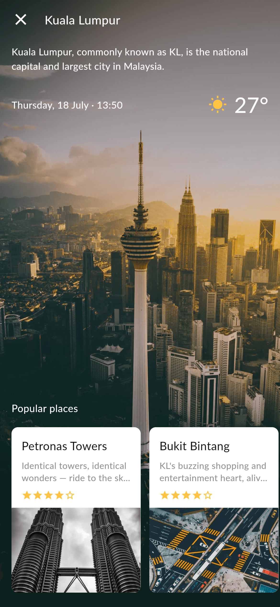
What you'll build
- ✓A full-screen hero photo with a Flutter-painted dark gradient scrim for legible white text
- ✓A close icon, city title and about paragraph overlaid on the photo
- ✓A date row plus a gold sun icon and a large temperature reading
- ✓A horizontally scrolling rail of white 'Popular places' cards, each with a blurb and star rating
- ✓A reusable place-card widget and a five-star rating row driven by plain data models
Step-by-step build
Create the file
Add a new file at lib/travel_city_two/travel_city_two_screen.dart in your Flutter project.
Register the bundled fonts
No external packages — this is pure Flutter. It does bundle its design font (Lato), so drop the font file into fonts/ and declare it in pubspec.yaml:
flutter:
  fonts:
    - family: Lato
      fonts:
- asset: fonts/Lato-Regular.ttfBuild it, piece by piece
Here's how the screen goes together. Each block below is a real slice of the code with a plain-English explanation — paste them in order, or grab the whole file from the next section.
Imports, the screen class, and design tokens
import 'package:flutter/material.dart';

/// "City Detail" screen from the Travel Kit (City Two): a full-bleed city photo
/// under a legibility gradient, a close button + city name, an about
/// paragraph, a date/weather row, and a "Popular places" row of rated place
/// cards.
///
/// Self-contained, pure Flutter. Bundles its design font (Lato) and the kit's
/// original photos (converted to WebP). The gradient scrim is recreated in
/// Flutter (no asset). Fully responsive — content centres on tall devices and
/// scrolls on short ones, so nothing overflows. Renders standalone when pushed
/// as a route.
///
/// [onBack] is an optional callback for the close button; it defaults to a
/// no-op so the screen works on its own (the preview gallery wires it to pop).
class TravelCityTwoScreen extends StatelessWidget {
  const TravelCityTwoScreen({super.key, this.onBack});

  /// Invoked when the close button is tapped. No-op by default.
  final VoidCallback? onBack;

  static const Color _ink = Color(0xFF131314);
  static const Color _desc = Color(0xFF8F8F8F);
  static const String _font = 'Lato';
  static const String _dir = 'lib/screens/travel/travel_city_two/images';
The file imports only Flutter's material library, so this screen is pure Flutter with no third-party packages. TravelCityTwoScreen is a StatelessWidget because nothing on the screen changes after it's drawn. It takes one optional onBack callback for the close button, which defaults to a no-op so the screen works standalone. Four static const tokens set the palette and assets in one place: _ink (#131314) is the near-black used for the scaffold and card titles, _desc (#8F8F8F) is the grey blurb text, _font is 'Lato', and _dir is the folder path prefixed onto every image name.
The 'Popular places' data list
  static const List<_Place> _places = <_Place>[
    _Place(
      name: 'Petronas Towers',
      blurb: 'Identical towers, identical wonders — ride to the sky bridge for '
          'the view.',
      rating: 4,
      image: '$_dir/place_petronas.webp',
    ),
    _Place(
      name: 'Bukit Bintang',
      blurb: "KL's buzzing shopping and entertainment heart, alive day and "
          'night.',
      rating: 4,
      image: '$_dir/place_bukit.webp',
    ),
    _Place(
      name: 'Merdeka Square',
      blurb: 'The historic plaza where modern Malaysia was born in 1957.',
      rating: 5,
      image: '$_dir/place_petronas.webp',
    ),
  ];
Rather than hard-coding cards in the layout, the three places are stored as a static const list of _Place objects. Each carries a name (like 'Petronas Towers'), a short blurb, an integer rating from 1 to 5, and an image path built with the _dir prefix. Separating the data from the UI like this means the rail below can be built by looping over the list, and you can add or edit a destination by touching only this list — the card widget never changes.
Stacking the hero photo under a legibility gradient
  @override
  Widget build(BuildContext context) {
    return Scaffold(
      backgroundColor: _ink,
      body: Stack(
        fit: StackFit.expand,
        children: <Widget>[
          Image.asset(
            '$_dir/city2_hero.webp',
            fit: BoxFit.cover,
            filterQuality: FilterQuality.high,
          ),
          // Legibility scrim — darker at the top and bottom for white text.
          const DecoratedBox(
            decoration: BoxDecoration(
              gradient: LinearGradient(
                begin: Alignment.topCenter,
                end: Alignment.bottomCenter,
                colors: <Color>[
                  Color(0x8C000000),
                  Color(0x1A000000),
                  Color(0x59000000),
                ],
                stops: <double>[0.0, 0.4, 1.0],
              ),
            ),
          ),
build() returns a Scaffold with the _ink background, and its body is a Stack with StackFit.expand so every child fills the screen. The first layer is the city2_hero.webp photo drawn with BoxFit.cover and FilterQuality.high so it fills the frame sharply. On top sits a DecoratedBox with a vertical LinearGradient running top to bottom through three black tints — 0x8C (55% dark) at the top, 0x1A (10%) in the middle, and 0x59 (35%) at the bottom, at stops 0.0, 0.4 and 1.0. This scrim darkens just the top and bottom so the white title and temperature stay readable over any photo, and it's painted in Flutter with no extra image asset.
Responsive scrolling, the top bar, and about text
          SafeArea(
            child: LayoutBuilder(
              builder: (BuildContext context, BoxConstraints constraints) {
                return SingleChildScrollView(
                  physics: const ClampingScrollPhysics(),
                  child: ConstrainedBox(
                    constraints:
                        BoxConstraints(minHeight: constraints.maxHeight),
                    child: IntrinsicHeight(
                      child: Column(
                        crossAxisAlignment: CrossAxisAlignment.start,
                        children: <Widget>[
                          // Top bar: close + city name.
                          Padding(
                            padding: const EdgeInsets.fromLTRB(16, 14, 16, 0),
                            child: Row(
                              children: <Widget>[
                                GestureDetector(
                                  onTap: onBack ?? () {},
                                  behavior: HitTestBehavior.opaque,
                                  child: const Icon(Icons.close,
                                      color: Colors.white, size: 26),
                                ),
                                const SizedBox(width: 20),
                                const Text(
                                  'Kuala Lumpur',
                                  style: TextStyle(
                                    fontFamily: _font,
                                    fontSize: 17,
                                    color: Colors.white,
                                  ),
                                ),
                              ],
                            ),
                          ),
                          const Padding(
                            padding: EdgeInsets.fromLTRB(16, 22, 16, 0),
                            child: Text(
                              'Kuala Lumpur, commonly known as KL, is the '
                              'national capital and largest city in Malaysia.',
                              style: TextStyle(
                                fontFamily: _font,
                                fontSize: 13.5,
                                height: 1.5,
                                color: Colors.white,
                              ),
                            ),
                          ),
The content layer is wrapped in SafeArea to dodge the notch, then a LayoutBuilder + SingleChildScrollView + ConstrainedBox(minHeight: maxHeight) + IntrinsicHeight combo makes the column fill the screen on tall phones but scroll instead of overflowing on short ones, with ClampingScrollPhysics to stop it bouncing. Inside, a left-aligned Column starts with a Row holding a GestureDetector-wrapped close Icon (white, size 26, HitTestBehavior.opaque so the whole area is tappable) that calls onBack, followed by the 'Kuala Lumpur' title in 17px Lato. Below it, a padded about paragraph is set at 13.5px Lato with a 1.5 line height for comfortable reading over the photo.
The weather row and the horizontal places rail
                          // Date + weather row.
                          const Padding(
                            padding: EdgeInsets.fromLTRB(16, 22, 16, 0),
                            child: Row(
                              children: <Widget>[
                                Expanded(
                                  child: Text(
                                    'Thursday, 18 July · 13:50',
                                    style: TextStyle(
                                      fontFamily: _font,
                                      fontSize: 13.5,
                                      letterSpacing: 0.3,
                                      color: Color(0xFFFEFEFF),
                                    ),
                                  ),
                                ),
                                Icon(Icons.wb_sunny,
                                    color: Color(0xFFFFC444), size: 26),
                                SizedBox(width: 10),
                                Text(
                                  '27°',
                                  style: TextStyle(
                                    fontFamily: _font,
                                    fontSize: 30,
                                    letterSpacing: 0.2,
                                    color: Color(0xFFFEFEFF),
                                  ),
                                ),
                              ],
                            ),
                          ),
                          const Spacer(),
                          const Padding(
                            padding: EdgeInsets.fromLTRB(16, 0, 16, 16),
                            child: Text(
                              'Popular places',
                              style: TextStyle(
                                fontFamily: _font,
                                fontSize: 14,
                                letterSpacing: 0.3,
                                color: Colors.white,
                              ),
                            ),
                          ),
                          SizedBox(
                            height: 250,
                            child: ListView.separated(
                              scrollDirection: Axis.horizontal,
                              padding:
                                  const EdgeInsets.fromLTRB(16, 0, 16, 20),
                              itemCount: _places.length,
                              separatorBuilder:
                                  (BuildContext context, int i) =>
                                      const SizedBox(width: 12),
                              itemBuilder: (BuildContext context, int i) =>
                                  _PlaceCard(place: _places[i]),
                            ),
                          ),
                        ],
                      ),
                    ),
                  ),
                );
              },
            ),
          ),
        ],
      ),
    );
  }
The date/weather Row uses an Expanded to let 'Thursday, 18 July · 13:50' take the left side, then a gold (#FFC444) wb_sunny Icon and a large 30px '27°' temperature on the right. A Spacer pushes everything above it toward the top, opening space before the rail. After the 'Popular places' label, a fixed-height 250 SizedBox hosts a horizontal ListView.separated: scrollDirection is Axis.horizontal, itemCount comes from _places.length, the separatorBuilder inserts a 12px gap between cards, and the itemBuilder renders a _PlaceCard for each place. Using ListView.separated here gives smooth horizontal scrolling and lazy building for free.
The reusable place card and star rating
/// A rounded white place card: title, blurb, star rating and a photo.
class _PlaceCard extends StatelessWidget {
  const _PlaceCard({required this.place});

  final _Place place;

  @override
  Widget build(BuildContext context) {
    return SizedBox(
      width: 180,
      child: Material(
        color: Colors.white,
        borderRadius: BorderRadius.circular(9),
        clipBehavior: Clip.antiAlias,
        child: Column(
          crossAxisAlignment: CrossAxisAlignment.start,
          children: <Widget>[
            Padding(
              padding: const EdgeInsets.fromLTRB(14, 14, 14, 0),
              child: Column(
                crossAxisAlignment: CrossAxisAlignment.start,
                children: <Widget>[
                  Text(
                    place.name,
                    maxLines: 1,
                    overflow: TextOverflow.ellipsis,
                    style: const TextStyle(
                      fontFamily: TravelCityTwoScreen._font,
                      fontSize: 16,
                      color: TravelCityTwoScreen._ink,
                    ),
                  ),
                  const SizedBox(height: 8),
                  Text(
                    place.blurb,
                    maxLines: 2,
                    overflow: TextOverflow.ellipsis,
                    style: const TextStyle(
                      fontFamily: TravelCityTwoScreen._font,
                      fontSize: 12.5,
                      height: 1.35,
                      color: TravelCityTwoScreen._desc,
                    ),
                  ),
                  const SizedBox(height: 8),
                  _Stars(rating: place.rating),
                  const SizedBox(height: 10),
                ],
              ),
            ),
            Expanded(
              child: Image.asset(
                place.image,
                width: double.infinity,
                fit: BoxFit.cover,
                filterQuality: FilterQuality.high,
              ),
            ),
          ],
        ),
      ),
    );
  }
}

/// A small five-star rating row.
class _Stars extends StatelessWidget {
  const _Stars({required this.rating});

  final int rating;

  @override
  Widget build(BuildContext context) {
    return Row(
      mainAxisSize: MainAxisSize.min,
      children: List<Widget>.generate(
        5,
        (int i) => Icon(
          i < rating ? Icons.star : Icons.star_border,
          size: 15,
          color: const Color(0xFFFFC444),
        ),
      ),
    );
  }
}
_PlaceCard is a 180px-wide SizedBox whose Material gives it a white background, a 9px rounded corner and Clip.antiAlias so the photo's corners are clipped too. A top Column holds the place name (16px _ink, single line with ellipsis), a two-line blurb (12.5px grey _desc), and the _Stars row, while an Expanded Image.asset fills the remaining height with the place photo. _Stars builds its row with List.generate(5, ...), drawing a filled Icons.star for indexes below the rating and Icons.star_border for the rest, all in the same gold #FFC444 — a compact pattern for any 0-to-5 rating display.
Full code
The complete, ready-to-paste source. Free to use in your projects — one click copies it all.
import 'package:flutter/material.dart';

/// "City Detail" screen from the Travel Kit (City Two): a full-bleed city photo
/// under a legibility gradient, a close button + city name, an about
/// paragraph, a date/weather row, and a "Popular places" row of rated place
/// cards.
///
/// Self-contained, pure Flutter. Bundles its design font (Lato) and the kit's
/// original photos (converted to WebP). The gradient scrim is recreated in
/// Flutter (no asset). Fully responsive — content centres on tall devices and
/// scrolls on short ones, so nothing overflows. Renders standalone when pushed
/// as a route.
///
/// [onBack] is an optional callback for the close button; it defaults to a
/// no-op so the screen works on its own (the preview gallery wires it to pop).
class TravelCityTwoScreen extends StatelessWidget {
  const TravelCityTwoScreen({super.key, this.onBack});

  /// Invoked when the close button is tapped. No-op by default.
  final VoidCallback? onBack;

  static const Color _ink = Color(0xFF131314);
  static const Color _desc = Color(0xFF8F8F8F);
  static const String _font = 'Lato';
  static const String _dir = 'lib/screens/travel/travel_city_two/images';

  static const List<_Place> _places = <_Place>[
    _Place(
      name: 'Petronas Towers',
      blurb: 'Identical towers, identical wonders — ride to the sky bridge for '
          'the view.',
      rating: 4,
      image: '$_dir/place_petronas.webp',
    ),
    _Place(
      name: 'Bukit Bintang',
      blurb: "KL's buzzing shopping and entertainment heart, alive day and "
          'night.',
      rating: 4,
      image: '$_dir/place_bukit.webp',
    ),
    _Place(
      name: 'Merdeka Square',
      blurb: 'The historic plaza where modern Malaysia was born in 1957.',
      rating: 5,
      image: '$_dir/place_petronas.webp',
    ),
  ];

  @override
  Widget build(BuildContext context) {
    return Scaffold(
      backgroundColor: _ink,
      body: Stack(
        fit: StackFit.expand,
        children: <Widget>[
          Image.asset(
            '$_dir/city2_hero.webp',
            fit: BoxFit.cover,
            filterQuality: FilterQuality.high,
          ),
          // Legibility scrim — darker at the top and bottom for white text.
          const DecoratedBox(
            decoration: BoxDecoration(
              gradient: LinearGradient(
                begin: Alignment.topCenter,
                end: Alignment.bottomCenter,
                colors: <Color>[
                  Color(0x8C000000),
                  Color(0x1A000000),
                  Color(0x59000000),
                ],
                stops: <double>[0.0, 0.4, 1.0],
              ),
            ),
          ),
          SafeArea(
            child: LayoutBuilder(
              builder: (BuildContext context, BoxConstraints constraints) {
                return SingleChildScrollView(
                  physics: const ClampingScrollPhysics(),
                  child: ConstrainedBox(
                    constraints:
                        BoxConstraints(minHeight: constraints.maxHeight),
                    child: IntrinsicHeight(
                      child: Column(
                        crossAxisAlignment: CrossAxisAlignment.start,
                        children: <Widget>[
                          // Top bar: close + city name.
                          Padding(
                            padding: const EdgeInsets.fromLTRB(16, 14, 16, 0),
                            child: Row(
                              children: <Widget>[
                                GestureDetector(
                                  onTap: onBack ?? () {},
                                  behavior: HitTestBehavior.opaque,
                                  child: const Icon(Icons.close,
                                      color: Colors.white, size: 26),
                                ),
                                const SizedBox(width: 20),
                                const Text(
                                  'Kuala Lumpur',
                                  style: TextStyle(
                                    fontFamily: _font,
                                    fontSize: 17,
                                    color: Colors.white,
                                  ),
                                ),
                              ],
                            ),
                          ),
                          const Padding(
                            padding: EdgeInsets.fromLTRB(16, 22, 16, 0),
                            child: Text(
                              'Kuala Lumpur, commonly known as KL, is the '
                              'national capital and largest city in Malaysia.',
                              style: TextStyle(
                                fontFamily: _font,
                                fontSize: 13.5,
                                height: 1.5,
                                color: Colors.white,
                              ),
                            ),
                          ),
                          // Date + weather row.
                          const Padding(
                            padding: EdgeInsets.fromLTRB(16, 22, 16, 0),
                            child: Row(
                              children: <Widget>[
                                Expanded(
                                  child: Text(
                                    'Thursday, 18 July · 13:50',
                                    style: TextStyle(
                                      fontFamily: _font,
                                      fontSize: 13.5,
                                      letterSpacing: 0.3,
                                      color: Color(0xFFFEFEFF),
                                    ),
                                  ),
                                ),
                                Icon(Icons.wb_sunny,
                                    color: Color(0xFFFFC444), size: 26),
                                SizedBox(width: 10),
                                Text(
                                  '27°',
                                  style: TextStyle(
                                    fontFamily: _font,
                                    fontSize: 30,
                                    letterSpacing: 0.2,
                                    color: Color(0xFFFEFEFF),
                                  ),
                                ),
                              ],
                            ),
                          ),
                          const Spacer(),
                          const Padding(
                            padding: EdgeInsets.fromLTRB(16, 0, 16, 16),
                            child: Text(
                              'Popular places',
                              style: TextStyle(
                                fontFamily: _font,
                                fontSize: 14,
                                letterSpacing: 0.3,
                                color: Colors.white,
                              ),
                            ),
                          ),
                          SizedBox(
                            height: 250,
                            child: ListView.separated(
                              scrollDirection: Axis.horizontal,
                              padding:
                                  const EdgeInsets.fromLTRB(16, 0, 16, 20),
                              itemCount: _places.length,
                              separatorBuilder:
                                  (BuildContext context, int i) =>
                                      const SizedBox(width: 12),
                              itemBuilder: (BuildContext context, int i) =>
                                  _PlaceCard(place: _places[i]),
                            ),
                          ),
                        ],
                      ),
                    ),
                  ),
                );
              },
            ),
          ),
        ],
      ),
    );
  }
}

class _Place {
  const _Place({
    required this.name,
    required this.blurb,
    required this.rating,
    required this.image,
  });

  final String name;
  final String blurb;
  final int rating;
  final String image;
}

/// A rounded white place card: title, blurb, star rating and a photo.
class _PlaceCard extends StatelessWidget {
  const _PlaceCard({required this.place});

  final _Place place;

  @override
  Widget build(BuildContext context) {
    return SizedBox(
      width: 180,
      child: Material(
        color: Colors.white,
        borderRadius: BorderRadius.circular(9),
        clipBehavior: Clip.antiAlias,
        child: Column(
          crossAxisAlignment: CrossAxisAlignment.start,
          children: <Widget>[
            Padding(
              padding: const EdgeInsets.fromLTRB(14, 14, 14, 0),
              child: Column(
                crossAxisAlignment: CrossAxisAlignment.start,
                children: <Widget>[
                  Text(
                    place.name,
                    maxLines: 1,
                    overflow: TextOverflow.ellipsis,
                    style: const TextStyle(
                      fontFamily: TravelCityTwoScreen._font,
                      fontSize: 16,
                      color: TravelCityTwoScreen._ink,
                    ),
                  ),
                  const SizedBox(height: 8),
                  Text(
                    place.blurb,
                    maxLines: 2,
                    overflow: TextOverflow.ellipsis,
                    style: const TextStyle(
                      fontFamily: TravelCityTwoScreen._font,
                      fontSize: 12.5,
                      height: 1.35,
                      color: TravelCityTwoScreen._desc,
                    ),
                  ),
                  const SizedBox(height: 8),
                  _Stars(rating: place.rating),
                  const SizedBox(height: 10),
                ],
              ),
            ),
            Expanded(
              child: Image.asset(
                place.image,
                width: double.infinity,
                fit: BoxFit.cover,
                filterQuality: FilterQuality.high,
              ),
            ),
          ],
        ),
      ),
    );
  }
}

/// A small five-star rating row.
class _Stars extends StatelessWidget {
  const _Stars({required this.rating});

  final int rating;

  @override
  Widget build(BuildContext context) {
    return Row(
      mainAxisSize: MainAxisSize.min,
      children: List<Widget>.generate(
        5,
        (int i) => Icon(
          i < rating ? Icons.star : Icons.star_border,
          size: 15,
          color: const Color(0xFFFFC444),
        ),
      ),
    );
  }
}
Plus bundled 5 binary assets (fonts/images). The CLI and MCP install those for you automatically.
Two faster ways to add it
Copy-paste works, but you can skip it entirely.
1. FlutterKit CLI
One command drops this screen — and its fonts — straight into your project.
$ flutterkit add travel-city-two2. AI agent (MCP)
Connect FlutterKit's MCP server in Claude or Cursor and just ask your agent to install travel-city-two — it fetches and writes the files for you.
FAQ
Is this travel city detail screen free to use?
Yes. The full Dart source on this page is free to copy into your own apps, personal or commercial. Paste it directly, install it with the FlutterKit CLI (flutterkit add travel-city-two), or have an AI agent add it for you via MCP.
Does it need any external packages?
No — it's pure Flutter, built entirely on the material library. The extra assets are the bundled Lato font (which you register in pubspec.yaml as shown in step 2) and the WebP photos for the hero and place cards. The CLI and MCP install the font and images for you; swap in your own photos by replacing the files in the images directory.
Which Flutter version does it target?
It uses super parameters in its constructors (const TravelCityTwoScreen({super.key, ...})), so it targets Flutter 3.x with Dart 3. It relies only on stable, long-standing widgets — Stack, LinearGradient, ListView.separated — so any modern Flutter 3.x SDK will compile it as-is.

