How to Build a Notifications Inbox in Flutter (Full Code + Preview)
A notifications tab is a list, but the details are what make it feel like a real product: date grouping, unread rows that look different, per-type icon colours, and a 'Mark all read' escape hatch. This tutorial builds all of it from the Travel Kit — alerts grouped under 'Today' and 'Earlier', each row a white or pale-blue tile with a 44px coloured circle icon, a bold title, grey body, timestamp and a blue unread dot — with zero image assets, because every glyph is a Material icon.
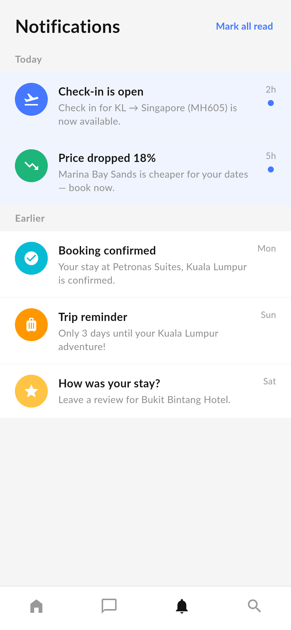
What you'll build
- ✓A two-level data model (_NotifGroup holding _Notif items) that drives the whole list from one const declaration
- ✓Nested collection-for loops that flatten groups and items into a single ListView with sticky-looking section labels
- ✓Unread styling done two ways at once — a pale #EFF4FF row tint and a blue dot
- ✓Colour-coded 44px circular icons per alert type (flight blue, price-drop green, confirmation cyan, reminder orange, review yellow)
- ✓A four-tab BottomNavigationBar with labels hidden, in the bundled Lato font
Step-by-step build
Create the file
Add a new file at lib/travel_notifications/travel_notifications_screen.dart in your Flutter project.
Register the bundled fonts
No external packages — this is pure Flutter. It does bundle its design font (Lato), so drop the font file into fonts/ and declare it in pubspec.yaml:
flutter:
  fonts:
    - family: Lato
      fonts:
- asset: fonts/Lato-Regular.ttfBuild it, piece by piece
Here's how the screen goes together. Each block below is a real slice of the code with a plain-English explanation — paste them in order, or grab the whole file from the next section.
Tokens and the notification data model
import 'package:flutter/material.dart';

/// "Notifications" screen for the Travel Kit — a bottom-nav destination built
/// in the kit's visual language (Lato, light-grey canvas, white rows). Shows
/// travel alerts grouped into "Today" and "Earlier", with coloured leading
/// icons, unread highlighting, and the shared bottom navigation bar.
///
/// Self-contained, pure Flutter — no bundled images (leading glyphs are
/// Material icons). Fully responsive (the list scrolls). Renders standalone
/// when pushed as a route.
///
/// [onTabSelected] fires with the tapped bottom-nav index; it defaults to a
/// no-op so the screen works on its own. The preview gallery wires it to switch
/// between the travel tabs.
class TravelNotificationsScreen extends StatelessWidget {
  const TravelNotificationsScreen({super.key, this.onTabSelected});

  /// Invoked with the bottom-nav index when a tab is tapped. No-op by default.
  final ValueChanged<int>? onTabSelected;

  static const Color _bg = Color(0xFFF5F5F5);
  static const Color _ink = Color(0xFF131314);
  static const Color _grey = Color(0xFF8F8F8F);
  static const Color _greyLow = Color(0xFF999999);
  static const String _font = 'Lato';

  static const List<_NotifGroup> _groups = <_NotifGroup>[
    _NotifGroup(
      label: 'Today',
      items: <_Notif>[
        _Notif(
          icon: Icons.flight_takeoff,
          color: Color(0xFF4476FF),
          title: 'Check-in is open',
          body: 'Check in for KL → Singapore (MH605) is now available.',
          time: '2h',
          unread: true,
        ),
        _Notif(
          icon: Icons.trending_down,
          color: Color(0xFF1FB57A),
          title: 'Price dropped 18%',
          body: 'Marina Bay Sands is cheaper for your dates — book now.',
          time: '5h',
          unread: true,
        ),
      ],
    ),
    _NotifGroup(
      label: 'Earlier',
      items: <_Notif>[
        _Notif(
          icon: Icons.check_circle,
          color: Color(0xFF00BCD4),
          title: 'Booking confirmed',
          body: 'Your stay at Petronas Suites, Kuala Lumpur is confirmed.',
          time: 'Mon',
          unread: false,
        ),
        _Notif(
          icon: Icons.luggage,
          color: Color(0xFFFF9800),
          title: 'Trip reminder',
          body: 'Only 3 days until your Kuala Lumpur adventure!',
          time: 'Sun',
          unread: false,
        ),
        _Notif(
          icon: Icons.star,
          color: Color(0xFFFFC444),
          title: 'How was your stay?',
          body: 'Leave a review for Bukit Bintang Hotel.',
          time: 'Sat',
          unread: false,
        ),
      ],
    ),
  ];
Only material.dart is imported — no packages and no image assets, because every leading glyph is a Material icon. The screen is a StatelessWidget that takes an optional onTabSelected callback, defaulting to null so it renders standalone. Four colour tokens plus the Lato font name are static consts. Then _groups: a const List<_NotifGroup>, each holding a label and a list of _Notif records with icon, colour, title, body, time and unread flag. Declaring the whole feed as const data means the compiler builds it once and the list widget stays a pure function of that data — swap it for a fetched List and the rest of the screen doesn't change.
Header with a Mark all read action
  @override
  Widget build(BuildContext context) {
    return Scaffold(
      backgroundColor: _bg,
      body: SafeArea(
        bottom: false,
        child: Column(
          crossAxisAlignment: CrossAxisAlignment.start,
          children: <Widget>[
            // Header.
            Padding(
              padding: const EdgeInsets.fromLTRB(20, 18, 12, 10),
              child: Row(
                children: <Widget>[
                  const Expanded(
                    child: Text(
                      'Notifications',
                      style: TextStyle(
                        fontFamily: _font,
                        fontWeight: FontWeight.w700,
                        fontSize: 24,
                        color: _ink,
                      ),
                    ),
                  ),
                  TextButton(
                    onPressed: () {},
                    child: const Text(
                      'Mark all read',
                      style: TextStyle(
                        fontFamily: _font,
                        fontWeight: FontWeight.w700,
                        fontSize: 13,
                        color: Color(0xFF4476FF),
                      ),
                    ),
                  ),
                ],
              ),
            ),
SafeArea(bottom: false) handles the top inset and leaves the bottom to the nav bar. The header is a Row with the 24px bold 'Notifications' title in an Expanded — Expanded is what pushes the TextButton to the far right without needing a Spacer, and it also lets the title ellipsise rather than collide if it grows. The asymmetric padding (20px left, only 12px right) compensates for the TextButton's own internal padding, so the button's visible text lines up with the 20px margin the rows use.
Flattening groups into one list
            Expanded(
              child: ListView(
                physics: const ClampingScrollPhysics(),
                padding: const EdgeInsets.only(bottom: 16),
                children: <Widget>[
                  for (final _NotifGroup group in _groups) ...<Widget>[
                    Padding(
                      padding: const EdgeInsets.fromLTRB(20, 8, 20, 8),
                      child: Text(
                        group.label,
                        style: const TextStyle(
                          fontFamily: _font,
                          fontWeight: FontWeight.w700,
                          fontSize: 13,
                          letterSpacing: 0.4,
                          color: _greyLow,
                        ),
                      ),
                    ),
                    for (final _Notif n in group.items) _NotifTile(notif: n),
                  ],
                ],
              ),
            ),
          ],
        ),
      ),
      bottomNavigationBar: _BottomNav(
        currentIndex: 2,
        onTap: onTabSelected,
      ),
    );
  }
}
This is the part worth stealing. Inside a ListView, two nested collection-for loops walk the data: the outer one emits a group label with a ...<Widget>[] spread so each iteration can contribute several children, and the inner one emits a _NotifTile per item. The result is a single flat scroll list that reads as sections, without SliverList boilerplate or a manual index calculation. The label style uses letterSpacing: 0.4 at 13px in the light _greyLow, the standard 'quiet section header' recipe. The nav bar is passed to Scaffold's bottomNavigationBar with currentIndex: 2 so the Notification tab is lit.
The notification tile
/// A single notification row: coloured leading icon, title + body, time, and an
/// unread dot/tint.
class _NotifTile extends StatelessWidget {
  const _NotifTile({required this.notif});

  final _Notif notif;

  @override
  Widget build(BuildContext context) {
    return Container(
      color: notif.unread ? const Color(0xFFEFF4FF) : Colors.white,
      padding: const EdgeInsets.fromLTRB(20, 14, 20, 14),
      margin: const EdgeInsets.only(bottom: 1),
      child: Row(
        crossAxisAlignment: CrossAxisAlignment.start,
        children: <Widget>[
          Container(
            width: 44,
            height: 44,
            decoration: BoxDecoration(
              color: notif.color,
              shape: BoxShape.circle,
            ),
            child: Icon(notif.icon, color: Colors.white, size: 22),
          ),
          const SizedBox(width: 14),
          Expanded(
            child: Column(
              crossAxisAlignment: CrossAxisAlignment.start,
              children: <Widget>[
                Text(
                  notif.title,
                  style: const TextStyle(
                    fontFamily: TravelNotificationsScreen._font,
                    fontWeight: FontWeight.w700,
                    fontSize: 15,
                    color: TravelNotificationsScreen._ink,
                  ),
                ),
                const SizedBox(height: 3),
                Text(
                  notif.body,
                  style: const TextStyle(
                    fontFamily: TravelNotificationsScreen._font,
                    fontSize: 13,
                    height: 1.35,
                    color: TravelNotificationsScreen._grey,
                  ),
                ),
              ],
            ),
          ),
          const SizedBox(width: 10),
          Column(
            children: <Widget>[
              Text(
                notif.time,
                style: const TextStyle(
                  fontFamily: TravelNotificationsScreen._font,
                  fontSize: 12,
                  color: TravelNotificationsScreen._greyLow,
                ),
              ),
              const SizedBox(height: 6),
              if (notif.unread)
                Container(
                  width: 8,
                  height: 8,
                  decoration: const BoxDecoration(
                    color: Color(0xFF4476FF),
                    shape: BoxShape.circle,
                  ),
                ),
            ],
          ),
        ],
      ),
    );
  }
}
Each tile is a Container whose colour is the unread switch: #EFF4FF pale blue when unread, plain white otherwise. margin: EdgeInsets.only(bottom: 1) is a neat trick — a 1px gap against the #F5F5F5 page background acts as a hairline divider with no Divider widget involved. Inside, a 44px circle filled with the notification's own colour holds a white 22px icon; the title is 15px bold, the body 13px grey at height: 1.35. The trailing Column carries the timestamp and, only when unread, an 8px blue dot rendered via a bare if inside the children list. crossAxisAlignment: CrossAxisAlignment.start keeps the icon aligned to the first line when the body wraps to two.
The shared bottom nav
/// Bottom navigation bar shared by the travel tab screens.
class _BottomNav extends StatelessWidget {
  const _BottomNav({required this.currentIndex, this.onTap});

  final int currentIndex;
  final ValueChanged<int>? onTap;

  @override
  Widget build(BuildContext context) {
    return BottomNavigationBar(
      currentIndex: currentIndex,
      onTap: onTap,
      type: BottomNavigationBarType.fixed,
      backgroundColor: Colors.white,
      selectedItemColor: TravelNotificationsScreen._ink,
      unselectedItemColor: TravelNotificationsScreen._greyLow,
      showSelectedLabels: false,
      showUnselectedLabels: false,
      elevation: 8,
      items: const <BottomNavigationBarItem>[
        BottomNavigationBarItem(icon: Icon(Icons.home_filled), label: 'Home'),
        BottomNavigationBarItem(
            icon: Icon(Icons.chat_bubble_outline), label: 'Message'),
        BottomNavigationBarItem(
            icon: Icon(Icons.notifications), label: 'Notification'),
        BottomNavigationBarItem(icon: Icon(Icons.search), label: 'Search'),
      ],
    );
  }
}
_BottomNav wraps Flutter's BottomNavigationBar with the kit's settings: type: BottomNavigationBarType.fixed so four items stay evenly spaced (without it, four-plus items switch to the shifting style), showSelectedLabels and showUnselectedLabels both false for an icon-only bar, and elevation: 8 for the shadow that separates it from the list. Note the icons differ by state across the travel screens — this one uses the filled Icons.notifications because Notification is the active tab, while the outline variant appears on its sibling screens.
Full code
The complete, ready-to-paste source. Free to use in your projects — one click copies it all.
import 'package:flutter/material.dart';

/// "Notifications" screen for the Travel Kit — a bottom-nav destination built
/// in the kit's visual language (Lato, light-grey canvas, white rows). Shows
/// travel alerts grouped into "Today" and "Earlier", with coloured leading
/// icons, unread highlighting, and the shared bottom navigation bar.
///
/// Self-contained, pure Flutter — no bundled images (leading glyphs are
/// Material icons). Fully responsive (the list scrolls). Renders standalone
/// when pushed as a route.
///
/// [onTabSelected] fires with the tapped bottom-nav index; it defaults to a
/// no-op so the screen works on its own. The preview gallery wires it to switch
/// between the travel tabs.
class TravelNotificationsScreen extends StatelessWidget {
  const TravelNotificationsScreen({super.key, this.onTabSelected});

  /// Invoked with the bottom-nav index when a tab is tapped. No-op by default.
  final ValueChanged<int>? onTabSelected;

  static const Color _bg = Color(0xFFF5F5F5);
  static const Color _ink = Color(0xFF131314);
  static const Color _grey = Color(0xFF8F8F8F);
  static const Color _greyLow = Color(0xFF999999);
  static const String _font = 'Lato';

  static const List<_NotifGroup> _groups = <_NotifGroup>[
    _NotifGroup(
      label: 'Today',
      items: <_Notif>[
        _Notif(
          icon: Icons.flight_takeoff,
          color: Color(0xFF4476FF),
          title: 'Check-in is open',
          body: 'Check in for KL → Singapore (MH605) is now available.',
          time: '2h',
          unread: true,
        ),
        _Notif(
          icon: Icons.trending_down,
          color: Color(0xFF1FB57A),
          title: 'Price dropped 18%',
          body: 'Marina Bay Sands is cheaper for your dates — book now.',
          time: '5h',
          unread: true,
        ),
      ],
    ),
    _NotifGroup(
      label: 'Earlier',
      items: <_Notif>[
        _Notif(
          icon: Icons.check_circle,
          color: Color(0xFF00BCD4),
          title: 'Booking confirmed',
          body: 'Your stay at Petronas Suites, Kuala Lumpur is confirmed.',
          time: 'Mon',
          unread: false,
        ),
        _Notif(
          icon: Icons.luggage,
          color: Color(0xFFFF9800),
          title: 'Trip reminder',
          body: 'Only 3 days until your Kuala Lumpur adventure!',
          time: 'Sun',
          unread: false,
        ),
        _Notif(
          icon: Icons.star,
          color: Color(0xFFFFC444),
          title: 'How was your stay?',
          body: 'Leave a review for Bukit Bintang Hotel.',
          time: 'Sat',
          unread: false,
        ),
      ],
    ),
  ];

  @override
  Widget build(BuildContext context) {
    return Scaffold(
      backgroundColor: _bg,
      body: SafeArea(
        bottom: false,
        child: Column(
          crossAxisAlignment: CrossAxisAlignment.start,
          children: <Widget>[
            // Header.
            Padding(
              padding: const EdgeInsets.fromLTRB(20, 18, 12, 10),
              child: Row(
                children: <Widget>[
                  const Expanded(
                    child: Text(
                      'Notifications',
                      style: TextStyle(
                        fontFamily: _font,
                        fontWeight: FontWeight.w700,
                        fontSize: 24,
                        color: _ink,
                      ),
                    ),
                  ),
                  TextButton(
                    onPressed: () {},
                    child: const Text(
                      'Mark all read',
                      style: TextStyle(
                        fontFamily: _font,
                        fontWeight: FontWeight.w700,
                        fontSize: 13,
                        color: Color(0xFF4476FF),
                      ),
                    ),
                  ),
                ],
              ),
            ),
            Expanded(
              child: ListView(
                physics: const ClampingScrollPhysics(),
                padding: const EdgeInsets.only(bottom: 16),
                children: <Widget>[
                  for (final _NotifGroup group in _groups) ...<Widget>[
                    Padding(
                      padding: const EdgeInsets.fromLTRB(20, 8, 20, 8),
                      child: Text(
                        group.label,
                        style: const TextStyle(
                          fontFamily: _font,
                          fontWeight: FontWeight.w700,
                          fontSize: 13,
                          letterSpacing: 0.4,
                          color: _greyLow,
                        ),
                      ),
                    ),
                    for (final _Notif n in group.items) _NotifTile(notif: n),
                  ],
                ],
              ),
            ),
          ],
        ),
      ),
      bottomNavigationBar: _BottomNav(
        currentIndex: 2,
        onTap: onTabSelected,
      ),
    );
  }
}

class _NotifGroup {
  const _NotifGroup({required this.label, required this.items});

  final String label;
  final List<_Notif> items;
}

class _Notif {
  const _Notif({
    required this.icon,
    required this.color,
    required this.title,
    required this.body,
    required this.time,
    required this.unread,
  });

  final IconData icon;
  final Color color;
  final String title;
  final String body;
  final String time;
  final bool unread;
}

/// A single notification row: coloured leading icon, title + body, time, and an
/// unread dot/tint.
class _NotifTile extends StatelessWidget {
  const _NotifTile({required this.notif});

  final _Notif notif;

  @override
  Widget build(BuildContext context) {
    return Container(
      color: notif.unread ? const Color(0xFFEFF4FF) : Colors.white,
      padding: const EdgeInsets.fromLTRB(20, 14, 20, 14),
      margin: const EdgeInsets.only(bottom: 1),
      child: Row(
        crossAxisAlignment: CrossAxisAlignment.start,
        children: <Widget>[
          Container(
            width: 44,
            height: 44,
            decoration: BoxDecoration(
              color: notif.color,
              shape: BoxShape.circle,
            ),
            child: Icon(notif.icon, color: Colors.white, size: 22),
          ),
          const SizedBox(width: 14),
          Expanded(
            child: Column(
              crossAxisAlignment: CrossAxisAlignment.start,
              children: <Widget>[
                Text(
                  notif.title,
                  style: const TextStyle(
                    fontFamily: TravelNotificationsScreen._font,
                    fontWeight: FontWeight.w700,
                    fontSize: 15,
                    color: TravelNotificationsScreen._ink,
                  ),
                ),
                const SizedBox(height: 3),
                Text(
                  notif.body,
                  style: const TextStyle(
                    fontFamily: TravelNotificationsScreen._font,
                    fontSize: 13,
                    height: 1.35,
                    color: TravelNotificationsScreen._grey,
                  ),
                ),
              ],
            ),
          ),
          const SizedBox(width: 10),
          Column(
            children: <Widget>[
              Text(
                notif.time,
                style: const TextStyle(
                  fontFamily: TravelNotificationsScreen._font,
                  fontSize: 12,
                  color: TravelNotificationsScreen._greyLow,
                ),
              ),
              const SizedBox(height: 6),
              if (notif.unread)
                Container(
                  width: 8,
                  height: 8,
                  decoration: const BoxDecoration(
                    color: Color(0xFF4476FF),
                    shape: BoxShape.circle,
                  ),
                ),
            ],
          ),
        ],
      ),
    );
  }
}

/// Bottom navigation bar shared by the travel tab screens.
class _BottomNav extends StatelessWidget {
  const _BottomNav({required this.currentIndex, this.onTap});

  final int currentIndex;
  final ValueChanged<int>? onTap;

  @override
  Widget build(BuildContext context) {
    return BottomNavigationBar(
      currentIndex: currentIndex,
      onTap: onTap,
      type: BottomNavigationBarType.fixed,
      backgroundColor: Colors.white,
      selectedItemColor: TravelNotificationsScreen._ink,
      unselectedItemColor: TravelNotificationsScreen._greyLow,
      showSelectedLabels: false,
      showUnselectedLabels: false,
      elevation: 8,
      items: const <BottomNavigationBarItem>[
        BottomNavigationBarItem(icon: Icon(Icons.home_filled), label: 'Home'),
        BottomNavigationBarItem(
            icon: Icon(Icons.chat_bubble_outline), label: 'Message'),
        BottomNavigationBarItem(
            icon: Icon(Icons.notifications), label: 'Notification'),
        BottomNavigationBarItem(icon: Icon(Icons.search), label: 'Search'),
      ],
    );
  }
}
Plus bundled 2 binary assets (fonts/images). The CLI and MCP install those for you automatically.
Two faster ways to add it
Copy-paste works, but you can skip it entirely.
1. FlutterKit CLI
One command drops this screen — and its fonts — straight into your project.
$ flutterkit add travel-notifications2. AI agent (MCP)
Connect FlutterKit's MCP server in Claude or Cursor and just ask your agent to install travel-notifications — it fetches and writes the files for you.
FAQ
Is this Flutter notifications screen free to use?
Yes. The full Dart source on this page is free for personal and commercial projects. Copy it here, install it with the FlutterKit CLI (flutterkit add travel-notifications), or have an AI agent add it via MCP.
How do I load real notifications?
Replace the const _groups list with data from your API or Firestore and convert the screen to a StatefulWidget (or wrap the ListView in a StreamBuilder). The _NotifGroup / _Notif classes are already the shape you'd deserialise into, and the tile takes a _Notif, so nothing in the rendering changes.
Does it need any external packages or images?
Neither. It's pure Flutter on the material library, and it ships no image assets — every leading glyph is a Material icon tinted per notification type. The only bundled asset is the Lato font, registered in pubspec.yaml as shown in step 2.
Which Flutter version does it target?
It uses super parameters and const collections, so Dart 3 / Flutter 3.10+ is enough. There are no withValues() or withOpacity() calls in this screen, so it compiles cleanly on newer and slightly older SDKs alike.

