How to Build a Touch ID Opt-In Screen in Flutter (Full Code + Preview)
Asking for biometrics is a trust moment: if the screen looks cheap, people tap Skip. This tutorial builds the biometric opt-in step from the bankee kit — a white canvas, a back chevron, a purple-gradient fingerprint badge drawn with concentric rings, a two-line headline, an explainer about skipping the PIN, and two stacked buttons ('Activate Now' in purple, 'Skip This' in grey). By the end you'll have a scroll-safe screen that pushes its CTAs to the bottom on tall phones and never overflows on short ones — pure Flutter, no packages, no image assets.
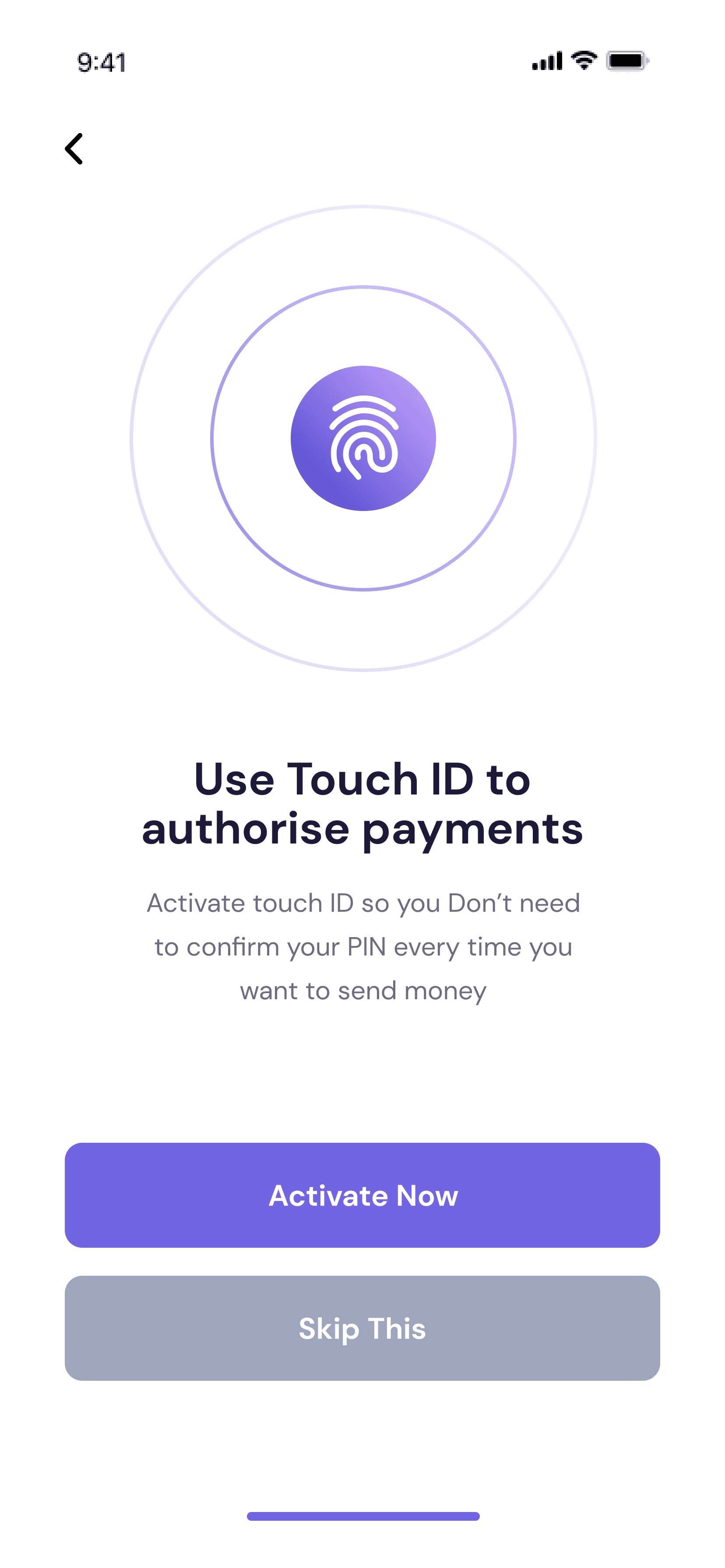
What you'll build
- ✓A fingerprint badge built from nested gradient circles and Icons.fingerprint — no PNG needed
- ✓A four-token colour palette (navy ink, 80%-opacity subtitle, purple primary, grey secondary) held as consts
- ✓Two identical CTAs driven by one reusable CtaButton that only differs by colour and label
- ✓A LayoutBuilder + IntrinsicHeight layout where a Spacer pins the buttons to the bottom without ever overflowing
- ✓The bundled DM Sans design font wired through pubspec.yaml
Step-by-step build
Create the file
Add a new file at lib/touch_id/touch_id_screen.dart in your Flutter project.
Register the bundled fonts
No external packages — this is pure Flutter. It does bundle its design font (DMSans), so drop the font file into fonts/ and declare it in pubspec.yaml:
flutter:
  fonts:
    - family: DMSans
      fonts:
- asset: fonts/DMSans-Regular.ttfBuild it, piece by piece
Here's how the screen goes together. Each block below is a real slice of the code with a plain-English explanation — paste them in order, or grab the whole file from the next section.
Imports and the colour tokens
import 'package:flutter/material.dart';

import 'widgets/cta_button.dart';
import 'widgets/finger_id_badge.dart';

/// Touch ID Confirmation screen from the "bankee" UI kit.
///
/// A back affordance, a purple-gradient fingerprint badge, a headline and
/// supporting copy, and two stacked CTAs: "Activate Now" (purple) and
/// "Skip This" (grey).
///
/// Self-contained, pure Flutter. Bundles its exact design font (DM Sans). The
/// fingerprint badge is recreated with Flutter (gradient + Icons.fingerprint),
/// so there are no bundled image assets. Renders standalone when pushed as a
/// route.
class TouchIdScreen extends StatelessWidget {
  const TouchIdScreen({super.key});

  static const Color _navy = Color(0xFF1C1939);
  static const Color _subtitle = Color(0xCC1C1939); // #1C1939 @ 80%
  static const Color _primary = Color(0xFF7165E3);
  static const Color _grey = Color(0xFF9EA6BE);
The screen imports only Flutter's material library plus two local widgets — CtaButton and FingerIdBadge — which is why there are no pub packages to install. TouchIdScreen is a StatelessWidget because nothing on the page changes until the user taps a button. The four static const Colors are the whole design system for this screen: _navy (#1C1939) for the headline, _subtitle which is the same navy written as 0xCC1C1939 — the CC prefix is 80% alpha baked into the hex, a neat trick that avoids a withValues() call — _primary (#7165E3) for the purple CTA, and _grey (#9EA6BE) for the Skip button.
A scaffold that can't overflow
  @override
  Widget build(BuildContext context) {
    return Scaffold(
      backgroundColor: Colors.white,
      body: SafeArea(
        child: LayoutBuilder(
          builder: (BuildContext context, BoxConstraints constraints) {
            return SingleChildScrollView(
              child: ConstrainedBox(
                constraints: BoxConstraints(minHeight: constraints.maxHeight),
                child: IntrinsicHeight(
                  child: Padding(
                    padding: const EdgeInsets.fromLTRB(37, 29, 37, 24),
                    child: Column(
                      crossAxisAlignment: CrossAxisAlignment.stretch,
                      children: <Widget>[
build() returns a white Scaffold wrapped in SafeArea so the back chevron clears the notch. The three widgets that follow are the responsiveness recipe: LayoutBuilder exposes the real available height as constraints.maxHeight, SingleChildScrollView makes the content scrollable, and ConstrainedBox(minHeight: constraints.maxHeight) + IntrinsicHeight force the column to be at least a full screen tall so the Spacer further down still has room to work. Padding of 37px left/right matches the kit's margins, and CrossAxisAlignment.stretch makes the two CTAs span the full width automatically.
Back chevron and the fingerprint badge
                        Align(
                          alignment: Alignment.centerLeft,
                          child: GestureDetector(
                            behavior: HitTestBehavior.opaque,
                            onTap: () => Navigator.of(context).maybePop(),
                            child: const Padding(
                              padding: EdgeInsets.symmetric(vertical: 4),
                              child: Icon(
                                Icons.arrow_back_ios_new,
                                size: 20,
                                color: Colors.black,
                              ),
                            ),
                          ),
                        ),
                        const SizedBox(height: 19),
                        const Center(child: FingerIdBadge()),
                        const SizedBox(height: 47),
The back affordance is a GestureDetector rather than an IconButton, so it takes only the space of the 20px Icons.arrow_back_ios_new glyph plus 4px of vertical padding. HitTestBehavior.opaque is what makes that padding tappable too — without it, taps landing in the padding would fall through. Navigator.of(context).maybePop() is used instead of pop() because maybePop is safe when this screen is the first route: it does nothing rather than crashing. Align(centerLeft) keeps the chevron left while the parent column stretches everything else, and Center(child: FingerIdBadge()) drops in the concentric-ring badge.
Headline and explainer copy
                        const Text(
                          'Use Touch ID to\nauthorise payments',
                          textAlign: TextAlign.center,
                          style: TextStyle(
                            fontFamily: 'DMSans',
                            fontSize: 26,
                            height: 28 / 26,
                            fontWeight: FontWeight.w700,
                            color: _navy,
                          ),
                        ),
                        const SizedBox(height: 16),
                        const Text(
                          'Activate touch ID so you Don’t need\n'
                          'to confirm your PIN every time you\n'
                          'want to send money',
                          textAlign: TextAlign.center,
                          style: TextStyle(
                            fontFamily: 'DMSans',
                            fontSize: 15,
                            height: 25 / 15,
                            color: _subtitle,
                          ),
                        ),
Both text blocks use fontFamily: 'DMSans' — the bundled design font — with TextAlign.center. The headline is 26px w700 with height: 28 / 26, which is how designers' line-height specs translate into Flutter: Figma says 28px line height on 26px text, and Flutter's height is a multiplier, so you write the division and let Dart compute it. The explainer is 15px at height: 25 / 15 in the 80%-alpha _subtitle colour. Both strings use explicit \n line breaks and adjacent string literals so the copy wraps exactly where the design says it should, instead of wherever the device width happens to land.
The Spacer and the two stacked CTAs
                        const Spacer(),
                        CtaButton(
                          label: 'Activate Now',
                          color: _primary,
                          onPressed: () {},
                        ),
                        const SizedBox(height: 16),
                        CtaButton(
                          label: 'Skip This',
                          color: _grey,
                          onPressed: () {},
                        ),
                      ],
                    ),
                  ),
                ),
              ),
            );
          },
        ),
      ),
    );
  }
}
A single const Spacer() sits between the copy and the buttons: it eats all leftover vertical space, which pushes 'Activate Now' and 'Skip This' down to the bottom of the screen on tall phones while letting them sit right under the text on short ones. Because the column lives inside IntrinsicHeight and a scroll view, that Spacer never causes an overflow error. The two CTAs are the same CtaButton widget passed different label and color values — _primary purple for the real action, _grey for Skip — separated by a 16px SizedBox. Making the secondary action a full grey button rather than a bare text link is a deliberate kit choice: both options stay easy to hit one-handed.
Full code
The complete, ready-to-paste source (3 files). Free to use in your projects — one click copies it all.
import 'package:flutter/material.dart';

import 'widgets/cta_button.dart';
import 'widgets/finger_id_badge.dart';

/// Touch ID Confirmation screen from the "bankee" UI kit.
///
/// A back affordance, a purple-gradient fingerprint badge, a headline and
/// supporting copy, and two stacked CTAs: "Activate Now" (purple) and
/// "Skip This" (grey).
///
/// Self-contained, pure Flutter. Bundles its exact design font (DM Sans). The
/// fingerprint badge is recreated with Flutter (gradient + Icons.fingerprint),
/// so there are no bundled image assets. Renders standalone when pushed as a
/// route.
class TouchIdScreen extends StatelessWidget {
  const TouchIdScreen({super.key});

  static const Color _navy = Color(0xFF1C1939);
  static const Color _subtitle = Color(0xCC1C1939); // #1C1939 @ 80%
  static const Color _primary = Color(0xFF7165E3);
  static const Color _grey = Color(0xFF9EA6BE);

  @override
  Widget build(BuildContext context) {
    return Scaffold(
      backgroundColor: Colors.white,
      body: SafeArea(
        child: LayoutBuilder(
          builder: (BuildContext context, BoxConstraints constraints) {
            return SingleChildScrollView(
              child: ConstrainedBox(
                constraints: BoxConstraints(minHeight: constraints.maxHeight),
                child: IntrinsicHeight(
                  child: Padding(
                    padding: const EdgeInsets.fromLTRB(37, 29, 37, 24),
                    child: Column(
                      crossAxisAlignment: CrossAxisAlignment.stretch,
                      children: <Widget>[
                        Align(
                          alignment: Alignment.centerLeft,
                          child: GestureDetector(
                            behavior: HitTestBehavior.opaque,
                            onTap: () => Navigator.of(context).maybePop(),
                            child: const Padding(
                              padding: EdgeInsets.symmetric(vertical: 4),
                              child: Icon(
                                Icons.arrow_back_ios_new,
                                size: 20,
                                color: Colors.black,
                              ),
                            ),
                          ),
                        ),
                        const SizedBox(height: 19),
                        const Center(child: FingerIdBadge()),
                        const SizedBox(height: 47),
                        const Text(
                          'Use Touch ID to\nauthorise payments',
                          textAlign: TextAlign.center,
                          style: TextStyle(
                            fontFamily: 'DMSans',
                            fontSize: 26,
                            height: 28 / 26,
                            fontWeight: FontWeight.w700,
                            color: _navy,
                          ),
                        ),
                        const SizedBox(height: 16),
                        const Text(
                          'Activate touch ID so you Don’t need\n'
                          'to confirm your PIN every time you\n'
                          'want to send money',
                          textAlign: TextAlign.center,
                          style: TextStyle(
                            fontFamily: 'DMSans',
                            fontSize: 15,
                            height: 25 / 15,
                            color: _subtitle,
                          ),
                        ),
                        const Spacer(),
                        CtaButton(
                          label: 'Activate Now',
                          color: _primary,
                          onPressed: () {},
                        ),
                        const SizedBox(height: 16),
                        CtaButton(
                          label: 'Skip This',
                          color: _grey,
                          onPressed: () {},
                        ),
                      ],
                    ),
                  ),
                ),
              ),
            );
          },
        ),
      ),
    );
  }
}
Plus bundled 1 binary asset (fonts/images). The CLI and MCP install those for you automatically.
Two faster ways to add it
Copy-paste works, but you can skip it entirely.
1. FlutterKit CLI
One command drops this screen — and its fonts — straight into your project.
$ flutterkit add touch-id2. AI agent (MCP)
Connect FlutterKit's MCP server in Claude or Cursor and just ask your agent to install touch-id — it fetches and writes the files for you.
FAQ
Is this Flutter Touch ID screen free to use?
Yes. The full Dart source on this page is free to copy into personal or commercial projects. You can paste it, install it with the FlutterKit CLI (flutterkit add touch-id), or let an AI agent add it for you over MCP.
Does it actually read a fingerprint?
No — this is the UI layer only, which is exactly what you want it to be. The badge is drawn in Flutter with a gradient and Icons.fingerprint, and the 'Activate Now' CTA has an empty onPressed callback. Drop in local_auth (or your platform channel) and call it from that callback to run the real biometric prompt.
Does it need any external packages?
No — it's pure Flutter on the material library. The only extra asset is the bundled DM Sans font, registered in pubspec.yaml as shown in step 2; the CLI and MCP install those font files for you.
Which Flutter version does it target?
It uses super parameters in its constructors, so it needs Dart 3 / Flutter 3.10+. The supporting widgets use Color.withValues(), which lands in Flutter 3.22+ — on an older SDK, swap withValues(alpha: x) for withOpacity(x) and it compiles.

