How to Build a Sign In Screen in Flutter (Full Code + Preview)
A sign-in screen is the door returning users walk through every day, so it should be fast and familiar. In this tutorial you'll build a complete Flutter login screen: a centered 'Welcome Back!' header, an Email field that auto-focuses on open, an obscured Password field, a right-aligned 'Forgot Password?' link, a full-width purple 'Sign in My Account' button, and a two-tone 'Sign Up' link. You'll also see how to keep text controllers tidy and dismiss the keyboard on an outside tap. It's pure Flutter — no packages, just one bundled DM Sans font.
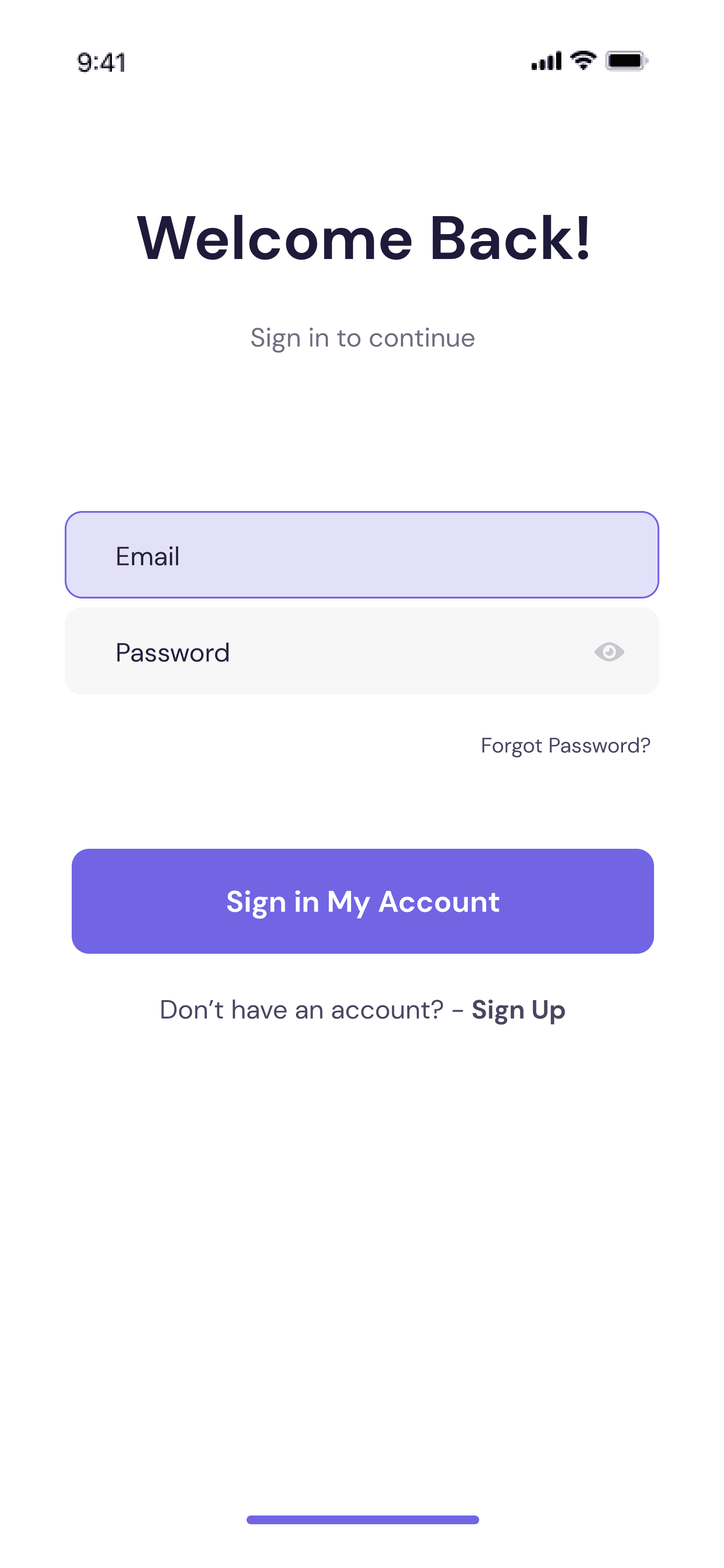
What you'll build
- ✓A centered 'Welcome Back!' header with a 'Sign in to continue' subtitle
- ✓An auto-focused Email field and an obscured Password field, each with the right keyboard type and action
- ✓A right-aligned 'Forgot Password?' text link that reacts to taps
- ✓A full-width purple CTA button plus a bold two-tone 'Don't have an account? Sign Up' link
- ✓Clean controller lifecycle — controllers created in state and disposed on teardown
Step-by-step build
Create the file
Add a new file at lib/sign_in/sign_in_screen.dart in your Flutter project.
Register the bundled fonts
No external packages — this is pure Flutter. It does bundle its design font (DMSans), so drop the font file into fonts/ and declare it in pubspec.yaml:
flutter:
  fonts:
    - family: DMSans
      fonts:
- asset: fonts/DMSans-Regular.ttfBuild it, piece by piece
Here's how the screen goes together. Each block below is a real slice of the code with a plain-English explanation — paste them in order, or grab the whole file from the next section.
Imports, a stateful screen, and color tokens
import 'package:flutter/material.dart';

import 'widgets/cta_button.dart';
import 'widgets/sign_in_field.dart';

/// Sign In screen from the "bankee" UI kit.
///
/// A centered welcome header over a form board: Email (focused by default, per
/// the design) and Password fields, a right-aligned "Forgot Password?" link, a
/// primary CTA and a sign-up link.
///
/// Self-contained, pure Flutter. Bundles its exact design font (DM Sans) and
/// renders standalone when pushed as a route.
class SignInScreen extends StatefulWidget {
  const SignInScreen({super.key});

  @override
  State<SignInScreen> createState() => _SignInScreenState();
}

class _SignInScreenState extends State<SignInScreen> {
  static const Color _primary = Color(0xFF7165E3);
  static const Color _navy = Color(0xFF1C1939);
  static const Color _subtitle = Color(0xCC1C1939); // #1C1939 @ 80%
Because the screen owns two live text fields, SignInScreen is a StatefulWidget whose State holds the mutable data. It imports two local widgets — CtaButton and SignInField — so this file stays about layout, not field internals. Three private const Colors act as design tokens: _primary is the purple #7165E3 used for the CTA, _navy (#1C1939) is the near-black header text, and _subtitle is that same navy with a 0xCC prefix, which bakes 80% opacity straight into the color value for the muted subtitle and links.
Text controllers and disposing them
  final TextEditingController _email = TextEditingController();
  final TextEditingController _password = TextEditingController();

  @override
  void dispose() {
    _email.dispose();
    _password.dispose();
    super.dispose();
  }
The state creates two TextEditingControllers, _email and _password, one per field so you can read their .text later. The important habit is dispose(): both controllers are released when the screen is destroyed, then super.dispose() runs. Skipping this is a classic Flutter memory leak, so any controller you build in a State should always be freed here.
Scaffold, keyboard dismissal, and the header
  @override
  Widget build(BuildContext context) {
    return Scaffold(
      backgroundColor: Colors.white,
      // Tap anywhere to dismiss the keyboard (the Email field autofocuses).
      body: GestureDetector(
        onTap: () => FocusScope.of(context).unfocus(),
        child: SafeArea(
          child: SingleChildScrollView(
            padding: const EdgeInsets.fromLTRB(37, 66, 37, 32),
            child: Column(
              crossAxisAlignment: CrossAxisAlignment.stretch,
              children: <Widget>[
                const Text(
                  'Welcome Back!',
                  textAlign: TextAlign.center,
                  style: TextStyle(
                    fontFamily: 'DMSans',
                    fontSize: 35,
                    fontWeight: FontWeight.w700,
                    color: _navy,
                  ),
                ),
                const SizedBox(height: 21),
                const Text(
                  'Sign in to continue',
                  textAlign: TextAlign.center,
                  style: TextStyle(
                    fontFamily: 'DMSans',
                    fontSize: 15,
                    height: 25 / 15,
                    color: _subtitle,
                  ),
                ),
                const SizedBox(height: 87),
build() returns a white Scaffold whose body is a GestureDetector calling FocusScope.of(context).unfocus() on tap — the standard 'tap any blank space to close the keyboard' idiom, which matters because the Email field autofocuses on open. SafeArea plus a SingleChildScrollView (padded 37px sides, 66px top) keep the form off the system insets and let it scroll when the keyboard rises. The Column stretches to full width and stacks the 35px bold 'Welcome Back!' title, a 21px gap, the 15px muted 'Sign in to continue' subtitle, then a large 87px gap before the fields.
The form: fields, forgot-password link, and CTA
                SignInField(
                  hint: 'Email',
                  controller: _email,
                  autofocus: true,
                  keyboardType: TextInputType.emailAddress,
                  textInputAction: TextInputAction.next,
                ),
                const SizedBox(height: 5),
                SignInField(
                  hint: 'Password',
                  controller: _password,
                  isPassword: true,
                  textInputAction: TextInputAction.done,
                ),
                const SizedBox(height: 21),
                Align(
                  alignment: Alignment.centerRight,
                  child: GestureDetector(
                    behavior: HitTestBehavior.opaque,
                    onTap: () {},
                    child: const Text(
                      'Forgot Password?',
                      style: TextStyle(
                        fontFamily: 'DMSans',
                        fontSize: 12,
                        color: _subtitle,
                      ),
                    ),
                  ),
                ),
                const SizedBox(height: 35),
                CtaButton(
                  label: 'Sign in My Account',
                  color: _primary,
                  onPressed: () {},
                ),
                const SizedBox(height: 19),
                _SignUpLink(onTap: () {}),
Two SignInField widgets do the input work: the first is Email with autofocus: true, keyboardType: emailAddress, and textInputAction: next; the second passes isPassword: true to obscure text and uses textInputAction: done. A tiny 5px SizedBox separates them. Below sits an Align(centerRight) holding a GestureDetector-wrapped 'Forgot Password?' Text (12px, muted) so only the right side is tappable. Then the full-width CtaButton labelled 'Sign in My Account' in the purple _primary — its onPressed is left empty ({}) for you to wire — followed by the _SignUpLink.
A two-tone 'Sign Up' link with Text.rich
/// "Don't have an account? - Sign Up" — regular text with a bold link.
class _SignUpLink extends StatelessWidget {
  const _SignUpLink({required this.onTap});

  final VoidCallback onTap;

  @override
  Widget build(BuildContext context) {
    return GestureDetector(
      behavior: HitTestBehavior.opaque,
      onTap: onTap,
      child: Text.rich(
        const TextSpan(
          text: 'Don’t have an account? - ',
          style: TextStyle(
            fontFamily: 'DMSans',
            fontSize: 15,
            height: 25 / 15,
            fontWeight: FontWeight.w400,
            color: _SignInScreenState._subtitle,
          ),
          children: <InlineSpan>[
            TextSpan(
              text: 'Sign Up',
              style: TextStyle(fontWeight: FontWeight.w700),
            ),
          ],
        ),
        textAlign: TextAlign.center,
      ),
    );
  }
}
_SignUpLink is a small StatelessWidget that mixes two font weights on one line, so it uses Text.rich with a TextSpan. The base span reads "Don't have an account? - " in regular weight and the muted _subtitle color, while a nested child TextSpan makes just 'Sign Up' bold (FontWeight.w700). The whole line sits in a GestureDetector with HitTestBehavior.opaque so a tap anywhere along it fires onTap. This is the clean way to style part of a string differently without splitting it into separate Text widgets in a Row.
Full code
The complete, ready-to-paste source (3 files). Free to use in your projects — one click copies it all.
import 'package:flutter/material.dart';

import 'widgets/cta_button.dart';
import 'widgets/sign_in_field.dart';

/// Sign In screen from the "bankee" UI kit.
///
/// A centered welcome header over a form board: Email (focused by default, per
/// the design) and Password fields, a right-aligned "Forgot Password?" link, a
/// primary CTA and a sign-up link.
///
/// Self-contained, pure Flutter. Bundles its exact design font (DM Sans) and
/// renders standalone when pushed as a route.
class SignInScreen extends StatefulWidget {
  const SignInScreen({super.key});

  @override
  State<SignInScreen> createState() => _SignInScreenState();
}

class _SignInScreenState extends State<SignInScreen> {
  static const Color _primary = Color(0xFF7165E3);
  static const Color _navy = Color(0xFF1C1939);
  static const Color _subtitle = Color(0xCC1C1939); // #1C1939 @ 80%

  final TextEditingController _email = TextEditingController();
  final TextEditingController _password = TextEditingController();

  @override
  void dispose() {
    _email.dispose();
    _password.dispose();
    super.dispose();
  }

  @override
  Widget build(BuildContext context) {
    return Scaffold(
      backgroundColor: Colors.white,
      // Tap anywhere to dismiss the keyboard (the Email field autofocuses).
      body: GestureDetector(
        onTap: () => FocusScope.of(context).unfocus(),
        child: SafeArea(
          child: SingleChildScrollView(
            padding: const EdgeInsets.fromLTRB(37, 66, 37, 32),
            child: Column(
              crossAxisAlignment: CrossAxisAlignment.stretch,
              children: <Widget>[
                const Text(
                  'Welcome Back!',
                  textAlign: TextAlign.center,
                  style: TextStyle(
                    fontFamily: 'DMSans',
                    fontSize: 35,
                    fontWeight: FontWeight.w700,
                    color: _navy,
                  ),
                ),
                const SizedBox(height: 21),
                const Text(
                  'Sign in to continue',
                  textAlign: TextAlign.center,
                  style: TextStyle(
                    fontFamily: 'DMSans',
                    fontSize: 15,
                    height: 25 / 15,
                    color: _subtitle,
                  ),
                ),
                const SizedBox(height: 87),
                SignInField(
                  hint: 'Email',
                  controller: _email,
                  autofocus: true,
                  keyboardType: TextInputType.emailAddress,
                  textInputAction: TextInputAction.next,
                ),
                const SizedBox(height: 5),
                SignInField(
                  hint: 'Password',
                  controller: _password,
                  isPassword: true,
                  textInputAction: TextInputAction.done,
                ),
                const SizedBox(height: 21),
                Align(
                  alignment: Alignment.centerRight,
                  child: GestureDetector(
                    behavior: HitTestBehavior.opaque,
                    onTap: () {},
                    child: const Text(
                      'Forgot Password?',
                      style: TextStyle(
                        fontFamily: 'DMSans',
                        fontSize: 12,
                        color: _subtitle,
                      ),
                    ),
                  ),
                ),
                const SizedBox(height: 35),
                CtaButton(
                  label: 'Sign in My Account',
                  color: _primary,
                  onPressed: () {},
                ),
                const SizedBox(height: 19),
                _SignUpLink(onTap: () {}),
              ],
            ),
          ),
        ),
      ),
    );
  }
}

/// "Don't have an account? - Sign Up" — regular text with a bold link.
class _SignUpLink extends StatelessWidget {
  const _SignUpLink({required this.onTap});

  final VoidCallback onTap;

  @override
  Widget build(BuildContext context) {
    return GestureDetector(
      behavior: HitTestBehavior.opaque,
      onTap: onTap,
      child: Text.rich(
        const TextSpan(
          text: 'Don’t have an account? - ',
          style: TextStyle(
            fontFamily: 'DMSans',
            fontSize: 15,
            height: 25 / 15,
            fontWeight: FontWeight.w400,
            color: _SignInScreenState._subtitle,
          ),
          children: <InlineSpan>[
            TextSpan(
              text: 'Sign Up',
              style: TextStyle(fontWeight: FontWeight.w700),
            ),
          ],
        ),
        textAlign: TextAlign.center,
      ),
    );
  }
}
Plus bundled 1 binary asset (fonts/images). The CLI and MCP install those for you automatically.
Two faster ways to add it
Copy-paste works, but you can skip it entirely.
1. FlutterKit CLI
One command drops this screen — and its fonts — straight into your project.
$ flutterkit add sign-in2. AI agent (MCP)
Connect FlutterKit's MCP server in Claude or Cursor and just ask your agent to install sign-in — it fetches and writes the files for you.
FAQ
Is this sign-in screen free to use?
Yes — the full Dart on this page is free to copy into your own apps, personal or commercial. Paste it directly, run 'flutterkit add sign-in' with the CLI, or install it via MCP.
Does it need any external packages?
No — it's pure Flutter, built on the material library. The only asset is the bundled DM Sans font, which you register in pubspec.yaml as shown in step 2. The CLI and MCP install the font file for you. The Sign in and Forgot Password handlers are left empty ({}) so you can plug in your own auth logic, reading _email.text and _password.text inside them.
Which Flutter version does it target?
It uses super parameters (const SignInScreen({super.key})), so it targets modern Flutter 3.x on Dart 3. There's no Color.withValues() here — the muted colors are encoded as alpha-hex values like 0xCC1C1939 (80% opacity), which compile on any current Flutter SDK.

