How to Build a Payments Home Screen in Flutter (Full Code + Preview)
Payment apps live or die on their home dashboard — it has to surface your balance, quick actions, and recent activity the moment you open it. This tutorial builds a PhonePe-style payments home in Flutter: a greeting top bar, a purple gradient balance card, a row of quick actions, scrollable pay contacts, a two-column services grid, a recent-transactions card, and a floating bottom nav with a centre 'Scan & Pay' QR button. This page focuses on the screen file that composes all of those pieces, showing how a scrolling dashboard is assembled and how the floating nav is layered over it. Pure Flutter, one bundled font.
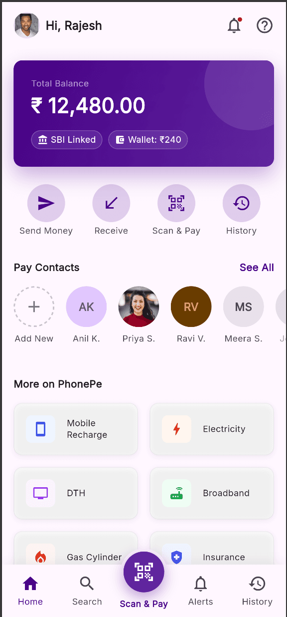
What you'll build
- ✓A full dashboard scaffold that layers a floating bottom nav over a scrolling body using a Stack
- ✓A vertically scrolling feed of sections — balance card, quick actions, contacts, services, transactions — with consistent spacing tokens
- ✓A reusable section header that works with or without a tappable 'See All' action
- ✓A stateful bottom-nav index wired with setState so tabs stay in sync
- ✓Clean design tokens (the shared palette P) plus the bundled Inter font
Step-by-step build
Create the file
Add a new file at lib/payments_home/payments_home_screen.dart in your Flutter project.
Register the bundled fonts
No external packages — this is pure Flutter. It does bundle its design font (Inter), so drop the font file into fonts/ and declare it in pubspec.yaml:
flutter:
  fonts:
    - family: Inter
      fonts:
- asset: fonts/Inter-Regular.ttfBuild it, piece by piece
Here's how the screen goes together. Each block below is a real slice of the code with a plain-English explanation — paste them in order, or grab the whole file from the next section.
Imports, the doc comment, and the screen class
import 'package:flutter/material.dart';

import 'widgets/balance_card.dart';
import 'widgets/palette.dart';
import 'widgets/pay_contacts.dart';
import 'widgets/payments_bottom_nav.dart';
import 'widgets/quick_actions.dart';
import 'widgets/services_grid.dart';
import 'widgets/top_bar.dart';
import 'widgets/transactions_list.dart';

/// A PhonePe-style payments home dashboard: greeting top bar, hero balance card,
/// quick actions, pay-contacts row, a services grid, recent transactions, and a
/// bottom nav with a centre, elevated "Scan & Pay" QR button.
///
/// Self-contained, pure Flutter. Bundles its exact design font (Inter) and uses
/// network avatars. Renders standalone when pushed as a route.
class PaymentsHomeScreen extends StatefulWidget {
  const PaymentsHomeScreen({super.key});

  @override
  State<PaymentsHomeScreen> createState() => _PaymentsHomeScreenState();
}
The file imports Flutter's material library and eight local widget files — balance_card, palette, pay_contacts, payments_bottom_nav, quick_actions, services_grid, top_bar, and transactions_list — so this screen file only has to compose them, not define them. Each section lives in its own widget under widgets/, which keeps the screen readable. PaymentsHomeScreen is a StatefulWidget (not stateless) because the bottom nav needs to remember which tab is selected, and it uses the modern super.key parameter to forward its key to the base class.
State, the Scaffold, and the top bar
class _PaymentsHomeScreenState extends State<PaymentsHomeScreen> {
  int _navIndex = 0;

  @override
  Widget build(BuildContext context) {
    return Scaffold(
      backgroundColor: P.surface,
      body: Stack(
        children: <Widget>[
          Column(
            children: <Widget>[
              const SafeArea(bottom: false, child: TopBar()),
The State class holds a single mutable field, int _navIndex = 0, which tracks the selected bottom-nav tab. build() returns a Scaffold whose backgroundColor is the P.surface token (a near-white #FFF7FF from the shared palette), and its body is a Stack so the floating nav can later sit on top of the content. Inside the Stack, a Column starts with SafeArea(bottom: false, child: TopBar()) — the top-only SafeArea pushes the greeting bar clear of the status bar and notch while letting content run to the bottom edge under the floating nav.
The scrolling body: balance, actions, and contacts
              Expanded(
                child: SingleChildScrollView(
                  physics: const BouncingScrollPhysics(),
                  // Bottom padding clears the floating bottom nav.
                  padding: const EdgeInsets.only(bottom: 110),
                  child: Column(
                    crossAxisAlignment: CrossAxisAlignment.start,
                    children: <Widget>[
                      const Padding(
                        padding: EdgeInsets.fromLTRB(P.md, P.md, P.md, 0),
                        child: BalanceCard(),
                      ),
                      const Padding(
                        padding: EdgeInsets.fromLTRB(P.md, P.lg, P.md, 0),
                        child: QuickActions(),
                      ),
                      const SizedBox(height: P.xl),
                      _SectionHeader(title: 'Pay Contacts', onSeeAll: () {}),
                      const SizedBox(height: P.md),
                      const PayContacts(),
Below the top bar, an Expanded gives the rest of the height to a SingleChildScrollView with BouncingScrollPhysics for an iOS-style overscroll. Its padding adds EdgeInsets.only(bottom: 110) so the last items can scroll above the floating nav instead of hiding behind it. The scroll view holds a left-aligned Column of sections: a BalanceCard padded with the P.md (16) token, QuickActions with P.lg (24) top spacing, then a SizedBox of P.xl (32) before the 'Pay Contacts' _SectionHeader — built with an onSeeAll callback so it shows a 'See All' link — followed by the horizontally scrolling PayContacts row.
Services grid and recent transactions
                      const SizedBox(height: P.xl),
                      const Padding(
                        padding: EdgeInsets.symmetric(horizontal: P.md),
                        child: _SectionHeader.title('More on PhonePe'),
                      ),
                      const SizedBox(height: P.md),
                      const Padding(
                        padding: EdgeInsets.symmetric(horizontal: P.md),
                        child: ServicesGrid(),
                      ),
                      const SizedBox(height: P.xl),
                      _SectionHeader(
                        title: 'Recent Transactions',
                        onSeeAll: () {},
                      ),
                      const SizedBox(height: P.md),
                      const Padding(
                        padding: EdgeInsets.symmetric(horizontal: P.md),
                        child: TransactionsList(),
                      ),
                    ],
                  ),
                ),
              ),
            ],
          ),
After another P.xl gap, the 'More on PhonePe' header is built with the _SectionHeader.title named constructor — the title-only variant with no 'See All' — then ServicesGrid renders the two-column tile grid, both inset by P.md horizontal padding. A final section repeats the pattern: a 'Recent Transactions' header (this one with onSeeAll), spacing, and the TransactionsList card. Consistently reusing P.md, P.lg, and P.xl for gaps is what gives the whole feed its even rhythm without hard-coded pixel values scattered around.
Floating bottom nav layered with Positioned
          Positioned(
            left: 0,
            right: 0,
            bottom: 0,
            child: PaymentsBottomNav(
              currentIndex: _navIndex,
              onChanged: (int i) => setState(() => _navIndex = i),
              onScan: () {},
            ),
          ),
        ],
      ),
    );
  }
}
This is the second child of the outer Stack. A Positioned pinned to left: 0, right: 0, bottom: 0 stretches PaymentsBottomNav across the bottom, floating it over the scrolling body. The nav is handed currentIndex: _navIndex so the active tab reflects state, and onChanged: (i) => setState(() => _navIndex = i) rebuilds the screen whenever a tab is tapped so the highlight moves. onScan is a separate empty callback for the centre QR button, which is an action rather than a selectable tab.
The reusable _SectionHeader widget
/// Section header with a title and an optional "See All" action.
class _SectionHeader extends StatelessWidget {
  const _SectionHeader({required this.title, required this.onSeeAll});

  const _SectionHeader.title(this.title) : onSeeAll = null;

  final String title;
  final VoidCallback? onSeeAll;

  @override
  Widget build(BuildContext context) {
    final Widget heading = Text(title, style: P.labelMedium);
    if (onSeeAll == null) {
      return heading;
    }
    return Padding(
      padding: const EdgeInsets.symmetric(horizontal: P.md),
      child: Row(
        mainAxisAlignment: MainAxisAlignment.spaceBetween,
        crossAxisAlignment: CrossAxisAlignment.end,
        children: <Widget>[
          heading,
          GestureDetector(
            behavior: HitTestBehavior.opaque,
            onTap: onSeeAll,
            child: Text(
              'See All',
              style: P.labelMedium.copyWith(color: P.primary),
            ),
          ),
        ],
      ),
    );
  }
}
This private StatelessWidget is the header used above every section. It has two constructors: the default one takes a title plus a required onSeeAll, while the named _SectionHeader.title sets onSeeAll = null for headers that shouldn't show a link. In build(), the title is a Text styled with P.labelMedium; if onSeeAll is null it returns just that heading. Otherwise it wraps the heading and a 'See All' Text in a Row with MainAxisAlignment.spaceBetween, and the 'See All' — tinted with P.primary — sits in a GestureDetector using HitTestBehavior.opaque so the whole label area is tappable.
Full code
The complete, ready-to-paste source (9 files). Free to use in your projects — one click copies it all.
import 'package:flutter/material.dart';

import 'widgets/balance_card.dart';
import 'widgets/palette.dart';
import 'widgets/pay_contacts.dart';
import 'widgets/payments_bottom_nav.dart';
import 'widgets/quick_actions.dart';
import 'widgets/services_grid.dart';
import 'widgets/top_bar.dart';
import 'widgets/transactions_list.dart';

/// A PhonePe-style payments home dashboard: greeting top bar, hero balance card,
/// quick actions, pay-contacts row, a services grid, recent transactions, and a
/// bottom nav with a centre, elevated "Scan & Pay" QR button.
///
/// Self-contained, pure Flutter. Bundles its exact design font (Inter) and uses
/// network avatars. Renders standalone when pushed as a route.
class PaymentsHomeScreen extends StatefulWidget {
  const PaymentsHomeScreen({super.key});

  @override
  State<PaymentsHomeScreen> createState() => _PaymentsHomeScreenState();
}

class _PaymentsHomeScreenState extends State<PaymentsHomeScreen> {
  int _navIndex = 0;

  @override
  Widget build(BuildContext context) {
    return Scaffold(
      backgroundColor: P.surface,
      body: Stack(
        children: <Widget>[
          Column(
            children: <Widget>[
              const SafeArea(bottom: false, child: TopBar()),
              Expanded(
                child: SingleChildScrollView(
                  physics: const BouncingScrollPhysics(),
                  // Bottom padding clears the floating bottom nav.
                  padding: const EdgeInsets.only(bottom: 110),
                  child: Column(
                    crossAxisAlignment: CrossAxisAlignment.start,
                    children: <Widget>[
                      const Padding(
                        padding: EdgeInsets.fromLTRB(P.md, P.md, P.md, 0),
                        child: BalanceCard(),
                      ),
                      const Padding(
                        padding: EdgeInsets.fromLTRB(P.md, P.lg, P.md, 0),
                        child: QuickActions(),
                      ),
                      const SizedBox(height: P.xl),
                      _SectionHeader(title: 'Pay Contacts', onSeeAll: () {}),
                      const SizedBox(height: P.md),
                      const PayContacts(),
                      const SizedBox(height: P.xl),
                      const Padding(
                        padding: EdgeInsets.symmetric(horizontal: P.md),
                        child: _SectionHeader.title('More on PhonePe'),
                      ),
                      const SizedBox(height: P.md),
                      const Padding(
                        padding: EdgeInsets.symmetric(horizontal: P.md),
                        child: ServicesGrid(),
                      ),
                      const SizedBox(height: P.xl),
                      _SectionHeader(
                        title: 'Recent Transactions',
                        onSeeAll: () {},
                      ),
                      const SizedBox(height: P.md),
                      const Padding(
                        padding: EdgeInsets.symmetric(horizontal: P.md),
                        child: TransactionsList(),
                      ),
                    ],
                  ),
                ),
              ),
            ],
          ),
          Positioned(
            left: 0,
            right: 0,
            bottom: 0,
            child: PaymentsBottomNav(
              currentIndex: _navIndex,
              onChanged: (int i) => setState(() => _navIndex = i),
              onScan: () {},
            ),
          ),
        ],
      ),
    );
  }
}

/// Section header with a title and an optional "See All" action.
class _SectionHeader extends StatelessWidget {
  const _SectionHeader({required this.title, required this.onSeeAll});

  const _SectionHeader.title(this.title) : onSeeAll = null;

  final String title;
  final VoidCallback? onSeeAll;

  @override
  Widget build(BuildContext context) {
    final Widget heading = Text(title, style: P.labelMedium);
    if (onSeeAll == null) {
      return heading;
    }
    return Padding(
      padding: const EdgeInsets.symmetric(horizontal: P.md),
      child: Row(
        mainAxisAlignment: MainAxisAlignment.spaceBetween,
        crossAxisAlignment: CrossAxisAlignment.end,
        children: <Widget>[
          heading,
          GestureDetector(
            behavior: HitTestBehavior.opaque,
            onTap: onSeeAll,
            child: Text(
              'See All',
              style: P.labelMedium.copyWith(color: P.primary),
            ),
          ),
        ],
      ),
    );
  }
}
Plus bundled 1 binary asset (fonts/images). The CLI and MCP install those for you automatically.
Two faster ways to add it
Copy-paste works, but you can skip it entirely.
1. FlutterKit CLI
One command drops this screen — and its fonts — straight into your project.
$ flutterkit add payments-home2. AI agent (MCP)
Connect FlutterKit's MCP server in Claude or Cursor and just ask your agent to install payments-home — it fetches and writes the files for you.
FAQ
Is this payments home screen free to use?
Yes. The full Dart source on this page is free to copy into your own apps, personal or commercial. Paste it directly, install it with the FlutterKit CLI (flutterkit add payments-home), or have an AI agent add it for you via MCP.
Does it need any external packages?
No — it's pure Flutter, built entirely on the material library. The dashboard is split across the screen file and its widgets/ folder (balance card, quick actions, contacts, services grid, transactions, top bar, and bottom nav), all sharing one palette. The only extra asset is the bundled Inter font, which you register in pubspec.yaml as shown in step 2; the network avatars load over HTTP with an errorBuilder fallback, so no image assets are required. The CLI and MCP copy the font file for you.
Which Flutter version does it target?
It uses modern APIs — super parameters (super.key) throughout and Color.withValues(alpha: ...) in the balance card, top bar, and bottom nav — so it targets Flutter 3.22+ (Dart 3). On an older SDK, replace each withValues(alpha: x) with withOpacity(x) and it will compile.

